Original Link: https://www.anandtech.com/show/9605/the-ios-9-review
The Apple iOS 9 Review
by Brandon Chester on September 16, 2015 8:00 AM EST- Posted in
- Apple
- Smartphones
- Mobile
- Tablets
- iOS 9
2015 has been a pretty big year for Apple as a company. Product launches this year included the Apple Watch, the iPhone 6s and 6s Plus, the iPad Mini 4, the iPad Pro, and the new Apple TV. This month is a big month for their software launches, with today marking the release of iOS 9 as well as watchOS 2, and OS X El Capitan launching at the very end of the month. In time I hope to do some sort of review of the new features in watchOS 2, but today's article focuses strictly on iOS 9 and everything new that Apple is bringing to their biggest operating system for both users and developers.
What's interesting about iOS 9 is how Apple has involved their community of users in the development process by creating a public beta program. OS X Yosemite famously was the first version of OS X to have a public beta (with the exception of the OS X 10.1 Kodiak beta 15 years ago), but Apple had never done anything like it for their mobile devices until now. However, many users found ways to install the developer betas of iOS on their devices by bypassing the activation or having a service register their UDID for beta installation. With more and more features being added to iOS, and more and more users adopting devices that run it, it appears that Apple felt that expanding their beta user base beyond developers would be a good way to collect information on bugs and stability, as well as general feedback about what does and doesn't work well.
Opening up iOS 9 with a public beta also plays into the focus of the new release. iOS 7 was an enormous release that redesigned the entire operating system, and iOS 8 added features like continuity and extensibility to improve how apps communicated on iOS, and how iOS devices and Macs communicate with each other. With all those changes there has been concern that there hasn't been enough attention to polish and eliminating bugs in iOS. While it's not something explicitly stated, it's clear that iOS 9 does go back to basics in some ways, and focuses on improving performance and stability. There are still new features, and some of them are very integral to keeping iOS competitive as a mobile platform, but the key focus is on solidifying the existing foundations.
The polish and improvements that will be most obvious to the end user are those that involve visual or functional changes to the apps they use on a daily basis. With that in mind, it makes most sense to start off the review by taking a look at some of the general changes made to the UI and the system in iOS 9, so let's dive in.
Table Of Contents
- General UI and System Changes
- Apple News
- Apple Maps: Now With Transit
- Power & System Improvements
- Services
- Multitasking on the iPad
- The Performance Implications of Multitasking
- Under The Hood
- Safari
- Final Words
UI And System Changes
With every major release of iOS Apple makes various changes to the interface. This has been especially true with both major and minor updates that have come after the launch of iOS 7. With Apple redesigning iOS in what is rumored to have been less than a year, there were naturally areas that weren’t polished or didn’t fit in. This section just covers some of the more major visual and functional changes to the various aspects of iOS.
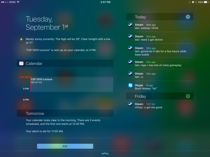
One of the first major changes I noticed in iOS 9 was the new Notification Center layout when in landscape orientation on the iPad. Since there’s enough horizontal space to do so, Apple has segmented the drawer into two sections, with the today view and widgets on the left, and notifications on the right. I’m surprised it took this long for someone to do this, as it has always seemed like an obvious way to use the space in landscape, rather than simply having a bunch of empty space on the sides or stretching the interface to fill the width of the display.
One other thing to note is that notifications now sort by time, and also by date. Previously the notifications still sorted “by time”, but they were also grouped by app. This meant that they didn’t really sort by time in the way you would expect. The group by app feature is now optional, and disabled by default. Notifications are now sorted by when they arrive, and while you still can’t close them all at once, you can delete them by day which ends up being pretty quick. I know the sorting of notifications has been a long source of pain on iOS, particularly among Android users moving to iOS who were used to the sensible time based manner than Android has always used to sort notifications, and it’s good to finally see it changed.
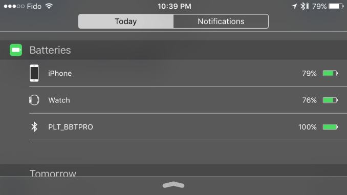
As for the today view, there aren’t many big changes. The one addition that I did notice is a new battery widget, which shows the battery life of devices connected via Bluetooth. This was obviously added with the Apple Watch in mind, but it also applies to other devices like Bluetooth keyboards, speakers, and headsets. It’s important to keep in mind that your Bluetooth device has to report its battery life to the host device in order for this to work. You’ll know if it does if you’ve ever seen a small battery symbol next to the Bluetooth logo in the status bar when your device was connected. For example, I have a Plantronics and a Creative headset here that do show up in the battery widget, but a pair of Sony headphones and an older Creative set that do not.
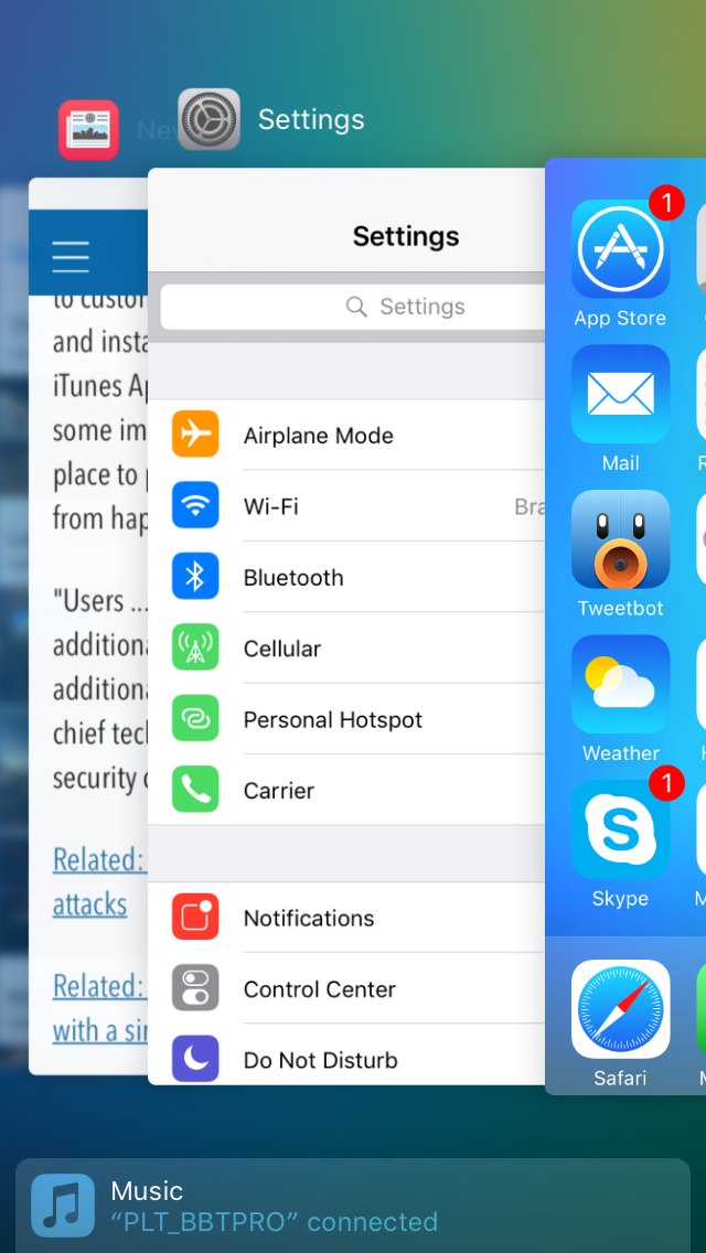
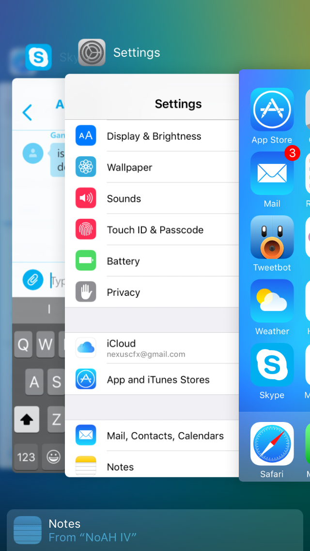
The recent apps switcher receives a big visual overhaul in iOS 9. Long ago it was a bar at the bottom with app icons, and with iOS 7 it was changed to a list of icons with cards to preview the application. It reminded me a lot of the Windows Phone recent apps list, but it was a much better implementation. This time around it seems that Apple has taken a bit of inspiration from the recent apps tray introduced in Android Lollipop which has a scrolling stack of app preview cards that are overlaid. The iOS recent apps tray is basically the exact same thing, but scrolling sideways instead of forward and back. It works fine, although I don’t know what necessitated the change apart from the old style being really difficult to run smoothly on a device like the iPad due to the requirement of high resolution app previews being entirely loaded into memory.
One consequence of the fact that the recent apps tray now scrolls left initially rather than right is that the direction of the four finger app switching gesture on the iPad is now reversed. I still find myself swiping to the left with four fingers to get my last used app on screen, but this just results in a bouncing overscroll effect as you now need to swipe right with four fingers. I understand Apple’s reasoning, as moving your thumb to the right when holding a phone in your right hand is more ergonomic than moving it left, and this works with the new app switching gesture enabled by 3D Touch on the iPhone 6s, but it does cause a bit of confusion at times if you're used to using that gesture on an iPad.
Something that has been greatly improved about the recent apps list is how you access applications that are being handed off from another device. With the old tray, you accessed it by swiping to the left of the card that had the home screen on it. This meant that if you weren’t at the very beginning of the list you had to scroll all the way back. In iOS 9 you complete the handoff of an application simply by pulling up on a card shown at the bottom of the display. Apple has also used this same interface to show the music app when you have a pair of headphones or a speaker connected via Bluetooth or the 3.5mm jack. I’ve found this very useful when switching from an application to the music app, as it removes the need to go to the home screen to find and select it there.
The last thing I wanted to mention about the new recent apps tray is that the recent contacts list at the top has been removed. I mentioned in my iOS 8 review that it wasn't very useful and that I had never used it, and it looks like I wasn’t the only one who felt that way.
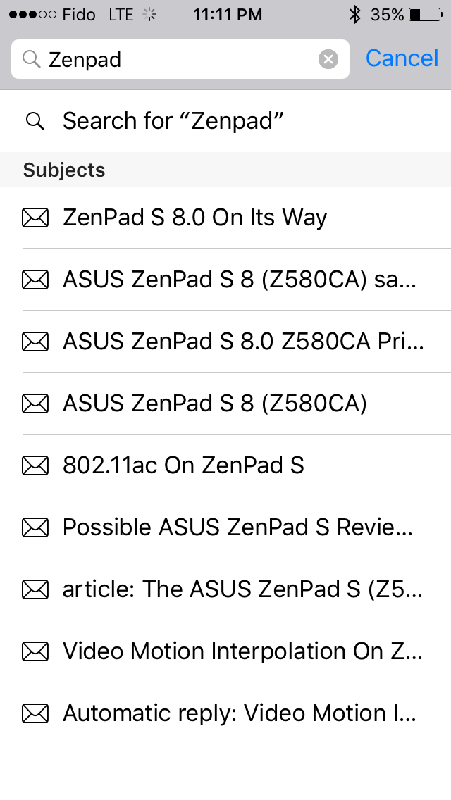
Some of the included iOS apps receive some notable improvements as well. Mail now allows you to include more than five photos in a message which is a long overdue removal of an antiquated constraint. You can also add attachments now, which you select from iCloud Drive. Searching through mail is also much better as well. Previously it would just show you every message that corresponded to the keywords you entered. The search now gives you a list of thread topics that match, and if those aren't sufficient you then have the option to use the older individual message view.
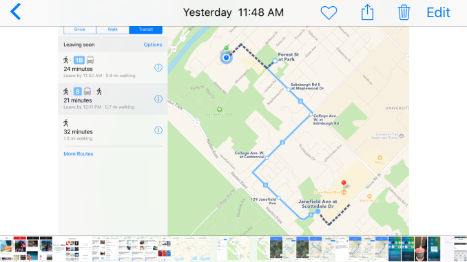
Apple's Photos app gets a couple of upgrades too. There's now a scrubber at the bottom of the iPhone version of the app which allows you to quickly go through photos. The functionality of the scrubber is slightly different from the older version on the iPad, as it accelerates the movement through photos much more quickly. You can also select multiple photos in an easier manner by pressing on one and dragging left or right to select images in a row, and up or down to select an entire row.
There are other visual and functional changes all over the place, and it’s impossible to document them all. A few others that I felt are worth mentioning include a significantly more rounded share and overflow menu with a separated cancel button, 4x4 folders on the iPad, the ability to set your recording resolution to 720p in the settings app in order to reduce the space taken by videos, and the ability to have caller ID guesses made based on emails you’ve received.
Ultimately, there are no revolutionary improvements to the interface among the changes that I’ve highlighted here. The new visual appearance that came with iOS 7 appears to have matured by this point, and now Apple is making refinements to how things look, and improving how things work. I think most of the changes I’ve found and discussed here are for the better, even when they’re removing something like the recent contacts in the multitasking tray. If you’re not a fan of the design of iOS your opinion isn’t likely to change with iOS 9, but if you do enjoy it then you’ll be getting some nice visual and functional improvements throughout the system.
A New System Font
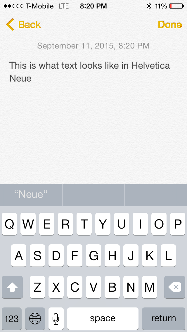
Both OS X and iOS have made some major changes to the system font in recent years. iOS moved from Helvetica to Helvetica Neue on Retina devices in iOS 4, with non-Retina devices moving to the thinner weighted Helvetica Neue alongside the Retina devices in iOS 7. OS X changed from Lucida Grande to Helvetica Neue with OS X Yosemite. This year both operating systems are adopting Apple's San Francisco font. Technically this is different than the San Francisco font used on the Apple Watch, which is a result of the different circumstances and sizes that will be used on an iPhone, iPad, and Mac compared to a smartwatch. Specifically, the San Francisco Compact font used on the Apple Watch has flat edges to letters like e, a, and o have flat edges that put more space between them and other characters to improve legibility.
To be honest, I'm not the best person to give commentary on what's good and bad about Apple's new typeface. While I can see and understand the differences between fonts, I find it difficult to articulate exactly what makes a font look and feel different from another similar font. My first impression when using San Francisco was that characters seem more rounded than those in Helvetica Neue, and the spacing between them is greater. After using iOS 9 for quite some time I've grown completely used to them, and the initial surprise of having a different looking font everywhere actually wore off after a couple days. To learn a whole lot more about San Francisco and the process of designing it I would check out Apple's WWDC session that was dedicated to discussing it.
Apple News
Once upon a time I used Pulse to keep track of the news and reviews coming from my favorite websites. That seems like a long time ago now, as once it was acquired by LinkedIn the Pulse app received a number of updates that negatively impacted the interface and the app’s performance. At that point I abandoned it for Flipboard, which has been my news application of choice on both Android and iOS up until this point. At WWDC 2015 Apple announced that they were creating their own news reader called Apple News, and that it would be launching with iOS 9. Naturally I was interested in seeing how good it was, and if it was good enough to merit replacing Flipboard with it on iOS.
Before I go forward, I have to mention that Apple News is only launching in the United States, United Kingdom, and Australia. The content is hardly regional though, so I have no idea why this is the case. Until your device is set to one of these regions the app won't even show up, and if you want to get around this restriction you need to go to Settings > General > Language & Region and set your region to one of those three places. This doesn't require you to change your language, but it does change the formatting of dates, currencies, etc.
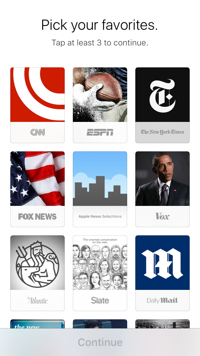
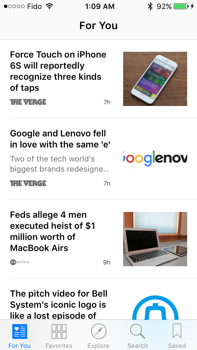
When you first launch Apple News you’ll be asked to add three of your favorite news sources to the app. The app is intelligent about offering additional selections based on what you initially choose. For example, if you scroll down and decide to add AnandTech as a source the list will begin adding additional news sources related to technology. Once you’ve picked three or more sources you’re ready to start using the app. The first screen you’ll see is the “For You” screen, which aggregates stories from your selected news sources and topics. I’d imagine a lot of users will spend their time reading here, but I personally like to dive into a specific site or topic, which you can do from the favorites tab.
Of course, you’ll likely want to expand your news sources beyond what you initially chose when you’re setting up the app. Apple has two methods of doing this. The first is to go to the explore tab. This section has lists of channels and topics which are selected based on what sources you already have. You can also scroll down to browse news sources by topic, which can be a good way to find a new source about a topic you enjoy reading about. If you already know what you want then there’s no need to go exploring, and you can instead go to the search tab to search for a topic or a website.
At this point Apple News seems pretty good, but it hasn’t really done anything that an existing news application like Flipboard doesn’t already do. The real appeal of Apple News is in the content, and more specifically, how nice it can be to read content designed for the Apple News format. At this point I’m going to switch over to the iPad, as the large display really works great with the formatting of Apple News articles, and in general it’s just a nicer way to read news than a phone.
Most publications haven’t fully taken advantage of the Apple News format, and are just providing the same RSS feed as they would to other applications. This is because the format has only been available to selected sites in a closed beta during the iOS 9 beta cycle. In those cases you don’t get the same experience as publications that have, but you still benefit from the layouts and typography of articles in Apple News. Publications that present articles designed for the Apple News format are a whole other story. As you can see above, CNN has decided to customize their hub with a list of topic sections along the top. When you’re reading news from a particular publication that has done the work to add these things it feels just like being inside a native application, but without the storage usage and clutter on your device that having separate apps for every news source would create.
The experience inside the articles themselves is also better than any other news reader I’ve used in the past. Standard articles still look nice because they’re formatted well, and Apple has made good choices for the fonts and sizes to use for different types of text. When you get into articles designed for Apple News the experience gets even better. Like I mentioned before, it really feels like being in a native application for a publication. There can be animations, parallax image scrolling, Gaussian blur, and special text formatting. These things improve the experience by adding things, but there are also improvements made by taking things away. There are no auto playing videos in the articles, and no intrusive advertisements that scroll along or pop up and block your content. The features involving smooth scrolling and animations are very difficult to do well on the web, and it’s really not something other news apps can compete with if they’re just using standard RSS feeds for websites.
I mentioned that there are no intrusive ads in Apple News and in fact at this point I actually haven’t seen any advertisements at all. I know that they will be coming at some point because publishers need to make money, but I don't know when that will be. What’s great is that the ads won’t be intrusive like the ones you’ll get when you visit many of these publications on the web, which is another win for users.
Of course, there is one downside to Apple News that could force some users to continue using other services, and that’s the lack of support for adding RSS feeds. Thankfully, an extremely large number of publications have added themselves to Apple News, including ones that primarily cover Microsoft and Google which confirms that it's not an echo chamber of Apple related news. That being said, there are a couple of sites that I normally check from time to time that aren’t on the service yet and while none of them are sites I consider essential enough for me to stop using the app, it’s very possible that for the time being a user could be missing a site that they really need supported.
Based on the current support I see, I think it’s clear that websites and publishers are already aware of how necessary it is to be on Apple News, and if a publication isn't on it yet it certainly will have to come sooner rather than later unless it's a publication so specialized and unique that users are willing to visit it through Safari because there's no alternative. Being a default app for an operating system comes with a lot of power because users will choose it based on its immediate accessibility, even when it’s not as good as some third party alternatives. However, in the case of Apple News I honestly feel that it is the best news reading application I’ve used to date, and I miss it a lot when using devices like the Nexus 9 and Galaxy S6.
Apple Maps: Now With Transit
Apple Maps has been the butt of many jokes in the tech industry since its initial release with iOS 6. At that time it was clearly not ready to start shipping, and it paled in comparison to the previous maps app which used data from Google. Apple was forced to issue a public apology for the issues, and recommended that users use mapping services other than Apple Maps. Since that time, Apple has steadily improved their maps by acquiring companies, sending out cars to do manual mapping, and adding new sources of information for businesses. Even with their improvements, Apple Maps has still lagged behind Google Maps in some key areas, with one of them being built in directions for public transportation. With iOS 9 Apple has implemented their own transit directions right into the app, bringing back a feature that was lost with the switch from Google to their own mapping service three years ago.
Ever since the original Apple Maps release I have used Google Maps to find locations and get directions, as it provides the same experience on iOS and Android, and because public transit directions are something I need. With transit returning to maps on iOS, I thought it was worth going back to Apple Maps to see what improvements have been made in the last three years, and how it compares to Google Maps in my local area.
My first impression is that the Apple Maps application itself is better than Google Maps on any platform. Google Maps has always had fairly janky scrolling and zooming for me. Apple Maps definitely isn't devoid of stuttering, but it's normally significantly smoother than Google Maps. I find the aesthetics of the maps themselves to be nicer, and I think it's just due to the colors used and the fonts for the street names. The Apple Maps app also fits in better with iOS by following Apple's design and navigation guidelines, while Google Maps, like Google's other apps, feels like you're running an Android application and uses methods of navigation that are actively discouraged on iOS.
Google Maps certainly has a number of advantages though. I enjoy travelling by bike, and Google Maps has a really great overlay that shows you bike trails which are often submitted or edited based on user submissions. Apple Maps has no such thing, and I don't know how they would ever match the feature because it would require getting cyclists to submit to Apple Maps as well as Google, which will never occur to any meaningful extent. Google Maps also shows you the names of streets at a reasonable zoom level, while Apple Maps barely shows you any street names until you zoom so close that you don't even have a concept of where you are. The satellite imagery in Google Maps is also much better; it never turns to black and white like Apple Maps, and is noticeably higher in detail and resolution.
At the same time, Apple Maps has some advantages too. While it's very reluctant to put the names of streets, it lists many businesses and they all appear to be accurately placed. In contrast Google Maps does the same thing Apple Maps does with street names and makes only the ones it has arbitrarily chosen show up unless you zoom really close. If you're having to balance clutter I would probably choose to show street names rather than businesses though.
Both mapping apps actually had some issues with the accuracy of their mapping. Google Maps omits a ton of small streets that branch off of other streets, while Apple Maps marked a residential area as though it was a field. There are also some paths and roads that are marked in a questionable or incorrect manner in Apple Maps.
If I had to choose an application based solely on the quality and accuracy of the maps themselves, I would have to go with Google Maps. Apple Maps has improved greatly in my area since it originally launched, but Google has been in this business for far longer and they've collected and accurately marked a lot of data in that time. For my purposes Apple Maps is definitely sufficient, as I really treat my maps app more like a GPS device than a map, and so I was very interested to see what Apple has done with transit.
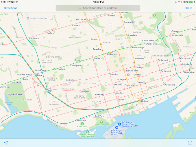
When Apple announced transit support at WWDC they did so in a somewhat confusing manner. It seemed that it would only support a handful of major cities, like New York, London, and Toronto. In reality, transit directions are supported in a great number of cities, and the ones specifically mentioned by Apple are the cities where they have created map overlays that show all the transit lines in the city. This is really not unlike the situation with Google Maps, where the cities that have transit overlays are big cities that have various types of public transport that run both above and below the ground. Clearly Google still has an advantage of scale, especially with Apple launching with few European and no Japanese cities, but these will be improved over time just like the maps themselves have been.
Of course, coming late to the party does give Apple a chance to think about what things could be done better about transit. For example, you can see above that when you select Toronto's Union Station in Apple Maps you're presented with a very clean view containing relevant info and sections for all the different transport services that run there. In contrast, Google's listing actually splits the station into five separate points on the map for the different transit services, and when you click on one the different transit lines are just laid out haphazardly.
The most amazing thing of all is that contrary to the reputation Apple Maps has, the transit directions and maps are accurate! Not only are they accurate, but I've seen several situations where they give a more sensible route than Google Maps has, and I even had to deal with this firsthand when travelling in Toronto earlier this year. Above you can see me trying to travel from Toronto's Union Station to High Park. Apple Maps presents a very logical route which takes the subway for the entire journey. For whatever reason, Google Maps suggests taking the subway for one section, and then taking a street car which results in a longer journey and also places you in a less convenient spot near a loud expressway on the other side of the park.
I've also noticed that in my city the algorithm Google Maps has used to map the journey of buses has made a number of errors. I see several cases where your route apparently takes you floating over a river, or through the middle of residential areas. While these may seem inconsequential, if the errors occur near the beginning end of your route it can be difficult to tell where you need to get or where you'll be let off. Google Maps also doesn't let you know when a route has been put on a detour due to construction, which is another way to end up missing the stop you want to get to. It really sounds crazy even to myself, but in my experiences I've seen Apple Maps constantly outperform Google Maps as a transit tool.
Now before anyone gets the wrong impression based on what I've written here, I want to reiterate that these are only my experiences. I can't travel too far to test out maps, and I live in a fairly urban area. I've heard and seen the stories of areas where Apple Maps is still mapped completely wrong, or where there's no map at all. I'm sure there are lots of stories that run contrary to my experience. However, with Apple Maps being used by 3.5x the number of users that Google Maps on iOS has, it's clear that a lot of users do find the default maps app to be satisfactory.
My big complaint now is that there are no bicycle routes, and that's an area where I predict Google will have a continued advantage. With that said, I think the better performance and better design of the Apple Maps app are serious points to consider as well. If you're someone who turned away from Apple Maps initially like I did I would encourage you to give it another try. If it's a disaster, then Google Maps is still there to provide great mapping info. However, I think the good aspects of Apple Maps may surprise you, as they surprised me.
Low Power Mode
Low power mode is a new feature in iOS 9, and it's fairly self-explanatory. Android OEMs have been adding similar features for a while now. When your battery hits 20% the normal low battery popup will appear, but it now has a button to turn on low power mode. Apple hasn't specifically detailed what they're doing in low power mode, but they have given a broad overview of what they're doing, and some of the things can be measured manually. Low power mode makes the following changes:
- Brightness is dimmed
- Mail fetch is disabled
- Push notifications are disabled
- Background refresh is disabled
- Background network access is limited
- CPU performance is reduced
- Parallax on the home screen is disabled
- Animated wallpapers go static
With all of these changes, Apple says that low power mode can extend battery life by up to three hours if used for an entire cycle. You can actually enable the mode manually if you want by going to the battery section of the settings application. The low power mode will also automatically disable itself once the device is charged to 80%.
As for some of the specifics, I can confirm that the iPhone 5s will bring the SoC to a state where the max clock is 800MHz, while the display on this specific unit drops from 523nits to 414nits. I hope to get figures for the iPhone 6 and 6s as soon as possible, and I'll update this section once I have them. It's difficult to measure the impact of something like low power mode, as it's still heavily dependent on how you use the device. Regardless, it's good to see Apple bring this sort of feature to iOS, and I would be interested to see which users decide to use it all the time to improve their battery life even if it requires sacrificing apps running in the background and a degree of performance.
An Improved Notes Application
The iOS Notes application has been fairly simplistic since its original incarnation. You can add text, and if you long press you can insert images. Through some copy and paste magic you could end up getting text formatted with different fonts and sometimes features like bullets, but that implies that you had to write it out in another application anyway unless you’re pasting right from the web. In contrast, an application like Google Keep on Android has support for other features, like making checklists of items. Something like Evernote provides even more features that make the iOS stock app look bare in comparison. In iOS 9 the notes application receives a large overhaul, with a number of visual tweaks and new features.
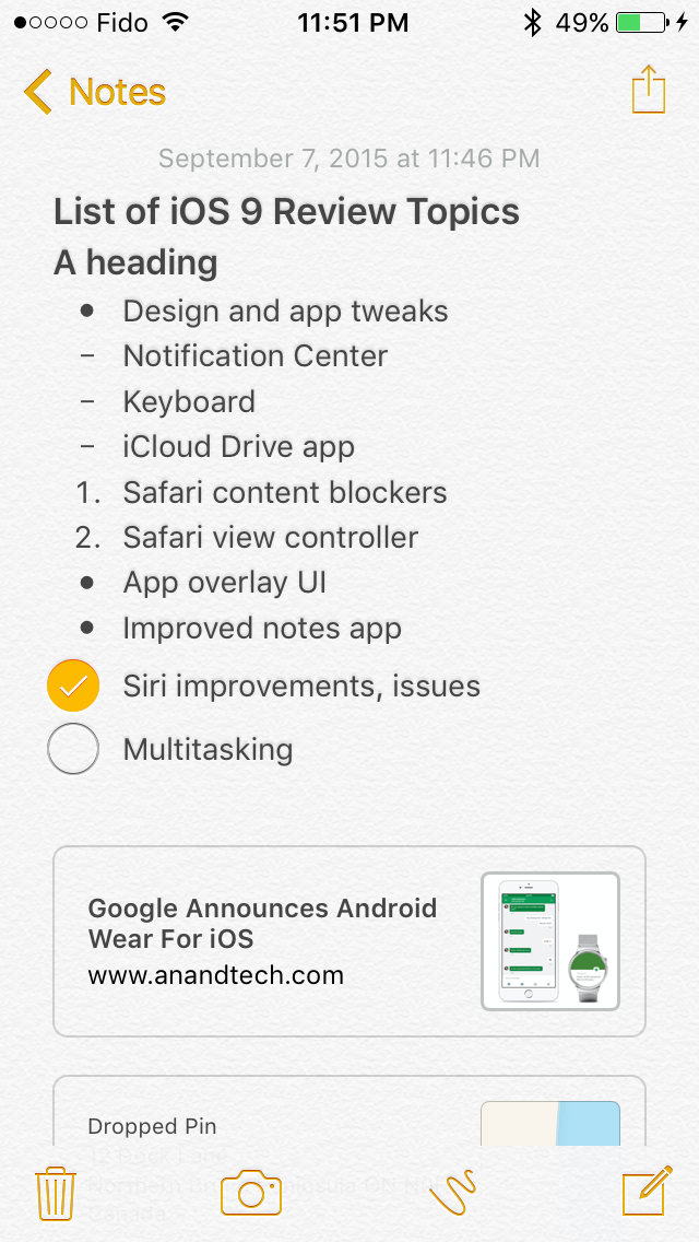
Notes on iOS now supports rich text formatting. You can change whether your text is meant to be for a title, a heading, or a body of text. You can also make text bold, italicize it, or underline it. There’s still no support for fine adjustments like setting a precise text size, and for those controls you’ll still need to rely on a third party application or on Pages. To be fair, it’s not in Apple’s best interest to kill the viability of making third party note applications.
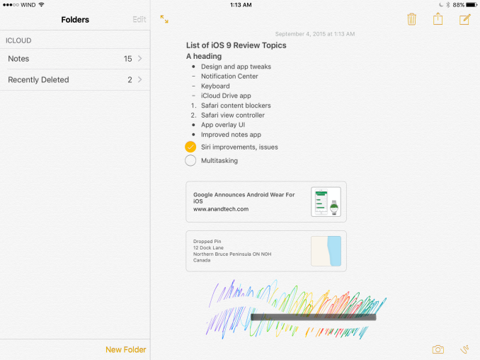
In addition to the font formatting you can also make lists using bullets, dashes, or numbers. There’s also the ability to create checklists, which I have used a few times during the course of writing this review to make sure I haven’t forgotten anything that I want to cover. You’ll also notice in the screenshot above that you can link to locations, webpages, voice recordings, and other content and they’ll be embedded in the note inside a rounded rectangle.
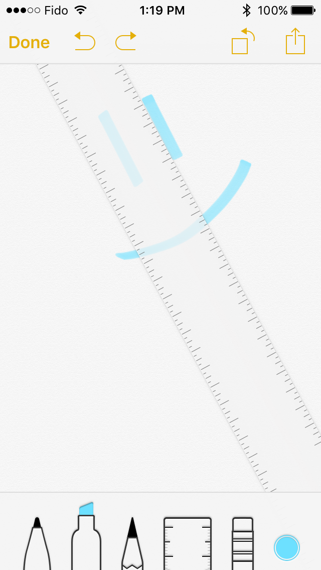
Something else Apple has added is the ability to draw on notes. Clicking on the squiggly line on the bottom navigation bar opens up a drawing section which has different virtual tools to draw with. There's your standard fine marker, a thicker tool like a highlighter, and a pencil. There's also a ruler which can be used to draw straight lines, and both an eraser and undo/redo buttons for any mistakes.
While the ability to draw on pages is interesting, it’s not implemented the way I had hoped it would be. Your sketches are essentially images in the note, rather than being drawings that you can position anywhere. An app like Notability lets you put scribbles wherever you wish, which can be helpful when you want to emphasize something or put yourself a note in a margin. Since your sketches are just images they have to be positioned above or below a line of text, and cannot be put to the right.
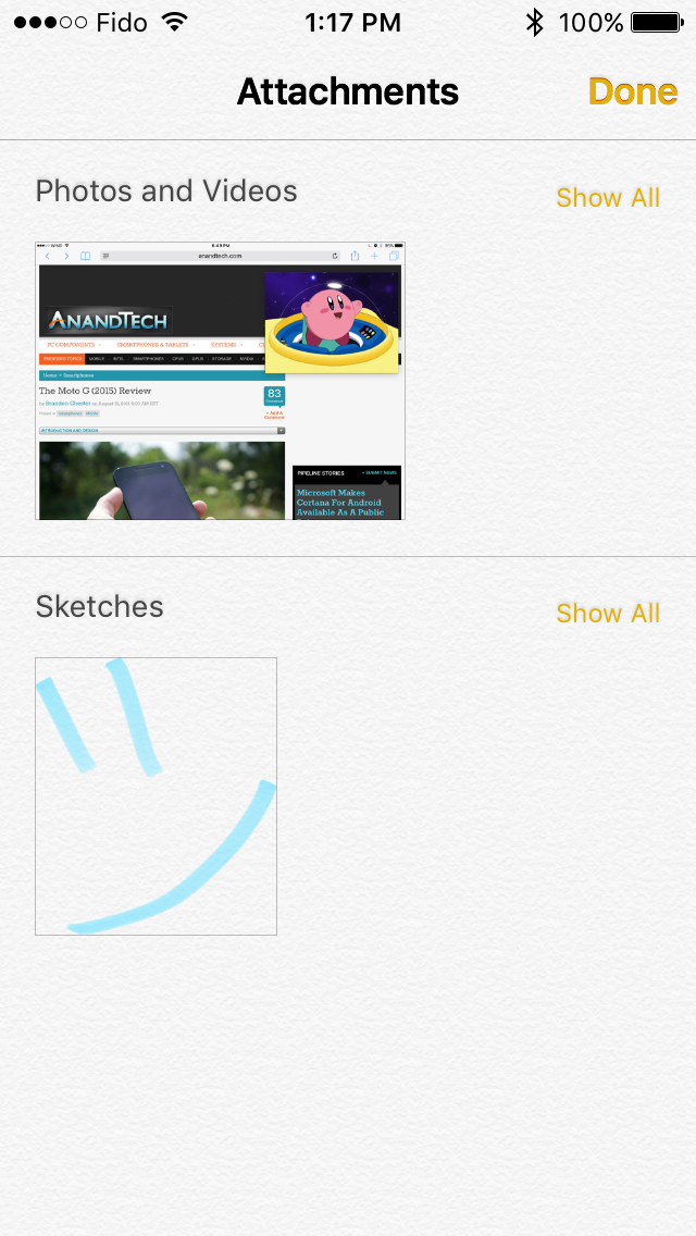
The last thing worth mentioning about the new Notes app is that Apple has also added the ability to view all the images, sketches, and attachments that exist within all of your notes. This can be helpful when trying to find a note based on a photo or a link inside it when you aren’t sure exactly what sentence or list you had in the note alongside it.
A Better iPad Keyboard
I've always felt that the iPad has one of the best first party tablet keyboards out there. I think part of it has to do with the 4:3 aspect ratio allowing for keys of greater height in landscape, which means you aren't dealing with rectangular keys that result in uneven movement depending on whether you're moving your fingers vertically or horizontally. The iPad keyboard has also had some unique features that the iPhone doesn't, such as the ability to split it into two parts by pulling outward from the middle. However, when Apple added QuickType suggestions I always felt like there was a lot of wasted space on the left and right sides where there were no suggested words. In iOS 9 the iPad keyboard gets a few feature additions that can greatly improve productivity, and fills in those empty areas in the QuickType bar while doing so.
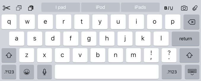
The most obvious addition to the keyboard are the new shortcut keys on the left side of the QuickType suggestions. Depending on the context these buttons will differ, but by default you get a pair of undo and redo keys, and a paste key. If you select text these buttons change to a cut key, a copy key, and a paste key. They also change in different apps, with the Notes application condensing the standard 3 shortcuts into an overflow menu, and adding a button to create a checklist as well as a button to adjust the formatting of text.
On the right side of the keyboard are additional shortcuts that depend on the application you're in. In Notes they are buttons to insert images and access the sketch screen, while in Mail they're for text formatting, adding images, and adding attachments. Many apps don't have shortcuts here at all, and you'll have to open up the keyboard in an app to see what you get.
More interesting than the new shortcuts is the ability to use the keyboard as a trackpad of sorts. It's not something that allows you to bring up a mouse cursor and move it around the screen, but in apps where you're inputting text it allows you to move that input cursor and to increase or decrease the size of a text selection field. To use this trackpad mode you need to place two fingers on the keyboard at the same time until the keys go blank. After that you can move your fingers around and the cursor will track with them. It's a useful way to move the cursor within a sentence to insert a word, or to accurately change the size of a selection by only a letter or two.
One last thing I'd like to mention is that the case of the letters on the keyboard now changes depending on the status of the shift key. This fixes a longstanding issue with the shift key on the iOS keyboard that has existed since iOS 7. The change applies to both the iPad and iPhone keyboards, but I felt it was best to just mention it here.
Ultimately, I think the changes Apple is making to the iPad keyboard go hand in hand with the new multitasking features that I'll be discussing later in the review. They represent the iPad finally growing up and becoming its own device. It was never correct to say that the iPad was just a big iPhone, but from a high level the two devices did provide similar experiences as they used the same applications and operating system. Adding features that are very specific to the iPad differentiates it more from something like the iPhone 6 Plus, and improves its ability to be used to get actual work done.
Siri
Siri debuted with iOS 5 on the iPhone 4s, and at the time was really the first virtual assistant integrated into the core of a mobile OS. It has faced steady competition from Google Now and now from Microsoft's Cortana, and in my experience it seems that Google Now still holds an advantage as far as speed and accuracy goes. However, at WWDC 2015 Apple detailed a number of statistics relating to Siri, and showed how Siri is being improved in iOS 9. According to Apple, Siri serves over one billion requests every week, and has gotten 40% more accurate in the past year, with a word error rate of just 5%. Siri has also gotten 40% faster in the last year, and having tried using Siri again for the purposes of this review it does seem that it has improved in these respects.
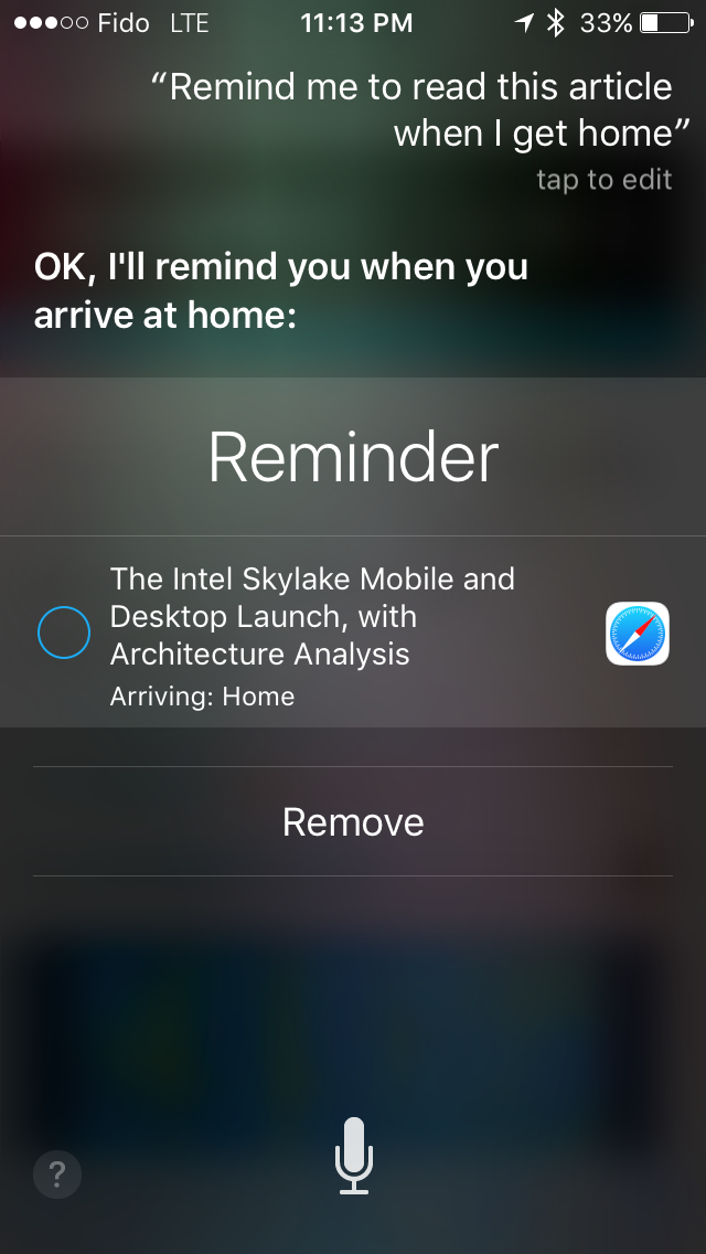
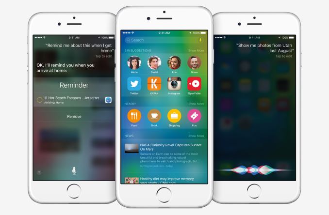
iOS 9 focuses on making Siri more intelligent and proactive. Part of this just involves simple improvements, such as how conversions are now done natively instead of referencing Wolfram Alpha, which ends up being much faster. In other cases, the fact that Siri is more aware of context allows for new uses that weren't previously possible. You can see above how asking Siri to remind me to read an article created a reminder which would have an embedded link to the webpage I was reading when it reminds me after I arrive home. You can also use Siri to make specific searches, like looking for photos based on a time and location. However, the contextual awareness doesn't go near as far as Google Now on Tap which will be launching in Android M and will allow you to ask questions in natural language about the content you're viewing and get relevant answers.
Ultimately the local and front end improvements to Siri as a voice assistant are not enormous, and the real improvements are those that Apple continues to make on the back end to make Siri more accurate and responsive when you use it. Since these improvements have nothing to do with the timeline of iOS releases - a consequence of Siri being as much a service as it is an OS function - there's not much I can say about them beyond what Apple has said. However, Siri has been expanded in iOS 9, and has now taken over what was previously Spotlight Search. The new search screen and enhanced universal search on iOS are what I'll look at next.
Universal Search
iOS 3 brought Spotlight Search from OS X to the iPhone. It was a screen you could access by swiping to the left of your first home screen, and it allowed you to search for applications and a limited set of content on your device. With the iOS 7 redesign this screen was eliminated, and Spotlight was now something you accessed by swiping down on any home screen. iOS 9 changes things up, and in a case of what you might call indecision Apple has decided to put a search section both in the old Spotlight Search area, and the screen accessed by swiping down on a home screen. However, this new search section to the left of your home screens has a couple of new features which are worth mentioning.
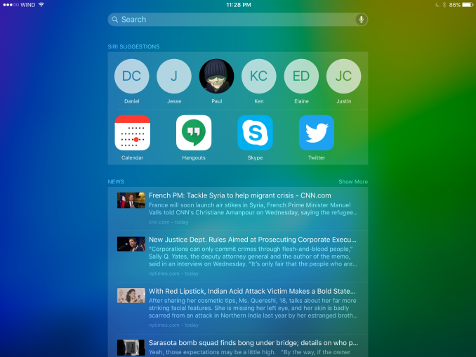
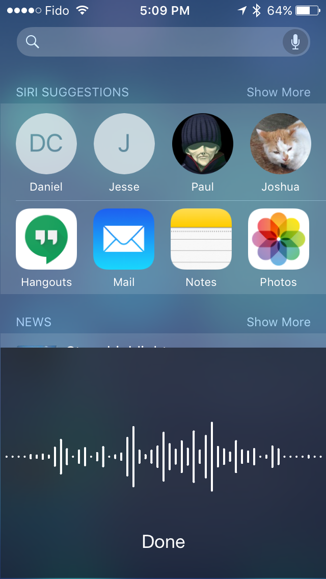
In addition to having search, the new search screen displays suggestions from Siri for apps you may want to open or contacts you want to call or send a message to. My problem is that I don't understand the reasoning behind the suggestions that I'm being given. The contacts seem to be chosen well, but only because I only contact four or five people frequently. The apps just seem nonsensical. I am very sure that I have never opened the YouTube app at 12:30AM in my entire life. The news selections are also terribly irrelevant. That isn't to say that all the stories themselves are irrelevant, but considering the fact that the majority of my Apple News sources are technology related I would love to know why I have never ever seen a single technology article in this list.
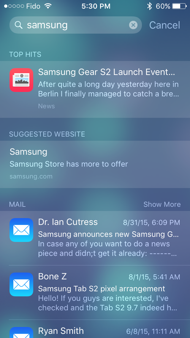
As for the searching itself, that's where things improve. Search has been given the same upgrades as Siri, with support for making conversions. You can also do voice searches which is a long overdue addition. Searching for general terms is also greatly improved. For example, searching for Samsung gives me the Samsung website as a suggested site, news from Apple News, general results from Bing, apps from Samsung on the App Store, Samsung's Wikipedia page, contact suggestions from people at Samsung that I've sent emails to, and even more. This is honestly the level of depth that search should have had on iOS for a long time now, and it's great to finally have a reliable way to search for something on the device with only a simple search term.
With iOS 9 Apple is also providing a search API for developers, which will allow them to add their own applications to the sources that are searched through. This means that an app like Twitter could allow you to search for tweets that you favorited or retweeted using the built in iOS search bar, and Microsoft Office could show you a document based on your search for a phrase that is inside it.
Search is definitely an area where iOS has been lacking for a long time now, and the additions Apple is making in iOS 9 are welcomed but definitely overdue in many cases. I think being able to search through many applications is great, and the integration with Siri to provide results like contact suggestions can be very helpful. At the same time, I really think the screen to the left of the home screens is poorly thought out and not useful because you can access search itself from any home screen. I feel like there was an initiative at Apple to create some sort of competition for the Google Now card screen, but it really didn't turn out well.
iCloud Drive
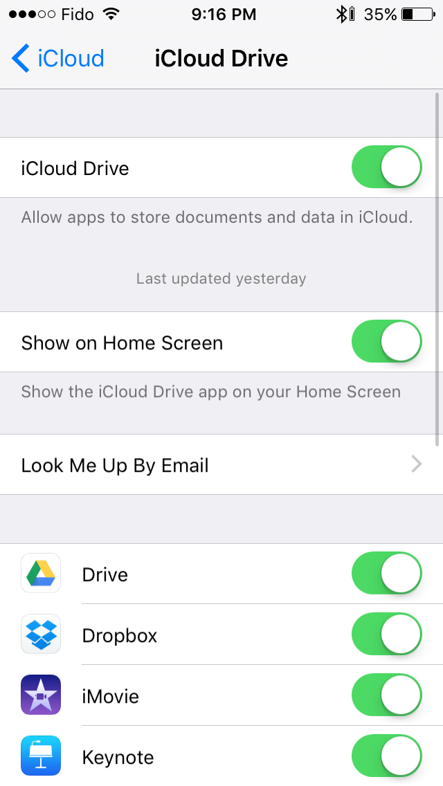
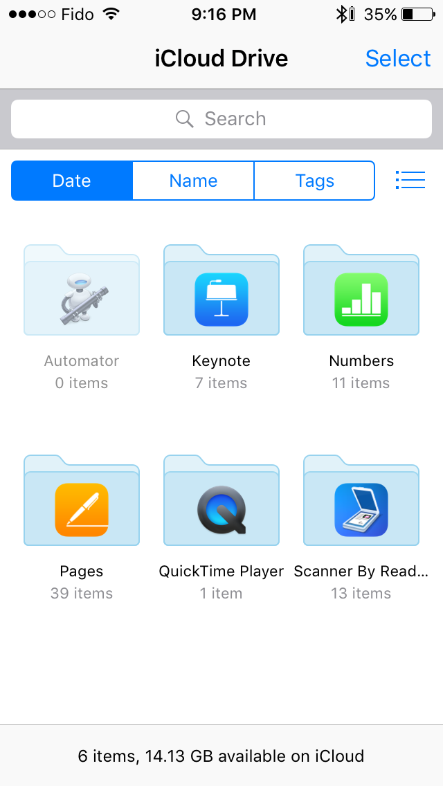
This is more of a power user app, and it's put in the OS somewhat like an easter egg. Basically there's an application that lets you view, download, and open files stored in iCloud Drive. The UI is essentially just the iCloud Drive picker put into an app with some changes, and you can see it below.
There's really not much to say about the app. Everything is organized the same way iCloud Drive is in Finder on OS X and on the iCloud website. You can download files, move them to different folders, and open them or copy them to an application of your choosing. It's just something to make note of if you ever want to manage your drive from your iPhone or iPad.
Multitasking
iOS has had some level of multitasking for a long time now. iOS 4 introduced the app switcher, along with APIs to allow certain background tasks like audio, location services, push notifications, and task completion. iOS 7 expanded multitasking by allowing applications to perform background updates at certain intervals. None of these features are really multitasking in the same sense as a computer, and they don’t even match the word itself very well because you as the user aren’t able to perform more than one task at the same time. While this is fine on a smartphone, on the iPad it has always felt a bit strange as there’s definitely enough room to run multiple apps at once. In iOS 9 this changes, and the iPad gains several abilities that allow you to truly multitask.
To describe how Apple has enabled multitasking on the iPad it's necessary to go over a brief history of app development on iOS. In the beginning, a developer would create a pixel perfect interface for their application. The reasoning behind this was that there was only one iOS device with the same display size and virtual resolution for many years. The introduction of the iPad introduced another device target which put extra work on developers, but one could argue that iPhone apps being so terrible on the iPad is what pushed developers to make great iPad specific apps anyway. Unfortunately, this method of creating app layouts wasn't very forward thinking, and it didn't allow apps to scale properly to new devices like the iPhone 5, and the iPhone 6. With developers now having to support a number of different display sizes and resolutions it was necessary for Apple to implement a method of designing apps that would work across multiple display sizes.
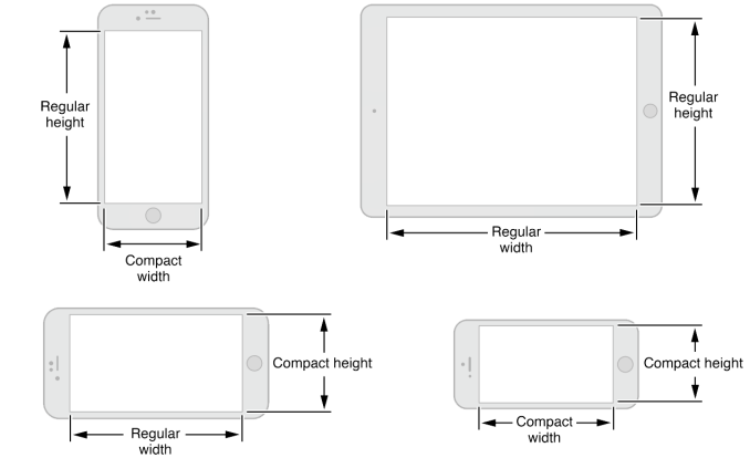
Apple began pushing developers to design applications that would work across multiple displays at WWDC 2014. This involves adopting Auto Layout, which is a method of creating iOS application interfaces that can scale to different screen sizes while still giving the developer a degree of control over the placement of objects by allowing them to create virtual constraints. Auto Layout defines two size classes, which essentially define the attributes of the interface on a certain device based on its resolution and size along a given axis. For example, the iPad always uses the regular size class in both dimensions regardless of its orientation, while the iPhone 6 uses the regular height but compact width size classes in portrait, and both compact size classes in landscape. The iPhone 6 Plus is an interesting situation due to its size, and it uses the same regular size class for its width in landscape as the iPad, which is why you'll see applications that use Auto Layout almost acting like mini iPad apps on it when in landscape mode.
At the time, the recommendation to use Auto Layout made sense for developers who wanted to support every iPhone along with the iPad, as it meant they didn't have to maintain several entirely different layouts for different devices, but could still make interfaces that took advantage of larger displays. At WWDC 2015 it was made clear that Auto Layout was created with additional purposes in mind, with one of them being the multitasking capabilities coming to the iPad.
Before explaining the different methods of multitasking in iOS 9 it’s probably a good idea to explain how you even access the features. Despite what one might think, you don’t start multitasking by going to the recent apps tray. Apple has instead added a new menu which you can access by swiping in from the right edge of the device when inside an application. Rather than showing you all of your open/recent apps, this menu only shows you applications that are compatible with multitasking. To open an app you simply tap it, and to return to the list of apps you swipe down from the top of the open application. To close the menu you can tap elsewhere on the display, or swipe to the right. Something I'd like to note is that this feature does not break the ability to swipe from the right in Safari to go forward a page, as in Safari you need to swipe from the middle of the edge to open the multitasking menu.
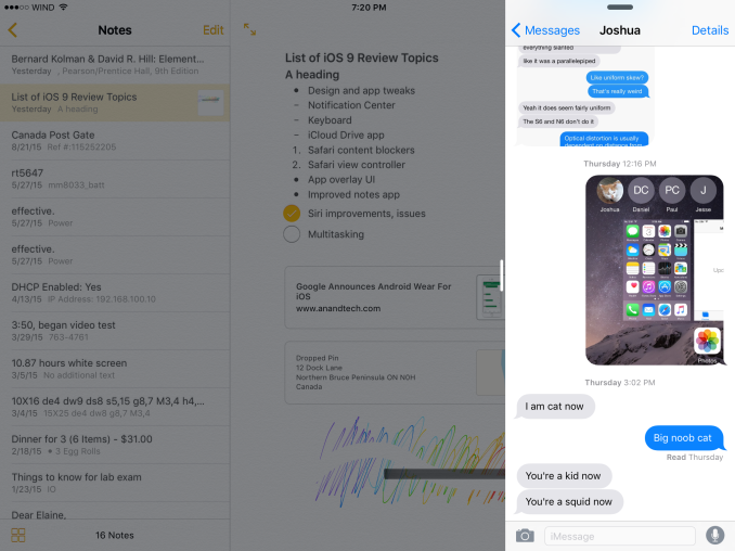
The first aspect of iOS 9 multitasking, and the one I think most iPad users will end up using for device compatibility reasons, is the new slide over feature. This allows you to slide in a compatible application overtop of your current one. This can be really useful for quickly sending a message, or looking up something in Safari while writing a document in Microsoft Office. This may sound very cliché, but it really does transform how you use an iPad just due to how much easier it makes the experience of working on one.
Slide over windows appear in a bar which is the exact same size as the new multitasking menu. They cannot be resized, and I don’t think readers will be surprised to know that the applications have a width of 320 points, or 640 pixels. This is due to what I explained earlier about size classes, and in this case Apple has just decided to use what is, for all intents and purposes, a very long 3.5/4” iPhone app.
The next multitasking feature in iOS 9 is picture-in-picture (PiP) mode. If you’ve ever used Google’s YouTube application then you already have some idea how this works. Essentially, it’s just a floating window that can play video content. At the moment it’s limited to the iOS videos app and video content using the standard HTML5 player (not YouTube) in Safari, but in theory it would eventually be implemented in all applications that play video. To activate the feature you can press the button in the app you’re using which will pop the video out. If you already had the video in full screen then iOS will automatically move it to a PiP window if you switch apps or return to the home screen.
Once you have the PiP window open, it will position itself in one of the display's four corners. If you need to see something underneath it you can either move it or swipe it off to the side where it will just stick out enough for you to move it back on screen. The window will also move with other parts of the interface. An example of this can be seen when the window moves upward whenever Control Center is opened while the window is in one of the bottom display corners. The use cases for a picture-in-picture feature are fairly obvious, and in my case I used it often to watch WWDC sessions while writing parts of this review in Office for iPad.
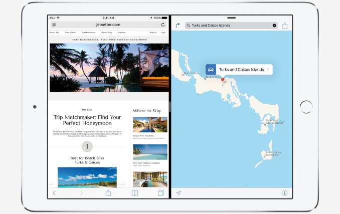
The last, most powerful, and most exclusive multitasking feature in iOS 9 is split screen applications. The reason I’m discussing this at the end is both because it’s by far the most significant and useful feature, and because the only users who get it are those with the iPad Air 2 and all later iPads. Split screen is essentially an extension of slide over, and you access it by going through the motions of opening slide over and then going a step further by tapping the tiny rounded rectangle next to the multitasking menu. The above video shows you the steps to access split screen view, and some of the specifics of how it works.
Something you’ll notice is that if you have two apps in split screen and you switch to another app the secondary application pinned on the right side will then create a new split view with the new application assuming it supports split screen multitasking. You’ll also notice that unlike the new split view in OS X El Capitan which has a similar interface, you can’t just set any arbitrary split between the two applications. In landscape mode you either get a 50/50 view, or a split with one app taking up 640 horizontal pixels and the other taking up the remaining space. In portrait orientation you can only add a second app with a 640 pixel width. In both cases you also have 22 lines of pixels taken up by the scrubber between the two applications.
As for performance, my experience with the applications that can be put into split screen has been very good. I've recorded a video showing that there's quite a lot you can do at once with the system still maintaining 60fps motion in all apps. It's worth noting that in this case the PiP window was dropping some frames, but in use cases that don't involve scrolling three different sections and flinging a video around all at the same time the PiP window also maintains its frame rate. On the next page I go into more detail on what resources multitasking requires with Apple's apps, and the potential CPU and memory use that will occur with more intense third party applications.
I often remember a situation a couple years ago where I was trying to watch the Google I/O keynote on an iPad while also keeping an eye on Twitter. It felt completely ridiculous to have to use a phone to view Twitter when there was a 9.7" 2048x1536 display sitting in front of me, but that was just how things worked on the iPad at that time. In my view, the addition of multitasking just puts the iPad experience even farther ahead of other tablets. Obviously Windows has a similar implementation, but the unfortunate truth is that the Windows tablet market is almost non-existent at this point outside of the Surface lineup.
As for Android, part of me is surprised that Google actually allowed Apple to beat them to it when Android applications would be able to handle it without any developer modifications at all. It's unfortunate to say this but the other part of me isn't surprised at all, as it feels like improving Android as a tablet OS just isn't a priority at Google. New features like multitasking coming to the iPad just makes it even more difficult to recommend higher end Android tablets with there already being issues like the app gap and lacking performance. Based on the multitasking code present in the early previews of Android Marshmallow I suspect that this is on Google's radar, and for the sake of having some degree of competition in the tablet market I hope this isn't something unique to the iPad for long.
To wrap things up, I really feel that split screen multitasking is the best feature to ever come to the iPad. The boost it provides to productivity is difficult to put into words. If you’re working with productivity apps you can now easily transfer text and images between the two without having to continually switch between two full screen apps. You can also pin the messages app to the side if you’re carrying on a conversation while also trying to write a note or edit a photo. It’s just really great, and the interface is implemented in a very smooth, natural, and intuitive manner.
The Performance Implications of Multitasking
I noticed that many users were frustrated that the split screen multitasking in iOS 9 was only being brought to the iPad Air 2 and future iPads. If you’re an iPad Mini 3 owner then I think you’re rightfully upset, as your tablet launched at the same time as the Air 2. Users who aren’t aware of things like how much RAM an iOS device has may see this as artificial segmentation. Unfortunately, it’s really a result of the fact that every iOS device before the iPad Air 2 had only 1GB of RAM at most. The iPad Air 2 has 2GB of RAM, and this is crucial to enabling multitasking. But with iOS already running into RAM limitations just running a single intensive app on 1GB devices, it’s very reasonable to question whether or not even 2GB is enough to be running two applications. There’s also the question of whether or not the CPU is up to the task. To try to answer these questions about CPU and memory usage I’ve constructed a couple of use cases which attempt to saturate these components of the system.
Since Apple’s default apps are so lightweight, it’s difficult to set up an actual CPU test for multitasking right now. During this test I had Photos in a 50/50 split with Safari, along with a video playing using picture-in-picture. Since nothing was going on in Safari the CPU usage was very low. Decoding video occurs on its own fixed function blocks as well, so there’s very little CPU usage there. If you decide to try and play Hi10P or HEVC files in another application then you might see CPU usage rise very high during video decoding, but that’s a very limited set of users.
I found that editing in the Photos app seemed to be the most intensive task that you can do with Apple’s default apps, and even it only uses 50-60% of a single core on A8X. Backboardd is also using an additional 24% of a core as it handles information coming from various device sensors and input. As far as Apple’s apps go, A8X is more than fast enough to handle running two applications at once.
Once you consider some more intensive third party apps things get a bit more stressful for the system. While I can’t test this with a split view due to the fact that no third party apps support it yet, you can see above that Adobe’s Photoshop Express application can use an entire CPU core and 65% of another simply by applying photos to filters and rendering the changes in real time. If you were to run two apps of this intensity you would still likely not saturate A8X’s CPU capabilities as you would need to be interacting with both apps at the same time, but it does highlight the possibility that if one application is doing any sort of intensive work on its own it could end up having a negative impact on the performance of the other active application. However, I think for 99% of use cases there’s nothing to worry about as far as CPU performance goes when multitasking on the iPad Air 2.
My test of RAM naturally involved Safari. Safari is an app that quite frankly does not work incredibly well on any iPad except for the Air 2. The reason I say this is because there’s a very rapid eviction of tabs due to the limited amount of memory on those devices. I can recall situations on iOS 7 where an iPad Mini Retina was unable to keep three heavy tabs in memory at the same time. In my test case I have Safari with 6 tabs open. These tabs are all pages from a certain technology website which has particularly heavy pages. With all six pages loaded into memory, I then open the Apple Maps app and enter a split screen view, and I then proceed to bring the map to a 3D city view which requires the caching of various models and textures in memory. Below you can see my observed memory usage.
As you can see, the Safari process and all its tabs ends up using a whopping 728.12MB of RAM. A 3D view of New York City in Maps uses another 322.73MB on top of that, for a total of 1.05GB. On top of that you’ll have something between 100 and 200MB used for general background processes and the iOS system. This makes it pretty clear why Apple has limited multitasking to only the iPad Air 2, as a use case with only two default apps can already use over 1GB before you even consider what the system needs. One could argue that Safari could evict tabs to free up memory, but there are other applications that can’t jettison memory that easily, and even then evicting tabs from memory creates a poor user experience. That brings us to the next question: is even 2GB of RAM enough?
Since most of Apple’s included applications are fairly lightweight, it’s safe to say that you won’t come close to using 2GB of memory even when multitasking unless you open a very large number of Safari tabs. However, many third party applications can be very complex. You could be handling very large images, or drawing complicated 3D scenes. Naturally, these applications will require more memory to keep all of the assets that they’re working with accessible.
The above image shows you the memory usage when the foreground app on a device is Paper by FiftyThree. This is my favorite mobile drawing application, and it’s what one would call a very simple 2D drawing app. You’re not working with extremely high res bitmaps, or RAW image files, or 3D models. Despite that, I was able to see memory usage peak as high as 376MB. In a theoretical case where one had paper in split screen view with Safari, your total RAM usage for the entire system would be somewhere between 1.1 and 1.2GB. This is still well below the total amount of memory the iPad Air 2 has, but a web browser and a simple 2D drawing app in split screen is hardly the most RAM intensive situation I can imagine. If you were to have two applications with a memory footprint as large as or even larger than my Safari example then you could end up running into the 2GB memory wall. This isn’t even considering the memory impact of picture-in-picture windows, or spikes in memory caused by loading in new assets due to the user resizing the split between two apps or interacting with the applications themselves. Even if you can manage two active apps and the system processes with 2GB of RAM, you may end up having to evict every other background application to do so.
The question now is what the solution to this potential issue is. The most obvious is to start shipping devices with more RAM. Apple has traditionally been very conservative with the amount of memory they include in both their mobile devices and even their computers, but in the mobile world it’s becoming a more pressing issue as applications become far more advanced to make use of the enormous increases in mobile processing power, while the amount of memory they can use hasn’t increased nearly as much. Outside of more physical memory, developers can optimize their applications to manage and use RAM as effectively as possible. There’s only so much that a developer can do to minimize memory usage, and beyond that there’s really only one more solution, and it’s not something that I ever expected to see in mobile in the same way it was implemented in PCs. That solution is memory mapped data, which you may also know as swapping to disk or paging.
iOS has actually supported memory mapped data for a number of years, but in iOS 9 Apple is making it more well known to developers and recommending that it be used to manage the memory use of applications rather than its traditional purpose of streaming large files or groups of files that couldn't all fit into memory at once. Apple’s recommendation is that it be used for unchanging read only data, such as images. While this is a “solution”, it introduces the possibility of the user encountering page faults, which is an error/exception that occurs when the system is trying to access memory that is mapped into virtual memory but not actually loaded into RAM. This is something that, for the most part, has never existed on mobile devices. The reason for this is that even with NAND based storage solutions that are several orders of magnitude faster than spinning disk storage, your system memory and cache are significantly faster. Quite frankly, this situation is embarrassing when one considers how much users pay for iPhones and iPads.
I think in most cases, the 2GB of RAM in the iPad Air 2 will be enough to handle two foreground applications. That being said, with 2GB of RAM it’s still possible that you could get dangerously close to having an active app evicted from memory if they're very RAM heavy, such as applications that work with complicated 3D models. Multitasking may also require many background applications to be killed. Even with tricks like compressed memory and high levels of memory optimization, the fact of the matter is that the amount of RAM shipping in iOS devices has needed an increase for a while now, and in the case of the iPad I think it needed to go beyond 2GB. Not only could there be issues in the future with the iPad Air 2, but Apple has been forced to block the split screen feature from every other existing iPad, which is ridiculous when you consider that the best iPad Mini you could go and buy before last week is on the list incompatible devices. Paging is not really an acceptable solution, as the latency of NAND is somewhere around 10x higher than DRAM, and 25x higher than L3 cache.
As for CPU usage, I think A8X is more than fast enough to handle 99% of use cases. If you have an app rendering a video and are also editing photos at the same time you may run into issues, but beyond those edge cases you can expect very fluid performance in both active applications. I'm interested in seeing how the iPad Mini 4 handles multitasking with its dual core Apple A8 SoC.
What would have been optimal for RAM would be if Apple had moved to 2GB with A7 to offset the additional memory usage of 64bit applications, and moved to 4GB in the next generation iPads (Air 2, future devices) to accommodate multitasking. An accidental leak from Adobe implies that the iPad Pro actually will come with 4GB of RAM which is great, but it's possible that the user experience may suffer in heavy use cases with multitasking occurring on existing iPads. Alternatively developers will be limited in the functionality and experiences they can provide in order to function within the limited amount of memory they have to work with, which wouldn't be a good situation either.
A New Way To Navigate Between Apps
iOS 9 has a couple new features that Apple collectively calls Deep Linking. Users are undoubtedly familiar with the scenario where they’ll receive a link to a YouTube video or a tweet, or something else that relates to a service that does have a native iOS app. Unfortunately, clicking these links will usually bring you to a web page in mobile Safari instead of the appropriate application, which isn’t a very good experience. Android tackled this issue long ago with Intents, but even with the improvements to inter-app communication in iOS 8 there wasn’t a way for developers to easily and seamlessly implement such a feature. With iOS 9 they finally can.
Deep Linking builds on the same foundation as Handoff from the web which was introduced in iOS 8. The way that developers can implement deep linking is fairly straightforward. On their web server there needs to be a file called an apple-app-site-association file. This file contains a small amount of JSON code which indicates which sections or subdomains of your website should be directed to an on-device application rather than Safari. To ensure security, the association file needs to be signed by an SSL certificate. Once the developer has done this there’s nothing more to be done, and iOS will take care of opening the appropriate application on the device when an application is clicked.
The aspect of the improved navigation between applications that is most relevant to users right now is the back link that appears in the status bar when you move from one app to another. In the past, opening a link from within an application would either rip you out of that application and take you to Safari, or open the link in a mini web browser of sorts inside the application. The new back link is designed to allow users to quickly return to the application they were working in from the application that a link took them to.
Right now, the primary use for this is returning from Safari when you’re taken to it from inside an application. Once developers implement deep linking this feature will become even more significant, because clicking a Twitter link in the Google Hangouts application will simply slide the Twitter app overtop for you to see, and when you’re done you can click the back link to return to Hangouts.
It’s important not to confuse this new feature as a back button in the same sense as the one in Android or Windows Phone. iOS still has the exact same architecture for app navigation, with buttons to go back and forward located within each application rather than having a system wide button. The new back link is more of a passage to return to your task after a momentary detour into another application.
As for the UX, I think this is basically the only way that Apple could implement it. I’m not a fan of the fact that it removes the signal strength indicator, but anywhere else would have intruded on the open application which would cause serious problems. I initially wondered if it would have been better to just use the swipe from the left gesture to go back, but this wouldn’t be obvious and risks conflating the back link with the back buttons in apps. It looks like having the link block part of the status bar is going to be the solution until someone imaginative can come up with something better.
Reducing Input Lag
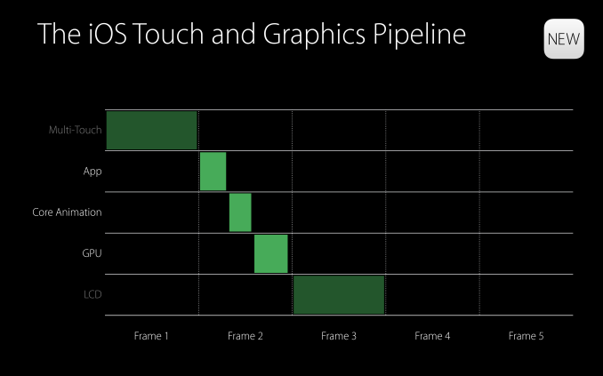
iOS is fairly good at minimizing input lag, but there has always been a certain amount of delay that you couldn't get around no matter how quick your application is. Part of this is related to how frequently the capacitive touch sensors scan for input, which is usually at the same frequency as the refreshing of the display, which puts the time between scans at about 16.7ms. Devices like the iPad Air 2 and upcoming iPad Pro scan at 120Hz for finger input, which drops this time to about 8.3ms. On the software side you have the steps and processes of the iOS touch and graphics pipeline, which is where Apple has made improvements to reduce touch latency on all devices in iOS 9.
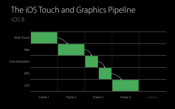
The above image is a visual representation of the iOS touch and graphics pipeline. As you can see, with a typical application you're looking at about four frames of latency. Apple includes the display frame in their definition of latency which I disagree with because you'll see the results of your input at the beginning of the frame, but for the purposes of this discussion I'll use their definition.
In this theoretical case, it just so happens that the time for the updating the state of the application is exactly one frame long. One would think that decreasing the amount of time for the app to update state would reduce the latency for input by allowing Core Animation to start translating the application's views into GPU commands to be passed to the GPU for rendering. Unfortunately, this has not been the case on iOS in the past. No matter how well optimized an app is, Core Animation would only begin doing work at the beginning of the next display frame. This was because an application can update state several times during a single frame, and these are batched together to be rendered on screen at once.
In iOS 9, Apple has removed the requirement that Core Animation will begin working at the beginning of the next frame. As a result, an optimized application can take care of updating state, having Core Animation issue GPU commands, and drawing the next frame all within the time span of a single display frame. This cuts the touch latency down to only three frames from the previous four, while applications with complicated views that require more than a single frame for Core Animation and GPU rendering can drop from five frames of latency to four.
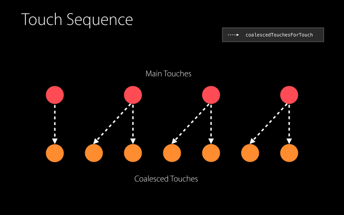
Apple has also made improvements at the actual touch input level. Like I mentioned earlier, the iPad Air 2 and iPad Pro scan for finger input at 120Hz, which can shave off an additional half frame of latency by allowing applications to begin doing work midway through a frame. In addition to reducing latency, the additional touch input information can be used by developers to improve the accuracy of how applications respond to user input. For example, a drawing application can more accurately draw a line that matches exactly where the user swiped their finger, as they now have twice the number of points to sample. Apple calls these additional touches coalesced touches, and they do require developers to add a bit of code to implement them in their applications. However, being able to begin app updating in the middle of a frame is something that will happen automatically on devices with 120Hz input.
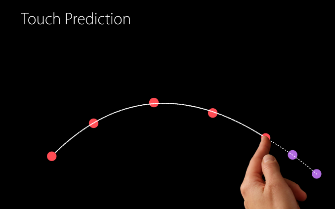
The last feature Apple is implementing in iOS 9 to reduce input latency is predictive touch. Put simply, this is information that developers can access to have some idea of where the user's finger is moving on the display. This allows them to update views in advance using the estimated information, and once actual information about the user's movement has been received they can undo the predicted changes, apply the actual changes, and also apply predictions made based on the user's new movements. Because Apple provides predicted touches for one frame into the future this technique can reduce apparent input latency by another frame. Combined with the improvements to the input pipeline this drops latency as low as 2 frames on most devices, and on the iPad Air 2 the effective touch latency can now be as low as 1.5 frames, which is an enormous improvement from the four frames of latency that iOS 8 provided as a bare minimum.
App Thinning
Apple gets a lot of criticism for shipping only 16GB of NAND in the starting tier for most iOS devices. I think this criticism is warranted, but it is true that Apple is putting effort into making those devices more comfortable to use in iOS 9. The most obvious improvements are with their cloud services, which allows users to store data like photos in iCloud while keeping downscaled 3.15MP copies on their devices. Unfortunately iCloud still only offers 5GB of storage for free which really needs to be increased significantly, but they have increased the storage of their $0.99 monthly tier from 20GB to 50GB, dropped the price for 200GB from $3.99 to $2.99 monthly, and reduced the 1TB tier price to $9.99, while eliminating the 500GB option that previously existed at that price.
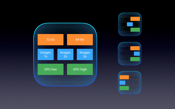
In addition to iCloud, iOS 9 comes with a number of optimizations to reduce the space taken up by applications. Apple collectively refers to these improvements as app thinning, and it has three main aspects.
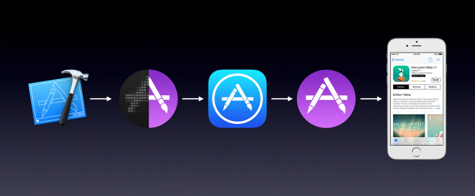
The first aspect of app thinning in iOS 9 is called app slicing. This refers to something that honestly should have been implemented five years ago, which is only including the assets that a device needs rather than having a package including assets for all devices. For example, current applications will come with 1x, 2x, and 3x scale bitmaps in order to work across every iOS device. Anyone who owned an iPad 2 may have noticed that app sizes inflated significantly after the release of the iPad 3, and this is because when apps were updated you needed to store all the 2x resolution bitmaps even though they were completely irrelevant to you. With the introduction of ARMv8 devices this problem has gotten even more significant, as app packages now include both 32bit and 64bit binaries. GPU shaders for different generations of PowerVR GPUs also contribute to package bloat.
App slicing means that applications will only include the assets they require to work on the device they are downloaded onto. The analogy Apple is using is that application only needs a single slice of the assets that a developer has made. What's great about app slicing is that any application already using the default Xcode asset catalogs will automatically be compatible, and the App Store will handle everything else. Developers using custom data formats will need to make an asset catalog and opt into app slicing.
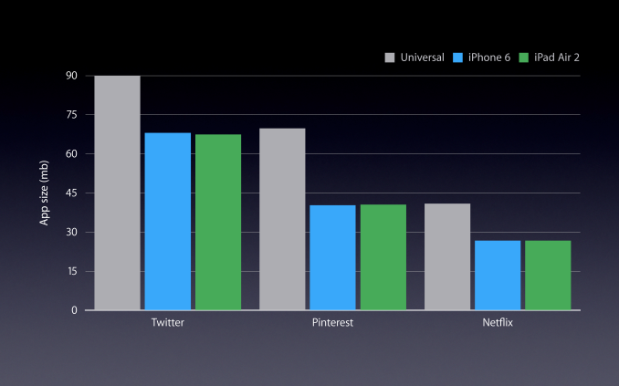
Apple's statistics show a significant reduction in app size when app thinning is used. Savings are typically in the range of 20-40%, but this will obviously depend on the application. I'm not trying to criticize what is really a good feature, but it's hard to believe that this is just now being implemented. It's likely that the introduction of the iPhone 6 Plus increased the need for this, as apps now need to include 3x assets, whereas previously having 1x assets in addition to the 2x ones wasn't a huge deal when most devices were retina and the 1x assets weren't very large.
The next aspect of app thinning is on demand resources. This feature is fairly self explanatory. Developers can specify files to be downloaded only when they're needed, and removed from local storage when they aren't in use. This can be useful for games with many levels, or for storing tutorial levels that most users won't end up ever using.
The third and final aspect of app thinning is bitcode. Bitcode is an intermediate representation of an application's binary, which allows the App Store to recompile and optimize an application for a specific device before it gets sent to the user. This means that the application will always be compiled using the latest compiler optimizations and can take advantage of optimizations specific to future processors. While I've mainly focused on how app thinning relates to trimming the space of applications, bitcode is targeted more toward thinning apps in the sense that they're always as fast as they can be.
Much like the situation with RAM on iOS devices, my favored solution to users having issues with storage is to start giving them more storage. With the iPhone 6s and 6s Plus still starting at 16GB it looks like the physical storage situation on iOS will remain unchanged for some time. At the very least, Apple is making an effort to come up with software improvements that will free up space on devices. This is still not an optimal fix, and even better would be implementing these changes and also giving users more storage, but any improvements are certainly welcome. Implementing them in ways that don't require much hassle on the part of developers is something they will certainly appreciate as well.
The Safari View Controller
Deep linking takes care of the situations where a link in an application redirects to Safari. However, there are other ways that developers can handle links in their applications. The other major method is one you’ll find in apps like Skype and Facebook, and it’s basically a mini web browser built inside the application. These built in web browsers traditionally used UIKit’s UIWebView class, which was subject to performance constraints when compared to mobile Safari. iOS 8 introduced the WKWebView class which was just as fast as Safari, but had some issues of its own that made it difficult to implement in many situations. While iOS 9 fixes many of the issues with WKWebView, such as lack of support for loading local files with the file://URL protocol, it also comes with a much better method for developers to handle the transition from their app to Safari. This new feature is called the Safari View Controller.
The main reason for Safari View Controller’s existence is to provide a better user experience than the existing miniature web browsers that applications have built in to them to handle web links. When an application handles the rendering of web pages on its own, the user loses access to many features of Safari like their password keychain, their stored credit card info, their cookies, and more. The obvious solution to this is to just use Safari, but that has traditionally come with the cost of moving the user out of their current application. This is certainly improved with the addition of the back link in iOS 9, but it would be much better if those mini web browsers could just be replaced by Safari running inside of an application. That’s essentially what Safari View Controller is.
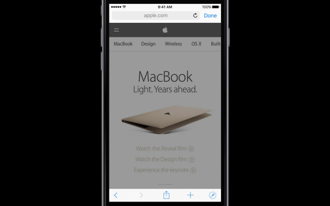
When an application uses Safari View Controller to handle web content, the user will be presented with the interface above after clicking on a link. It’s very similar to Safari’s interface, but with a few alterations to let the user know what has happened. For starters, there’s a button in the upper right that says “Done”, which is a fairly obvious control to return to the application. The URL bar at the top is also greyed out, which indicates that you can’t change it. If you do want to start surfing the web, there’s a button in the bottom right to open the actual Safari application. Developers can also specify a custom tint color for the UI so users remember what application they’re working within.
While Safari View Controller gives the user access to all of their data like passwords, credit cards, and cookies, none of this information is provided to the host application. This is because Safari View Controller is actually running in a completely separate sandboxed application, which means that users don’t have to worry about the security of what they input or where they visit. This is also helpful for developers who don’t want to deal with the privacy implications of having users input into their own built in mini browser. What’s also useful for both developers and users is the ability to specify custom options in the Safari View Controller share sheet, such as a button that can share the current web page to a social network or to a contact via an instant message.
Since applications haven’t taken advantage of Safari View Controller yet it’s difficult to really communicate the advantages it provides. However, I think everyone can appreciate the improved user experience that comes with having access to all your web browser content in a safe and secure manner within any application. Since Safari View Controller also makes a developer’s life a lot easier by taking away the need to build a mini web browser UI, I think it will see significant and speedy adoption among new and existing applications.
Safari Content Blockers
I mentioned earlier in the review that Apple News ends up freeing you from the terrible ads, trackers, and slow JavaScript code of the modern web. However, the fact of the matter is that almost every user will have to use Safari or another web browser to do things on their phone, and most will use one on a daily basis. If your task isn't reading news, then Apple News can't protect you from the cruft of the web. One solution is to use native apps for websites, but it's hardly the case that every website offers their own app. The other solution is what we get in iOS 9, with a new Safari feature called Content Blockers.
Safari Content Blockers are extensions that provide Safari with a list of rules which defines content or resources on webpages that should not be shown or even loaded. The list of rules is written in JSON, and the syntax is simple enough that it really wouldn't be that difficult for most people to figure out how to make their own Content Blocker on their own. Having a relatively user-friendly syntax is also important because iOS 9 now allows you to sideload applications and extensions without having to pay the yearly $99 for an iOS developer account so long as you're compiling from source. This means that users can write and install their own Content Blocker with Xcode, or download and install an open source one from the web.
Pretend that you're reading AnandTech, and you're really annoyed at the Twitter sidebar on the right for whatever reason. You decide to write a Content Blocker to remove it, and the code for that blocker is what's shown in the Xcode project window above. As you can see, it's fairly readable code. The action applies the css-display-none attribute to page elements matching the selector, which is article.twitter in this case. For the trigger section we have the url-filter set to .* which means anything, as we want to indiscriminately eradicate every part of the Twitter feed. To make sure it doesn't affect content on other sites we tell it to only apply if the domain matches AnandTech.com or any of its subdomains.
Once you install an application that provides a Content Blocking extension, a new Content Blocker menu will appear in the Safari section of the settings app. In that menu you can enable or disable the Content Blockers that exist on your device. There's not much more to it once you enable the Content Blocker. If you were to install this and load any page on AnandTech the Twitter sidebar would be completely gone. It's worth noting that Content Blockers can only be installed on ARMv8 devices, which limits it to any device with Apple's A7, A8, or A8X SoCs.
While blocking specific content is one application of Content Blockers, you can create rules that apply to large swaths of content. The application that I'm sure many users are thinking of is blocking advertisements, and trackers. It is true that you can make Content Blockers to remove advertising, and I have no doubt that there will be ad blocking apps available very soon. As a writer, I can only do my job because this website is funded by advertising revenue, which would disappear if everyone blocked ads. At the same time, I recognize the fact that ads almost always come along with privacy violating tracking, garbage JavaScript code, and a long period of network activity which keeps your device's radio working and drains your battery. I'm not going to get involved in the debate about the ethics of ad blocking, but I did make an ad blocker for AnandTech to show what changes it makes to load times and page sizes.
The top image show a timeline of the network activity, page rendering, and JavaScript execution for the AnandTech home page without any advertisements or tracking scripts disabled. The bottom shows those same metrics when they are all blocked using a Content Blocker that is only a couple of lines longer than the one above I used to remove the Twitter sidebar. As you can see, the difference is absolutely enormous. Without Content Blocking it takes 1.43 seconds to just load in the core site content, which is over double the amount of time with Content Blockers. 1.43 seconds doesn't sound like a lot when it's not even one second longer, but it's extremely noticeable once you see how quickly the page loads with the blockers. There's also a 2.5MB reduction in data usage, and it's worth noting that there are sites that load even more than 3.5MB with ads. I'm not in the business of public shaming, but other people have already published the results of using Content Blockers on other websites and all I can say is that while 3.5MB is not amazing, it can get even worse.
The most shocking thing of all is the reduction in network traffic. With no ads firing trackers your network requests end when the page loads. Without the Content Blockers you can see that the network requests continue. The results vary, but I've seen it go as long as 25 seconds. Those 25 seconds are a period where your data is being used, and your radio is actively in use which is draining your battery without you even knowing it.
Like I said before, I'm not going to take a stance for or against adblocking. I will say that as a user, one never really gives explicit permission to be tracked, and it's just implied by your use of a service which makes it less clear to the user what exactly they're consenting to. I'll also say that the ad experience on the web is nothing short of terrible. If ad blocking becomes a big thing in mobile the publishers and ad networks are going to have to fix the intrusiveness and slowness of ads, or move inside applications like Apple News where another company that does know how to implement them in a user friendly manner can do it for them.
Final Words
This year has been a big year for Apple, and a big year for iOS devices. I’m interested to see how 3D Touch on the iPhone 6s and 6s Plus changes how users interact with their iPhones, and I’m also interested to see what the iPad Pro means for the iPad as a productivity device. As for iOS 9 and all the existing devices it’s coming to, I would say that’s it’s not as big of a release as iOS 7 or iOS 8 was when you consider the entire ecosystem of iPhones, iPads, and iPod Touches. However, when you just consider the iPad iOS 9 might be the biggest and most important update that Apple has ever shipped.
Multitasking has a profound impact on how you can use an iPad. No longer do you need to interrupt your current task to quickly check another application, as you can now slide it in from the side. Watching videos is no longer something that prevents you from performing any other tasks, because now we have picture-in-picture support. The iPad Air 2 and now the iPad Mini 4 go even further with split screen multitasking, allowing you to have two applications running in the foreground at the same time. The boost to productivity that split screen multitasking enables will be enormous once applications enable support for it. To me, iOS 9 feels very focused on breaking down many of the limitation that have held the iPad back as a productivity device. The iPad has always had applications tailored to its large display, but you were still limited to using one app at a time just like a tiny 3.5” iPhone was.
The future of the iPad is something I don’t even want to attempt to speculate on, because I don’t know where it’s headed. Apple certainly gave the iPad Mini a significant update this year, but the smaller form and lower price prevent it from achieving the same performance as Apple’s bigger tablets. However, for many users the convenience of a small device is worth sacrificing a bit of performance. Apple has also gone really big with the iPad Pro, and there’s no way to say how popular it will end up being, or what percentage of users will adopt the Apple Pencil and Smart Keyboard. I do wonder if they those accessories will also be made usable with future versions of the iPad Air if they prove to be popular, or if they’ll remain as tools specifically for the type of user that would purchase an iPad Pro.
While I definitely feel that iOS 9 focuses on the iPad, it’s not true to say that Apple’s other devices have been left behind. Every device benefits from the performance improvements and optimizations to save storage space that have been made to the core OS and to applications. New developer APIs open up many new possibilities, and some of the new features and APIs relating to Safari may have a significant impact on the web as we know it if Apple decides to allow ad blocking applications into the App Store.
As for Apple’s services, I think Apple Maps has matured more than I expected it would have in the past few years. Apple’s transit additions are actually really well executed, and they were enough to make me try out Apple Maps again which I think is impressive given how much I would use Google Maps on a daily basis. Apple’s foray into news aggregation with Apple News is definitely a great success as well, and while Flipboard is still my preferred application for news on Android and the web, Apple News is my app of choice on iOS. What surprises me is that Apple didn’t make an Apple News application for OS X, but I suspect that this will be coming in a future release after Apple opens up the iOS version to a greater number of countries.
I still have some complaints about iCloud. Part of the justification for 16GB devices is that users can now leverage cloud services for storing photos, videos, and other content. This is true, but Apple still only provides you with 5GB of free storage, and if you want to back up your iOS device to iCloud it counts against that storage. I think Apple is in a position where they could offer free users 15 or 25GB of storage for free, and not have their device backups count against it. This would allow all users to take advantage of iCloud backup without having to pay for an iCloud storage plan, and would make the experience on a 16GB a lot more comfortable even if 16GB is still not optimal.
On the topic of 16GB devices, it looks like we'll be seeing them for another year with the new iPad Mini 4 and the iPhone 6s and 6s Plus. Apple's app thinning optimizations are definitely going to help make 16GB devices more usable, particularly the app slicing aspect of app thinning. Obviously I would prefer that devices just ship with 32GB, but then I could also say that I think they should all ship with 128GB and what I would like doesn't usually align with maintaining a device's average selling price.
Siri is a feature that Apple can constantly improve on the back end, and I can definitely notice that the accuracy and speed of Siri has improved in recent times. I think Apple’s attempt to make Siri more proactive and intelligent didn’t really work out though, particularly the search screen to the left of your main home screen. I just didn’t feel that the suggestions for apps, contacts, and news were relevant to me. However, the improvements to search itself are substantial, and this will only become even more evident as developers allow their applications to be indexed by search so users can search through them for information or content.
It’s probably not surprising to hear that iOS 9 is better than iOS 8. On the iPhone I think iOS 9 brings along many smaller improvements throughout the OS, along with new APIs that developers can implement to improve the user experience. There are definitely some big changes such as the addition of Apple News and Transit in Apple Maps, but these are again just strengthening the core services of iOS rather than adding incredible new abilities and features. iOS 9 is definitely a huge release for the iPad though, and because I’ve been limited to Apple’s own applications I’ve only been able to scratch the surface of what capabilities the new multitasking features can enable. I think the iPad definitely deserved a major release that focused on it though, and it’s clear that Apple has had many of these changes in the pipeline for quite some time now.
In the end, iOS 9 offers something new and great for all iOS users, and particularly those who use an iPad. With Apple expanding their portfolio of iOS devices and implementing new features like 3D Touch there are a number of directions they could go in with future releases of iOS, and only time will tell which direction they choose.

