Original Link: https://www.anandtech.com/show/9381/the-apple-watch-review
The Apple Watch Review
by Joshua Ho & Brandon Chester on July 20, 2015 8:00 AM EST- Posted in
- Apple
- Mobile
- Wearables
- Apple Watch
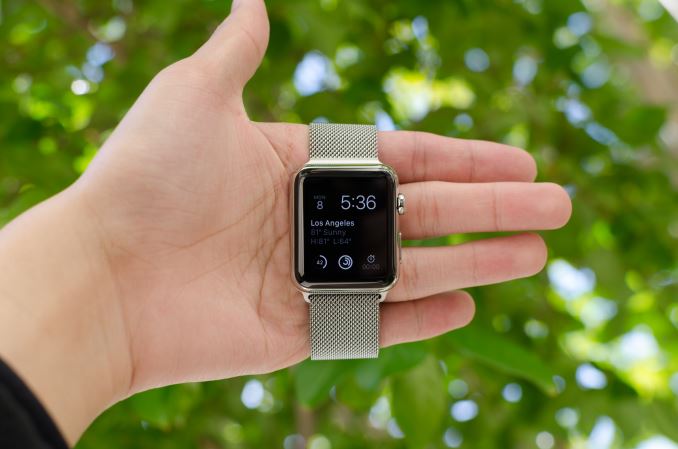
Prior to the launch of the Apple Watch, there had been rumors that Apple would make a watch for quite some time. In a broader sense, the wearables industry has become an area of significant interest as the next growth market after devices like tablets and smartphones as the high-end market became saturated and much of the growth that previously existed in the mobile space started to level out. This has resulted in a new alignment of markets and technology; the markets are ripe for a new device to recapture the wild growth of smartphones, and in the 8 years since the launch of the iPhone the inexorable march of Moore's Law has seen another 4 generations of improvements in technology. This time is finally right, it seems, to take a crack at something even smaller and more personal than the smartphone: the watch.
About two years ago, we put out our first wearable review, which examined Samsung’s Galaxy Gear. In the time since then, Android Wear has been launched, with numerous OEMs launching some form of wearable using Google’s wearable OS. However, Apple remained curiously absent from the field despite numerous rumors suggesting that Apple would soon launch a wearable. Last year, Apple announced the Apple Watch, but it wasn’t until just a few months ago that it finally went on sale.
Consequently, Apple didn’t get a first-movers advantage getting into wearables, though it remains to be seen whether that would even matter. As the creator of the iPhone and frequently on the cutting edge of technology and design, Apple had enough good will with the public to be late, and at the same time with all eyes on them they could not afford to screw up. The end result is that though by no means a slight towards Apple’s competitors, there is a clear distinction between everything that has come before the Apple Watch and everything that will come after. For the consumer market as a whole, the launch of the Apple Watch signifies that wearables have moved beyond the early adopter phase for techies, and are now being pitched at (and purchased by) the wider consumer market.
Normally, it’s easy enough to jump straight into what the device is and what’s new about said device, but in the case of the Apple Watch it’s really important that we explore the world in which this watch exists. The world is divided into people that wear watches, and people that don’t. Apple faces the distinct problem is trying to sell to both audiences, which have very different desires from a watch. The people that already have watches don’t want to give up the almost infinite battery life of conventional watches, high levels of water resistance, or anything else that is an accepted standard for watches.
The people that don’t wear watches are probably the closest thing to a clean slate that we’ll get when it comes to the wearable market. On a personal note, I fall into this camp, as I pretty much grew up in the age of widespread cellphone adoption. One of the convenient things about a phone is that they usually have the time on them, along with alarm and timer functionality. For me, this effectively meant that there was no point to wearing a watch. I also tended to have problems with the logistics involved in wearing a watch. In general, wristbands had an amazing tendency to either be too tight or too loose no matter how I adjusted the band. These issues were also compounded with any sort of physical exertion, as sweat tended to collect under the band which made wearing a watch noticeably more uncomfortable. These ergonomic issues, combined with the lack of functionality in a watch, ultimately made me stop wearing watches. Even before cellphones, wall-mounted clocks were more than sufficient for me when it came to checking the time, although I suspect I was far too young for time to really matter all that much.
Of course, I have been trying out various wearables over the course of the past few years. Although I didn’t try LG’s G Watch, I have been able to use the Pebble Steel and Motorola’s Moto 360. However, it was really a challenge for me to find anything to say about these wearables. They could definitely tell the time, and they had some extra functionality, but many of the same problems remained. The wearables I tested just weren’t all that comfortable to wear, and due to some technology limitations both weren’t really all that compelling to use. They could manage notifications, but other than that I found the functionality to be rather lacking. I often would forget to put them on at all before setting out for the day, and when I did I didn’t feel any particular need to go back to put it on my wrist. After a few months, I completely forgot about these wearables and stopped wearing them. At the time, I honestly felt like wearables could end up being another passing fad because it seemed most wearables faced similar barriers in terms of getting people to keep wearing them. Wearables like Fitbit suffered from a pretty significant abandonment rate, and given that I did the same for both the Pebble Steel and Moto 360 it increasingly felt like this would be a persistent problem.
In this context, it seems easy for Apple to fail. Generally speaking, no one has really figured out how to solve the problem of wearable adoption, chiefly because the functionality offered often wasn’t very compelling, and broadly speaking these wearables were often not well-designed. One of the first places we can start with the Apple Watch is the spec sheet. We can speak in empty platitudes about how specs don’t matter, but in the case of something like Apple Watch they definitely will. The right components won’t ensure success, but the wrong components can ensure a poor user experience.
| Apple Watch 38mm | Apple Watch 42mm | |
| SoC | Apple S1 520MHz CPU | Apple S1 520MHz CPU |
| RAM/NAND | 512MB LPDDR3(?) 8GB NAND |
512MB LPDDR3(?) 8GB NAND |
| Display | 1.32” 272x340 LG POLED | 1.5” 312x390 LG POLED |
| Dimensions | 38.6 x 33.3 x 10.5mm, 25/40/55/54 grams (Sport/Watch/Gold/Rose Gold) |
42 x 35.9 x 10.5mm, 30/50/69/67 grams (Sport/Watch/Gold/Rose Gold) |
| Battery | 205 mAh (0.78 Whr) | 246 mAh (0.93 Whr) |
| OS | WatchOS 1 | WatchOS 1 |
| Connectivity | 802.11/b/g/n + BT 4.0, NFC | 802.11/b/g/n + BT 4.0, NFC |
| Price | $349/549/10,000 (Sport/Watch/Edition) | $399/599/12,000 (Sport/Watch/Edition) |
As we can see, Apple has elected for some relatively conservative specifications. The SoC is relatively low power in nature, and the amount of RAM is probably about right for the kinds of tasks that a wearable will be used for at this time. The display is also of a decent resolution given the display size, and all the necessary wireless connectivity is present. It is notable that Apple is using a relatively small battery, but I suspect that this is necessary in order to fit all of the hardware into the casing of the watch. At least at a high level, it looks like Apple has put the right components into this wearable. However, it's going to take a deep examination of both technology and design to really figure out if Apple has avoided the pitfalls that I've discussed. One of the first and most obvious places to go first is the industrial and material design, which is what we'll talk about next.
Design
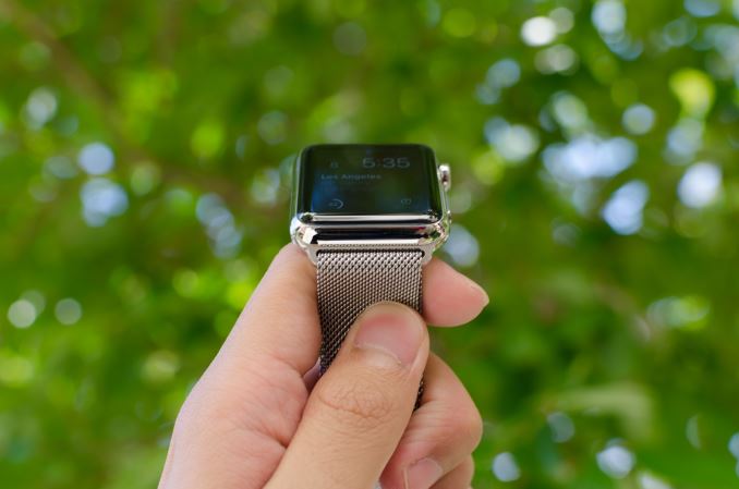
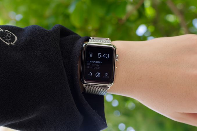
With a new form factor comes the need to deeply analyze design, and in the case of a smartwatch it really becomes more important than ever before. Like clothing, watches are deeply personal in a way that smartphones weren’t. The most immediate aspect of the Apple Watch is the size. I’ve used the Moto 360 before, and while I didn’t think it was too big for me, people with smaller wrists can look rather ridiculous wearing the Moto 360 or many other smartwatches. Even in the 42mm variant, the Apple Watch is surprisingly small for a smartwatch. The 38mm variant is definitely sized for people with smaller wrists.
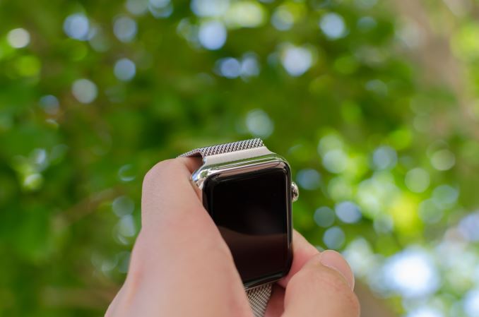
Outside of height and width, the thickness of the watch is definitely a bit more than what one might expect from a regular watch, but it isn’t really all that noticeable due to the rounded curves of the casing. When looking at the display, the display’s cover glass also blends seamlessly into the metal case of the watch, which really looks impressive indoors, although the illusion is somewhat lost in strong sunlight as it becomes obvious where the display ends and the bezel begins. This really helps with analog watchfaces, but in practice I found I was never really bothered by rectangular watch displays. If anything, I’ve found round watch display to lack information density; round watch displays just aren’t pragmatic for general purpose computing.
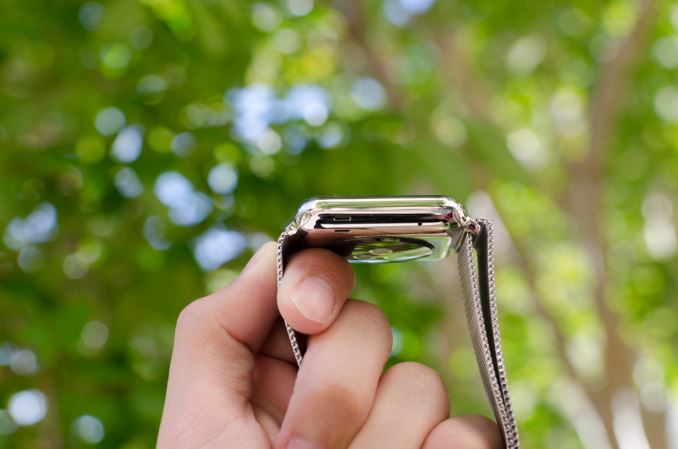
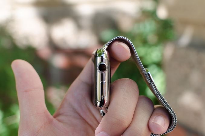
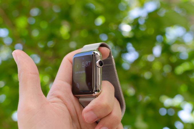
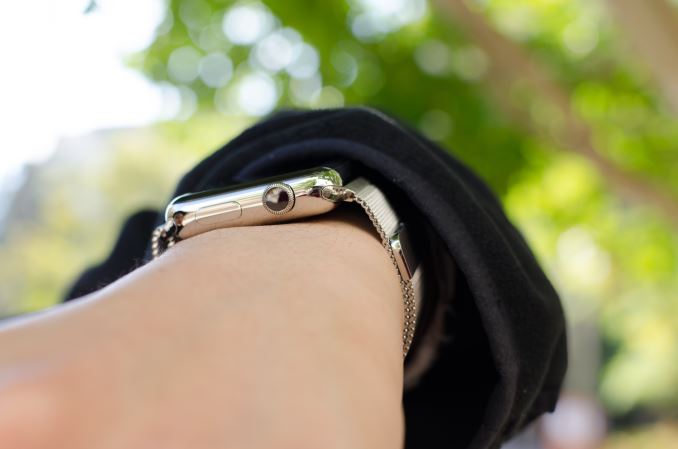
In order to really give a sense of what the watch looks and feels like when it’s on the wrist, I’m going to start by assuming that most people will wear this watch on their left hand. This places the side button and digital crown on the right. If you read nothing else in this entire article, you should know that the digital crown is probably the best solution I’ve seen to the smartwatch input problem yet. The digital crown manages to have just the right amount of friction to the knob so input feels deliberate without being difficult. The notches that surround the crown really help with gripping the crown and improve the precision of input with the digital crown. Both the digital crown and side button have a solid, clicky action, but it’s probably not a surprise at this point given that Apple seems to consistently nail down details like button feel on their iPads and iPhones.
On the left side of the watch, the only notable interruptions are the speaker and microphone holes. As far as I can tell there’s only a single microphone hole, but it seems that Apple has some form of noise cancellation as background noise is generally well-muffled.
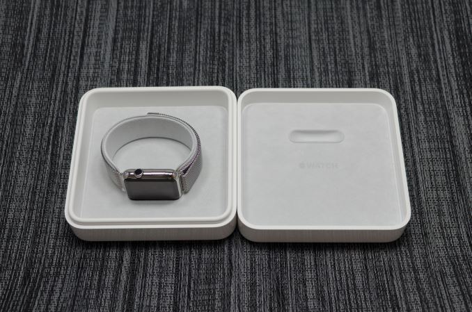
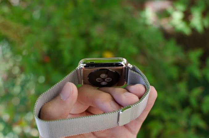
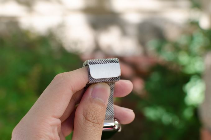
The top and bottom of the watch are just the attachment points for the bands of the watch, but from a design perspective this is probably one of the most crucial. The interchangeable bands work incredibly well because of just how easy it is to attach and detach bands. Attaching a band is as simple as matching with the slot and sliding it in, although it is possible to get it wrong by putting a band in upside-down. The fit and finish of both the Milanese loop and sport band that I received were both essentially perfect here, and the Milanese loop band has a glossy finish on the side that helps the band to blend in with the casing of the watch.
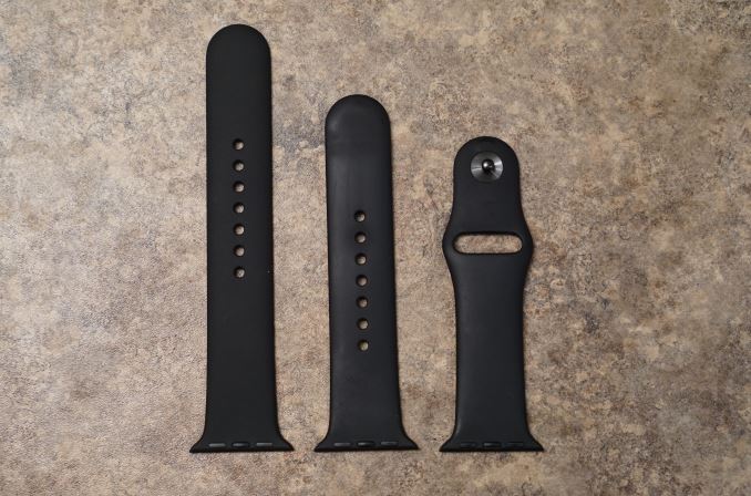
The bands themselves are probably the most important aspect of the Apple Watch's design. While Apple definitely hopes that users will be purchasing bands in addition to the one that comes with their watch, it's a safe bet that most users will be using the fluoroelastomer bands that ship with the Apple Watch Sport and the entry level Apple Watch and Apple Watch Edition models. Because the fluoroelastomer band ships with the Sport version of the watch and has to fit every wrist size the fluoroelastomer band actually is more like one and a half bands. Included in the package is the section of the strap with the metal pin, and two pieces of different lengths with holes in them. The longer one is meant for users with larger wrists, and the smaller one for users with smaller wrists.
As for the band itself, the feel of it can be difficult to describe. When they were first revealed, my initial thought was that they would have a somewhat firm and rubbery feel. It turns out that the bands are very flexible, and also very soft. The best description I could give is that it feels similar to the soft touch back of the black Nexus 5 and Nexus 9, but much smoother and very resistant to smudges. Water also tends to roll right off of it which makes it very well suited to fitness activities. Since it's not infinitely adjustable there's always a small mismatch between the size of the band and the size of your wrist, but there's not much that can be done to solve that with a pin and tuck design.
In the case of the Milanese loop, the infinitely adjustable design has basically solved the teething issues I have with wearing most watches. The band manages to deal with the issues I’ve always had with wristbands that always seemed to be either too tight or too loose. The fabric-like pattern of the metal links also helps to distribute pressure while allowing for ventilation, so I don’t feel the need to constantly take off the watch due to trapped sweat or some similar issue. It’s also easy to clean the metal bands if they get dirty, although I suspect the leather bands will be rather difficult to deal with in this regard. There is some potential to pinch hairs, but in my experience this is pretty unlikely and I can count on one hand the number of times I’ve noticed this problem in the past few months. As a result, this is probably the only watch I’ve ever worn that is consistently comfortable regardless of weather conditions. Independent of how good the wearable is from a digital logic/software standpoint, I’ve noticed that these aspects of the design are far, far more crucial than anyone seems to notice. In the case of Apple Watch, the bands are pretty much as good as it gets.
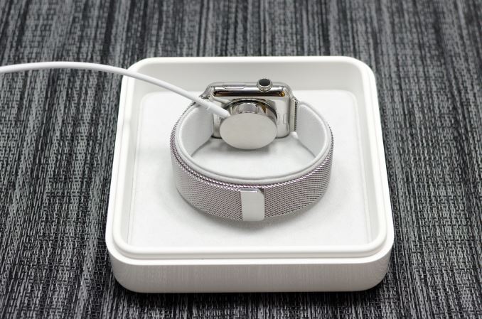
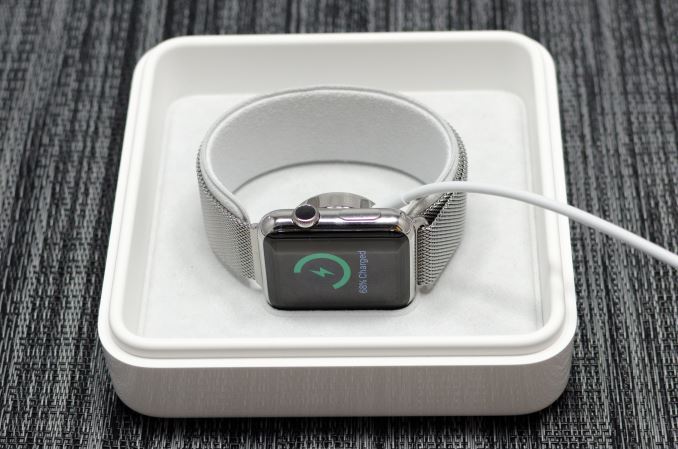
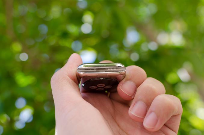
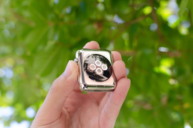
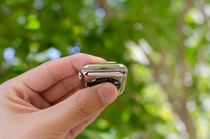
Moving past the bands, the back of the watch is somewhat unremarkable. There’s a rounded crystal that houses the heart rate LEDs and sensors, and serves as an attachment point for the MagSafe wireless charger. In practice, the only notable issue here is that the crystal seems to act as a pressure point when wearing the Watch, but it’s likely that this is done to ensure proper contact for the heart rate monitor.
Overall, Apple has pretty much nailed the design of the watch. The controls are well-executed and placed in a pragmatic position, in a way that I haven’t really seen anyone else achieve yet. The only real objection I have to the design is that the stainless steel casing seems to be a magnet for small scratches. They’re tough to see in most conditions, but with strong lighting it becomes pretty obvious that it’s pretty easy to scratch the watch casing. I suspect the only solution here is to regularly buff out scratches from the casing like most any stainless steel watch. As for the Apple Watch Sport, the 7000 series aluminum seems to hold up to daily use without any sign of scratches or chips on the casing of the watch. At 25g and 30g for the 38mm and 42mm respectively it's also lighter than the 40g and 50g masses of the stainless steel models. Since the Sport edition uses Ion-X glass like the iPhone 6 instead of the Sapphire crystal of the normal Apple Watch and Apple Watch Edition, the display cover glass is much more susceptible to scratching. While I haven't encountered any scratches at this point, the sapphire glass editions will undoubtedly better stand the test of time.
Apple S1 Analysis
One of the biggest issues with the smartwatch trend that I’ve seen is that as a result of most companies entering the market with smartphone backgrounds, we tend to see a lot of OEMs trying to shove smartphone parts into a smartwatch form factor. There have been a lot of different Android Wear watches, but for the most part everything seems to use Qualcomm’s Snapdragon 400 without the modem. Even though A7 is relatively low power for a smartphone, it’s probably closer to the edge of what is acceptable in terms of TDP for a smartwatch. Given that pretty much every Android Wear watch has around a 400 mAh battery at a 3.8 or 3.85 volt chemistry to attempt to reach 1-2 days of battery life and a relatively large PCB, the end result is that these smartwatches are really just too big for a significant segment of the market. In order to make a smartwatch that can scale down to sizes small enough to cover most of the market, it’s necessary to make an SoC specifically targeted at the smartwatch form factor.
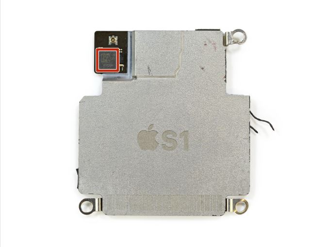
Capped Apple S1 SoC (Image Courtesy iFixit)
The real question here is what Apple has done. As alluded to in the introduction, it turns out the answer is quite a bit. However, this SoC is basically a complete mystery. There’s really not much in the way of proper benchmarking tools or anything that can be run on the Watch to dig deeper here. Based on teardowns, this SoC is fabricated on Samsung’s 28nm LP process, although it’s not clear which flavor of LP is used. It’s pretty easy to eliminate the high power processes, so it’s really just a toss-up between HKMG and poly SiON gate structure. For those that are unfamiliar with what these terms mean, the main difference that results from this choice is a difference in power efficiency, as an HKMG process has less leakage power. Given how little cost is involved in this difference in process compared to a move to 20/14nm processes, it’s probably a safe bet that Apple is using an HKMG process here especially when we look at how the move from 28LP to 28HPm at TSMC dramatically affected battery life in the case of SoCs like Snapdragon 600 and 800.
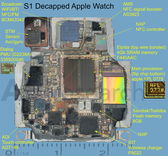
Decapped & Labeled S1 SoC (Image Courtesy ABI Research)
We also know that binaries compiled for the watch target ARMv7k. Unfortunately, this is effectively an undocumented ISA. We know that Watch OS is built on iOS/Darwin, so this means that a memory management unit (MMU) is necessary in order to make it possible to have memory protection and key abstractions like virtual memory. This rules out MCU ISAs like ARMv7m even if it's possible to add an MMU to such an architecture, so it’s likely that we’re looking at some derivative of ARMv7-A, possibly with some unnecessary instructions stripped out to try and improve power consumption.
The GPU isn’t nearly as much of a mystery here. Given that the PowerVR drivers present in the Apple Watch, it’s fairly conclusive that the S1 uses some kind of PowerVR Series 5 GPU. However which Series 5 GPU is up to debate. There are reasons to believe it may be a PowerVR SGX543MP1, however I suspect that it is in fact PowerVR's GX5300, a specialized wearables GPU from the same family as the SGX543 and would use a very similar driver. Most likely, dedicated competitive intelligence firms (e.g. Chipworks) know the answer, though it's admittedly also the kind of information we expect they would hold on to in order to sell it to clients as part of their day-to-day business activities.
In any case, given that native applications won’t arrive until WatchOS 2 is released I don’t think we’ll be able to really do much in the way of extensive digging on what’s going on here as I suspect that graphics benchmarks will be rare even with the launch of WatchOS 2.
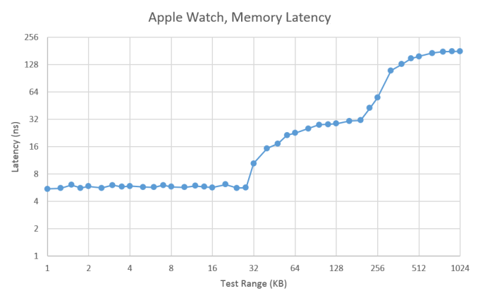
Meanwhile, after a lot of work and even more research, we're finally able to start shining a light on the CPU architecture in this first iteration of Apple's latest device. One of the first things we can start to look at is the memory hierarchy, which is information crucial to applications that require optimization to ensure that code has enough spatial and/or temporal locality to ensure that code is performant.
As one can see, there’s a pretty dramatic fall-off that happens between 28 and 64KB of “DRAM”, as we exit the local maximum of L1 data cache, so we can safely bet that the L1 data cache size is 32KB given current shipping products tend to fall somewhere between 32 and 64KB of L1 data cache. Given the dramatic fall-off that begins to happen around 224KB, we can also safely bet that we’re looking at a 256KB L2 combined cache which is fairly small compared to the 1-2MB shared cache that we might be used to from today’s large smartphone CPUs, but compared to something like an A5 or A7 it’s about right.
If Apple had just implemented the Cortex A7 as their CPU of choice, the obvious question at this point is whether they’ve really made anything “original” here. To try and dive deeper here, we can start looking past the memory hierarchy and looking closer at the machine itself. One of the first things that is obvious is that we’re looking at a CPU with a maximum frequency of 520 MHz, which is telling of the kind of maximum power that Apple is targeting here.
| Apple S1 CPU Latency and Throughput | ||||
| Instruction | Throughput (Cycles/Result) | Latency (Cycles/Result) | ||
| Loads (ldr reg,[reg]) | 1 | N/A | ||
| Stores (str reg,[reg]) | 1 | N/A | ||
| Move (mov reg, reg) | 1/2 | - | ||
| Integer Add (add reg, reg, imm8) | 1/2 | - | ||
| Integer Add (add reg,reg,reg) | 1 | 1 | ||
| Integer Multiply (mul reg,reg,reg) | 1 | 3 | ||
| Bitwise Shift (lsl reg,reg) | 1 | 2 | ||
| Float Add (vadd.f32 reg,reg,reg) | 1 | 4 | ||
| Double Add (vadd.f64 reg,reg,reg) | 1 | 4 | ||
| Float Multiply (vmul.f32 reg,reg,reg) | 1 | 4 | ||
| Double Multiply (vmul.f64 reg,reg,reg) | 4 | 7 | ||
| Double Divide (vdiv.f64 reg,reg,reg) | 29 | 32 | ||
Obviously, talking about the cache hierarchy isn’t enough, so let’s get into the actual architecture. On the integer side of things, integer add latency is a single cycle, but integer multiplication latency is three cycles. However, due to pipelining integer multiplication throughput can produce a result every clock cycle. Similarly, bitshifts take two cycles to complete, but the throughput can be once per clock. Attempting to interleave multiplies and adds results in only achieving half the throughput. We can guess that this is because the integer add block and the integer multiply block are the same block, but that doesn’t really make sense because of just how different addition and multiplication are at the logic level.
Integers are just half of the equation when it comes to data types. We may have Booleans, characters, strings, and varying bit sizes of integers, but when we need to represent decimal values we have to use floating point to enable a whole host of applications. In the case of low power CPUs like this one, floating point will also often be far slower than integers because the rules involved in doing floating point math is complex. At any rate, a float (32-bit) can be added with a throughput of one result per cycle, and a latency of four cycles. The same is true of adding a double or multiplying a float. However, multiplying or dividing doubles is definitely not a good idea here because peak throughput of multiplying doubles is one result per four clock cycles, with a latency of 7 clock cycles. Dividing doubles has a peak throughput of a result every 29 clock cycles, with a latency of 32 clock cycles.
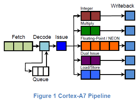
If you happen to have a webpage open with the latency and throughput timings for Cortex A7, you’d probably guess that this is a Cortex A7, and you’d probably be right as well. Attempting to do a load and a store together has a timing that indicates these are XOR operations which cannot be executed in a parallel manner. The same is true of multiplication and addition even though the two operations shouldn’t have any shared logic. Conveniently, the Cortex A7 has a two-wide pipeline that has similar limitations. Cortex A5 is purely single-issue, so despite some similarity it can't explain why addition with an immediate/constant value and a register can happen twice per clock.
Given the overwhelming amount of evidence at the timing level of all these instructions, it’s almost guaranteed that we’re looking at a single core Cortex A7 or a derivative of it at 520 MHz. Even if this is just a Cortex A7, targeting a far lower maximum clock speed means that logic design can prioritize power efficiency over performance. Standard cells can favor techniques and styles that would otherwise unacceptably compromise performance in a 2+ GHz chip could be easily used in a 520 MHz chip such as device stacking, sleepy stack layout, higher Vt selection with negative active body biasing, and other techniques that would allow for either lower voltage at the same frequency, or reduced capacitance in dynamic power and reduced static leakage. Given that Cortex A7 has generally been a winning design for perf/W metrics, I suspect that key points of differentiation will come from implementation rather than architecture for the near future. Although I was hoping to see Apple Watch on a more leading-edge process like 14LPP/16FF+, I suspect this will be deferred until Apple Watch 2 or 3.
WatchOS: Time and Notifications
Ultimately, Apple Watch is a first generation product. As a result, details like the CPU, GPU, and RAM configurations are of secondary importance to software. Choices made early in the growth of a platform can have far-reaching consequences that will remain many years after the original hardware has long been obsolete. Android still uses the sdcard convention for user storage, even though many modern Android smartphones place the sdcard partition on internal storage as early Android smartphones strongly relied on microSD cards for user storage. iOS generally sees more issues with aspect ratio and density transitions than Android due to choices in UI rendering architecture, which were determined with the original iPhone. As a result, Watch OS 1 has to be a solid base for future growth, even if future iterations of Watch OS end up nothing like the original Watch OS.
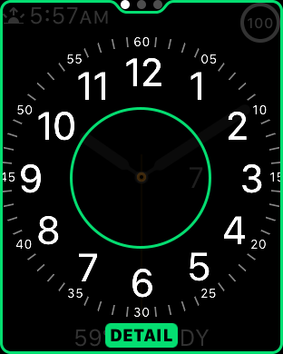
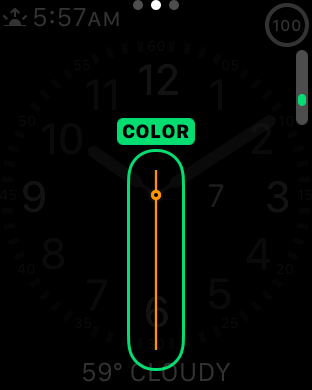
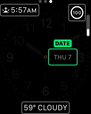
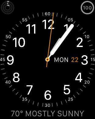
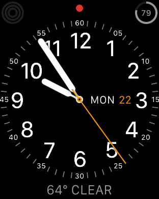
Probably the first area worth discussing are watchfaces. One of the first things that became apparent to me in my experiences with Watch OS was that watchfaces have a great amount of depth when it comes to interactivity and customization. On other wearable platforms there are definitely applications that allow a pretty decent level of watchface customization in terms of appearance, but the equivalent of complications in Watch OS is usually missing to some extent. You might be able to see the weather, but you usually can’t display something else like battery percentage, sunset, calendar events, moon phases, activity progress, stocks, or any other information that you might be interested in seeing at a glance. It’s also possible to change the amount of detail you get when displaying the watch and use the digital crown to adjust the detail present analog faces. For example, the chronograph watchface allows you set 60, 30, 6, and 3 seconds for the timer. Other analog faces make it possible to set hours, minutes, and seconds of precision on the display. This might be a bit boring, but the included watchfaces show a solid framework for future growth.
It is a bit disappointing to see that there isn’t support for third party watchfaces out of the gate, but I suspect this is more due to a need to work out exactly what is needed for the API and the need to commit to long term support for any public-facing API. By comparison, it goes without saying that whatever private APIs Apple is using to enable the first-party watchfaces are subject to change at any time, which allows for significant latitude in how watchfaces are implemented.
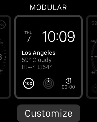
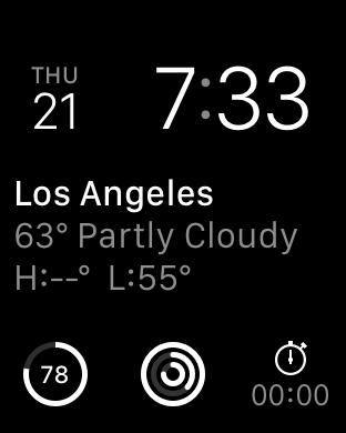
Overall, the included watchfaces are also well-designed. It isn’t really possible to show with video, but the animations that are included are impressively executed. On analog watchfaces, the second hand moves smoothly with no apparent stutter, which is a nice touch even if this isn’t all that difficult for a general purpose computer with a display that can refresh at incredibly high rates as I’ve seen more than one smartwatch that will only update the second hand every second rather than in a seemingly continuous manner. I personally ended up using the modular watchface most of the time, which doesn’t have any analog motion, but something as simple as the breathing second indicator is subtle and well-executed.
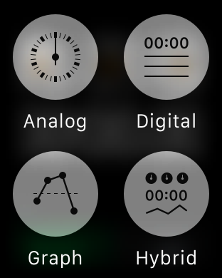
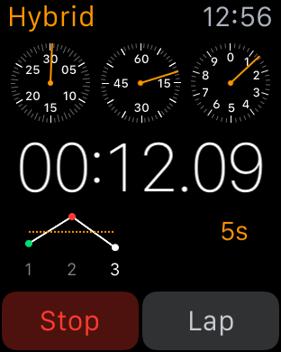
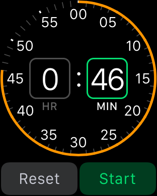
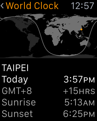
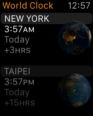
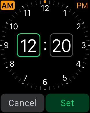
Given that Apple Watch is supposed to be a timepiece first, there are other aspects of the watch worth discussing like the timer, alarm, and stopwatch UIs. Although this is seemingly small stuff, it’s really worth calling out the timer and alarm UIs as the best example of how the combined touch and digital crown navigation works in practice. There are large touch targets to select hours and minutes, and the digital crown allows for fast and precise selection within hours or minutes. The stopwatch UI is a great demo of Force Touch in action, as it’s possible to go from a simple analog or digital interface to a hybrid one, with a live graph of relative lap times instead of just a list of previous laptimes.
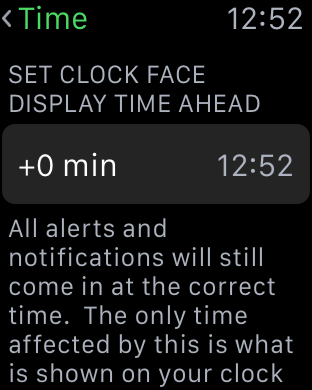
This is all really rather boring when you take a step back and realize that I’ve been talking about three of the most boring and bog-standard applications on any smartphone today, but when it comes to a first generation smartwatch it’s critical to get these applications done right. Of course, it goes without saying that alarms and timers work incredibly well on the Apple Watch due to the haptic feedback that is occurring on my wrist. Overall, on these simple aspects it's already pretty clear that Apple has put a pretty significant amount of thought into WatchOS. Probably the most obvious example of this is the ability to set the clock to be a set number minutes ahead, which is something that really shows attention to detail on Apple's part.
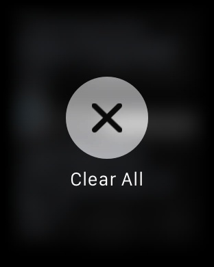
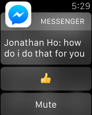
Outside of watchfaces, the next most important aspect of the Apple Watch is probably the notification system. When purely focused on the actual notification shade, the design doesn’t have any obvious flaws. If there are notifications in the drawer, a red dot appears on centered on the top of the display. Swiping down from the watchface opens up the notification drawer, with the ability to scroll through notifications with the digital crown and dismiss all notifications by using Force Touch providing a smooth and quick experience, although if you’re like me you might not realize that you can use Force Touch to dismiss all notifications for some time. However, in my experience with Watch OS 1 the experience is pretty bimodal when it comes to how useful these notifications are. The first case usually involves the ideal experience, which is an actionable notification that I can respond to on my wrist and dismiss after responding to it without ever taking out the phone to respond to the notification. Multiple simultaneous notifications are handled smoothly and logically. This is usually what happens with simple text messages/iMessage and other first-party applications.
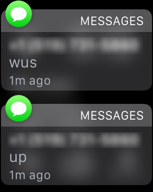
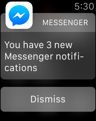
The second case is usually what happens with third party applications, which tends to be a combination of poor handling of multiple notifications and no real actions that can be taken. Pretty much any third party IM client suffers from these issues right now, and probably the biggest source of notifications on my phone comes from third party IM clients. As a result, it’s really quite irritating to raise my wrist and see nothing but the application icon and a message saying that I have two notifications. In order to appropriately respond to this, the only solution at this time is for me to take out my phone, unlock it, and then read and type out my response on the phone. Alternatively, I have to dismiss the notification, then go back to the notification drawer and go through each notification separately.
To me, this represents a pretty significant issue that pretty much every wearable platform has right now, which is that there are often corner cases where wearables end up using more time than just using a smartphone alone. In the near term, I suspect the quickest solution to this issue is turning multiple notifications arriving simultaneously into a scrollable list instead of simply notifying that there are multiple notifications. It would also be helpful to be able to respond to notifications using dictation on the watch to draft a response, but I suspect that this requires additional work on the part of the developer to enable such things.
WatchOS: Apps and Glances
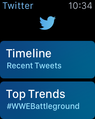
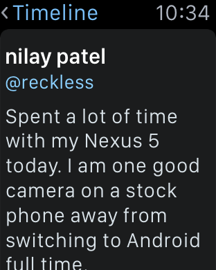
In general, the third party app ecosystem seems to be a bit weak at this point as I suspect most developers haven’t quite figured out the model for how apps should look like and how they should work on the watch. For example, Twitter currently only shows trending tweets and a timeline. However, features like direct messages, mentions, replies, and other notifications are missing from the main application. Instead, these are solely surfaced through notifications, so if you accidentally dismiss the notification you have to use your phone to respond to such things. Even the timeline feature isn’t fleshed out properly, as scrolling through about five tweets is all it takes before you have to tap a button to load more tweets when the user shouldn’t have to worry about doing such things. It seems like a small problem, but simple things like this can have major effects on the user experience.
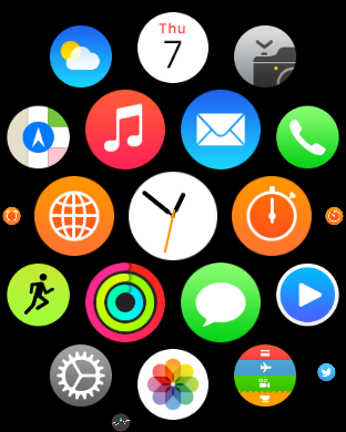
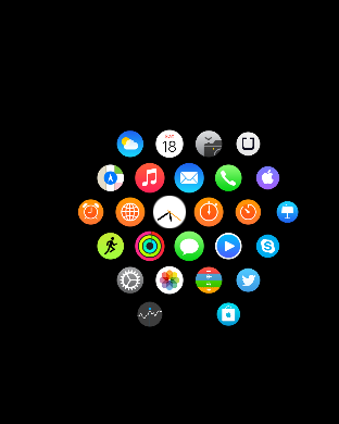
Speaking of apps, reaching the app drawer is accomplished by pressing the digital crown once, which is equivalent to the home button as pressing the digital crown twice sends you back to the previously used application and a long hold of the crown will activate Siri. The resulting app drawer will probably be a bit strange to people that are used to more conventional app drawers from operating systems like iOS and Android, but this design works well. Panning around the app drawer is simple, and it’s relatively easy to go back to the center of the app drawer if you get lost while panning around for whatever reason. It’s also helpful to be able to zoom in and out to find the right application, then zoom in so it’s possible to tap the icon on the app drawer. At first I definitely had some problems with the apparent size of the icons at maximum zoom but with time it became pretty obvious to me that the touch targets are sized well to make it basically impossible to accidentally launch the wrong application at the maximum zoom level.
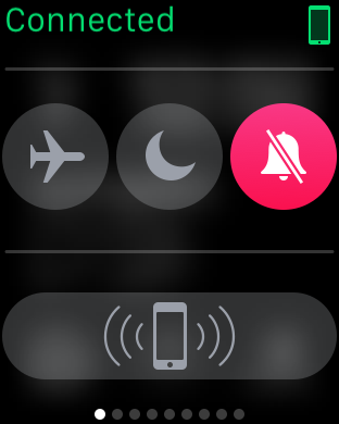
Although the app drawer is a logical place to place most applications, swiping up on the watchface reveals the glances menu, which by default will contain a quick settings menu for airplane mode, do not disturb mode, and silent mode. There’s also a button that makes the paired iPhone play the same pinging noise as Find My iPhone, which is surprisingly helpful in my experience as it’s pretty easy to just rely on the watch for notifications around the house and leave the phone in random places instead of in a pocket. Other than this panel, in practice I didn’t actually use this feature all that much as most of the information at a glance isn’t really all that necessary with the use of complications, but it’s nice to be able to use it for media controls, enable power reserve mode, and various other interactions that can be separated out from an application for quick access on the watchface.
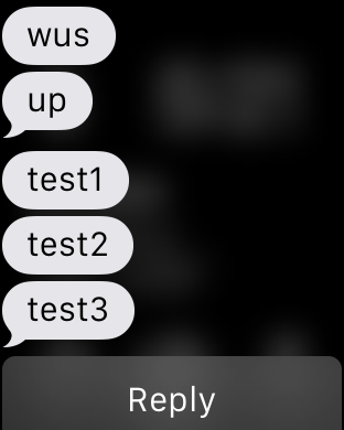
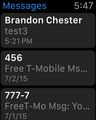
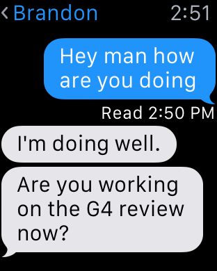
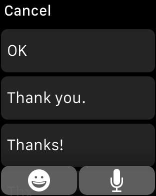
I’ve already mentioned third party applications, but first party applications are really the indicator of the potential of the watch platform at this state. The two most important applications of the watch platform are really email and messaging. When it comes to messaging, the UI is deeply familiar to anyone that has ever interacted with messaging on a smartphone, especially an iPhone. You can access each conversation with a person by tapping on their name, which gives you the conversation. Scrolling is accomplished with the digital crown, which is really far superior to touch screen scrolling because of just how valuable each pixel of display real estate is. Reaching the bottom of the list gives you an option to compose a reply, which can either be done using a list of preset messages or using Siri voice dictation. In the case of the preset messages, Apple is leveraging the same prediction engine that they have with the iOS keyboard to roughly guess what you’d want to say in reply to something.
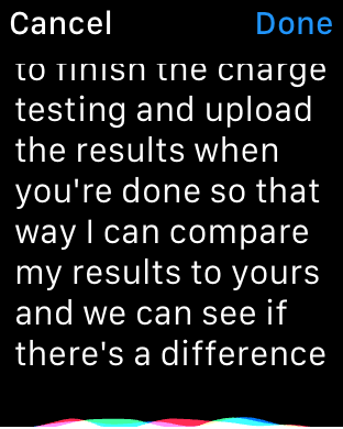
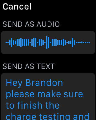
In practice, I suspect a lot of people will be able to use this to send the reply that they were hoping to use, but I ended up using voice dictation a lot. Voice dictation for its part works well, but has its limits. If I didn’t use any obscure jargon or acronyms, Siri voice dictation is almost flawless. However, if the words I tried to use weren’t in Siri’s dictionary, it was almost guaranteed that whatever I was going to get would be wrong. So discussing dinner plans is quick and painless, but discussing anything related to AnandTech would usually require taking out the iPhone to write out the full message.
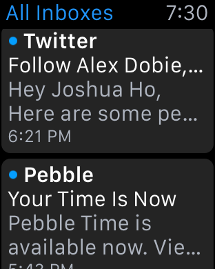
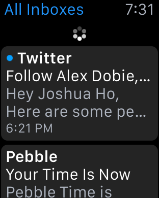
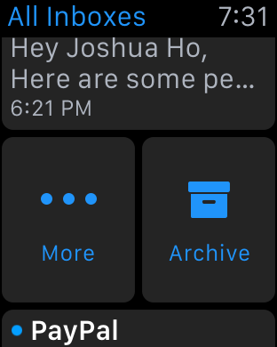
Email is similarly well-done, even if there are some limits to what Apple is able to accomplish. You’re given access to read your inbox, although it doesn’t look like there’s any ability to change the inbox that you want to read on the watch itself and there’s only folder that can be synced at any given time. Although this isn’t really a big deal as you can read all email from all inboxes as-is, it does feel like the UI would be much more full-featured if a force touching the inbox screen would allow viewing email by account and subfolders of each account like the iPhone email application.
At any rate, tapping an individual email will bring up the email or the thread of emails, and reading through the email can be done by scrolling through the email with the touchscreen or the digital crown. The same email can be opened from the lockscreen as a part of iOS' continuity feature, which is a great solution for when drafting a response to an email. WatchOS 2 should also bring the ability to dictate replies, which might be useful but will require testing to see how it works in practice.
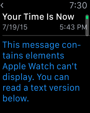
Within the inbox, scrolling up until you hit a “detent” with the digital crown will cause the email application to check for new mail, which works as you’d expect. Going back through the application is done by swiping right on the display, which is intuitive and obvious given the similarity to the iOS UI and animations used. The one issue here is that email can only be read in plaintext, which can present a lot of formatting issues in some cases. For the most part actual emails with value are easily read with plaintext, but I suspect that it would be helpful if there were a better conversion to “reader mode” for content with images or HTML in the UI for future iterations of the OS.
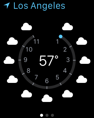
These are probably the hardest cases for a watch to cover, given the utter lack of a proper keyboard and no real way of providing input outside of dictation and a selection of predicted responses. For all other first-party apps, I don’t have any particular issues and design is pretty much as good as I can reasonably expect from a wearable interface. Something like a weather application isn’t really all that difficult to execute well on a wearable given that such information can be easily conveyed in a watch form factor. However, the use of Force Touch in the weather application is done well and allows for multiple different types of information like weather conditions, temperature, and the chance of rain throughout the day in addition to a ten day forecast of conditions and temperatures. Other applications like the calendar app are similarly well-executed although the month view is restricted to only the current month and the day view to the current week presumably to avoid the case where the user ends up 20 years in the past with no one-touch method of getting back to the current day.
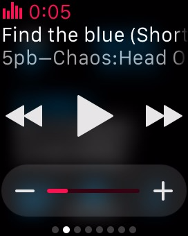
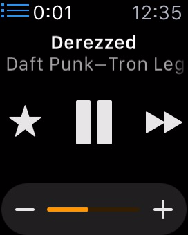
One app that translates much better to the Apple Watch's limited screen size than I expected is the music application. There are really two sides to the app. For most users it will act as a remote control of sorts for the music playing on your iPhone. Since the Apple Watch has a glance for music controls, you can easily access the now playing section of the app right from your watchface. This allows you to pause, play, and go to the previous song or the next with a swipe and a single tap. In addition, you can use the digital crown to adjust the current volume of the audio, which is a great application of the precise adjustments that the crown allows beyond just scrolling through lists.
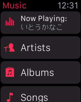
When going into the application itself, you'll notice that it's very similar to the music app on the iPhone. There's not many other ways to lay out a list of artists or albums than a scrolling list, especially on such a small screen size, but it makes the app feel instantly familiar. Swiping on the screen or using the digital crown allows you to scroll through albums or artists, and from there you can go into lists of songs and change what track is playing. I've actually found this to be one of my favorite functions of the watch, because it completely removes the need to pull out a phone, unlock it, open the music app, leave the now playing screen, and then scroll through a list of albums to find the track I want to play.
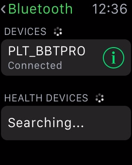
The music app is also one of the few apps that can be used while the Apple Watch is away from its companion iPhone. While it has no 3.5mm headphone jack, Bluetooth headphone users can pair their headphones with the Apple Watch, or alternatively, Apple now sells some of their own pairs as part of the Beats headphone line. In either case, when paired up with a set of Bluetooth headphones, the Apple Watch works as a stand-alone device and behaves a lot like an iPod.
When using the Watch as a stand-alone music player, there are a number of stipulations on the amount of music you can include. The first is that you can only include a single playlist. Since you can customize playlists to your liking this isn't a big deal. However, the amount of space you can use for music on the watch is limited to 2GB, the same amount as an iPod Shuffle. Alternatively, you can select a limit of 250 songs.
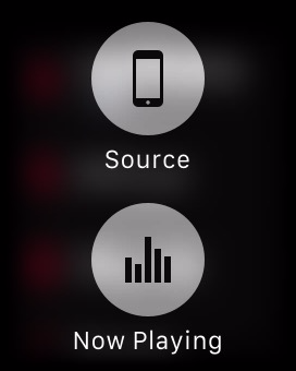
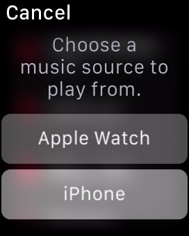
Managing which playlist syncs over and how much space you allow music to take is done using the Apple Watch app on the iPhone, which means the music and playlist you send to your Apple Watch must exist on your iPhone as well. Accessing your local Apple Watch music library simply involves force pressing anywhere in the application. Once you do, you'll be prompted to pair your Bluetooth headphones with the watch if you haven't done so by then, as there's no way to play local music via the speaker. After you've moved to your local library, you can use the app the same way you did when playing music from your iPhone, and can switch back to that mode with another force press.
I think the ability to play back local music ties in very well with the fitness aspects of the Apple Watch, as users who are out for a jog can listen to music without having to have a phone bouncing around in their pocket or strapped to their arm. For general users I don't think it will be quite as useful, as you'll typically have your iPhone with you and will have much more space to store music on that.
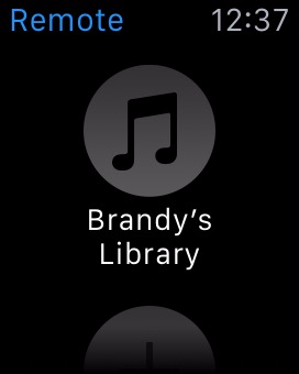
One Apple app that is surprisingly limited is the iTunes Remote app, which can be installed on the watch if you have the corresponding iPhone app from the App Store. While I expected it to essentially be the same as the music app but for controlling iTunes playback, it ends up being much more limited than that. You're only able to play/pause the currently playing song and go to the next track, along with being able to adjust the volume slider in iTunes. This means you can only continue to move forward through your list of songs, which doesn't give you much control over what song is playing. These limitations seem like a lack of effort on Apple's part to make the application functional, which is a shame because there's a perfectly good template for it in the music application. My guess is that engineering resources have been more focused on the continued development of watchOS and on the apps that pair with the applications built into iOS, with App Store apps being put on the backburner.
In summary, I think Apple has done a good job of integrating notifications and applications on watchOS into an interface that is sensible and intuitive. Some parts of the interface leverage existing user knowledge in order to be discovered and used, such as the notification shade that comes down from the top. Others do require a bit of discovery, but much of it is the natural exploration that any user would perform with a new device such as pressing buttons and swiping around.
The Digital Crown also has the benefit of providing a similar function to that of the home button on iOS devices, and with it having the same functions such as long pressing to access Siri it's easy for users to begin using to navigate and access parts of the operating system. Force touch provides a smart way to access different sections of an application, but in the beginning it does require some random pressing around the UI to figure out what menus it brings up in a certain app or area.
The notifications and applications themselves are also handled well, but Apple's less than optimal interface for multiple notifications for third party apps also creates certain situations where using the watch is actually slower than just taking out your iPhone. Many of the issues with the notifications and third party apps in watchOS are also a result of the current situation for third party developers. At the moment, the number of applications that support actionable notifications on the watch is very small, which means that at times the watch can serve as a communication device, but at others it just ends up being a notification device.
It's clear that at this point in time developers are experiencing a period of uncertainty as to how apps should be made for this new platform. Piled on top of that is the fact that applications have to execute all code on the iPhone itself, and are working with limited or non-existent APIs to access to hardware features like the digital crown and microphone. As developer support for watchOS increases and watchOS 2 brings developers support for native apps and greater access to the Apple Watch's hardware most of these issues should disappear, and Apple's first party applications like messages, mail, and music are great showcases for the potential of the Apple Watch and watchOS.
WatchOS: Communication
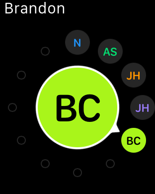
If you’ve been reading closely in the past few pages, you’ll probably notice that there’s a rather consistent theme when it comes to what I find myself doing with the Apple Watch. For the most part, those uses revolve around instant messaging, text messages/iMessage, email, and the extremely rare phone call. Ultimately, communication is what the Apple Watch is all about. I suspect that this is ultimately why Apple has placed a dedicated side button for the Friends screen, which contains a carousel of contacts that you would frequently contact. In practice, this is the only way to access some of the features that are specific to Apple Watch, namely Digital Touch and sending animated emoji.
The Friends UI itself is definitely quite effective for what it is, and really shows again just how useful the digital crown can be when it comes to keeping the UI compact without compromising usability. Selecting a given person is done with the digital crown, with confirmation providing by tapping the display. Once confirmed, the user can elect to call or send a text message. If the friend has an Apple Watch as well, the previously mentioned Digital Touch and animated emoji features will also be accessible from the same screen.
Honestly, I saw next to zero value for sending heart rate or animated emoji, but the ability to send taps to someone is really quite helpful given how good the haptic feedback (Taptic Engine) is at getting someone’s attention. It’s definitely possible to accidentally spam taps to someone without malice though, which is something to be mindful of. Drawings are also a fun feature, but probably not a killer app. At the end of the day, it’s probably a fair bet that you’re going to spend most of your time using the Apple Watch to send text messages and make phone calls rather than drawings or emoji.
Although I’ve already discussed the text messaging aspect, the phone aspect is a pretty interesting experience. In practice, phone calls are definitely not going to work in public on the watch, but in private settings I found the experience to be without any major problems. The actual phone call part of the experience is usually pretty relaxed as you can basically leave the iPhone 6 somewhere else and talk over speakerphone with your hands on a computer as the microphone can still pick up voices reasonably well in that kind of situation as long as you haven’t covered the mic with your wrist or clothing. Trying to make a call is also one of the easier things to do, with a list of recent calls synced from the paired iPhone, favorites, a contact list, and voicemail access from the phone application. You can also make a call from the previously mentioned Friends screen.
One issue that I've observed when making calls on the Apple Watch is that there are times where it will hand the call off to the iPhone rather than completing it on the watch. In fact, every time you make a call you will momentarily see a message that says "Handed Off", which would imply that the call has been transferred to the iPhone. Usually this will be quickly followed by the standard ringtone and call connection being done using the speaker and microphone right on the watch, but I've encountered times where it actually does hand the call off to the iPhone and there's no way to pass it back. This seemed to happen in very specific circumstances, such as calling a certain contact using the friends menu rather than right from the phone app, and it's definitely something that will just require a small bug fix.
Something else to note about audio calling is that the Apple Watch doesn't support making FaceTime Audio calls. This is less of a problem now than it would be in the past, as Continuity and Handoff allow iPhone users with iPads and Macs to answer phone calls on those devices. That being said, it means that there's no way to communicate with a person on their iPad or Mac if they don't own an iPhone, which is somewhat disappointing with how FaceTime is positioned by Apple as a way to communicate across all Apple devices. I would imagine that support for FaceTime Audio calling will be added down the road in either a software update or a new version of the Apple Watch, quite possibly with a front-facing camera to enable both video and audio calling.
Fitness
Fitness has been a huge trend in the wearable industry as of recent, with no signs of slowing down. Heart rate monitoring is almost a standard in smartwatches by this point for better or worse, as is step counting. Fitbit, Jawbone, Microsoft, Garmin, HTC, and others have all made strongly fitness-targeted wearables. In the case of the Apple Watch, I was somewhat dubious that this feature would be all that important to my evaluation of the watch. After all, an enormous number of these wearables suffered from the abandonment problem that I previously discussed. Given that fitness tracking didn’t seem to be all that of an appealing feature, I was pretty well convinced that the selling points of a truly successful wearable would be elsewhere. I’m also decidedly low-tech when it comes to how I approach exercise, as to me there’s no real data needed other than a timer and whether I feel like I’m exercising at a sufficiently strenuous pace, when I exercise at all. As a result, I haven’t been evaluating applications like Endomondo and other fitness-related applications in deep detail, and I didn’t really expect to be writing this section either.
So now that we’ve established the background in which I approach fitness, we can start to talk about the actual fitness app on the watch. The fitness aspect is actually remarkably simple. Setting up the application at the start goes something like inputting your height, weight, sex, and age, then selecting a starting move goal. Once you’re done with all of this, just about the only thing you actually have to do with any kind of regularity to make the fitness tracking work is put the watch on and make sure it isn’t locked when you use it. One of the most important parts of getting people to actually use an application is to always ensure a low barrier to entry, and Apple has pulled this off remarkably well.
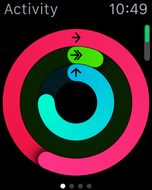
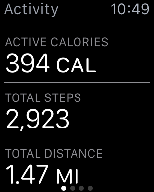
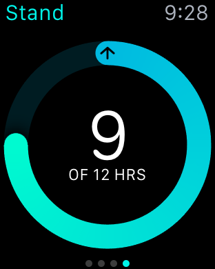
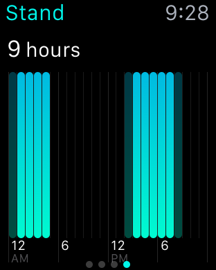
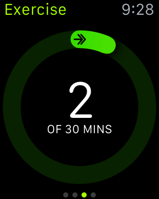
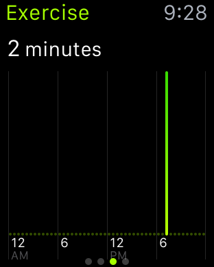
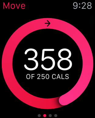
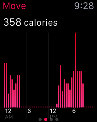
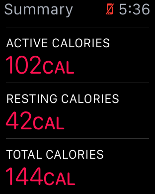
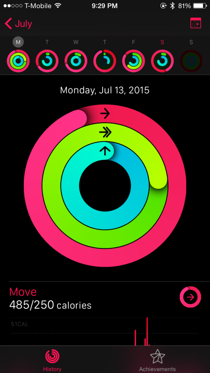
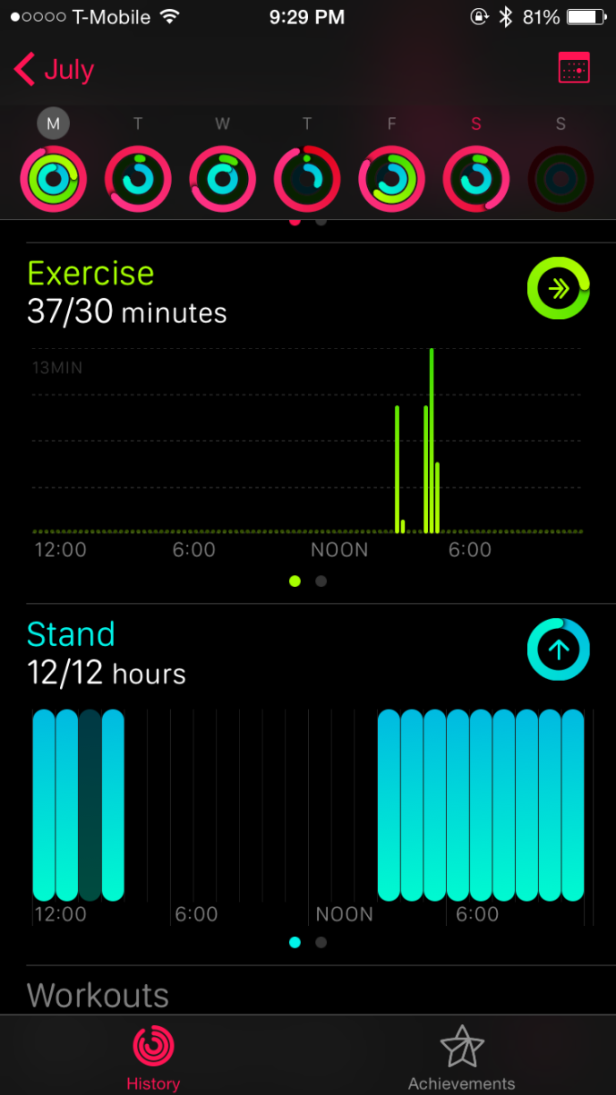
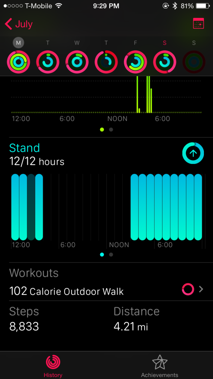
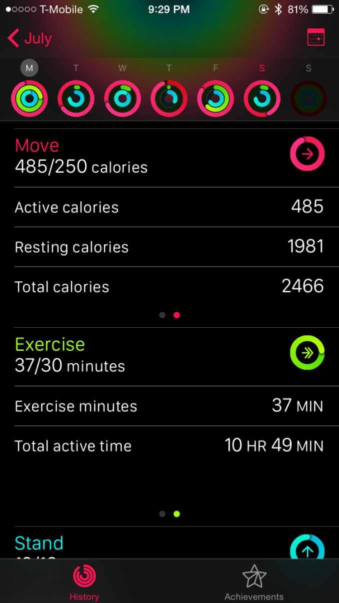
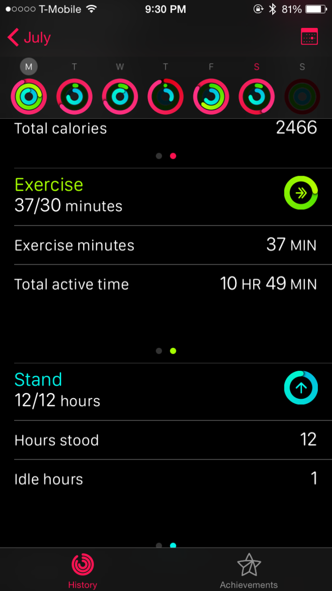
From there, the actual fitness tracking is completely invisible. The user never actually has to actively interact with the watch to get fitness tracking to work. There are only three metrics tracked at this time, but they’re probably the most important predictors of health. The first is movement, which appears to be at least partially based upon heart rate because I seem to have “movement” calories during times when I’m doing nothing but sitting in front of a computer and typing. The second is exercise, which is definitely influenced by heart rate although I haven’t been able to really experiment to see if heart rate is the sole determinant of this metric. The final metric is standing, which effectively attempts to get people to stand for at least a minute every hour for twelve hours a day.
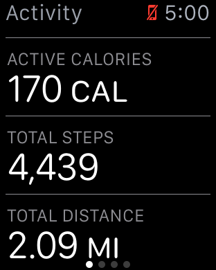
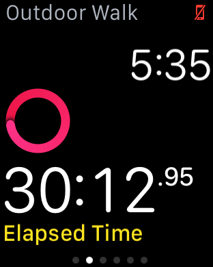
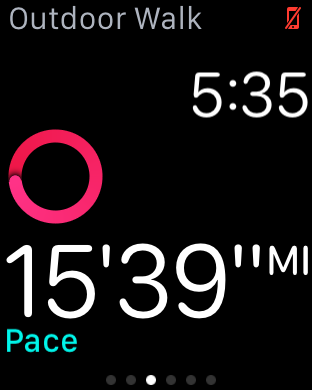
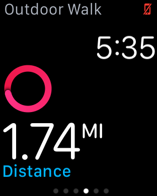
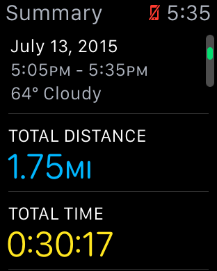
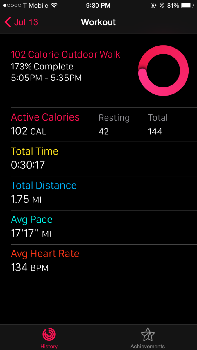
As far as I can tell, after a few weeks of continuously using the watch with the phone paired it didn’t make a real difference in distance estimates when I would forget the phone and rely on the watch for distance estimates. When using purely passive distance tracking, I found that the watch estimated a 1.8 mile walk at 2 miles, or roughly 10% error. However, when selecting the "outdoor walk" fitness option a 1.8 mile walk was estimated at 1.75 miles, which is pretty much no error at all.
There is a workout component, but I suspect that this is something more targeted towards someone who is actually setting aside time every day to do nothing but exercise. I tried the interface and found it to be a useful addition, but I really haven’t had a reason to use it as the automatic tracking is pretty much good enough for my needs.
Of course, outside of tracking the watch will also give you reminders (or guilt trips?) throughout the day of your progress on these three metrics. If you haven’t stood within the last hour, the watch will also remind you of this so you can stand for at least a minute and take a break from whatever you were doing. None of these are really all that intrusive though as the reminders are widely spaced throughout the day so it didn’t feel like I was getting bombarded by notifications from the fitness application. The stand notifications can get pretty excessive if you’re sitting down for an excessive amount of time, but it’s possible to disable this which is a nice touch.
Surprisingly, I found myself looking at these features pretty often because it’s data that I haven’t actually had any real insight into. I’ve never really used a fitness tracker that keeps track of something as simple as standing time, which seems like an obvious metric to track as soon as you start using the fitness functions of the watch because sitting for extended periods of time can have significant effects on health regardless of how much exercise you do. Other fitness trackers have also tracked calories burned and distance covered before, but an actual exercise metric is surprisingly helpful because it’s often difficult to tell what exercise really constitutes as. For example, I wouldn’t consider walking at a decent pace to and from a store half an hour away to be exercise, but with heart rate tracking it turns out that at least half an hour of the one hour walk was actually exercise. I’m sure some people would consider this to be cheating, but in practice I’ve found that the end result was that I had a tendency to try and be more active more often because almost any kind of reasonably strenuous activity would be counted as exercise.
Overall, I found that the fitness component of this watch to be a real surprise. I often hear that Apple is good at making things we didn’t know we wanted, but this is probably the first time I’ve really believed that statement. Going into the review, I didn’t really realize that I wanted a solid fitness tracker on a smartwatch, but now I’m really convinced that there is value to such features.
The only difference was implementation, and it’s apparent to me that the difference here is strongly influenced by a level of thought that I otherwise haven’t seen in most smartwatches. I don’t particularly care for step counts, but I do care about how many calories I’ve used through activity and how many minutes of exercise I’ve done in a day. Even if you don’t care about fitness tracking, the watch’s fitness tracking capabilities are worth keeping in mind when comparing against other wearables. Of course, buying Apple Watch isn't going to magically make you healthier, but it will provide information that allows such actions to be taken.
Apple Pay
I normally don’t cover mobile payment solutions, but in the case of the Apple Watch I suspect this is the fastest way for anyone not using an iPhone 6/6 Plus to get Apple Pay access. Although I’ve never written anything about Apple Pay on the iPhone 6, in my experiences it’s probably the best solution around when it comes to easy payment due to the NFC boosting that makes the iPhone 6 send and receive NFC with no real orientation dependence and TouchID payment authentication. Coming into this review, the real question for me is whether Apple Watch could have the same seamless experience.
To try and figure out the answer to that question, there are really a few elements to the payment experience that have to be figured out. The first is authentication, which can easily be the biggest downfall in the experience. To this end, Apple has figured out a pretty smart system of wrist detection combined with a PIN code which ends up making for a pretty seamless experience. At the start of the day, you input your passcode when you put on the watch, and any time the watch is removed you have to input the passcode again or else pretty much everything (including Apple Pay) is locked out. If you lose your watch, no one can access the payment component without your PIN.
This effectively means that when you’re paying for something with the watch, all you have to do is double-tap the side button to activate Apple Pay. I’m not sure why it’s strictly necessary for NFC to be off unless the user activates it, but it’s likely that even the standby power of NFC would be significant with the battery of the Apple Watch.
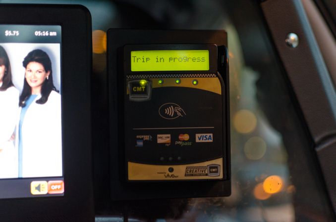
This payment terminal was at head-level in the back of a taxi
The second potential roadblock is ease of use with payment terminals. To this end, the RF component is actually without issue. I didn’t find myself particularly constrained in terms of distance or orientation of the watch to interface with readers. However, I think the problem with payments on the Apple Watch is that in some cases readers are just placed in positions that require some really odd contortions to get the watch to the reader, regardless of whether the NFC RF subsystem is well-designed. Anything at chest or waist level was usually without problems, but I noticed that readers mounted at head-level were remarkably difficult to use with Apple Watch. Other issues like setup for card payments were really without issue, and I suspect most people won’t have any problems setting up their watch for Apple Pay.
Ultimately, while Apple Watch will work just as well as an iPhone 6 for payments, the real downfall here is mostly a problem of physiology. While in some cases using the watch for payments is a natural gesture, there are a number of edge cases that require a lot of contortion to get the watch to the payment terminal. If you don’t have an iPhone 6/6 Plus and you want to use Apple Pay, Apple Watch is probably the best way of getting Apple Pay. However, I still think the smartphone is a better platform for payments for ergonomic reasons.
WatchOS Final Words
The Apple Watch has a completely new OS, which warrants some especially close scrutiny of the OS as any early design decisions made have a tendency to snowball in terms of momentum, so it’s almost impossible to make some changes once applications are widely using shared libraries and APIs that are expected to work in a temporally consistent manner. To recap for those that don’t want to read everything previously discussed, there are a few areas that are worth examining in WatchOS, namely the watch functionality itself, notification handling, glances, apps, communication, fitness, and Apple Pay.
The watch functionality is solid, and Apple has created a number of compelling, useful, and deeply customizable watchfaces. The use of Force Touch and digital crown here makes a lot of sense when it comes to training the user for the rest of the UI, and the ease of use in customizing the watchface is truly great. There is the issue of no public API for watchfaces, but I suspect that this will come with time as it’s important to ensure that such an API is properly designed for long term support. Glances are well-executed and a useful feature, but I don’t really get the point of integrating heart rate monitoring into a glance or similar cases of app information as anything important to me ends up as a complication on the watchface. In practice, I think glances are best thought of as quick settings toggles rather than sources of glanceable information. To this end, the ability to turn on power reserve mode, toggle airplane mode, silent mode, do not disturb mode, and ringing the paired iPhone, and other controls like music playback control are definitely welcome and make a lot of sense.
When it comes to notification handling, once again I think Apple has done an effective job from a UI perspective as the notification shade uses familiar constructs from iOS/Android and the use of Force Touch to dismiss all notifications is a nice touch. However, I do have issues with how multiple simultaneous notifications are handled, which should be converted into a list view of all notifications rather than a single notification that indicates there are multiple notifications from the same application. Other than this, I think Apple has done a solid job with all the necessary features (do not disturb, actionable notifications, dismiss all, smooth UI). From a broader UX perspective the Taptic Engine is good enough to be worthy of a separate discussion, but within the context of notifications it works well.
Apps are ultimately what make a platform, because at the end of the day the reason why people use any general purpose computer is because of the apps that it can run. To this end, there’s currently a huge division in quality and functionality between first-party and third-party apps. Apple’s applications are executed well, with pretty much all the functionality that makes sense and great design. I never really had any frustrating moments with Apple’s apps on the watch. For any kind of input, there was always the ability to use Apple keyboard predictions or Siri voice input, which covered just about every case in which I wanted to input some kind of text in reply.
However, the same can’t be said of third-party apps. Probably the best example of this is Uber, which is literally just a button to request a pick-up with no other options when I can easily imagine a UI leveraging the digital crown to precisely indicate pickup, and swipes or Force Touch to select the type of Uber I want to use. This kind of UI is simple, but arguably too simple for a watch with as many UI tools as Apple Watch. I’m not sure that “native apps” will necessarily fix everything here, but native apps combined with developer experience and more powerful hardware will probably deal with most of the complaints I have about third party apps for WatchOS 2.
Communication is really a part of apps, but deserves specific mention because it’s such a critical task of the Apple Watch. To that end, there are really three key native apps that fall under this category. These are the phone, messages, and email application. All of these are well-executed, and in practice the user experience around all of these is pretty much painless. One could argue that email is missing some functionality, but for at a glance email viewing it works pretty much as it should. Fitness falls under a similar category in the sense that it’s a subset of the apps category, but if nothing else, Apple has made a great fitness tracking application when it comes to information presented, design, and ease of use. Apple Pay is also well-implemented in terms of ease of use, but there’s a fundamental issue with ergonomics that prevents Apple Pay on the watch from being as great as it is on the iPhone.
Overall, I think Apple has created an OS that is forward-looking and fully capable of supporting future iterations of Apple Watch without too much trouble, although many details will change as time goes on. However, for early adopters I suspect there will be some objection to performance. As one might be able to guess from our S1 CPU analysis, the S1 SiP is not going to be able to come close to a modern smartphone for performance, which means that even basic UI tasks can be a bit of a struggle with visibly-dropped frames when scrolling and swiping through some parts of the UI like the fitness app. There’s also the issue of app load times, but I suspect this will disappear with the inevitable advance of Moore’s law and native apps can load almost instantly in some cases.
Currently, third-party apps are lacking either from the lack of native app support or from general unfamiliarity of design principles for the watch. Probably the only real criticism I have for the OS overall is that there’s currently a distinct lack of watch independence, as if I set the iPhone to airplane mode but keep the watch able to connect to the internet applications like weather are unable to download anything even though it should be able to connect to my home router and download this kind of information anyways. Given the number of constraints that come with the wearable form factor, WatchOS is probably one of the best OSes out there for wearables.
Display
As with just about everything these days, display matters quite a bit. In a lot of ways, the wearable segment has display requirements similar to the smartphone space. However, unlike the smartphone space it isn’t necessarily critical to have the highest possible resolution, and it isn’t necessarily crucial to have perfect color calibration as in most cases wearables won’t be used for color-critical applications.
In the interest of addressing this, for the near-term we’ll continue to use the standard smartphone workflow, but I hope to expand the testing done here as wearables develop. For now, we’ll continue to do the standard brightness and accuracy testing, but I’ve removed the grayscale test as it strongly emphasizes gamma accuracy. Although it is important to not have obscenely incorrect gamma curves, wearables generally have to prioritize readability over dynamic range, which means that near-black colors would be brightened to try and overcome background reflectance. Similarly, we won’t be placing dE2000 average error in our Bench comparison tool or in graphs, as something like the Apple Watch cannot have controlled display brightness.
As a result, we can’t really be 100% sure that gamma tests and other tests of luminance are actually accurate when automatic brightness means that any inconsistency in light to the sensor will affect display brightness, which will strongly affect dE2000 results.
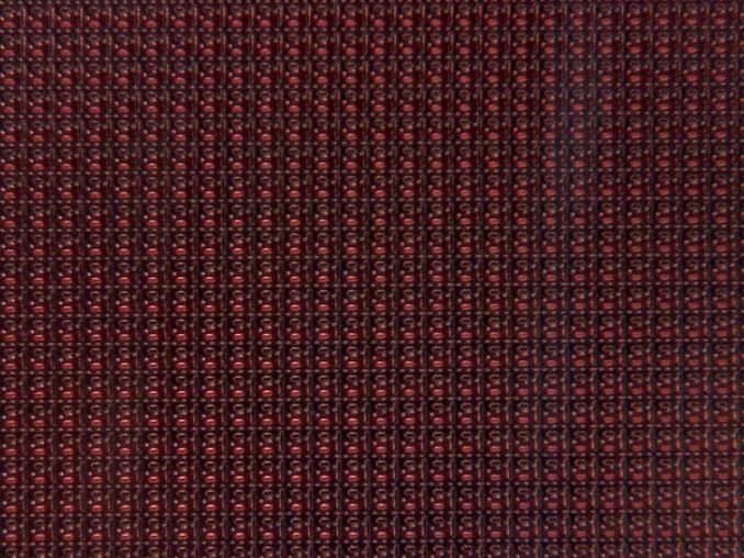
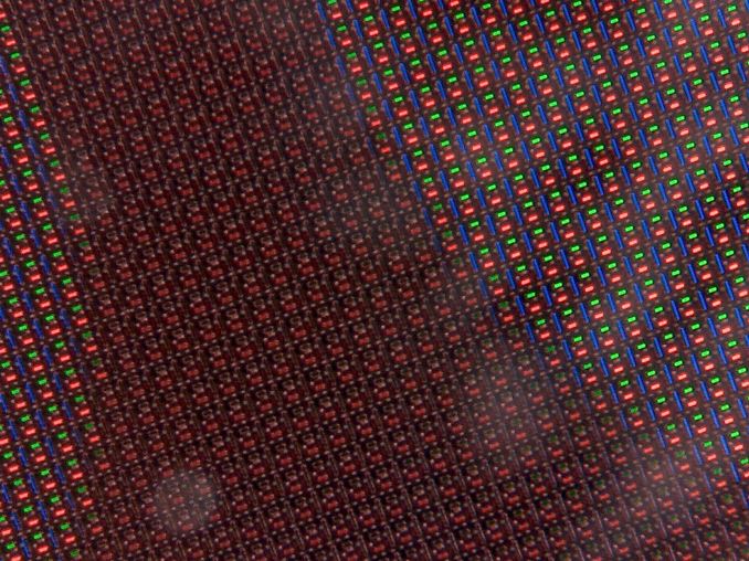
In the case of the Apple Watch, the display is interesting because this represents the first AMOLED display to ever be used in an Apple product. As far as I can tell, this is an LG OLED display with an RGB subpixel arrangement, but it isn’t quite the same as a traditional RGB stripe. I suspect that for the near future we will continue to see the use of this subpixel arrangement as the resolution of the Apple Watch doesn’t really allow for a PenTile layout. Given the current state of AMOLED (as evidenced by the Galaxy S6) I believe it is effectively the future of mobile displays, and it seems that whoever makes these decisions at Apple agrees as well.
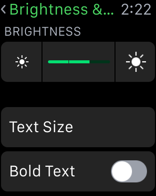
As I mentioned in the start of this section, the Apple Watch also doesn’t have any way of manually setting brightness. You get approximately three choices of auto brightness algorithms, which bias the brightness curve of the display appropriately.
In practice, I didn’t actually care that manual brightness was gone on the watch because I never actually used manual brightness on the iPhone or any phone that has at least a halfway decent auto brightness system. In every phone I’ve ever used, the only time I use manual brightness is when the auto brightness system is clearly programmed wrong in some shape or form. Common cases where this would happen include auto brightness that didn’t actually set the display to maximum brightness in daytime or wouldn’t set the display to minimum brightness in absolute darkness.
Thankfully, the default auto brightness setting on the Apple Watch doesn’t have any of these problems, although for reasons unclear minimum brightness changes depending upon the brightness setting that is selected. As a reviewer though, it would definitely help if the watch had a manual brightness setting for more precise display testing and battery life testing. I’m sure that the precision of the digital crown would allow for precise brightness settings as well, but I suspect that this would have some very real potential to affect practical battery life as I’ve seen more than one person walk around with their smartphone display permanently set to maximum brightness because of reasons.
There’s also the issue of reflectance, which could be a problem given that the two higher-end models use a sapphire crystal glass on the display instead of traditional hardened glass. I did notice that reflectance is much higher than something like the iPad Air 2, but I never really felt like the reflections completely washed out the display. The reflections also indicate that the watch has a properly laminated display, without issues involving index of refraction mismatch. However, if people are worried about outdoor visibility Apple Watch Sport should be better given the use of more common aluminosilicate glass. I’m not sure if Apple has actually loaded different auto brightness algorithms for the Apple Watch/Watch Edition compared to the Watch Sport to try and compensate for this though, and I suspect such a change would be difficult to test for as well.
Although reflectance is one aspect of outdoor visibility, the other is display brightness. This is probably the only aspect of the Apple Watch where I can get consistent and repeatable results. Unfortunately, given that we haven’t actually done any other full-featured wearable reviews I’ll have to reference smartphones to get a good comparison point. As the Apple Watch display is already quite small, we won’t be able to get accurate APL vs brightness readings as it’s impossible to hold the meter in a repeatable position that isolates ambient light while also holding an LED to the display.
At any rate, the Apple Watch gets respectably bright at around 460-470 nits, although not quite the ridiculous 600 nits that the Galaxy S6 can achieve. At this full white display, I recorded a color temperature of 6891K, and 6883K at the ~100 nits that was used for the remainder of display testing. It’s important to keep in mind that these values are only at 100% white, so this isn’t the average color temperature that we normally list in reviews. Of course, this display’s contrast is also infinite, with no visible residual brightness on pure black images.
Saturation Sweep
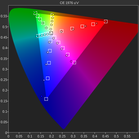
Moving on to the saturation test, we can see that Apple has put a huge amount of effort into calibrating these displays, which is somewhat surprising given that one might expect wearables to not be all that critical when it comes to color accuracy. In my experience, I never actually bothered looking at photos on the watch outside of the messaging app and Twitter. I suspect that this was done in order to make it so that images look the same across all Apple devices, as something would seem “off” in most photos taken by an iPhone 6 if displayed with an Adobe RGB gamut. In this test, the dE2000 average error was 2.33, and as one might guess from the photo above most of the error was concentrated in blue, which appears to have some gamut issues as the native gamut appears to be wider than sRGB but not enough to completely cover sRGB.
GretagMacbeth ColorChecker
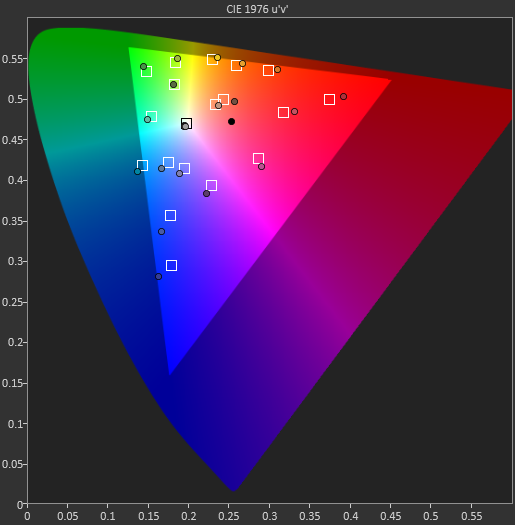
The GretagMacbeth ColorChecker test reveals a similar surprising level of attention to detail in color calibration. Color accuracy isn’t quite on par with the very best, but given that this is a first generation product I’m really surprised that the display is already receiving this much attention with an average dE2000 error of 2.42. Overall, this means that the display has relatively little perceivable error for sRGB content, which is the standard almost across the board, although wider gamuts like Rec. 2020 or Adobe RGB may one day supplant sRGB.
Overall, I’m impressed with the quality of the display of the Apple Watch. The AMOLED panel could probably reach a 600 nit max with sufficient progression in emitter technology from LGD, but I suspect this will take some time. The calibration is also incredible for a first-generation wearable, and the use of a full RGB subpixel helps to avoid a lot of the aliasing issues that tend to plague PenTile or other RG/BG subpixel arrangements at these relatively low pixel densities.
The reflectance of the sapphire lens on the display is a bit high and could probably benefit from anti-reflective coatings of some sort, but given that I haven’t had to worry about scratching the display thus far it’s probably a fair trade as a screen protector will usually increase reflectance noticeably. It’s also a bit annoying as a reviewer to not have manual brightness settings, but as an end user I never felt the need for manual brightness as the auto brightness algorithm works quite well.
Ultimately the entire user experience around the display in every aspect is well-executed, although there is still room for improvement on the technology side of things.
Battery Life
The Apple Watch, more than any other wearable, presents some enormous barriers for battery life testing. On the smartphone side, testing has traditionally been pretty simple in the sense that you can usually design an app, script, or some other form of automatic test that will run a specified workload. The display is set to not timeout by either an application that adjusts the timeout to an extremely large value or by adjusting the timeout in the settings menu.
Meanwhile for wearables, on Android Wear, testing battery life is generally quite simple, because you still have some control over the timeout settings, you can set manual brightness, and the display automatically turns on when you receive a notification. On Watch OS, exactly none of those things are true. As a result, objective battery life testing of the watch has a number of significant challenges and thus far I haven’t seen any real solution to this problem. We hope to have a standardized battery life test across all wearable OSes in the near future, but for now this section will be purely subjective in nature.
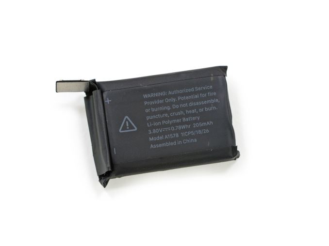 38mm Apple Watch Battery (Image Courtesy iFixit)
To really sum up battery life on the Apple Watch, it’s definitely more than sufficient. I never recall having battery life drop below 30% in a single day of use. If a day was particularly slow in terms of notifications, I often would end the day with more than 50% battery life, so going two days wasn’t completely impossible. However, in practice I found myself charging the watch every night.
Just by virtue of the glance-based nature of the watch, battery life continues to be far better than the iPhone 6 over the course of the day. I did notice that idle battery life isn’t particularly strong on Apple Watch when wearing it on my wrist, presumably because things like the haptic feedback, fitness tracking, and background sync activities have to be running quite often. Something like reading email doesn’t seem to drain the battery all that quickly, which is also helped by the consistently low average picture level (APL) throughout the UI. However, I would notice throughout the day that the battery percentage seemed to decrease even though I’d go the whole day just checking the time. Given that the workout mode also seems to have a pretty significant workload, I suspect fitness tracking is a significant component of this idle drain.
For a first-generation product on 28nm, this level of battery life is actually rather remarkable as I expected wearables to go through a few generations of somewhat poor battery life before reaching an acceptable point. Although performance isn’t amazingly fluid on WatchOS, it’s definitely more than made up for due to the improved battery life that comes from such a low-power SoC. Roughly speaking, Apple has definitely met their promise of 18 hours of battery life, and arguably exceeded it. Of course, given that there’s no real data here yet opinions may vary widely on whether the battery life of Apple Watch is acceptable.
Charge Time
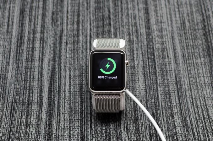
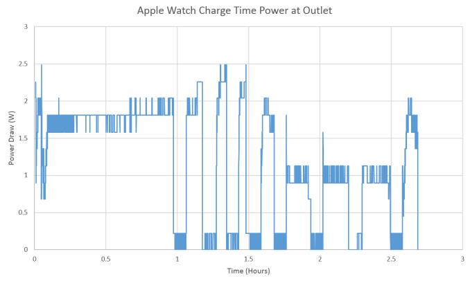
Although battery life is usually the primary way in which people determine how good a device is at staying mobile, charge time often enters the equation. I’m sure a lot of people have experienced situations in which charge time becomes critical. Traveling will often affect this, as power outlets are fairly rare in airplanes and airports, which means that the time spent at a power outlet needs to be as productive as possible in terms of increasing battery charge. In the case of the Apple Watch, the only option for the average user to charge the watch is with a wireless charger that uses magnets to hold the charger in the correct position on the watch. This wireless charger is fed by Apple’s standard 5V, 1A charger. In order to test this, we monitor the time it takes for the wearable to go from a completely drained state to a fully charged state.
It’s probably no surprise that our test results track relatively closely with listed Apple spec at 2.68 hours. What isn’t listed in the spec is that like every other wireless charger I’ve tested thus far, trickle charging with wireless charging isn’t really trickle charging to the AC adapter. I thought something might have just been off with the Moto 360, but after my experiences with the Apple Watch it’s clear to me that wireless charging behaves differently from wired charging. As a result, it wasn’t unusual for me to wake up 9 hours after putting the watch on the charger and still feel that the watch was quite warm from charging. At any rate, given the need for wireless charging on wearables I suspect that we’re already at the limits for charge rate on wearables for the near future given the increased heat output of wireless charging.
Taptic Engine
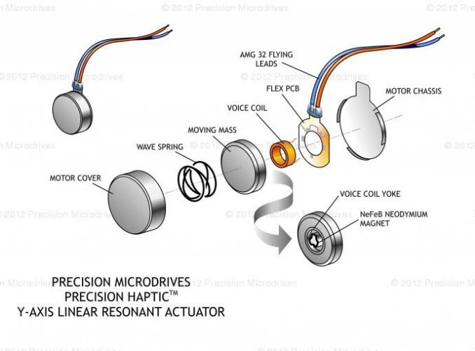
As I’ve mentioned earlier in the review, one of the biggest points of differentiation with the Apple Watch is the use of a brand new haptic feedback system that Apple calls the Taptic Engine. At a low level, this is just a linear actuator, but the system is very different from a traditional linear actuator.
For those that are unfamiliar with traditional linear actuator haptic feedback systems used in smartphones, a voice coil has voltage applied across it, which allows current to flow and generates a magnetic field because the voice coil is an electromagnet. This voice coil acts on a mass, which vibrates in a small cell at a certain frequency. However, in the traditional y-axis configuration of most linearly-actuated feedback systems, the limited length means that there isn’t a lot of room for low frequency vibrations.
Source: Precision Microdrives
In the case of the Apple Watch, it seems that Apple is using a z-axis vibration motor combined with the speaker. Relative to the PCB on the watch, the weight and the length of travel for the mass is enormous. This inherently allows for much better haptic feedback at lower frequency vibrations. This haptic feedback motor design, combined with the speaker, is what makes up the Taptic Engine.
Source: Precision Microdrives
The question now is whether Apple has actually accomplished significant here for the end user experience, and the answer to that is definitely a strong yes. When this feature was first announced, I wasn’t particularly interested in it because I’ve never really been one to pick nits over haptic feedback which is why I never point out a phone’s haptic feedback system as a key point of differentiation unless it’s egregiously poor. However, in the case of the Apple Watch it’s an enormous step up from what one might be used to from a phone because of just how distinct it is. It really feels like someone is tapping me on my wrist when notifications come through, and it’s sufficiently distinct from conventional vibrations that I’ve never failed to miss a notification that comes in, which happens every so often with my phone or even other wearables.
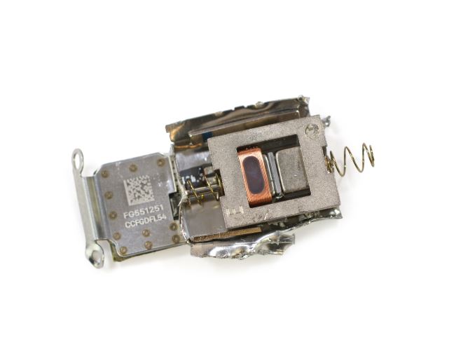
Apple S1 Taptic Engine (Image Courtesy iFixit)
There might be some missed potential here though, as it would be great to have more variation to the vibration patterns to indicate various types of notifications as I usually can’t reliably guess what application a notification came from by the haptic feedback alone. The system is also remarkably quiet compared to vibrations from phones, presumably because the frequency of the noise is relatively low and the watch is strapped to the wrist, which muffles noise. As said before, I normally don’t care enough about vibration feedback to write anything about it, but in the case of the Apple Watch the difference is big enough to be notable in terms of user experience.
Misc. Thoughts
As far as I can tell, the speaker is decently loud for relatively quiet environments but it’s easily drowned out by background noise. I also found that I almost never took the watch out of silent mode, as the haptic feedback is enough and audible ringtones definitely lack the relative subtlety that comes just vibrations.
On the receiving side, I was pleasantly surprised by just how effective the microphones are at rejecting noise, as it rejects anything reasonably far away and seems to amplify nearby voices based upon some casual testing of iMessage audio messages. However, Siri seems to struggle a bit with noise rejection and I’m pretty sure that Google Voice Search continues to be faster and less error-prone than Siri when it comes to dictation.
As best as I can tell, Apple Watch currently doesn’t detect sleep states or much of anything around sleep, which is definitely an area of potential improvement as it would be amazing to have an alarm clock that would go off at the end of a sleep cycle to reduce sleep inertia. Sleep tracking in general would be a significant feature if executed well, although this would likely require significant increases in battery life so that an average workload would only use around 40% of the battery in a day.
Meanwhile as far as inputs go, the side button is roughly analogous to the power button on a smartphone, but with a friends list and Apple Pay mapped to the button as well. The Digital Crown is roughly analogous to a home button, but with a scroll wheel attached. In my experience, the Digital Crown isn’t manipulated with a twisting motion, but a sliding motion with a single finger similar to a scroll wheel.
Handoff works well with the iPhone, although it’s often difficult for me to remember to swipe up to activate Handoff when TouchID makes phone unlock almost instant. You are still able to use handoff via the multitasking drawer on your iPhone, but that requires a number of extra steps that can be slower than simply opening an app and navigating to where you need to be. I also find it a bit odd that Apple Watch doesn’t have a multitasking interface like iOS does, but given how rare it is that I attempt to switch to another app with the use of the double press interface I suspect that this is more of a fast app return switch than a multitasking switch.
Finally, "Hey Siri" works well in terms of activation, but it's really kind of disappointing that the hotword detection doesn't work with the display off. I suspect this is due to power requirements as I haven't seen any other wearable have screen-off hotword detection, but it would definitely be great to see such a feature in the future.
Final Words
At the beginning of this review, I said that I haven’t worn watches in any consistent fashion for my entire life. In a lot of ways, this will be an accurate characterization for many people. With the rise of the cellphone and its network-synchronized time, it became pretty much pointless for most people to wear a watch. The ergonomic annoyances involved with wearing a wristwatch strongly outweighed whatever functionality it provided. In this context, Apple is really facing an uphill battle with the Apple Watch. Apple has to sell people on the concept of a watch all over again, and not just on the idea of a smarter watch, which is a challenge that they never faced in smartphone adoption.
There are so many aspects of the Apple Watch that really have to be considered before we figure out whether Apple has succeeded, so we have to break this down into multiple aspects. The first is the design, because people that wear wristwatches all the time don’t really approach this the same way others would. What seems normal to people that wear watches all day long is easily uncomfortable and annoying to people that aren’t used to wearing watches.
As a result, this kind of discomfort can easily result in a wearable that ends up thrown in a drawer somewhere to be forgotten, which won’t bode well for long-term gains. I’ve tried other wearables, but nothing really interested me because everything was uncomfortable in some way. Over time, these small annoyances just made it easy for me to decide that the functionality of the wearable was outweighed by the discomfort of the design.
The Apple Watch on the other hand doesn’t suffer from discomfort issues at all, and in this regard, Apple has arguably pushed the industry forward. For the most part, it’s a pretty safe bet that pretty much anyone will find a band design that they like. In the case of a band like the Milanese Loop band, the problems I’ve always had with traditional leather buckle bands are pretty much eliminated. The Sport band is rather traditional, but the material used helps to alleviate discomfort when sweat starts to wet the band and evenly distributes tension around the wrist.
Meanwhile, although Apple’s wristbands use a proprietary mechanism to lock into the watch, like the Lightning connector it makes a huge difference in user experience because it’s incredibly easy to swap out bands compared to just about every other watch or wearable I’ve seen. The design is also executed well, which is good enough that it doesn’t look out of place when comparing it to analog watches. We can talk about whether the watch is too thick but on the wrist it blends it well without significant problems. The one problem that I’ve noticed in terms of ergonomics is that long sleeves are a significant impediment to usability because I have to pull my sleeve back to use the watch.
One crucial aspect of the Apple Watch's design and accessibility is its size. Apple sells two versions for people with different wrist sizes, and this alone is something that distinguishes it from most other smart watches on the market today. Even with two sizes, the larger 42mm Apple Watch is still substantially smaller than most other wearables. This makes the Apple Watch accessible to a wide range of people, and it highlights an issue that is prevalent within this section of the wearable market which is that smart watches tend to be sized quite generously to accommodate large batteries and PCBs. While this is fine for users with larger wrists, it ends up excluding a large portion of the market. A user who feels most comfortable with the 38mm Apple Watch, for example, will almost certainly find a watch like the Moto 360 to be far too large.
Outside of design, the other critical aspect to getting a modern watch right is SoC, which sounds absolutely absurd for a timepiece. However, it's important to emphasize that Apple cannot afford to only sell Apple Watch to people who already believe that it is sufficient for a watch to only tell time; Apple Watch needs the performance to do more.
In this regard, Apple has targeted the SoC correctly for a 28nm HKMG process. A 520 MHz Cortex A7 is ultimately the right choice to make to focus as strongly as possible on perf/W for this platform, given that average power draw over the course of 18 hours can only be about 40-50 mW at most it’s important to make sure that the CPU voltage and frequency curves are in the right place for the TDP of a watch and that the CPU spends most of its time in an efficient mode of operation. The use of an appropriately-sized GPU for the watch form factor is also important, and helps with making power stay at the 40-50 mW average power consumption over the course of a day.
The one catch here is that at 28nm the performance that the watch can deliver is on the edge of what’s acceptable in terms of frame rate and loading times. Apple Watch really needs a better process technology in order to deliver more performance without compromising power consumption, and a move to a leading-edge FinFET process would go a long way towards accomplishing this thanks to the rather significant voltage improvements FinFETs afford.
Ultimately, hardware is just one part of the equation. Hardware innovation is impressive in its own right, but without an application there’s no value to the end user. Fortunately, WatchOS delivers in a very big way. Force Touch is consistently used throughout the UI to provide additional controls that otherwise would reduce information density. The Digital Crown is used to allow for information density that allows for precise zoom and scrolling in a way that I never really experienced with other wearables, and is really an integral part of the WatchOS UI as capacitive touch is almost never used outside of tapping in everyday use.
Key features like fitness, music playback, text messaging, and email are all executed well with very little need for end user intervention which is really critical on a device where any sort of text input is difficult to say the least. Notifications are also well-handled and work as expected, with no strange behavior like not dismissing notifications on the phone if dismissed from the watch, and appropriate haptic feedback for various notifications. Apple Pay also works well from the software side even if there are some ergonomic pitfalls.
Out of all the wearable OSes I’ve seen, it really feels like WatchOS is what iOS was for smartphone OSes. Of course, Apple Watch isn’t perfect in the software department. Due to the relatively weak SoC in this version of the Apple Watch there’s a lot of time spent staring at loading screens when the app is loading from the phone or if the app needs to pull information from the network. There are also a surprising number of cases where the UI visibly runs below 60 FPS or otherwise stutters, which suggests that an extra CPU core and/or higher clocks would help a lot. There are also some problems with how multiple notifications from either the same or different apps are handled, but overall the execution on the software side is excellent.
Getting back to hardware, aspects like the display and battery life are also solid when examined in a vacuum. The display could probably be improved upon from an energy efficiency perspective, but given limited testing tools it’s difficult to have the same data that we do on the smartphone side, so this assumption is almost purely based on power testing of LG OLED and Samsung OLED displays in various smartphones. The brightness of this display is acceptable, and the calibration is excellent by any standard which surprised me given the reduced need for color accuracy in a wearable display. Subjectively, I didn’t have a lot of trouble with seeing the display in daytime but given the use of the more conventional glass on the Sport edition reflection should be greatly reduced relative to variants with the sapphire lens.
Although we don't have an objective battery life test, the Apple Watch never failed to last a full day, and charge time is acceptable although nowhere as fast as something with wired fast charging. This sounds like a relatively short comment, and it's because I sincerely never worried about battery life. Range anxiety just isn't a problem like it is on smartphones.
The Taptic Engine is also a seemingly simple change, but the result of a modified linear actuator incorporating the speaker has a pretty enormous effect because notifications become impossible to miss. Apple claimed that the haptic feedback would feel like someone is tapping you on the wrist, and that’s actually entirely accurate. I normally don’t pay that much attention to haptic feedback in something like a smartphone, but in this case it’s such a big deal because it’s far quieter than conventional vibration yet immediately obvious no matter the situation. I’ve missed notifications before on my phone despite strong vibration feedback, but I’ve never missed a notification on the watch because of this new haptic feedback system.
In light of all of this, we have to try and split up this review into multiple parts. Although this is a review of the Apple Watch, the Apple Watch will ultimately be quickly forgotten with the launch of future iterations of the Apple Watch. After all, Apple is not trying to sell the world on the idea of a smarter watch, but the idea of a watch altogether.
For those still deciding on whether the first Apple Watch makes sense, I have no reservations in saying that it’s the best wearable I’ve ever used. However, at the same time I find it hard to recommend this first-generation Apple Watch. It’s clear that there are far too many obvious areas to improve upon, areas where Moore’s law will help to dramatically improve the experience. In the case of smartphones, Moore’s law made it possible to deliver true all-day battery life and fluid app performance. After spending a few months with the Apple Watch, all I can see is a need for more compute and battery life, like what happened with smartphones.
Finally, we get back to the question of whether Apple will be sell people on the concept of a watch. In the months since I first used the watch I’ve ended up wearing it every day. I distinctly noticed its absence when I forgot the charger on a trip. I don’t know if Apple will succeed in convincing others of the utility of a watch, but they’ve definitely convinced me.

