Original Link: https://www.anandtech.com/show/8629/looking-at-os-x-yosemite-and-ios-81
A Look At OS X Yosemite And iOS 8.1
by Brandon Chester on October 27, 2014 8:00 AM EST
Introduction
It has been a busy year for Apple, although one could argue it has been more of a busy few months. The yearly updates for most of Apple's products now occur in September and October, and as a result we've seen the release of a number of new products and services in a very short period of time. On the hardware side we have the new iPhone 6 and 6 Plus, the iPad Air 2 and Mini 3, the iMac with Retina 5K display, and a preview of the upcoming Apple Watch. The software side has arguably been even more exciting with the release of iOS 8 and its first major update iOS 8.1, OS X Yosemite, and Apple Pay.
The theme this year appears to be integration and the power of a software and hardware ecosystem. Apple has always had some level of integration between iOS and OS X. As time went on, both operating systems began to share a core set of applications like Reminders, Calendar, and Notes. The iPad extended this even further by bringing the iWork and iLife suites to mobile. iCloud also played a key role in integrating both systems, by synchronizing documents and photos between all of a user's devices. However, the launch of iOS 7 with its visual and functional enhancements left many of the shared features and applications on OS X feeling left behind.
OS X Yosemite brings with it a massive visual overhaul, on a scale even greater than what we saw with iOS 7. This makes sense, as OS X is an operating system for desktops and laptops which makes it inherently more expansive and complex than iOS. Although OS X is not nearly as popular as iOS in terms of user base, the fact that the redesign changes some visual elements that have existed for over 14 years makes it quite a monumental moment in Apple's history. These changes finally unify the visual styles of both operating systems, which were once united but split with the launch of iOS 7.
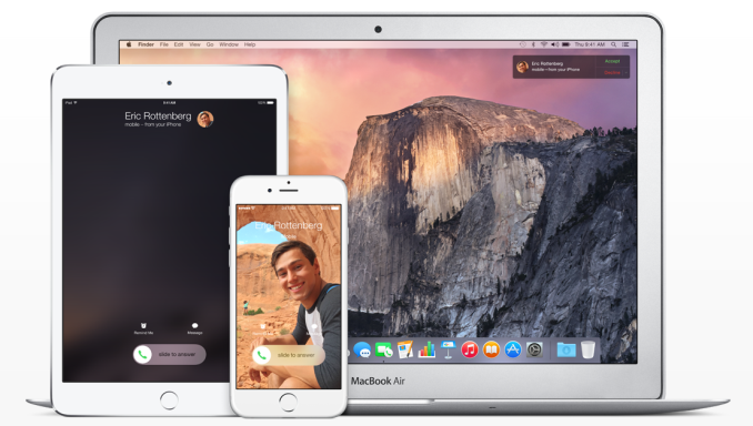
The integration of these two operating systems goes far beyond a common type of visual design. OS X Yosemite and iOS 8.1 also include new features that allow them to work together in unprecedented ways. Features like Handoff blur the borders between the iPhone, the Mac, and the iPad by allowing you to continue work you began on one device on another. SMS and call forwarding takes communication abilities that were typically reserved for the iPhone and brings them to every device.
There's a lot to talk about, and it all begins at the aesthetic level with the new design of Yosemite.
Rethinking OS X
The original interface for iOS was inspired by Apple's Aqua UI, with skeuomorphic elements that mimicked real world objects. Computers have always mimicked the real world to a degree. They have buttons you press, and knobs you turn. The entire desktop metaphor is really just a digitization of the real world office with folders, documents, and a trash can. As computers have evolved and people have become more familiar with them, this overall metaphor has remained for the most part. But many of the visual elements that previously mimicked these real world objects could be simplified to copy in function, but not design. Users who are familiar with computers no longer need a distinct outline and heavy shading to recognize that a button is something they click or tap. They don't want their Calendar and Reminders applications to have leather borders, stitching, and paper like their calendar and date book in the real world, because doing so confines them to the limitations of those physical objects.
iOS 7 was in a sense a rebirth of iOS. The interface that had existed for six years was entirely redone. Core design elements like the homescreen remained, but everything was given a new visual style that eliminated skeuomorphism and ushered in a new era with a new design philosophy for Apple. This style of design is fairly well understood now. iOS makes heavy use of translucency and color. Each application has a primary color throughout which is indicated on its icon. Calendar uses red, Notes uses yellow, etc. With all these massive changes, the future of the design of OS X was uncertain.
One month after we got iOS 7, we got Mavericks. Mavericks was not the major overhaul that iOS 7 was. The visual elements of the operating system were very much the same as previous versions. This can simply be attributed to a lack of engineering resources. Apple's work to redesign iOS most certainly would have began after the departure of Scott Forstall which occurred after the release of iOS 6. Redesigning iOS in less than a year was quite an accomplishment, even with the bugs that were brought along with such a major change. It would have simply been impossible to do the same for OS X within the same period of time.
However, the design in Mavericks did not stand still. While the interface remained the same for the most part, many key applications that implemented skeuomorphic interfaces were redesigned. The leather and stitching was ripped out of apps like Calendar and Notes. The linen was removed from Notification Center and the login screen. These changes were the beginning of the path to what we have now with Yosemite.
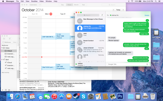
For someone used to older versions of OS X, the above interface may seem like a shocking change. But for people who have been exposed to newer versions of iOS, it will actually feel quite familiar. The use of translucency, the flatter interface, and the new system font all draw upon the design principles that were established with iOS 7. It's important to understand what is meant by that. Apple is not establishing a common interface across their devices. OS X and iOS are not the same, and Apple has shown no interest in making them the same. What they are doing is using the same method of design, and the same type of interface elements, to create an experience across those two different operating systems that feels seamless and unified without having to compromise one to fit within the limitations of the other.
I was a fan of Apple's design direction with iOS 7, and so the same has held true for Yosemite. The use of translucency allows the customization of your wallpaper to have an impact on the appearance of the entire operating system. The status bar, the Dock, Launchpad, and any other window that uses translucency can look very different based on the wallpaper that is chosen. Using the new interface tends to have an interesting effect on the user by revealing how dated many parts of the older interface had become. Even users who enjoyed the older design will quickly find themselves questioning how they ever used such a dated interface. It's the same reaction I observed when the iOS userbase moved to iOS 7.
Usability and UI Performance
When the new design of Yosemite was revealed at WWDC 2014, some users voiced concerns that the new design would reduce clarity due to its lighter weighted fonts and heavy use of blur and transparency. On a typical 23" 1080p monitor I haven't noticed any issues reading text that uses the new system font which seems to be a modified Helvetica Neue, but I can see how it may be an issue on non-retina Macbooks where the viewing distance from the display is smaller than a desktop monitor. The blur is also well implemented to preserve legibility. Only the currently active window has the blur effects and transparency enabled. These sections turn opaque when a window is not being used, which means there are not layers upon layers of blur making it difficult to read any text on top of it.
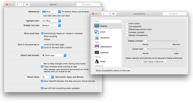
For those who do find that some of the new design choices affect their ability to read or see things, Apple does provide a number of options for accessibility and visual customization. New additions include "Reduce transparency" which removes the translucency effects across the OS, and "Use dark menu bar and Dock" changes the white translucent material in the status bar, the Dock, and Spotlight Search to a black translucent material similar to Notification Center. I tried using the dark mode but I quickly reverted to the original design because the dark menu bar and Dock looked out of place amongst all the white and grey in the rest of the interface.
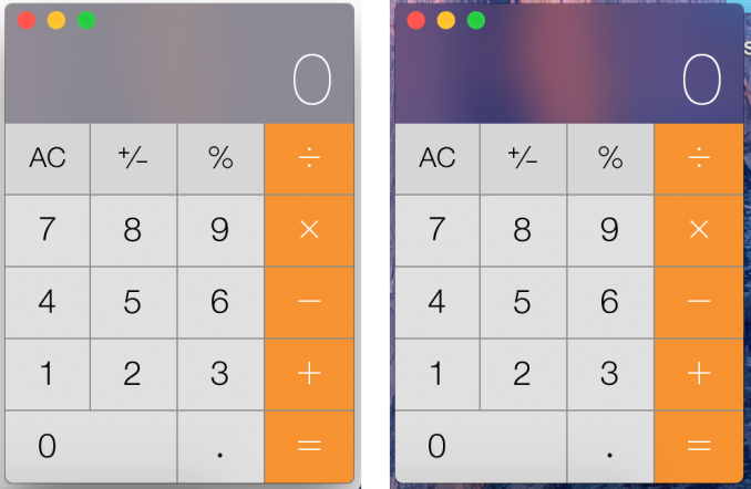
One issue I have observed with the blur is that windows will show the desktop wallpaper in addition to the applications between which should be blocking the wallpaper from showing through. As you can see above, despite me putting a completely opaque white box behind the calculator, there is still an area with an orange tint in the center. Removing the white reveals that the desktop has the same pattern. During the beta cycle the transparency would only display the wallpaper, and so there was a fix implemented but it introduced a problem of its own. I have seen complaints from other users about this issue, so hopefully it will be remedied in an upcoming update.
Performance is another area of concern with a new design and graphically demanding visual effects like translucency. I have noticed decreases in UI framerate compared to OS X Mavericks based on measurements with Quartz Debug. Overall the OS runs fairly well, but I would be lying if I said it didn't have its issues. Some scrolling lists will regularly drop to somewhere between 30 and 40fps. Scrolling performance in Notification Center is inconsistent, with performance closer to 60fps at some times, and closer to 30fps at others. The worst case I have encountered is the animation for Mission Control which has dropped as low as 5fps when many applications are open. Going forward it will be interesting to see how quickly and to what degree these issues are fixed by Apple.
Notification Center
Notification Center on OS X has been in a strange situation for a while now. While some features like Spotlight Search transitioned from OS X to iOS, Notification Center went the other way. It has never felt like it had much reason to exist, and it has lacked in features compared to its iOS counterpart. This was made even more evident when iOS 7 and OS X Mavericks rolled out. iOS received the new Today view with new widgets for apps like Calendar, Reminders, and Stocks, while on Mavericks the only change was the removal of the linen texture as Apple began to transition away from their old style of interface design.
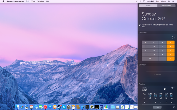
With iOS 8 and Yosemite we receive parity between the abilities and design of the two versions. With the new Yosemite interface being modeled on that of iOS, Apple has been able to bring the new translucent design of Notification Center to OS X, along with the new support for Today view and widgets. Notification Center is one of the best examples of the use of translucency to convey what parts of the interface are on a higher vertical plane than others. While in previous versions of OS X Notification Center pushed the desktop to the left, in Yosemite it simply comes in overtop of the desktop and even the Dock.
Today view gives Notification Center a greater purpose than it previously had. The ability to add widgets allows it to become a hub for getting key information at a glance, or performing quick actions. It's actually even more functional than on iOS because Apple has provided widgets for apps like Calculator which do not have widgets on iOS. A weather widget with a full forecast is also available to make up for the fact that OS X has no standalone weather app.
Because I always keep the dock visible, I can see what applications I need to check based on the red badge. As a result, I still don't use the actual notifications tab of Notification Center very often. But I do use the Today view to check what events I have coming up, what the current weather conditions are, and to do quick calculations using the Calculator widget. Overall I would say that Apple has done a good job with making Notification Center feel useful, and although not every part of it fits into the way I use my computer, I can still find ways to make use of it.
Spotlight Search
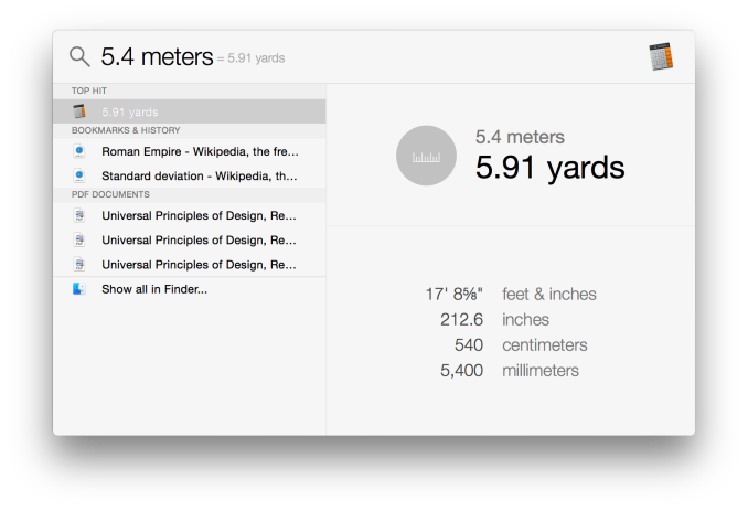
Spotlight receives some great improvements in Yosemite. I said in my iOS 8 review that I had never really used Spotlight on iOS because it didn't feel like it offered convenience or features that made it worth using. Apple's improvements actually made me start using it. The same was true of Spotlight on OS X. I had never used it until Yosemite rolled out with the new capabilities that Apple had built in. Spotlight on OS X has an even greater number of improvements than the iOS version, and it starts with the UI. The field for entering your search has gone from a tiny input field in the top right corner of your display to a large window that appears right in the center. This may sound obtrusive initially, but it is done this way because once you begin typing the window expands to the one you see below.
Spotlight now adopts a dual pane design, and it makes it infinitely more powerful and useful than its previous form which was a list of results situated in the top right corner of the display. The left side gives results from Safari, files on your Mac, applications, etc. The right side acts as a preview for what you have selected. This is really useful when trying to find a document when you aren't quite sure of the name, but know what you wrote in it. Rather than having to open every single document that could possibly be the one you're looking for, you can have Spotlight find all the documents with those keywords and you can preview them right in the window without ever having to go into the app itself.
Spotlight can also do quick conversions now. This feature is especially handy, and it's notably absent in the iOS version of Spotlight which shows there's still work to do in creating parity between the features that Apple has on both of their operating systems.
Overall, Spotlight search on OS X has some solid improvements and it's a good feature. It can be hard to get in the habit of using it if you previously ignored it on older versions of OS X, but it's a useful tool to have and I encourage anyone who uses OS X to take a look at it. You may be pleasantly surprised.
iCloud Drive and Photo Library
At WWDC 2014 Apple introduced a number of significant additions and improvements to their iCloud service for developers and consumers. On the user side we got iCloud Drive and iCloud Photos. Both of these features position themselves against the offerings from other companies in the increasingly competitive cloud storage space. Apple's advantage within their own ecosystem is how iCloud integrates with their own systems better than Dropbox, OneDrive, or Google Drive ever can. Integration cannot keep a service alive if it becomes stagnant though, and these two features are very necessary additions.
iCloud Drive
iCloud Drive is arguably the more important and interesting of the two features. In the past, iCloud has been something like a magic black box that users can never access or even look into. Files would be created in an application, sent to iCloud, and hopefully they would show up on your other devices. This type of model makes for a great document synchronizing solution, but it's not very good at some of the other things people have grown to expect from a cloud storage service. Apple had to build something that allowed users to manage their documents stored in iCloud, including the ability to add or remove files as needed without having to go into each individual iCloud enabled application.
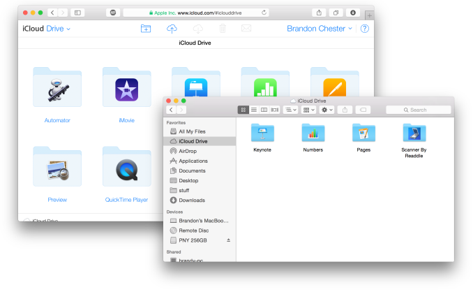
As a file storage service, iCloud Drive functions exactly how you would expect. You can make folders, and upload files to those folders which can be accessed on any other device with access to iCloud drive. In addition to those files, iCloud Drive also houses the files for any iCloud enabled application. As you can see above, each iWork and iLife application also has its files accessible in iCloud Drive, along with third party iCloud enabled apps like Scanner by Readdle.
Your drive can be accessed in a few different ways. In OS X it's integrated right into Finder and is listed in Favorites by default. Windows users can download Apple's iCloud Control Panel to have it accessible via Windows Explorer. I've avoided the Windows solution because my past experience is that having iCloud Control Panel do anything with to Windows Explorer will make it crash Windows Explorer. While I haven't experienced that while using the new Control Panel 4.0 for the purposes of this review, I still don't trust it.
The third method is to access it from iCloud.com. You would think that with these 3 options, including a web based option, Apple would have every platform covered. Unfortunately they don't. There is no way to directly manage iCloud Drive from an iOS device because iCloud.com displays a special page with links to get information on setting up iCloud and installing Find my iPhone. Applications that integrate with iCloud have the ability to open documents stored in iCloud Drive using the document picker, but there's no way to move or delete other files. I don't know if this is just an oversight or if Apple doesn't want it accessible via mobile but it is honestly a necessary feature and I hope to see it added soon either through an app or through iCloud.com on iOS.
iCloud Photos
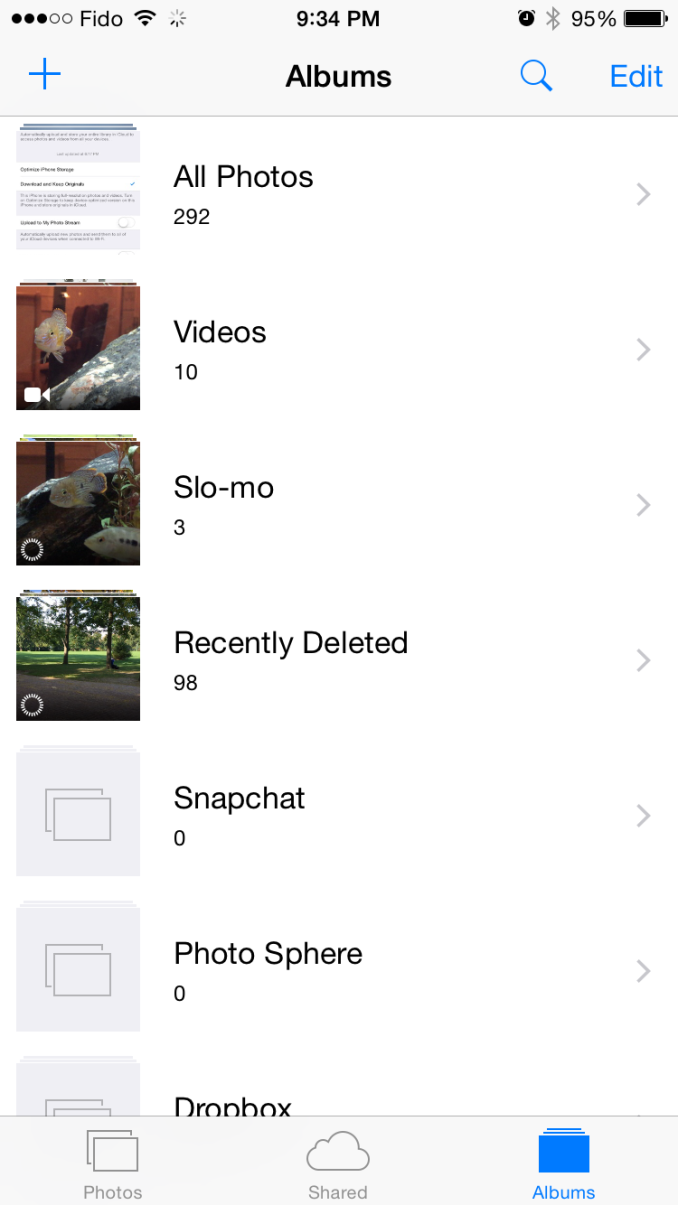
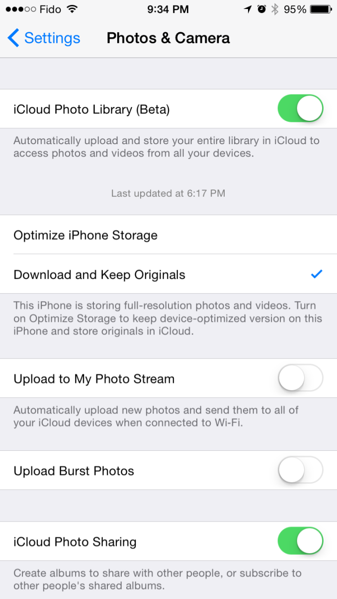
iCloud Photo Library was released with iOS 8.1 in the form of a public beta. I actually wrote about it in my initial iOS 8 review due to confusion regarding its availability. It was only near the end of Apple's beta cycle that they revealed SMS Forwarding and iCloud Photo Library would be arriving with a later release. On top of that, using the OS X Yosemite preview would cause the option to reveal itself on your iOS devices. As a result, my devices running the gold master build still had the feature and I was unaware that for most users it would not be accessible until October. But now October has come and we can take a closer look at iCloud Photo Library in its beta form. Users who want to try it out just need to opt into the beta in the Photos & Camera section of the Settings application. Doing so will change the name of Camera Roll to All Photos in the Photos app.
As I've stated before, iCloud Photo Library is not the same as Photo Stream. Photo Stream is really just a method of pushing your photos between all your devices. It relies entirely on local storage and the photos are removed from iCloud after 30 days. iCloud Photo Library keeps all of your pictures in the cloud, and keeps the most recent and frequently accessed ones locally on your device. This is often referred to as nearline storage. Users can also specify to download copies that are optimized for their display resolution which will save space compared to storing full resolution copies on local storage.
iCloud Photo Library is definitely a great feature, but right now the experience is missing a few key things. On iOS it works very well due to how the entire photo experience is within the Photos application. On OS X it's still lacking. Some people may feel it's unfair to criticize certain aspects due to the fact that the feature is technically a beta, but oversights need to be addressed for them to be fixed.
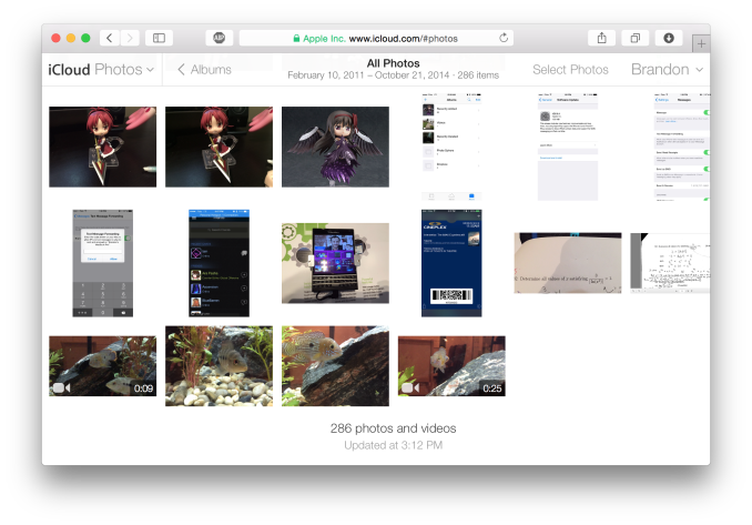
The biggest issue for me is that Apple's Photos application for OS X won't be shipping until early 2015. That's quite a long time after the initial release of Yosemite, and an even longer time after iOS 8 was released. This means that there is currently no way to access photos stored in iCloud on a Mac unless it is done through the web interface. It's an okay solution for now, but the web interface is nothing spectacular. It's essentially the iPad Photos app interface but in a web browser. My biggest issue with it is that it doesn't actually scale. The Safari window with iCloud Photos above is as small as you can make the window without introducing horizontal scrolling. Making the window larger doesn't show more photos on the screen, it just makes the thumbnails bigger. This contrasts with iCloud Drive's web interface which does scale the arrangement of folders based on the size and shape of the window.
There is definitely a lot of pressure involved in trying to ship two major operating system updates around the same time every year, and to pack in new features that work across both of them. Apple made it clear at WWDC 2014 that Photos on OS X wasn't going to be ready until 2015, but I think the issue created by that could have been addressed much better by updating iPhoto to support iCloud Photo Library rather than relying on the web interface.
Continuity
By far the most exciting features that Apple has created this year are part of continuity. Continuity is essentially an umbrella term for all the features that allow iOS and OS X devices to work together. Apple has always had some degree of integration and commonality, but continuity is really the first time Apple has really taken advantage of the ecosystems they have created and brought customers into. The key word there is ecosystems. Going forward, the power of a product and service ecosystem is going to be a key point of differentiation between companies that make their own software and those that piggyback off of another platform.
Unfortunately, users who only have a single device or have products spread out across many companies and operating systems are unable to take advantage of these sorts of features. The topic of platform lock-in is a complicated one and could spawn a whole article in itself, so I won't go into detail with it. What Apple users need to know about continuity is they need to have two or more supported devices. The heavily connected continuity features like Handoff and Airdrop will require Bluetooth 4.0 support which limits devices on the OS X side to Macs released in the last few years. Apple has also disabled Handoff on the 2011 MacBook Airs and 2011 Mac Mini despite their support for Bluetooth 4.0. iOS users will need an iPhone 5 or later, iPad 4th generation / Mini 1 or later, or the iPod Touch 5th generation. Like with Airdrop, the iPad 3 is left out when it comes to Handoff support, but it does support SMS and Call Forwarding.
Handoff
Handoff is the big star of the show when it comes to leveraging the power of an ecosystem and controlling the software on every device you sell. It allows you to start tasks on one device and continue them on another, provided the application supports it. As of right now the list is as follows, but it will continue to expand with both Apple's applications and third party ones from developers implementing Handoff into apps that have versions for both OS X and iOS.
- Safari
- Contacts
- Calendar
- Reminders
- Maps
- Messages
- Pages
- Numbers
- Keynote
The way Handoff works depends on which direction you're going. As you can see above, when transitioning from an iOS device to a Mac an icon will appear on the side of the dock which will show the currently active application on the iOS device if it supports Handoff. I don't have multiple devices to test this, but I would assume a second icon appears if two iOS devices are close and have open applications that support Handoff.
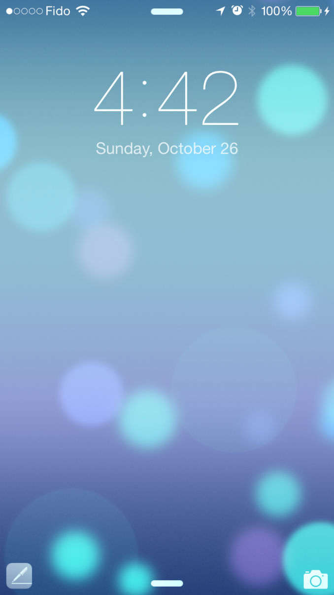
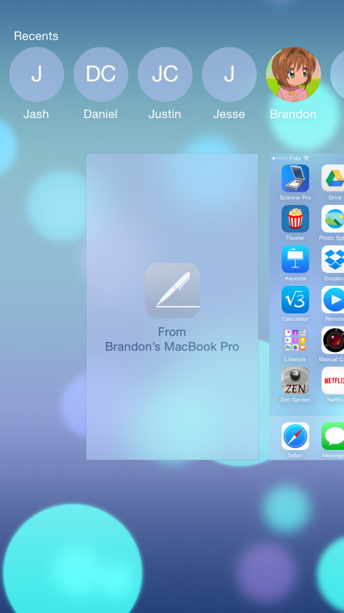
Going from OS X to iOS or from one iOS device to another has two ways of handing off an application. The first is via the lock screen, where an icon will appear in the bottom left corner of the display. Swiping upward will take you to the spot in the application open on your other device. It should be noted that if you have a passcode or Touch ID enabled you will still need to authenticate before it takes you to the app. The second method is from the app switcher, where any application waiting to be handed off will appear to the left of the homescreen.
Once you know how to use Handoff, it's very simple and can be quite useful. Tapping on the Handoff section on your iOS or OS X device brings you into the exact spot in the application you were working in on another device. With applications like Pages and Keynote it even remembers your cursor position and current selection which means you can literally begin to type a word on one device and finish it on the other without having to go to where you were on that page. SMS Forwarding in iOS 8.1 also resolves the issues with Handoffs that involved transitioning from Messages on an iPhone to another device when inside an SMS thread which previously would not have existed on the other device.
Instant Hotspot
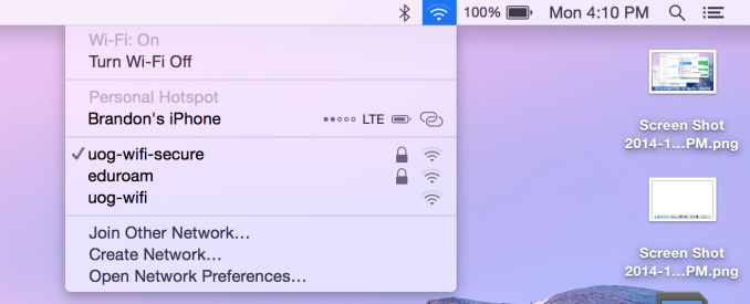
Instant hotspot is one of those small but thoughtful features that may seem like a novelty but can actually prove to be quite helpful and convenient. All it is is the ability to tether to your iPhone or cellular iPad to your Mac without ever having to configure it, or put in a password, or even take it out of your bag or pocket. The feature uses Bluetooth 4.0 for discovery and makes sure that both devices are connected to the same iCloud account. Selecting the device automatically enables the Personal Hotspot feature, and disconnecting automatically turns it off to conserve battery life.
This is a really great feature for MacBook users in an area where there's no WiFi available. There's no need to take out your phone, navigate through Settings to the Personal Hotspot option, enable it, and then connect on your computer. Everything you need is right there in the WiFi menu, along with information about your device's reception and battery life so you can decide if you have the necessary battery charge and signal.
Calls On Your Mac and iPad
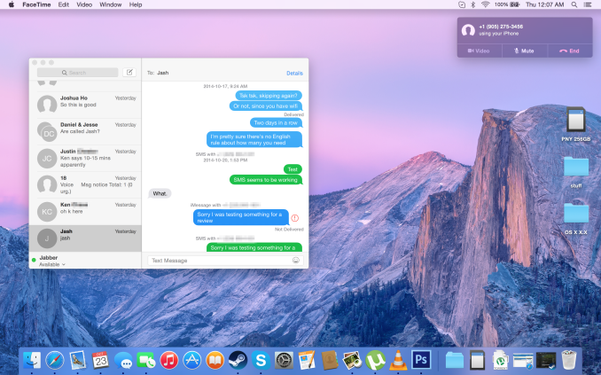
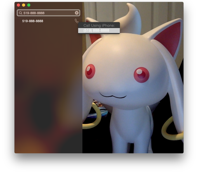 Using a Mac or an iPad for phone calls has a few more requirements than SMS, due to the greater speed required to audio compared to text. Both devices must be connected to the same WiFi network, and signed into the same Apple ID. To enable the feature the user must enable the iPhone Cellular Calls toggle in the FaceTime section of the iPhone settings application. It may seem odd that this setting is stored in the FaceTime menu rather than the Phone menu, but this is because of how Apple has integrated the feature into the FaceTime applications on the iPad and on OS X rather than building a separate Phone application. This works well and on the iPad there are no glaring issues. On OS X there is one oversight, which is that there is no dialer available to the user once a call has been made which prevents the use of extensions, or navigating menus without picking up your iPhone to do so.
There are lots of reasons why a user would want to disable the cellular call support on their devices. For example, having your computer or iPad ring isn't really necessary if you have an iPhone dock on your desk. Disabling the feature on an iPad is as simple as disabling the switch in the FaceTime section of the Settings application. It's a bit more hidden on OS X. Users will have to open FaceTime, and then disable it from the Preferences menu for FaceTime that is accessible from the menu bar.
For those who do want it enabled, I've found that in practice the feature works, and it works well. I haven't encountered any issues with audio quality or delays. I don't receive many phone calls, but when I do I find myself answering them from my computer rather than my phone. However, I still make outgoing calls from my iPhone. Making phone calls from the computer will likely require more behaviour adaptation than receiving them because of the notification you receive with incoming calls. Having an actual dialer would help too.
SMS Forwarding
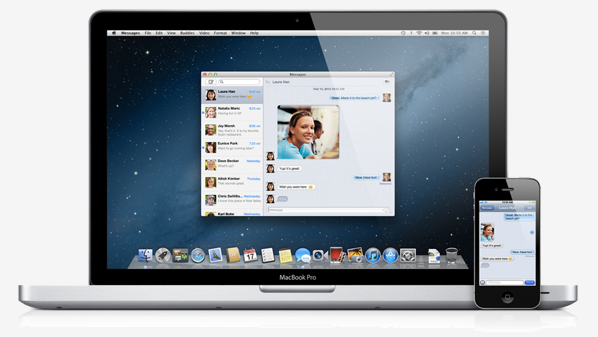
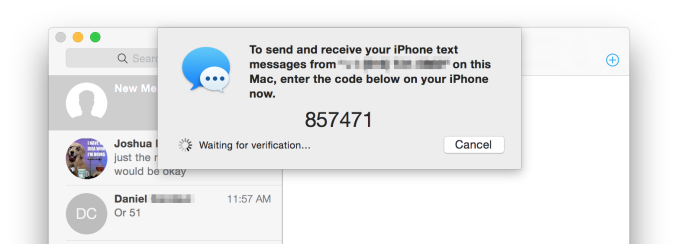
SMS Forwarding was a long desired feature. Having iMessages sync between devices has always been a great feature, but SMS was left out which meant that conversations with non-Apple users were confined to the iPhone. With OS X Yosemite and iOS 8.1, Apple has enabled the ability to send and receive SMS messages across all of your Apple devices. Enabling it is fairly simple. The Messages section of the Settings application has a new subsection called Text Message Forwarding. Inside is a list of all devices associated with your Apple ID, and flipping the slider on one brings up a keyboard and an input field with instructions to enter the code that will be displayed on that respective device. Once this is complete, SMS message support will be enabled on that device. Below is an image of the security code displayed in the Messages app on OS X when enabling SMS Forwarding.
Contrary to what you may read from other sources, SMS Forwarding does not require devices to be on the same WiFi network or to have Bluetooth enabled. To test this, I disabled Bluetooth on a computer running OS X Yosemite, and connected it to a WiFi network. I also took an iPhone 6 and disabled both Bluetooth and WiFi. I then went very far out of both WiFi and Bluetooth range. I sent a text message and then promptly switched off the iPhone. When I had returned to my room, the SMS message was displayed in the OS X messages app, which means it had to have been transferred by another method.
So what is the method of transfer? Well, there is one requirement to use SMS Forwarding. A device must have iMessage enabled. This confirms my suspicions from the original iOS 8 review that the feature works by sending iMessages silently to and from the iPhone, and SMS messages are then sent to the proper phone number.
This is honestly the most sensible way to go about implementing this sort of feature. Leveraging iMessage means that Apple can avoid having synchronization issues with the SMS messages. A system where messages were transmitted over a Bluetooth LE or WiFi direct connection would mean that any SMS messages sent or received when not in proximity to the iPad or Mac would not show up on those devices. It would be a poor user experience.
Once your setup is complete, you're ready to go. SMS messages can be sent and receives in the Messages app. All phone numbers not associated with iMessage will now default to an SMS message thread, and threads that contain both SMS messages and iMessages will now display both in the same style as the iPhone. This is definitely my favorite feature in iOS 8.1 and Yosemite, because it lets me respond to SMS messages without interrupting my workflow.
Apple's Foray Into Payments
Apple has made two announcements this year that show an expansion into areas outside of the technology industry. The first was Apple Watch, which is most definitely a technology product but looks positioned against the current premium watch industry just as much as against current smartwatches on the market. The second was Apple's foray into the payment industry, Apple Pay. While Apple Watch won't be around until next year, Apple Pay is here right now with one caveat. Apple Pay currently only works in the United States, or more specifically, only with a credit card issued by a United States bank. However, the service will eventually be expanded to support cards issued by banks in other countries.
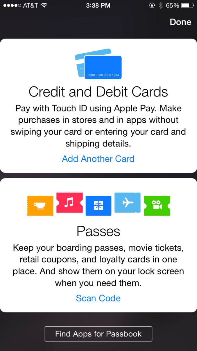
How Apple pay works is fairly straightforward, that's the entire point of it. If the region on your device is set to the United States, the passbook app will contain a card that allows you to add a credit or debit card. You can then either type your info in, or use your camera to get the information from the card. Once the card is verified by your bank, you will have a card that appears in passbook and you're ready to start using Apple Pay. From the user's perspective, Apple Pay is simple and easy to use. But what goes on behind the scenes to keep everything secure can be quite complicated.
Security
The first thing to know is that your credit card information is never stored on the phone. Upon adding a credit card, the information is encrypted and sent to the appropriate issuing bank which confirms that the card is valid. A token is then sent back to the iPhone and stored in the secure element, which is essentially just an internal smart card chip. This token, not your credit card number, is what is used during payments. Apple's marketing and technical material refers to it as a Device Account Number. The token itself resembles a credit card number, but the only similarity between it and your card is the 4 digits on the end.
The use of tokens is where much of the security of Apple Pay comes from. By removing the actual credit card number from the equation, the merchant you're paying never gets to see your credit card number, security code, or your name. The token presumably is also only linked to the actual credit card via some database held by the bank, rather than some sort of equation that could be reverse engineered. This means that even in the event where a merchant is hacked and your token number shows up, it is entirely useless because it does not function as a credit card and is tied to the iPhone it was used on.
Beyond the overarching security, there's additional security at the time of payment. It begins with the use of Touch ID for authorizing payments. Although Touch ID launched with the iPhone 5s which does not have the necessary NFC hardware to use Apple Pay, I believe that this sort of service was the original goal when Touch ID was first being created. Paying with Apple Pay requires using Touch ID to verify your fingerprint. This prevents anyone from making purchases using your iPhone if it is lost or stolen.
One thing to note is that Apple Pay is not just a service for making purchases in stores. It also works for making purchases at online retailers than integrate it into their applications. All the security features that I've described apply to both in-store and online purchases, so there's no compromises on either side.
Going Forward
Making Apple Pay successful is going to take a lot of work on both Apple's part and on the part of retailers. Currently the service only works with cards from US banks, leaving out the rest of the world. Apple needs to expand the service much quicker than competitors have done so with theirs. For example, Google Wallet remains a US only service over 3 years after its initial launch. Apple Pay is not going to achieve success if it ends up in the same situation. Apple has given no timeframe for expansion to other countries, but if the iPhone 6 and 6 Plus get replaced by newer models before Apple Pay expands outside the US it will be a worrisome situation.
Apple also needs to convince retailers to support the service. The list of supported merchants on the Apple Pay section of their website has grown since its initial launch, and if Apple Pay is ever going to be a viable way to make everyday purchases that list needs to continue to grow. Work by banks to increase adoption of NFC capable terminals will also speed up this process, as Apple Pay works with existing NFC enabled checkouts. Apple also faces resistance from retailers that are partnered with other payment systems. Recently there have been reports that merchants who support the CurrentC mobile payment standard are disabling NFC on the payment terminals in their stores to block Apple Pay. I don't believe this will be an issue in the long term because consumers will realize when companies are prioritizing their own agenda over the customer's experience and they'll go to other retailers. If Walmart won't support Apple Pay and a customer wants to use it, they'll just go to Target instead.
As someone who doesn't live in the United States, I'm hopeful that the service will expand to Canada before this iPhone becomes obsolete. There are many obstacles in the way, but Apple appears to have put more effort into working with banks and merchants to get the service off the ground than any of the other mobile payment services we have today. How things play out will only be revealed with time.
Conclusion
It has definitely been a busy few months in the Apple world. September delivered the iPhone 6 and 6 Plus, along with iOS 8, and a preview of the still mysterious Apple Watch. This month we got the iPad Air 2, the iPad Mini 3, the iMac with Retina 5K display, iOS 8.1, Apple Pay, and OS X Yosemite. Those last three points are some of the most interesting, and they all happen to be part of Apple's software ecosystem. I don't think that's a coincidence. We're reaching a point where it's becoming more and more difficult to differentiate your products based on hardware alone. Great software driving a great experience is where the focus needs to be moving forward.
Apple's strategy to provide that experience appears to be deep integration of their services across all of their product lines. It starts with the cloud, with new additions to iCloud like iCloud Drive and Photo Library. From there it goes to software commonality, with a design language that exists on both iOS and OS X, and applications that exist on both platforms. On the opposite end of the spectrum from the cloud are the new continuity features which provide integration between all the devices that you have right there with you. SMS Forwarding and iPhone call transferring expands communication on iPad and the Mac to new areas, while Handoff makes the transition between applications seamless and accurate right down to where your cursor was.
What interests me the most about Apple's stategy is how it provides incentive for a user with one Apple device to buy other Apple devices. This exists to a certain degree with other manufacturers as well. If you own a Samsung smartphone, you may be more inclined to buy a Samsung tablet due to the similar hardware design and user interface. But apart from any brand loyalty you feel, you don't really have any incentive to buy a Samsung laptop which runs Windows and doesn't integrate with your other devices. Apple's integration covers their entire lineup of devices. An iPhone user has a lot to gain by choosing a MacBook over a Windows Ultrabook, and an iPad over a Nexus 9. It would be interesting to analyze what percentage of people purchasing a new Apple device already own one or more Apple products.
Overall, I'm happy with the work that Apple has done with iOS 8.1 and OS X Yosemite. It's clear that a lot of this has been in the works for some time now, and integrating products and services to this degree requires a lot of planning to position your hardware and software so that it will be capable of working together in the ways you want them to. The Yosemite redesign has also gone quite well, and there aren't as many jarring inconsistencies as there were with iOS 7 at launch despite OS X being a more expansive operating system. Apple has definitely learned from their experiences with the iOS redesign. That being said, there is still a lot of work to do. Apple Pay needs to expand rapidly, and iCloud Photo Library isn't as far developed as I had expected it to be.
It's hard to say where Apple will go as we move forward. It will be hard to outdo the work that has been done with Yosemite. However, history tells me that there are still great things yet to come from Apple. It seems that year after year Apple is able to make updated products and proclaim them to be the biggest advancements in that product's history, and regardless of my initial reaction, I somehow always find myself agreeing .

