Original Link: https://www.anandtech.com/show/7157/asus-pq321q-ultrahd-4k-monitor-review
ASUS PQ321Q UltraHD Monitor Review: Living with a 31.5-inch 4K Desktop Display
by Chris Heinonen on July 23, 2013 9:01 AM EST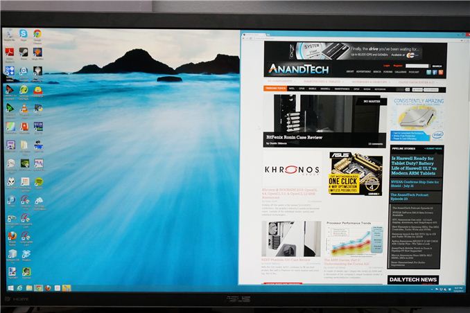
Many consider me to be a 4K hater. The past few trade shows I’ve attended have been pushing it on consumers to replace their TVs, but I see less value in it. When it comes to a computer display, it is a different game. Unlike a 50” TV, we sit close to our monitors, even if they are 30” in size. We also have no worries about a lack of native content, since everything is rendered on the fly and native. There are no issues with the lack of HDMI 2.0, as DisplayPort 1.2 can drive a 3840x2160 screen at 60 Hz.
When it comes to 4K on the desktop, my main question is: how much difference will I see? ASUS is one of the first with a HiDPI display in the PQ321Q. While not truly 4K, it is a 3840x2160 LCD display that can accept an Ultra High Definition (UHD) signal over HDMI and DisplayPort. It also clocks in at a wallet-stretching $3,500 right now. The question is, are we seeing the future with displays here, or are we seeing a niche product?
What does 4K/UHD/HiDPI bring to the desktop? We’ve seen it for a few years now in smartphones and tablets, making their smaller screens more usable for reading and general work. My initial thought is more desktop space, as that is what it has meant before. With a 32” monitor and a pixel density this high, running it without any DPI scaling leads to a desktop where reading text is a huge pain. Instead I believe most users will opt for DPI scaling so elements are larger and easier to read. Now you have something similar to the Retina screen on the iPhone: No more desktop space compared to a 2560x1440 monitor, but one that is razor sharp and easier to look at.
To get to this pixel density, ASUS has relied upon a panel from Sharp that uses IGZO technology. IGZO (Indium gallium zinc oxide) is a material that replaces amorphous silicon for the active layer of an LCD screen. The main benefit is higher electron mobility that allows for faster reacting, smaller pixels. We have seen non-IGZO panels in smartphones with higher pixel densities, but we don’t have any other current desktop LCDs that offer a higher pixel density than this ASUS display. IGZO also allows for a wide viewing angle.


ASUS has packed this LCD into an LED edge-lit display that only extends to 35mm thick at the maximum. Getting to that thinness requires a power brick instead of an internal power supply, which is a trade-off I’d rather not see. The 35mm depth is very nice, but unlike a TV most people don’t mount a desktop LCD to the wall so I’d take the bulk to avoid the heavy power brick. It does lead to a cooler display, as even after being on for two consecutive days the PQ321Q remains relatively cool to the touch. The power brick itself is quite warm after that period.
Unlike most ASUS displays that click into their stand, the PQ321Q is screwed in with four small screws. This seems to be another attempt to cut down on the thickness of the display, as that mounting mechanism takes up space, but I like the quick release that it offers. Inputs are provided by a single DisplayPort and a pair of HDMI 1.4a inputs. In a nice touch these inputs are side mounted, instead of bottom mounted, making It easy to access them.


Be aware that HDMI 1.4a is really not designed around UHD/4K resolutions, and so your maximum frame rate is only 30p. If you’re watching a 24p film it won’t matter, but there is no real source for those right now anyway. HDMI 2.0 is supposed to resolve this issue, but that was promised at CES this year, and I think we’ll be lucky to see it at CEDIA in September.
One area that the ASUS falls a bit short in is the On Screen Display (OSD). While clear and fairly easy to work in, it takes up most of the screen and you can’t resize it or reposition it. Moving to 4K might have required a new OSD to be developed and it just isn’t totally refined yet, but it needs some work. It isn’t awful as it’s easy to work in, and offers a user mode with a two-point white balance, but it isn’t at the top of the game.


The full specs for the ASUS are listed below. Once this beast is unboxed, lets set it up.
| ASUS PQ321Q | |
| Video Inputs | 2xHDMI 1.4a, 1xDisplayPort 1.2 with MST |
| Panel Type | IGZO LCD |
| Pixel Pitch | 0.182mm |
| Colors | 1.07 Billion |
| Brightness | 350 cd/m2 |
| Contrast Ratio | 800:01 |
| Response Time | 8ms GTG |
| Viewable Size | 31.5" |
| Resolution | 3840x2160 |
| Viewing Angle (H/V) | 176/176 |
| Backlight | LED |
| Power Consumption (operation) | 93W |
| Power Consumption (standby) | <1W |
| Screen Treatment | non-glare |
| Height-Adjustable | Yes, 150mm |
| Tilt | Yes, -25 to 5 degrees |
| Pivot | No |
| Swivel | Yes, -45 to 45 degrees |
| VESA Wall Mounting | Yes, 200mm |
| Dimensions w/ Base (WxHxD) | 29.5" x 19.3" x 10.1" |
| Weight | 28.7 lbs. |
| Additional Features | 3.5mm Input and Output, 2Wx2 speakers |
| Limited Warranty | 3 Years |
| Accessories | DisplayPort cable, USB to RS232 adapter cable |
| Price | $3,499 |
If you are going to use the ASUS PQ321Q, you’re going to want DisplayPort 1.2 support. HDMI will work, but it’ll be choppy with its 30Hz refresh rate. If you have a video card with dual HDMI 1.4 outputs, you can use both of them to drive it at 60Hz if your video driver supports it. DisplayPort 1.2 allows for Multi-Stream Transport (MST) support, letting you drive two displays with a single DP cable. But why does that matter if the ASUS is your only monitor? Because to get the full 60Hz refresh rate out of it, DisplayPort needs to see it as a pair of 1920x2160 monitors that each get their own signal.
The ASUS has MST mode disabled by default. With my NVIDIA GTX 660 Ti I had to manually enable it in the monitor for it to turn on. I’ve been told that with ATI or Intel GPUs over DisplayPort 1.2 it is automatic, but I don’t have those to test with. Once enabled, it quickly went from 30 Hz to 60 Hz while staying at 3840x2160 resolution.
Since I run multiple displays like most people, this seemed to be an ideal time to test out Windows 8.1 and its ability to offer individual DPI scaling on monitors. For this test I used the ASUS PQ321Q, connected over DispayPort, and a Nixeus VUE 30 (review forthcoming) connected over DVI running at 2560x1600. With a single universal setting, you use a percentage setting for scaling in Windows 8.1. With individual control, you use a slider more like on a Retina MacBook Pro. The percentage is hidden, which I dislike. I don’t understand why we have a different way to select the scaling level if you have two monitors versus one. Perhaps it is a beta issue, but I think they should be uniform.
Moving beyond that, when I attempted to scale the PQ321Q, I had an image that was still fuzzy instead of sharp. Thankfully a driver update (as 4K MST panels are new) fixed this issue quickly. The independent display scaling in Windows 8.1 still didn’t work the way I wanted it to. The choices are unclear, including which monitor you are adjusting, and I never could get it setup exactly how I wanted it. I wound up setting it to 150% for both displays and dealing with my 27” running with larger icons than I prefer.
Now I have an effective 2560x1440 desktop, only everything is sharp. Amazingly sharp. It is like moving from my iPhone 3G to the iPhone 4 and its retina screen. The text as I write this in Word is crisp and clear, and editing gigantic spreadsheet in Excel is much easier when the cells are so easy to read. Unfortunately not every application in Windows plays well with DPI scaling.
Chrome is scaled 150% as Windows asked, but it is hazy and blurry. Disabling DPI scaling for the application and then scaling to 150% inside Chrome produces crisp, clear text. Firefox also didn’t scale automatically, but it has a setting to adjust to make it follow the Windows DPI scaling rules. Once set, Firefox looks very nice and crisp. For most people, that setting should already be set to follow DPI scaling.
Finding a chat client that works well is a challenge. Both Pidgin and Trillian don’t do DPI scaling and are fuzzy by default. Another app that had issues is Steam. Right-clicking in the System Tray icon brought up a menu in the middle of the screen, where it would be without DPI scaling. The reality is that some apps are great and support DPI scaling, and some need work, just like when the retina MacBook Pro was released. Evernote looks great, but Acrobat is a fuzzy mess. This is all a bit of growing pains, but I find myself disabling DPI scaling on applications that don’t support it because I prefer tiny and sharp to fuzzy and large.
Because the 2560x1440 resolution is what I’m used to with my usual 27” monitor, I found there to be no real difference in how I used the ASUS monitor. I typically split items to different sides of the screen, with Word on the right and Evernote on the left as I type this. The application that benefitted for me was image editing. Being able to fit more on the screen, or zoom in to higher levels, made working with images on the ASUS better than on a 27” of the same effective resolution. I don’t do that much image editing, but for the work I have done it has been wonderful.
You’ll also quickly find out how much people need to go back and fix up programs or websites to use images and text separately. Text combined in an image scales very poorly, but is often easier than doing proper layout for two separate elements. I feel a bit bad for all the developers that need to go back to fix everything to work with high-DPI screens, but that time has come.
The only way to sum up daily use of the ASUS PQ321Q is “awesome”. It’s not perfect, but much of that is the fault of Windows or other programs and websites. When you have something that can scale and look correct, it is amazing how much the extra pixel density and sharpness helps. Yes, this is the future for displays, and we are entering the transition period to get there.
Since the ASUS has a pair of HDMI inputs, but there is effectively no 4K HDMI content right now, the performance of the internal scaler is essential to know. To test it, I use an Oppo BDP-105 Blu-ray player and the Spears and Munsil HD Benchmark, Version 2. The Oppo has its own 4K scaler so I can easily compare the two and see how the ASUS performs.
First off, the ASUS is poor when it comes to video processing. Common film and video cadences of 3:2 and 2:2 are not properly picked up upon and deinterlaced correctly. The wedge patterns are full of artifacts and never lock on. With the scrolling text of video over film, the ASUS passed which was strange as it fails the wedges. It also does a poor job with diagonals, showing very little if any filtering on them, and producing lots of jaggies.
Spears and Munsil also has a 1080p scaling pattern to test 4K and higher resolution devices. Using the ASUS scaler compared to the Oppo it had a bit more ringing but they were pretty comparable. This becomes very important for watching films or playing video games, as you’ll need to send a 1080p signal to get a 60p frame rate. 24p films will be fine, but concerts, some TV shows and some documentaries are 60i and would then appear choppy if sent at 4K over HDMI.
Brightness and Contrast
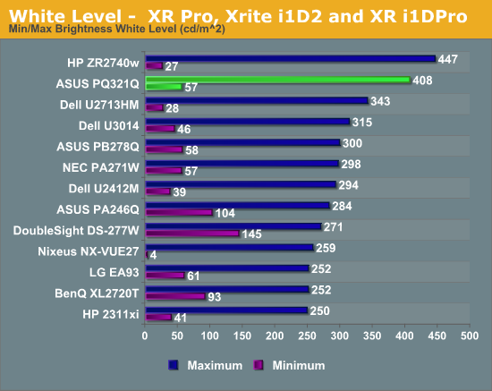
In our preview of the PQ321Q, we looked at how it performed out of the box with the default settings. What we did see is that the PQ321Q can get really, really bright. Cranked up to the maximum I see 408 cd/m2 of light from it. That is plenty no matter how bright of an office environment you might work in. At the very bottom of the brightness setting you still get 57 cd/m2. That is low enough that if you are using it for print work or something else in a darkened room the brightness won’t overwhelm you.
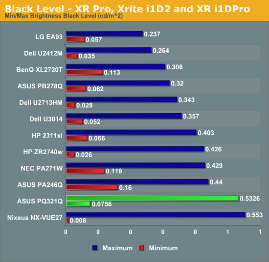
The change to IGZO caused me to wonder how the black levels would behave on the ASUS. If energy flows far more freely, would that cause a slight bit of leakage to lead to a higher black level? Or would the overall current be scaled down so that the contrast ratio remains constant.
I’m not certain what the reason is, but the black level of the PQ321Q is a bit higher than I’d like to see. It is 0.756 cd/m2 at the lowest level and 0.5326 cd/m2 at the highest level. Even with the massive light output of the ASUS that is a bit high.
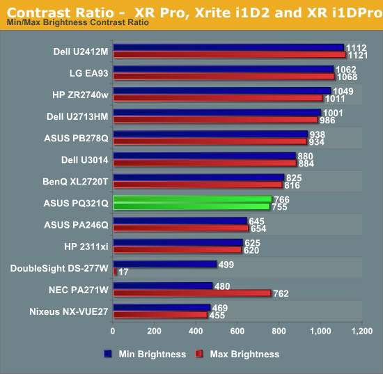
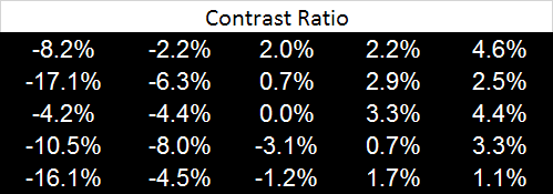
Because of this higher black level, we see Contrast Ratios of 755:1 and 766:1 on the ASUS PQ321Q. These are decent, middle-of-the-pack numbers. I really like to see 1,000:1 or higher, especially when we are being asked to spend $3,500 on a display. Without another IGZO display or 4K display to compare the ASUS to, I can’t be certain if one of those is the cause, or if it is the backlighting system, or something else entirely. I just think we could see improvements in the black level and contrast ratio here.
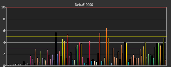
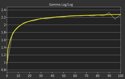
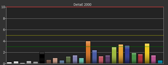
After I published the initial grayscale dE2000 results for the PQ321Q, there was a lot of feedback over the quality of the numbers. The simple fact in the end is that only two of the numbers rose above the visual threshold of a dE2000 of 3.0. Yes, I would really like to see an average dE2000 of 1.0 or less, but the point of dE2000 is to tell us if we can see an error or not. With the exception of pure white, and even then just barely, the PQ321Q should look incredibly neutral without any calibration done to the grayscale. The gamma also tracks the 2.2 target very well, which will help to make up for the lack of depth in the black level.
Of course we want to calibrate the PQ321Q to see what it can really do. If you are buying a $3,500 display, you can likely buy, or rent, calibration gear to get it dialed in if you really care about image quality. And if you do, you are in for a treat.
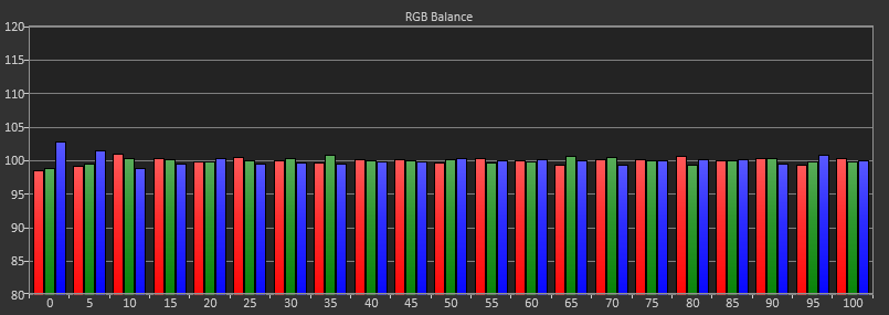

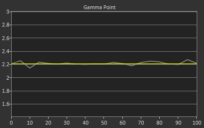
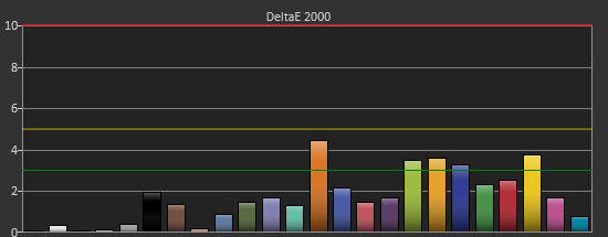
Post-calibration, our dE2000 average is now 0.56. We see every error below 2.0 except for 0, which really doesn’t matter anyway. There is no color shift, and the gamma tracks along 2.2 almost perfectly. Our contrast ratio has taken a small hit, down to 704:1 as it has to manipulate the peak white level to be more accurate. What we see now is a grayscale image that is basically flawless.
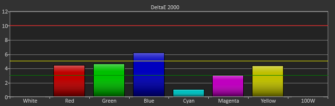
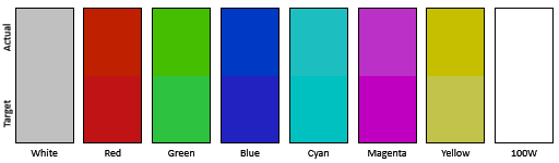
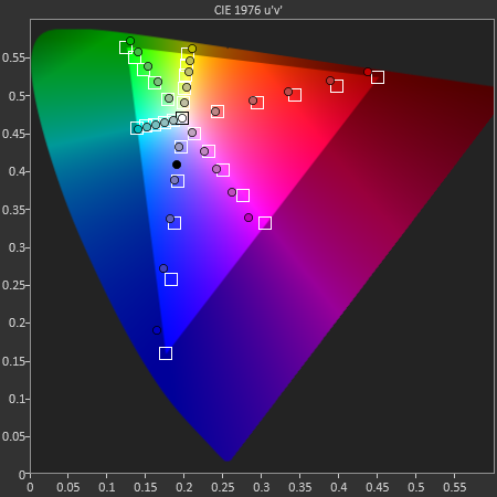
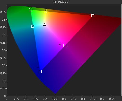
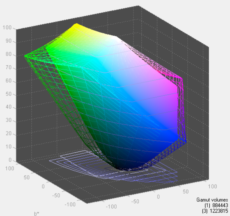
With color the PQ321Q has a pair of issues. The first issue is undersaturation in the gamut when it comes to red and blue. This also causes Magenta to be undersaturated, and brings out some high dE values for 100% saturations on those colors. We also see that green and red fall outside the sRGB gamut triangle. This too is unfortunate as it pushes yellows and oranges outside the gamut, and causes errors there. Our Cyan value is almost perfect, but every other color has some issue on the PQ321Q, at least at 100%.

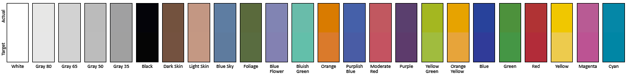
The reason we don’t just stop with the gamut charts is because they only represent 6 colors out of millions. They might have a large error, but it is rare to see 100% saturated colors in real content like photos or movies. To test this we use the Colorchecker chart in CalMAN. We’ve always used the Gretag Macbeth chart, which has 24 common colors on it. SpectraCal has added a 96-sample chart to the newest version of CalMAN. This adds more skin tones and other colors, and will provide a more accurate indication of monitor performance. The color samples for it are taken from an XRite chart. I’m going to run them both for a few reviews to see how it goes, but more samples leads to better accuracy, and lets us pinpoint exactly where things are going bad.
On the PQ321Q the issues all come back to Red/Orange/Yellow shades. Skin tones are good, blues and purples and cyans are all decent, and blue-greens are nice as well. Those tones that fall outside of the triangle cause the dE2000 average to rise way, way up and show us where the issues are. Reds certainly have a good amount of pop on the ASUS, and there really isn’t a good way to bring them back in. This issue is the largest one with the ASUS PQ321Q, as that extra gamut can’t really be addressed.
Traditionally if you look at the standard gamut dE2000 chart and see a large error in red, that indicates you will have issues with skin tones and people looking sunburned, With the larger Color Checker chart, we see that this is not the case, and that skin tones are, for the most part, under control while orange and yellows are not. This extra data helps us realize where the ASUS will look correct and where it will fall short.
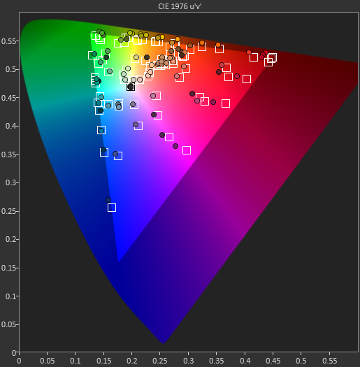
With the saturations charts, we see that the errors start small, like usual, and get larger as you move towards the edge of the gamut. Blue has the largest error, though we are less sensitive to blue than other colors. Cyan again remains great, and it would be nice if every color had the same performance as it does.
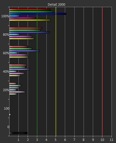
Post-calibration the ASUS is a bit of a mixed bag. We get great grayscale and gamma performance, but most people don’t just deal in black-and-white content. The color gamut provides a bit of an issue being both under-saturated and out-of-gamut at the same time. Looking through images the issue that pops out to me is the yellows. They really pop off the screen and look too bright. The color of reds looks slightly off, but yellow has the biggest issue that I can see with my eyes.
Given the lofty price tag, there is a good chance the ASUS PQ321Q is targeting graphics and print professionals, so meeting the sRGB standards of 80 cd/m2 and its custom gamma curve will be important.
Looking at the grayscale first, sRGB is just as good as our 200 cd/m2 target is. The gamma is virtually perfect, and there is no color shift at all. The contrast ratio falls to 667:1, which I expected as the lower light output leaves less room for adjustments. Graded just on grayscale and gamma, the PQ321Q would be perfect.


As soon as we get to the gamut, we see the same issues here as I expected to. That gamut is just a little off which gives us some noticeable dE2000 errors at 100% saturations for all colors.

Here with the color checker charts, we see a large difference between the Gretag Macbeth results and the 96-sample results. The error rises from 1.62 to 2.05 as we are sampling more orange/yellow shades that fall outside of the gamut. Nothing really different than the last calibration, so the same issues apply.


The saturations are also identical to see here. They start out with small errors but by the end, every color except for Cyan is showing a noticeable error at 100%.

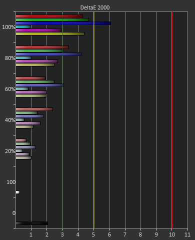
For 200 cd/m2 and a gamma of 2.2 or for 80 cd/m2 and the sRGB gamma, the ASUS PQ321Q performs almost equally. The grayscale and gamma are perfect, but the gamut has some issues. Once we start to see more displays using this same panel, but different electronics and possibly different backlights, then we can determine what is causing this shift in the gamut. With the initial target for the ASUS likely being professional designers, these errors seem a bit out-of-place.
Uniformity is tested by using 25 locations across the screen and measuring the color checker chart at each of them. From there we can pull out contrast, black and white uniformity, and color uniformity. This review is the first to utilize the newest measurement available in CalMAN 5.1.2: dE From Center. Now instead of measuring the dE2000 at every location, we measure it relative to the center measurement.
This gives us a true uniformity measure. I could measure the left side and the right side of the monitor and get a dE2000 of 2.0 for each side. What that doesn’t tell me is that the left side might be red tinted, and the right side blue tinted, while the center might be green tinted. In this case they could all measure the same dE2000, but look totally different. By comparing the measured values to the center, we get an actual measurement of if one area of the screen will look the same as another area. Since we always use the center of the screen as our calibration target, which is why everything is measured relative to that.
Starting out with White Uniformity, we see decent but not amazing results. The panel stays within +/- 10% for the center, but falls down to a 17% variation at the edges. The light fall-off is relatively high, and makes me wonder if the look of the panel, and its thin design, might place a bit of emphasis on style over substance.
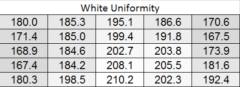
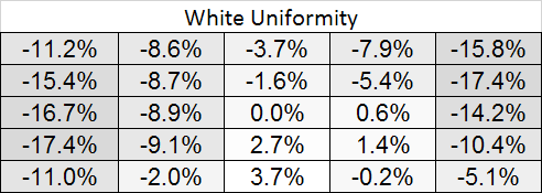
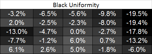
With the black level charts we see similar results. The middle of the panel is +/- 10% again, but the edges fall off to a nearly 20% difference. There is a curious rise in black level in one measure where there was a fall-off in white level, but otherwise the results between the two measurements are similar.
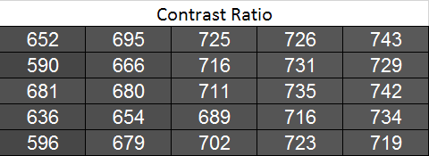
Looking at the resulting contrast, the numbers here are much closer to 100%, which we expect to see. Areas with light fall-off affect the white and black levels almost equally, so the contrast ratios are very similar all across the screen. That gives us a 700:1 expected contrast ratio for the screen as a whole.
Now we can see the new dE2000 From Center data. The issues here crop up at the outsides of the screen, where we see the backlighting issues earlier. Uneven lighting is the issue most likely to cause color issues on the screen, and that is certainly backed up here. In the center of the screen, you are going to not see a difference in colors when you look directly at the screen. With a light loss of less than 10%, and a color dE2000 of <2 for most of the center screen, everything will look identical. As you get to the extreme edges you will run into more issues. I will need more monitors to be tested with this new method, but I think this is going to wind up as a good result in the end.

Going with an LED lighting system, and not a backlit array one, is always a bit of a concern for me. Overall the PQ321Q does well for uniformity for using one, and it avoids some of the massive issues we have seen with some LED systems before. But we are looking for near-perfection from the ASUS and it can’t quite do that. The center 60% of the screen is excellent overall, and for most people that will mean you may not notice these issues at all, but they are there.
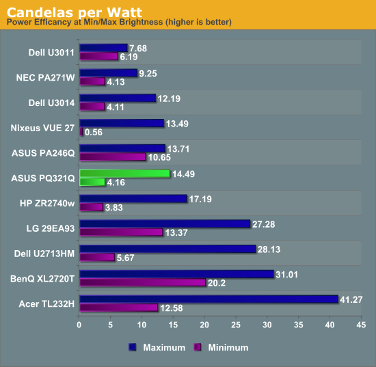
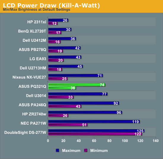
Using the updated metric for power usage, where I factor in maximum brightness and screen area and not just power usage, the ASUS PQ321Q falls right in the middle of the pack. For both maximum and minimum brightness it does OK but not incredible in comparison to other displays. With the greater transmission of IGZO I would have thought I might see better numbers from the ASUS, but I imagine power usage was very low on the list of concerns relative to other performance numbers.
Overall the ASUS PQ321Q draws a relatively average amount of power compared to other displays.
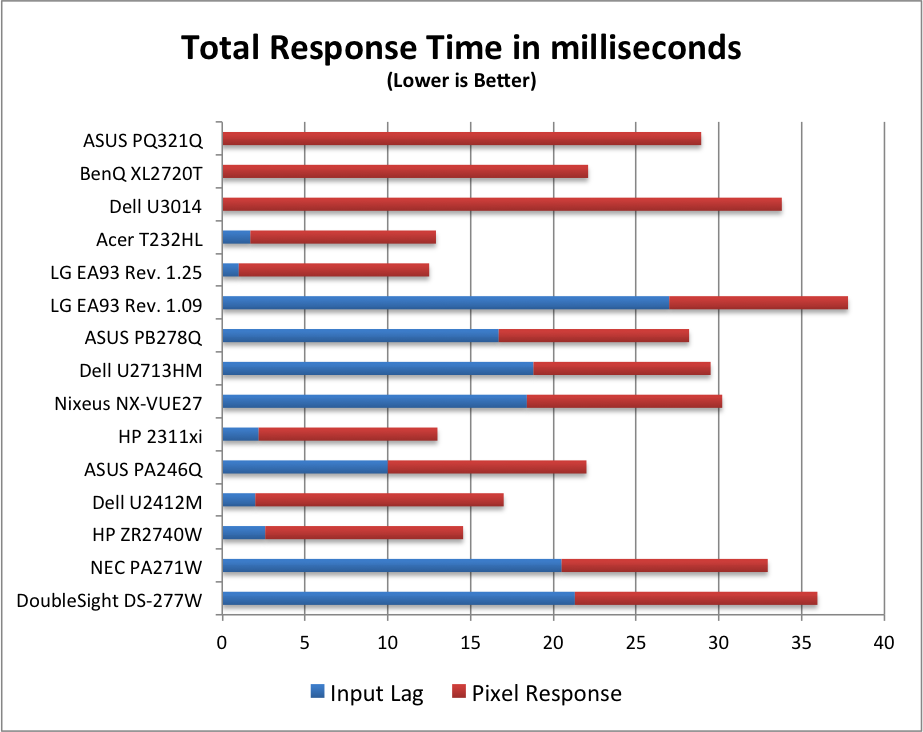
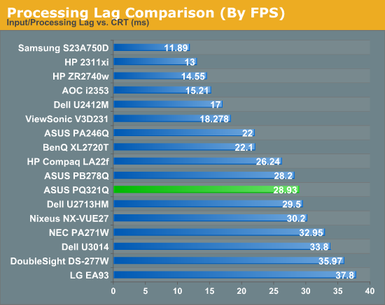
For testing input lag, I’m again reduced to using the Leo Bodnar lag tester over HDMI. This also means that the ASUS will have to scale the 1080p signal to be 2160p and fill the screen. Unlike before, I think this might be a more accurate test as many people will not be gaming at 2160p yet. Looking at the gaming numbers that our Ian Cutress found with a 4K display, you might want to run at 1080p for a little bit until setting up a 4x Titan rig becomes more affordable. Then again, if you can afford the ASUS PQ321Q, you might be buying a 4x Titan setup as well.
Back to the actual data, and the ASUS comes in at 28.93 ms of lag on average for the 3 measurement locations. This is better than the Dell U3014 monitor does, but slower than the BenQ XL2720T that is a native 1080p display. Given that you have scaling going on here, this actually is a pretty decent result I think.
Despite my GPU only being a GTX 660 Ti, I did try out a little bit of gaming on the ASUS. One question that was debated in Ian’s round-up was the necessity of MSAA at 4K resolutions. Measuring just now, I sit exactly 2’ away from the ASUS PQ321Q, with my eyes around dead center on the display. Turning on Half Life 2 (look, I’m not much of a gamer!), I can easily see the difference between no MSAA, 2x and 4x MSAA. The pixel density would need to be even higher, or I’d need to sit further away, for MSAA to not make a difference.
Without MSAA things still looked very sharp overall, but jagged lines are easy to spot if I look for them. You might be able to more easily get away with 2x or 4x instead of 8x MSAA, but you’ll want to have it enabled. Beyond that, the PQ321Q worked well for my casual gaming. Nothing recognized the display correctly at first, perhaps because of MST, but once in the game you can properly select the 3840x2160 resolution for it.
At the request of a commenter I'm adding some PixPerAn photos, trying to show best and worst case results. I've not used PixPerAn at all before, so feedback would be great. If I've done something wrong with it, I'll try to correct it ASAP.


Looking at the gamut, we see a value that indicates full sRGB gamut coverage. From our earlier images of the CIE diagram we know we don’t have full coverage of red, blue and magenta. It seems the extra green/yellow/orange section is large enough that we get a value that indicates a volume equal to the sRGB space, but some of that volume is an area outside of sRGB. It is close to the sRGB area, but not quite.
Coming into this review, I wasn’t totally sure what to expect from the ASUS PQ321Q, or any monitor with this high of a resolution. I love the screen on my iPhone 5 and my retina iPad, but I hold those really close to my face. Since I sit a couple feet away from a monitor, was I really going to notice the difference? Yes, yes I did.
Even coming into the office right after a standard 30”, 2560x1600 display, the difference is huge. You get either a larger desktop, or a far crisper screen, or possibly both. It isn’t a small difference, but one that I can notice easily, and every single time I sit down to my desk. It also is apparent that many application vendors have to hurry up with their software support for DPI scaling, because when it isn’t supported correctly it is really ugly out there.
The ASUS PQ321Q does have its share of problems. The color gamut isn’t perfect and leads to a good number of errors in the red, orange, and yellows of the spectrum. I found yellows to be the only one that I could easily notice when I looked at photos, but I did see red and orange issues as well. The dual HDMI 1.4a inputs are nice, but with HDMI 2.0 possibly coming later this year you are going to be limited to 30p on those inputs. The OSD could also be improved upon, as it works, but lacks any location or size adjustments and takes up almost half the screen when active.
In the end, my feelings about the ASUS PQ321Q wind up being very simple. Of the dozens of displays that I’ve reviewed for AnandTech so far, this is the one I want to hold onto the most. The razor sharp screen is just addictive to use, and you realize this is the future for displays. I’m sure over the next few years that performance will improve, prices will come down, and features will increase, and that helps everyone. But I want this now, and I don’t want it to leave my house.
The ASUS PQ321Q is pricey, and I can’t say that getting three or four 30” 2560x1600 panels isn’t a better deal, but it’s not the same as having one display that looks like this. In the end, I give the ASUS PQ321Q a Silver Award, which is the highest award I've personally given to any display. It's not perfect, but there isn't a display that's come across my desk that left me in constant awe over how incredible it was to use on a day-to-day basis that the ASUS has. It's also effectively killed any thoughts I've had about buying a laptop like a MacBook Air instead of a Retina MacBook Pro, because I can't imagine going back to a regular display. The next few years of high resolution displays can't come fast enough now.