Original Link: https://www.anandtech.com/show/6747/htc-one-review
The HTC One Review
by Brian Klug on April 5, 2013 8:50 PM EST- Posted in
- HTC
- Smartphones
- Android
- Mobile
- HTC One
- Snapdragon 600
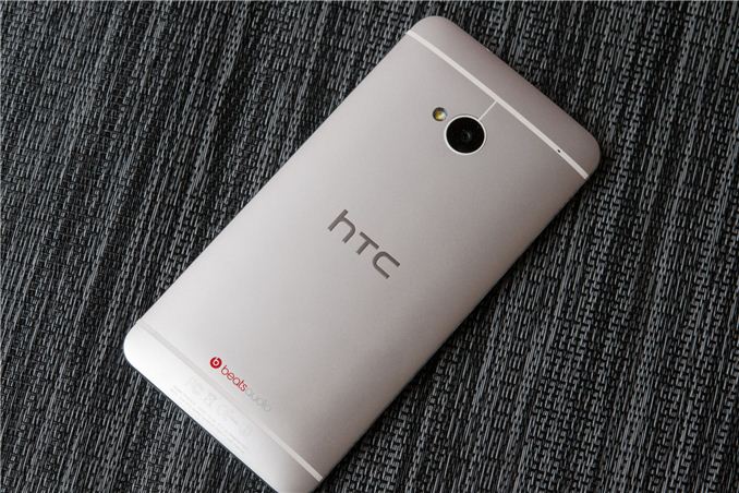
It is nearly impossible to begin to review the HTC One without some context, and I’ll begin our review of the HTC One (formerly the device known as codename M7) much the same way I did my impressions piece simply by stating that HTC is in an interesting position as a result of last year’s product cycle. If there’s one thing Anand has really driven home for me in my time writing for AnandTech, it’s that in the fast-paced mobile industry, a silicon vendor or OEM really only has to miss one product cycle in a very bad way to get into a very difficult position. The reality of things is that for HTC with this last product cycle there were products with solid industrial design and specs for the most part, but not the right wins with mobile operators in the United States, and not the right marketing message abroad. It’s easy to armchair the previous product cycle now that we have a year of perspective, but that’s the reality of things. HTC now needs a winner more than ever.
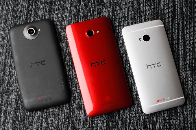
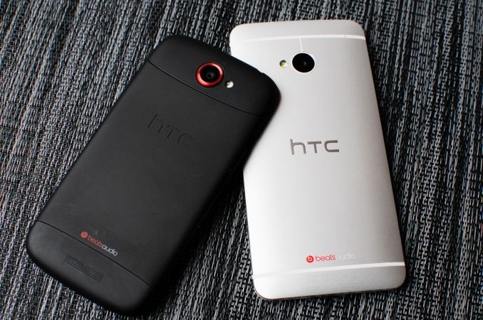
HTC One X, HTC Butterfly, HTC One
For 2013 HTC is starting out a bit differently. Rather than announce the entire lineup of phones, it’s beginning with the interestingly-named HTC One. It’s just the HTC One — no S or X or V or any other monikers at all. It’s clear that the HTC One is the unadulterated representation of HTC’s vision for what the flagship of its smartphone lineup should be. HTC is different from other OEMs in that it only makes smartphones, and as a result the flagship clearly defines the rest of the product portfolio below it. With the One it looks as though HTC is making that kind of statement by literally letting it define the entire One brand.
Enough about the position and the strategy for HTC, these are mostly things that are interesting to enthusiasts and industry, but not really relevant to consumers or the review of a singular product. Let’s talk about the HTC One.
Hardware
For whatever reason I always start with industrial design and aesthetics, probably because it’s the most obvious superficial thing that hits you when picking up almost anything for the first time. With a smartphone that’s even more important, since there’s so much that revolves around the in-hand feel. I pick up my phone too many times a day to count for better or worse, thus the material quality and in-hand feel really do make a big difference.
The HTC One’s fit and finish are phenomenal. There, I said it. You almost don’t even need to read the rest of this section. In my books, fit and finish goes, in descending order of quality, metal, glass, and finally plastic. Or instead of plastic, polymer, or polycarbonate, or whatever overly-specific word we use to avoid saying plastic.
I’ve talked with a lot of people about HTC’s lineup last year, and even though the One X was a well constructed plastic phone, the One S really stuck out in my mind for being a level above and beyond in terms of construction and industrial design. I asked Vivek Gowri (our resident Mechanical Engineering slash industrial design connoisseur slash mobile reviewer extraordinaire) if I was crazy, and he agreed that the One S was one of, if not the, best industrial designs of 2012.
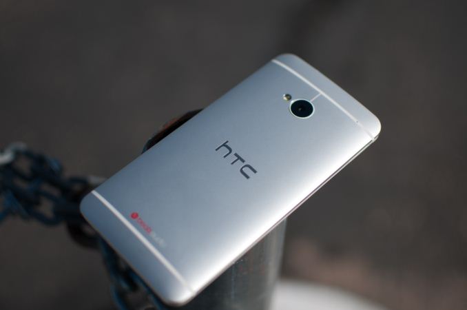
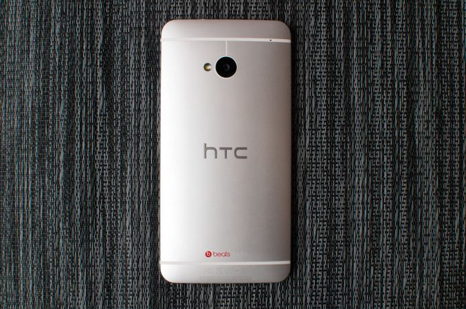
So when I heard about M7 being on the horizon as the next flagship, I couldn’t help but worry that there would no longer be a primarily-metal contender at the high end from HTC. The HTC One is that contender, and brings unibody metal construction to an entirely new level. It is the realization of HTC’s dream for an all-metal phone.
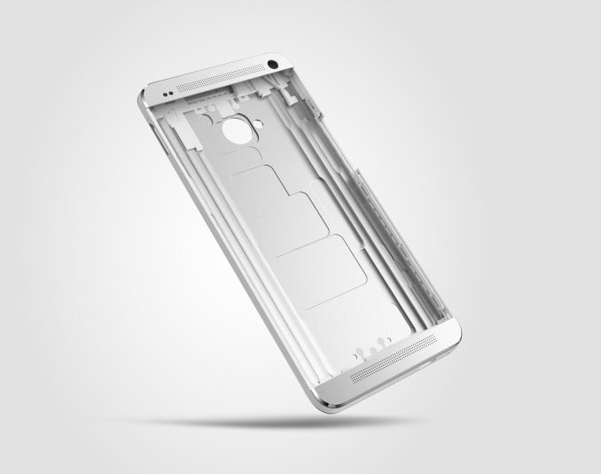
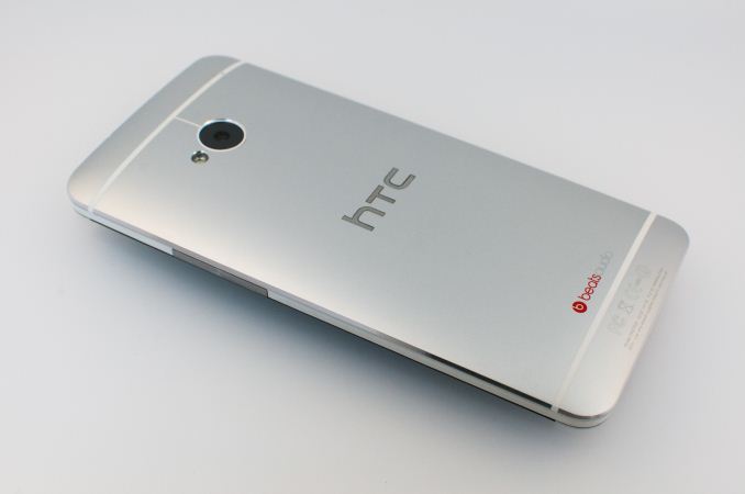
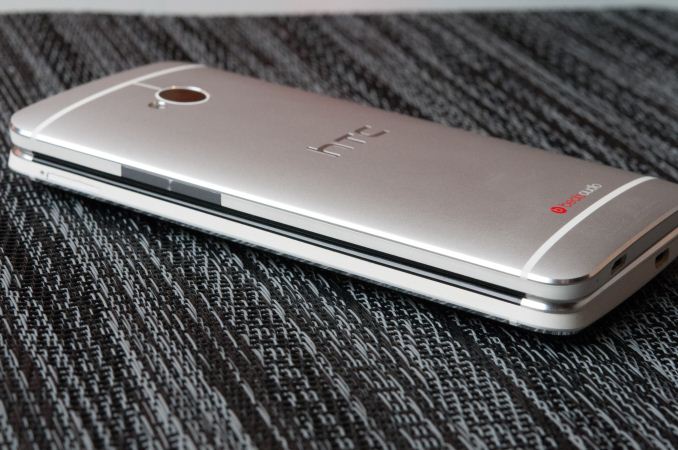
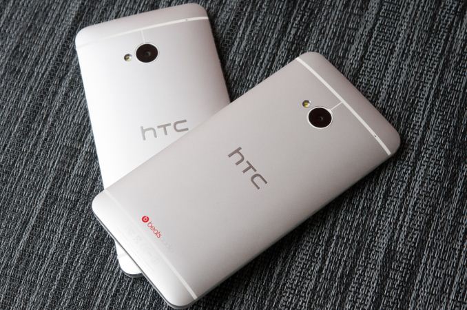
HTC begins construction of the One from a solid piece of aluminum. Two hundred minutes of CNC cuts later, a finished One chassis emerges. Plastic gets injected into the chassis between cuts during machining for the antenna bands and side of the case, which also gets machined. The result is HTC’s “zero-gap” construction which – as the name implies – really has no gaps between aluminum and polymer at all for those unibody parts. There’s no matching parts together from different cuts to achieve an optimal fit, everything in the main chassis is cut as one solid unit. It’s the kind of manufacturing story that previously only the likes of Apple could lay claim to, and the HTC One is really the first Android device which reaches the level of construction quality previously owned almost entirely by the iPhone.
The only place there’s some fit and finish weakness is in the top and bottom front facing aluminum pieces, which aren’t part of the CNC machining that the rest of the chassis undergoes. Instead I suspect these are adhered onto the rest of the phone after the display, PCB, and battery are inserted into the back case. The result is that there is unfortunately a small gap between where those parts come together, but we’re talking about a tiny, tiny gap.
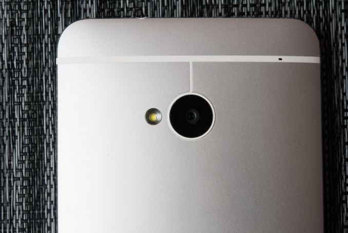
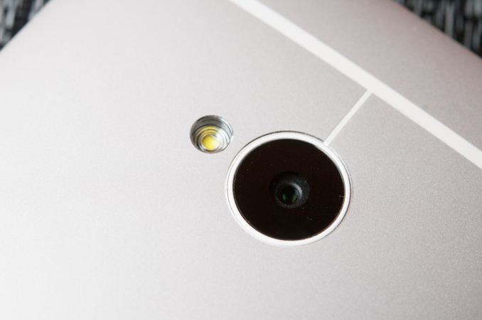
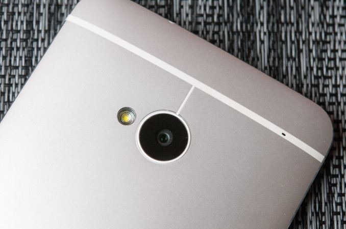
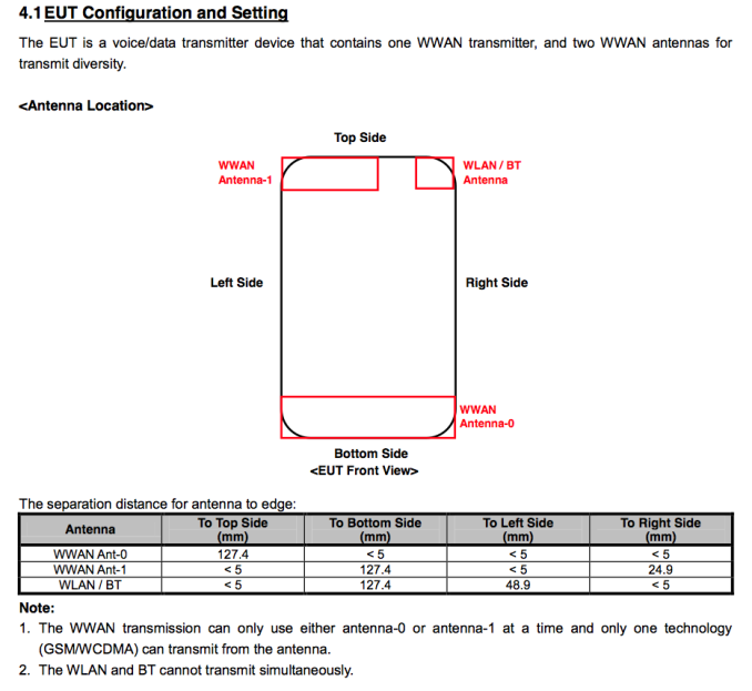
The back of the HTC One is one continuous, gently curved, bead-blasted piece of aluminum, with the exception again of the thin plastic bands which insulate the top and bottom antennas from each other. The camera aperture sits near the top of the One and has a third small plastic band attaching it to the primary one. It turns out this is a critical feature to enable NFC, whose active area is the loop antenna formed by the ring around the camera. Industrial design and antenna design are often in direct, almost absolute opposition when it comes to mobile devices, and with the HTC One a huge part of the story is how such a design is possible without falling prey to unintended attenuation a-la iPhone 4. In all honesty, the technology which empowers this new generation of all-metal phones (actively tuned antennas) is a huge part of both the iPhone 5 and HTC One stories, and other phones coming in 2013, but more on that later. What’s interesting about the HTC One is that there aren’t glass cutouts on the opposite side of the antennas, in fact on the opposite side are matching aluminum pieces married to the top and bottom of the 4.7-inch 1080p LCD display.
HTC won’t disclose exactly the alloy of aluminum used in the One, however it feels well hardened and not as prone to deformation as other aluminum devices. That’s of course the tradeoff with going to aluminum – to make the material easily machinable, it needs to be more malleable. Of course, more malleable is great for making machining easy, but not so good for longevity or resistance to deformation when dropped. In the case of the One, HTC says it is using an alloy of its own composition which it believes is the optimal balance between the two.
An obvious benefit to aluminum construction is that there is no flex in the HTC One. With the One X and One X+, I developed a fidget with those devices where I would pop the display out of the plastic unibody all the time when standing idle or needed to do something with my hands, which is literally the way to disassemble them. That or I would flex the thin backside of those phones by pressing on them to take up the gap between the plastic frame and battery. With the One there is no opportunity for me to fidget and semi-disassemble the phone, no flex if I push really hard on the back, or anywhere on the device. This is what build quality is about, making an actually solid device.
There’s a tiny notch in the top plastic band of the HTC One, which is the aperture for the secondary microphone. At the bottom just to the right of the microUSB port is the primary microphone. The bands are again an important part of the design which enable antenna diversity.
The HTC One is ringed with a plastic band between two aluminum chamfered edges. The band isn’t glossy or shiny plastic, but rather a textured, rigid feeling material which also seems to have been sand blasted or bead blasted, and also gets machined as a part of the case. Rather than being perfectly perpendicular to the front of the device, the edge is angled inward slightly. It’s difficult to describe, but the result is surprisingly noticeable.
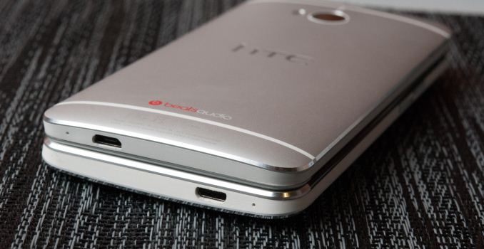
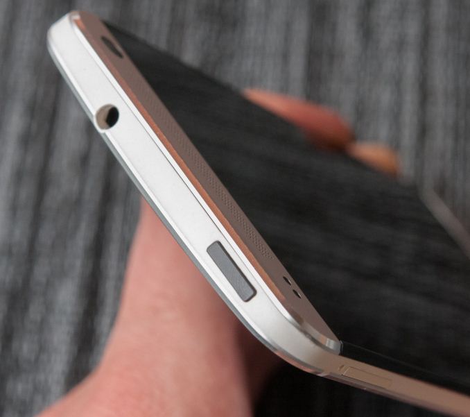
It’s in this plastic lip around the edge that basically all the ports or buttons lie. On the left side up top there’s the microSIM tray plus ejection port, and on the right side the single piece volume rocker. At the bottom, off center is the microUSB port and primary microphone. Up top, the One locates the headphone jack off-center and just cutting into the aluminum. On the opposite side is the power/standby button, which doubles as an infrared port which supports transmit and receive for controlling a TV or entertainment system.
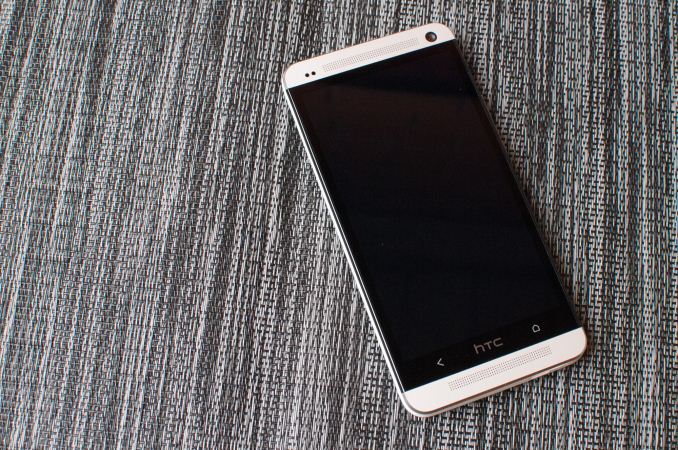
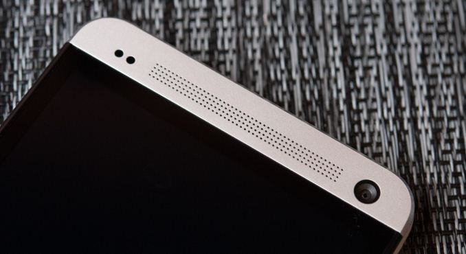
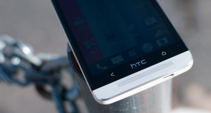
There are two aluminum cutouts which lip the One’s display. These two speaker grilles are a tight grid of laser cut holes, behind which sit two speakers for stereo sound. Up top on the right is the 88 degree wide field of view front facing 2.1 megapixel camera, and on the left side is the ambient light and proximity sensor. The notification LED is the only thing that really gets a downgrade compared to the Butterfly or DNA, as there’s no longer an awesome rear facing LED in addition to the front facing one behind the grille.
Probably one of the more polarizing design aspects of the HTC One is the inclusion of two capacitive buttons instead of the three we see on most other handsets that do include them. HTC’s rationale is that fewer buttons equates to less confusion for users, and as a result we have just back and home on the HTC One. For getting to the multitasking interface or task switcher, one double taps on the home button.
What’s notably absent on the HTC One is a menu button, which just like the other HTC Ones prior follows Google’s “say goodbye to the menu button” guidelines from early 2012. Unfortunately for HTC, just like the previous iteration of Ones, this means that unless an application properly implements the appropriate Android SDK level (11 or higher) it will have an ugly black action overflow button at the bottom. Worse, even some of the biggest developers and most popular apps (I’m looking directly at the pile of fail that is Twitter for Android) have failed to move to the new UI pattern or follow Google design guidelines. Last time around many blamed HTC for the action overflow button like it was an aberration of Sense. This actually isn’t entirely HTC’s fault, this is HTC getting burned for following Google’s hardware and software design guidelines which officially deprecated the menu button back in January 2012. Interestingly enough, in previous non-final builds of the HTC One software, there was an option for users to disable the action bar and press the menu button by long pressing the back button, which removed the action overflow bar entirely since the menu button is then implemented with a long press. However this has since been removed in the final software, and I strongly suspect Google is the reason here since they have final say about some of these things, and obviously nobody at HTC wants to waste pixels with a black bar at the bottom, since that was the whole point of going with capacitive buttons in the first place.

Twitter for Android (Left) whose action overflow bar does absolutely nothing. No option to change the behavior of the buttons for emulating a menu button in the final ROM (Right)
I need to stop here and note that I haven’t had any problems with the two capacitive button layout. I have yet to inadvertently tap the HTC logo once, nor is double tapping on the home button to access the multitasking screen difficult to internalize. As for the back button, in my brief time just playing with the build which had long press for menu, I had no difficulties either. I’m blown away, however, that the Android ecosystem has still yet to settle on a button layout that makes any sense, and no, the solution is not wasting pixels on painting buttons that don’t do anything but sit there. My experience is purely anecdotal however, and I’m switching between devices with myriad different button layouts so often and so regularly that my mind isn’t stuck in any one behavior pattern (nothing makes sense anymore, it’s just a surreal existence), but the two button system for me at least was little concern after the first ten minutes.
The HTC One industrial design is striking and unique, and that’s an understatement. There have been other largely-metal phones in 2013, and for that note, other largely-metal phones from HTC in 2012, but to call them similar looking or remotely similar to the HTC One is nothing short of a hilarious oversimplification. The HTC One feels unlike anything else on the market and marries just the right display size to just the right material choices and industrial design. The HTC One is without a doubt the first Android phone I’ve felt since the Nexus One that blew me away in terms of fit, finish, and materials choice. There’s something inherently valuable about metal that I can’t convey, and those materials choices drive the rest of the experience so strongly that I can’t help but get stuck on it every time I pick the phone up.
| HTC One Specifications | ||||
| Device | HTC One | |||
| SoC |
1.7 GHz Snapdragon 600 (APQ8064Pro - 4 x Krait 300 CPU, Adreno 320 GPU) |
|||
| RAM/NAND/Expansion | 2GB LPDDR2, 32/64 GB NAND | |||
| Display | 4.7-inch SLCD3 1080p, 468 ppi | |||
| Network | 2G / 3G / 4G LTE (Qualcomm MDM9x15 UE Category 3 LTE) | |||
| Dimensions | 137.4 x 68.2 x 9.3mm max / 4mm min, 143 grams | |||
| Camera | 4.0 MP (2688 × 1520) Rear Facing with 2.0 µm pixels, 1/3" CMOS size, F/2.0, 28mm (35mm effective), 2.1 MP front facing | |||
| Battery | 2300 mAh (8.74 Whr) | |||
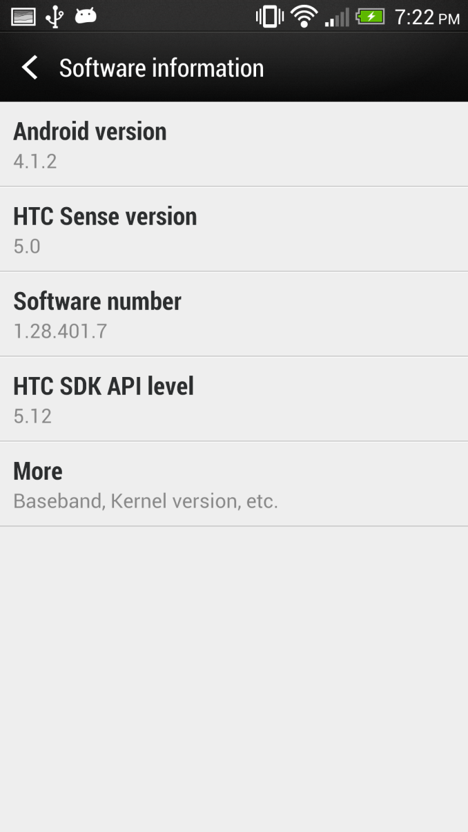
| OS | Android 4.1.2 with Sense 5 | |||
| Connectivity | 802.11ac/a/b/g/n + BT 4.0, USB2.0, GPS/GNSS, MHL, DLNA, NFC | |||
| Misc | Dual front facing speakers, HDR dual microphones, 2.55V headphone amplifier | |||
Cases
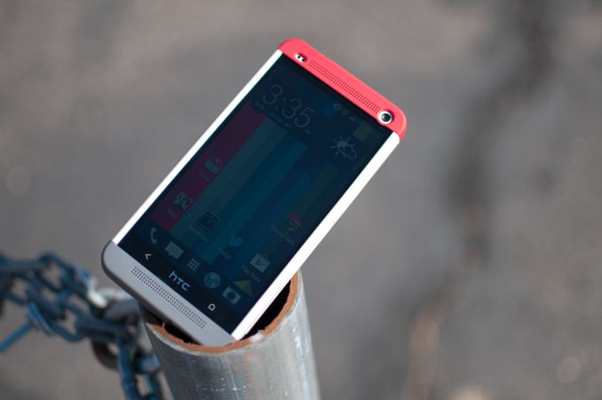
I had the opportunity to use one of HTC’s first party cases for the One, which HTC calls the Double Dip hard shell case. The hard case consists of three pieces — one large plastic component which slides on over the device, and two end caps which snap onto the top and bottom.
The case affords a fair amount of protection to the back and sides, and gaps the front display by a few millimeters as well to protect it from scratches if laid face down on a surface. I think the hard case looks awesome on the HTC One, with the grey, white, and red color scheme, I only wish there were some color options for the top and bottom snaps, which would make for cool personalization options.
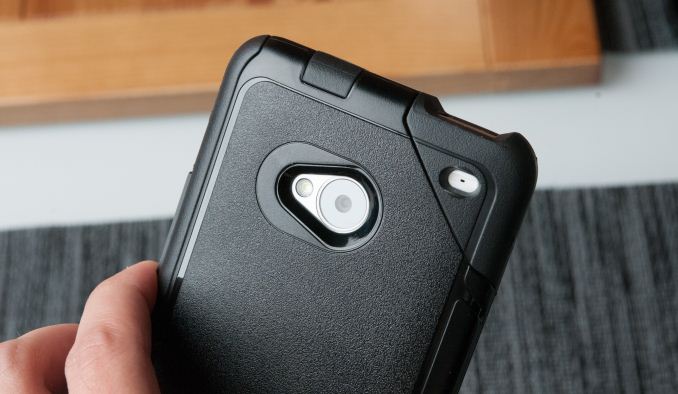
I also got to play with the Otterbox Commuter case for HTC One briefly, which is pretty much exactly what you’d expect it to be. It snaps on over the One and provides ample protection for all sides. It's a commuter case through and through, and if you're into Otterbox's style which trades some of the thin profile for a lot more protection, the case they've crafted for the One is great. I like the rubber cutout in the corner as well.
The unfortunate thing about using a case with the One is that of course you’re covering up all that great-feeling aluminum surface. The One is one of the first phones I really wouldn’t want to use a case with, so much so that it outweighs my natural impulse to protect devices from scuffing or scratching. Hopefully the One will get a nice patina after enough time.
Battery Life and Charging
Battery life is one of those things that consistently ranks among the highest in consideration for a mobile device. At the same time, OEMs still seem largely unwilling to double or triple battery capacities between generations, or go the Motorola route and offer two different models with double capacity. The story of smartphones is again this continual competition between everything and the industrial design.
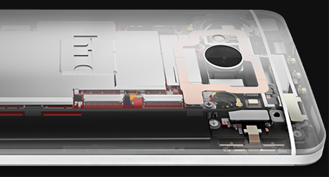
With the One, HTC has gone again to its pyramidal stack of display, then battery, then PCB. The result is the familiar curved backside from where the PCB sits, and a large, thin battery sandwiched between the display and PCB.
The HTC One moves to a 2300 mAh, 3.8V (the higher nominal chemistry that everyone has moved to) lithium-ion polymer battery, giving it a capacity of 8.74 watt-hours. It’s obviously internal and not easily user-replaceable. Of course, battery size doesn’t entirely dictate battery life, it’s just a larger electron tank to draw from. What ultimately is a more interesting is how efficient the platform is which draws from it.
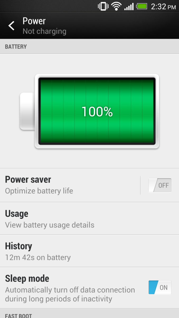
The thing about HTC and battery life specifically is that as of late they’ve been penalizing themselves on the display side of things, which is the single largest consumer of power in a device. A number of other OEMs artificially clamp display brightness just to set a better higher bound for battery life, and for example HTC’s display auto brightness function doesn’t have as much dynamic range as the slider being actuated manually. The result is a phone that’s brighter than it needs to be a lot of the time. On the software side HTC does have system optimizations that do things like batch up network traffic so that the phone isn’t going into a constant cellular connected state and burning power for an app written by a developer who doesn’t know anything about cellular connection state tables, and strategies like suspending the cellular data connection when on WiFi or when the phone is in standby for long periods.
To find out where the HTC One sits in the battery life spectrum, we turn to the newest version of our battery life test. This is now our sixth revision of the battery life test, and we feel is the optimal balance between challenging workloads and idle time. The basic overview is the same as the previous test — we load webpages at a fixed interval until the handset dies, with display set at exactly 200 nits as always. Power saving features (in this case the HTC Power Saver) are disabled if they turn on automatically, and background account sync is disabled. The test is performed over both cellular data on all available air interfaces and over WiFi in an environment with good signal levels. The new test has decreased pause time between web page loads and added a number of JavaScript-heavy pages. I sat down with some UMTS RRC (Radio Resource Control) emulator tools and also made sure we had a good balance of all the RRC states (DCH, PCH if possible, FACH, IDLE) so we weren’t heavily biased towards one mode or the other.
I’ve included the HTC DNA in the fray as well since I’ve had those numbers for a while. Let’s start with the WiFi test, where we attach the device to a dedicated WiFi network with no other clients.
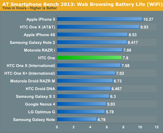
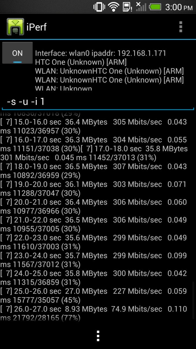
The One includes the newest BCM4335 WiFi/BT/FM combo from Broadcom, which is still built on a 40nm process. For the purpose of the battery life test I attached the One to the same AP as I’ve always used, however I will repeat with my 802.11ac AP in due time to see whether the shorter duty cycle afforded by a much higher PHY rate makes any difference.
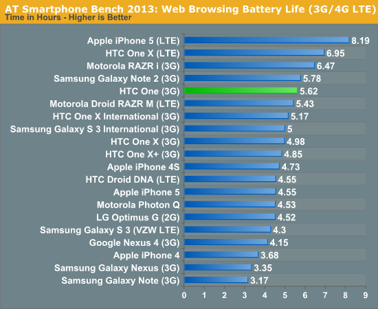
On cellular data the One isn’t bad at all, looking at the 3G result from final hardware and final software. I consider this pretty good all things considered for the HTC One, and mirrors my experience.
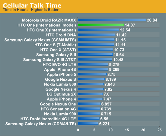
On cellular talk time the One really shines, coming in well ahead of almost everything else. This is an impressive result.
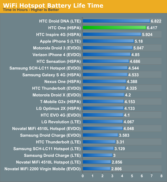
As a hotspot once again we have great battery performance. This test consists of four of the page loading tabs running on an attached notebook in addition to 128kbps streaming MP3 audio being played on the device. This is a challenging test that results in the cellular connection being lit up almost constantly, and isolates out display.
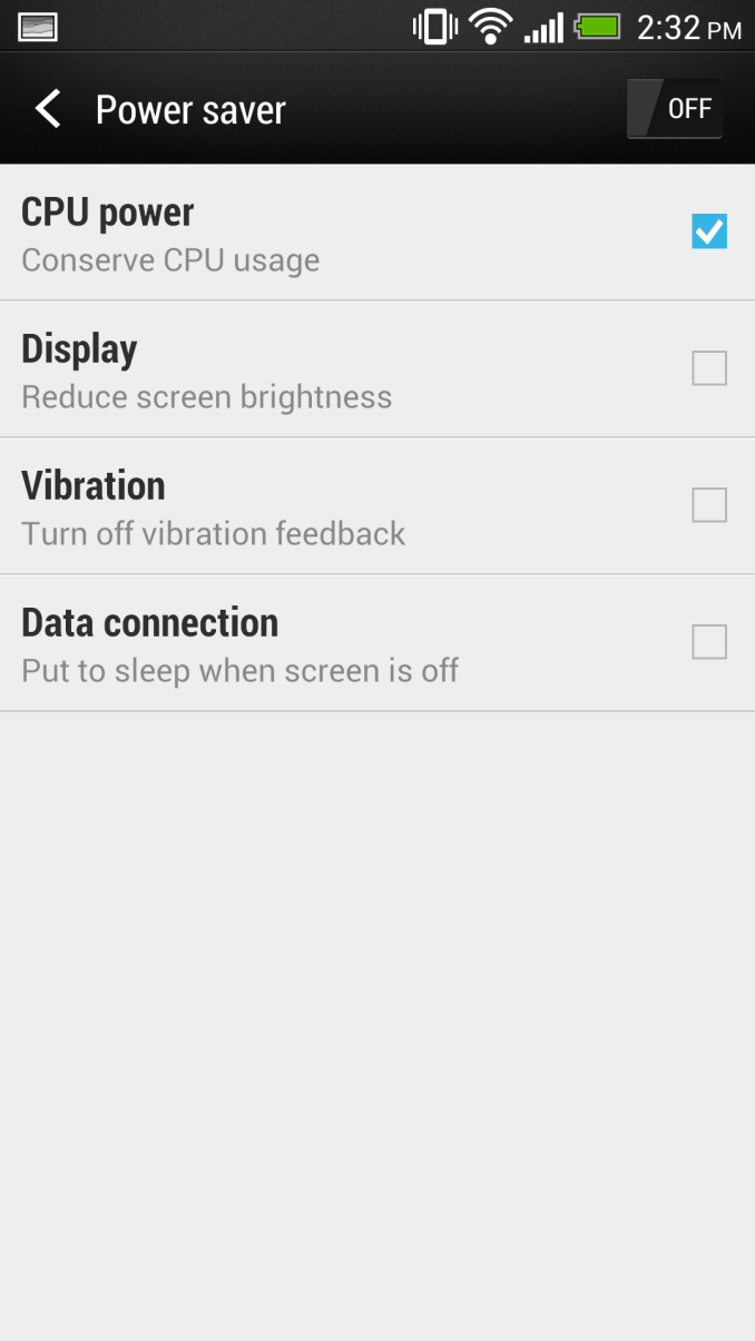
My subjective impressions using the HTC One as my personal device are that battery life is quite good, and moreover that the DNA battery life also was better than some other phones people had no problems with in 2012. I have yet to have an issue making it through an entire day on the HTC One, even when aggressively using the camera. If I knew I was going to be away from the charger for a long time, I did enable the power saver, which sets max CPU clock on the Snapdragon 600 to around 1.3 GHz in addition to lowering brightness a little bit, and a few other things as shown in the previous screenshot. In practice I really don’t notice much of a performance difference with the power saver box checked unless I’m really looking for it, but this probably dumps the SoC into a better voltage state to say nothing of how much lower active power is.
Charging on the HTC One takes a little while longer than I’m used to for other devices. I get lots of requests to do charging tests and have been running them on everything I can lately, but anything power related remains an involved process. To test the best case charge time, I have a dedicated power supply voltage limited to 5V and capable of supplying a lot of current. I emulate the USB BC1.2 charging spec on a breadboard and connect USB to the device, then time how long it takes to charge devices completely. I plug the phone in after it dies running our battery life test, and time the amount of time from that fully dead, won’t-turn-on state to fully charged, either with a green LED or when charge current goes to zero for devices without a charge status LED.
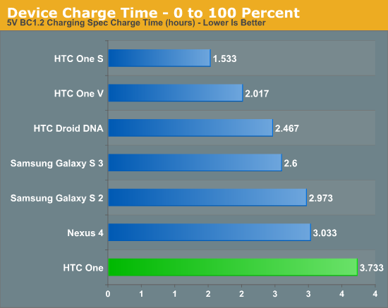
The HTC One definitely takes a while to charge. What’s interesting however is that the charge curve gets the One to 85–90 percent under the normal 3 or so hours, it’s that last ten percent that takes forever. I also have confirmed that Qualcomm’s Quick Charge is not being used on the HTC One, for whatever reason, possibly to maximize compatibility with the portable USB battery chargers that are now proliferating. The PMIC is there, it just isn’t enabled. My guess would be that HTC wants to prioritize battery longevity and minimize any even potential extra wear since the battery on the One is sealed inside.
HTC's Ultrapixels - Bucking The Trend
With the One, HTC has taken an incredibly daring direction for camera. Last year’s One X, One S, and rest of the One series included an ambitious F/2.0 system, discrete ISP, and set an impressive imaging baseline. A full year later, few of the major players are shipping an F/2.0 system (though Nokia will ship an F/1.9 system later this year and has the F/2.0 Lumia 920), but with the One, camera is even more of a serious emphasis. In fact, the camera in the One is surprisingly perhaps the most interesting and ambitious feature of all, outclassing even the unibody aluminum construction. The short list of features on the HTC One camera that make it unique are an F/2.0 system with larger than the norm 2.0 micron pixels, optical image stabilization (OIS), and a new revision of imagechip.
For years now, smartphone manufacturers have been moving to smaller and smaller pixels to increase the resolution of their cameras. It’s the megapixel race all over again, but in the smartphone platform. I gave a presentation at an industry event and laid out the general trends that I’ve seen smartphones taking for the past years. In general, there has been a progression from 1.75 micron pixels, to 1.4 micron pixels, now to 1.1 micron pixels on smartphone CMOS imagers. The result has been a steady increase in megapixels for the same 1/3” or 1/3.2” sensor size common for smartphones, from 5 MP to 8 MP to 13 MP, respectively, for those pixel sizes at the same optical format size. Conversely, OEMs can also deliver the same number of megapixels on a smaller and smaller sensor each generation, for example 8 MP at 1.4 microns on a 1/3.2“ sensor, or 8 MP at 1.1 microns on a 1/4” sensor. At the same time, smaller sensor means smaller z height required for the optics, which often is the thickest part of a design. There’s this constant battle between, you guessed it, industrial design and the camera system that goes in a smartphone.
Though improvements to quantum efficiency (think sensitivity, whether every photon is converted to an electron) at each successively smaller pixel size have mitigated some of the downsides from having smaller effective integration area for a pixel each time, there are still downsides to going smaller. Smaller pixels require an even better optical system to resolve that resolution, and already imaging onto pixels at 1.4 microns is really just oversampling. With the bayer color filter on top, you can make an argument that it isn’t really oversampling given the 2x2 nature of the array, but the reality is that we can’t image a spot onto a single 1.1µm pixel even with diffraction limited optics. Other downsides to smaller pixels are again a loss of sensitivity, partially from having a smaller integration area, partially from other things like the smaller active region for the sensor and a change in drive voltage. The other problem is loss of dynamic range before saturation occurs - already smartphones are operating with a dynamic range of around 5,000 photoelectrons. This means a very narrow range of brightnesses that can be represented inside the normal 10 bits of data shipped back from a given pixel at a given exposure.
The end result to this game is a ton of tradeoffs. In the case of the very high 13 MP cameras that are emerging today, we’re talking about an image that might not even be sharp outside in bright daylight if the optical system can’t resolve a high enough spatial frequency for the sensor, potentially very compressed dynamic range, and less and less sensitivity indoors in dim or low lighting. This year at the high end the trend is predominately 1.1 micron pixels, and basically any 13 MP camera you see in a smartphone is going to come with them. Likewise there’s a huge push for HDR this year in just about every mode (photos, videos, and panorama), and the reason is pretty much entirely to mitigate the fact that smartphone platform cameras just don’t have a lot of it before they saturate.
With the One camera, HTC has gone the other way entirely, instead moving up the scale to bigger 2.0 micron pixels while others move down to 1.1, while last year everyone primarily shipped at 1.4 microns. They’ve branded this the ‘UltraPixel sensor’, but really the important thing to think about is that the pixels are 4 square microns (2.0 x 2.0 micron) compared to the flavor-du-jour 1.21 square microns (1.1 x 1.1 micron) and thus have just over 3x the area. The result is, like anything else, a tradeoff but in the other direction - improved low light sensitivity and dynamic range at the expense of spatial resolution. At 1/3" sensor size, use of 2.0 micron pixels translates to 4.0 MP of resolution.
| Smartphone Camera Comparison - 2013 | |||||||
| HTC One | Samsung Galaxy S 2 | Samsung Galaxy S 3 | Samsung Galaxy S 4 | ||||
| Front Camera | 2.1MP | 2MP | 1.9MP | 2MP | |||
| Front Camera - CMOS |
OV2722 (1.4µm, 1/5.8") |
- |
S5K6A3 (1.75µm, 1/6") |
S5K6B2 (1.34µm, 1/6") |
|||
| Front Camera - Focal Length | ~1.59mm | 2.73mm | 2.7mm | 1.85mm | |||
| Front Camera - Max Aperture | F/2.0 | F/2.8 | F/2.8 | F/2.4 | |||
| Rear Camera | 4MP | 8MP | 8MP | 13MP | |||
| Rear Camera - CMOS |
ST VD6869 (2.0 µm, 1/3") |
S5K3H2YX (1.4µm 1/3.2") |
Sony/Samsung (1.4µm, ~1/3") |
IMX135 (1.12µm, 1/3.") |
|||
| Rear Camera - Focal Length |
3.82mm (28mm eff) |
3.97mm | 3.7mm |
4.2mm (31 mm eff) |
|||
| Rear Camera - Max Aperture | F/2.0 | F/2.65 | F/2.6 | F/2.2 | |||
While some may decry the tradeoff of resolution for sensitivity and dynamic range, the reality is that we live in a world dominated by displays that are either 1080p, slightly above, or share via web-based services that dramatically downscale images for bandwidth reasons. The question is then how much resolution is really necessary given predominately electronic displays start to finish and lack of much printing or enlargement. At least for my workflow, 4 or 5 MP seems more than adequate for most sharing, especially if it’s sharp and ends up having good dynamic range, and that’s still enough resolution to downsample to 1080p and get an even sharper-looking image. There’s also a case to be made for storage requirements which are lighter and so on, but most of that is obvious. The benefits from having more sensor sensitivity are also immediate – no need to fire the distracting flash in a restaurant or at a party, shorter exposure times with less blurring, quicker follow up shots, more accurate preview, and so on.
When I heard that HTC was taking their camera this direction, I was incredibly excited. Not only is this completely bucking the camera trend that just about every other OEM seems satisfied with marching down just for marketability reasons, it’s actually sound science and possibly the best way to end the megapixel myth in the smartphone space. Unfortunately the flip side is that, obviously, HTC now has to fight the megapixel myth head on. This is incredibly difficult to market to most normal consumers since megapixels is just about the only parameter ever exposed to them, and marketing was probably the biggest problem with HTC’s lineup last year. Conveying the Ultrapixel message will require more than a branded name and carefully avoiding talking about the fact that the camera is 4.0 MP on the box or online specifications (as it is now), it will require real education and an active role in building credibility in the imaging space. It will also require real demonstrable benefits to consumers in use cases that matter to them.
Still Camera Analysis
Let’s talk about the HTC One’s camera.
The HTC One sensor is 16:9 aspect ratio natively, not the usual 4:3 we’re used to seeing for sensors, with a resolution of 2688 x 1520, for 4.08 MP. I did a lot of digging around on the device and found that the rear facing CMOS is made by ST Microelectronics, it’s the VD6869. This is the 1/3.0” format sensor with BSI and 2.0 µm x 2.0 µm pixels. I asked ST for more information about VD6869 and couldn’t get any information about the sensor, which tells me this is very likely a part made specifically for HTC’s One. Chipworks tore down a One and confirmed the presence of an ST CMOS, which confirms what I've seen inside in software.
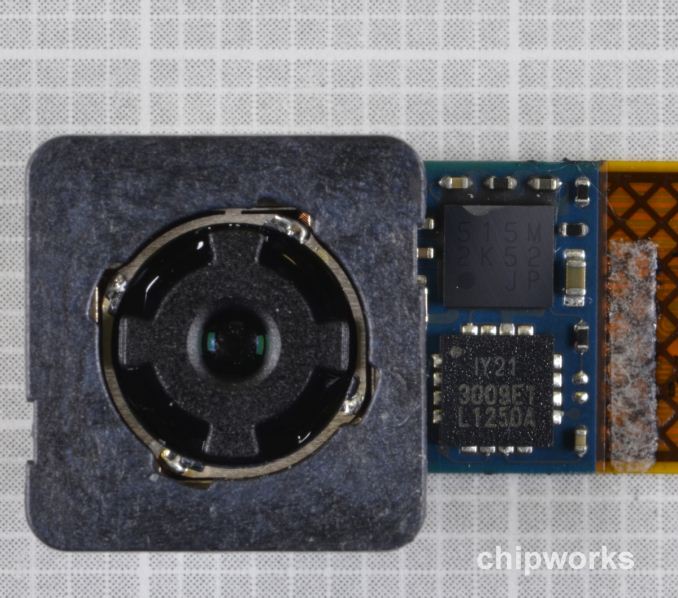
HTC One camera module (Courtesy Chipworks)
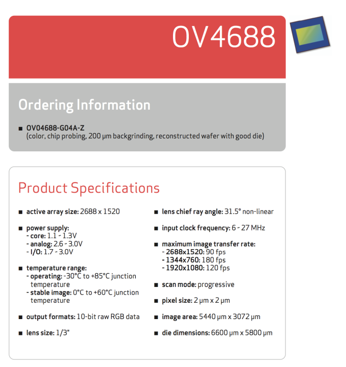
Even more interestingly, OmniVision announced a 4.0 MP CMOS sensor which matches the VD6869 specs identically, the OV4688, which has the same size (1/3”), resolution (2688 x 1520), pixel size (2.0 micron), and a line about sensitivity being 40 percent higher on the 2.0 micron pixels compared to OV’s 1.75 micron pixels. There’s still no real information about sensitivity or saturation, but I suspect that OV4688 might become an alternate supply source if ST can’t produce VD6869 in quantity.
The optical system on top of that CMOS is a 5P (5 plastic element) lens system with F/2.0 aperture and 3.82mm focal length, which when combined with the 1/3.0” CMOS crop factor of 7.21 gives a 35mm equivalent focal length of 27.54mm. HTC rounds up and calls this 28mm inside EXIF and on their own spec page. I still feel like something closer to 35 mm effective would be more natural for shooters, however the realities of thinner modules and the z-height problem make it a difficult sell.
The One also has OIS which can accommodate +/- 1 degree of deviation and has its own dedicated gyroscope which polls at 2 kHz for making corrections. You can actually see OIS working if you look at the module while the camera preview is going and slightly deviate the phone — it’s quite surreal to watch the system make a reverse accommodation to the angle you’ve deviated the phone. The camera system in the One is capable of doing 8 FPS full resolution image capture as well. Image capture is on the HTC One is extremely speedy, in fact shot to shot latency is incredibly short. This is partially thanks to the prioritization of fast exposure times in the Auto mode unless Night mode is used.
On the front facing camera, we have an OmniVision OV2722 CMOS which is 1/5.8” in size with 1.4 µm x 1.4 µm pixels and an imaging area of 1932 x 1092, though output images are 1920 x 1088 since this oversized sensor is for accomodating EIS (electronic image stabilization) and rolling shutter correction. On top of that is an optical system of an unknown number of elements with F/2.0 aperture, and focal length around 1.59 mm, which gives the tiny sensor an effective focal length of around 22 mm and 88 degree full field of view.
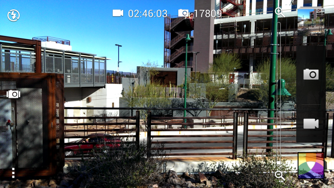
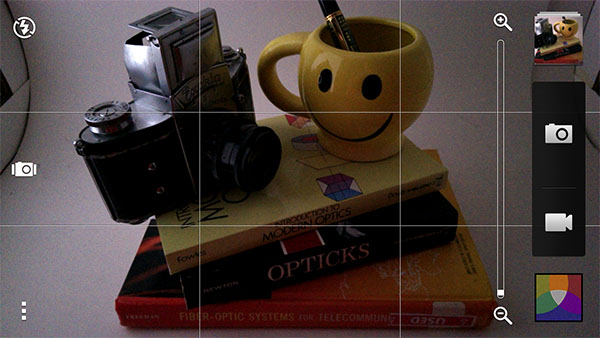
Camera UI on the HTC One has changed slightly with Sense 5. The preview is 16:9 and fills the whole screen, so this time around there’s no need to go and toggle a setting to get the full sensor output. In fact, this time around the 4:3 and square settings are crops of the 16:9 native output. Most of the UI is visually similar to previous HTC cameras, and functionally not a lot is changed. You can now drag from the edge to change between front and rear facing cameras, which is a nifty gesture. On the left side are the flash control, Zoe mode button, and menu, err “action button” which exposes the rest of the settings.
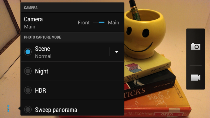
Tapping menu, err I mean the action overflow button, gives you another more explicit front/rear facing toggle, photo capture modes (Normal, Night, HDR, Swep Panorama, and tapping drop down gives Portrait, Landscape, Backlight, Text, Macro), video modes (Slow motion, Fast HD 60 FPS, Video HDR Full HD). The rest of the settings include crop aspect ratios (Wide - 16:9, Regular - 4:3, Square - 1:1), video quality (1080p, 720p, MMS 176x144), review duration, image adjustments (exposure, contrast, saturation, sharpness), ISO (Auto, 100, 200, 400, 800, 1600), white balance, continuous shooting, camera options, shutter options (tap to capture, sound), lock focus on video (disable CAF) and auto upload.
As I’ll talk about in a moment, I find that although HTC has lightened up on the sharpening each year, it’s still a bit much for my preferences. With the setting at –2 it appears that sharpening is turned off entirely. If you look at the edge of the lettering it’s immediately obvious how much of a difference this makes.

The photo modes are pretty self explanatory. Normal is something of a safe default and balances shorter exposures and ISO, Night enables much longer exposure times and keeps ISO down at the same time. HDR is is the typical multi-frame capture and recombination to add detail in regions that are over or under exposed.
I also borrowed NVIDIA’s HDR demonstration at GTC to take a series of images demonstrating HDR for still images. You can see how HDR mode combines multiple exposures for an equivalent image with more dynamic range than either of the parts.

I still find myself wishing that HTC had an AF/AE lock gesture for the camera UI, and there are still some quirks in the interface. At the end of the day I wish we could have a smartphone UI expose all of the manual exposure settings (exposure time is the big one) and not just a subset. I’m fine with either full auto being the default setting for normal shooters but would still love an expert mode with manual controls that expose everything, especially because at present the Android camera APIs simply doesn’t expose enough for third party camera apps to be very powerful.
Let’s talk about imaging performance on the HTC One. To evaluate this we turn to our usual camera bench photo locations, lightbox test with the lights on and off, and test charts. In addition I spent a lot of time taking side by side comparisons with the HTC One alongside some other good low light performers out and about. I also shot a lot of photos just around town with the HTC One in my pocket to get a good feel for camera performance, and to understand the various camera modes since they aren’t overtly documented. I should also note that I am reviewing the final HTC One hardware with final camera module, and launch software. This is the retail unit and retail software which is already shipping in EMEA markets. That said, there are going to be future tweaks to the imaging pipeline, especially OIS on the HTC One during its product cycle, but this is what is shipping today.
In the smartphone camera bench album, note that only locations 3, 4, 5, and 7 were available for use. The real world bench photos look subjectively good to me, final hardware has fixed most of the issues with the left or right side of the image being slightly soft or out of focus. Location 3 doesn’t have too much noise in the sky or homogenous parts of the image, location 4 has some slight moire and color rainbowing in the grating, it’s in location 7 that I see a lot of sharpening going on which affects the readability of the menu beyond just the loss of resolution from the camera being 4 MP. In outdoor broad daylight, the HTC One is admittedly at a bit of a disadvantage if you’re looking at things 1:1 on a high resolution display. On a 1080p display or shared on Twitter however, the images from the One are more than adequate.
In the lights on camera box, the HTC One does a good job at getting the white balance right, something a few cameras still struggle with for some reason. Detail on the focusing ring of the Exakta is visible, though it’s obvious there’s some sharpening going on. Dynamic range looks really good here, I can see detail in the texture of the black camera body without the background becoming a saturated blob, although there’s still some visible noise reduction at work here which doesn’t make sense since this image was taken at ISO 101. In fact that’s my one big overriding thought about the HTC One by default, there’s a strange combination of noise reduction and sharpening going on at some times, and at first I thought this was overly aggressive JPEG compression, until I learned this is set at 95-percent quality. It is definitely noticeable in the homogenous color regions and textures which there are a lot of in the lights on test photo.
With the lights off, the HTC One oddly continually underexposed the image with the flash on. My other issue is that HTC continues to not light the LED for AF assist during focus, meaning that there were a bunch of out of focus shots before I finally obtained an in-focus shot out of luck. AF assist LED should be an option in the camera menu, though admittedly on the HTC One as we’ll show in a moment you really don’t need the flash unless you’re shooting in absolute complete darkness. In fact, in my time with the HTC One I pretty much kept flash off all the time (looking at EXIF for all the images I’ve taken reveals only 10 where flash fired), since the color cast of an LED flash to me is ugly and the One has enough low light performance to take good photos in natural lighting even in scenes which previously would’ve required a flash.
In the distortion chart we can see that the One follows some other devices and has a bit of pincushion at the center but is pretty well controlled at the edges. There’s some softness in the top left corner and bottom right, but this is still something I see a lot of on devices. On the GMB color checker image I see some noise in a few of the solid color boxes, and white balance is a bit off, which is interesting since the One nailed white balance in other scenes in the same box with the same light source.
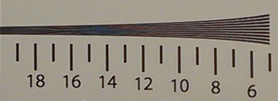
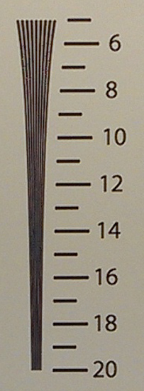
If we look at crops of the spatial resolution in saggital and tangential orientations from the ISO12233 chart, we can see that the One starts to alias around the 12 or 13 mark (units of line pairs per image height), and other 8 MP shooters alias around the 15 mark or just above. That’s not too much of a surprise however given the fact that it’s a 4 MP camera compared to higher resolution cameras. We can see some odd little demosaicing artifacts as the two lines start to alias as well (the maze-looking pattern).
Real World Camera Comparison, Performance in Well Lit Scenes
I took a bunch of photos with the HTC One alongside a number of other cameras in either a bracket or some other form of mount, and I think they tell an interesting story. If you click on the buttons the thumbnail will change, and the image link will also change for viewing the full res original image. I’d recommend opening the full res images in new tabs and then switching back and forth at 1:1 zoom. The phones I had with me for most of these were the HTC One (obviously), iPhone 5, Lumia 920, HTC Butterfly, and LG Optimus G Pro. I took many many photos with each camera at each location and selected the best ones.
What sticks out at me is how much the subtleties of the HTC One match the HTC Butterfly, it’s obvious how much of the regional tastes of their camera tuners makes its way into the images. Both have a bit too much sharpening for my tastes, and virtually all the smartphones lose a lot of detail to noise reduction but still manage to have surprisingly noisy sky texture. I still can’t shake the impression that HTC has some JPEG artifacts which accentuate the noise in these relatively homogenous regions as well. Apple seems to reflect the kind of tuning I would find myself wanting the most – minimal noise reduction in-camera, encode the noise out, and don’t risk losing any detail. HTC and LG seem to go for more aggressive noise reduction which occasionally leaves that oil painting look, and Nokia surprisingly is somewhere in-between.
In the first Sentinel Peak image, the Lumia 920 is oddly soft at the bottom, the HTC One has a bit of softness at bottom right. Because of the way that OIS works in both these cameras there’s that chance that the extreme field angles will have some softness if the camera is shifted during capture while OIS is compensating.
In the second Sentinel Peak image with the saguaro cactus, it’s interesting to pay attention to the detail in the foliage of the palo verde tree. The Optimus G and Butterfly turn most of the tree into a blurry homogenous mess, the Lumia 920 has a bit of an oil painting look as well, and the HTC One does pretty well given its lower resolution, though still looks a bit too sharpened for me.
In this next shot I exposed for the shadowed Virgin Mary figurine using tap to focus / capture on all the cameras. I find that the One excels in situations like this which are a challenge because of very bright and very dark regions next to each other. There’s no HDR used here.
What sticks out about the HTC One to me is what I get from looking EXIF, which is why I pulled that data out for each image in its comparison. Because there’s no way to manually set exposure on any smartphone right now (because nobody is willing to treat smartphone users like adults, apparently), I wind up using auto mode and looking back at what each camera selected in each setting. In the daytime images, what sticks out is that the exposure time is incredibly short, or fast. The result is that the One is incredible at stopping motion outdoors, and this seems to have been HTC’s big priority with tuning the One, rather than pushing noise down even further by going perhaps to ISO 50 like we see the iPhone and LG Optimus G Pro do, if the ST CMOS in the One even supports it.
The Real Test: Low Light Performance of the HTC One
The HTC One is really built for the kind of scenarios that I find myself in more of the time armed with only a smartphone — evening, dusk or night time, indoors in low light at a restaurant, with friends at a social get together, at a store, or in the confines of my office. It’s there that the One shows the fruits of its tradeoff between resolution and larger pixels.
First of all it bears going over that there is a known bug with ISO as of this writing on the HTC One, and the issue is twofold. First, setting an ISO manually from the UI doesn’t guarantee that the ISO will be used, instead, this behaves like an upper bound for what ISO the camera software can choose to use. Think Maximum Auto ISO and you’ll get what I’m talking about if you’re a Nikon shooter. This means if you’re in a well lit scene and select ISO 1600, even though EXIF will report 1600 and you’ve selected 1600, it’s up to the ISP to choose whatever it feels is best, probably well short of 1600. If you’re in a dark scene, most of the time the manually chosen ISO will wind up being the one you get, however. HTC also has chosen to prioritize stopping action when a manual ISO is selected, meaning in a dark environment the maximum exposure time appears to be 1/20 of a second. I took a series of images at each of the manually selectable ISOs to demonstrate this, in addition to the Auto (Normal) mode and Night Mode setting. Note that in Auto, HTC also chooses to prioritize stopping motion with a very high ISO of 1520 in this dark scene and with an exposure time of 1/7s. Going to Night Mode will get you shutter times of up to 1/3 of a second, and ISO of basically 800. I spent a lot of time figuring out what the various modes do, and this is it — Auto goes down to 1/7s with maximum ISO of just short of 2000, and Night Mode goes down to 1/3s with maximum ISO of 800. There’s no real documentation about what these do, which is my gripe with the modal approach to camera UX.
I setup the lightbox scene with a controlled 4 lux illuminance. This is quite dark, around twilight level brightness. Here the difference between phones is dramatic. In Auto mode we see the HTC One reach out to the extreme end of its auto exposure behavior, with ISO of just shy of 2000 and exposure of 1/7s. In Night mode, we get a lot less noise thanks to ISO 800 and a longer 1/3s exposure. Other than the Lumia 920 the rest of the cameras basically aren’t even close, as the iPhone 5 is able to get a decently bright image but has a ton of chroma and luma noise even with 2x2 binning. The G Pro in its night mode reaches out to ISO 1000 and takes a longer 1/8s exposure, but still has noise and looks darker than ideal. Samsung has a curious night mode which appears to take a bunch of exposures and combine them, and doesn’t record any exposure data in EXIF, in auto mode the Note 2 matches the G Pro’s ISO but takes a 1/15s exposure and comes out completely black. Only the Lumia 920 can come close to the One by setting up an exposure with similar configuration to the One’s Night Mode - 0.3 second exposure at ISO 800. I threw in a D300S (5.5 micron pixels, 12.3 MP DX format) with the 35mm F/1.8 at ISO 1600 just for comparison as well for those that maintain smartphones are as good as DSLRs — that clearly is not the case yet.
Pretty much the only viable contenders to matching the One in low light are the Lumia 920 thanks to OIS and iPhone 5 thanks to its 2x2 binning. In the case of the Lumia 920, its OIS allows it to take quite long exposures of up to 0.3 seconds, and in the case of the iPhone 5, 2x2 binning allows Apple to push ISO to the incredibly high 3200 without noise getting too out of control.
Update: A lot of people have asked for the low light mode from the Note 2, which I've gone ahead and included. Note that the Note 2 is essentially also a proxy for SGS3 performance since they share the same imaging system. What's curious about Samsung's low light mode is that it doesn't record any EXIF information at all beyond make and model, making it very hard to tell what the total exposure time is, and thus how succeptible to hand shake it is outside without a tripod. I've found that in practice night mode requires the shooter to be extremely stable and suspect this mode takes multiple images and then computationally merges them afterwards into the final result, which also results in the processing bar popping up. It's an interesting and necessary comparison to make however, even if it doesn't change my conclusions about the One's camera.
I went out at midnight with the HTC One, Lumia 920, and iPhone 5 to shoot some camera comparisons in the bracket and get a feel for how they perform in real world use. I took these photos with all three cameras on full auto, since again there’s broken ISO controls on the HTC One at the moment, since no smartphones will let me set all the exposure settings manually (despite repeated pleas), and finally since that’s honestly what normal users are going to do most often.
The Lumia 920 and One are pretty darn close when it comes right down to it, and both easily outclass the iPhone 5 and the rest of the Android landscape in dark settings. The One is slightly noisier than the Lumia 920 in some of these, and it took me a while to figure out why that was.
In auto mode, the Lumia 920 pushes its OIS further with longer 0.3 second exposures, while the One maxes out at 1/7s (0.143 s) and a higher ISO. I took all these comparison photos before discovering the awesomeness that is Night Mode on the One, which enables the One to push out to 0.3 seconds as well with ISO 800 as the maximum, essentially matching the Lumia 920.
To figure out what was going on, I took a ton of photos in the dark that evening, and put them through my python scripts which parse EXIF and made some histograms.
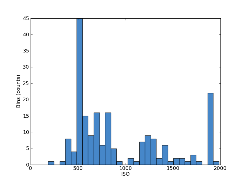
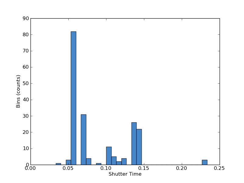
What comes out really tells how each OEM tunes their camera. Apple sticks to two exposure times and just a handful of sensor gain settings, everything above 800 is the 2x2 binned mode. Nokia meanwhile caps ISO at 800 by default, and in their menu, since it’s probably the highest gain the CMOS exposes, and has to push exposure time out to 0.3 seconds a lot, there’s one outlier at 0.5 seconds as well. Meanwhile HTC basically caps everything at 1/7s and ISO 2000 on the One unless you enable Night Mode (which is that one outlier).
What sticks out at me is that the out of box shooting experience on the One rivals the Lumia 920 with shorter exposures by default, and if you force Night Mode on it gets even better. As a result, shot to shot latency on the One even in extremely dark settings is incredibly fast, whereas the Lumia 920 takes much longer. An even bigger difference is in the camera preview — with the One the preview is basically exactly what you end up getting most of the time, it’s bright, full res, and well lit. On the Lumia 920 the preview is usually dark until you run a capture, and then see a well lit scene in the final captured image.
I honestly don’t think the Lumia 920 comparison is the end of the world either, since the One runs Android and the Lumia runs Windows Phone 8. There’s really not a lot of cross platform shopping, and I doubt that camera is going to be enough to put anyone over the ecosystem hump either way, it’s just interesting to compare two smartphones with OIS.
What’s important for HTC is whether the One is the best shooter among Android phones, and that is definitively the case right now. In low light scenarios that are important to me, the One makes the difference between a totally dark image and something usable. It’s only outdoors in broad daylight that the resolution tradeoff is occasionally difficult to stomach, but only if you’re viewing images 1:1 on a computer. Viewed at 1080p or shared online with most services, the One ends up being more than adequate and at the same time able to reach out in low light.
I've taken a huge number of photos on the HTC One and uploaded 117 of them for your perusal straight out of the camera into a gallery which I also included earlier.
I think the tradeoff that HTC has made with the One is an ambitious one and the correct industry direction. It’s awesome to see an OEM other than Nokia continue to prioritize camera on their smartphones, and the One is absolutely the smartphone I’m reaching for to take photos now. I strongly believe that against 13 MP shooters, the One will be even more competitive since what I’ve seen so far of images from cameras with 1.1 micron pixels isn’t a pretty picture. My only big unfulfilled wishes were for the One to have a dedicated camera button and in-box tripod mount.
Video Quality Analysis
The HTC One continues its emphasis on camera with a lot to talk about in the video department. Obviously OIS helps video recording look more stable when hand-held, beyond that there are stereo dual-membrane MEMS microphones, higher bitrate H.264, and low light comparisons to be made with the HTC One.
There are a bunch of video modes on the HTC One which they’ve outlined nicely under Video Resolutions on the camera spec page. The HTC One doesn’t support 1080p60, something I know a lot of users want, it seems like we’re still a generation away from being able to deliver that. HTC includes a mode switch under the Video Capture Mode menu, and the mapping is Normal (1080p30), Slow motion video (768x432p96), Fast HD (720p60), Video HDR (1080p28).
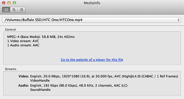
I’ve been writing forever about how OEMs choose oddly enough to not go for the maximum capabilities of the encoders on the SoCs they’ve included. The One goes for the full APQ8064 encode block capabilities of 20 Mbps H.264 high profile this time around. It’s still 1 reference frame, but kudos to HTC for maxing out the encoder capabilities of APQ8064/APQ8064T this generation so I can stop talking about it. Audio is stereo 48 kHz 96.0 kbps AAC per track.
I made a number of videos with two 1080p frames side by side for comparison. First is the HTC One normal versus HDR comparison, which allows you to see a difference in the sky between the non HDR and HDR version.
In the normal 1080p video it’s totally saturated, in the HDR video we can see clouds and sky, and the street appears different as well. There are however some recombination artifacts visible during fast panning left and right. There’s also some odd hysteresis at the beginning as you begin shooting video where the brightness of the whole scene changes and adapts for a second. This ostensibly prevents the whole scene from quickly changing exposures, but at the beginning it’s a little weird to see that fade-in effect which comes with all HDR video. HTC enables video HDR by running its video capture at twice the framerate with an interlaced high and low exposure that then get computationally recombined into a single frame which gets sent off to the encoder. There’s some of this outlined in the camera whitepaper as well.
Next up is how much impact OIS makes on video recording. HTC joins Nokia in including a hardware image stabilization solution which physically moves the lens module around inside the smartphone to dampen out movement. Other OEMs currently are implementing EIS solutions (Electronic Image Stabilization) which works by leveraging a region of pixels around the center 1080 or whatever resolution crop and either an algorithm watching features in the image or the same gyro used by the AP.
In the case of the One, OIS is provided partly thanks to an invensense gyro which can sample at up to 2kHz and in conjunction with with the camera module can correct up to +/- 1 degree in yaw and pitch angle. For still images, this means you can run an exposure longer before running up against blurriness from hand movement, for videos this means much more stable shots with all the high frequency shake hopefully removed. OIS is immediately evident when holding the One and running the camera preview, quick shakes and fast pans are damped out, and if you stare at the module on the back side and slightly move the device you can see the whole lens assembly counteract your motion as well.
So how does it work in practice? I decided to compare with the Lumia 920 in my camera bracket, which makes it easy to guarantee the same shakes and impulses are conveyed to both cameras. I stomped around while shooting video simultaneously on both cameras, then edited together the result side by side and synced them up.
First of all, it goes without saying that the One blows away the devices which only can use EIS when it comes to video stabilization, which means essentially everything besides the Lumia 920. The One does an impressive job damping out the high frequency movement, but doesn’t quite match the Lumia 920, which looks so good that you’d think it’s on a tripod or steadicam or something. Only the most aggressive of shakes show up in the Lumia 920’s output video, while I feel like the One could be a bit more generous with the low frequency shakes. Still, having OIS on an Android device is a huge boon.
The normal video bench location is essentially closed down with not a lot to look at while construction re-starts there on the modern streetcar project, so I’ve recorded a few other samples at other locations. I’ve also uploaded samples of the videos in their original form if you’re interested in seeing them without YouTube’s transcode or resizing. There’s a 1080p HDR sample, 1080p normal sample, 720p60 sample, and the fast/slow motion mode 768x432 video which gets played back at 30fps.
The quality of normal 1080p30 video on the HTC One is good, and it doesn’t appear to drop any frames during capture in daylight or outdoors. Also since the bitrate is nice and high, I don’t see any encode artifacts to complain about. I can’t however shake the feeling that it should be a bit sharper. It’s likely that HTC is sampling the sensor at 1080p natively rather than able to request the full sensor output then downsample and encode, which would make the quality of output video even sharper. It’s good it just isn’t mind-blowing outdoors in broad daylight. Switching into video mode also doesn’t result in magnification changing wildly, though it’s obvious there is a bit of a crop going on, but it’s slight, and I suspect to leave some pixels for additional image stabilization reasons.
At night however the One really shines. I put together another comparison video with the One, iPhone 5, and Lumia 920 in side by side to demonstrate the differences in low light behavior.
Here the benefits in having those bigger pixels pay off. The One is substantially brighter than either of the other two phones. The Lumia 920 prioritizes framerate and keeps things exactly at 30, which results in the video looking much darker. The iPhone has distracting EIS which runs and results in lights and other point sources looking like they’re blurring in all directions while I walk along the path. HTC lets the framerate slip into the 20s on the One, but looks a heck of a lot brighter. In the final parking garage scene there are a few parts where we can’t see anything on the Lumia but can see the scene on the One.
MEMS Microphones
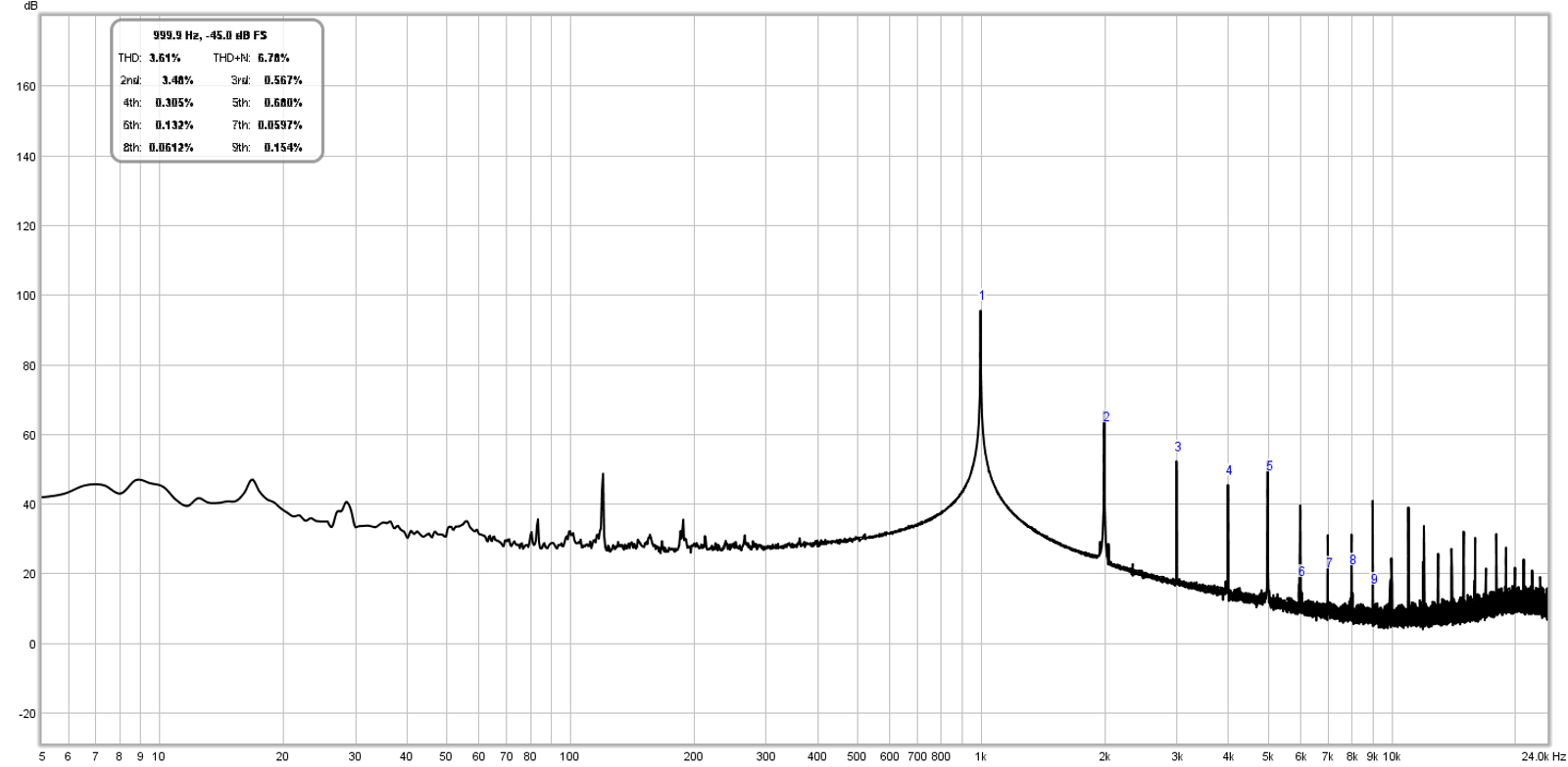
Last but not least are the special high dynamic range microphones on the HTC One, which are dual-membrane MEMS. Both microphones on the One are these special MEMS dual membrane type. The idea is to have one region with a large membrane that works when ambient noise is quieter (lower SPL, higher sensitivity), and a second smaller membrane for higher volume (higher SPL, lower sensitivity) ambient noise. There’s a crossover point in loudness where one microphone gets used, somewhere around 70 dBA. The goal is to both be sensitive in quiet scenarios and still not saturate in loud scenarios like a concert or some other much louder situation. HTC also claims that the microphones simply are better than the competition and able to record more dynamic range in frequency space. Inclusion of higher end MEMS microphones isn’t something that only HTC has done, Nokia also did this on their PureView devices though I’m not as clear about the details there.
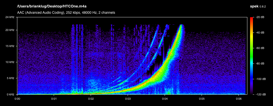
I’m very impressed with the audio recording quality of the HTC One. I took the One out and recorded video in a setting so loud (~155 dBA) that it would cause hearing damage without protection and absolutely positively saturates just about every smartphone camera I can throw at it, and even higher end microphones on dedicated video cameras. You just don’t hear anything other than clipping on most devices. The One doesn’t saturate at all in this setting, amazingly. I’ll leave it to you to figure out what setting this was based on the spectogram.
I ran a frequency sweep in front of some very loud speakers from 20 Hz to 20 kHz and recorded the output on the iPhone 5 and HTC One to see if HTC’s claims about frequency response also are valid. Turns out, they are, and I didn’t realize it but Apple cuts microphone output at around 16 kHz and can’t resolve above it, in addition we can see lots of power which is entirely just noise. The HTC One meanwhile goes up to around 22 kHz, also encodes more lower frequency components as well during the beginning of the sweep, and has less noise. There’s a definite audible difference in the recording made by the iPhone 5 and HTC One if you can resolve these frequencies on your speakers.
The combination of OIS, unique CMOS sensor, and special microphones makes the video recording experience on the HTC One demonstrably better than pretty much all other smartphones. I’m impressed that we have not one but two handset makers now including OIS, even though I feel that there’s room for additional tuning of OIS even on the final hardware and software to damp out more low frequency events and make the video even more buttery smooth. HTC’s dual membrane MEMS microphones also don’t saturate in even the most challenging environments, HTC is using the fullest output of the encoder, and video quality for the most part is good enough that I don’t have a problem using it when recording demos at shows or of things that are important to me. Low light performance is also head and shoulders above the competition.
Zoes and the Highlights Reel
The reality of the device landscape at the moment is that raw specs can certainly break a device if they’re not the right ones, but don’t necessarily sell the device. Experiences on the other hand sell devices directly, either from users indireclty marketing them to friends with demonstrations, or through well packaged advertising by an OEM. The short of it is that HTC can deliver an awesome device with great camera, speakers, and microphones, but without something compelling that touches all of them it’s just not quite as impactful or directly engaging.
Enter the HTC One’s killer app, by far, the combination of a new shooting mode called Zoe (short for Zoetrope) and a gallery feature called the Highlights reel.
Zoes are a new form of photography — part video, part still photo, part software. Put simply, a Zoe is video plus still images, specifically 3 seconds of video with 20 full resolution 4 MP images taken during the video record. HTC’s combination of ISP, SoC, and sensor choice enables them to take that 1080p video and simultaneously capture full resolution images, and that’s what a Zoe is. Inside the gallery Zoes animate and then go back to being still, and there’s a UI for scrubbing through the still images which make up that particular Zoe. To shoot a Zoe, one simply taps the button in the camera UI and hits the photo button, which then turns into a progress bar that fills with red as the Zoe is taken.
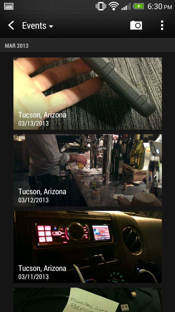

The gallery will animate thumbnails with Zoes and video content inside (left). Tapping on the big double wide icon up top triggers the Highlights Reel (right)
Zoe video is slightly lower bitrate and framerate, 1080p24 8 Mbps H.264 High Profile, but in practice these are good enough if you’re trying to balance a mode that essentially treats videos like photos.
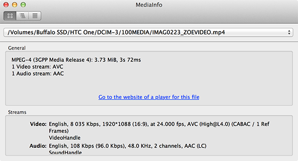
When I first heard about Zoes I was worried that HTC would break the DCIM (Design Rule for Camera File System - Digital Camera IMages) rules and dump the Zoe in some proprietary file extension or zip inside another directory. I was at first overjoyed when I learned they didn’t do exactly that. Instead these are just videos and photos with a different name that the gallery app parses and turns into the Zoe experience, eg “IMAG0815_ZOE005.jpg” and “IMAG0815_ZOE006_SHOT.jpg” for the shot you’ve chosen and “IMAG0815_ZOEVIDEO.mp4” for the corresponding video.
I say at first I was happy because I use Dropbox Camera Upload for all the myriad phones I have in conjunction with a python script I made that sorts the images into appropriate folders based on the camera type in use. The unfortunate part is that Zoes plus Dropbox’s camera upload file renaming makes looking through images a nightmare, and you wind up with 20 per. Hopefully the two will arrive at some collaborative solution since Dropbox and HTC have partnered to offer free storage on non US variants of the One. The rest of the Zoe experience, however, is quite good.
The only thing that takes a bit of a hit is low light performance while taking Zoes, partly because video framerate is prioritized and thus HTC can’t run as long exposures. Most of the time this isn’t a big deal until you’re in an extremely dark scene.
The real advantage to shooting Zoes instead of normal photos or videos is what you can do with them on the One with the next feature — the Highlights Reel.
HTC has combined the concept of events inside its gallery with a unique computationally edited 30 second video experience called the Highlights Reel. After tapping on the top icon in a gallery in the element view, you’re greeted with a short video built from all the images and videos from the event. Zoes, images, and videos get arranged into a video with music and appropriate editing, and it looks awesome.
Still images get a Ken Burns effect with panning and zooming, videos play back in short little sequences, it seems as though HTC also does face detection to pick out what images and videos to use, and the result usually is enough to tell the story of an evening or some social engagement if you’re actively taking Zoes and other media. There are six different themes, with different filters and moods that range from dreamy to making you feel like you’re part of some reality show. At present only those six combinations of music, filters, and cuts are available, though in the future HTC will add the ability to include custom music and perhaps more themes.
The Highlights reels can be viewed immediately (rendered in real time on the device, which is impressive) or encoded and saved out to a video for doing what you want with. In addition HTC has a first party sharing service called Zoe share which stores the Highlights Reel, Zoes, and media on HTC’s servers for 180 days with either an HTC account or Facebook login. I uploaded an example Zoe Share based on my low light downtown test photos and videos, and another one based on a few outings with friends.
I’ve made a lot of great Zoes in my time with the HTC One, and the best ones have people and friends in them, unfortunately those are the people most likely to get angry about me sharing videos of their antics. If you shoot Zoes for an evening or take a trip and only shoot them however, the One will produce some awesome Highlights reels. The HTC software does an incredibly good job creating something engaging and professional looking videos with minimal interaction. It’s really optimal to shoot Zoes if you’re going to be looking at the Highlights reel afterward, and this is the exact kind of content you want to use with the front facing speakers. It’s the perfect example of a killer app which shows off all the cool parts of the HTC One.
Display Quality - 4.7-inch 1080p
The HTC One includes a 4.7-inch 1080p LCD display. I thought the HTC Droid DNA slash Butterfly was probably around the highest we would see pixel density go for a smartphone, turns out the HTC One is even higher, obviously, given its smaller size. The display is what HTC calls Super LCD 3, previous revisions were Super LCD 2. As far as I know this is an IPS display as well, Low Temperature Polysilicon (LTPS). Atop the display is a Synaptics ClearPad Series 3 S3202 with 10 point touch detection. This isn’t in-cell based on the presence of S3202.
I did some digging, turns out the display is curiously marked as being from JDI (Japan Display Inc) who also was behind the DNA and Butterfly display. In fact there’s even a press release from JDI about a display with those exact same specs (5.0 inch, 1080p, 443 PPI). Of course the One is even higher, 4.7 inch, 468 PPI, no doubt this is a different revision. Interestingly enough I believe Samsung display is also a secondary supplier based on the string I saw dumped.
PANEL_ID_M7_JDI_SAMSUNG_C2_2
For interested parties, this resolution and size puts the HTC One display in a category above xhdpi, the nascient xxhdpi Android density which is technically for 480 PPI but 470 PPI is apparently high enough to qualify as well. HTC internally defines the One as being 480 PPI to meet this threshold.
Subjectively, I find the HTC One display nothing short of amazing. The DNA already was incredibly high resolution, the One is even better. That level of resolution definitely exceeds my visual acuity, and is a sight to behold. When it comes to viewing angles, they’re excellent indoors and just about the same as every phone outdoors. There’s hardly any gap between surface and display with the One at all, it’s brilliant indoors and out. To say that 1080p on mobile devices has spoiled me is putting it lightly. In addition, 4.7 inches seems to be a nice middle ground in terms of display size — it’s close enough to 5 to not seem small, and not absurdly huge.
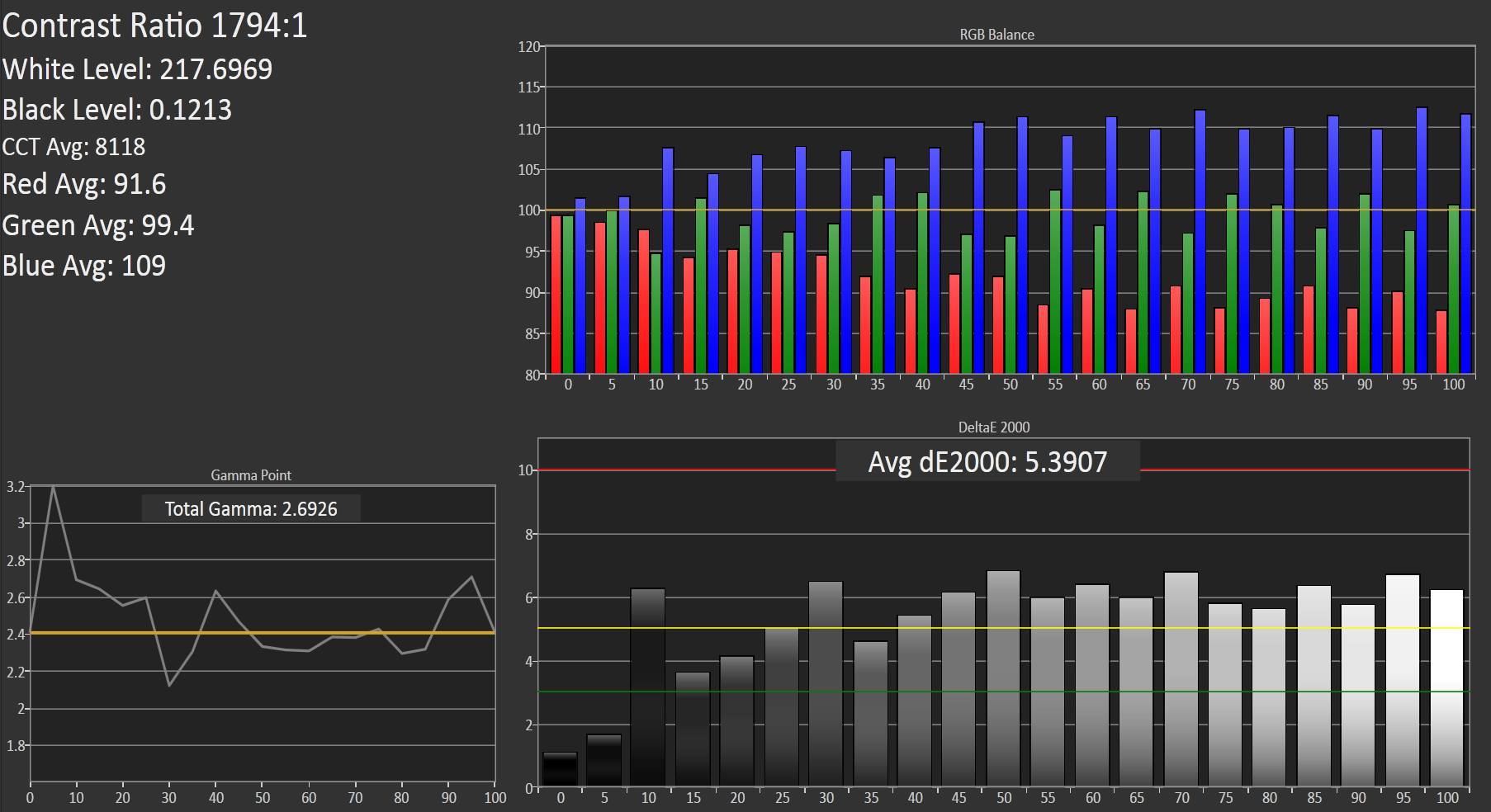
The HTC One includes a dynamic contrast function which can’t easily be disabled, as there’s no option in the display settings for it. There are obvious log messages which get dumped which reflect the dynamic contrast’s presence as well. This makes measuring contrast and black level somewhat difficult since it’s always adjusting brightness based on the content. HTC makes it pretty subtle, but it is definitely there.
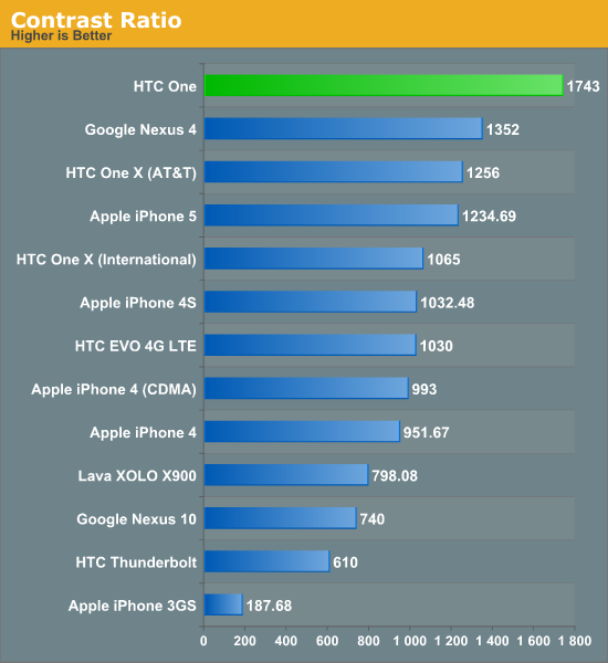
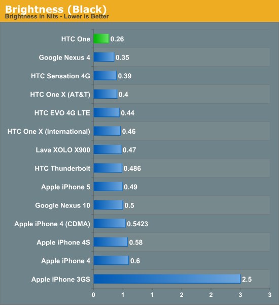
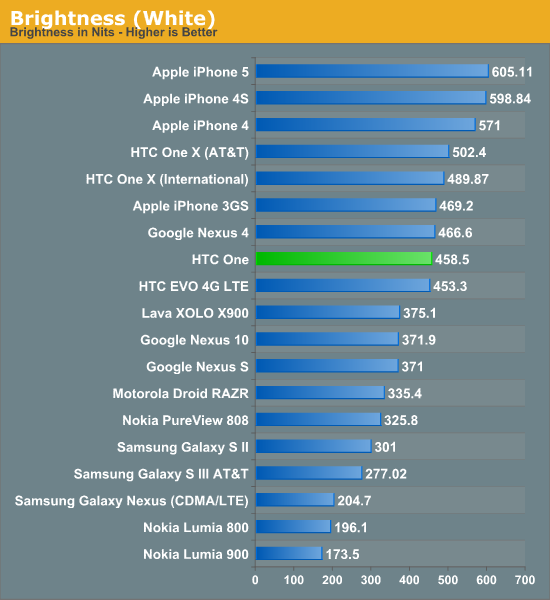
The One goes nice and bright, at just shy of 460 nits. If you believe the contrast and black levels, it’s also incredibly contrasty. I suspect that real contrast is much closer to 1000 though than 1700+ given the dynamic contrast.
I did the usual thing and ran the One through our new-ish smartphone display calibration workflow. In the past I’ve been very pleased with HTC’s calibration, publicly I said that the One X was probably the best Android-landscape display I had seen for that generation, and the One S was by far the best I’ve seen SAMOLED calibrated and the most well controlled I’ve seen it out of the box, no joke.
| CalMAN Display Comparison | |||||||||||
| Metric | iPhone 5 | iPhone 4S | HTC One X | Samsung Galaxy S 3 | Samsung Galaxy Note 2 | Google Nexus 4 | HTC Droid DNA | HTC One | |||
| Grayscale 200nits Avg dE2000 | 3.564 | 6.162 | 6.609 | 4.578 | 5.867 | 7.686 | 6.738 | 5.391 | |||
| CCT Avg (K) | 6925 | 7171 | 5944 | 6809 | 7109 | 8506 | 8108 | 8118 | |||
| Saturation Sweep Avg dE2000 | 3.591 | 8.787 | 5.066 | 5.460 | 7.986 | 8.517 | 5.856 | 3.365 | |||
| GMB ColorChecker Avg dE2000 | 4.747 | 6.328 | 6.963 | 7.322 | 8.185 | 7.531 | 6.687 | 4.656 | |||
By the numbers the HTC One is better calibrated (lower Delta-E is better in the table) than the One X or DNA, and the color space comes very close to sRGB out of the box. It is demonstrably better than the predecessor in every way, and amazingly gives the iPhone 5 a run for its money in saturation and the GMB color checker card. Inexcusable however is the 8000K+ white point, which is blue, although during use I never have looked at the One and thought wow this is really blue.
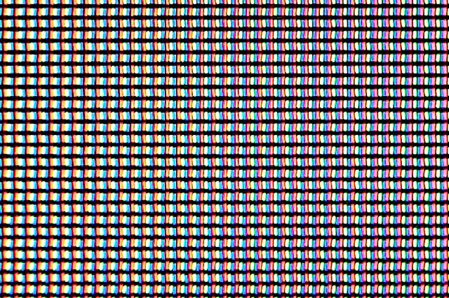
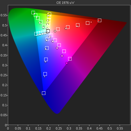
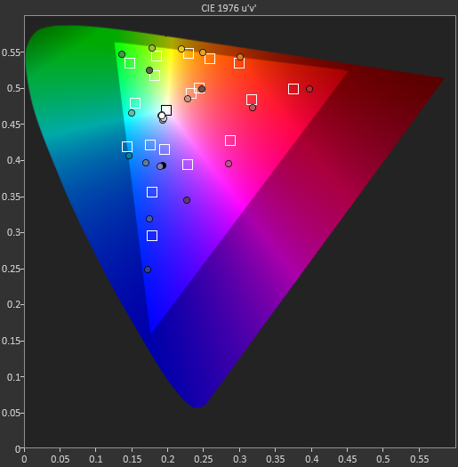
I think we’ve gotten to the point in the smartphone landscape where we have enough PPI, maybe a bit overkill honestly. There’s really no point in going much beyond the visual acuity limit, you could make an argument about nyquist and covering a few edge cases where the 50 percent square wave assumption built into 1 arcminute doesn’t hold up, but there’s no need to go much beyond this. Instead, now we need to get color accuracy tracking well and not drifting during a product’s lifespan. I think HTC continues to do a much better job than all the other Android OEMs, but only Apple is really taking things seriously here and taking the couple of dollar hit to have each panel calibrated. That said the HTC One’s display is a sight to behold, it is incredibly crisp and sharp in every condition you can throw at it.
The One: Powered by Qualcomm's Snapdragon 600
At the beginning of 2012, the flagship smartphone platform was Qualcomm's MSM8960 featuring two Krait cores, Adreno 225 GPU and integrated LTE on TSMC's 28nm LP process. By the end of the year, the target shifted to Qualcomm's Fusion 3 platform: APQ8064/Snapdragon S4 Pro featuring four Krait cores, Adreno 320 GPUand a discrete MDM9x15 LTE baseband also on TSMC's 28nm LP process. Here we are, less than half a year later and the bar has been raised once more.
The new platform for any flagship Android smartphone is Qualcomm's recently announced Snapdragon 600. At the heart of the Snapdragon 600 platform are four Krait 300 CPU cores and an Adreno 320 GPU. The move from Krait (also known as Krait 200) to Krait 300 CPU cores comes with a handful of microarchitectural level improvements, not all of which have been disclosed publicly at this point.
Krait 300 is still built on the same 28nm LP process at TSMC, Samsung and perhaps a third foundry at this point. The pipeline of Krait 300 hasn't been changed, but Qualcomm claims it is able to run Krait 300 at higher clocks than the original version of the core without relying simply on voltage scaling. Indeed we see this in HTC's One, which can run each core at up to 1.7GHz compared to the 1.5GHz max in the APQ8064 based Droid DNA. Samsung has already announced that some versions of its Galaxy S 4 will feature the Snapdragon 600 with its CPU cores running at up to 1.9GHz.
As with previous implementations of Krait, each Krait 300 core can operate at its own frequency and voltage independently of the other cores. Each core is also power gated, so if you're not using cores they aren't a power burden on the system.
Diving a bit deeper, Krait 300 introduces a hardware L2 data prefetcher, responsible for using available memory bandwidth to preemptively bring data into the L2 cache ahead of actual demand. Any sort of prefetching (or speculative execution) typically comes with a significant power penalty, which is why we don't see a ton of it in mobile - at least not without an associated move to a smaller manufacturing process.
Branch prediction accuracy improves with Krait 300 and the new architecture is capable of executing more instructions out of their original program order. Krait 300 still isn't as fully out of order as ARM's Cortex A15, but it's somehow more OoO than the original core. Finally Qualcomm claims improvements to both FP and js performance with Krait 300, but we still don't have details as to how.
In general, Qualcomm claims we should expect a 15% increase in CPU performance at the same frequency for Krait 300 vs. the og Krait. Factoring in clock speed improvements and you're looking at 25 - 30% at the high end. To find out just how much of an improvement exists in the real world, we once again turn to a combination of microbenchmarks and the usual set of web browser and native client tests.
I started out by running Geekbench 2.0 on the One and HTC's Butterfly, an APQ8064 platform. The One has its CPU cores clocked at up to 1.7GHz while the Butterfly tops out at 1.5GHz. As I've done in the past, I'm presenting the Geekbench results at native speeds as well as scaled up by 13% to simulate a theoretical 1.7GHz APQ8064.
We'll start out with a look at integer performance. These benchmarks exclusively use integer data and are generally small enough to fit in at least the processor's L2 cache. Each benchmark runs in both a single threaded (1 core) and multithreaded (many core) instance. Since both SoCs feature four CPU cores, we should get a good idea of how multithreaded scaling changed with the move to Krait 300/Snapdragon 600.
| Geekbench 2 - Microbenchmark Performance Comparison - Integer Performance | ||||||
| Krait - 1.5GHz | Krait - 1.7GHz (Simulated) | Krait 300 - 1.7GHz | Krait 300/Krait Perf Advantage | |||
| Integer | 973 | 1103 | 1959 | 77.6% | ||
| Blowfish | 23.5 | 26.6 | 34.6 | 29.9% | ||
| Blowfish MT | 52.9 | 59.9 | 129 | 115.2% | ||
| Text Compression | 1.84 | 2.08 | 2.41 | 15.6% | ||
| Text Compression MT | 3.07 | 3.47 | 8.16 | 134.5% | ||
| Text Decompression | 1.78 | 2.01 | 234 | 16.5% | ||
| Text Decompression MT | 3.92 | 4.44 | 6.08 | 36.9% | ||
| Image Compression | 4.98 | 5.64 | 8.78 | 55.6% | ||
| Image Compression MT | 15.7 | 17.7 | 21.8 | 22.5% | ||
| Image Decompression | 7.41 | 8.39 | 13.6 | 61.9% | ||
| Image Decompression MT | 21.0 | 23.8 | 45.1 | 89.5% | ||
| LUA | 299.0 | 338.8 | 607.6 | 79.3% | ||
| LUA MT | 753.0 | 853.4 | 2090 | 144.9% | ||
| ST Average | 43.1% | |||||
| MT Average | 90.6% | |||||
The Blowfish test is an encryption/decryption test that implements the Blowfish algorithm. The algorithm itself is fairly cache intensive and features a good amount of integer math and bitwise logical operations. Here we see a 30% increase in single threaded performance, but a whopping 115% increase in the multithreaded Blowfish test. We see this same ST/MT disparity echoed in a number of other benchmarks here as well.
The text compression/decompression tests use bzip2 to compress/decompress text files. As text files compress very well, these tests become great low level CPU benchmarks. The bzip2 front end does a lot of sorting, and is thus very branch as well as heavy on logical operations (integer ALUs used here). We don't know much about the size of the data set here but given the short run times we're not talking about compressing/decompressing all of the text in Wikipedia. It's safe to assume that these tests run mostly out of cache. Here we see a 15.6% advantage over a perfectly scaled Krait 200, but once again looking at multithreaded performance the gains are far larger (134.5%). Qualcomm may have improved cache coherency/cache sharing performance in Krait 300, which results in a significant speedup when multitple threads are accessing the same data. All of this is speculation at this point since I don't have good low level information on what Krait's architecture actually looks like however.
The image compression/decompression tests are particularly useful as they just show JPEG compression/decompression performance, a very real world use case that's often seen in many applications (although hardware JPEG acceleration does limit its usefulness these days in mobile). The code here is once again very integer math heavy (adds, divs and muls), with some light branching. On the compression side we see a reversal of the earlier trends - single threaded performance is where we see the biggest improvement (55.6%) while MT scaling is roughly half that. On the decompression side, both ST and MT performance improves by a healthy amount. Improved branch prediction likely plays a role here. I'm still not totally clear on why we're seeing inconsistency in ST and MT scaling here between Krait 200 and Krait 300, but it's obvious that Qualcomm has done significant work under the hood of the Krait microarchitecture.
The final set of integer tests are scripted LUA benchmarks that find all of the prime numbers below 200,000. As with most primality tests, the LUA benchmarks here are heavy on adds/muls with a fair amount of branching. Krait 300's gains here are nothing short of impressive both in single and multithreaded performance. The improved branch prediction accuracy likely helps here, but there's still some unknown impact that enables greater-than-expected MT scaling.
On average there's a 43.1% increase in non-memory-bound single threaded integer performance and almost twice that on the multithreaded side. Remember we're talking about very targeted benchmarks here, so a real world single threaded perf increase closer to 15% wouldn't be surprising.
| Geekbench 2 - Microbenchmark Performance Comparison - FP Performance | ||||||
| Krait - 1.5GHz | Krait - 1.7GHz (Simulated) | Krait 300 - 1.7GHz | Krait 300/Krait Perf Advantage | |||
| FP | 2199 | 2492 | 4244 | 70.3% | ||
| Mandlebrot | 201.0 | 227.8 | 416.5 | 82.8% | ||
| Mandlebrot MT | 582.0 | 659.6 | 1650.0 | 150.2% | ||
| Dot Product | 442.0 | 500.9 | 855.5 | 70.8% | ||
| Dot Product MT | 944.0 | 1069.8 | 3070.0 | 187.0% | ||
| LU Decomposition | 184.0 | 208.5 | 368.3 | 76.6% | ||
| LU Decomposition MT | 571.0 | 647.1 | 795.9 | 23.0% | ||
| Primality | 180.0 | 204.0 | 370.5 | 81.6% | ||
| Primality MT | 491.0 | 556.4 | 657.2 | 18.1% | ||
| Sharpen Image | 3.85 | 4.36 | 7.15 | 63.9% | ||
| Sharpen Image MT | 13.0 | 14.7 | 18.6 | 26.2% | ||
| Blur Image | 2.31 | 2.61 | 3.51 | 34.1% | ||
| Blur Image MT | 5.73 | 6.49 | 12.9 | 98.6% | ||
| ST Average | 68.3% | |||||
| MT Average | 83.8% | |||||
The Mandlebrot benchmark simply renders iterations of the Mandlebrot set. Here there's a lot of floating point math (adds/muls) combined with a fair amount of branching as the algorithm determines whether or not values are contained within the Mandlebrot set. Right off the bat we see significant gains in FP performance, and once again we see the same non-linear scaling when we compare MT improvement to ST improvement.
The Dot Product test is simple enough, it computes the dot product of two FP vectors. Once again there are a lot of FP adds and muls here as the dot product is calculated. With a 70% increase here (ST), we're able to put numbers to Qualcomm's claims of increased FP performance. Multithreaded performance improves by an even larger margin.
The LU Decomposition tests factorize a 128 x 128 matrix into a product of two matrices. The sheer size of the source matrix guarantees that this test has to hit the L2 cache. The math involved are once again FP adds/muls, but the big change here appears to be the size of the dataset. Interestingly enough, the multithreaded performance improvement isn't anywhere near as large in this physically bigger FP workload. Single threaded performance gains are still significant however. I wonder if the better than expected MT scaling results might be limited to workloads where the datasets are small enough to be contained exclusively in the L1 cache.
The Primality benchmarks perform the first few iterations of the Lucas-Lehmar test on a specific Mersenne number to determine whether or not it's prime. The math here is very heavy on FP adds, multiplies and sqrt functions. The data set shouldn't be large enough to require trips out to main memory. The performance resultshere are very similar to what we saw in the LU decomposition tests - significant gains in single threaded perf, and more subtle increases in MT performance.
Both the sharpen and blur tests apply a convolution filter to an image stored in memory. The application of the filter itself is a combination of matrix multiplies, adds, divides and branches. The size of the data set likely hits the data cache a good amount. The sharpen test shows great scaling in single threaded performance, but less scaling in the multithreaded workload - while the blur test does the exact opposite.
Overall FP performance improvements are solid. Single threaded performance improves a bit more than what we saw with the integer workloads, while overall multithreaded FP is somewhat similar. Bottom line, small size compute limited workloads seem to improve tremendously with Krait 300.
The next table of results looks at memory bound performance to see if things have improved on that front. We don't have a good idea of the DRAM used in the HTC One vs. the HTC Butterfly, and since memory performance doesn't necessarily improve with clock speed I'm not presenting the scaled Krait 200 results:
| Geekbench 2 - Microbenchmark Performance Comparison - Memory Performance | |||||
| Krait - 1.5GHz | Krait 300 - 1.7GHz | Krait 300/Krait Perf Advantage | |||
| Memory Overall | 1244 | 2617 | 110.4% | ||
| Read Sequential | 347 | 1160 | 234% | ||
| Write Sequential | 950 | 2940 | 209% | ||
| Stdlib Alloc | 1.11 | 1.40 | 26.1% | ||
| Stdlib Write | 2.91 | 4.74 | 62.9% | ||
| Stdlib Copy | 2.98 | 5.33 | 78.9% | ||
| STREAM Overall | 571 | 657 | 15.1% | ||
| Copy | 804 | 916.5 | 14.0% | ||
| Scale | 852 | 849.7 | 0% | ||
| Add | 923 | 1005.6 | 8.9% | ||
| Triad | 672 | 970.8 | 44.5% | ||
The read and write sequential tests measure reads and writes to/from the register file. In both situations, performance on Krait 300 is significantly better - more than doubling its predecessor.
The C-library functions all improve by varying degrees - it's clear that peak memory performance improved with Krait 300.
STREAM gives us a good look at sustained memory bandwidth, and here we don't see a ton of improvement in most of the tests. The copy, scale and add tests just copy data around in memory, with the latter two tests including a single FP operation (mul then add, respectively). It's only the final test, Triad, where we see significant scaling. The only difference there is the use of two FP operations, with the add being dependent on the results of the previous mul. Here we could be seeing the results of the ability to forward data between pipeline stages in Krait 300.
To corroborate the Geekbench 2 results, we turn to AndEBench - effectively Coremark for Android. The Coremark source is composed of very tiny benchmarks that fit entirely within local caches, giving us a poor indication of system level performance but good insight into improvements at a microarchitectural level. The results below appear in both native code and java runtime formats:
| AndEBench - Microbenchmark Performance Comparison | ||||||
| Krait - 1.5GHz | Krait - 1.7GHz (Simulated) | Krait 300 - 1.7GHz | Krait 300/Krait Perf Advantage | |||
| Native Score | 6627 | 7510 | 8958 | 19.3% | ||
| Java Score | 221 | 250 | 432 | 72.5% | ||
Native performance increased by only 19.3%, while Java performance improved by a healthy 72.5%. AndEBench doesn't actually give us any new data, but it does help to validate some of the gains we saw earlier.
Overall it's clear that Krait 300 includes substantial improvement to register file access and integer/FP compute. Sustained memory bandwidth alone doesn't improve by a huge amount, which makes sense given Krait's already decent memory subsystem (at least compared to ARM's Cortex A9). Features such as data forwarding and improved branch prediction can also have significant impacts on performance. Finally, there seems to be some enhancement in Krait 300/Snapdragon 600 for improving multithreaded performance when all cores are working on a similar program with shared data. All of these improvements make Krait 300 a significant upgrade, at least from a microarchitectural perspective, over its predecessor. While we don't have good low level power analysis for Krait 300 vs. the original Krait yet, it's entirely possible that the nature of these improvements won't come at a significant power penalty. In particular, improving branch prediction accuracy can lead to lower power consumption as well as higher performance as mispredicted branches result in wasted compute and wasted power.
Snapdragon 600 - CPU Performance
With the low level look at Krait 300 out of the way, let's see how the One fares in our standard suite of Android based CPU tests.
We'll start with SunSpider 0.9.1, our trusty javascript performance test.
Despite the low level improvements, HTC's One here doesn't offer any advantage over the APQ8064 based flagships from last year. I suspect what we're seeing here are limits of software/browser optimizations on the One rather than a conclusion about the performance of its hardware.
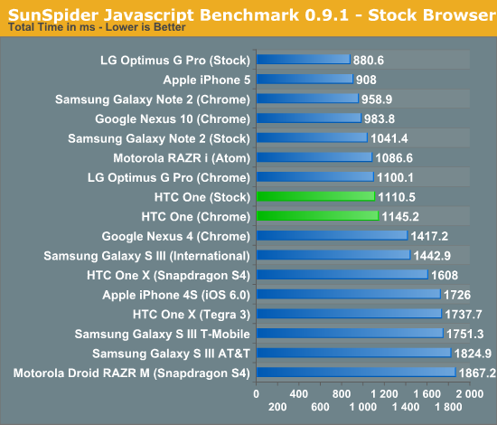
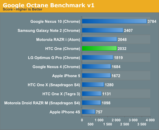
The One's standings improve as we look at Google's Octane test, effectively tying the performance of the Atom based Motorola RAZR i. The Exynos 4412 based Galaxy Note 2 continues to perform very well here, despite being built on older Cortex A9 hardware running at a slightly lower clock frequency.
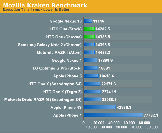
Kraken is likely the least optimized for javascript benchmark we have in our suite, which makes it (temporarily) interesting. There's also the fact that the benchmark is quite large and takes a while to run on all platforms, giving us some more useful results. Here the One is second only to the Cortex A15 based Nexus 10 tablet, which should be faster given its higher TDP and much beefier microarchitecture. Otherwise the One is the fastest Android device we've tested here.
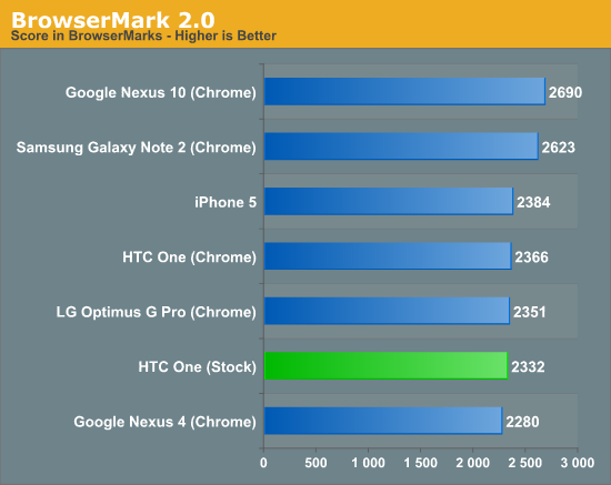
BrowserMark 2.0 goes back to having the GNote 2 on top in the phone space, nearly equalling the performance of the Nexus 10. The data is very strange but I don't have a good explanation for it, other than that we really need to move away from js based benchmarks as soon as good ones are available. The BrowserMark 2.0 performance of the One looks very similar to the iPhone 5.
Our two Vellamo benchmarks both show the One doing very well. In the HTML5 test, the One puts everything else to shame - including the old APQ8064 based Droid DNA and the Galaxy Note 2. The Qualcomm comparison is the more interesting as it echoes some of what we saw in the microbenchmarks - take into account the clock speed difference and you're looking at a 22% improvement in performance due to the new Krait 300 cores.
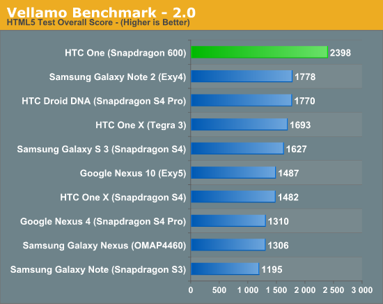
The Vellamo Metal score shows a smaller overall performance advantage (~11% if you take into account the clock speed difference), but still a measurable one nonetheless. Here we also see the Nexus 10 perform as expected:
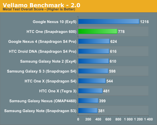
Subjectively, the new Snapdragon 600 platform is appreciably quicker than the previous generation S4 Pro. The margin of improvement will really depend on the application you're using, but in terms of responsiveness the HTC One is among the best out today. The real question is how Qualcomm's latest will compare once Cortex A15 based SoCs begin shipping in phones, not just from a performance standpoint but taking into account power as well.
Snapdragon 600 - GPU Performance
On the GPU side of Snapdragon 600 we're still looking at Adreno 320, which is easily Qualcomm's first highly competitive GPU. At its launch, Qualcomm claimed the Adreno 320 clocks in Snapdragon 600 could be higher than what we saw in S4 Pro/APQ8064. To find out, we turned to our trusty GLBenchmark suite.
The good news is that none of the thermal throttling we saw on the APQ8064 based Nexus 4 was present on the HTC One. Curiously enough, the thermald.conf file is now stored as a binary file - which means we can't get direct access to it. Either way, although the One can get warm during heavy CPU/GPU workloads, it doesn't throttle while running GLBenchmark which meant our freezer can remain on food cooling duties for this review.
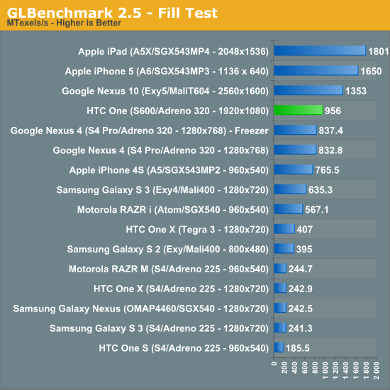
Here we see a small increase in fill rate compared to the Nexus 4, roughly 14%.
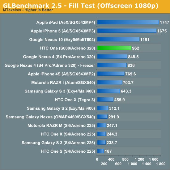
The beauty of being on a 1080p display is that GLBench's on and offscreen tests produce roughly similar results as they are both run at 1080p. The offscreen results do have vsync disabled though.
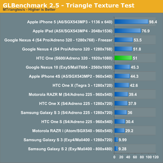
Very similar triangle throughput to the Nexus 4, and a bit lower than the Nexus 4 freezer test, which implies that Qualcomm is doing a better job of keeping GPU clocks under control in Snapdragon 600.
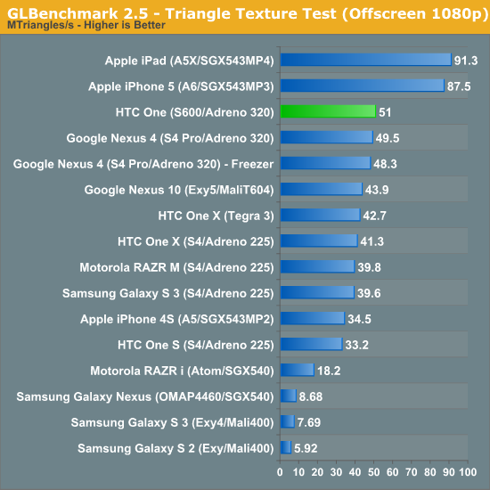
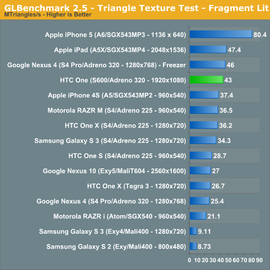
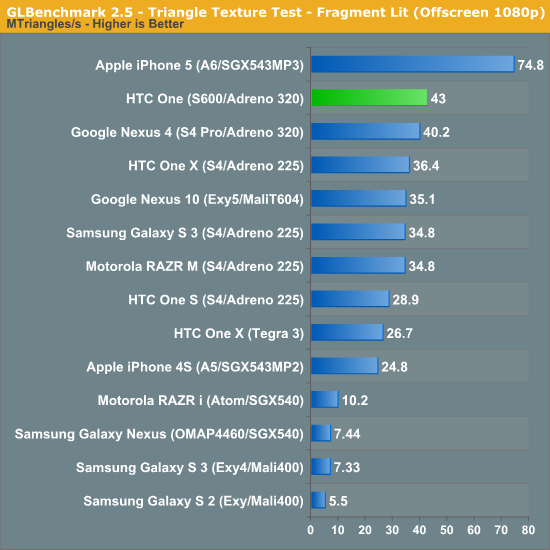
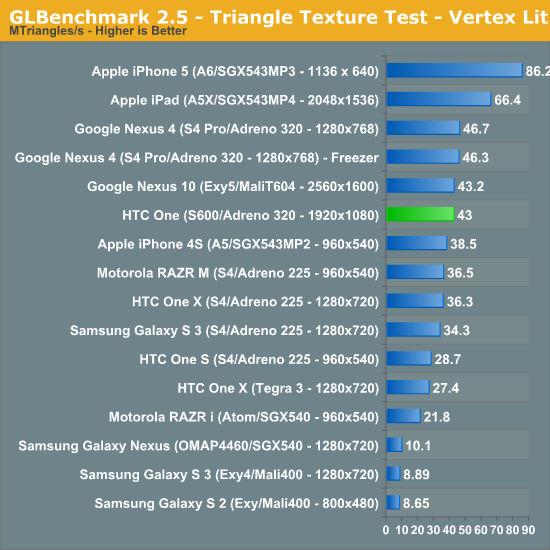
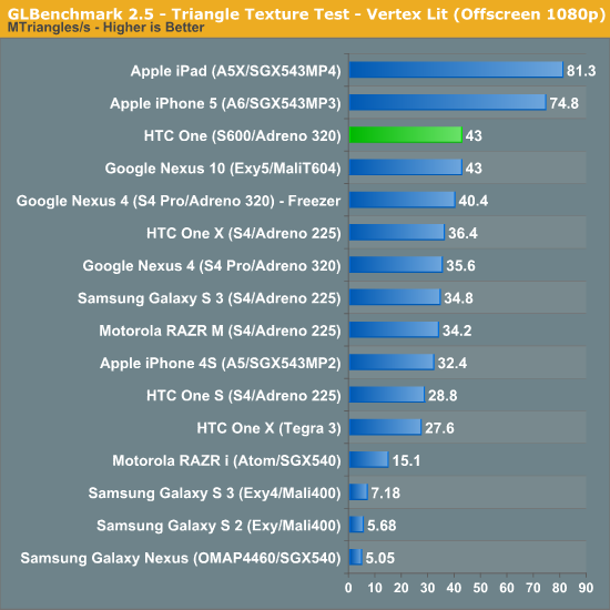
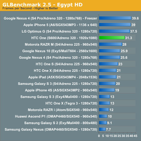
The "game" benchmarks in GLBench give us a good indication of overall performance. The offscreen results are most interesting from drawing comparative conclusions:
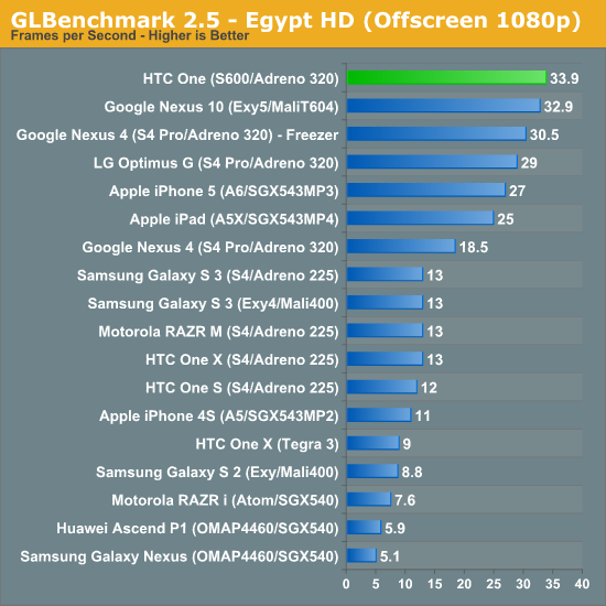
The One is fast - it's now the fastest smartphone we've ever tested in the Egypt HD offscreen test. The margin over the Nexus 4 however makes me believe that we're talking about very small increases in GPU frequency at best (either that or better thermal management).
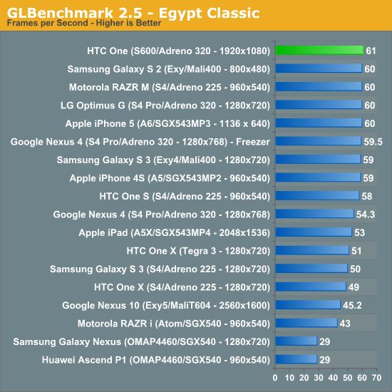
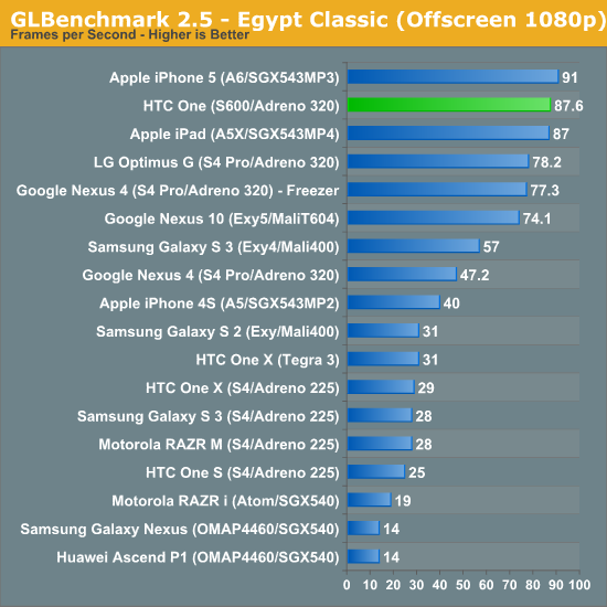
The Egypt Classic results are equally impressive. Here we're seeing about a 12% increase in performance compared to the APQ8064 based Optimus G, so at best we may be talking about a 15% increase in frequencies - or again, just better thermal management (or a combination of the two). Given the fact that process node hasn't changed at all, I think a small clock speed boost wouldn't be unreasonable to expect from the 600's Adreno 320. It's very clear that thermal management has improved though.
Sense 5
UI skins are generally a polarizing thing for Android users. On one hand, there’s a camp of enthusiasts who want nothing but the AOSP (Android Open Source Project) experience, the unadulterated version of Google’s Android platform which is reserved typically only for Google Experience Devices. Then there are enthusiasts who spend time crafting their own custom ROMs with features that are essentially analogous to skins, but somewhere in-between full-on OEM skins and the AOSP version of Android. At the other side of the spectrum we have what OEMs deliver which they believe adds value for normal — dare I say naïve — users who just want a smartphone. You have to realize that UI skins and OEM customizations are the result of the back and forth optimization function which takes place between operators and OEMs. The operator is trying to reduce returns and increase attachment and satisfaction, while the OEM has to somehow keep a middle ground without their platform becoming a homogenous mess and at the same time manage their own vision for the platform.
The HTC One is launching running Android 4.1.2, and the software that I’ve been testing is the final build for the hardware I’m using. At some point in the future, the HTC One will get an update to Android 4.2.x, but at this point I can live with 4.1.x, and HTC says it went with 4.1 for both stability and time to market reasons, which I think is reasonable considering some of the 4.2.x issues people have complained about, though 4.2.2 fixes most of it. At this point it would be awesome to have 4.2, but for a smartphone the only features I miss are the notification shade settings and perhaps photosphere. I’m sure Google I/O will make me want whatever version of Android comes out there, but for now the HTC One running 4.1 isn’t a problem.
The new Sense 5 experience is a re-imagining of what HTC’s idea of an Android experience should be. Sense 5 introduces a number of new features that HTC believes address the most common user work patterns on a smartphone, and at the same time creates an entirely different visual theme.
The Sense 5 UI does away with the rounded edges and 3D looking effects that previous iterations included and instead moves to a much more modern looking flat UI style. There are still some gradients here and there, but most of the places which previously had that late 2000s bubbly appearance to them have been smoothed over or flattened entirely. Perhaps the most striking difference is the move to Roboto Condensed for the system font, which looks amazing throughout the UI. I’m surprised Google doesn’t make more use of that font given how good it looks as a system font, just about the only place I’ve seen it in AOSP is during setup. HTC has also moved to their own flat iconography for system icons throughout, which look attractive and much different from the tacky, bubbly icons I’ve seen on various other Android skins I won’t name.
The application launcher gets a number of striking changes. First, by default the grid is a 3x4 arrangement which leaves a lot of negative space around the application icons themselves. The list is paginated vertically by default as well. There’s of course an option to return to the more dense 4x5 grid of icons, however, there’s something about the 3x4 grid which seems less intimidating, and that’s a lot of what HTC wants to do with Sense 5 — make Android less intimidating to normal users and the launcher less of a sea of icons.
Probably the biggest new thing in the launcher is that there’s now some level of default organization. My biggest mental friction point when getting a new device is the soup of applications dumped in an ad-hoc fashion into the launcher on whatever new device I’m using. With the One, HTC is mandating order to the chaos, and there are no exceptions. Operators can preload applications, but they now will always be sorted into their own folder by default, rather than peppered all over the place. There are no exceptions to the organization mandate, their apps all live inside a folder with the operator name. The rest of the first party HTC applications are likewise sorted into some logical containers like Google, Media, Tools, and so on, not just an arbitrary mess. Of course all this can also be turned off, if you want a stock-looking 4x5 grid with an alphabetized list, it’s there for you to select.
Probably the biggest new feature in Sense 5 is HTC’s BlinkFeed, which is a combination of local and remote content aggregator and optional home screen replacement. BlinkFeed aggregates media from accounts that are signed in on the device like Facebook and Twitter, as well as events from the gallery, calendar entries, and news from aggregation sources. HTC uses a third party content service called MobileRepublic to aggregate and bubble interesting stories, which it then exposes as feeds users can enable for consumption via BlinkFeed. By default BlinkFeed only auto refreshes when connected via WiFi, where it has essentially minimal impact on battery life. When on mobile, getting new data requires a pull to refresh the external feeds, though I’ve noticed that local data on the device will still get surfaced into BlinkFeed which makes sense. HTC says it wants to provide easily glanceable information for users to consume during idle periods. I should note that BlinkFeed by default is the home page, however it is entirely possible to change the home page in Sense 5 to one of the traditional widget panels and never have to look at BlinkFeed again. There’s no way to turn it completely off, but if you really want you can disable all the services and set the homepage to another widget panel. At launch there’s no support for arbitrary RSS feeds in BlinkFeed, but this obvious omission will supposedly get added in with a later update. RSS is on everyone’s mind right now after the loss of Google Reader, so I suspect this will come sooner rather than later.
Again the traditional widget panels don’t really change much, and in Sense 5 you can have four of them in addition to the leftmost BlinkFeed homepage. HTC changed up their first party widgets as well, though the ever-familiar Sense clock and weather widget still is in there if you choose. Most of the widgets get the same nice flat themed UI and style, however.
The notification shade is now cleaned up drastically as well from previous versions of Sense, there’s the shortcut into settings which we saw with 4.1, expandable notifications, and the time and date in Roboto Condensed. An always-present fixture is the power saver option, which seems like a bit of wasted space to have always present, but is a handy feature otherwise. Multitasking gets a big change with a 3x3 grid that shows the 9 last applications in the order which you used them. These can be dismissed by dragging up.
The rest of the first party applications in Sense 5 get a complete makeover too, many of which rely on a pivot bar design which is very Holo-like. It’s actually surprising to me how well HTC managed to stick to the pivot bar design pattern, even in ways that I haven’t seen the first party Google applications.
I spend a lot of time using messaging SMSing friends, and in Sense 5 most of the UI patterns are the same, however the opposed conversation dialog also gets a bit of a makeover and looks better. I still wish the compose box wasn’t nearly as big however, so I could view more of the conversation context. I feel like the send and attach buttons should be moved from the right side so that the conversation box starts out being one line tall and grows with the message, rather than starting with such huge size.
The stock keyboard also gets a makeover in Sense 5 to a design that is much cleaner and, you guessed it, flatter than the rounded virtual domes of Sense 4 and 4+. It matches the rest of the Sense 5 UI, however there don’t appear to be any major changes if you’re comparing the 4+ and 5 keyboards beyond visual style. There are still some issues with a few applications like Plume (which HTC and Plume trade blame on), and I can occasionally out-type autocorrection, but I was able to last longer with the Sense 5 keyboard before feeling the urge to jump ship to SwiftKey like I inevitably always do on any Android phone.
The combination of that pivot bar UI pattern, Roboto Condensed, as well as overall flat design, really make Sense 5 feel the most like Android 4.x of the skins I’ve seen in this last cycle or two. I have been using Sense 5 for a while now and don’t have a problem with it, in fact, it’s just about the cleanest and most sensible skin I’ve seen on Android to date. If you don’t like BlinkFeed, you can basically configure the home screen so that a widget panel is what you’ll see instead, however I’ve found myself discovering content from BlinkFeed far more often than expected. Now if only AnandTech was included as of the feed sources…
HTC Sense TV
HTC has added TV control to the HTC One via a Consumer IR transmitter and receiver cleverly hidden in the power/standby button at the top. For whatever reason, IR went away after the Palm OS and Pocket PC days, never to really surface again. IR seems to be making a resurgence however in tablets or larger tablet-style phones, but the HTC One thankfully brings this back to the smartphone form factor.
With the One, HTC doesn’t want to replace the Logitech Harmony type universal remotes of the world, but rather try to make the smartphone you’re going to wind up holding while watching TV anyways a functional utility for controlling it. As such there’s no state machine like workflow on the One, and the instructions sometimes bear this out by asking you to press input until the right device appears.
The TV experience is driven by a custom HTC application which uses Peel as the backend, and is pretty well done, though there are a few rough points in the UI. There’s some basic setup and configuration at first, with your market and either TV cable, satellite, or OTA package, and then download of device profiles. What’s great about marrying a smartphone with IR is that the device profiles are always online and easy to pull down, so now everyone can quickly hack hotel room TVs for the HDMI inputs or change channels at the sports bar or airport (though I’ve noticed airports are getting smarter about this lately). There’s no longer any need for me to cart around a Logitech universal remote and miniUSB cable for programming it when I want to use HDMI at a hotel that thinks locking it down is a wise endeavour.
The experience is pretty good. I admittedly pretty much never watch TV anymore, even OTA programming, but I can imagine this being more than just a little bit handy if you’re an avid TV watcher. There are alerts for shows you’re interested in or might be interested in, reminders, and supposedly good integration with set top boxes. Again I can’t really speak to any integration beyond OTA tuning on the TV itself since I haven’t had TV since I entered the dorms. I do however love having an IR port on my phone again — I can relive the shenanigans which played out while having an IR-enabled device in my pocket during high school.
There’s allegedly no official way to talk to IR devices in Android, for this HTC will open up an API through HTCdev and its OpenSense SDK to enable development of IR applications.
USB-OTG Support
Lately I’ve been getting questions about USB On The Go (USB-OTG) support on just about every handset I test. With microSD cards going away for the most part, it does make sense to explore this somewhat. I tested the HTC One using a USB-OTG adapter I bought a while back, and can report that it does work with USB mass storage devices, keyboards, mice, and even hubs. I tried the USB ethernet adapter that I’ve used with the Galaxy Nexus and Nexus 7, but that didn’t work.
If you want to mount USB storage that’s totally a possibility on the One, I had no issues playing back media or browsing a simple USB flash drive attached to the device. In addition an SDXC card reader I attached over USB-OTG works, finally I can tweet JPEGs from my DSLR on the HTC One! It’s nice to see decent USB-OTG support included on the HTC One.
Cellular
A huge part of the HTC One story is how the device is entirely one piece of aluminum without suffering from unintended attenuation or detuning when held. To a large extent, all-metal and phone are an oxymoron. It goes without saying that a phone requires cellular connectivity to be more than a brick, and sticking antennas inside of an RF opaque metal box isn’t an option, therefore an all metal platform necessitates using part of the exterior as the radiator itself. The problem with the exterior is that the device then becomes sensitive to capacitive detuning from contact with the skin, to say nothing of the attenuation from such close proximity with your water-filled appendages. I hopefully don’t need to revisit how this has been a problem for other handset manufacturers in the past who were a bit overzealous about pushing industrial design somewhere RF at the time wouldn’t allow it to go.
The other problem is broad frequency band support in a world where we keep adding more. Moving to an exterior antenna that is part of the industrial design means one geometry for a ton of markets with sometimes wildly different frequency bands for LTE. Traditionally OEMs tackle the battle by having a modular antenna and speaker box at the bottom which gets changed out depending on the SKU or region for the appropriate primary bands. With external antennas that are part of the look, feel, brand, and are constrained by manufacturing processes, there’s no allowance for different things for different markets. With the One, HTC solves these problems by including full transmit and receive diversity along with actively tuned antennas and special antenna feeding. By active tuning I mean a dedicated antenna tuner with the ability to match impedance and drive optimal SWR (standing wave ratio) across the antenna for each band or depending on the presence of a case or hand. I’ve also verified there’s a double pole double throw switch for transmit and receive diversity. To look at the feed points we’d need to disassemble the One, but that’s a bit daunting on a device with no screws.
The One is HTC’s realization of a long held dream to create an all metal phone, and as such I asked for an official statement about what specific features were incorporated into the antenna design, since this is a huge part of what’s special.
The antenna design is composed of some active components, special antenna feeding structure and the metal ID appearance. All are in-house design and HTC owned IP. With regards to ensuring high quality reception for all the various types of radio frequencies, we’ve utilized proprietary adaptive antenna solutions plus special antenna feeding structure and built in redundancies to ensuring that attenuation doesn’t affect the overall antenna performance regardless of how the handset is held.
For a while now HTC has been pushing the boundaries of antenna design in their platforms. Previous unibody phones with primarily metal exteriors cleverly located antennas patterned on the inside of polymer regions, like the HTC Sensation or One S, and I’ve always been impressed with HTC’s willingness to use just about any RF transparent region to hide an antenna while making the rest of a device metal, like the HTC Desire HD. HTC could then swap out these polymer inserts per market and get to a different antenna geometry with the right gains for each band. But going to all metal has always been the real goal, a goal the One achieves without any caveats from what I can tell.
I mentioned earlier that actively tuned antennas are going to be a part of 2013, and the reason is support for so many LTE bands, though it also goes hand in hand (haha, get it?) with the deathgrip problem. In fact, HTC fought a battle very similar to the battle fought by Apple over the past three generations of iPhone (four if you count the CDMA/Verizon iPhone 4) to get to a metal exterior with the iPhone 5 without caveats. Before you go and say that HTC copied Apple, remember that the reality of product development cycles means that HTC was well underway with the One around the time the 4S was out.
The HTC One uses the two metal strips at the top and bottom for antennas. The top is used for both cellular and WiFi/BT, the bottom is just cellular. In addition the One is the first phone other than the iPhone 5/4S I’m aware of which has full transmit diversity, allowing it to choose between the top or bottom to transmit depending on which offers better radiative properties (no hand on it). Interestingly enough the One is actually more sophisticated than the iPhone 5 in this regard by combining both 2.4 and 5 GHz WiFi/BT and transmit/receive cellular into this top antenna. On the iPhone 5 the WLAN/BT combo still has its own discrete PIFA (planar inverted F antenna) printed on a flex board, which then radiates out the top glass back region. With the One there aren’t any glass regions, so HTC instead uses that top metal antenna to do double duty with the right set of filters.
Receive diversity is mandatory for LTE, but even the UMTS/WCDMA only One includes it since is is again required in part to enable the all metal design. All of the One models are based on Qualcomm’s 28nm 2nd generation LTE baseband, the MDM9x15 platform we’ve seen a bunch of, and its DC-HSPA+/GSM-only (LTE blocks fused off) sibling, MDM8215 for the UMTS/WCDMA only model. This is a big step up from the international edition of the One X and One X+ which both shipped without receive diversity and were based on the aging Intel/Infineon XMM6260 platform.
Like any LTE-enabled handset right now, there’s still no way to deliver a single SKU with support for all of the bands that are required, even with active tuning, just due to what transceivers we have. As a result there are a number of different announced variants of the One, which I’ve outlined in a table. There’s also the rumored Verizon model which will no doubt just be a cousin of the Sprint version but instead with support for Band 13.
| HTC One Band Coverage | |||||
| Model | WCDMA Bands |
LTE Bands (UE Category 3: DL 100 Mbps, UL 50 Mbps) |
CDMA 1x/EVDO Bands | ||
|
UMTS/GSM Only (MDM8215) |
850/900/1900/2100 MHz (HSDPA 42, HSUPA 5.76) |
NA | NA | ||
|
UMTS/GSM+LTE (MDM9215) |
T-Mobile US: 850/AWS/1900/2100 (HSDPA 42, HSUPA 5.76) |
T-MobileUS, AT&T, Canada, Latin Am.: 700/AWS | NA | ||
|
AT&T: 850/1900/2100 (HSDPA 21, HSUPA 5.76) |
|||||
|
ASIA: 850/900/1900/2100 (HSDPA 42, HSUPA 5.76) |
ASIA: 1800/2600 | ||||
|
EMEA: 850/900/1900/2100 (HSDPA 42, HSUPA 5.76) |
EMEA: 800/1800/2600 | ||||
|
CDMA + UMTS/GSM +LTE (MDM9615) |
Sprint: 1900/2100 (HSDPA 14.4, HSUPA 5.76) |
1900 (DL 50, UL 25) | 800/1900 | ||
I’ve been playing with the international EMEA version of the One (Europe, Middle East, and Africa) which thankfully includes PCS 1900 MHz WCDMA support since I live in an AT&T PCS 1900 only market. I’ve also been using that same device on T-Mobile on WCDMA thanks to the recent rollout of WCDMA on PCS 1900 MHz carriers. In my time with the device, I’ve been very impressed with cellular RF performance and haven’t ever seen the handset be affected by detuning from holding it. The combination of receive and transmit diversity along with active tuning means that deathgrip is basically a thing of the past in metal phones like the One.
My last note about the HTC One is that just like the last set of HTC devices, there’s no awesome Qualcomm field test application which you can get to via a dialer code. That’s gone on every single variant as a result of some operator request for proposals which explicitly asked for it to be removed. Operators remain the reason we can’t have nice things, even on international phones.
Just to prove that it works, I attached the HTC One to the Anritsu MD8475A signaling tester that they graciously have loaned me. The EMEA (Europe, Middle East, Africa) International HTC One I’m reviewing includes support for LTE on 800, 1800, and 2600 MHz (Bands 20, 3, 7). I was able to attach the HTC One with no problem to a Band 3 test network with 20 MHz FDD channels and sustain the expected UE Category 3 throughput of just short of 100 Mbps downstream.
GNSS
GNSS (Global Navigation Satellite System) on the HTC One comes basically for free off of the MDM9x15/MDM8215 baseband and includes both USA GPS and Russian GLONASS support. This is the same GPSoneGen8A with GLONASS that we’ve seen in many Qualcomm modems in the past, and I can’t find any issue with it on the One. It works off of one of the cellular receive paths and locks extremely quickly.
NFC
The One also includes NFC in spite of having a metal body. Here things are bit more opaque to me. The NFC active region is centered around the camera aperture. If we look at the transparent photo of the One we can see there’s clearly a loop antenna below the aluminum, and the FCC documents confirm the presence of a loop antenna for NFC. The insulating notch which connects to the larger main notch clearly is some key aspect of the design since it is present right here, and also in a similar means on the Padfone Infinity (perhaps to prevent some kind of induced loop current?). The location of the NFC coils around the camera aperture of course helps not degrade the electromagnetic field entirely. Either way I haven’t had any issues with NFC on the HTC One, and it appears to be working courtesy the ubiquitous NXP PN544 controller.
One thing obviously not present on the One is wireless charging. The reality is that having that much metal and a magnetic inductance based charging system isn’t possible.
WiFi
On the WiFi side of things the HTC One is the first smartphone to support 802.11ac, the next generation WiFi standard, and thus inherits support for 802.11a/b/g/n. 802.11ac we have written about before, and basically extends 802.11n support on 5 GHz to include support for 80 MHz channels (up from 40 in N), additional spatial streams, 256QAM, and multi user MIMO. In the case of the HTC One, we get 802.11ac support included with the new Broadcom BCM4335 combo I’ve written about before which is the BCM4334 successor, likewise built on a 40nm CMOS process, and includes a bunch of 802.11ac optional features like 256QAM, short guard interval rates, beamforming, space-time block coding, and low density parity check support. The result is a maximum PHY rate of 433 Mbps which one should be able to see in the best conditions when attached to an 802.11ac router.
I’m still working on an epic roundup of all the 802.11ac routers and just got the new ASUS RT-AC66U in, so this seemed like as good of an excuse as any to hook it up and give it a shot. The HTC One immediately attached without problem and I saw a PHY rate of 433 Mbps in my office.
I fired up iPerf and ran our usual test, where I saw 275 Mbps on TCP, and just over 300 Mbps at times on UDP. This is an impressive amount of bandwidth and substantially higher than anything I’ve seen before out of a smartphone. Many have asked what exactly the benefits are from throughput this high on a smartphone, the answer is potentially better battery life given a shorter duty cycle for the same amount of throughput, in addition to the improvements that 802.11ac adds to 5 GHz WiFi in general and that the new combo chip affords, like better range.
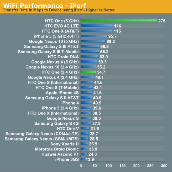
Thankfully the Advanced WiFi menu on the HTC One still includes the frequency band selection menu and other options, including best WiFi performance toggle. I have no issues to report with WiFi working anything other than how I expect it to on the HTC One.
BoomSound Speakerphone and Call Quality
With the One, HTC continues its partnership with Beats Electronics for use of the Beats Audio branding and experience thanks to its stake in the company. While the previous version of Beats amounted to basically dynamic range compression running either on the Qualcomm DSP inside Snapdragon or somewhere else on the AP Tegra 3, Beats as of late has started to translate to substantially different hardware with real improvements. The One includes a number of audio features that make it stand out from the norm, starting with an obvious industrial design feature — dual front facing speakers.
I don’t think it’s an exaggeration to state that the dual front facing speakers on the One are phenomenal. Without even making any audio measurements, it was obvious immediately that they represent a substantial audible improvement over just about every other smartphone purely because they’re stereo, and they’re good speakers at the same time. I’m reminded of the first time I heard stereo audio while playing YouTube videos on a Samsung Galaxy Tab 10.1 after being an iPad user for a while, I was in disbelief that adding stereo made. With the One I am equally shocked at just how much of a difference stereo makes on a smartphone, even given the small separation distance that the size of the One provides. Consuming media on the device or showing a video to a friend is so much better with stereo sound, and it’s hard to characterize just how noticeable the difference is since you need to be in front of it to experience it.
A close to second to the fact that there are two speakers is just how much of a difference putting those speakers on the front makes. After using the One I can’t help but think - why the heck are speakers on other smartphones on the backside? A few use cases stuck out at me as being just head and shoulders above with the front facing speakers. First, in a car, using Google Navigation on the device is much improved over those with the speaker on the back. I usually use a mount or lay phones on my leg when using Google Navigation, where rear speakers either need to reflect off the windshield to be heard or get covered up by my leg. It just makes sense having them on the front in that scenario. Obviously watching YouTube videos or showing friends highlights reels is a huge use case, to say nothing of using the One to play music in a hotel room when traveling. Even conference calls make more sense, since the last thing you want to do to a phone is put it display-down on a table and let it get all scratched up.
What’s interesting is that the One manages to include both the earpiece and primary speaker in the top module, and microphone plus second speaker in the bottom. Basically the top speaker has a mode for earpiece function and another mode for speaker function. Both speakers are relatively gigantic for a smartphone, and fit inside a 16 mm x 9 mm x 3 mm outline.
I ran the HTC One through our normal speakerphone tests and a few more. The speakerphone test consists of a call placed to a local test number that always plays the same recorded message with a sound level data logger 3-inches above the front of the display. Since the first device I’ve tested this way, they’ve always been placed display-up, which obviously helps the HTC One. In addition speakerphone volume is cranked to maximum on the devices.
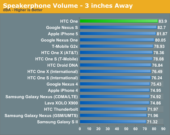
The HTC One tops the charts in the speakerphone call test, not by a huge margin, but tops them nonetheless. There’s no distortion or crackling from saturation on the One during the speakerphone call.
In addition I decided to run another new test which consists of two songs played back with the same USB datalogger setup. I played the entire song while capturing data and took the average. There’s an audible difference between the One and all the other phones I tested, and the data backs it up.
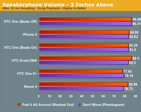
I tested the One with Beats enabled and disabled, and interestingly enough Beats disabled results in louder sound measurements. I’m told that turning Beats on changes some equalizer settings that result in lower overall dBA weighted measurements (the weighting we’ve always used). Either way, the result is that the HTC One is 2.5 dB louder than the iPhone 5, and listening to the device, it’s obvious that the One has wider frequency response. In addition stereo opens up the soundstage in a way that makes listening much more enjoyable than you’d expect from a smartphone.
The One joins a number of other devices shipping this year which contain active components designed to increase speaker volume and still protect it from damage. In the case of the HTC One, based on my digging that is a pair (one for each speaker) of NXP TFA9887 ICs. NXP describes the TFA9887 as an audio system with adaptive sound maximizer and speaker protection. This system optimizes speaker loudness while making sure speaker membrane displacement and temperature do not exceed safe limits. I saw a similar system inside the Droid DNA / Butterfly. The audio codec (Qualcomm calls it a sound SoC) itself used inside the HTC One is the familiar Qualcomm WCD9310 which manages pretty much all the audio IOs over SLIMbus.
Not satisfied with just saying that the One is measurably louder than some other phones, I consulted Chris Heinonen (our displays editor and sound guru) to measure the speaker output using a calibrated microphone and Room EQ software. I measured against the iPhone 5 just since it’s another phone with significant pedigree for having good speakerphone output.
I measured THD+N (total harmonic distortion plus noise) at two different points, at 1 kHz and 10 kHz using the calibrated microphone at the same sound pressure level on the HTC One with Beats on and off and the iPhone 5.
At 1 kHz, the HTC One has a THD+N of just above 6.1 percent with Beats on, and around 6.7 percent with Beats off, at 100 dBA at 1 kHz. Compare to the iPhone 5, which gets around 9.6 percent of THD+N for the same loudness. We can also see that the harmonics are also taller on the iPhone 5 than the HTC One, which means they’re more audible. The tradeoff is that the iPhone 5 does have more dynamic range at other points with less noise, for example between 100 and 700 Hz around 20 dBA of noise, whereas the HTC One is around 30 dBA. I’d expect this is outweighed by the louder harmonics though at 1 kHz.
At 10 kHz the iPhone 5 does better, with THD+N of 2.75 percent, while the HTC One is up at around 5.8 or 6 percent depending on Beats. We can also see that the the 10 kHz spike is much pointier meaning more dynamic range on the iPhone. What’s interesting however is the much taller 2nd harmonic on the iPhone 5. I should also note that the iPhone 5 was cranked to almost maximum volume to get around 95 dBA at 10 kHz while the HTC One was just above halfway — it can go considerably louder.
Lastly, the only issue I’ve found with the HTC One is that left channel seems to be always mapped to the top speaker, and right channel to the bottom speaker. This means that left channel is indeed left when rotated −90 degrees (90 degrees counter clockwise), but that the channels are swapped when rotated 90 degrees (90 degrees clockwise).
The speakers on the One are a critical part of the overall multimedia experience. Showing highlights reels to friends wouldn’t be the same without stereo or the loudness that the One’s system offers. Likewise I’ve been using the device while traveling as a standalone speaker extensively and am impressed with its ability to fill a hotel room on its own with tunes. Putting the speakers on the front just makes a ton of sense, it’s something I don’t see other handset makers doing.
Call test
The One uses the top speaker as both earpiece and speakerphone, which means it needs to carefully switch between the two. I haven’t had any issues with the earpiece going too loud yet, but an interesting side effect is that the One can go quite loud on phone calls. HTC has chosen to market that the One can increase the volume of calls based on the presence of background noise under the Sense Voice branding. Other phones have been doing this for some time now, I’m not sure if HTC has made it more pronounced with the One than other handsets however.
The One also has a secondary microphone for rejecting noise on the backside. It’s a tiny notch in the white plastic on the right side of the phone. The HTC One is using Qualcomm’s Fluence which comes with the APQ8064T platform, as verified by poking around inside the ROM.
persist.audio.fluence.mode=endfire
I recorded a call with the HTC One in front of some speakers to test noise rejection the same way I have numerous other phones, by playing a distractor babble track and placing a call to another smartphone where I record the call. This tests the noise rejection on the handset placing the call, which is what I’m most interested in. Volume of the distractor track is ramped up to around 92 dBA and then decreased.
In practice the HTC One noise rejection is adequate but nothing particularly special. I’m spoiled by the Audience solution, even if there’s a power disadvantage from going with their older solutions which were built on a 65nm process, though the newer hardware has considerable power gains. Qualcomm’s fluence gets the job done in most circumstances however.
The HTC One is also AMR-WB (Adaptive Multi Rate - Wideband) enabled, as expected with basically all the new flagship phones. If you’re lucky enough to be on a wireless operator that enables this, and are terminating a mobile call to another subscriber on the same operator with AMR-WB, then you’ll enjoy an awesome higher bitrate, higher bandwidth (8 kHz with 16 kHz sampling rate) and better sounding circuit switched voice call. The calls I placed with the HTC One on T-Mobile and AT&T sounded good, but I’m still hunting for AMR-WB. Because the top speaker doubles as the earpiece, it sounds crisp and doesn’t saturate. I’d describe the sound as one of the most native I’ve heard, but then again I don’t do much voice calling.
As an aside I still wish AT&T would deploy AMR-WB so I could use it on my primary line, instead AT&T continues to run AMR-NB, and only recently has deployed full bitrate AMR-NB (sometime in 2013 continues to be the vague AT&T deadline for AMR-WB). It also goes without saying that the T-Mobile USA version will include AMR-WB support, and the Sprint version will include EVRC-NW, the CDMA2000 HD voice equivalent.
I like to play a game where I guess what platform and what features phones will have in the next generation, and if you're anywhere at all close to this industry it doesn't take a lot of clairvoyance to get pretty darn close to a perfect prediction. This year it's something along the lines of - 5-inch display with 1080p, quad core Snapdragon 600 or similar, all the usual air interfaces, probably from MDM9x15, and a 13 MP rear facing camera. So much of the platform is dictated by those choices, and the rest of it means that OEMs have to resort to whatever they can to differentiate themselves. When I heard about the One, I was blown away because so much of it wasn't the prevailing industry trend for this generation. With the right hardware choices, so much of it hinged on getting the marketing message right as well, which traditionally has been HTC's weak point even since moving from being an ODM to an actual brand. In the current market, great hardware just doesn't sell itself anymore. That doesn't mean 'specs are dead' — a phrase that usually will solicit laughter from me — it's just a part of what makes a device successful, the rest is experiences and doing something with it.
The HTC One is an incredibly ambitious phone. I can't think of the last time I've been excited not just because I'm reviewing a triple-A handset, but rather because there are innovative new features inside and ambitious risks taken by the OEM. In the case of the One, there are a number of them — front facing stereo speakers, an all metal unibody construction with unique antenna design, display just short of 5.0-inches, and of course the 4.0 megapixel camera with OIS and comparatively huge 2.0 micron pixels. The result is a phone that's not just exciting because it's something new to review, but because it's different and uniquely better for the right reasons.
I've been using the One pretty much nonstop since getting it, and still feel the same way about the construction as I did when I first held the device. The build quality really is phenomenal, and for the first time rivals what we get out of, well, Apple. At the same time the industrial design is still uniquely HTC and carries over design language from the Butterfly or DNA. I was worried that HTC had given up the all metal pursuit after the One S, which I thought was one of the most unique devices of 2012, but thankfully the One takes it one step further. I've been stuck on antenna design and the challenges imposed by both contact with the skin, tuning for all the various bands, and the 2x1 requirements implicit in LTE, and thus the stuff required to make the One work as a phone excite me for the engineering hurdles they represent. Needless to say, the HTC One works as a phone and I haven't noticed any unintended attenuation or connectivity issues.
On the camera side I still fundamentally believe larger pixels is the correct way to go. Most digital photographers know that bigger sensors are better somehow, fundamentally what they're talking about are bigger pixels with more sensitivity. I've been asked what I believe the best course of action is, and I think either staying at around 8 MP with 1.4 micron pixels or moving back up the scale to larger pixels is the dream. Obviously the ideal situation would be an 8 MP sensor with 2.0 micron pixels, but there's no way to do that conventionally without moving to a thicker phone or including a big bump. There's no right answer here, and camera is one of the places that we see each OEM offer a huge amount of differentiation, from including just a module bought from a supplier, to designing the optics and talking to a CMOS vendor for something custom. For the past few generations HTC has been pushing further and further into the custom side, and I thought the One X/S/V optical system was the best that generation. There is no question in my mind that the One includes the best camera in the Android space right now with the right tradeoff between resolution and sensitivity. Resolution just isn't all there is to a good camera, and HTC now finds itself knee-deep in fighting the megapixel myth.
The flip side of the coin is that the One and the Lumia 920 trade positions for top dog quite a bit (to say nothing of the 808, which I honestly consider more of a connected camera than smartphone, having one myself). The Lumia 920's resolution advantage outside in well lit scenes is hard to overlook, and in very dark scenes their default mode pushes OIS to its limits with long 0.3 second exposures that HTC only enables in Night Mode. The One will produce the equivalently exposed shot with a shorter exposure and a bit more noise, which makes it better for shooting moving subjects, and if you toggle Night Mode, you'll get the longer exposure, less noisy equivalent (maybe HTC should rename that mode Lumia mode? I jest). The problem for OEMs isn't that low light performance is inaccessible, it's how best to do it without sacrificing too much in the best case scenario. At the same time, OIS is still new in the smartphone space and even Nokia hasn't finished tuning it and pushing out updates, I expect we'll see HTC do the same with the One. To be honest, I find the Lumia 920 versus HTC One comparison to be besides the point since one runs Windows Phone and the other runs Android. At least for me, camera performance still isn't enough to push me between platforms. HTC doesn't have to beat Nokia for HTC's gambit to be the right one — it only needs to beat the rest of the Android shooters, and that's a market which is, quite honestly, up through now so bad it really has been HTC's to lose, and with the One, HTC just set the bar even higher.
The speakers on the One have spoiled me. I initially wrote them off as being an accessory to the rest of the story, but in the past year or so have become addicted to watching a few YouTube channels and their product reviews on my mobile devices. As a result I'm now thoroughly spoiled by the One and not having to cup my smartphone with the second hand and direct the audio around to my face. For just about everything audio related the difference in experience that stereo affords — to say nothing of frequency response or loudness — is monumental.
I touched on experiences selling devices earlier, and HTC's problem from the prior generation. Probably the single most compelling experience that ties the entire One together are the Zoe and Highlights Reels. I can't imagine the One without this feature, since it touches nearly everything that the One emphasizes — display, camera, and front facing speakers. The point of having an experience like this is that it makes people get why the rest of the hardware choices are important, and get why this is a compelling device. It's the kind of experience that fits in a TV spot and is easy to demonstrate in an operator store or to a friend, and again, I can't imagine the One without it.
On the software side, Sense 5 is a much needed remaining of the Sense experience with flatter UI and classier contemporary iconography and typography choices throughout. I think HTC has nailed the industrial design and delivered one of the classiest UI skins I've seen in a long time. There's no question that HTC has found awesome design house talent, something the other Android OEMs still are failing to do. I only had a few gripes with Sense 4 and fewer with 4+, with 5 I have fewer still, and at the same time it isn't a hokey cartoonish bubbly experience like some of the other big OEM skins. There's still going to be that population of users that wants only AOSP Android, and I still believe that it would benefit HTC a lot to improve its enthusiast following by doing whatever political penance is required to enable AOSP build support, in addition to posting kernel source faster. An even bigger wish would be for HTC to get back onboard with Google in making a Nexus device of some kind. Other players understand the importance of and fight over that opportunity, while meanwhile I get the impression HTC doesn't see much value in it. There's a huge opportunity for HTC to step into that ring with the best enthusiast 3rd party ROM support at the same time another big OEM I won't name is going to start marginalizing it. That's one way to plug the anxiety hole that shipping a phone with 4.1.2 comes with for enthusiasts, even if I honestly don't find myself wanting 4.2 on the One every day.
I've never given any smartphone an editors choice award before, though I daily regret not giving the One S an award of some kind. For the HTC One I'm giving our Editors Choice Gold award, which is our second highest award. The One is an incredibly awesome device.

I'm a big fan of the HTC One and can see myself using it for quite a while, even without seeing necessarily everything of its main upcoming contenders. It's a device which amazingly is built to the kind of specifications I'd want from a device — huge emphasis on camera, all metal construction with actively tuned antennas, and a powerful SoC inside.

