Original Link: https://www.anandtech.com/show/6302/apple-ios-6-review-maps-investigated-and-more
The iOS 6 Review: Maps Thoroughly Investigated and More
by Brian Klug & Saumitra Bhagwat on September 19, 2012 2:21 PM ESTIntroduction
By this point, we’re all familiar with Apple’s revised release cadence for iOS and iOS devices. Introduce a new iOS release at WWDC, beta test it through to the Fall event, and release it alongside the next iOS device. This year is no different with iOS 6 and the iPhone 5.

A lot has happened in the mobile OS space in the past few months; and with Android 4.1 Jelly Bean and Windows Phone 8, the competition is really heating up. At this point however, all major mobile OSes have pretty mature feature set; notifications, copy/paste, multitasking and so on have all been implemented and checked off the list. The focus is now slowly shifting towards re-evaluating basic usage scenarios and implementing small tweaks and UI enhancements that improve the end-user experience.
For the most part, iOS 6 seems to focus on these smaller tweaks and under-the-hood refinements to build on iOS 5 and improve the end-user experience. There’s no way around saying it, iOS 6 is an evolution rather than revolution of the iOS platform. Today, iPhone, iPad and iPod Touch make up a significant portion of Apple’s revenue, and as a result moving the platform along is more of a question of minimizing friction points rather than completely reinventing the OS. iOS 6 does exactly that, and builds on the platform with a number of noteworthy new features and UI changes. Let’s see what’s changed.
Maps in iOS 6
With Apple’s iDevice lineup, vertical integration has been a constant theme. In iOS 6, this trend continues, even if the motivations are a bit more contrived than a desire to further bring more of the iOS experience under Apple’s control. The drive this time is a souring relationship between Apple and Google which has been in the making for some time now. To a broader extent, the Maps.app experience on iOS has been aging for a while with no clear party to blame. iOS 5 lacked turn by turn navigation, 3D buildings, higher resolution map tiles or vector roads, and other modernizations that have been part of the Android mapping experience for quite a while. That is, until now.
With iOS 6 Apple moves to a solution completely detached of Google, and for the most part brings functionality back up to parity with the competition. The features I touched on already are the main highlights of the new Maps.app experience, as iOS 6 now includes: turn by turn navigation with voice guidance, fully textured 3D buildings, and vector roads. Most of the things users have come to expect from Maps.app remain as well, including three separate views: standard, satellite, and hybrid. Those almost don’t need explanation: standard is the typical solid colored region mapping paradigm we’ve grown accustomed to with vector roads, and points plus regions of interest, satellite includes purely aerial or satellite imagery, and hybrid overlays vector maps and points of interest on the satellite view. Nevertheless there are some things missing from the new Maps.app which we will touch on later.



Left to Right: Standard, Hybrid, Satellite
The amount of complexity in moving to a different mapping data source is not something to underestimate. Over the years, Google has built out an extraordinary mapping product with the conjunction of their own street view fleet (which collects both location data, driving conditions data, and a full two pi steradian sphere of imagery), and an even larger set of data contributed by individual handsets reporting back driving conditions which is aggregated into traffic data. Google also made some acquisitions of its own back in the day to catalyze its own Google Maps experience, and at present it is the 9000 pound gorilla for maps.
Most users don’t realize this, but this traffic data is often statistically derived and crowdsourced using data from handsets in areas where in-road inductive sensors aren’t installed. The mobile space has already seen one major battle over who gets WiFi location trilateration data (Skyhook, Apple, or Google) and this traffic data often comes back with WiFi location data as well if the interface is turned on. For traffic data, Apple has begun building out its own dataset with the same approach – by crowdsourcing the velocity vector from iOS 6 devices that are in motion. If you plug your handset into a car charger and have the setting ticked under System Services, you’ll notice “Traffic” showing a purple location services icon while rolling around town. It’s obvious to me that Apple is aggressively collecting data to build its traffic database and get close to parity with Google.

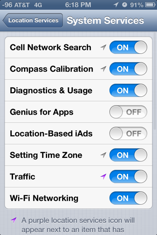
Maps.app settings (Left) showing data from TomTom and link, (Right) Traffic data aggregation in progress while driving around (purple location services icon)
For iOS 6 maps, Apple moves to a variety of data sources beyond what’s in their in-house collection, and for the most part they’re disclosed on the acknowledgements page under settings on iOS 6. There are obviously a few different components to the whole maps product: the road data itself, aerial, satellite, and building textures; business and point of interest listings; and finally reviews. If you look at that acknowledgements page, you can back out a mapping between data sources and the components they contribute. The names have already been pretty well discussed: TomTom, Acxiom, AND, CoreLogic, DigitalGlobe, DMTI, Intermap, Urban Mapping, Waze, Yelp, Flickr, NASA, OpenStreetMap, US Census, US Geological Survey, and the US National Mapping Agency. There are 24 different sources whose data is aggregated together into iOS 6 maps, at least in my region with my acknowledgements page. Apple has also acquired Placebase, Poly9, and C3 Technologies for adding to its own in-house maps team.
The other component is the 3D polygons and textures for terrain and buildings. Terrain elevation data comes from regional government data such as USGS, but for cities and higher resolution terrain data there’s one more key player. That player is C3 Technologies, a company Apple acquired which was an offshoot of SAAB AB. The polygons and textures are generated computationally by taking many aerial photos from small aircraft with a small swath size. For Apple, there are undoubtably some buildings which have seen hand massaging of geometry and textures, it’s in the vast majority of otherwise normal buildings that we can use to gauge quality.
This is an interesting contrast to Google’s 3D dataset, which started out supporting 3D buildings with contributed 3D Sketchup models that were manually built and submitted to Google Earth. After that, Google began also computationally deriving buildings using the isotropic aerial view, and further hand massaging trouble buildings.
If that all sounds complicated, it’s because it is. GIS (Geographic Information Systems) are a science in and of themselves, and the complexity and investment involved with Apple completely managing their own product is nothing to be underestimated. The fact that Apple is willing to not only move to, but also maintain their own GIS should emphasize to what lengths Apple is willing to go to distance themselves from reliance on Google.
What iOS 6.0 maps does away with are the few things that Apple and its data partners can’t yet replicate: street view, and routing on public transportation. For street view, you’re basically out of luck, and users will have to use a standalone Google Maps application in the future which hopefully includes this functionality. I’m told that Apple views 3D building support as the replacement for street view's absence. For routing, Apple is going to rely on 3rd party application support to provide public transportation routing data. Searching for directions and selecting the bus or public transport icon will bring you to a routing apps screen, which will be divided into installed routing applications and suggestions from the App Store based on your region. These will then hand a token back to the Maps app relevant data.


Routing showing toll road notification (Left), current location popup (Right)
So enough about all this theory and what the framework is like, how does the new iOS 6 Maps application actually work? Well, evaluating that whole experience requires us to break down the features into a few different areas.
The overall maps interface changes dramatically from iOS 5. The new iOS 6 maps interface includes a very different appearance or base layer, and again vector roads and street labels. In iOS 5, maps were previously served as texture tiles and scaled appropriately for different zoom levels. While the Google Maps for Android interface includes a combination of vector maps at some zoom levels and texture tiles at others, iOS 6 moves to an entirely vector approach for roads and graphics in the Standard map layout at every zoom level. In hybrid mode, there are vector roads drawn atop texture tiles, and in Satellite mode you get only the aerial tiles. Apple also changed around the unloaded region texture to a black grid with white lines which also scale.
Overall the appearance of Maps in iOS 6 is clean and unique enough to not be a direct ripoff of Google Maps. The jump to vector roads and labels comes with almost no performance hit on the iPhone 4S, where it remains smooth as butter when zooming and panning around. I played with Maps in the standard and hybrid modes on a 3GS and 4 as well, and didn’t see any unacceptable slowdowns. Performance has drastically improved since the first betas.
The quality of aerial textures at this point is perhaps my only major complaint with this new version, as the LoD can be quite low at some zoom levels, and varies wildly by region. Internationally I saw texture resolution jump around between completely unacceptable and quite good. It's obvious that Apple has prioritized home soil since in the USA things are better. Obviously the regions that have 3D building data offer very high resolution textures as a result of custom aerial capture.
This is as far as you can zoom into Seoul, South Korea in Hybrid or Satellite mode, due to low resolution aerial texture assets at present.
There’s no option to include or exclude point of interest labels, instead they appear at appropriate zoom levels automatically in the standard view. About the only option besides changing map modes under the in-app settings fold is inclusion of traffic notes on roads, and an option to print.
New iOS 6 map assets working in Tweetbot for iPhone
From a developer perspective, I'm told and have read that that the switch to Apple-supplied maps is transparent. All the same APIs are implemented with the new maps as in the past, including pins, overlays, the three already mentioned views (standard, satellite, and hybrid), traffic, and points of interest. The apps that I’ve played with which use the maps API work flawlessly so far on iOS 6.
3D Flyover
New in Maps is the 3D flyover feature which is limited in iOS 6 to devices with an A5 SoC or better. This means the iPhone 4 (GSM and CDMA), iPhone 3GS, and iPod Touch 4th Generation get excluded from the 3D buildings experience. 3D buildings already taxes the 4S considerably and drops frames from time to time, so I can see why the 4 and 3GS didn’t make the cut. 3D buildings on the iPhone 5 is completely fluid 60 fps, it seems.
On applicable devices, there’s a 3D button alongside the location indicator (which snaps to your present location or toggles compass mode) which toggles a perspective tilt. If theres a region in the current view with 3D building data and you’re at a sufficient zoom level, this changes to an icon with buildings, and tapping enables 3D building rendering. On excluded devices without the right SoC you simply don’t see this toggle at all and can’t two-finger tilt.
NYC was recently added to the iOS 6 3D Maps dataset
These buildings generated using aerial captures as I touched on earlier, and pop in with dynamic Level of Detail (LoD) both for geometry and textures. If you’ve used Google Earth on a mobile device and seen the 3D buildings Google has and the way they pop in, you’ll instantly know what I’m talking about. Generally the geometry starts very smoothed, and Apple has done a good job in iOS 6 of keeping visible switching around between levels hard to notice.
When it comes to evaluating the detail and quality of 3D buildings, the difficulty ultimately lies in selecting the right features to compare. I suspect Apple is also doing some hand massaging of building geometry in some of the more notable urban centers, something Google has told me they do as well, in addition to the user-contributed sketchup buildings. Thus, comparing notable landmarks gives an idea for the best case but not the empirically derived geometry that makes up most of the dataset. Of course in the dense urban environment reconstructing geometry and imagery requires a lot more hand massaging because of occlusions and other considerations.
Cities like Chicago are stunningly detailed.
The level of geometry detail is mostly great in the markets that I checked out. Trees and other geometry which isn’t like a building also gets represented, though some palm trees end up looking like elongated lightbulbs at times. It isn’t always perfect though.
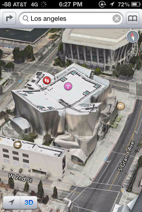
A trouble building I found while making a cursory inspection of Los Angeles. Update: The building actually looks like this (Google Maps) as pointed out by a commenter. Still, it's possible to find buildings with strange geometry and textures applied in iOS 6.
I’ve browsed a lot of buildings which aren’t noteworthy landmarks or part of a city skyline and seen some interesting geometry and texture interpolation errors. Thankfully they’re not super common, and not even Google’s 3D database is free of them, so it’s nothing I hold against Apple’s crew.
The other question then becomes how many cities actually have 3D buildings available from Apple. To find out I manually checked the top 100 most populated cities in the USA and top 30 globally, and made a huge spreadsheet. Unfortunately as of my checking there really aren’t that many markets at all. In fact, it isn't much of a stretch to say that Apple's 3D buildings database is actually very limited at the moment, and basically only includes the USA.
Internationally, none of the top 30 cities have any 3D buildings. In fact, the only international 3D support that I’m aware of is a small region around the Sydney opera house, the Colosseum in Rome, and parts of London in the UK. I was actually surprised to see London get added into the dataset right for the iPhone 5 keynote, as I had checked and seen it was absent just a day before.
In the US, 26 or so cities have 3D building data as of this writing. For the number of the cities which do have it, it tends to be a small grid localized around the densest urban area, which isn’t surprising. Apple doesn’t seem to have prioritized its launch markets by population either, and there are some fairly notable exclusions as well.
Hopefully Apple continues building this dataset out at a good pace, because at present the dataset for 3D buildings and acceptable aerial photography is honestly disappointing compared to Google Earth's impressive dataset. That said, we've already seen Apple deploy more 3D markets between iOS 6 beta 4 and the GM. The question for the future is not only how long it will take to get adequate coverage of the top 100 markets in the USA and abroad, but beyond that point what the re-visit schedule for this dataset will be.
Turn By Turn
3D buildings look pretty, but without a doubt the most useful new maps feature in iOS 6 is first party support for turn by turn navigation. This has been notably lacking from iOS for some time now, partly due to rules Google imposes on what can be done with their map tiles.
I’ve spent a lot of time driving around with iOS 6 turn by turn, and in a word (well, three) it just works.
The previous maps app used to have two panes for search and directions. In iOS 6 maps theres a unified search bar, directions button, and address book button. As you’d expect, navigation can be initiated from either individual search listings by tapping on the quick route icon, or explicitly from the directions menu. Siri can also launch navigation if you ask it to navigate you somewhere. If you tap the directions icon you can select from either driving guidance, walking guidance, or routes using third party apps.
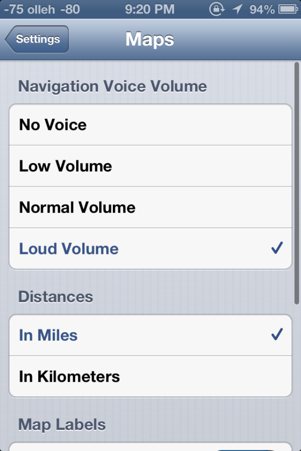
iOS initially prompts you to select from a few recommended routes, and then guidance begins. Further options are hidden away inside Settings.app, though these are relatively sparse. Voice guidance volume, label size, and units are really the only options here — there seen any options for preferring highways or surface streets, avoiding tolls (though you are warned when given routes to select from) or other common standalone GPS options. In iOS, voice guidance uses the same text to speech engine as Siri, so there’s no changing that either.
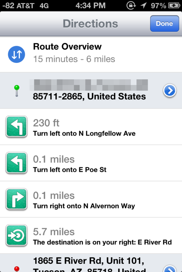
A third button appears alongside 3D as well which gives the route turn list and some detailed information. During normal turn by turn guidance, the status bar and all other UI is hidden, tapping brings these menus back into focus.
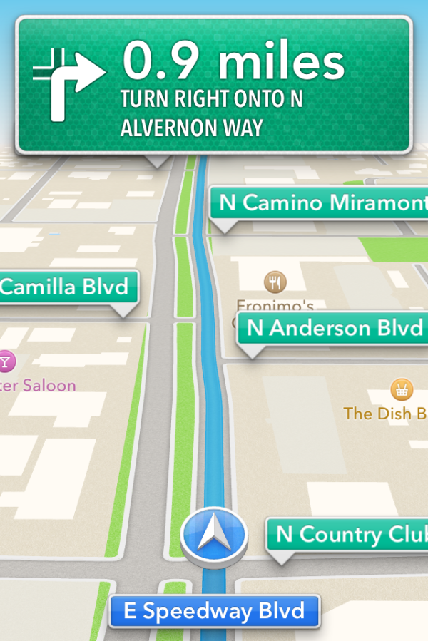
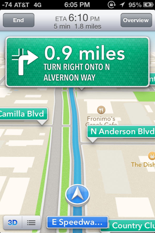
Driving interfaces - Navigation in progress (Left), tapping reveals more UI elements (Right)
I guess that brings us to the driving interface itself, which is extremely clean and minimalist. Previously I thought Google Navigation had an almost overly-minimalist set of OSD elements. After seeing iOS 6’s navigation interface it became clear that Apple has gone to some lengths to have even fewer things on their driving window. Up top is the next turn or event, and sometimes below it is the quick follow up guidance detail. At bottom is your current road, a vector position indicator, and really that’s it. The indicator is blue when you have a GNSS fix, grey when you otherwise don’t. By default the whole thing goes fullscreen including the status bar.
Apple’s design language for signage and alerts in the turn by turn app almost directly mirrors the USA’s Department of Transportation signage design style. Specifically, this is white text atop a green background for informational signage in the USA. In some navigation bubbles, Apple even emulates signage retroreflector texture (more skeuomorphism). Roads are called out with a green background as you drive along, route-specific roads are highlighted in blue. Points of interest and the same Apple maps base layer are both obviously carried over as well. In addition the interface zooms and pans very smoothly (breathes, really) as you change velocity and course. In addition, the view also changes perspective when approaching an intersection or turn. These animations are very smoothed and aren’t abrupt or otherwise distracting. I feel as though Apple’s main consideration for this interface was minimizing unnecessary clutter which would need parsing by your head and be potentially distracting.
On the whole the main view for turn by turn driving is strikingly minimalist. I was initially alarmed just how little information there is on the primary view when I first drove around with it, but it gets the job done. I generally want all the information I can get, so this isn’t really designed to what I like, but it makes guidance very easy to follow for drivers. What’s absent from the full screen view are any time to destination or estimated time of arrival clocks, present speed, or speed limit indicators. You can however see an estimated time of arrival and trip time by tapping which brings up the normal controls.
Closing navigation by pressing the home button doesn’t stop guidance, instead you get an ongoing process status bar indicator and textured badges when guidance alerts happen. This is very well executed, if you do need to do something else on the phone but still need guidance it is totally possible to survive, assuming your multitasking skills are up to snuff.
I’ve driven around with iOS 6 turn by turn since the first beta trying to break it or uncover some weird edge case where it gives horribly wrong guidance, but so far haven’t found a single thing. This is more than I can say for Google Navigation during its first few months, when it would periodically break on the I–10 and recommend driving literally up and down the interstate just past Casa Grande on the way to Phoenix (I jest not) and give endless voice prompts until being quit. That’s not to say Apple’s navigation product is perfect, I just haven’t uncovered anything insane yet.

Time will tell both whether Apple’s GIS product is free of errors which cause weird routing instability, and whether its traffic avoidance component is competent. It is ready to go now, however, and I guess that is why it isn’t wearing a beta badge like some other iOS features I’m thinking of that don’t work nearly as well. At the same time however, Apple is hedging its bets with a “report a problem” button under the settings fold where you can select from a variety of issues or enter your own.
I drove around for a couple of journeys with both an iPhone 4S and an HTC One X giving voice guidance to compare the two. I still don’t believe there’s much cross platform shopping going on, but Google being the other dominant smartphone OS maker (well, and Nokia, but my Lumia review units are long gone) giving away free navigation does merit a comparison. I recorded an 18 minute video showing the difference since there’s just so much that can’t be conveyed with screenshots. Of course getting 20 minutes of good footage required a few hours of driving, so I’ve noticed a lot gradually.
First, iOS 6 is a bit less chatty with navigation information callouts, but does the usual alerts before reaching a turn and speaking roads. Second, Google and Apple do differ in their pathfinding a surprising amount as well. If you watch the video there are a number of times both disagree on which route is best to a surprising extent. Both reroute after deviating from the route very fast as well. My other thought is that the English (USA) female voice sounds more natural using the stock Google text to speech engine in Android 4.x than Siri does. In addition even at the maximum volume selected in settings and with system volume cranked all the way up in iOS, voice guidance is still way, way too quiet.
For devices which don’t include turn by turn (ones that aren’t A5 or A5X based or above), you can still get directions, however there’s just a paginated list which works basically like directions worked in iOS 5 and prior. That is to say you have to manually advance through each step of the journey.
On the whole though turn by turn in iOS 6 is a pretty solid experience with minimal stuff to complain about.
Listings
Maps also completely revamps the individual listing pages for dropped pins and places of interest. The app now uses Yelp for reviews and photos and presents these in a three pane layout for restaurants as businesses. Yelp data is heavily featured in the new maps application. Tapping on reviews launches the appropriate listing in the standalone Yelp app if it is installed, otherwise you immediately get brought to the App Store. This level of integration will no doubt be a huge boon for Yelp, though I wish there was a single sign on pane in Settings.app which would work the same way as Facebook and Twitter.
I’m a little confused by some of the duplication of functionality between the listings themselves and how seemingly every road leads to the Yelp app, however. Want to read a full review? Tap it, and you’re taken to the Yelp app. View more photos? To the Yelp app we go! It would’ve made a lot more sense to just integrate all of Yelp into Maps and have the standalone app exist as an extra of some kind.
As an aside, it’s interesting to see how the places and listing battle has shaken up, with Google buying Zagat after a falling out with Yelp, and Apple now being a key Yelp partner.
App Store UI Changes
Apple hasn’t made a huge deal about it, but in iOS 6 the App Store UI changes in a dramatic way. The new interface appears to offer greater flexibility for Apple to customize the layout on the fly and change the order of menu items or other features. In addition there are a host of subtle but welcome changes.
The individual app listing page is different, adopting a three-tab system for details about the app, reviews, and a related column with apps by the same developer. There’s a lot more whitespace in the new layout as a whole, and although the changes make the app description pages more inviting I can’t help but shake a suspicion that information density took a hit as a result.
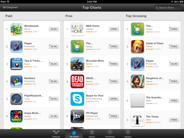
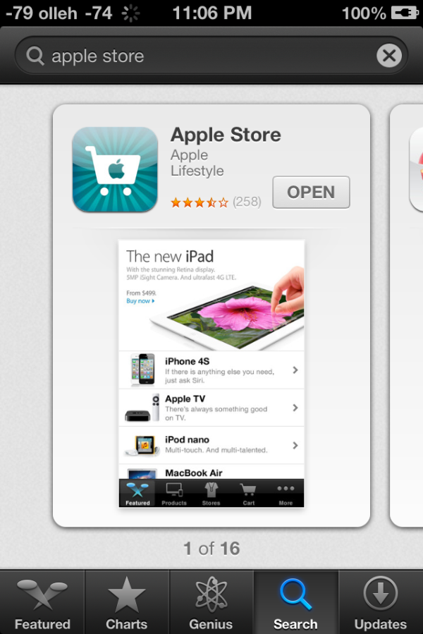
App discovery traditionally has been a challenge for mobile platforms, partly because it’s hard to come up with a good visualization for lots and lots of apps and partly because of the limited display area inherent in a mobile device. Unsurprisingly it seems as though the App Store redesign tries to tackle that problem head-on. First, the bottom bar places Genius dead center and offers a horizontally paginated nearly infinite scrolling list of recommended apps. This basic view also gets copied on the search page – there are pages of apps matching the search term with a big screenshot and install button. Featured gets changed dramatically and Top becomes Charts.

Updates with individual changelogs (Left), New search view (Right)
There are a few friction points which have also been smoothed over. A hugely welcome change is that app updates can now take place without requiring an Apple ID password. Likewise, free applications can be installed from the store without entering a password. Only purchases require a sign-on. The update screen also now has an expandable region under each app for viewing many changelogs at a glance as well. There’s update progress displayed in this menu in addition to on springboard. Newly installed applications also now get a new badge on them which goes away after a first launch.
Siri
We put Siri through her paces quite extensively when we reviewed the iPhone 4S, and since then, she’s learnt some new tricks along the way. Also, Siri is no longer exclusive to the iPhone. At Apple’s Fall event last week, it was revealed that in addition to the 3rd generation iPad, Siri will also be available on the new 5th generation iPod touch. So with the iPhone 4S and the iPhone 5, that’s four devices with support for Siri now. Good stuff.
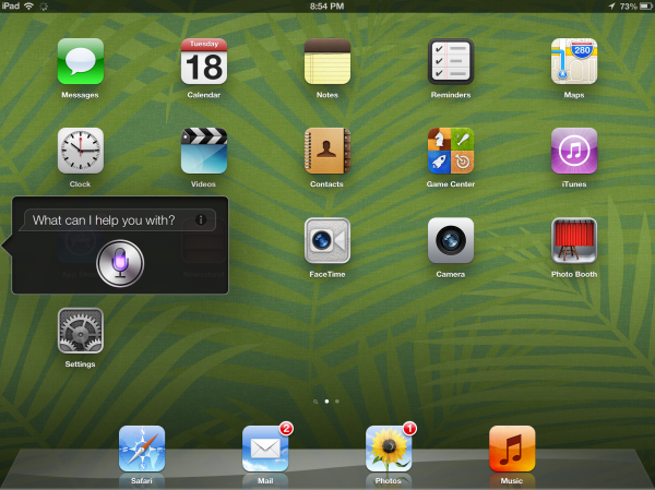
Location based Siri queries really depend on, as you might guess, your location. A lot of queries worked fine in the US, however we also did testing in Dubai where the results have been quite appalling. There’s very little that you can do with Siri in Dubai. Anything location-based simply doesn’t work, but other, more general queries work just fine.
I was actually quite impressed by Siri’s sports quotient; it pulls up game schedules and team rosters very accurately. Now this isn’t limited to American sports, because it pulled up information about teams and schedules for the English Premier League as well. Other stuff like Cricket and Table Tennis evoked a much humbler response; probably something we can expect to see a few years down the line. Siri can now also launch apps, but unless you have a ton of apps, it’s probably faster to do it the old-fashioned way. Just for fun, I was looking at some of the queries Anand ran for Siri in our iPhone 4S review and decided to replicate the one for calculating tips. I was pleasantly surprised to see the results, because it returned the answer in USD as well as AED (UAE Dirham). Its little things like these that go a long way towards fostering the kind of overzealous customer loyalty that Apple enjoys.
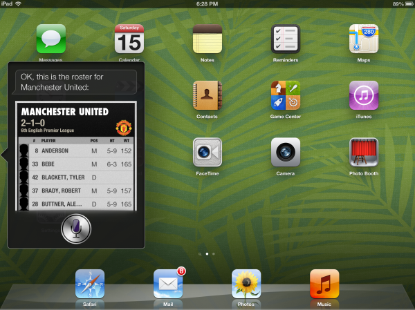
People may use Siri to do a lot of different things and I would argue that, because of the subjective nature of the results, primarily based on your location and other external factors, a review would simply not do justice to all the readers. So instead of focusing on Siri’s performance, we will be focusing more on its implementation on the iPad.
Now the iPad has a mammoth 9.7” screen compared to the 3.5” screen on the iPhone 4S and the 4” screens on the new iPhone 5 and 5th generation iPod touch. I expected Siri on the iPad to be more than a simple port of the iPhone version; but that’s exactly what Apple’s done. I’ve had a similar complaint with Notifications Center on the iPad as well. Apple’s entire argument with the iPad was that apps get a bigger canvas and developers can do a lot more with the extra screen real estate. But with Siri, Apple does not seem to be making good use of that space at all. You get the same-sized UI from the iPhone, and after one query, you’re left scrolling away to glory to keep track of your results.
It could have been helpful if Siri had a slightly more optimized UI to leverage the added screen space afforded by the iPad. Just as an example, I tried to get Manchester United’s team roster, and low and behold, I was scrolling forever to get through that list. At the very least, they could make the UI taller so that it displays more information. Apart from that, I do not have any major gripes with the way Siri works on the iPad, and it’s definitely a welcome addition.
New iCloud Features
Since iCloud made its debut last year alongside iOS 5 and OS X Lion, it has matured as a truly integrated service and has been at the center of Apple’s cloud strategy. With iCloud deeply integrated with iOS and OS X, it evident that Apple is using the service to keep users happy and stuck within Apple's own ecosystem. Good iCloud integration gives users a reason to buy tablets, notebooks and phones all from Apple, instead of picking and choosing from different vendors.
iCloud itself cannot be regarded as a new feature in iOS anymore as it its already been deeply embedded into the OS since iOS 5. There are however some new features that rely on the iCloud backend, such as iCloud tabs, offline reading list and Shared Photo Streams. Other features such as Facebook integration also leverage iCloud to keep contact lists and calendar events in sync. In conjunction with the iOS 6 release, Apple has also added new apps to iCloud.com, namely, Notes and Reminders. Other apps such a Mail, Calendar and Contacts have also been refreshed to blur the line between their iOS and OS X counterparts.
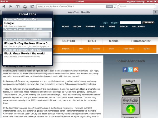
iCloud tabs lets you view your open tabs on your iOS 6 devices and Macs running Mountain Lion. The feature works as advertised, and the update speed across devices is quite impressive. This is a huge boon to the tablet usage model as it allows you to quickly switch between being productive on a notebook and relaxing content consumption on your tablet. Gone are the days when you need to email yourself links to your iPad to continue browsing what you had open on your Mac. This is also a big feature for keeping users using Safari on the Mac instead of migrating to alternate browsers like Chrome.
Safari on iOS also adds support for offline reading list, so you can cache pages for offline viewing later. These also get synced across devices almost in real time and at an impressive speed. If you’ve ever had to live through the nightmare that was MobileMe, you will truly appreciate the speed and reliability offered by apps and features that use iCloud.
Passbook
Passbook is one of those features that’s hard to review without actually seeing it working. At present, what we can say about Passbook comes largely from what has been announced publicly, and actual execution will require third party developer support.
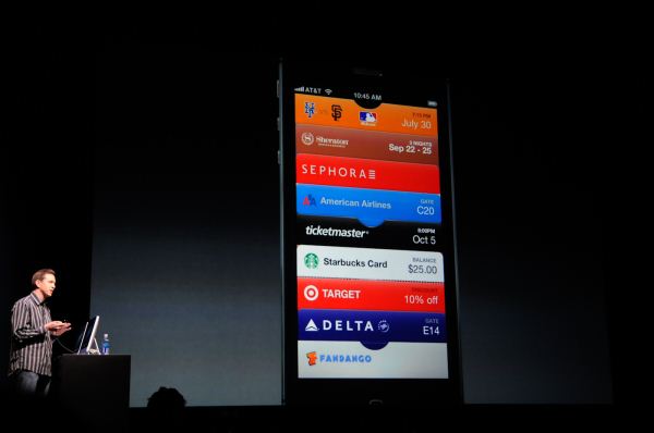
Passbook is a combination data store and gateway to a variety of tokens. Apple has passed around the idea that Passbook will be used for things like coupons, boarding passes, event tickets, and loyalty cards. At present the application offers a common API for generating barcodes based on a given token, abstracting this away from developers.
Passbook entries will then come from over the web through MobileSafari as a URL, through Mail.app, or through the PassKit API which will work with companion applications or through some form of APNS (Apple Push Notifications Service).
At a high level, Passbook is a solution to a real problem on mobile devices. Smartphones are portable enough to act as replacements to a lot of cards and pieces of paper we carry with us on a regular basis. Unfortunately today we still mostly rely on a disconnected collection of mobile apps and email notifications. Passbook has the potential to clean up and unify a lot of this.
In the past, the speculation involving Passbook was that this would be the gateway for NFC, but at present there’s nothing indicating that this is Apple’s intent. That isn’t to say it won’t come at some point in the future, however.
Unlike other apps in iOS, Mail has seen a steady stream of new features, usability improvements and UI tweaks in almost every release. We’re on the 6th major release of iOS, and Mail is already a very mature app in terms of its feature set and capabilities. At this point, there is very little that can be done to improve the core functionality of the app. So the focus is on small usability tweaks that enhance the overall user experience and workflow.
In iOS 6, Mail gets support for VIP lists introduced in OS X Mountain Lion. The main screen gets a dedicated VIP folder that lets you keep track of emails from the important people in your life. Tap the blue arrow, and you can easily manage your VIP lists and set custom notification alerts. The latter can also be accessed through Notifications under Settings. I find VIP lists to be quite useful, especially on my old Gmail account that gets more spam mail than mail that I actually care about. VIP lists makes it really easy to filter out and keep track of important emails.
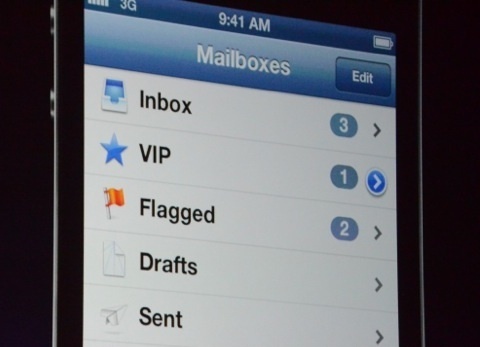
One of my biggest gripes about Mail has finally been addressed in iOS 6, and that is the ability to add photos and videos to emails from within the app. This was quite frustrating earlier, when I’d write entire emails, only to realize that I needed to scrap the draft and rewrite the whole thing again after adding the photo/video from a third app. Well not anymore; a simple long tap brings up a contextual menu that lets you add a photo or video to your email. I’m amazed at how such basic functionality has been missing from the Mail app until the 6th release of the OS.
To top it off, there’s a cool new animation on the main screen when you swipe down, that refreshes all mailboxes simultaneously. Quite the time saver.
Mobile Safari
There are really only a few things that a smartphone OS needs to do right. Messaging (SMS and email), 3rd party applications (with a marketplace), PIM (personal information management – calendar, contacts, etc), and finally inclusion of a decent web browser. This last section is devoted to the iOS 6 improvements to Safari.
With iOS 6, Apple hasn’t dramatically changed anything but (you guessed it), made some tweaks. First is the inclusion of a full screen mode for landscape.

(Left) New fullscreen button at bottom right, (Right), Full screen view for Safari in iOS 6
If you rotate into landscape, there’s a new full screen icon which appears. Tap it and boom you’re given a full screen browsing experience without the loss of status bar and bottom bar. Tapping again in full screen mode brings up the toggle to switch back into windowed mode.
The other new feature is inclusion of an offline reading mode. Tapping on the send/action button lets you send the current page to an offline cache. I have no doubt this leverages some of the reading view backend. There’s a progress indicator under the bookmarks icon while the device is caching pages for reading offline, and it continues on into the background. Going in that menu brings you to another category with a list of what all you’ve made offline that has and hasn’t been read yet.
Another feature is iCloud tabs, which as the name suggests syncs open tabs across devices with iCloud logins. At some level this brings MobileSafari back up to parity with the equivalent feature in Chrome (synced tabs).
JavaScript Performance
This section wouldn’t be complete without mention of the speedups made to Nitro for MobileSafari, which is Apple’s JavaScript JIT engine which works for ARMv7. I tested the iPhone 4 and 4S on iOS 5.1.1 and iOS 6 GM and saw around a 10% and 30% improvement, respectively. I’m not entirely sure why there’s such a discrepancy between the two, however it’s possible that the new Nitro sends things off to multiple threads more effectively.
| iOS 5.1.1 versus iOS 6 GM | ||||||||
| Device | iOS Version | Sunspider 0.9.1 | Browsermark | HTML5test.com | css3test.com | |||
| iPhone 4 | iOS 5.1.1 | 3553.1 | 52557.0 | 324+9b | 459 of 946, 221 | |||
| iOS 6 GM | 3358.8 | 57351.0 | 360+9b | 498 of 946, 221 | ||||
| iPhone 4S | iOS 5.1.1 | 2242.9 | 86062.0 | N/A | N/A | |||
| iOS 6 GM | 1716.0 | 109775.0 | N/A | N/A | ||||
There’s also a nice jump in HTML5 feature support, which I’m always a fan of seeing. The user agent string in iOS 6 GM now reports webkit 536.26 alongside safari version 8536.25.
Phone
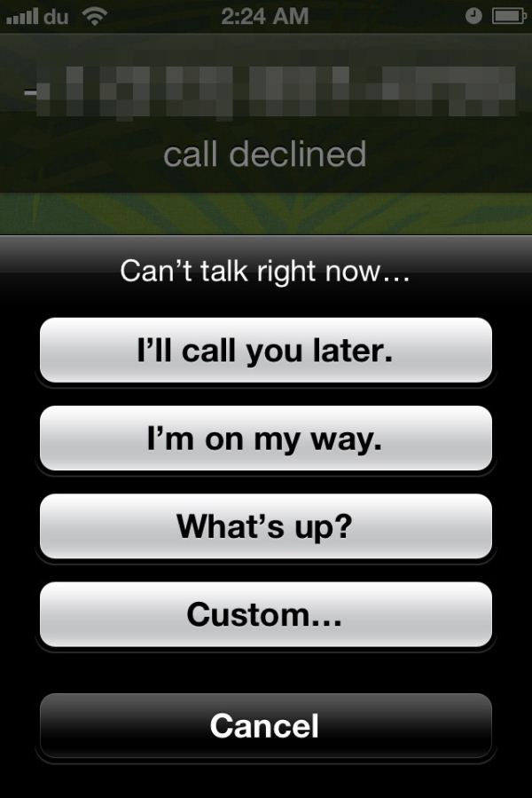
With iOS 6, Apple has finally added some much needed call management features to the Phone app and a simple UI to get the job done. So now when you get a call (and can’t answer), there’s a new swipe-up menu that lets you reply to the caller with a message, or set a reminder to call back. The UI is similar to the lock screen camera option introduced in iOS 5.1.
Apple includes a few pre-defined messages like “I’ll call you later.” and “I’m on my way.”, but you can reply with a custom message as well, if time permits. The text for the pre-defined messages can be edited to your liking under Phone settings.
The reminder feature allows you to set a time or location based reminder, which is quite handy. I’m notoriously bad at calling people back, and I have to admit I’ve used these reminders quite a bit already.
Finally, the dialer UI has been toned down to softer hues of white and blue; a stark departure from the darker, bubbly UI that everyone’s been accustomed to. I believe the main dialer view was changed to this grid format to accommodate the iPhone 5, where it resizes up and takes up the whole vertical area in portrait mode. That said, it makes no sense to change this so radically and then leave the in-call dialer the old style, which retains the original iPhone UI look.

Why are these two dialers from iOS 6 now vastly different styles? (Left: in-call, Right: mail dialer)
That’s about it for the Phone app in iOS 6. The new call management options have been a long time coming, but have been integrated rather well in the OS.
Do Not Disturb
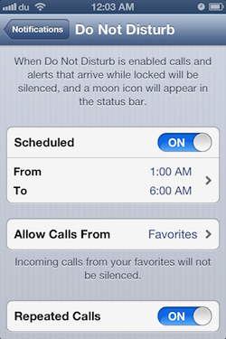
Continuing the focus on call management, Do Not Disturb is another well thought out feature in iOS 6 that is incredibly useful if you’re planning on skirting calls. This is accomplished in a couple of different ways. You can designate scheduled “Quiet Hours”, during which all calls, texts and notifications will reach your phone, but stay hidden until the quiet hours end. During quiet hours, your phone will not ring, vibrate or light up unless you receive a call from an allowed group of people, such as your Favorites. All missed events during quiet hours are stacked, and you can review them once quiet hours end.
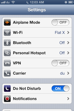
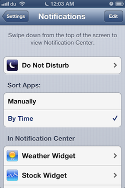
There’s also an option to enable repeated calls, which does not suppress a second call received within three minutes of the first one. Do Not Disturb can be toggled from the main Settings page, but you’ll need to go into Notifications to set the quiet hours and play with the other options.
The DND features are a welcome addition to iOS. It's good to see improvements to the phone part of this smartphone platform.
Other UI Changes
In each iOS release it always seems like Apple makes some subtle UI changes, similar to what it has done in OS X for years now. In iOS 5, Apple changed the toggles from a rectangular switch to circular, now in iOS 6 the status bar can change color depending on the app you’re inside. This color changes to either the average color of the bottom row of pixels in an application’s top bar, or to a specified value. It’s initially a jarring change since previously the status bar was this immutable iOS feature nobody could touch. It seems those barriers have come down in iOS 6, as now apps can change its color, and others like the official Twitter for iPhone app can even populate it with custom status text when sending a tweet.
The top status bar can now change colors
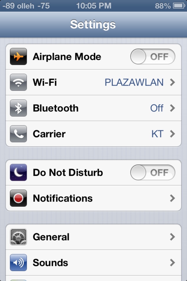
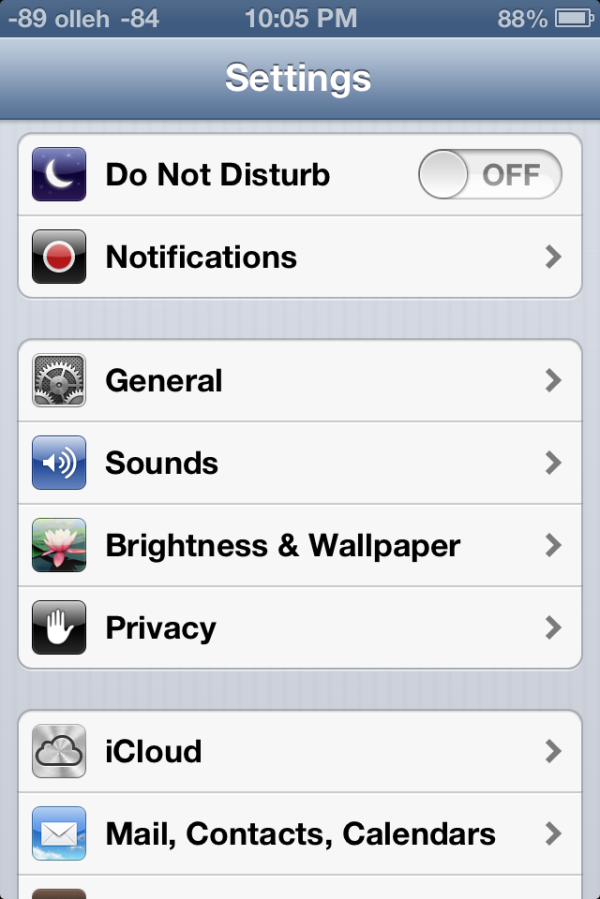
Settings.app gets a big makeover, with a few new items on the front page view and new organization as well. Bluetooth gets brought out of general and placed below the WiFi toggle how it always should have been. Facebook and twitter integration single sign on are grouped together, as are the new do not disturb and notifications center settings. This is just a lot of housekeeping for a settings app that was starting to get crufty as new features compounded over time.
Brightness and wallpaper hasn’t changed (with the addition of a few new wallpapers), but iOS 6 fundamentally changes the functionality and curves for auto brightness. Brightness now seems to be more of a log scale, and the slider seems to set a lower bound rather than a window for the auto brightness function. Where previously I would set brightness to around 50%, I now set it on iOS 6 to around 10% to get similar behavior. There’s a much longer hysteresis for change as well, and though this was initially disconcerting for me, I’ve found less blinding happening with iOS 6 than past releases.
That being said, the auto brightness on the 3rd generation iPad doesn’t seem to function very well. While the brightness is keenly revised upwards under extremely bright environments, it doesn’t seem to show the same enthusiasm to adjust downwards in darker environments. People elsewhere seem to be facing a similar issue on their 3rd generation iPads as well, so I fully expect a fix to be in the works.
Data Isolation
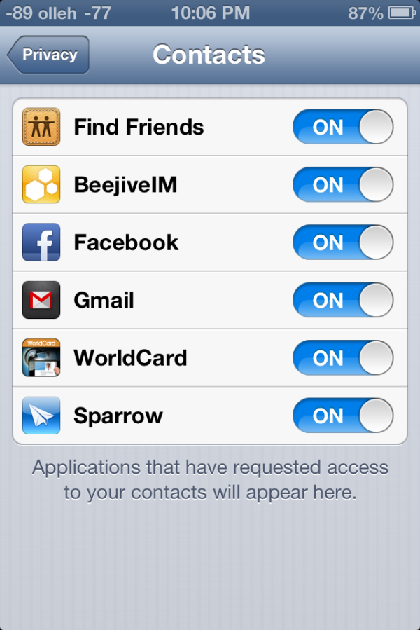
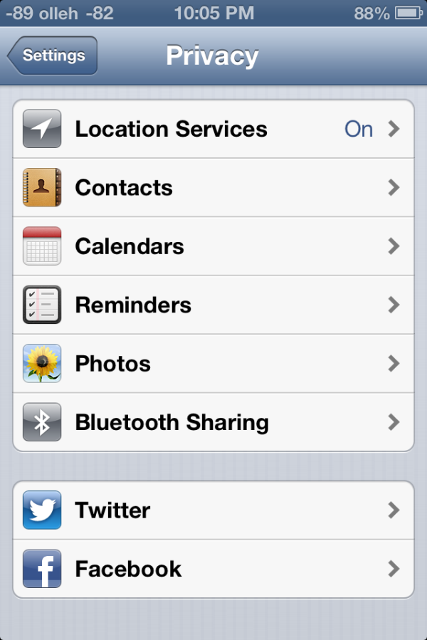
There’s a new privacy tab which now aggregates all the new iOS 6 data isolation stores. This is Apple’s response to both Android’s permissions system and recent discovery by users that apps frequently send off your entire address book. The system basically extends how iOS treated location services data permissions to contacts, calendars, reminders, photos, and the single sign on Facebook and Twitter tokens. Inside this settings page you can individually see what apps have been granted access, and revoke it.
Under location services is the same menu which was introduced in iOS 5. As we touched on earlier there’s a few new items under system services including the “traffic” process which contributes to Apple’s new traffic crowd source database. As usual you can disable these for privacy reasons or to save some power, though traffic seems to only fire up when the phone is plugged into a power source.
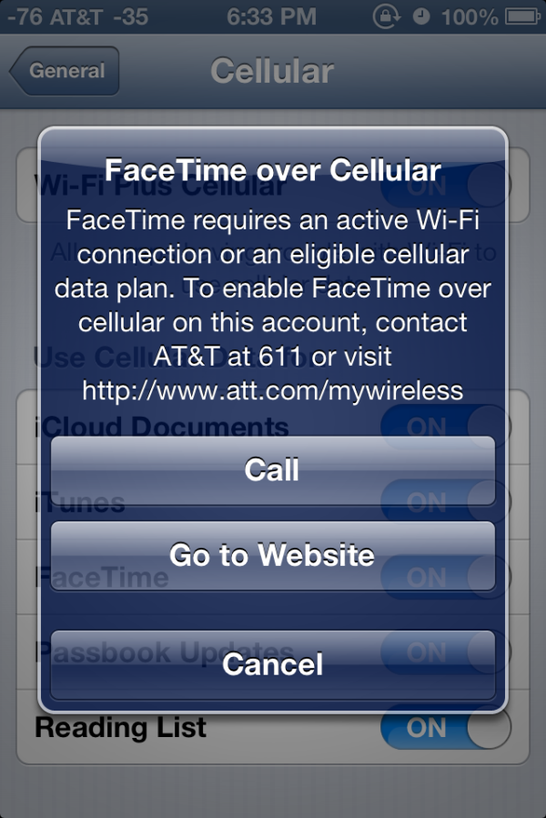
FaceTime over Cellular
Under FaceTime at the very bottom is a new toggle for cellular data. Toggle this and you’ll be able to make and receive FaceTime calls over the cellular air interface, if your carrier supports it. At present this menu appears to implement the same provisioning checks as the tethering pane. I wish I could say I tested FaceTime over cellular, but thanks to AT&T and my unwillingness to change to one of their supported plans I haven't done so.
Panorama for Camera.app
The camera interface in iOS 6 is largely the same as it was with previous versions, in fact this only really makes a significant departure for the iPhone 5 where it now has a larger black bar due to the fact that the camera imaging area is 4:3 and the display is now 16:9.
What's new is the inclusion of Panorama for the iPhone 4S (in addition to the iPhone 5), which oddly enough has been lurking inside iOS configuration plists for some time now. The iPhone 4 and 3GS get left out, however this feature does leverage the ISP and SoC strongly so some of that makes sense.
Instead of taking a few discrete captures at different positions in the panorama, the iOS 6 panorama feature integrates over a strip continuously which definitely helps minimize distortion and edge matching artifacts which normally plague panorama applications. The number of panoramas we've had a chance to make have turned out pretty well thus far. Panoramas can also be shot vertically in addition to horizontally.
Shared Photo Streams
Finally, as a logical extension of Photo Stream introduced with iOS 5, Shared Photo Streams lets you share your your photo albums with friends and family. Shared Photo Stream lets you share only with other iCloud users, so it’s a much more controlled environment for sharing your personal albums. There is however an option to publish the album on iCloud.com that lets anyone with a link to view the album. Photo Stream and Shared Photo Stream are mutually exclusive options; so you can choose to disable one and enable the other, depending on your requirement. Personally, I’ve never kept Photo Stream enabled, primarily due to data and other privacy concerns. But Shared Photo Streams is a nice way to selectively share content without having it publicly scrutinized on Facebook.
Sharing is easy; just create a new album (or choose an existing album) to share from the Photo Stream tab in the Photos app, enter the iCloud addresses that you’d like to share with and you’re done. Invited people receive an email asking them to join. Thereafter, they should be able to see the album on their iOS devices. Shared Photo Stream albums currently do not show up under iPhoto. The shared album naturally also appears on any other devices associated with the Apple ID used to share. Then the spree of endless liking and juvenile comments can commence.
Once an album is created, it’s easy to share it with new people or change other album settings. On the iPad, the interface is somewhat confusing; you have to tap Edit, and then tap any image in the album to being up the settings. On an iPhone/iPod touch, just click on the bright blue arrow next to the album name to bring up the settings. Under notifications for the Photos app, you can toggle Photo Stream alerts to show for everyone, or only from people in your contacts. This should be quite handy if you’ve subscribed to other people’s shared photo streams and don’t want to be bothered with incessant alerts.
Publicly shared albums are hosted on iCloud. The web interface is quite nice and builds heavily on the MobileMe Gallery UI. Unlike MobileMe Gallery though, there’s currently no option to bar people from downloading photos from public albums. Commenting and liking is disabled on the web interface, and for good reason.
Of course as we touched on earlier there’s a new Facebook single sign on function which integrates the service into iOS much the same way Twitter has been. Login here and notification center will include an option to update Facebook status, in addition to syncing with contacts and exposing Facebook as a share endpoint in some dialogs.
iPad Clock.app
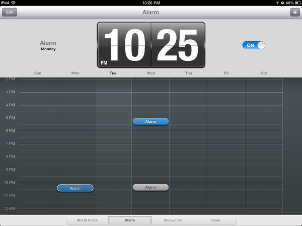
A surprising addition to iOS 6 is a slick new Clock app for the iPad. As the icon suggests, the app has a sliver and frosted white interface featuring a world clock, alarm, stopwatch and a timer. The world clock lets you add 6 clocks at the very top, while the map below displays those locations with their weather. The alarm page is also split up, with the top half showing the current alarm time, while the bottom half displays a week's calendar that shows all your alarms. Active alarms are highlighted blue and the inactive ones are gray. You can also tap and hold any of the set alarms and drag them on the calendar to set them manually. Very impressive indeed.
Similarly, the stopwatch shows the timer in the top pane and a list below populates all your lap times. The timer interface feels the oddest, because quite frankly doesn't require a 9.7" screen. Apple's literally gone ahead and pasted the iPhone timer UI and added the Start and Pause buttons around that. Kinda looks like Mickey Mouse with tiny ears. The new Clock app is a fantastic addition to the iPad, and users will enjoy its intuituve UI immensely.
YouTube
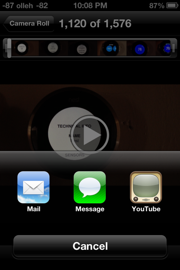
While the big news in iOS 6 is the substitution of Apple-supplied maps instead of Google maps, YouTube is the other Google product to get the boot this release. Though the standalone application is gone in iOS 6, YouTube itself remains an upload target from Photos.app and other places in iOS, but the familiar and oh-so-skeumorphic TV logo is now just a distant memory.
First, a little bit of history. Originally the only way to get to YouTube videos on iOS was through the YouTube app. The reason was actually pretty simple – the app served as a curated gateway to a small but growing subset of the YouTube catalog which was encoded using H.264 (as opposed to FLV). Recall that back in more innocent days, Google and Apple were such great lovers that Google was not only willing to dedicate tons of Xeons to transcoding from FLV to H.264, but hard drives as well to storing a bunch of different versions of the same video. Since then H.264 has pretty much won as the lowest common denominator encode target, though Google also steadfastly makes FLVs and added its own WebM/VP8 video as well. But back then, YouTube.app was the way iPhone users got to H.264 video content that the iPhone’s video decode block could play back. Remember that on mobile, hardware blocks dedicated to some particular use case are the way to achieving power efficiency. Oh, there also was obviously no HTML5 video element.
Since the iPad, Apple has employed a more direct approach, playing back the H.264 stream either in the browser or breaking you out of it directly in to a player. The YouTube app started getting more and more crufty, tied to iOS releases for any minor changes. Google began making its mobile interface better and better, and for years now you could largely view YouTube content on the iPhone or iPad without once launching YouTube.app.
What functionality did remain there were things like quickly browsing subscriptions and other tasks. In its stead, Google has built a replacement native YouTube app whose appearance and functionality almost completely mirrors the Android equivalent. Google has begun directing YouTube videos opened from MobileSafari and other apps to open and play back using their YouTube app as well. Unfortunately what gets lost is that at present there's no iPad application, and also AirPlay from the YouTube player appears to be completely broken. There’s really not much to say beyond that – there's a loss of features at the outset, but if you factor in the fact that Google can now maintain YouTube, freely decoupled from iOS, there's the potential for huge improvements. Of course, their motivations aren’t entirely benign, they want to serve mobile ads, but hey, nothing is perfect.

