
Original Link: https://www.anandtech.com/show/5689/the-new-ipad-retina-display-analysis
The new iPad: Retina Display Analysis
by Anand Lal Shimpi on March 19, 2012 5:49 PM ESTWe're hard at work on our review on the new iPad but with a fair bit of display analysis under our belts I thought a quick post might be in order. One of the major features of the new iPad is its 2048 x 1536 Retina Display. Apple kept the dimensions of the display the same as the previous two iPad models, but doubled the horizontal and vertical resolution resulting in a 4x increase in pixels. As display size remained unchanged, pixel density went through the roof:
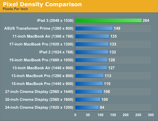
Although the iPad 2 has a fairly high pixel density compared to most of Apple's Mac/display lineup, you're more likely to hold a tablet closer to your eyes which made the low resolution/pixel density problematic. The new iPad addresses this issue as you can see from the chart above. I can't focus closely enough to the panel to actually make out pixels on the new iPad, much less at a normal viewing distance. With the aid of a macro lens we can definitely identify individual pixels. The improvement over the iPad 2 display is striking:
To the left we have the original 1024 x 768 panel, and to the right we have the new Retina Display. At this distance you can still identify individual pixels, an ability that quickly vanishes at normal viewing distances. The Music app icon is an even better example of what you gain from the newer display as it has more high contrast edges that appear more aliased on the 1024 x 768 panel:
The old iPad's 1024 x 768 resolution was fairly bothersome when it came to reading text on web pages or books. Most Android tablets standardizing on 1280 x 800 offered an advantage in that respect, albeit not delivering significantly higher pixel density. The new iPad completely resolves this issue. Hover over the links below to see roughly the same paragraph of text from our retail Radeon HD 7870 review on the iPad 2, new iPad and ASUS Transformer Prime:

| Apple iPad 2 | Apple iPad (3rd gen) | ASUS TF Prime |
| original | original | original |
While it's still obvious that you're looking at a screen and not an e-ink display, the pixels perform a good disappearing act on the new iPad.
Going Into the Pixel: Retina Display Under a Microscope
If we take a few (or an order of magnitude) more steps closer to the display and put it under the microscope we can get an even better appreciation for exactly what Samsung (and Apple's other display vendors) have done with the creation of this panel. Below are shots at 50x magnification of the display from the iPad 2, new iPad, ASUS TF Prime and iPhone 4S, organized from lowest to highest DPI:
![]()
Apple iPad 2, 1024 x 768, 9.7-inches
![]()
ASUS Eee Pad Transformer Prime, 1280 x 800, 10.1-inches
![]()
Apple iPad Retina Display (2012), 2048 x 1536, 9.7-inches
![]()
Apple iPhone 4S, 960 x 640, 3.5-inches
What you're looking at here are shots of the three subpixels for each pixel. Subpixel shapes will vary by panel type/manufacturer (hence the iPhone 4S vs. iPad subpixel structure), but the increase in density is tremendous.
Quantifying Display Performance: Big Gamut Gains
Pixel density may have improved, but what about the rest of the display characteristics? We'll start with the usual suspects - brightness, black levels and contrast ratio:
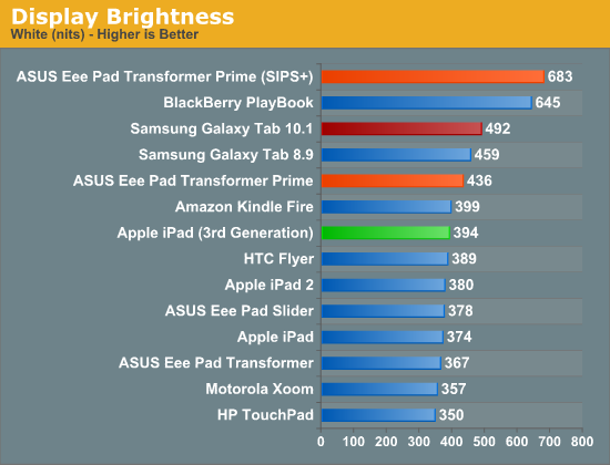
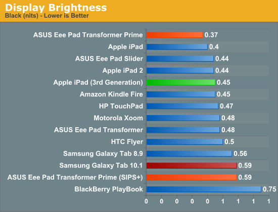
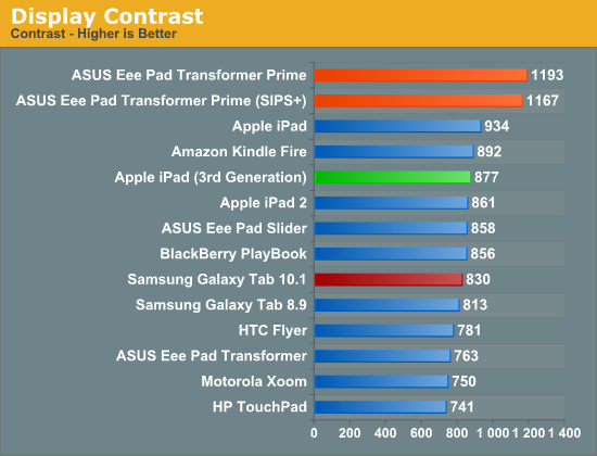
Despite a tremendous increase in pixel count and density, the new iPad delivers roughly the same brightness and contrast ratio as its predecessor. White point remains unchanged as well at ~6700K.
At the introduction of the new iPad, Apple briefly mentioned a 44% increase in color saturation from the new panel. Although the old display definitely looked good, the new one does actually look better. My eyes aren't normally the best judge of gamut, but we have some tools to help quantify exactly what I was seeing:
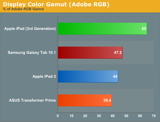
Color gamut has definitely improved. While the iPad 2 and TF Prime both were able to represent ~40% of the Adobe RGB color gamut, the new iPad jumps by nearly 50% to representing 65% of the Adobe RGB gamut. More impressive are the gains you see if you look at the color gamut of the new panel compared to the sRGB space:
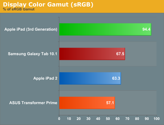
Here the panel is able to deliver nearly full coverage of the sRGB color gamut. Below is the CIE diagram for the new panel with an sRGB reference plotted on the same chart so you can visualize the data another way (the white triangle is the new iPad, the gray outer triangle is the sRGB reference):
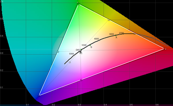
Near perfect coverage. The new iPad's display is a huge step forward in both pixel density and being able to represent a wider color gamut. While it's still no where near the quality of high-end PC displays, this is real progress for tablets. The bar has been raised.


