Original Link: https://www.anandtech.com/show/4191/motorola-xoom-review-first-honeycomb-tablet-arrives
Motorola Xoom Review: The First Honeycomb Tablet Arrives
by Anand Lal Shimpi on February 23, 2011 11:57 PM ESTValidation
With the iPad, Apple built a device that I wanted ten years ago, at a time when my workload wouldn’t allow me to use it. I spend most of my days in meetings, producing content, benchmarking and researching. Only the latter is better done on the iPad than a more conventional computing device. The killer apps on the iPad continue to be centered around content consumption and, more recently, gaming. Productivity apps exist, however there are still many usage models that demand the fast response time of a full blown PC or the convenience of a keyboard/mouse, higher resolution display and real working desktop.
That’s just me however. As is evidenced by the number of people I see in airports and airplanes who have traded in their Thinkpads for an iPad, this new era of tablets is serious business. I’m continually amazed by the number of people I see on a regular basis using an iPad, even though I understand why. It’s light, it has a long battery life, it’s easy to use, performance is more predictable than a netbook (thanks to the use of NAND flash vs. a conventional HDD), it’s got a beautiful screen and for some usage models, touching is better than pointing.
A Brief History of Android
Google found itself in an unfortunate predicament in the battle against Apple in the mobile OS space. The iPhone was released in June 2007, but the first Android phone didn’t make it out until October 2008. If Apple were a complacent giant with a stagnant mobile roadmap, showing up 16 months later wouldn’t be an issue. Unfortunately for Google, Apple was anything but that. Execution is critical in any innovation driven industry and Apple has executed extremely well. Since 2007 we’ve seen yearly OS releases (with subreleases in between them) and yearly hardware updates. Since 2007 the hardware updates have come like clockwork, every June we’ve had a new iPhone.
So how do you compete with a company that has a 12 - 24 month head start? Emulation isn’t the answer.
Google would have to out-execute Apple. Similar yearly OS/hardware releases wouldn’t be enough, because Apple would always be ahead at that point. Google wanted to pursue a more open path, with multiple hardware vendors and fully customizable UIs. While that’s great for the consumer, it made Google’s plight that much more difficult.
Apple only had to worry about a single hardware platform that it updated every year. With a dozen or so customers all with varying underlying hardware, Google would have to take longer (or dedicate even more resources) to developing an OS for all of those platforms. Google needed another strategy.
Apple has committed to a 12-month release cadence for OS/hardware, so Google would have to do better than that. On average we get a major Android release every 5 months. Granted Apple does update iOS more frequently than once a year, but Google has definitely come a longer way in the same amount of time thanks to its late start.
A more aggressive release schedule alone isn’t enough. Google wanted to bring Android to more than one hardware manufacturer, but doing so would make out executing Apple nearly impossible. The solution was to pick a hardware and a device partner for each major Android release. Google would work closely with those partners to release the flagship device for that version of Android. All of the other players in the Android ecosystem would be a bit behind the curve. It was a necessary evil in order to rev Android up quickly enough to compete with iOS.
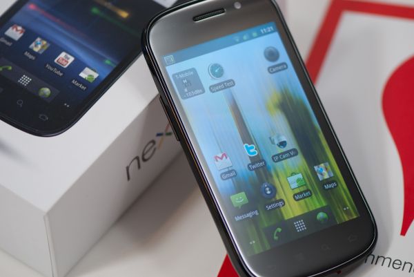
The hardware and device makers were evaluated based on their roadmaps as well as their ability to execute. Last round Samsung was selected as both the SoC and device partner with the Nexus S. Before that it was Qualcomm and HTC with the Nexus One. For Honeycomb, the tablet exclusive release of Android, Google’s SoC partner is newcomer NVIDIA with its Tegra 2. And the device partner? Motorola with the Xoom.
Google and Motorola worked very closely together on the Xoom and as a result, starting tomorrow, the Xoom will be the first Android tablet available running Honeycomb (Android 3.0). Other Honeycomb tablets based on NVIDIA’s Tegra 2 will follow shortly thereafter (Samsung’s Galaxy Tab 10.1, LG’s Optimus Pad) however the Xoom will be first. Down the road we can also expect to see Honeycomb tablets based on other hardware as well.
The Hardware
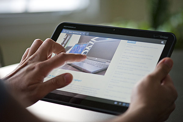
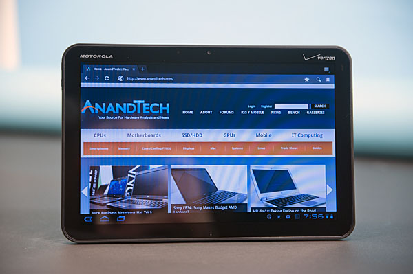
The Xoom looks and feels like a more rugged iPad. You lose the aluminum finish, but you gain something that feels a lot more grippy and utilitarian. The back is made of the same soft plastic with an almost velvet feel to it that we’ve seen on many smartphones in the past.
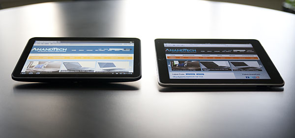
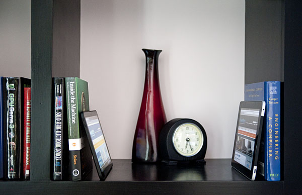
The front is all glass of course, however the screen has a much narrower bezel than the iPad making it look a lot more modern. The aspect ratio is also more widescreen than the iPad. The 10.1” screen has a 1280 x 800 display (16:10) vs. the iPad’s 1024 x 768 panel (4:3). As a result the Xoom is the same width in landscape as the iPad, but it’s noticeably shorter (and a little thinner). This gives the Xoom a slightly more manageable feel, although it’s still not as borderline pocketable as a 7-inch tablet.
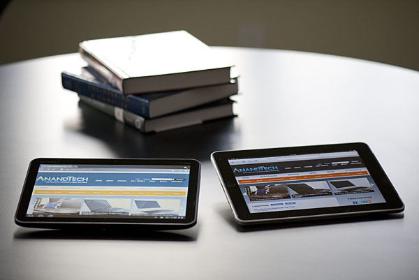
Motorola Xoom (left) vs. Apple iPad (right)
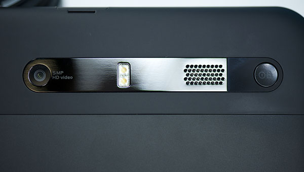
There are only three physical buttons on the Xoom: volume up, volume down and power/lock. The volume buttons are located along the left edge of the Xoom when held in portrait mode. The power/lock button is actually located on the back of the tablet, near the camera. When held in a landscape orientation the power/lock button should be near the index finger on your left hand. It’s location is actually not that bothersome when you’re holding the Xoom in landscape, it’s when you don’t know how you’re holding the tablet that you run into problems.
The lack of any physical buttons on the face of the Xoom give it a very clean look but also make it very difficult to tell what direction is up when you’re quickly grabbing the tablet. There’s an integrated accelerometer that allows the OS to know how to orient the screen, however when you first pick up the Xoom with the screen off you need to blindly feel around the back for the power/lock button rather than knowing exactly where it is.
Compared to the iPad the accelerometer/rotation magic seems to take longer on the Xoom. The lag between rotating the Xoom and the OS rotating the desktop seems to be just slightly greater on the Xoom compared to the first generation iPad. It’s not a deal breaker, but just a bit odd. Because of the widescreen aspect ratio I found myself using the Xoom in a landscape orientation more than portrait.
There are two cameras on the Xoom: a front facing 2MP and a rear facing 5MP camera with LED flash. The latter is capable of recording up video at up to 720p30. The front facing camera has a red LED next to it that illuminates when the camera is active. Rounding out the light fx are a green charge LED and a white notification LED strip on the front of the Xoom.
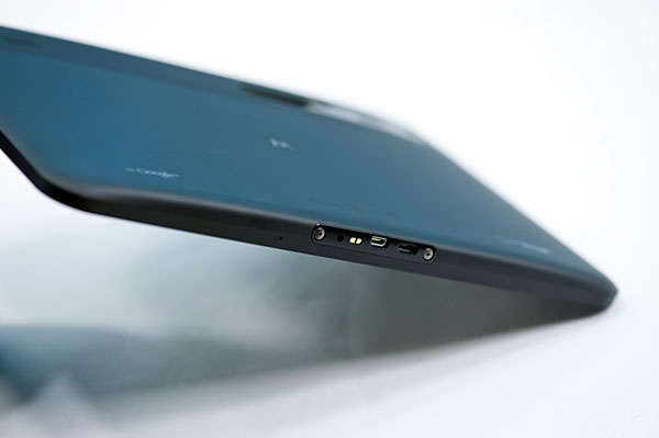
There are two speakers on the back of the Xoom, a 1/8” headset jack up top and a micro USB, micro HDMI and power input along the bottom. The micro HDMI port can't be used for mirroring, it looks to be exclusively for getting video out through some of the docks Motorola plans on selling. Update: HDMI mirroring is supported. I couldn't get it working on my Onkyo 508/Samsung UN55C7000 setup however I'll be tinkering around to see why the setup isn't working.
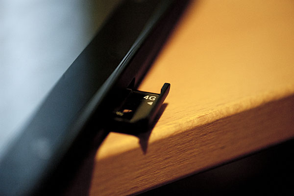
Internally the Xoom has a dual-core NVIDIA Tegra 2 SoC (T20) running at 1GHz. This is the tablet version of the Tegra 2 so it’s a physically larger package but it should have the same performance characteristics. Motorola also includes an Atrix-like 1GB of memory and 32GB of MLC NAND on board. There’s an external facing LTE SIM card tray that also hides the microSD slot in the Xoom.
The Xoom is launching with only one SKU at first: a 32GB 3G (LTE-ready) version priced at $799 through Verizon. This is an unsubsidized cost and it requires a single month of the $20/1GB data plan to function even over WiFi (thank you VZW). The closest Apple competitor is the 32GB iPad 3G priced at $729, a difference of $70. Granted the Xoom does give you two more cameras and two much faster CPU cores than what you get in the iPad, however I’m guessing the more fair comparison will be to the upcoming iPad 2.
| Tablet Specification Comparison | ||||
| Apple iPad | Motorola Xoom | |||
| OS | Apple iOS 4.2.1 | Google Android 3.0 (Honeycomb) | ||
| Dimensions | 242.8mm x 189.7mm x 13.4mm | 249.1mm x 167.8mm x 12.9mm | ||
| Display | 9.7-inch 1024 x 768 | 10.1-inch 1280 x 800 | ||
| Weight |
730g 680g (WiFi only) |
730g | ||
| Processor | 1GHz Apple A4 (Cortex A8) | 1GHz NVIDIA Tegra 2 (2 x Cortex A9) | ||
| Memory | 256MB | 1GB | ||
| Storage | 16GB up to 64GB | 32GB + microSD card | ||
If you want a lower up front cost you can opt for a $599 subsidized version, however that requires a 2-year service agreement at $20. If you’re going to pay for the data plan anyway this may be a better option.
What’s missing of course is a plain old WiFi only Xoom. Motorola says this is coming and will be priced at around $600.
Charging
Motorola advertises that the Xoom can fully charge in half the time of its leading competitor, requiring only 3.5 hours to charge completely. I will say that the Xoom does indeed charge very quickly, but the quick charging comes at a price.
The iPad charges over USB, although on the iPad end it’s exposed as a standard Apple dock connector. Connect it to a USB port that supports the battery charging spec and you’ll be able to charge the iPad slowly, and only when locked. Otherwise you’ll need to rely on the Apple supplied 10W power adapter. The benefit to this finicky approach is that you only need to carry one cable to sync and charge your device. Obviously it’d be even better if the cable in question were a standard micro USB but presumably if you’re an iPad/iPhone owner you’ve got at least some Apple dock cables laying around.
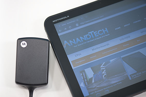
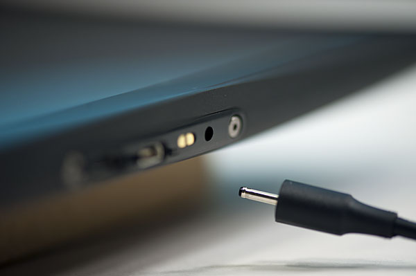
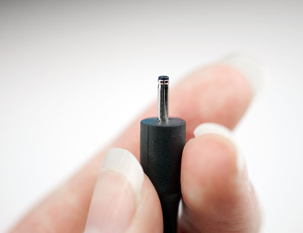
Motorola went a different route. There’s a standard micro USB port on the Xoom but it can’t be used for charging, only for data. Opposite the micro USB port is a very tiny power connector for the bundled 18W power adapter. When charging an empty battery the power adapter will draw up to 16.5W to help charge the Xoom as quickly as possible. The downside is obvious - you have to carry a much larger charging apparatus than just a cable with the Xoom.
I’m also concerned about the connector tip, it’s extremely tiny and is very flimsy (not to mention non-standard). I just worry about breaking it as it will require a completely new power adapter as a replacement.
The Display
I’ve got some good news and bad news. The good news is that the 1280 x 800 resolution on the Xoom’s 10.1-inch display is very nice. While I’m not sure that we’ve figured out the perfect tablet form factor/display resolution just yet, I will say that I hope it’s not 1024 x 768. The move to 1280 x 800 is at least a step in the right direction.
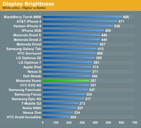
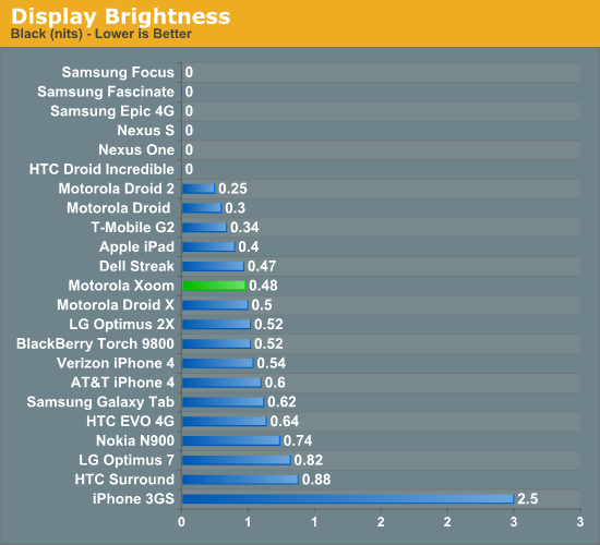
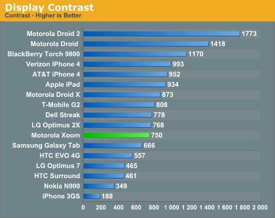
The bad news is the screen isn’t all that impressive. On my sample I measured a peak brightness of 356 nits and a black level of ~0.48 nits, resulting in a 750:1 contrast ratio. This puts the Xoom near the iPad in terms of brightness and lower contrast. In practice the lower contrast ratio is noticeable:
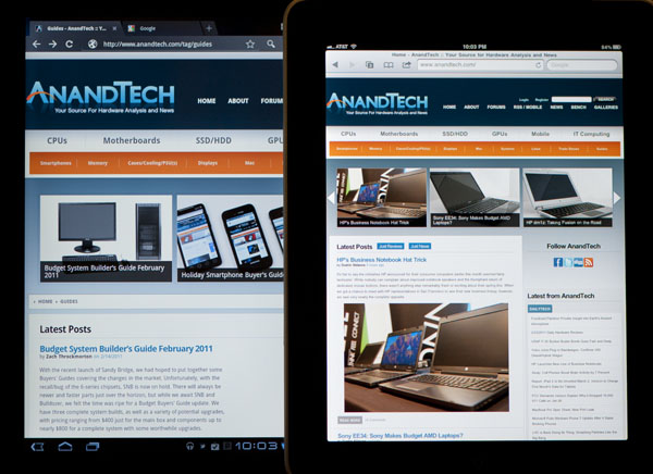
Motorola Xoom (left) vs. Apple iPad (right)
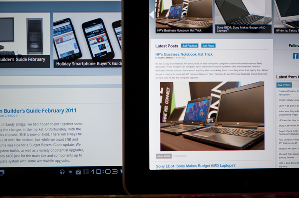
Motorola Xoom (left) vs. Apple iPad (right)
In practice the lower contrast ratio makes the Xoom almost completely unusable in daylight. If you can shadow the screen with your head it’s less of a problem but it’s still a pain to use outdoors in the daylight particularly if you’re staring at a dark colored background. Web pages and the email apps are easier thanks to their white background.
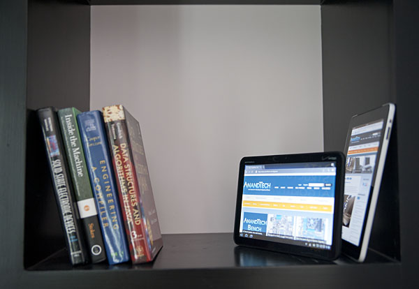
Motorola Xoom (front) vs. Apple iPad (back)
The iPad in particular has better color reproduction at off-center viewing angles. Alone, the Xoom looks acceptable. Not great, but not horrible either.
Finger prints and glare are issues on the Xoom display just like they were on the iPad’s display. You’re going to want to carry around a microfiber cloth with you at all times.
Welcome to Honeycomb
The first Android tablets were laughable. Without changes to the UI Android doesn’t scale well to a larger screen, not to mention the lack of tablet specific apps Oh but what’s this? Android’s all grown up:
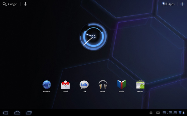
It doesn’t look like iOS but it surely doesn’t look like any version of Android we’ve seen before. Honeycomb is Google stating plainly that it can tear up blueprints and reinvent itself with the best of them.
Pick up any Android phone and you’ll see four buttons, either capacitive touch or physical switch, along the bottom of the front face: Home, Menu, Back and Search. The order was up to manufacturer interpretation but all four had to be present. Honeycomb nixes two (Search and Menu) and adds one (Tasks). Google also moved the buttons from the screen bezel to on the screen itself - the buttons aren’t just capacitive, they are a part of the OS.
![]()
Back, Home, Tasks
The order is fixed: Back, Home and Tasks. As of now there’s no customizing the Honeycomb UI - say goodbye to Motoblur, Sense and TouchWiz. The location is also fixed: bottom left. My biggest complaint here are the icons themselves, they are unnecessarily ambiguous at first sight and do take some getting used to for Android and iOS users alike.
The entire UI motif is Tron meets Robocop. Swipe between home screens and you’ll get a thin blue outline of the previous/next screens as you move. The fonts used for links at the top of the page are more expected, while everything along the bottom of the screen is a bit more 80s sci-fi. I don’t personally believe this is ultimately what Google will settle on for tablet UIs, but it shows a willingness to try something new and different, which is the quickest way to ensure that Android will remain relevant as this market evolves.
I suspect the ideal tablet UI is probably not too far off what modern desktop OSes have become. While a smartphone’s UI must be dramatically different due to the lack of screen real estate, a tablet UI just needs to be more efficient than its desktop counterpart - not necessarily very different.
I believe Google is beginning to realize this as Honeycomb has some very desktop-like elements in its design. What was once a pull down shade at the top of the UI is now a notification bar in the lower right of the screen, eerily reminiscent of the Windows system tray - just not as frustratingly cluttered.
![]()
Notifications
There are also clock, WiFi and battery status indicators down there, but I’ll stop drawing parallels. The point is that this works well and I expect that we’ll continue to see a lot of convergence between the desktop and tablet OS UIs (and eventually the OSes themselves, isn’t evolution fun?).
Overall the UI is amazingly clean and very well done. It's not perfect, but I'm pleasantly surprised - all this time I thought Android was just super functional, who knew it could look great as well?
Multitasking on Android: Done Right
Android has had multitasking since the start. Fire up an app and it can continue to execute even after you’ve shifted focus to another app (or the home screen) until you run out of memory. Once you reach a certain threshold of memory usage Android will automatically unload the least recently used app from memory.

The iOS 4 Task Switcher
What Android hasn’t had since the start is a good way of switching between apps. On iOS you double tap the home button to bring up a list of apps in memory, which you can use as a task switcher. Windows Phone 7 currently relies on a very powerful back button to switch between recently used apps, and eventually will implement a webOS-like card system. Android however did it the simplest way possible: tap home and run what you want to run next (Update: as well as tap and hold on home to bring up a list of recently used apps).
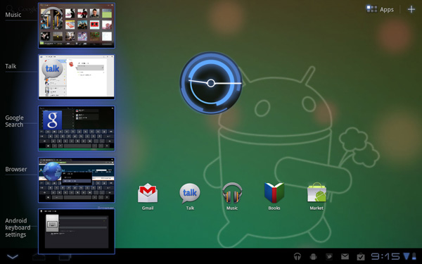
Honeycomb builds upon this. The third fixed button on the lower left brings up a list of up to five of your previously run apps/tasks (tap n hold home is gone). Each item has a text label telling you what it is as well as a visual preview.
For the most part it’s actual apps that will appear in this list (e.g. Twitter, Browser, Talk, etc...) however settings pages can appear here as well.
Unfortunately the task list is limited to five items - you can’t scroll to reveal more. I feel like this is a pretty big limitation as I do find myself going back to the Apps launcher screen more than I’d like given the functionality here. There’s also no way to force quit apps from this list, which would’ve been another nice addition.
New Notifications & Widgets
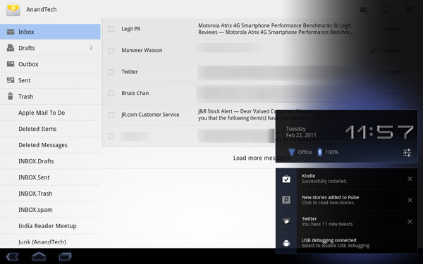
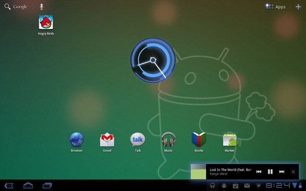
Honeycomb offers you more options to switch between apps than just heading back to the home screen. There’s the new multitasking UI, but there’s also the new notification area. Instead of having to pull down a shade to reveal notifications they simply pop up in the lower right corner of the screen and remain as icons to the left of the clock. Tapping on any of the notification icons brings up the full notification and also lets you clear it. If you tap on the signal/battery strength indicators you’ll reveal a stacked list of all of the notifications. If you have more than 6 notifications the stack will grow a scroll bar to show more.
Tap once more, this time on the full notification, and you’ll fire up the associated app. The combination of the new notifications and the task switching UI means that switching between apps in Honeycomb is more like your desktop PC. It’s not quite perfect yet, but we’re getting there - and in my opinion it’s better than what’s currently available on the iPad.
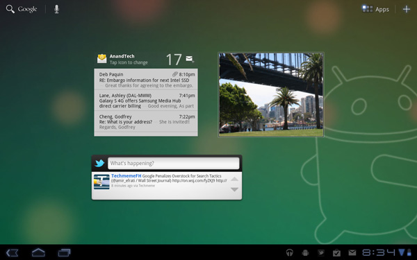
Google seems sold on the use of widgets as a major feature of Android. Personally I feel like widgets are more of a placeholder until we get full blown application windows that we can toss around our tablet desktop. If you subscribe to that thought process then what Google has done with widgets in Honeycomb will make a lot of sense. In Gingerbread and prior version of Android, widgets were fairly constrained and two dimensional. You could display information within the widget but there was no depth and no concept of scrolling.
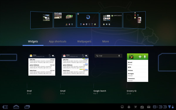
Take a look at the email widget from Honeycomb:
It’s basically a mini inbox viewer. You can scroll to view emails in your inbox or even tap the top of the widget to switch between viewing all emails and just those you haven’t read. You can’t read messages, delete or reply from within this widget, but tapping any email will open up the email app itself. As I said earlier, we’re just one step away from widgets becoming full blown apps that simply expand in place when we need them.
Honeycomb also provides some functionally decorative widgets, such as the picture frame which simply shows you a portion of one of your images. Tapping on the picture frame widget will open up the full sized photo it’s framing.
Stacks are also supported in Honeycomb widgets. Take the YouTube widget for example:

Here you get a stack of featured YouTube videos. The Books widget is also stacked, however it shows you covers of books you've loaded onto the Xoom. Tapping anything in a stack launches the associated app.
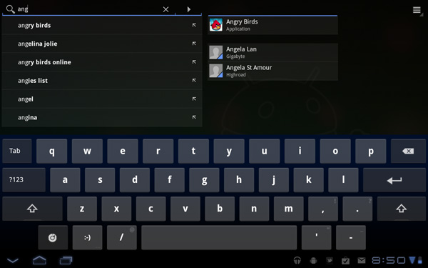
The Honeycomb Google search widget simultaneously generates web search queries as well as searches your local apps and contacts for your search string. There’s no Google Instant integration, but the UI is clean.
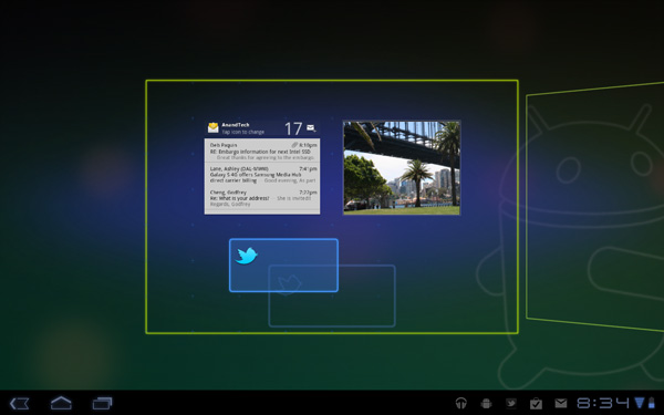
Adding widgets is as easy as hitting the + icon in the upper right of the screen. The default Honeycomb UI has five home screens - you can drag widgets and app shortcuts to any of them from the widget adder UI.
All of these widgets echo the same basic message in Honeycomb: giving you access to content and data in ways other than just going to the Apps launcher.
Apps Launcher
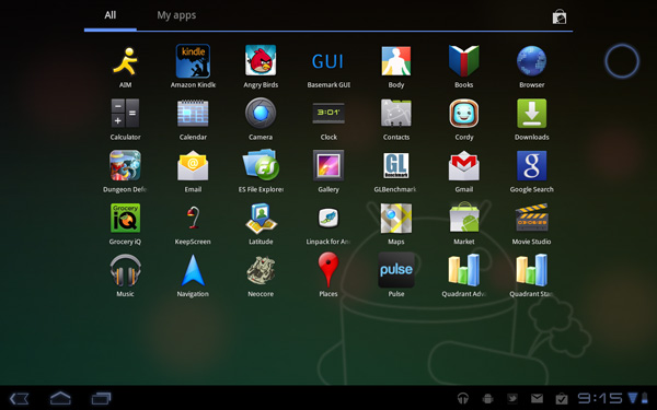
If the multitasking UI and the new notifications don’t get you to where you need to go, there’s still the old fashioned apps launcher. Located in the upper right of the screen (talk about turning Android on its head) tap the word Apps to reveal a more familiar looking grid layout of apps.
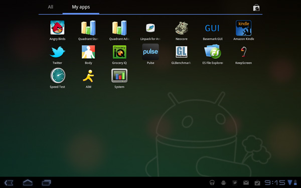
The apps are organized into horizontal pages instead of a vertical list. Google has also added a My apps tab to show just the apps that you’ve downloaded, not the apps that come as a part of Honeycomb.
I’d love to see a quick search field here so you could just start typing to find the app you’re looking for but perhaps we’ll see that in a future version of the OS.
The Android Tablet Keyboard
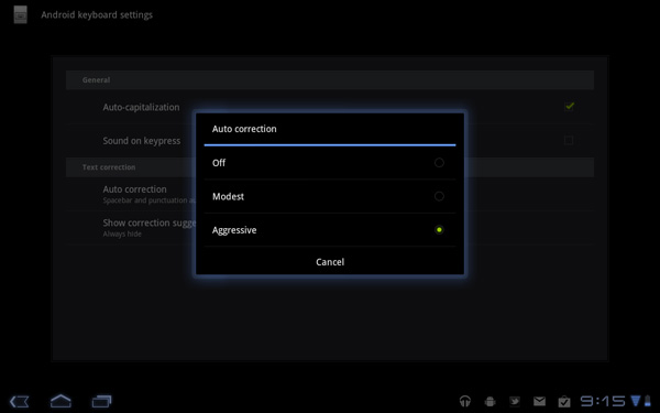
In our iPad review I complained that Apple purposefully turned down the autocorrect aggressiveness, which resulted in a more frustrating typing experience than on the iPhone. Google clearly struggled with the same decision, but left the option up to the end user to configure. There’s a new option in the input device settings to set how aggressive you want the autocorrect to be:
The main difference between moderate and aggressive seems to boil down to spatial recognition for typing errors. On Android and iOS the keyboard looks at the length of the word you’re typing, letters involved as well as the location of the letters selected when comparing to the built in dictionary. In my experience, Android tends to look more at word length and letters involved than it does the physical location of the keys you’re pressing. I’m not actually sure how much Android does the latter, but iOS seems to rely on it pretty heavily. Setting Honeycomb’s autocorrect to aggressive makes the Android keyboard behave a lot more like the iOS keyboard in this regard.
The main issue with aggressive autocorrect is when you’re intentionally typing a word that’s not in the dictionary. Aggressive autocorrect will typically correct it while moderate autocorrect won’t. I’ll give you an ironic example: the name Xoom.
With autocorrect set to moderate, Honeycomb will let you type Xoom without complaining. Set to aggressive, Honeycomb will look at the location of the letter X on the keyboard, realize it is close to the letter Z and assume you meant to type Zoom.
At the same time, where aggressive autocorrect comes in handy is when you actually make a spelling mistake due to a misplaced tap. Take the word "pool". If you accidentally type "pook", moderate autocorrect won’t do anything to the word. It’ll realize it’s not in the dictionary but it is not a blatantly misspelled version of another word. Aggressive autocorrect will realize that the letter k is next to the letter l on the keyboard, assume you meant “pool” and make the substitution.
Google also lets you disable autocorrect entirely but I’m not personally a fan. I’m torn as to what method I prefer on a tablet. Both can be frustrating at times but for different reasons. I feel like aggressive autocorrect is the best option if you have a mature dictionary to check against. By mature I don’t mean that it contains words of mature content, but rather it knows all of the words that you type frequently.
By default, Honeycomb takes a simplistic approach to autocorrection: the suggested words bar is hidden. Unfortunately this means there’s no quick and easy way to manually add words to the dictionary. Thankfully Google lets you show the suggestion bar all the time if you’d like, or only when in portrait mode if that tickles your fancy. Based on what I’ve seen I’d recommend using aggressive auto correct once you’ve added a significant number of words to the dictionary.
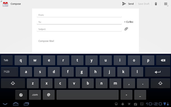
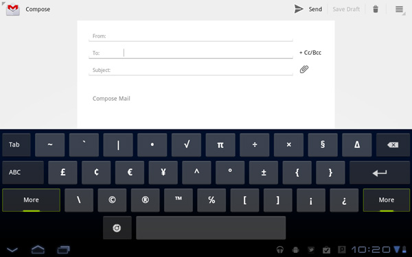
The virtual keyboard itself is pretty nice. Key spacing is good both in portrait and landscape modes and the learning curve isn’t too steep. It’s still faster (and less painful) to type on a physical keyboard, but for banging out short messages, emails and URLs - the virtual keyboard works.
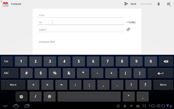
My only real complaint about the virtual keyboard is the location of punctuation keys. Google gives you access to commonly used punctuation (comma, question mark, exclamation point) without switching keyboard modes, but the position of the punctuation keys takes some getting used to - they don’t cleanly map to where you’d find them on a normal QWERTY keyboard. I feel like for first time users Apple got the layout a little better, but the point is moot - as long as you don’t go back and forth between an iPad and a Xoom you’ll get used to it.
A PC-like Tablet Browser
When I reviewed the iPad I wrote that web browsing was the killer app for the device. Today, with a healthy number of pretty impressive apps I don’t believe the iPad has to exclusively rely on web browsing to sell itself but it remains an important part of the tablet experience.
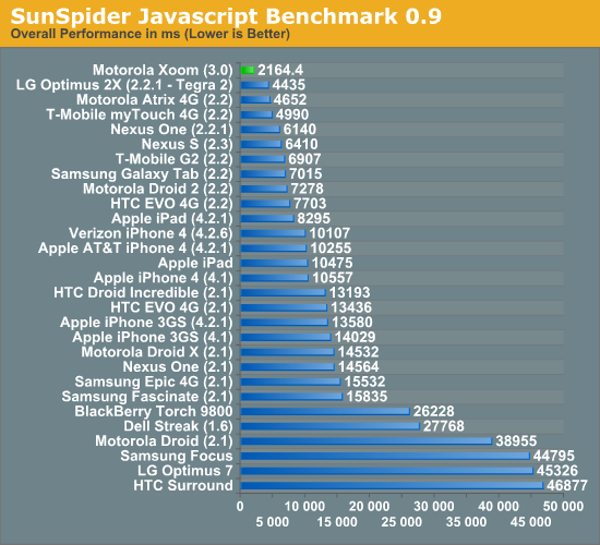
As such, Google focused very heavily on the browsing experience on Honeycomb and I can honestly say it’s better than what you get with the iPad today. There’s the performance first and foremost, the Honeycomb browser is unbelievably fast and it’s running on the fastest SoC shipping today: NVIDIA’s Tegra 2 (T20).
We’ve put together a new suite of web page loading tests that I’d like to debut in this article. The pages are served from a machine on the local network (the device never has to talk to the public internet) and thus this is a best case scenario for web page loading performance. The pages are automatically timed as they load. The browser cache is cleared before the first load and then each page is loaded another 7 times. I repeat the process on a total of 6 web pages and present an average of all of the times. The web pages tested are the front pages of AnandTech, Amazon, CNN, Engadget, Reddit and NY Times.
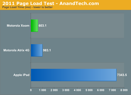
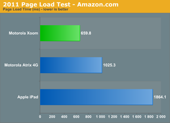
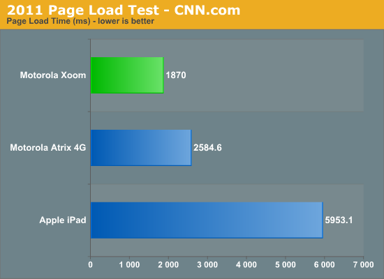
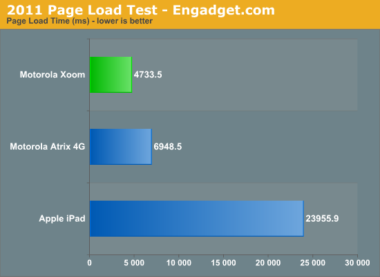
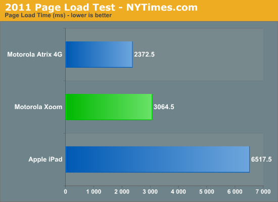
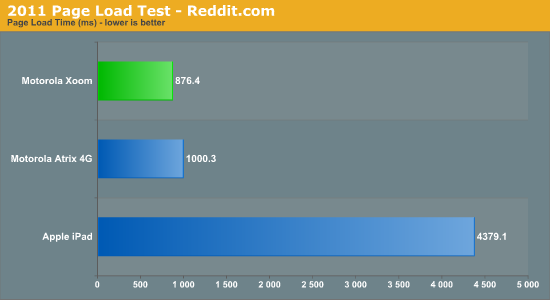
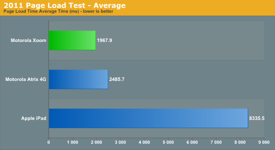
Simply put: the Xoom puts the iPad to shame. The combination of an ultra fast javascript engine with a pair of 1GHz Cortex A9s makes the Xoom feel less like a tablet and more like a PC when browsing the web. Particularly over WiFi the web browsing experience is just awesome. It’s like using a netbook, which in this case isn’t meant as a knock but rather a compliment.
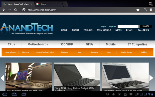
It’s not all about performance though, functionally the Honeycomb Browser is a huge improvement over anything else out there: it supports tabbed browsing. I can’t stress how much better this makes browsing on a tablet. Switching between tabs is just as easy as it is on your PC or Mac, you just use your finger instead of a mouse or keyboard combination.
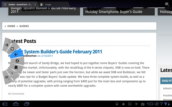
Google also allows an optional experimental UI that does away with the conventional controls altogether and gives you a popup dial that only appears when you swipe your thumb in either the left or right margins of the screen.
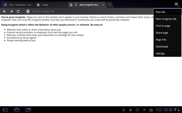
There’s full support for incognito mode and Find on Page, just like you’d find in Chrome on the desktop.
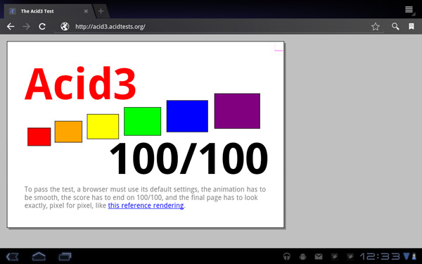
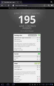
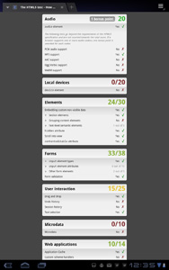
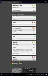
In terms of standards compliance, the Honeycomb Browser passes the Acid3 test but only manages a score of 195 (+3 bonus points) in the HTML5 test.
This is the future of tablet apps. As tablet hardware becomes more powerful we’ll end up running full desktop applications on these devices. This is only the beginning and Google clearly gets where it’s headed.
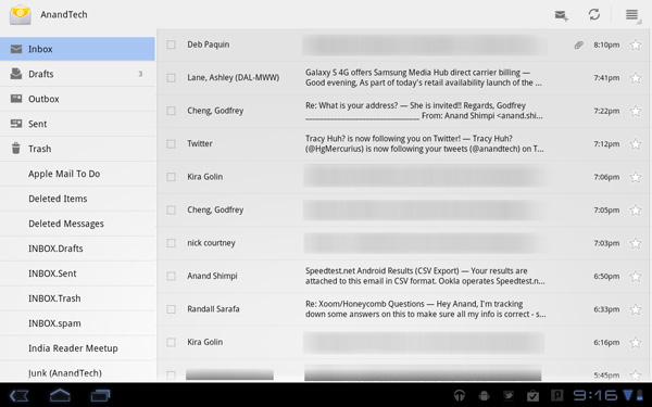
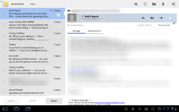
The email and Gmail apps are both perfect fits for Honeycomb. The UI provides a two column view, folders/inboxes on the left with messages/previews on the right. The formula works so why change it?
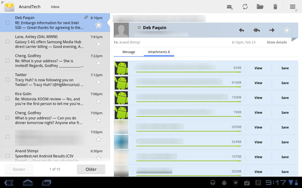
Attachments are handled beautifully in the email app. Rather than scrolling down to the bottom of an email to find all attachments there’s an attachment button you can hit in the message pane to show a list of attachments on the email.
Scrolling is smooth and the overall user experience is better than the iPad simply due to the performance of the app on this hardware.
There is one glaring bug I encountered however. I could not get email deletion to sync properly to the AnandTech IMAP server. Emails would download just fine, but if I deleted an email on the Xoom the email wouldn’t get deleted off of the server. This works fine in all earlier versions of Android so it looks like it’s a Honeycomb specific bug at this point. Obviously Gmail integration works perfectly.
Transferring Content
The USB connected notification is now gone in Honeycomb. When you connect the Xoom to a PC via a USB cable you just get a drive letter with no extra fanfare. Connect it to a Mac and things are a little different.
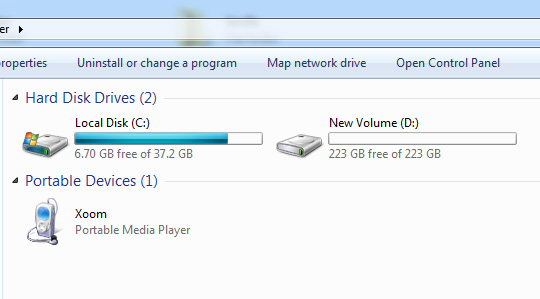
Xoom on a Windows PC
Xoom on a Mac
Google switched to using the Media Transfer Protocol (MTP) for USB storage, which isn’t natively supported under OS X. To get USB file transfer working under OS X you need an additional app. Google provides Android File Transfer which does get the job done, however it does have some quirks (mainly related to deleting files required by an app that has been used recently or overwriting files).
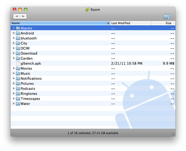

Music & Video Playback
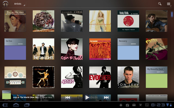
Honeycomb finally adds a pretty decent looking music app to the OS. The Music app gets a notification icon as well so you can tap to pause, play and skip songs while you’re playing around in other applications.
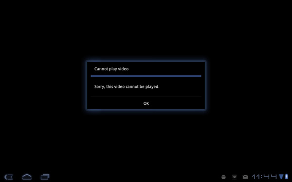
Video playback is nice on the large screen however there’s still the issue of file format support in Android (.3gp and .mp4 are supported, baseline profile H.264 only). Until we get Kal-El class SoC hardware I’m not sure if we’re going to be able to have a chance at playing most video content without transcoding.
Google Video Chat
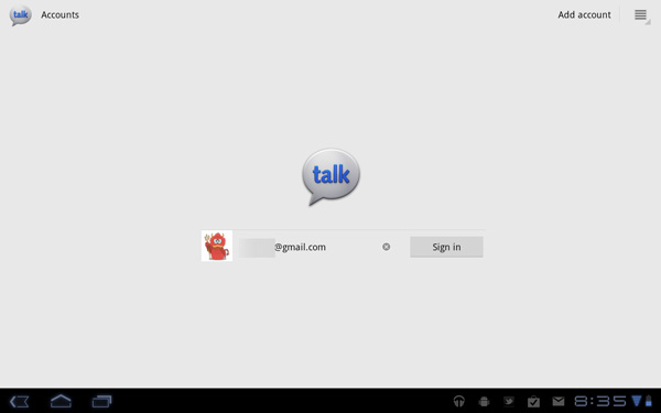
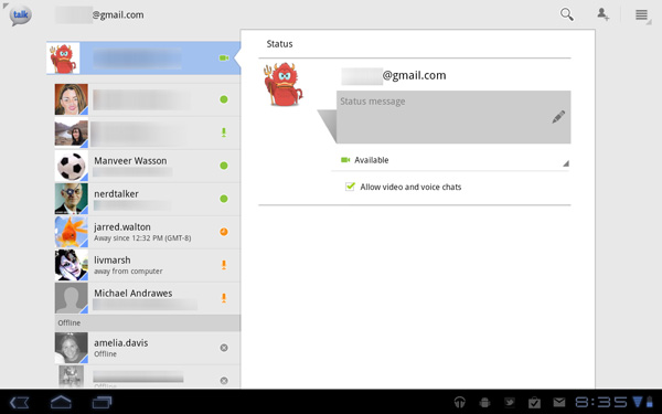
The whole point of having a front facing camera on the Xoom is to enable two-way video chat. Given that Android is a Google production, the video conferencing platform of choice is obviously Google Video Chat. Integrated into Gmail, Google Video Chat already works on all PCs and Macs with a webcam. In Honeycomb, video chat is available via the Talk app.
Just like in the browser version of Gmail, any contacts that can send audio and/or video will have the corresponding icon next to their user name. Tap the contact then tap the action item to initiate a video chat, or hit accept on any incoming video chat requests and you’re set.
Video chat takes place full screen although you can still multitask while it’s going on (your video feed will just pause while you’re off doing other stuff, audio will still transmit and you’ll still be able to hear the other party - they just won’t be able to see you).
While you lose the ability to type to the receiving party, anything they send to you will appear over the video window like so:
Incoming messages from other parties appear in the lower right as standard notifications.
You can switch between front and rear facing cameras using a toggle on the screen:
There’s also a slider to enable live image stabilization on the transmission side. In practice it works well at light settings but at full blast it can significantly distort the transmitting video.
Functionally the only problem I had with video conferencing on the Xoom is that the volume slider is non-linear. Speaker volume was a bit too high at 100%, however at the next step below 100% it was far too quiet. Note that this is the only part of Honeycomb where the volume control works like this, it works fine everywhere else.
The chat app does let you set mic and speaker volumes independently, which is a nice addition. In testing I found that setting both to 100% was the best to use in my office.
Video chat works over both WiFi and 3G, however there’s no difference in compression level or quality between the two interfaces from what I can tell. Video quality isn’t that great but it does get the job done. The front facing camera on the Xoom isn’t very impressive and you’ll want to be lit as well as possible. The video is compressed to under 400Kbps (I measured 360Kbps transmitting and 300Kbps receiving).
Old & New Apps on Honeycomb
As we mentioned in our overview of Android 3.0, there are a number of features that Honeycomb specific apps are going to be able to take advantage of. For example the dual-pane view that we see in the Honeycomb email apps - we’ll see more of that in future Honeycomb apps similar to what we saw happen with iPad specific apps. We’ll also see developers use contextual action menus.
Existing Android apps should just work on Honeycomb (although some definitely have issues). Google runs these older apps by default full screen, just scaled up to fit the higher resolution of the Xoom.
![]()
The fourth button for backwards compatibility: menu
You’ll remember that Honeycomb does away with the menu button, however older Android apps are expecting it to be there. In these situations you’ll see a fourth button added to the lower left of the screen: a virtual menu button.
It’s Crashy
At MWC earlier this month I noted that the Galaxy Tab 10.1 running Honeycomb seemed to be unusually unstable. Given that the first tablet running the OS would be shipping in a matter of weeks I just assumed that it was due to Samsung not having access to the latest build of Honeycomb. After all, Motorola is Google’s device partner this time around.
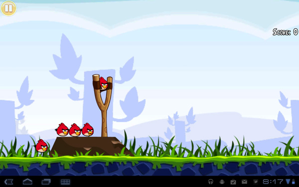
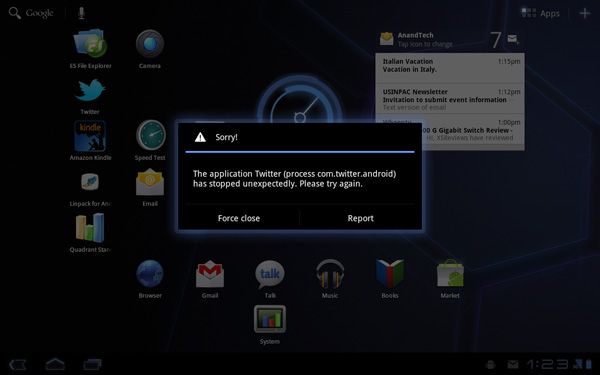
After using the Xoom for the past couple of days I can say that while the experience isn’t horrible by any means, Honeycomb isn’t anywhere near as stable as Froyo on the Atrix 4G. I’ve had many application crashes in both older Android apps and native Honeycomb apps. For a while there I couldn’t get the Android Twitter app to work at all, even after a reboot.
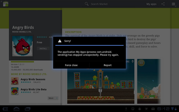
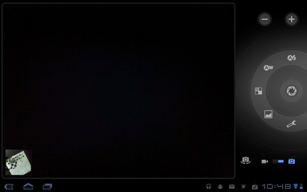
As I mentioned, it’s not just third party apps. The Honeycomb Browser, camera app and even Marketplace have all crashed on me over the past two days.
There’s also no microSD support in Honeycomb yet, it’ll be added via a forthcoming OS update. And there are many bugs sprinkled throughout the OS (background data automatically enables itself after a reboot even if you disable it). Things like this combined with the instability I mentioned earlier makes me feel like Honeycomb was a bit rushed, perhaps to hit the streets before one other major tablet announcement coming this year?
Camera Quality
As awkward as it may be, you can definitely hold the Xoom in two hands and use its rear facing 5MP camera as you would a point and shoot or your smartphone. I can’t help but feel absolutely ridiculous using a tablet to take pictures of something, but it does work.
The camera app’s UI is actually pretty easy to navigate. There aren’t a ton of options but they’re all available via a circular tool on the right side of the display. Switching between front and rear cameras as well as from still to video all happens quickly, at least compared to the smartphones we’re used to reviewing.

Image quality is surprisingly good. Photos don’t always come out as saturated as they should, particularly on cloudy days but sharpness and detail are both there. Increase the focus distance and the image quickly loses its sharpness/exposure:

Performance
With Honeycomb, Google enabled full GPU acceleration across the OS. As a result, I had hoped that we’d have a very Windows Phone 7 like experience in Android 3.0. For the most part, it’s similarly smooth, but it’s still not quite perfect.
Performance in Honeycomb seems even more dependent on background apps than with earlier versions of Android. I’m not sure if that’s because Honeycomb is less aggressive about kicking processes out of memory or if I’m simply doing more with the OS on a larger screen, but I found myself killing tasks manually more frequently in Honeycomb than I did on Froyo. It’s also possible that with faster hardware and a faster OS that any slowdown, even if only minor, is more perceptible.
Swiping between home screens is butter smooth under Honeycomb, as is interacting with widgets and notifications. Applications launch quickly and scrolling in them is smoother than any other Android release. Even scrolling in the browser is finally smooth on Android, although I don’t believe it’s quite up to par with iOS/WP7. Granted Honeycomb doesn’t support Flash yet so it’s too early to tell how Flash integration will change the browsing experience, but I wonder if the delay on integrating flash has to do with ensuring that browser scrolling performance isn’t hurt.
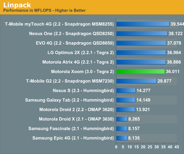
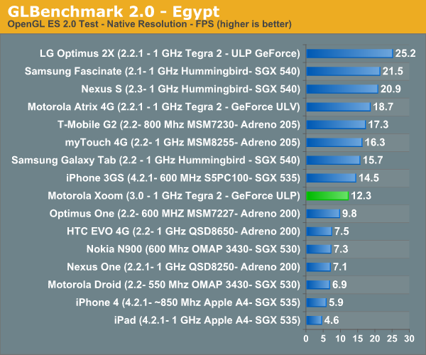
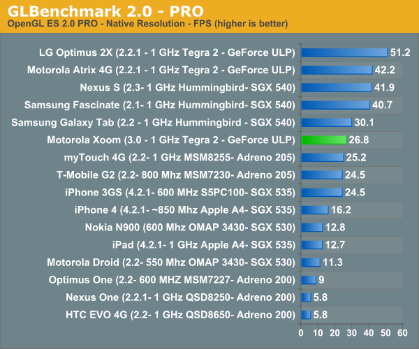
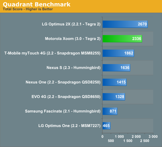
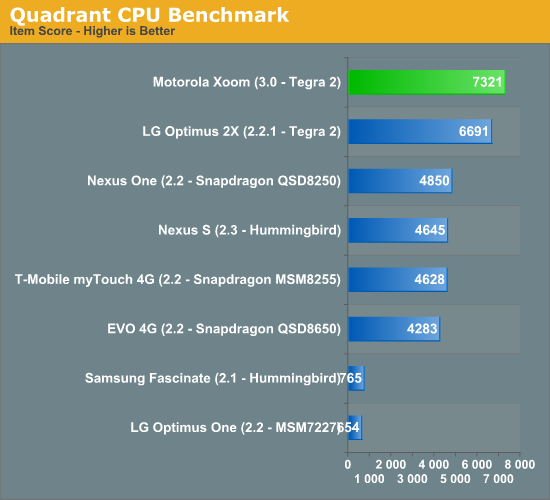
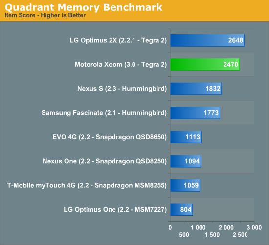
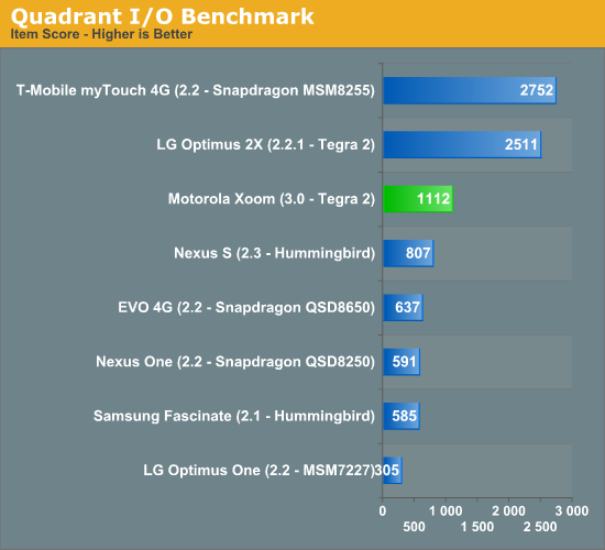
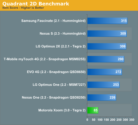
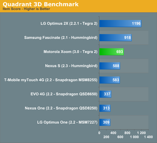
As we saw with the Atrix 4G, performance benchmarks may be slower on the Xoom due to its higher native resolution (1280 x 800) than the competitors. This is particularly evident in the 3D gaming tests. I almost wonder if we'll begin seeing higher performing SoCs in tablets going forward, with lighter hardware being used in smartphones. It's clear that these smartphone SoCs, while fine for lower res smartphones, don't have the compute horsepower or memory bandwidth to cope with higher resolution displays.
I'm also not entirely sure what's going on in the Quadrant results as there are some significant drops in performance on the Xoom vs. Atrix. This could be a Honeycomb thing or an issue with the benchmark itself.
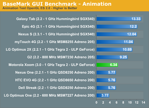
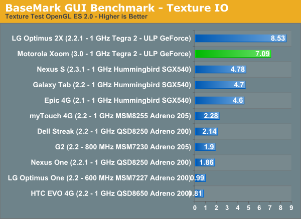
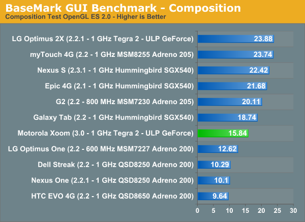
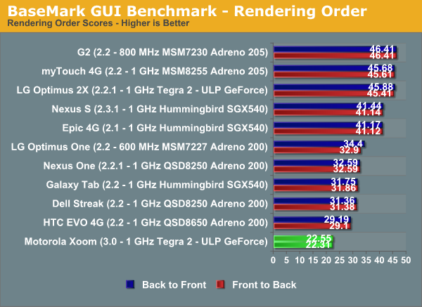
Wireless Performance: Cellular & WiFi
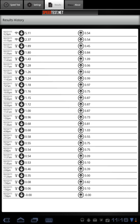
The Xoom ships by default with an EV-DO baseband for use on the Verizon network in the US. In practice I saw download speeds of anywhere from 0.35Mbps all the way up to 1.89Mbps and 0.10 to 1.09Mbps upstream. On average I got ~900Kbps down and ~600Kbps up, which is pretty typical for Verizon in North Raleigh.
By comparison the iPad 3G averaged 1.3Mbps down in the same locations as I tested the Xoom, but only 0.2Mbps up. Remember the iPad 3G has the same modem as the iPhone 3GS - it has HSDPA but not HSUPA so the theoretical max upload is only 384Kbps.
Motorola and Verizon will be offering a free upgrade to an LTE modem later this year. The modem will have to be physically soldered onto the motherboard so it’s not an end-user upgrade. There’s already an LTE SIM slot and tray built into the Xoom for use post-upgrade.
The Xoom also features an integrated 2.4GHz 802.11n WiFi radio supporting a single spatial stream at up to 72Mbps. In practice I measured a peak transfer rate of 36Mbps, which makes the Xoom the fastest device we’ve ever tested over WiFi (the original iPad was the previous king at 30Mbps).
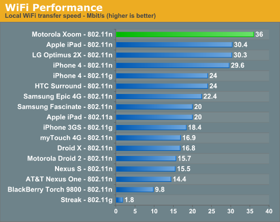
Like all other Android 2.2 or later devices, you can create a personal hotspot with the Xoom and share your cellular data connection with other devices over WiFi.
Battery Life
Motorola specs the Xoom at up to 10 hours of battery life, very similar to what Apple suggests the iPad can manage. Motorola sampled reviewers with the Xoom just two days ago and thus I haven’t had a tremendous amount of time to run through our entire suite of battery life tests, what I do have for you are two numbers that generally support Motorola’s rating.
The first is the Xoom running through the same 3G web browsing test we put all of our smartphones through:
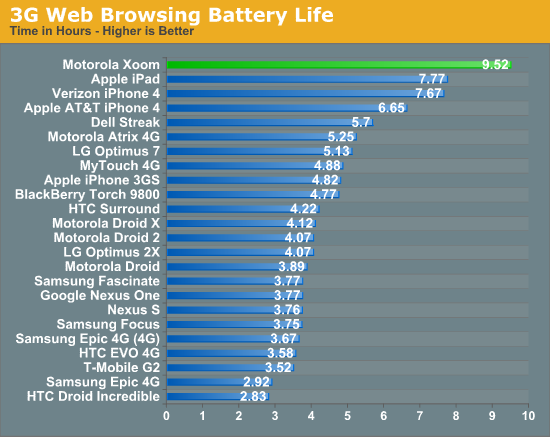
At 9.5 hours, the Xoom will easily last you throughout a workday even if you’re browsing the web the entire time and not actually doing work.
The second test is actually a test I put together for our original iPad review. Take our web browsing battery life test, add music playback and email downloading in the background and you’ve got a heavier workload on WiFi:
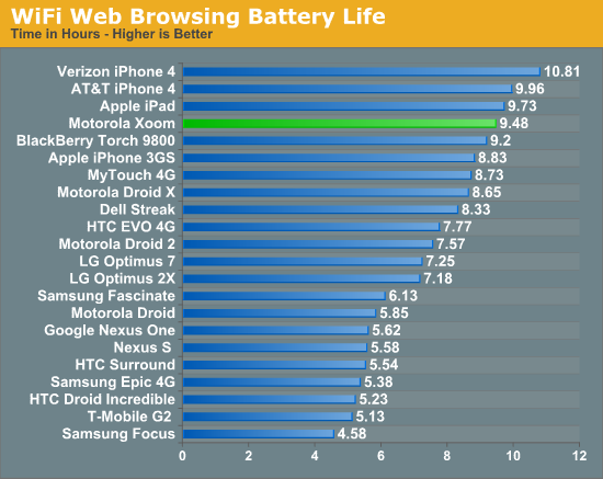
The number is almost identical - about 9.5 hours for the Xoom on WiFi with some additional tasks running in the background. I’m going to be running some more battery life tests on the Xoom but based on these results I’d say despite the performance advantage, you don’t sacrifice any battery life vs the iPad.
Final Words
I have to say, this is a lot better than I expected. Honeycomb feels a lot like Google’s take on iOS without sacrificing any of what makes Android unique. It’s a healthy combination of the appliance-like iOS without giving up any of the user facing customization & flexibility that Android users love. If you’re a die hard iOS user then I don’t think Honeycomb will tempt you, but if you’re undecided or you can appreciate both then Honeycomb may actually push you over towards Google.
I’m impressed with what Google has done with the UI. It’s a definite modernization of what Android is all about. There are elements of the Android UI we’re used to within Honeycomb but they aren’t all that prevalent at the surface. This looks and feels like a brand new OS for Google.
Am I more likely to use the Xoom than the iPad? Yes. The hardware is faster but more importantly, the software is better suited for multitasking. I’m a bigger fan of Honeycomb’s multitasking UI & notification system compared to the double-tap-home and passive notifications you get with the iPad and iOS. I can be more productive with the Xoom than I can be with the iPad as a result. I don’t believe Honeycomb’s UI is perfect by any means, it’s just more multitasking oriented than iOS is at this point.
There’s definitely room for improvement. The fact that there are still choppy animations within the OS is perplexing, I've asked Google for an explanation but I've yet to get an answer on that one.
I’d like to see the ability to scroll to reveal more apps in the task list for starters. I almost feel like we’re headed for an OS X dock-like setup where you have a permanent row of your active apps across a portion of the screen and you just tap to switch between them. This whole tapping twice to select a new app thing has to be short lived, it’s not an efficient use of fingers.
Elements of Honeycomb do feel rushed however. The stability of the OS/apps, the missing SD card support and random OS quirks come to mind. As a result I'd recommend waiting for at least the first Honeycomb update before pulling the trigger on one of these tablets.
As far as the Xoom itself is concerned, I like the hardware. It feels good, I’m less worried about it slipping out of my hands and onto concrete and it’s full featured. Battery life is clearly competitive with the iPad as well, which is impressive given how much faster the thing is by comparison.
The screen isn’t terrible but it’s not the most impressive thing around, which is about the only complaint I have regarding the hardware. Had this been a $499 tablet I wouldn’t be too concerned but we’re talking about $800 here - I’d expect a better quality display at this price point, especially considering the price premium is really for 32GB of cheap NAND and smartphone hardware. I appreciate that we have a higher-than-iPad resolution, but I also want a higher-than-iPad contrast ratio.
Overall I am very excited to see Honeycomb tablets hit the market. Last year was mostly a waste when it came to non-iPad tablets, but this year looks to be quite the opposite.
This conclusion is obviously unfair to Apple given the rumored impending release of the iPad 2, but if I had to buy a tablet today it’d probably be the Xoom.
If I wasn’t insane however, I’d wait to see what was being announced on March 2nd first.

