
Original Link: https://www.anandtech.com/show/3891/samsung-epic-4g-review-the-fastest-android-phone
Samsung Epic 4G Review: The Fastest Android Phone
by Anand Lal Shimpi on September 6, 2010 5:28 PM EST- Posted in
- Samsung
- Epic 4G
- Gadgets
- Smartphones
- Mobile
The sheer amount of choice you get in the Android smartphone market is overwhelming. Even if you stick within a single manufacturer like HTC, there are several releases to juggle all of which happen in a very short period of time. Below is a list of just the HTC Android phones that have come out in the past 12 months:
Hero, Click, Bravo, Legend, Incredible, Espresso, Supersonic/EVO 4G, Buzz and Liberty.
And that’s just in the past year! Then we’ve got Android phones from Sony Ericsson, Dell, Motorola and LG. You can’t argue that there is a lack of choice in the Android market, but the vast majority of these phones aren’t perfect. In fact, it feels like every subsequent Android phone we touch comes closer to perfecting one aspect of the platform while leaving another neglected.
The EVO 4G brought us a unique form factor, but poor performance and battery life. Dell gave us our first 5-inch Android tabletphone, but coupled with an ancient version of Android it’s just not prime for its 2010 release. And seemingly all Android phones suffer from varying amounts of stuttering when scrolling around app lists or web pages.
It’s easy for a reviewer to get excited about every new Android release, but it must be hell for someone actually looking to buy one of these things.
The good news is we’re getting closer to the perfect Android smartphone. I don’t believe we’re there yet, but every single manufacturer has contributed something to the platform that someone else will eventually copy and wrap into one device.
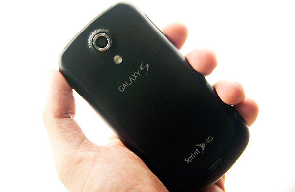
The latest in the list of attempts at perfection is Samsung with its Galaxy S. And I must say, Samsung’s take on Android is quite possibly the most unique I’ve seen. Unique compared to other Android vendors that is.
Vectors of Innovation
Samsung innovates along three vectors with the Galaxy S. You get a new screen size (4” vs. 3.5/3.7” or 4.3”). The 4” screen size is a near perfect combination of productivity boosting screen area and portability. You get a new screen type with Samsung’s Super AMOLED that really fixes a lot of issues I had with AMOLED displays in the past. To top it all off, Samsung continues to innovate by equipping the Galaxy S with the fastest GPU in any shipping smartphone: the PowerVR SGX 540.
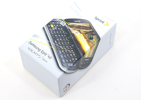
There are four versions of the Galaxy S, one for each of the major US carriers. There’s the Captivate on AT&T, the Vibrant on T-Mobile, the Epic 4G on Sprint and the forthcoming Fascinate on Verizon.
Easily Influenced
As the manufacturer for both the NAND that goes into Apple devices and the SoC that Apple uses in the iPhone/iPad, Samsung works closer with Apple than most other smartphone vendors. I was once given a characterization of Samsung that I will never forget: this is a company that’s trying to learn as much as it can from Apple for use in its own smartphone endeavors.
There’s no better example than the Galaxy S. Unlike other vendors who have been Cupertino inspired, Samsung’s learnings are put to use almost exclusively in software. Physically, the Galaxy S is quite dissimilar from the industrial design used in Apple’s iOS products.
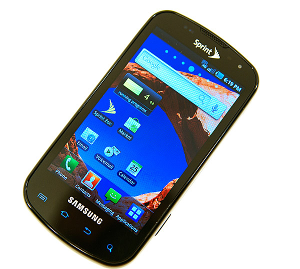
Samsung sent me the Epic 4G, a variant of the Galaxy S for use on Sprint’s network (with WiMAX support as implied by the 4G moniker). The Epic 4G has an amazingly contrasty 4” 800 x 480 Super AMOLED display. The capacitive touchscreen is backed up by a physical keyboard that slides out in landscape mode.
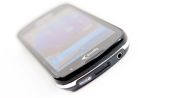
I’d say that Samsung did everything to be the most unlike Apple in the design of the Epic 4G. Along the top you have a microUSB port, but Samsung included a sliding cover to keep the pocket lint out. This adds complexity to the look of the device, but is nicely protective if you’re a bit OCD about getting lint in the crevices of your phone. The sheer location of the microUSB port is unusual as well. Most Android phones we’ve looked at have their power/sync connector at the bottom of the phone, not the top.
The power/lock button also shifts positions compared to what we’re used to. It’s on the right side, near the top on the Epic 4G.
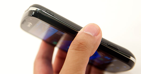
On the lower part of the right side of the phone there’s a shutter release button for the camera. There’s a volume rocker on the left side of the phone. All of the buttons on the Epic 4G have a rubbery texture to them with the exception of the shutter release button which has a metal insert surrounded by rubber.
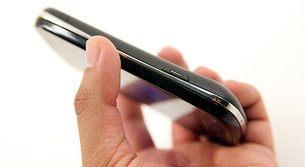
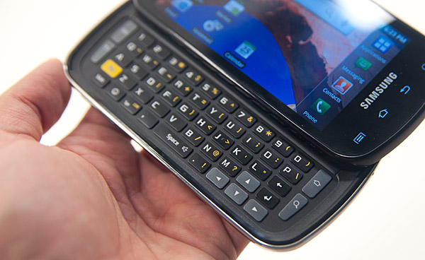
The screen slides up to reveal a landscape keyboard on the Epic 4G. The sliding mechanism is easy enough to operate with one hand and reasonably smooth. It’s not the most confidence inspiring but not terrible either.
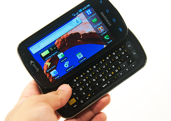
The physical keyboard itself is a nice addition for those who must absolutely have it. Samsung even duplicates the four Android keys on the keyboard itself (home, back, menu, and search) so you can exclusively use the physical keyboard for navigating the OS if you’d like. There is no scroll ball or equivalent on the Epic 4G, but the physical keyboard does have four arrow keys you can use in its stead.
The keys on the physical keyboard are fairly wide and reasonably spaced (it is a landscape keyboard after all). The keys are missing some curved definition that would make it easier to touch type on them but overall it’s not a bad keyboard. Again, not the best I’ve encountered but not terrible at all.
Since this is a slider phone, build quality isn’t the easiest to guarantee. The two halves of the phone independently feel well made, but the joining of the two isn’t super secure. The “oreo effect” as Brian likes to call it is very present on the Epic 4G. You can twist the top and bottom halves of the phone and get them to separate by a couple of degrees. It’s not terrible but if having a loose feeling phone bothers you then you may want to look elsewhere.
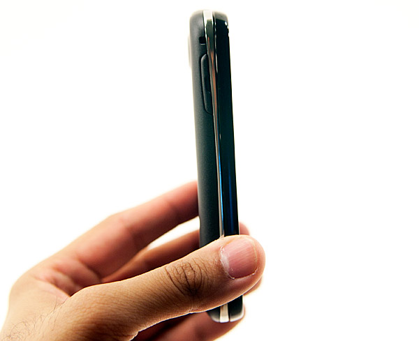
The four standard Android keys are also present in capacitive touch form along the bottom edge of the Epic 4G. Unlike most other Android phones, the capacitive buttons aren’t visibly outlined on the phone. You can only see them if they’re backlit, which has a timer associated with it that’s by default separate from the screen timer. What this means is that the row of Android buttons will actually disappear before the screen goes blank if you don’t touch the phone. Thankfully Samsung provides a setting to sync these two so both the screen and buttons go blank at the same time, but it’s just not enabled by default.
The Epic 4G is a good fit in my hand, but with a physical keyboard it is a thicker phone than most I’m used to. If you’re coming from a standard cellphone or feature phone, the Epic 4G is going to feel huge - if you’re coming from another Android/iOS device, it won’t be too bad.
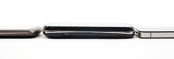
From left to right: Google Nexus One, Samsung Epic 4G, iPhone 4
The phone is a mixture of materials, with the front being glossy plastic, then a chrome strip around the middle and a matte black back cover.
The back cover snaps off with relative ease revealing the 1500mAh battery, a microSD card slot and what looks like four external antenna connectors. I’m not really sure what the exposed connectors are for, perhaps to help during hardware testing/debug. Not having to take the battery out to get to the microSD card is a nice addition as well. The phone comes with a 16GB card as well as a microSD to SD card adapter for use in standard card readers.
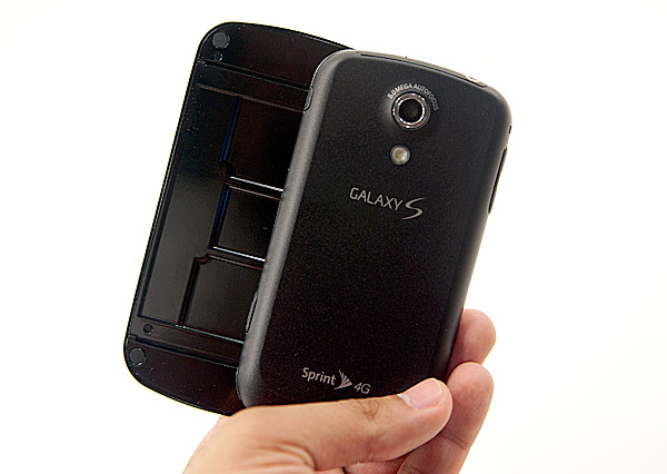
Finally on the back we have a lens for the 5MP camera sensor and a single LED flash.
| Physical Comparison | |||||||||
| Apple iPhone 4 | Apple iPhone 3GS | Samsung Epic 4G | HTC EVO 4G | Motorola Droid X | |||||
| Height | 115.2 mm (4.5") | 115 mm (4.5") | 124 mm (4.9") | 121.9 mm (4.8") | 127.5 mm (5.02") | ||||
| Width | 58.6 mm (2.31") | 62.1 mm (2.44") | 63.5 mm (2.5") | 66.0 mm (2.6") | 66.5 mm (2.62") | ||||
| Depth | 9.3 mm ( 0.37") | 12.3 mm (0.48") | 15.2 mm (0.6") | 12.7 mm (0.5") | 9.9 mm (0.39") | ||||
| Weight | 137 g (4.8 oz) | 133 g (4.7 oz) | (5.47 oz) | 170 g (6.0 oz) | 155 g (5.47 oz) | ||||
| CPU | Apple A4 @ ~800MHz | Apple/Samsung A3 @ 600MHz | Samsung Hummingbird @ 1GHz | Qualcomm Scorpion @ 1GHz | TI OMAP 3630 @ 1GHz | ||||
| GPU | PowerVR SGX 535 | PowerVR SGX 535 | PowerVR SGX 540 | Adreno 200 | PowerVR SGX 530 | ||||
| RAM | 512MB LPDDR1 (?) | 256MB LPDDR1 | 512 MB LPDDR1 | 512MB LPDDR1 | 512MB LPDDR1 | ||||
| NAND | 16GB or 32GB integrated | 16 or 32GB integrated | 1 GB integrated, 16 GB microSD preinstalled | 1 GB integrated, 8 GB microSD preinstalled | 8 GB integrated, preinstalled 16 GB microSD | ||||
| Camera | 5MP with LED Flash + Front Facing Camera | 3MP with autofocus | 5 MP with LED Flash and autofocus | 8MP with dual LED Flash + Front Facing Camera | 8MP with dual LED Flash | ||||
| Screen | 3.5" 640 x 960 LED backlit LCD | 3.5" 320 x 480 | 4.0" 480 x 800 | 4.3" 480 x 800 | 4.3" 480 x 854 | ||||
| Battery | Integrated 5.254Whr | Integrated 4.51Whr | Removable 5.55Whr | Removable 5.5Whr | Removable 5.698 Whr | ||||
The Smoothest Android UI To Date
I’ve tried the big names. The G1, Droid X, HTC Incredible, EVO 4G, and even newcomers like the Dell Streak. The one thing all Android phones I’ve laid my hands on have in common is varying degrees of a choppy UI. Some are worse than others but they all exhibited it. The choppiness is really apparent when compared to the iPhone. Scrolling through apps, or down web pages would just feel choppy - as if we weren’t running at a smooth or constant frame rate. I had no idea if it was an Android thing, a driver issue or something else entirely. The fact that it varied so much depending on hardware/software meant that there was no easy solution.
For example, the HTC Incredible got pretty close simply by ditching a number of animations. In fact, there’s even a setting within Android to do this:

The Galaxy S did it the old fashioned way though: a lot of software tuning and faster hardware.
Tap the icon in the lower right corner to bring up a list of applications and swiping through them feels just like an iOS device. It’s smooth. There are occasional dropped frames but it’s rare. Scrolling down web pages is still choppy though.
Remember me talking about Samsung learning from Apple? These are the learnings. Even the app list in Samsung’s custom TouchWiz Android UI mimics iOS. You get pages of apps that you flip through left-to-right, there’s no vertical scrolling.
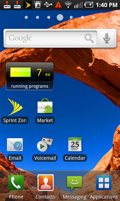
You still get multiple home screens, but swiping between them is fairly smooth as well. Occasionally I’ll get a hiccup or two but overall, it’s the best I’ve seen on an Android phone.
Samsung clearly put a lot of attention to making this aspect of the Epic 4G as Apple-like as possible, and I believe it delivered. I’d say you get around 90 - 95% of the scrolling feel of the iPhone 4, which is to say that it’s close enough.
The polish extends beyond the smoothness of the UI. Individual apps feel more appliance like and less PC like. The dialer UI is very clean and does sensible things like automatically look up phone numbers in your contact list as you dial them in - this applies to both number matching as well as T9-like text matching. The camera app hides unused customization options unless you ask to see them. Samsung modified the notifications pulldown to include a widget that lets you enabled disable WiFi, 4G, Bluetooth and GPS. It’s the little things like these that really make Samsung’s TouchWiz UI a friendlier face on Android.
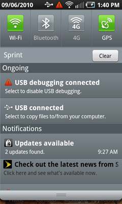
There’s a fine line between polish and oversimplification however, and in some areas Samsung does cross it. Samsung’s custom Android UI does things like removes all ability to see percentage of battery life remaining, all you get is a visual indication but nothing more. Even going into the Android battery info menu you can’t get that level of detail, you’ll have to turn to a third party app.
Samsung also removed all support for recording call length in your call log. On other Android phones you have a record of how long each phone call lasted, but Samsung removed it entirely. It keeps the UI ultra clean, but at the expense of functionality.
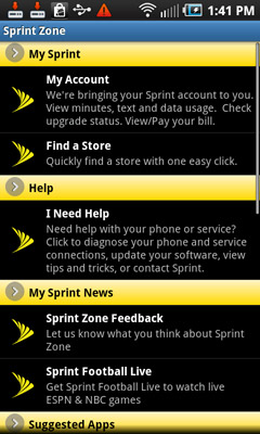
Sprint does its unnecessary evil and equips the Epic 4G with Sprint spam right out of the box. You'll occasionally get a Sprint icon in the notification bar telilng you about the latest news from Sprint. Tapping on it will bring you to the Sprint Zone (pictured above).
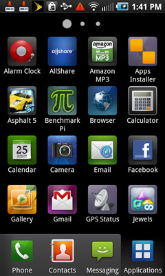
The Epic 4G’s icons are all custom designed and they all feel very modern and web-2.0-ey. You get bold colors and big boxes around each icon that make the app launcher feel like a grown up toy rather than a PC OS shrunk into a smartphone. The downside is that the individual app icons aren’t very memorable or distinguishable from one another. Colors are great for organization, but too many and you lose all semblance of order.
Ultimately if you’re trying to give someone a more iOS-like experience on an Android phone, Samsung gets the job done. Its custom skinning is the closest you can get to iOS without giving up the flexibility of Android.
The Keyboards
“Wait, this is Swype?”
I read about Swype in Brian’s Droid X review, but Motorola shipped the keyboard disabled by default so I figured it’d be one of those things with a steep enough learning curve to dissuade the impatient. When I first started using the keyboard on the Epic 4G I fell in love. It was by far my favorite Android keyboard. It wasn’t until I finished typing a word and noticed a little info button blinking in the lower left corner of the keyboard that I realized I was using Swype.
Samsung ships the Epic 4G with Swype installed and enabled by default, and I totally get why. The keyboard layout is simply perfect for Android. You get a very simple keyboard with a layout that makes sense, I have absolutely no complaints about it. The keys are both big and well spaced enough on the 4” touchscreen to make typing quickly a non-issue. There’s no And if you want an alternate input form that requires fewer taps, there’s always Swype input.
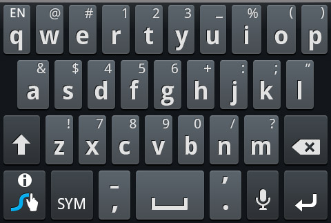
The virtual keyboard rocks but what Swype lets you do is input characters an alternative way: by tracing a line over the letters of the word you’re trying to type. For example, if I wanted to Swype out the world “them” I’d place my finger over the letter ‘t’ on the keyboard, then draw a line down to h, diagonally up to e, and back down and to the right over to m. When I lift my finger there’d be a slight pause, and Swype would insert the word “them”. There are tricks to do more complicated things: make a little circle around a letter you need to enter twice, or extend a line up above the keyboard to create a capital letter. If Swype is unsure of what you’re typing it’ll give you a list of options to choose from, and manually typing in words adds them to the dictionary.
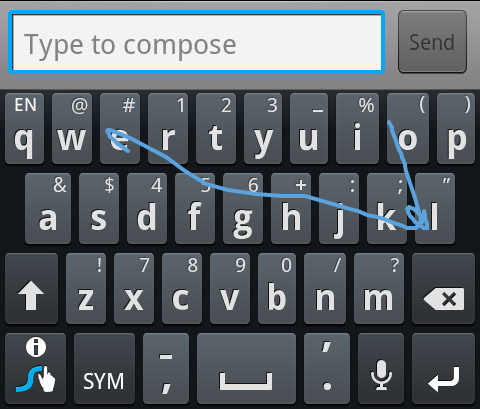
Swyping "hello"
I personally prefer the traditional typing method of text input but I can see how, with practice, you could be just as fast with Swype.
While Swyping you have to pay more attention to spelling. The iOS style of text input is pretty much tap and forget, if you misspell or mistype something the OS autocorrects. But with Swype, you actually need to know how to spell the words you’re trying to type and know where all of the keys are on the keyboard. I didn’t feel my mental CPU utilization hit 100% as Brian described in his first encounter, but I felt like I was in a constant spelling/key location bee. It just takes some getting used to but I actually liked Swyping when I didn’t feel like typing with two hands.
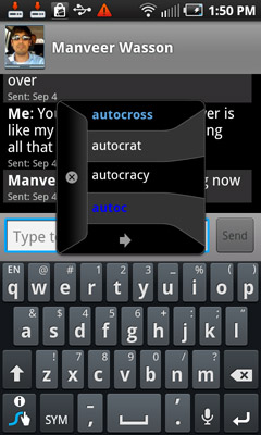
The downside to using Swype as a normal virtual keyboard is the optional autocorrection (you have to enable it under Swype settings). Instead of getting suggestions inline, you get a distracting popup. Thankfully you can easily switch back to the default Android keyboard just by holding down on any text input box and changing the input method.
The physical keyboard is a nice addition, I definitely appreciate it being there although most of the time I used the virtual keyboard. I’d probably prefer the other Galaxy S variants that lack the physical keyboard, but if you need tactile feedback the Epic 4G’s hybrid model works.
The Fastest GPU in a Smartphone
One thing I’ve learned over the past several years is that if you’re not the original manufacturer of something and are simply a glorified parts assembler, you generally have no clue how to do something right. There are obvious exceptions (Apple appears to be doing well), but this characterization applies to a lot of companies in the consumer electronics industry. They buy chips and parts from various suppliers, do a little bit of industrial design and generally don’t have the engineering know-how to deliver an optimized product into the marketplace.
Samsung is quite the opposite. Samsung is a DRAM manufacturer, a NAND flash manufacturer, and an application processor manufacturer. Samsung is responsible for the DRAM, NAND and silicon that goes into every iOS device sold by Apple. The company knows a thing or two about engineering.
The SoC inside the Epic 4G and other Galaxy S parts is called Hummingbird. It’s a 45nm SoC that implements a standard ARM Cortex A8 running at 1GHz and a PowerVR SGX 540 GPU. Despite Samsung’s experience in silicon manufacturing, it’s not much of an architecture/design company so we do see a lot of IP licensing within Hummingbird.
In this capacity Samsung is no different than TI, but what really sets Hummingbird apart is its GPU. Licensed from Imagination Technologies, the PowerVR SGX 540 is a significant improvement over the 530/535 in use in the iPhone, iPad and Motorola’s Droid X.
The SGX 530 has two USSE pipes and a single texturing unit. The 535 adds a second texturing unit, and the 540 adds another two USSE pipes. It’s unclear what clock speed the SGX 540 runs at inside Hummingbird, but I’d expect it’s somewhere near the 200MHz of the 535 in TI’s OMAP 3630.
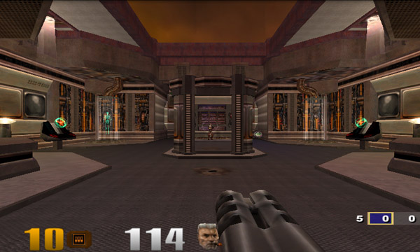
Quake 3 Arena running on the PowerVR SGX 540
The added execution hardware does incur a power penalty, however Imagination lists it as less than double the SGX 535.
The performance improvement is tangible. Samsung’s Hummingbird faster in 3D games/apps than any other SoC used in a smartphone today:
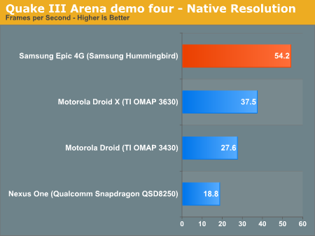
Under Quake III we saw a 44.5% increase in performance over the Droid X. Compared to Qualcomm's Snapdragon, performance improves by nearly 2x.
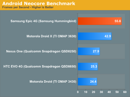
Even in Qualcomm's own 3D test, the PowerVR SGX 540 is more than twice as fast as the Snapdragon. We see a 30% performance advantage over the OMAP 3630. I'd expect to see about the same advantage over Apple's A4.
Unfortunately for Samsung, 3D gaming hasn’t really taken off on Android as a platform. The best examples of what’s to come are what we’ve seen from Epic and id, but both of those demos were done on iOS (although I suspect Android versions would hit at some point) and we’re still pretty far away from having actual games based on those engines on mobile phones.
While the SGX 540 could be responsible for the Epic 4G’s smoother than expected UI, it’s mostly a waste of hardware today. Clearly you don’t need this powerful of a GPU to make scrolling through menus smooth. Perhaps Samsung has grand plans for Hummingbird or simply wanted to outdo the competition on paper. Higher resolution products due out in the future will demand faster GPUs (think tablets) so it’s possible that Hummingbird wasn’t specifically targeted for an 800 x 480 smartphone.
General CPU performance is comparable to the OMAP 3630 and what you’d expect from a 1GHz Cortex A8. The 45nm SoC should sip power but it’s unclear what Samsung is doing for power management on the SoC itself. While both Hummingbird and Apple’s A4 are manufactured at the same fab at 45nm and both use the Cortex A8, there’s a lot more to determine the total power consumption of an SoC.
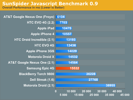
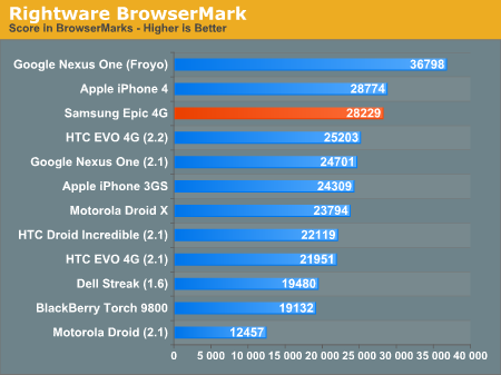
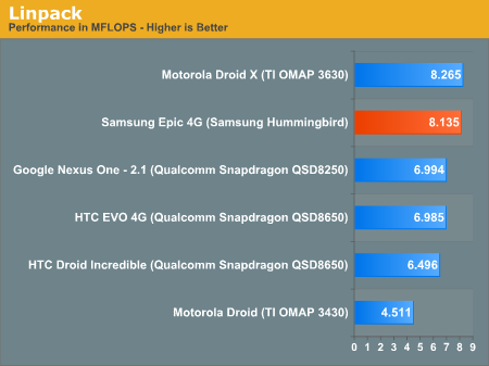
Hummingbird’s memory bus is likely a 32-bit single channel LPDDR1 interface, but overall I’d say it’s safe to say that this is the fastest SoC currently shipping in a smartphone. Apple’s A4 used in the iPhone doesn’t run at 1GHz, and TI’s OMAP3630 uses the PowerVR SGX 530 compared to Samsung’s SGX 540. Unfortunately much of the performance advantage will go unused as 3D gaming simply isn’t that prevalent on Android phones today.
Cellular & WiFi Performance
The Epic 4G is the second smartphone we’ve reviewed that has a WiMAX radio for use on Sprint’s 4G network. This is actually why I’m reviewing the phone and not Brian, Raleigh, NC happens to be one of the 40 US cities with Sprint WiMAX coverage.
Those of you who read my EVO 4G review will remember that I did’t have the best experience with WiMAX in Raleigh back then. I’m sorry to say that the situation hasn’t really improved much since.
The best download speeds I’ve seen are still in the low 3Mbps range, and upload is usually stuck around 1Mbps while on 4G. On a good day, AT&T’s 3G network is anywhere from 1 - 2Mbps down and 1 - 1.5Mbps up in my area. As with the EVO 4G, Sprint charges a mandatory $10 per month Premium Data fee for 4G support regardless of whether or not you use it.
The other issue is consistency. I usually don’t get those 3/1 numbers, often times I’ll see speeds more like 1/1 or 1/0.5Mbps. I’m always seeing screenshots of users in other WiMAX areas with speeds 2 - 3x my best case in Raleigh, so this may just be a problem with coverage in Raleigh. Either way I’d suggest looking into what to expect in your area before making a decision based on 4G alone.
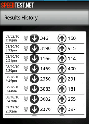
Speedtest Results for the Epic 4G, all results on 4G except for the topmost result
I will say that I no longer have the problem where 4G performance is worse than Sprint’s 3G in my area. I usually get around 0.5/0.5Mbps on 3G, so there’s a noticeable performance increase when WiMAX is enabled.
And just as was the case with the EVO 4G, 4G isn’t actually more of a battery drain as long as you’re stationary. If you have it enabled while you’re moving around (rather than just turning it on once you’ve gotten to a location) you’ll see a drop in battery life.
Whether or not Sprint itself is a good network for you depends entirely on coverage in your area. In my experience, AT&T is usually either great or absolutely horrible - there’s very little in between. While Sprint (and Verizon) are consistently good. Compared to areas with great AT&T coverage, Sprint can’t compete in performance - but where AT&T’s coverage is weak, Sprint’s average performance is usually better. Awesome occasionally or consistently reliable - those are the two choices it seems.
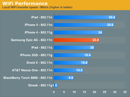
WiFi performance was better than the Motorola Droid X and the Nexus One, but behind the iPhone 4.
Like all other smartphones we’ve reviewed, the Epic 4G’s cellular signal does attenuate based on how you hold the phone. Given the sheer thickness of the device it’s harder to get the large signal drops by holding the phone that we see on thinner devices.
| Signal Attenuation Comparison in dB - Lower is Better | |||||||
| Cupping Tightly | Holding Naturally | On an Open Palm | |||||
| Samsung Epic 4G | 10.0 | 5.0 | 0.0 | ||||
| Droid X | 15.0 | 5.1 | 4.5 | ||||
| iPhone 4 | 24.6 | 19.8 | 9.2 | ||||
| iPhone 3GS | 14.3 | 1.9 | 0.2 | ||||
| HTC Nexus One | 17.7 | 10.7 | 6.7 | ||||
The biggest drop I noticed was 5 dB when I held the phone normally, and 10 dB when I held it tightly trying to cover as much of the antenna as possible with my hands. This is in line with other Android smartphones (actually a bit better), and obviously better than the iPhone 4.
The Display: Like AMOLED, but Super
Did I mention Samsung also makes displays? The Epic 4G and the rest of the Galaxy S line are among the first to use a new type of active matrix OLED called Super AMOLED. The main difference appears to be that the capacitive touch layer and AMOLED are now integrated rather than laying on top of one another. This sounds a lot like the manufacturing technique used in Apple’s Retina Display. It’s supposed to reduce unwanted glare/reflections and improve the efficiency of the display.

The end result is very noticeable. The Epic 4G is much easier to read outdoors compared to the original AMOLED Android phones like the Nexus One:
Google Nexus One AMOLED (left) vs. Samsung Epic 4G Super AMOLED (right)
The Super AMOLED display is a nice improvement over the standard AMOLED. I’d even go as far as to say that it’s comparable to most LCDs in direct sunlight, at least when you’re looking at things that aren’t white. Displaying white is a problem for AMOLED screens, it eats up a ton of power since the technology is emissive without the use of a backlight.
Direct Sunlight
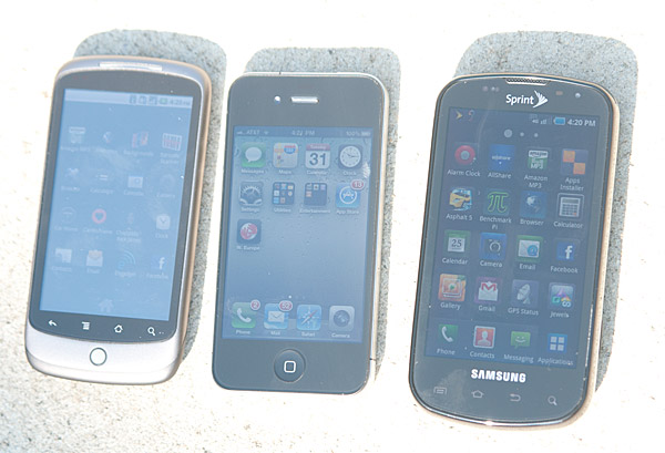
From left to right: Google Nexus One, Apple iPhone 4, Samsung Epic 4G
Shaded, Outdoors
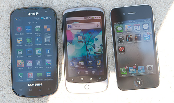
From left to right: Samsung Epic 4G, Google Nexus One, Apple iPhone 4
The biggest selling point of AMOLED is its deep blacks, which the Epic 4G’s display delivers perfectly. The display is almost too contrasty. The bright blue text on black background in the settings pages just pops.
Brightness is an issue with the display. The brightest white I measured was only 300 nits:
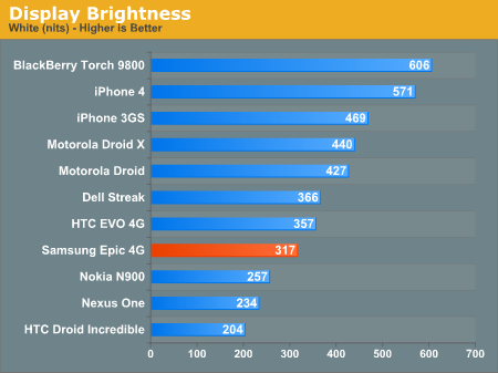
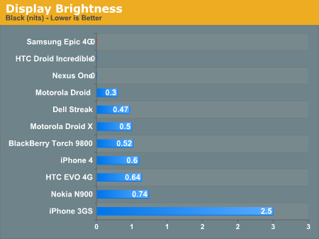
Samsung gets away with a relatively dim device by having perfect black levels, but the display’s weakness is visible when reading web pages with mostly white backgrounds.
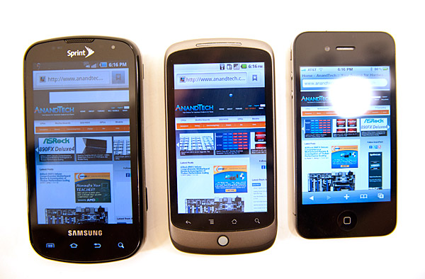
From left to right: Samsung Epic 4G, Google Nexus One, Apple iPhone 4
In the photo above, the Nexus One looks brighter, but the Epic 4G's white levels measure higher. I suspect this may be a Super AMOLED vs. AMOLED issue with our x-rite colorimeter. In practice the Nexus One has brighter pure whites while the Epic 4G has a brighter display in any other situation (e.g. home screen).
As AdamPflug correctly pointed out, the Epic 4G's web browser has a separate brightness setting which explains the difference in brightness above in the browser. In this case the brightness was set to around 20% of maximum on the Epic 4G.
Samsung includes a dynamic display feature that reduces brightness depending on the contents of the screen (there’s also the standard auto brightness based on ambient light). It’s not that noticeable when turned on in most situations but it reduces maximum brightness by about 100 nits. Again, this is mostly an issue with web pages that have a lot of white in them.
I’d say Samsung’s Super AMOLED is in the running for best display on a smartphone up there with the iPhone 4’s Retina Display. Apple has the resolution advantage, but Samsung has a huge contrast advantage. The former is nicer for reading text, while the latter is better for just about everything else.
Even if you don’t get the Epic 4G, Super AMOLED displays are where it’s at. They’re far more usable outdoors and you still get the contrast benefits of AMOLED.
Battery Life
The first 4G phone we reviewed, the EVO 4G, didn’t do so well in our battery life tests. I’m sorry to say that the Epic 4G is even worse.
Other than our WiFi web browsing test, I wasn’t able to get more than 4.5 hours out of the Epic 4G. Adding insult to injury, our web browsing battery life test showed worse battery life while operating on a 3G network vs. a 4G network (while stationary). I double and triple checked the numbers, and each time I got better battery life on 4G than I did on 3G.
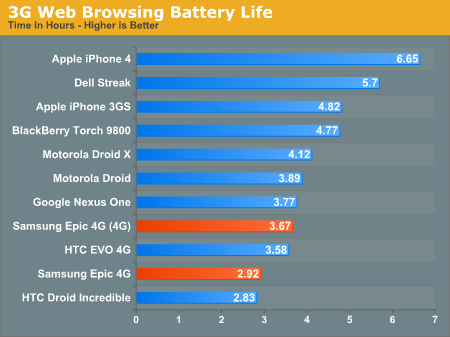
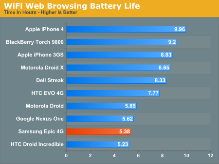
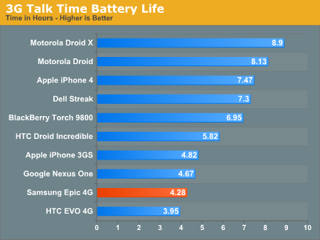
The Epic 4G has a beefy 1500 mAh battery and thankfully it’s removable, but battery life just isn’t a strong point of this phone. I’m not sure whether it’s Samsung dropping the ball on the software optimization side or if the power management on Hummingbird is just that bad.
Perhaps it’s Sprint related? After all, the EVO 4G had terrible battery life as well.
There are just too many variables to narrow it down. The bottom line? While the Epic 4G performs better than any other Android phone I’ve used, its battery life is among the worst.
Camera
The Epic 4G has a pair of cameras: a 5MP flash assisted camera on the back of the device and a front facing VGA camera on the front. Samsung’s camera app is a nicely trimmed down version of what we’ve seen on many Android phones. You still get the ability to adjust things like white balance, metering mode and exposure compensation, but you can also hide all of that so all you see is a viewfinder and a capture button.
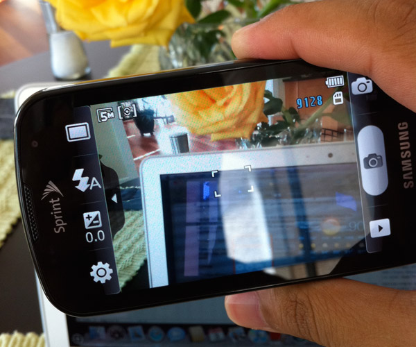
The Camera app, detailed mode
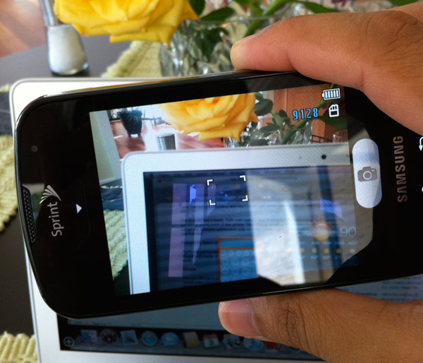
The Camera app, simple mode
The app launches in an average amount of time. I recorded 3.03 seconds to get from the icon to being able to line up my first shot. There’s a measurable lag between when you take a shot and when it’s actually captured, which can result in blurred photos if your subject is only stationary for a short period of time.
The Camera app repurposes the physical buttons on the Epic 4G. You can lock the camera app by hitting the power/lock button, doing so will render all other buttons on the phone inactive (e.g. home/back keys won’t work, useful if you’re recording video that you don’t want interrupted). The volume rocker serves as zoom in/out buttons as well.
You have two options to actually trigger the camera: you can use the button the screen, or the physical trigger on the camera itself. Both work well.
Picture quality out of the rear facing camera is great for web-sized images, but at full resolution you see the shortcomings of the sensor/software combo. Brian has most of the comparable smartphones so all I was able to do is showcase the Epic 4G vs. the Nexus One and iPhone 4.
White balance isn’t too bad. The Epic 4G tends towards more reddish tones than blue/green but it’s at least more predictable than the iPhone 4. The biggest issue really is image sharpness. At web resolutions it’s fine, but blown up to full size you see how soft the picture really is. You lose a lot of detail.

Apple iPhone 4 - Click to Enlarge

Samsung Epic 4G - Click to Enlarge

Google Nexus One - Click to Enlarge
I’d say that most modern smartphone cameras are fine for sharing pictures on Facebook but if you want to be able to pick out details you’ll need to look for another phone or carry a point and shoot with you.
The Epic, like many Android phones, has issues dealing with light shining through trees. You get an overblown halo effect, rather than an accurate depiction of the scene.

The rear camera is capable of recording 720p video and it can record video with the flash on, a feature that’s surprisingly absent from a number of flash enabled smartphones. Video quality here is reasonably good. The softness problem is less of an issue at 720p it seems.
GPS Issues
Every smartphone has its sets of issues. The iPhone 4 has its antenna problem, the Palm Pre has performance issues, the BlackBerry Torch needs a bit more oomph in the software department, and every Android phone has its own set of strengths/weaknesses. The Epic 4G is no different. In addition to the absolutely horrible battery life, the Epic has a pretty serious GPS issue.
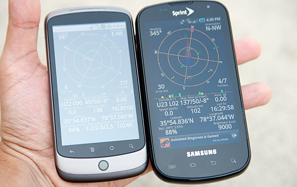
The GPS antenna is not very sensitive and usually has trouble locking onto GPS satellites. This manifests itself in two ways: the phone will take an inordinate amount of time to determine your actual location, and/or it won’t pinpoint your location very accurately.
Sometimes the Epic 4G will lock on perfectly and quickly, but usually it takes several minutes longer than the Nexus One to figure out where you are. Occasionally I even got a ‘location not available’ error while using Google Maps.
Accuracy is also a problem. I don’t think I ever saw horizontal error drop below 30m on the Epic 4G compared to ~3m on the Neuxs One and ~5m on the iPhone 4.
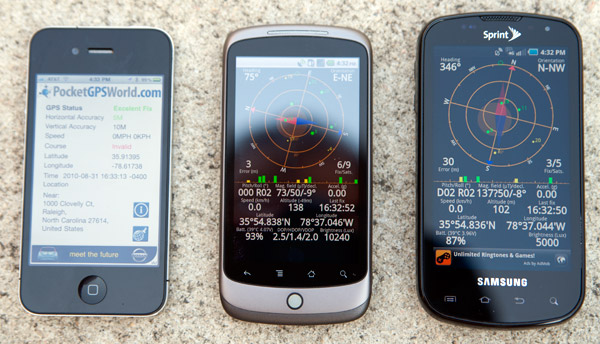
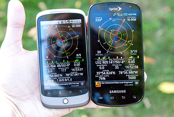
Google Nexus One, 4m error (left) vs. Samsung Epic 4G 30m error (right)
The Epic 4G would usually tell me that my physical location was somewhere down the street while the Nexus One would pin me down at my house. In fact, I got more accurate location tracking when I was connected to a WiFi network.
It’s unclear whether this is purely a software problem or a fundamental antenna design issue ala the iPhone 4. One thing is for sure, if you plan on using GPS location a lot you should avoid the Epic 4G.
Final Words
With each new iteration of Android smartphone we get closer to the perfect device. Samsung took some pretty big steps toward that ideal ‘droid but regressed in others.
The move to Super AMOLED is key. With Super AMOLED the Epic 4G improves outdoor usability significantly. It’s a large enough jump to make the Nexus One’s display feel old. While Apple can tout the benefits of higher resolution, contrast is very important on these devices - especially for content consumption. I would have liked to have a brighter display on the Epic 4G, but the contrast ratio is great.
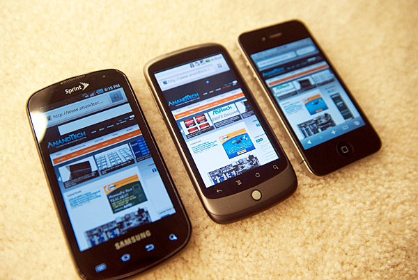
Samsung got the performance of the Epic 4G right. The OS feels snappy and relatively smooth. There are still some hiccups but its 1GHz Hummingbird SoC does a better job than anything else I’ve seen running Android. I suspect that after we get Gingerbread and dual-core Cortex A9 SoCs that these little performance quibbles will be a thing of the past. Unfortunately that doesn’t help those trying to make a decision today.
Build quality could use some work but that’s probably more of a function of the sliding mechanism on the phone than anything else. The physical keyboard is nice for those who want it, but that’s really a personal preference. I applaud Samsung for shipping Swype enabled by default on the Epic 4G. Not only does Swype offer a unique take on text input, but its virtual keyboard is the best I’ve used on Android to date.
On the software side, Samsung’s TouchWiz is one of the most polished custom Android UIs I’ve seen. Everything from the app launcher down to the dialer is well done. Samsung does take the simplicity a little too far in some areas (e.g. not showing battery percentage, only the visualization), but overall it’s nice. You don’t get as much of the PC-feel as you do on other Android phones, which again boils down to personal preference.
I love how Samsung integrated turning off Bluetooth/WiFi/4G/GPS into the notifications pulldown menu, and some of Samsung’s widgets are nice (e.g. task manager). However, the seven home screens are overwhelming and counterproductive in my opinion.
For all the praise I shower on the Epic 4G, it has two real problems: battery life and GPS reception. They are both pretty simple to explain: the Epic 4G won’t last longer than 4 hours of use, and it has a hard time pinpointing your location via GPS. There’s nothing more to it.
What does four hours of use translate to? I’d say less than a day’s worth of use taking into account idle time. If you pick your phone up at 8AM and use it periodically throughout the day, I’d expect it to be dead by 5PM. Quite possibly sooner.
The GPS issue makes the Epic 4G a pain to use as a navigational device. If you use Google Maps a lot for calculating directions, prepare for a frustrating experience with the Epic.
We’re closer and Samsung did very well, but we’re not quite perfect.


