Original Link: https://www.anandtech.com/show/3814/microsofts-kin-a-eulogy
Microsoft's KIN: A Eulogy
by Brian Klug on July 13, 2010 3:42 PM EST- Posted in
- Microsoft
- KIN
- Smartphones
- Mobile
When Verizon first sent me the ONE and TWO for review, I setup both KIN on the same Live account. Much like Android’s dependency on you having a Google account for backing up a list of installed applications, Microsoft used its Live service with the KIN for total device backups and creating a complete user profile. I figured it’d just work fine to have both devices on one account.
It didn't. That was very, very bad.
I don’t think anyone at Microsoft ever expected anyone to have two of those phones at the same time. After last week’s announcement, it looks like Microsoft had even lower expectations for KIN acceptance.
While the premature death of the platform isn’t really a shock (the phones had glaring issues and ran an OS that clearly had no roadmap in a Windows Phone 7 dominated future), there were some key features Microsoft and its Danger team did better than anyone else in the smartphone market today.
Even when Palm’s future looked bleak, there were and still are elements of WebOS that we hope will someday appear in Android or iOS. The same can be said about what Microsoft did with KIN. It’s true that as a device defying categorization as either a smartphone or featurephone, KIN wasn’t around long enough to be remembered, but as a platform there are things KIN gave us that we shouldn’t forget.
What follows is an exploration of just that.
We hope that this will serve as a list of the things Microsoft did right with KIN, so that we might see these features in future smartphone platforms - including Microsoft's Windows Phone 7. We realize that although it's still selling, KIN is unquestionably dead. With any luck, Microsoft and Verizon will roll out one promised software update, and then let the short lived platform ride off into oblivion. Though this is a platform you'll likely never encounter in the real world (I know I've yet to), there's quite a bit that could still be salvaged, including one truly revolutionary feature unrivaled by any competitor today.
In another review, Anand wrote some words that I can't get out in my head because they're so true: "Apple has started a trend of companies spending entirely too much on packaging." Truer words haven't been spoken, but the KIN did have some of the most unique packaging I've ever seen. There's been some other memorable packaging out there, including the 'Hacker Edition' N900 packaging which requires using terminal commands over serial to open the box.
The KIN packaging was different. It was hip, modern, and innovative. If nothing else, it shows that Microsoft can still get radically creative when it matters.
I'd like to point out that what's particularly odd about smartphone packaging is that - most of the time - you don't even get to unbox your own phone if you're purchasing it at a retail store. A carrier employee will take the phone out, activate it, and hand it to you. This has been the case for me at least with every phone I've ever purchased which was subsidized. Sometimes they'll ask you if you want to take it out of the box, but it's rare in my experience. Even though packaging isn't something the user frequently gets to dive into when buying at a store, it does set a first impression - which is likely why so much importance is afforded to it. But I digress.
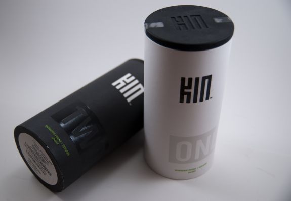
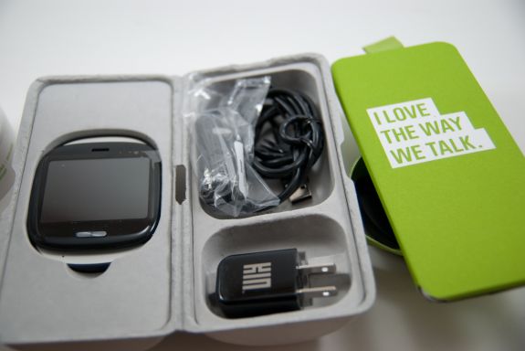
The KIN came in colorful cardboard tubes with rubbery caps at top and bottom. The ONE comes in a white tube, while the TWO comes in a black one. The first impression the KIN packaging sets is that it's radically different - just like the phones themselves.
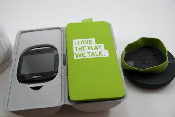
Pop the top off the pringles, er... KIN can (there's a joke in there about a can-can waiting to be had), and there's a green felt pull tab and a cardboard holder. Pull on that, and out comes a tube wrapped with the same kind of elastic green felt.
Take that felt ring off, open the cardboard fold, and you've got the phone in an inset on one side, and instructions, cables, and power adapter on the other. The TWO has the same affair, except the inset is slightly larger to accomodate the taller form factor.
It was different, and it worked for the KIN. The devices weren't smartphones, weren't featurephones either - completely different packaging just made sense. Packaging is functional too however, and there's a reason most smartphone boxes are small and squarish. Squares have better packing density for transportation reasons. Cylinders - not as much. Microsoft made a bold choice going with a much larger than normal package that was flashy and different.
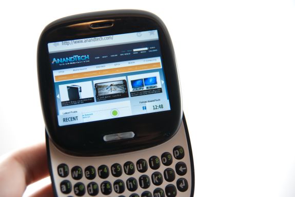
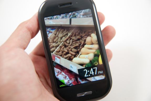
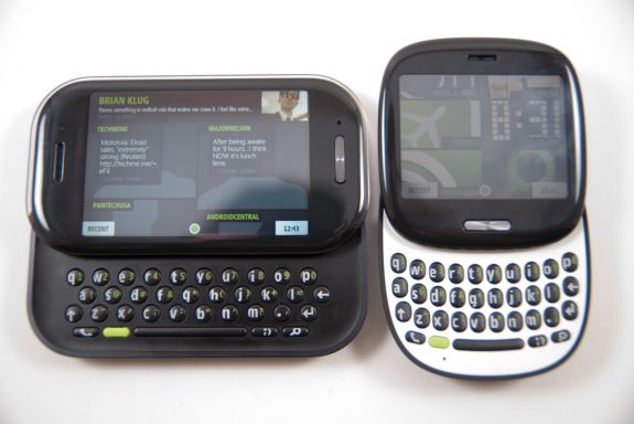
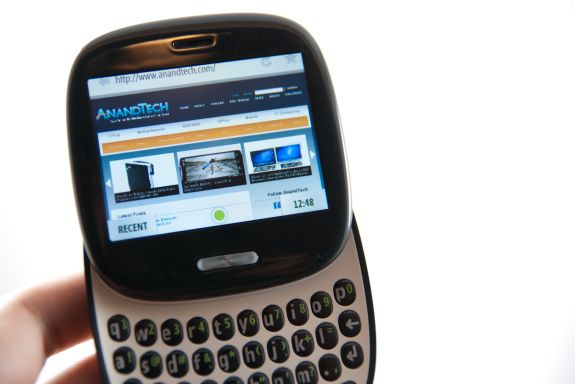
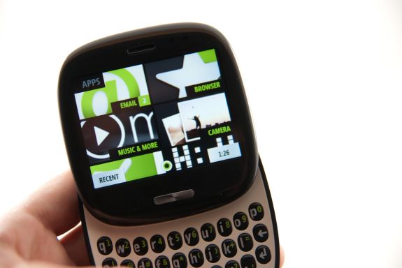
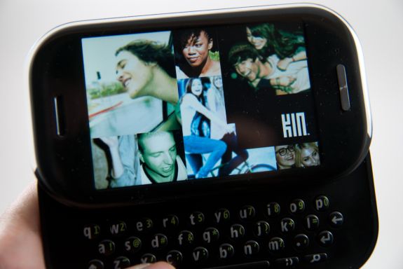
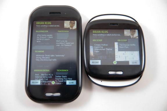
There were two faces of the KIN. The ONE, a rounded yet squarish device with a 2.6" (66.04 mm) screen, and the TWO, which was a landscape slider with a 3.4" (86.36 mm) screen.
Forget the TWO, if the KIN were on your must have list, the device to have was the ONE.
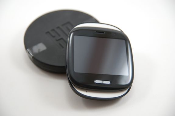
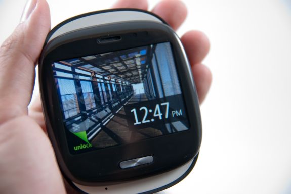
Having carried both for over a month, there's no doubt in my mind that that if the KIN was a couple, the ONE was the much much better half. Form factor wise, it was different enough to be cool, and that at-first awkward square shape turned out to be what set it apart from every other device I've encountered. It was small, compact, and fresh. If you've played with a Palm Pre, the ONE is like a miniature, more square version with matte plastic. It's curvy but squarish, and there's a nice filleted edge on the back, so it rests in your palm naturally. My girlfriend took to calling it a tamagotchi - honestly, I don't think it's far from the mark. In a good way.
The 3.x" screen form factor slate is everywhere these days. In fact, it seems to be an Android and iOS mainstay to keep that form factor of devices in our pockets on into the future. It works, it's tried and true, but you know what? It's getting boring, fast. The Palm Pre was exciting because it was different and new - I just got that same vibe with the KIN ONE.
The KIN TWO was soulless, unfortunately. It looked and feelt like a bland attempt at making a landscape slider, just for the sake of having one in the lineup. It's a form factor that's been done better so many times by so many other manufacturers, that anything but perfect execution stands out - which is why the TWO felt so generic.
I originally suspected the TWO would be my favorite because of its spacious landscape keyboard, which would make it the better device for SMS. To my surprise, I found the ONE just as easy if not easier to type on. In fact, even though the TWO had a larger screen, 8 megapixel camera, and recorded 720p video, I'd gladly sacrifice any of those features for a smaller device that feels different like the ONE. The ONE actually felt occasionally faster too, no doubt thanks in part to the smaller display resolution bring rendered.
Until we get foldable displays or roll out screens, the 3.x" slate form factor smartphone will rule. The Sidekicks had some of the most radical form factors in the smartphone business, so it was depressing to see something as generic as the TWO being the result of so much of that talent. That said, the ONE was a unique form factor that felt just right for the KIN platform.
Battery Life Testing
Battery life on the KIN was a shocker. It was superb.
Both of the KIN not only delivered above average call times of around 6 hours, but also 3G web browsing times of around 7. But the real shocker was WiFi web browsing battery life, which came in at around 13.5 hours. I ran this test twice on both phones because I was confused. It really lasts that long.
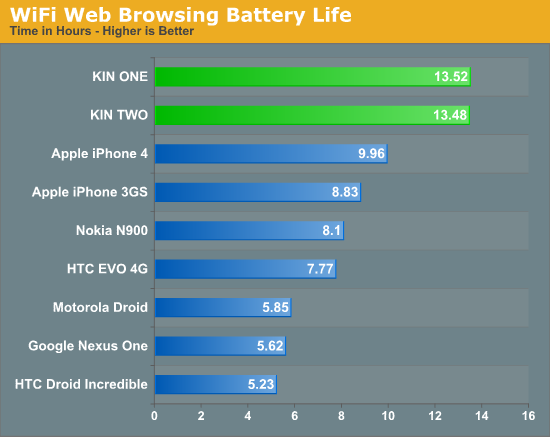
As a quick reminder, our web browsing benchmark loads a set of nearly two dozen webpages, pauses for 20 seconds on each one, and then loads the next page. None of the pages use flash, and the set loads endlessly until the phone's battery is exhausted. Screen brightness is set to 50%, and configured to remain on the whole time. Testing over WiFi is done in the same room as the AP.
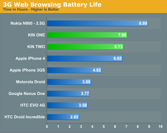
For call time testing, we play music on repeat into the microphone of the phone and call another phone, also playing music into it. This simulates voice transmitted and received. The displays are also allowed to go to sleep as they would when used in a normal call.
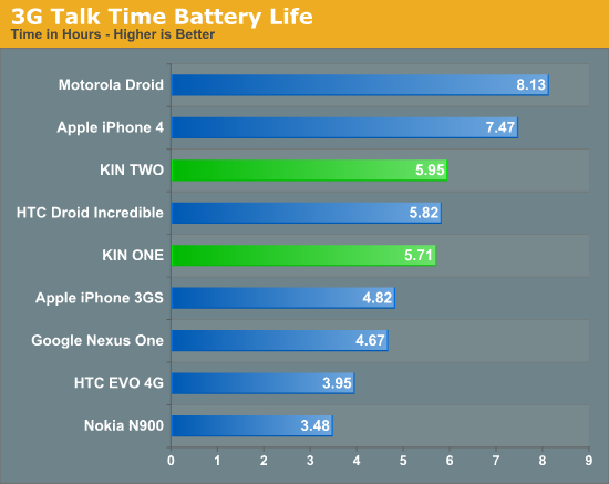
The result of all this testing is the obvious conclusion that the KINs have incredible battery life. In fact, the WiFi battery life on these devices was nothing short of amazing. It's entirely possible that Sharp aggressively underclocked the NVIDIA Tegra APX 2600 to get these numbers, or that there's other throttling going on when the device is idle. We don't measure standby time yet, but whereas my HTC Incredible would be dead within 24 hours of being unplugged, the KINs would last multiple days in standby.
Performance in the browser wasn't stellar, but pinch zooming and other multitouch gestures felt snappy. At other times, the browser and UI would really feel choppy while scrolling. It was a mixed bag. One thing was for certain however, the JavaScript engine on the KIN browser was abysmally slow, so even though the browser felt decently fast for most browsing, the JavaScript heavy tests we run on smartphones gave very poor results.
Microsoft's Turn in the Clouds
It's clear now that the real reason Microsoft acquired Danger was for their hugely cloud centric platform and IP manifested in the Hiptops. While the rest of the KIN platform felt relatively premature, its reliance on online services for not only bringing media down from the cloud, but also pushing it back up, was the device's almost perfectly executed redeeming feature.
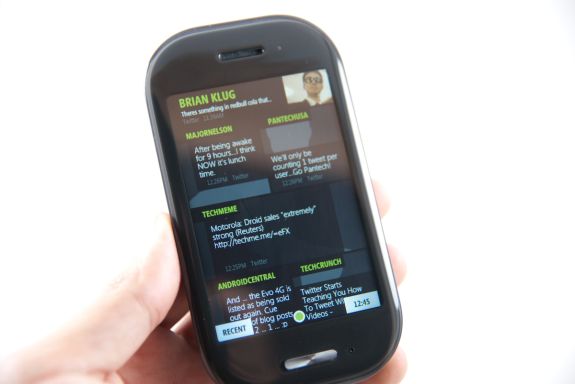
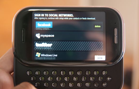
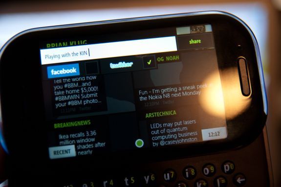
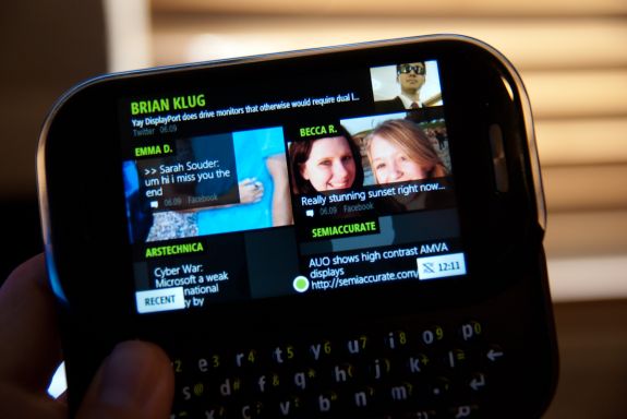
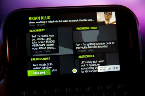
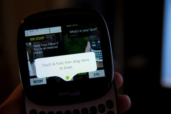
To start, the KIN are tightly integrated into Windows Live. At setup, users were prompted to create or login with a Windows Live account. This Live account is then what tied phone to the KIN studio, the web interface through which one could manage nearly all data on the phone. Moving along through that initial setup wizard, users were prompted to login with Faceboook, Myspace, and Twitter accounts. The KIN called these social networks 'feeds' and immediately pulled down data from them while setup completed. Data from these feeds populates tiles on the homescreen and contacts. Microsoft calls all this social data that gets aggregated together the KIN Loop - a mashup of status updates, news, and tweets from those feeds.
Up at the top is your name, Twitter avatar (which seems to take precedence over your Facebook avatar) and your latest Twitter or Facebook status. Tap on that, and you can push out an update to all the social networks you're connected to, or ones you choose. This is text only - no photos, videos, or anything else. In fact, this is really the primary way to publishing data to social networks from the KIN. Other media gets pushed out through the KIN spot, more on that later.
Avatars from Facebook come in and populate the loop, however avatars from Twitter inexplicably don't. The result is that you're occasionally left with a home screen full of grey shadow placeholders when your Twitter following out-updates your suspiciously silent, likely hungover Facebook friends. I don't have a MySpace account, though I'd hope that feed would bring in avatars lest Microsoft let the loop look even more sparse.
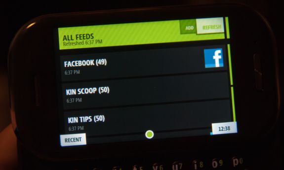
The KINs signed you up by default to a number of Microsoft feeds which were occasionally funny and sometimes surprisingly useful. The feeds themselves are RSS. You could add other RSS feeds and make them appear in the Loop, though there's a good chance you'd still want to read things manually in the Feed Reader application.
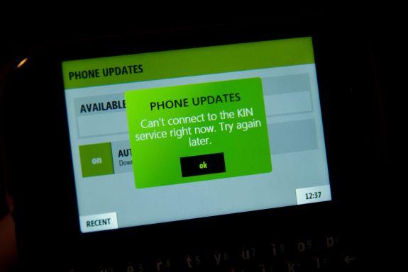
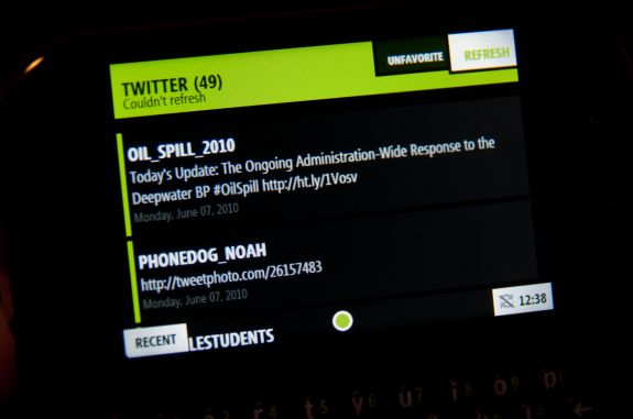
There's a major 'but' coming here though. The loop concept itself was the ultimate in glanceable information. It was always there, and always updating without any user interaction. It's what you see when you unlock the phone, and it's front and center to the platform. If you've got a good data connection, it would stay fresh as you used the device. But the ultimate problem with the loop was that there was no ability to change the feed update frequency - it's a fixed 15 minutes. You can manually refresh the feeds from within the 'Feed Reader' application in the apps screen, but who wants to do that? In addition, I encountered numerous timeouts trying to update my Twitter feed manually, eventually giving up and letting it update itself on that 15 minute schedule. The end result is that I found myself often staring at stale data and getting tired of it quickly.
Microsoft's rationale is likely that higher frequency updates would kill battery life or go over API rate limits for the social networks - they've got a decent argument, but 15 minutes is about 15 minutes too long for "generation upload." Pulling down text and tiny avatars isn't that much data at all either - so there's no rationale to the argument that this is done to make the KINs sip data. Especially considering the rest of the cloud integration I'm getting to.
KIN Studio
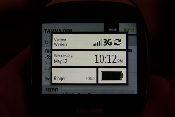
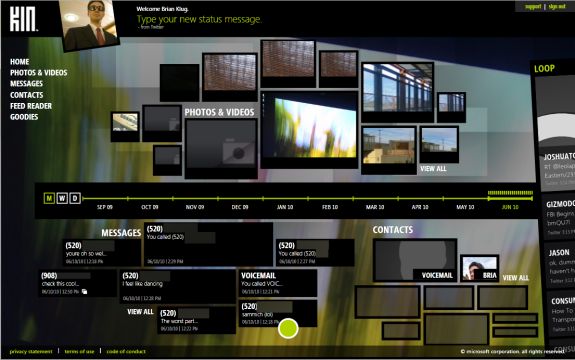
Now for the real cloud data link - KIN Studio. If there's one thing the KIN did that was truly different, it's this kind of totally radical web integration. You're not explicitly told so, but the KIN constantly syncs all text messages, call logs, photos, standard resolution videos, contacts, and other data back up to the Windows Live servers on an automatic sync schedule. You can manually invoke a sync anytime you like, but it takes a while and honestly didn't always seem to force a complete sync. Letting it happen on its own actually produced more consistent results. If your phone isn't completely synced up, you'll be told with a crossed out sync near the time in the status box at the bottom right. I encountered a failed sync only twice, the first time it solved itself on the next sync, and another with an impatient reboot. The rest of my problems hinged on my ill conceived plans to log both phones into the same live account - again, I'm sure nobody ever tried logging both phones into one account.
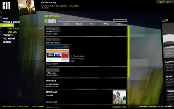
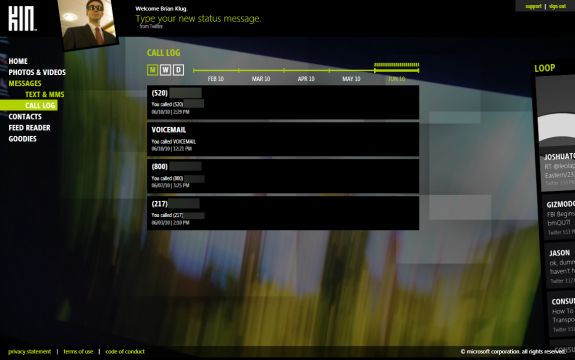
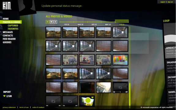
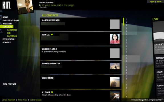
The KIN studio is silverlight based, which is a minor caveat since access always requires the plugin, but the upside is that the studio presents the exact same UI the KINs do. It's the same style, buttons, and even has the KIN spot for sharing things. You can view photos and videos, messages, contacts, and things from the feed reader through this interface. With the exception of making calls and sending text messages, virtually everything you can do on the phone, you can do here.
That includes editing contacts, publishing photos to Facebook, updating your statuses, whatever. Essentially everything on the phone gets backed up and is visible through the Studio, which itself is pretty impressive.
Think about that for a second - nearly everything you do on the phone gets backed up, synced, and made available on a web interface. It's awesome. Why hasn't anyone done this before? In both messages and photos & videos, you're given a timeline you can scrub along to see relevant information as it happened. For example, what day you took photos, when messages were sent, when you placed calls. It gives you a pseudo snapshot of a given day, week, or month.
It's an interesting notion - accessing your phone from the web - and there's so much about this which is really the way things should be across every smartphone platform. To some extent, you can already hack some of this together using services like Google Sync (which behaves like Exchange to mobile devices) or MobileMe, and then photos and videos using other services, but KIN does an excellent job mashing it all up under one account. It's truly Apple-like in that the Studio works without the frustration of managing a million different services. Throw one live account at it, and you're done - and it doesn't cost extra. The result is that there's no need to sync anything to the desktop, because it's already being done up to the cloud.
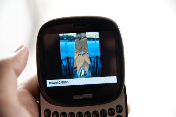
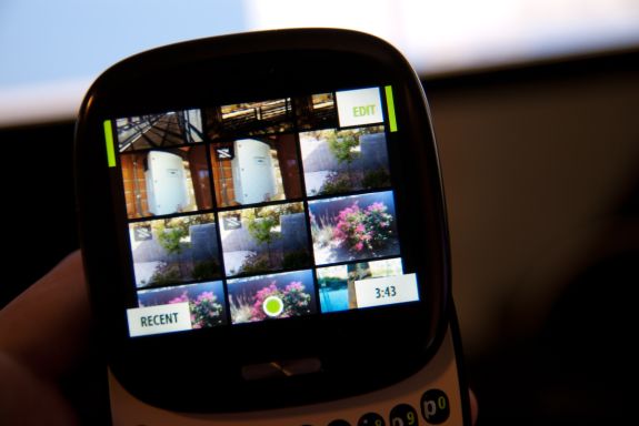
The user interaction paradigm that I found the most impressive with the KIN - if you're going to choose something to read into which the platform executed flawlessly - is how photos are handled. You can take - in theory - infinitely many photos, and never run out of space on the device. When you take a photo, it's stored in local storage in full resolution until a sync occurs, or for a few days.
When that sync finally happens, say overnight or during idle time, the photo gets uploaded to the KIN Studio entirely over the air, and the local copy is then replaced with a slightly higher than display resolution copy. It's still in the photo library on the device, but whenever you view it from now on, the KIN streams in the photo in completely over the air if you zoom in.
It happens fast, and the result is that you can take photos indefinitely. That's impressive.
The first time I encountered this feature, I was confused and initially thought the KIN had deleted my photos. I was connected to the desktop using the Zune software, trying to get copies of the test images I had taken with the camera, and saw there were only four photos on the phone. After nearly two hours of shooting test photos, I thought I had been soundly defeated, and began gnashing my teeth in consternation. I suspected a glitch - I could view the photos on the device just fine, but they were nowhere to be found in the correct directory. What the heck?
Then it occurred to me. I realized they were deliberately backed up to the cloud, waiting for me. I was viewing copies of the photos right off the cloud on the device. Sure enough, I checked the KIN studio, and the full resolution photos were there, waiting to be downloaded in full resolution or uploaded to Facebook without ever touching my computer. That's right, you can dump gobs of photos onto Facebook without having them ever touch your bandwidth - it's that kind of cloud to cloud connection where the future lies.
Interestingly enough, it's probably likely that the sheer amount of upload bandwidth the KIN used uploading all your photos and videos led to Verizon mandating smartphone data plans. Depending how many photos you take, uploading all of that to the cloud definitely consumes gobs of data.
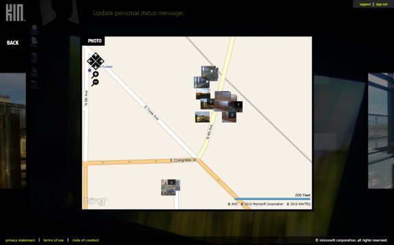
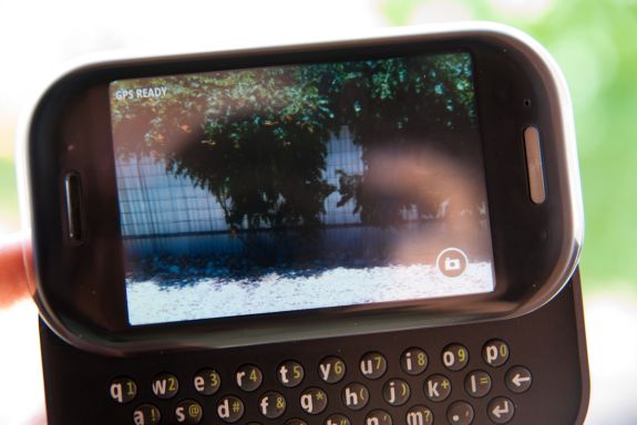
In that same interface, you can view photo geotagging data on a big Bing map. It's similar to the places view inside the photos app on the iPhone, except with high resolution thumbnails and natively on the web.
The KIN spot is also in the Studio, though admittedly it doesn't make as much sense on the web as it does on the device.
But it's useful for uploading lots of photos en-masse to Facebook without having them ever come close to using your bandwidth. As I noted, the transaction takes place from Microsoft's cloud to Facebook's. Unfortunately, downloading lots of your photos locally is a bit laborious. Even for the example shots I had taken for this article, it was at times a frustratingly slow matter, requiring you to visit each photo, click more, click download, and then wait for it to complete before moving on to the next one. The studio desperately needs batch operations for deletion, downloading native resolution copies, and perhaps some more speed tweaks. The recent Silverlight update for OS X improved speed on that platform considerably, but even on my Windows 7 desktop, it felt a bit slow.
The other notable KIN Studio functionality is backups - wipe your a device, login with the same Windows Live account, and everything is restored. Similarly, lose your device while swaggering home, buy a new one, and you'll instantly have everything restored over the air. Android is drawing close to doing the same thing - use a google account and every time you get a new device or replacement, applications will automatically install alongside contacts, emails, and calendars - but photos, application data, and other media are still gone forever. The KIN neglects to give music the same treatment, but it's clear given rumblings over Google and Apple both brewing their own cloud music platforms that this is next.
The real war being waged here isn't over just what brand of mobile device you're carrying around, but what services you're using up in the cloud - and as a consequence, who has your data. If you subscribe to Android, you're tightly tied into Google's suite of services and will probably use Google Sync. Choose Apple, and like it or not, you're up in the iTunes purchase cloud, possibly Mobile Me, and even more in the future when iTunes' cloud rolls around. Microsoft is also vying for that data, and at the same time hopes to hook you into the other suite of services - Xbox, Zune, and Live. Tying you into a specific camp of cloud services - and keeping you there - is what this is about, and Microsoft is still in a good position to roll the cloud integration IP from Danger into Windows Phone 7.
If you can, think back to the Sidekicks and how tightly they integrated with the cloud. Eight years later, it's intriguing that the Sidekicks were massively cloud focused devices before the phrase was even mainstream. They backed virtually all their data up to Danger's servers, including contacts, notes, calendars, photos, to-do lists, and messages. True to form, Danger's lasting impression on Windows Phone is a hugely cloud integrated experience.
Of course, the downside to this approach is that sometimes the cloud itself is the weak link. Look no further than the all too recent Sidekick data loss that happened in October of 2009.
The Failure of KIN
But we all know the way this story ends - Microsoft killed the KIN.
They're not entirely dead yet, however - Verizon is still selling both the KIN ONE and TWO for $29.99 and $49.99 on contract, respectively, and Amazon is selling both KIN for $0.01. They'll keep selling until Verizon has burned through its inventory. Though launch in Europe has been completely canned, there are just under 10,000 of the KINs in the US that will continue to demand support. The real uncertainty now for KIN is whether Microsoft plans to make good on its previously promised mid summer software update.
But let's look at what really did the KIN in.
Priced like a Smartphone
For starters, the devices lacked a realistic pricing structure - despite not quite being a smartphone, Verizon priced the data plans for the KIN as if they were, at $29.99 per month. There's since been discussion that Verizon originally intended heavily reduced pricing for the KINs, but soured on the deal when Microsoft delayed release. At the right price, the KINs could have been a compelling alternative to the dying breed of featurephones. It's hard to argue that there isn't a niche that the KIN could have filled at the bottom, yet above boring featurephones. At $10 per month or less for data, the KIN would've been a much more successful sell.
Though they were billed as being attractive for children and teens, the KIN's monthly plans ended up being just as hard to swallow as any other smartphone. It just didn't make sense to buy something that wasn't quite a smartphone, yet cost just as much monthly. Next to aggressively subsidized Android devices that deliver full featured smartphone experiences, the KIN just didn't make sense when buying the handset either. Pricing aside, the KIN did have a number of other notable and ultimately fatal flaws.
Social Integration
For such a strong social networking oriented device, there's a lot that the KINs left desired with regards to all the different social media platforms it tied into. First and foremost was Twitter integration.
As shipped, the devices treat Twitter more like a one-way feed of information. You can post simple updates with text, but cannot tweet and attach photos, geotags, videos, audio recordings, or other media. To be honest, the way Twitter was integrated felt hacked on at the last minute, like Microsoft discovered the API to pull down your timeline, post updates, but ran out of time to do anything more. You can't retweet, reply (without doing it manually), view conversations, search, direct message, view your replies, or anything more. It's basic to the point of being beyond barebones. Further, while social data from Facebook and Myspace makes it into contact cards, Twitter profiles inexplicably don't sync to contacts.
There's also the weird and uncertain way that certain social data takes precedence over other social data. For example, avatars come down from Facebook, but not from Twitter.
The next confusing bit was Facebook. I think there are two extremes to Facebook integration into a platform - integrate too much, and Facebook becomes so much a part of the OS that you can't find it anymore because it's everywhere. This is how the KINs integrated faceboook; it's a part of the OS in every nook and cranny. It's in the contacts pages, in the home screen, and in all the avatars. There's no dedicated Facebook application because it's everywhere, alongside data from all the other social media sources that you're prompted to log into during setup. The downside is that there's no specific place to get just Facebook information, instead, it's scattered throughout the OS.
At the other extreme is the iOS approach, which keeps Facebook sequestered away in an application of its own, requiring you to dive into contact information and users pages through that portal rather than through the OS' contacts pages. It's easier to understand at first, but ultimately you're left managing two disparate sets of information.
In between is the Palm Pre and Android approach, which aggregates all the data in a KIN like fashion, but still provides a standalone application for everything else. Ultimately, I believe this is the sweet spot. Data that can be mashed up and aggregated into contact fields should be, but there are some things that just don't map to other parts of the phone's UI. For example, status updates and wall posts are presented in a rather nebulous fashion in the KIN "loop" homescreen, alongside other info. Things like photo albums on Facebook, notes, events, and messages - they don't have any mapping into the KIN OS. Instead, you just do without them. And no, browsing online doesn't count.
The result was that I was left consuming whatever Facebook information was tossed my way, but completely missed all my notifications, wall posts, events, and friend requests. The KIN keeps you tied into the news feed, sure, but people need more. For a completely social phone, I found consuming social media a relatively confusing experience.
Social Beings need Calendars and Maps
That brings me to what else was lacking that was rather glaring - a calendar. With the right execution, the KIN could have perfectly integrated the Facebook event calendar, invitations, and exchange or Google calendars. Instead, the KIN has absolutely no planning tools or event notifications.
It's a glaring reminder of the rift that exists between smartphones and featurephones, and a testament to how many features we take for granted on modern smartphone platforms. But it wasn't a part of KIN.
Same for maps. The KIN both included aGPS support and geotagging for photos, yet there was no bundled Bing maps application.
Communications
The Danger Hiptops famously included instant messaging support for all the major protocols when they arrived on the smartphone scene in 2002. It's hard to fathom, then, how the KIN lacks instant messaging suppor a whole 8 years later. In fact, the KIN seems like a step backwards from the Sidekicks in a few regards. Social networks are beginning to implement their own instant message protocols, namely Facebook. Microsoft and Verizon were rumored to be releasing a mid summer update that would include instant messaging support and a number of other important lacking features, but that's all up in the air right now.
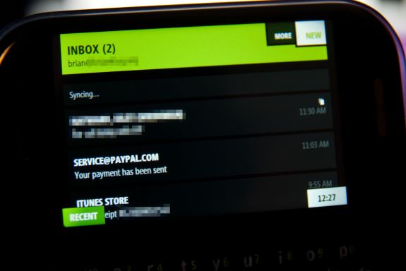
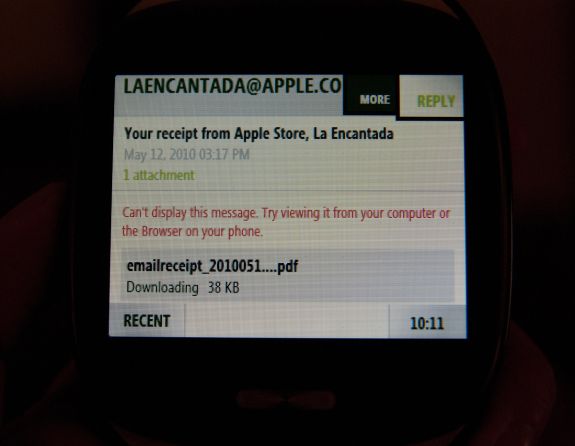
Moving on, the KIN email client was basic, but lacked attachment support for almost all document formats. PDF, Word, Excel, Power Point, and OneNote documents were all unsupported. In fact, the KIN couldn't open BMP, GIF, TIF, or MP3s as attachments either. Essentially all the KIN could open were videos (WMV, MP4, 3GP, 3G2) and photos that are JPG or PNG. The email client also lacked native HTML viewing, and spell check support.
That brings me to the keyboard assists - there were none. Though both KIN had spectacularly good keyboards, they were hampered by the lack of any autocorrection, capitalization after punctuation, or spell check. It literally amounted to just the keyboard. That's fine for most things, but for pecking out emails on the device, assists are extremely useful. Generation upload might not be the best at grammar, but Microsoft could've at least helped everyone along with some auto capitalization.
Phone for Kids?
Though the KIN was aggressively marketed towards the younger demographic, it surprisingly lacked a feature parents demand in large numbers. Namely, Parental controls. In fact, I came close to suggesting the KIN to a close friend of mine for their son, before it occurred to me that a lack of parental controls made the device something the parents would never swallow. It's that kind of glaring omission that makes the KIN a tough sell.
Lack of Applications
But the real problem with the KIN was that Microsoft was launching a new phone platform in 2010 without any application marketplace - it didn't make sense.
Microsoft promised application support eventually, and even suggested that Windows Phone 7's marketplace would eventually merge with the KIN's. Of course, the reality is that the KIN had no future in a WP7 dominated roadmap.
Browser
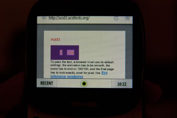
The KIN's browser felt speedier than Internet Explorer on Windows Mobile ever felt, but still feels an order of magnitude slower than any other mobile browser. Though all of the sites I visit on a regular basis render perfectly, the KIN web browser did abysmally poorly at all the browser standards tests:
Final Words
The reality is that the KIN launched too close to WP7 to be relevant, and too late in the game to be avant garde. Even if Microsoft had kept the platform going, it likely would've required a separate marketplace and different subset of applications. The truth is that Microsoft needs to focus all its resources and and efforts on successful WP7 launch, and build out a Windows Phone 7 Lite device after the core is established. There's a market for devices that are priced like featurephones, but deliver features they can't. Even if the KIN didn't succeed, there surely will be other devices that will if the price is right.
What's unique about KIN remains its unprecedented level of cloud integration. The KIN gave us a brief glimpse of the future of mobile integration with the cloud. Even if the platform itself failed, the KIN's cloud centric data storage and backup model remains the best out there. Android implements a number of similar features, but none of them come close to the level of integration Microsoft pulled off with KIN. Truly smart smartphones should be able to stand on their own - without a desktop they need to be nightly tethered to, synced with, or used to pull photos off.
Even though the KIN were yanked from the market under 3 months after launch, they weren't the abject failures that some have made them out to be. In fact, the competition would do wise to borrow concepts like the KIN Studio and build their own background sync services. The ideal smartphone OS is still floating around out there somewhere, waiting to be realized. Combine iOS' polish, speed, and battery life, Android's open marketplace, flash support, and customizability, WebOS's card multitasking model, beautiful UI, and finally KIN's level of cloud integration, and we might just have it.

