
Original Link: https://www.anandtech.com/show/3640/apples-ipad-the-anandtech-review
Apple's iPad - The AnandTech Review
by Anand Lal Shimpi, Brian Klug & Vivek Gowri on April 7, 2010 9:39 PM EST- Posted in
- Mac
- Apple
- iPad
- Smartphones
- Mobile
Confidence is built upon credibility, something Apple really earned thanks to the first iPod. Apple gained the mainstream credibility to introduce a product, say it's going to be the best thing ever, and have customers give it the benefit of the doubt.
Credibility is a finite good however. Promise the world and deliver beans instead too many times and you'll find yourself back to square one. Luckily for Apple, that hasn't happened yet.
The iPod gave Apple credibility, but Mac OS X, Mac hardware and eventually the iPhone all made deposits in that bank. That's not to say that Apple devices are flawless, but the company has won the confidence of a huge part of the market.
The road to the iPad announcement was riddled with rumors and unsubstantiated claims of what the Apple tablet would do. It was to be the replacement for everything from cable TV to netbooks. Hype is a difficult thing to control, but in the case of the iPad, the market's expectations were beyond unrealistic.
The hopeful child in all of us wanted to believe. We wanted to believe that Apple would introduce something truly revolutionary, something that would let us do anything we ever wanted to do. We just didn't know what that was, but we believed that there was a slight chance Apple might make it happen.
What followed on January 27, 2010, the day of the iPad announcement, was a collection of excitement, disappointment and confusion.
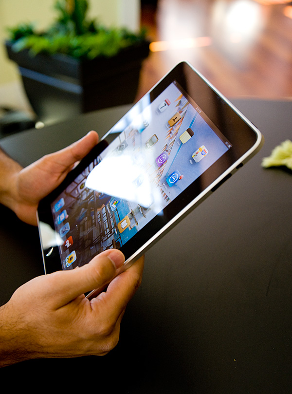
I do have to place some (a lot?) of the blame on Apple. By saying nothing, confirming nothing (short of threatening law suits) Apple let the hype get carried away. And I'm not totally convinced that Apple itself wasn't behind some of the leaks in order to generate free marketing for this device. The worst? Jobs calling the iPad magical. If the device was shipping today with no ergonomics issues, no slowdowns, no crashes and with a full list of heavy hitter apps (real ones, not just ones that showed us what the iPad could do in the future), then I'd call it magical. You can't call something magical if it just promises magic at some point in the future. Well, you can, but then you'll anger a lot of people who oppose to such liberal use of language.
You have to hand it to Apple PR though. Through careful planning and seeding of review units, it managed to end up in all of the right hands a few days prior to its launch.
It had been on every single late night talk show in the span of a couple days. It even made it to the grammys earlier this year. Folks looking to catch a break would kill for the sort of free publicity apples iPad has received. It has celebrity status without even adopting any orphans.
And like a celebrity, the iPad is very polarizing.
The iPad, even moreso than the iPhone, is not the end all, be all universal device for everyone. In fact, unlike the iPhone, it doesn't replace any existing device in your life. It's an addition. There are things it does beautifully, things it does ok, and things it just plain can’t do. Today, I'll try to take you through all of that as best I can.
It's a Tablet Running a Touch OS
At the heart, er surface, the iPad is a tablet computer. This has been tried before and usually met with very little success. The problems were three fold: hardware, form factor and UI.
What sets the iPad apart from those that came before it is that it finally has the right combination of all three. The hardware is powerful enough to run the OS quickly while maintaining good battery life, the form factor is thin and light enough to be portable and the UI is tailored to the device.
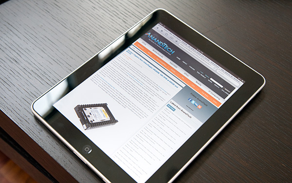
The latter is especially important. Where Microsoft has failed in the past with both its approach to smartphones and tablets is in its attempt to scale down a desktop OS. As we've seen countless times, the only way to design for a different segment is to start from the ground up. Microsoft itself learned this with the Media Center Edition UI on top of Windows.
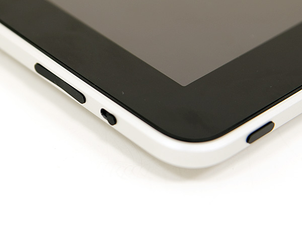
Since this isn't the 1980s, the iPad only has four physical buttons on the device. At the top you have a power/lock button, on the right you have a rotation lock switch (keeps the desktop from rotating) and volume rocker, and then at the lower part of the face of the unit there's a home button. If this seems familiar it's because this is the exact hardware layout of the iPhone, just on a larger scale.
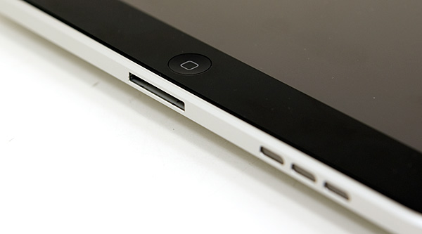
The vast majority of your interface to the iPad takes place via it's 9.7" capacitive touchscreen display.
Along the bottom edge of the iPad you'll find Apple's standard 30-pin dock connector. You can use existing iPod Touch/iPhone USB cables, however this is a much more power hungry device and thus you can't charge off of a standard USB port (more on this later).
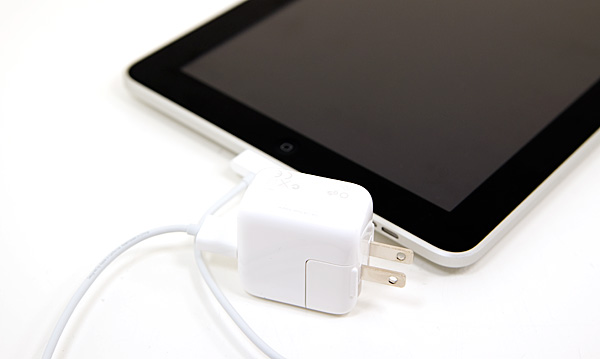
For your charging needs Apple supplies a single 10W power adapter, which looks a lot like the power adapters for the first iPhones.
Pricing: Heard Ya Got Robbed
Let's quickly recap Apple's iPad pricing. The base model only supports WiFi and starts at $499. It also comes with 16GB of MLC NAND flash for app/photos/music/video storage. You can double that capacity for an extra $100, or take it up to 64GB for $200. Note that these two upgrades alone work out to be $6.25 and $3.13 per GB. Intel will sell you an 80GB X25-M for $2.75 per GB.
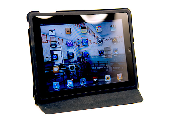
The accessories also take you for a ride. Want a case? That's $39. The case is actually more important than you think because it doubles as a stand, which is useful for typing while laying down or for watching videos on.
| Apple iPad | 16GB | 32GB | 64GB |
| WiFi | $499 | $599 | $699 |
| 3G | $629 | $729 | $829 |
Keyboard? That's $69 for the wireless version or $69 for the keyboard dock. Either way, Apple is getting its $69 from you if you want a physical keyboard. This is also useful if you want to do a lot of typing on the iPad.
Want to put pictures on it from your camera? Apple will sell you a $29 camera connection kit with a dock-to-SD card reader and dock-to-USB port adapter. Otherwise you'll need to carry around a computer to sync your iPad to.
There's also an optional VGA output, but no digital outputs (HDMI, DVI, DP). It looks like the A4 is missing a TMDS as all of its optional outputs are analog (VGA, composite, component).
So the $499 base price is really more like $530 or $600 depending on what sort of use you want to get out of it. This is a new category of device, but I just feel that Apple is being a little too aggressive on the profiteering with the iPad (we'll get to the app store in a bit).
Later this month Apple will be shipping 3G enabled versions of the iPad. The 3G adder will set you back $130 and isn't retrofittable. AT&T is the sole provider of data service for the iPad, but the pricing is actually fairly reasonable:
| Apple iPad 3G | 250MB per Month | Unlimited |
| Monthly Data Charge | $14.99 | $29.99 |
Anyway you slice it, it costs a lot to get into this concert.
Like a netbook, the iPad isn't a Mac/PC replacement but rather something you buy as a second, third or fourth computer. The problem is unless one of those computers is a notebook, the iPad doesn't really serve as a replacement for a powerful mobile computer. It's more of a notebook alternative depending on your needs, and at times it can be a great one. If you've got a desktop and a notebook then the iPad could fit in as a third device, but if you don't have a notebook the iPad is no notebook replacement as you’ll soon see.
It Was Meant For You
The best way I can describe picking up, holding and using the iPad is it feels like it was built for you. Whenever someone on Star Trek TNG walked around with a tablet, it was always natural and they always seemed able to do whatever it was they needed to do on it. That’s the iPad. As an added bonus, you don’t have to wear a terrible jumpsuit to use it.
A definitely overused phrase to describe Apple products, but the iPad just works. It’s got an ambient light sensor that’ll sensibly adjust the brightness of the display. There’s an accelerometer that feeds info into the system controller that lets the iPad know how it’s oriented. The display rotates smoothly to orient itself properly regardless of how you’re holding it. And for those tabletop or on the lap sessions you can lock rotation at the flick of a switch. Apple thought this one through.
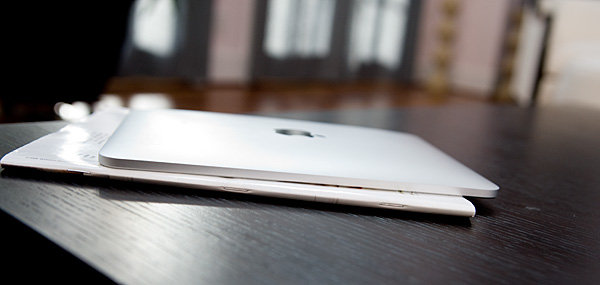
The iPad vs. a magazine
It works just like a big iPhone and at first, the UI actually looks awkward and overly spaced out. Use it for enough time and the opposite starts feeling true. The iPhone feels cramped and crowded and the iPad feels almost perfect.
Since the iPad is running iPhone OS 3.2, the UI works just like the iPhone. Your home screen is a collection of apps (20 per screen) and you get multiple pages to store more apps. There are four fixed icons at the bottom of the screen (you can add two more). These icons are present on all pages of the home screen.
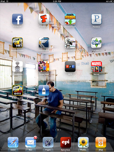
Press and hold an icon to move it around. Hit the little X button to delete an app from your iPad.
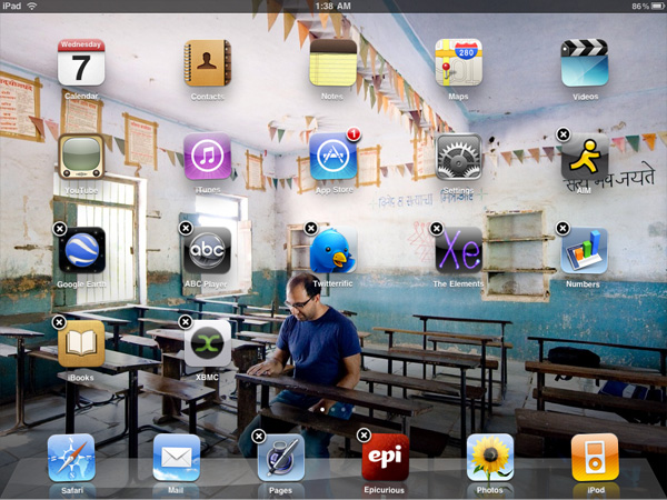
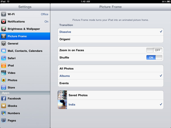
Apple lets you select any photo as your home screen wall paper, and you can use a different one for your lock screen wall paper. A neat addition is the ability to put the iPad in picture frame mode while locked by hitting this button that appears on the lock screen.

Hit that button and the device launches runs through a slideshow of all of the photos you’ve got on the device. You can set the iPad to only display certain albums or events so you don’t accidentally embarrass yourself around others.
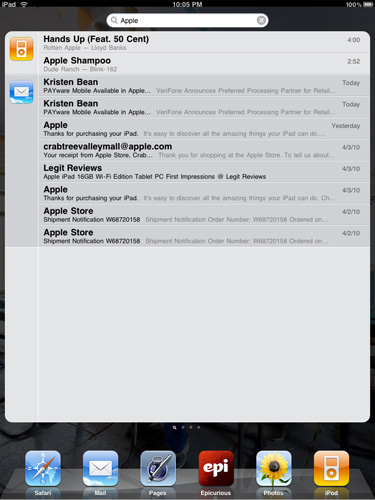
You get a system wide search option that’ll quickly search all applications, calendar entries and downloaded emails quickly.
Notifications are handled pop-up style like the iPhone. They are less annoying on the iPad simply because you don’t encounter as many (no SMSes, no missed calls, no voicemails), but the system still doesn’t scale well to handle lots of notifications. Apple is widely expected to address this in the next version of the OS.

A Testament to UI Efficiency, Distinctively Apple
I've always called the iPhone OS a very efficient UI. The ease at which you can perform primary tasks on the iPhone is what I mean by that. By comparison, many earlier tablet and handheld computer concepts used full blown desktop OSes scaled down so much that you could hardly get anything done. UI elements were far too small to be navigated with portable screens. On the flip side, if you scaled the iPhone UI to a 22" desktop PC you'd also lose efficiency, the UI simply wasn't designed for that purpose. You use the right tool for the job and that's exactly what the iPhone OS, webOS and Android try to do. They are great smartphone interfaces.
The success of the iPad's UI is really determined by how well it scales up to the larger screen size and resolution of the display. Simply running iPhone apps on the iPad doesn't cut it, something that is made obvious by how little I wanted to use them on my iPad.
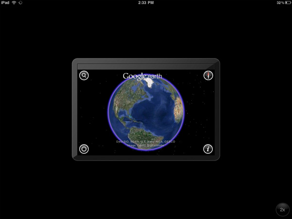
An iPhone app running on the iPad
Thankfully, with the exception of running iPhone apps, Apple has ensured at that all elements of the iPad UI are enhanced specifically for the larger screen. The most obvious is the larger keyboard but there's also liberal use of columns in apps. You'll also note that there's very little forced consistency between the look and feel of iPad applications. Their UI is determined entirely by their function.
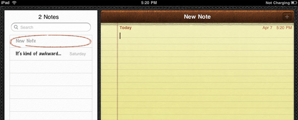
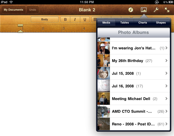
The popup dialog is also widely used throughout the iPad OS:

Thanks to the A4 SoC inside, multitouch gestures react even faster and smoother than they do on the iPhone. Particularly the pinch and stretch gestures for zooming in and out. Apple also introduced a new pinch/stretch to zoom feature in its Photos app. To expand or collapse any album or event simply take two fingers and stretch them apart or pinch them together. It seemed gimmicky when I first heard about it but in practice it works really well and I'd like to see it used in more places.

While not really significant to the plot, there are some nice touches that Apple has included with the iPad that are worth mentioning. The home screen is, er, home to a lot of the more prevalent examples of Apple flair. All the icons have a nice drop shadow behind them.
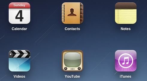
Bringing up the home screen from another app causes all the icons to fly in from the outside as if they're all scurrying home before you get there. Rotating the home screen also results in a sweet zoom out then in effect.
Despite having the screen real estate Apple doesn't get wasteful with UI elements. They are all fairly tiny and not intrusive.

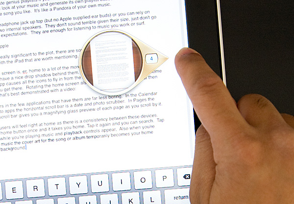
Scroll bars in the few applications that have them are far less boring. In the Calendar and Photo apps the horizontal scroll bar is a date and photo scrubber. In Pages the vertical scroll bar gives you a magnifying glass preview of each page as you scroll by it.
iPhone users will feel right at home as there is a consistency between these devices. Tap the home button once and it takes you home. Tap it again and you can search. Tap it twice while you're playing music and playback controls appear. Also, when you're playing music the cover art for the song or album temporarily becomes your home screen background.
Although there's no mute button, holding the volume down rocker for 2 seconds mutes the device instantly.
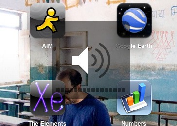
There are dozens of little features like these that show an attention to detail that is missing from most products. Rushed or not, the iPad still has the little things that do make it an Apple product.
Stop and Smell the Roses Computing
In my original iPad piece i talked about how the couch surfing Internet device is something I'd wanted ever since i started AnandTech 13 years ago. It's sort of ironic that when the day finally came that a company made what I wanted, I don't have the time to actually sit on my couch and browse the web. Such is life.
Since my job revolves around doing a lot online I rarely get the opportunity to chill and play online. Something the iPad is great at. That's not to say that it's totally useless for someone like me. In fact, despite the ergonomics issues I found myself typing a lot of this review on the iPad simply because it's nice to step away from the desk and more overwhelming computing interfaces.
When I'm writing sometimes a simple change of scenery helps clear my head. Using the iPad for writing, responding to emails or even browsing the web is like a virtual change of scenery. It forces you to take a slower and more focused pace. It's stop and smell the roses computing, but without being frustrating. You lose the stress of a more overwhelming compute experience, which if you spend most of your day working on the computer is nice. I don't want to get too flowery with language here but it is a more intimate setting. The screen can be closer to you and you interact with it directly. This is particularly evident in web browsing. The line between browsing for work and fun for me is very blurry, so my browsing experience is rarely relaxed. The iPad fixes that.
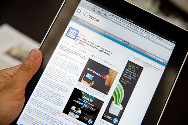
The iPad is a double entendre of computing. On the surface it's a clear option for folks who only do the simplest things with computers. Look a little deeper and there's actually use for those of us who don't fall into that category. It's your computer away from computers. An analogous duality actually exists with the Mac OS and it's easy to use vs. powerful nature.
It's actually this relaxed computing aspect that I feel most tablet makers will get wrong. These devices aren't notebook replacements but in the quest to enable things like multitasking and more usage scenarios I'm afraid that the simplicity will be lost. This is the Android vs. iPhone debate I brought up in my Nexus One review. Apple has the simplicity part down pat, so it's competitors use features to differentiate. In doing so you often lose one of the major selling points of the Apple offering.
Part of the relaxed experience does have to do with the total lack of multitasking on the iPad. Short of playing MP3s while you work, you pretty much can't do more than one thing at a time with the iPad. This is not as frustrating as you'd expect partly due to the faster-than-iPhone speed of the device. But it is a problem, something I believe Apple will address in tomorrow's iPhone OS 4 preview.
The iPad is relaxing to use. The interface is clean and not overbearing, and by virtue of the touch interface it acts more as a natural extension of you than a separate computing device. Maintaining those things while addressing core problems of the iPhone OS (e.g. Notifications, multitasking) will be challenging for Apple.
Spending Money Where it Counts: The Display
A blast from the past is the iPad's 1024 x 768 resolution. In a world that's almost fully transitioned to 16:9 or 16:10 panels, leave it to Apple to go back to a 4:3 CRT resolution for its latest product.
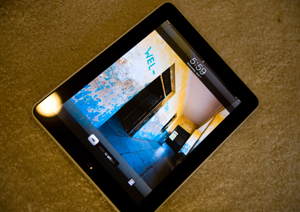
The aspect ratio actually works very well. You can comfortably view web pages in both portrait and landscape mode and get a reasonable amount of content on the screen without scrolling. Thanks to the great touchscreen, you almost want to scroll whenever possible.
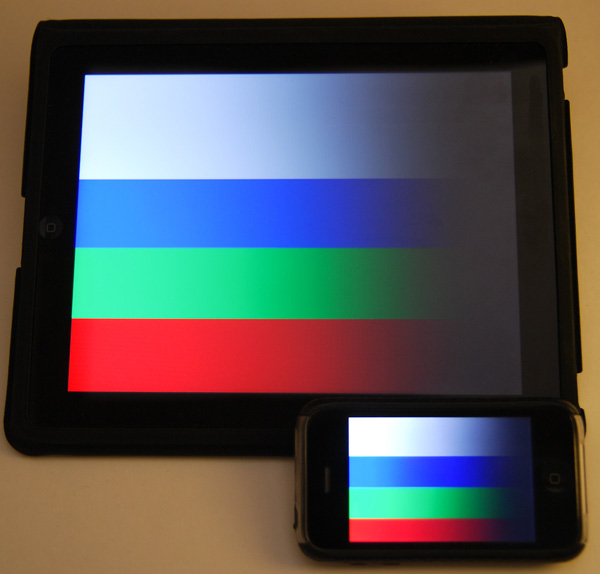
iPad and iPhone side by side
The problem with using the Nexus One for the past few weeks is that going to Apple's IPS (in-plane switching) LCD in the iPad just isn't that impressive. The colors aren't nearly as vibrant or panel nearly as contrasty as the AMOLED in the Nexus One. For an LCD, it looks great, it just lacks the punch of an OLED (as well as the pricetag such a large OLED display would carry).
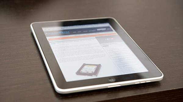
You quickly realize why Apple went with an expensive IPS panel for the iPad - viewing angle. When you're typing on the iPad it'll either be resting on a desk or angled slightly towards you. The iPad's display ensures that regardless of viewing angle, the display never looks washed out. In practice, the display performance was stellar for a device of this form factor - the viewing angle really does seem to be close to the advertise 178 degrees. There's little performance falloff or distortion even viewed at the most extreme angles. It's far more critical in an iPad than in a notebook simply because there are valid use cases where the display is totally flat. Apple spent money in the right place here, it usually does.
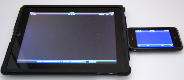
iPad vs. iPhone 3GS
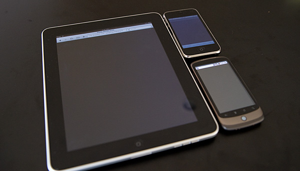
iPad vs. iPhone 3GS vs. Nexus One
In addition to viewing angle, IPS promises a larger color gamut and better contrast ratio compared to cheaper and more common LCD technologies. Qualitatively, the iPad goes far brighter than you'd need it to, and thankfully very low as well - a welcome feature for when you're reading in bed and don't want to distract. Indoors, the display is everything Apple promises, and it's clear side by side that blacks are far better on the iPad than on the iPhone. Brightness across the display is very uniform, and on the whole everything just looks great - indoors.
Indoors, the black levels between the iPad and iPhone 3GS are like night and day. In fact, several times while taking photos I thought the iPad's display had gone to sleep while displaying my black test image. It's that good. By comparison, the iPhone looks almost blue even when viewed at normal incidence.
Let's take it outside. Here's a bright sunny North Carolina day:

I stood in the sun and tried to use the iPad:
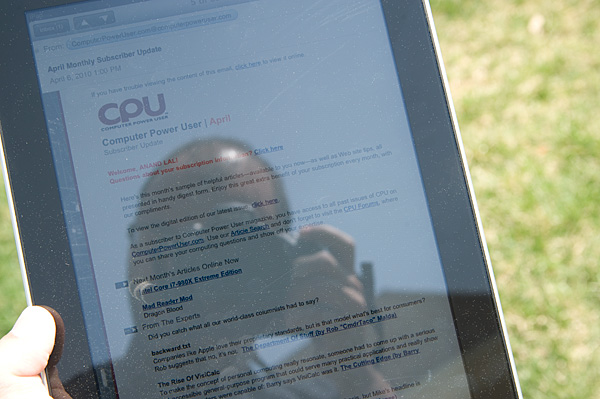
High contrast work scenarios where you're focusing primarily on black text atop a white background, like reading books, checking email, or reading the web, are definitely usable and readable outside. This is a testament to the brightness of the LCD panel. However, if you're using a particularly dark application, it's much harder to see anything comfortably.
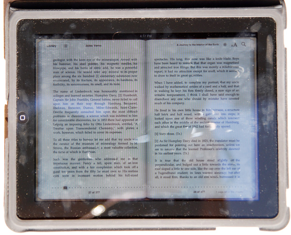
Finger prints in direct sunlight
In addition, the iPad's glassy surface doesn't have an oleophobic coating like the iPhone 3GS shipped with; the display is a fingerprint magnet. Just like the older iPhones, it always looks like you just finished eating a bag of cheetos right before you hand your iPad to anyone. Update: Apparently we're wrong and the iPad does have an oleophobic coat on it like the 3GS. Perhaps it's a different coating technique, or more likely that fingerprints are just more visible on the much larger screen.
Its glassy visage is also very reflective, as expected, and that can be distracting at times. Honestly, this is the kind of scenario where an anti-reflective coating can drastically reduce glare. There are really two scenarios to consider outside - under direct illumination from the sun, and shaded performance. Outdoors performance can be either just acceptable or perfectly miserable.
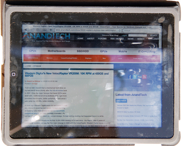
Safari in direct sunlight
After a hours of use (without eating any greasy food, I promise), in direct sunlight the iPad can get very difficult to read from all the fingerprints. However, performance in the shade outside is quite legible.
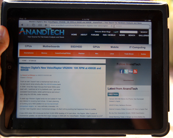
Safari outside in the shade
Clearly, the usage target Apple had in mind for the iPad was indoors, where its display is almost flawless.
But we weren't satisfied with making nebulous claims about the display performance, so we set out to verify them. After scratching our heads for a while, we settled on a shamelessly intuitive method - remote desktop. Using our X-Rite Eye-One Display 2, ColorEyes Display Pro, and some patience, we were able to measure and characterize the iPad's IPS display like any other.
Clearly, the IPS panel in the iPad offers drastically improved contrast and black levels - it's very obvious even in normal use that it blows away the iPhone.
| Display Comparison | Black Level (nits) | White Level (nits) | Contrast Ratio |
| Apple iPhone 3GS (100% Brightness) | 2.5 | 469.2 | 187.7 |
| Apple iPad (100% Brightness) | 0.4 | 373.7 | 934.3 |
| Apple iPad (50% Brightness) | 0.2 | 149.7 | 748.5 |
We also measured and were able to get color gamut volumes and uncalibrated Delta-E performance as well. However, we're not entirely convinced that these numbers are sound. The remote desktop software common to the iPad and iPhone 3GS we used offered 24 bit color depth at maximum, and the test results for both the iPhone 3GS and iPad turned out very similar. We're talking down to 0.01 Delta-E in some cases. For that reason, we're excluding the data we've obtained for color tracking until we're positive the numbers are right. Of course, the iPad itself remains 24-bit color, same as in previous versions of iPhone OS.
On the other hand, it's entirely possible that this is just the case, and color performance is the same between the two. In fact, an IPS panel was probably chosen in this context due to the very real viewing angle requirements for a handheld display of this size - anything else would be distracting. We're going to continue to investigate.
Whatever the numbers say, the display is beautiful in use and blows away most others. It's brilliant in use as a photo frame, for movies, reading books, and surfing the web. I watched a movie on it, spent a few hours reading online and a copy of HG-Wells' War of the Worlds and didn't experience any eye strain, though I'll admit I don't experience any fatigue with most LCDs. If you have a definite preference for E-Ink displays, you'll probably find reading less comfortable, but the added benefit of being able to browse the web and do everything else makes it a relatively minor trade-off. On the upside, you're reading on something that's backlit, so you don't need a book light for nighttime reading.
It's refreshing to finally see Apple taking mobile computing displays seriously with an IPS panel, instead of opting for far lower quality TN panels. Let's hope this same decision to not sacrifice display quality carries over to iPhone 4G.
Of course, the multitouch aspect of the display will be familiar to anyone who has used an iPhone or recent smartphone. We tested the iPad using all ten fingers, and they all registered properly. Even on the larger screen, using all 10 fingers is as clumsy as it is stupid looking, but clearly the iPad's screen is at least 10 point capacitive multitouch.
The Keyboard & Ergonomics
Apple can build touchscreen devices, I wasn't worried about that aspect of the iPad. Although surprising was the fact that the iPad's screen feels just slightly less responsive than the iPhone's. I'd say it's somewhere in between the Nexus One and the iPhone. It's possible that it's harder to build a uniformly responsive capacitive touch screen at such a large size.
What I was worried about was the keyboard. The iPhone's keyboard is difficult to adjust to but it can be done. You can hold the iPhone the same way you would a smartphone with a physical keyboard and all you lose is tactile feedback. Throw in some intelligent auto correction software and you're good to go.
This is one aspect of the iPhone experience that doesn't translate well. With the iPad you lose the tactile feedback of a physical keyboard, but you also lose the ergonomics.
The iPhone's keyboard is roughly the size of your average smartphone keyboard, but the iPad's keyboard is about 60% the size of a standard keyboard in portrait mode, and 85% in landscape. Thankfully Apple has done a good job of not scaling down key size and spacing, pulling a page from the iPhone handbook and just using different virtual keyboards depending on the app or what mode you put the keyboard in:
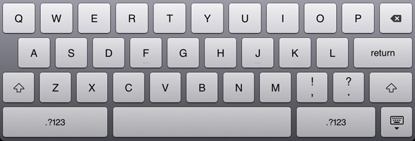
Default keyboard mode
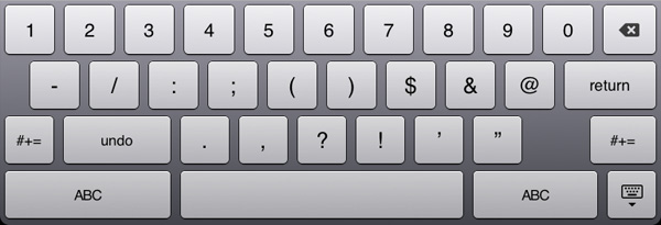
Hit the .?123 key and you get this - note the undo button
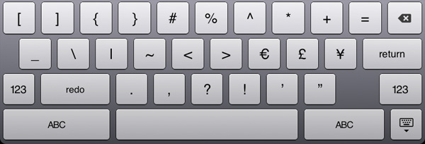
Hit the #+= key and you get this - note the redo button
The iPad keyboard works just like you would expect a virtual keyboard to work. No, not like the virtual keyboards you’re used to, but instead like a virtual representation of a real keyboard. If you know how to type on a regular keyboard, you’ll quickly be able to do the same on the iPad. The keyboard learning curve is definitely flatter than on the iPhone but it still exists. Touch typing is very possible.
The problems actually have to do with the ergonomics of the device itself. Put a notebook on your lap and you rest your wrists on either side of the trackpad as your fingers drape over the keys. You can't do this on an iPad. The bottom of the keyboard is less than an inch away from the edge of the device. In this sense it’s kind of like using a tiny netbook.
For typing, the ideal position is with the iPad flat on a desk with your wrists resting on the desk as well. It's akin to writing in a notebook so it should work well for students. It's still not as comfortable as using a laptop but its passable.
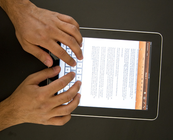
Ideal typing position on the iPad
Where the ergonomics really fail is if you don't have a desk to support your wrists with. Then you've got to either hold the device with one hand and peck at it with another, or do some uncomfortable stuff with your lap.
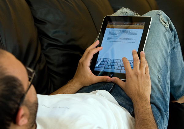
Note what I'm doing with my thumbs, that's the only way to get the iPad to stop sliding down my legs
You can actually hold the iPad with two hands and use your thumbs to type on it like a giant smartphone. You won’t last long doing this but it’s fine for entering in web addresses, Google searches or writing a short email response. The same holds true for holding the iPad in one hand and typing with the other. It works, but isn’t suitable for long use.
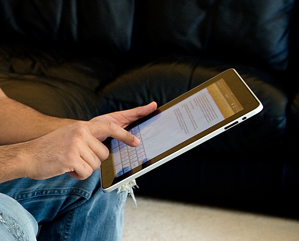
One handed
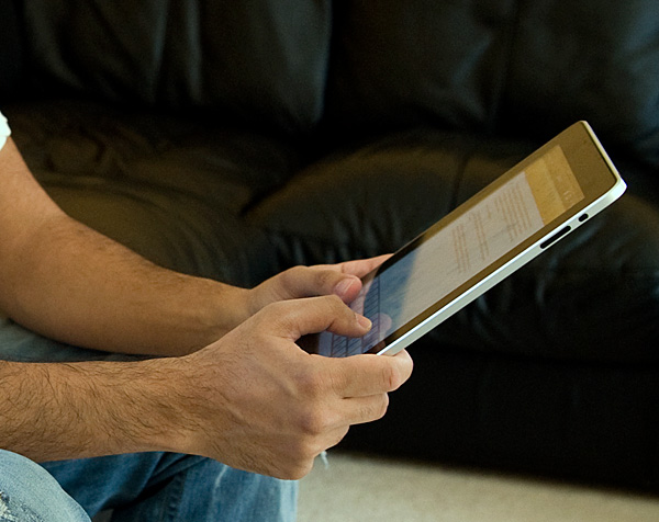
Giant Smartphone
With it resting on your lap you can’t lay as far back on a couch as you’d like, but you don’t have to be totally upright to use the iPad comfortably. There is a happy medium, but it’s just not quite as relaxed as I’d like it to be.

Sitting more upright is necessary
These aren’t show stoppers, but they are aspects of the device that don’t just work. The form factor is great, but when doing a lot of typing or trying to get a little too relaxed there are issues. Just like laptop usage is only comfortable in certain positions, iPad (or tablet) use is only comfortable in certain positions. The two sets of positions are just different.
Putting aside my ergonomics issues, once you figure out what works best you can actually get a lot of writing done on the iPad. In fact I wrote approximately 40% of this review on the iPad, and while my typing was slower than on my keyboard, the experience was a nice break from the traditional keyboard/mouse setup.
iPad Autocorrection: Withholding the Answer
In my Nexus One review I talked about how great the iPhone’s autocorrection system is. About how it just lets you type and forget about spelling or punctuation errors. I figured this would translate very well to the iPad. Unfortunately, I was wrong
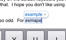
The autocorrect engine on the iPad is far less aggressive than on the iPhone. You have to pay much more attention to what you're typing here. The iPhone, if trained well, can usually guess what you're trying to say based on it's live dictionary and key position. On the iPad, it doesn’t guess nearly as much.
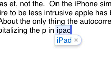
On the iPhone simple things are autocorrected but out of a desire to be less intrusive Apple has backed off on the iPad. Given that iPad users will most likely be typing a whole lot more than iPhone users, an aggressive autocorrect engine is probably a bad thing.
About the only thing the autocorrection does as well as on the iPhone is automatically capitalizing the p in iPad. While i understand why Apple made the autocorrection engine more lax, I would like to have the option to restore at least some of it's potency.
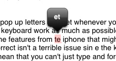
The spelling correction in Pages ($9.99 Apple word processing app) is also odd. For example I typed te and the only correction option it gave me was et, not the. Some other oddities I ran into in Pages are below:
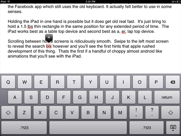
Of course I didn't mean to type box, just ix
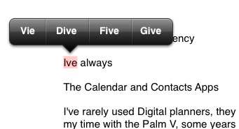
I've? No, I meant Vie
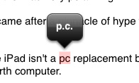
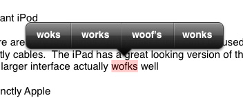
Hmm, works or woof's?
Also missing on the iPad's keyboard are the pop up letters you get whenever you hit a key on the iPhone. Apple tried to make this keyboard work as much as possible like a normal keyboard but in doing so left out some worthwhile features from the iPhone.
The weaker autocorrect isn't a terrible issue since the keyboard is a lot bigger than the iPhone’s but it does mean that you can't just type and forget. It also means that most of your fast typing won't be properly punctuated. There's no apostrophe key on the default keyboard you have to bring up the numerical mode to get access to that. I hope you don't like using contractions while typing fast.
Quickly formatting text is also irritating. There are no keyboard shortcuts, so while your fingers spend all of their time at the bottom of the screen apps like Pages still behave like a desktop app in that all of its options are at the top of the screen. It's quicker to type without caring about details and then edit later if you're trying to get something polished.
Selecting text, on the other hand, is awesome on the iPad. Double tap a word to select it. Triple tap to select an entire paragraph. From there you can drag the selection box's corners to enclose more. This is one of those situations where the iPad actually improves the experience over the notebook/desktop norm.
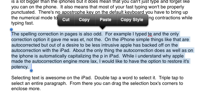
I set out to write this review in it's entirety on the iPad, unfortunately if I were to actually do so I would undoubtedly suffer from carpal tunnel syndrome or spend three times as long formatting the review. Steve wasn’t lying when he said that if you wanted to do a lot of typing you should buy the keyboard dock. For emails, web browsing and even normal sized documents it’s fine, for writing and formatting huge articles however, use a laptop.
WiFi
Many iPad users have been complaining about poor WiFi performance. What I have seen is the iPad doesn't seem to like to let go of a poorly performing access point in favor of another known access point with much better signal strength. Apple indicates that the iPad may not rejoin a known dual-band access point after coming out of sleep. I'm not sure whether my issue falls under Apple's KB article or not because the iPad will join my other networks, it just doesn't pick them as aggressively as I'd like.
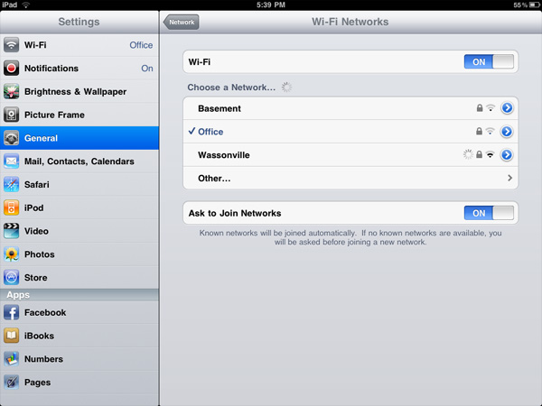
Which one of these would you choose?
I've seen smartphones do this as well and it is a problem on my MacBook Pro. The more mobile the device however, the more annoying poorly calculated handoff timing is. Not to mention that because the iPad runs the same OS as the iPhone, there's no way to quickly switch between WiFi access points from the home screen.
The Killer App - Web Browsing
Reading web pages on the iPad is great. The 4:3 aspect ratio gives you a nice column for text heavy websites and landscape mode works well for wider layouts. It's a great tool for browsing the web and sharing what you find with others sitting around you. I can even see it being perfect for web designers working on building websites together.

Navigation is wonderful thanks to the touch screen and web sites look gorgeous thanks to the pricey LCD. Scrolling is super smooth, and it’s so much more comfortable reading articles away from a desk or without the added bulk of a laptop. It’s relaxed computing.
I'm a bit torn on this one because although I love browsing on the iPad, I'm not a fan of using it to write lengthy responses to comments on AnandTech. Quick responses are fine, it’s the longer ones that I don’t like drafting on the iPad. What I usually end up doing is reading the comments on the iPad and responding to them from my desktop. Did I mention that the iPad was a luxury?
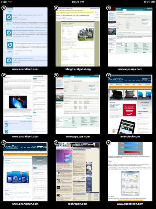
Tabbed browsing isn't supported but you can have multiple browsers and slowly switch between them
The difference in screen size and resolution between the iPad and iPhone really makes itself felt inside Safari. Where in the iPhone you end up in stripped down mobile versions of websites, the iPad is capable of displaying a regular webpage in full-fledged glory. And because of the processing horsepower in the A4 SoC, the iPad has no problems rendering these full pages (more on this later). Part of the reason is because processor-heavy Flash objects are skipped over entirely, but doing so keeps the browsing experience fluid, which is arguably more important in a device like this.
So how does the iPad deal with content-rich sites that depend on mixed media elements? It's mixed, but overall pretty well. Pages like the new AnandTech, Autoblog, and Engadget are perfect, with the exception of the blank space wherever there should be embedded Flash objects. (There's no more blue Lego of Flash as there is on the iPhone to let you know when you're missing out.) Things get more interesting when you start hitting HTML5 video-enabled websites.
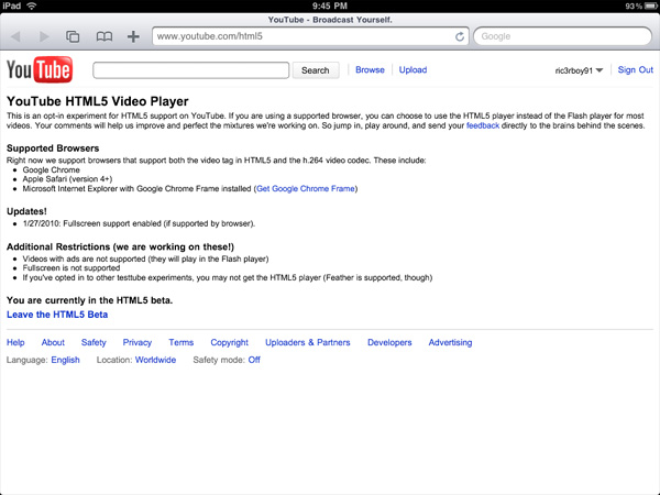
One of the first things I tried was the YouTube HTML5 beta. Yes, I know there's a YouTube app, but it's always nice to know that you can get the desktop version of YouTube working in Safari. Except, it isn't quite that simple. Reading through the HTML5 Beta page, there's one line that makes all the difference: "Videos with ads are not supported (they will play in the Flash player)." Which essentially means, if you ever want to watch an official music video or movie trailer (almost all of them have ads), you're hosed. Stick to the more off the road stuff (old Top Gear clips and various Indian music videos are good bets) and you should be okay, but it remains kind of annoying to go to a video page and be greeted with an empty hole where the video should have been. I'm hoping that Google will recognize the potential of a browser-based YouTube and disable ads when viewing on the iPad, but that remains to be seen.
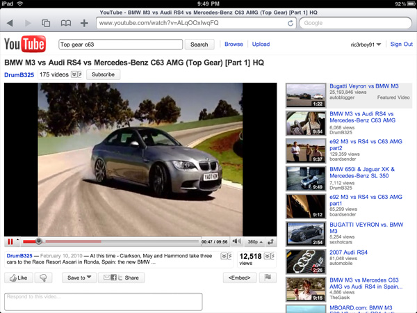
Sites built around HTML5 video (or recently converted to HTML5 video in the run up to the iPad launch) work as advertised. ESPN has made the switch, and I was impressed at how seamlessly the experience translated from a normal computer. The New York Times also uses HTML5 video on their website, and it behaves just as it would in a desktop browser.

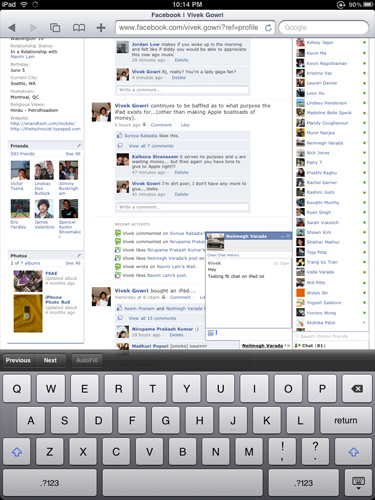
As far as social networking and communication websites go, the classic versions of Facebook, Twitter, and the Google web app suite all work to varying degrees. Twitter has a fairly simple desktop interface which translates over to the iPad flawlessly. Facebook functions well, though some of the buttons are a bit small. Also, the photo uploader doesn't work on the iPad, and while Facebook Chat does work, it remains fixed on the page, even if you scroll down. Nonetheless, it's far better than the touch optimized version of Facebook on the iPhone. It will be interesting to see how the Facebook developers utilize the extra screen space when creating the Facebook for iPad application. If it behaves like a slightly more touch optimized version of the full Facebook (instead of the icon-based iPhone app), it has the potential to be very user-friendly.
Google is another story entirely. For Gmail users, the iPad-optimized version of Gmail is awesome - you get the same dual pane message view like the Mail app, but with Gmail's signature threaded messaging included.

Google Docs is also optimized for iPad viewing. Note - viewing, not editing. There is no way as of yet to open a document in the desktop view, so it isn't possible to edit or create a new document. Highly disappointing, since full Google Docs compatibility would have been a killer feature on the iPad. If Google sees fit to rectify this problem by adding a mode to open a document in desktop view (and thus retain the ability to edit a document), it will be great. Google Talk Mobile is the same as on iPhone, except bigger, so you end up with a lot of wasted screen space. iGoogle Mobile is again the same as on iPhone, except larger, but switching to the desktop version of iGoogle fixes that problem. Some of the more advanced Google gadgets don't work, but the Gmail and RSS feeds work, as does the Weather gadget. The Google Chat sidebar makes it tempting to use the IM feature, but the experience is sadly broken. The chat windows are, like Facebook Chat, fixed on the page, and the text sometimes gets cut off on the edge of the screen. It's not enjoyable to use, but it will work in an emergency.
Google's iPad web services overall present an optimistic picture, highlighted by the Gmail application. As iPad-specific optimization finds its way to the other web apps, the Google suite could prove to be a valuable feature in the iPad. While web-consumption is a highlight of the iPad, interactive Web 2.0 sites do need work on the developer side to showcase the true capabilities of the platform. Full fledged web-browsing on the iPad ends up painting a similar picture to the rest of the device - there's a lot of potential in the device waiting to be tapped by continued development of the platform.
Apple gives you most of the essentials with the iPad. You get Safari, which we just finished talking about and an iPad version of the Mail app.
This is another one of those situations where it’s just a pleasure to read email on the iPad. I actually found myself unlocking my iPad just to read email on it while I was sitting in front of my desktop.
I hate to sound like a broken record but the combination of the touchscreen and the awesome display really help make the Mail app great. Switching between accounts still requires far too many taps, and there’s no easy way to select and mark a bunch of messages as read.
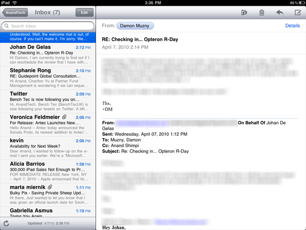
Mail, like many apps, is a bit more useful in landscape mode (you can view your inbox and selected message at the same time).
Being based on the same iPhone OS as the iPhone means that the iPad suffers from the same glitches. Sometimes when I get a new email it will appear then disappear. I have to wait for the app to check my email again or manually force it to see that message.
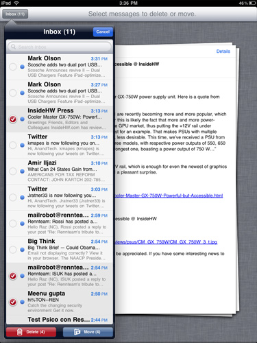
Another annoyance is the total lack of scroll bars on the iPad. While scrolling via touch works well in most cases, once you start displaying a lot of information (e.g. my entire inbox) you have to do a lot of touching to scroll from top to bottom. A simple grab and hold scroll widget would help a lot. It’s odd to me that there isn’t a single app that ships with the iPad that has this.
But if you’re away from your desk, the iPad can serve as an excellent stand in email client.
The Calendar and Contacts Apps
I've rarely used Digital planners, they never really felt right to me. The exceptions were my time with the Palm V, some years with Blackberries and more recently the iPhone. Something about the way their calendaring apps worked just seemed to fit well with my mental routine. Even then I didn't use them as much as I actually needed to, only critical events and reminders got entered in.
The iPad calendar is the closest thing I've seen to a daily planner in digital form. Apple just got the feel right with this one. Date selection is fast as is event input. I find that the UI of a good calendar app determines my likelihood of using it, and Apple got it right with the iPad. Ultimately it's just a scaled up version of the iphone app (like most apple iPad apps) but the visual flair it got in the transition from small to big is awesome.
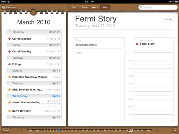
The calendar uses the scrubber UI element, but instead of flipping through photos you're scanning through dates. Flipping through pages also uses the popular page turning animation.
I'm sure heavy calendar users can easily find limitations with the app. But for regular users, it's very impressive.
The contacts app is straight forward port from the iPhone. It works and is one of the only apps to use the equivalent of a vertical scroll bar. Just run your finger over the alphabet on the left side and you can scroll through your virtual rolodex.

Apps like contacts are simply easier to use just because of the increase in screen size and resolution compared to the iPhone. Apple did an amazing job making the iphone UI very efficient and with some minor tweaks it scales very well to a nearly 10" screen.
User Interface: The Next Generation
For years we've wondered how desktop applications would get the multitouch treatment. While the iPad isn't a desktop computer, it does show us how multitouch will scale up to larger, deeper applications. And it can work very well.
Surprising is the fact that some of the biggest innovation in the UI department doesn't come from Apple, but from 3rd party developers instead. Will Smith (no, not the Will Smith, but still a cool dude) tweeted that the Epicurious app shows the potential of the platform. Now everyone has been talking about what does and doesn't show the potential of the platform, but Will wasn't wrong.
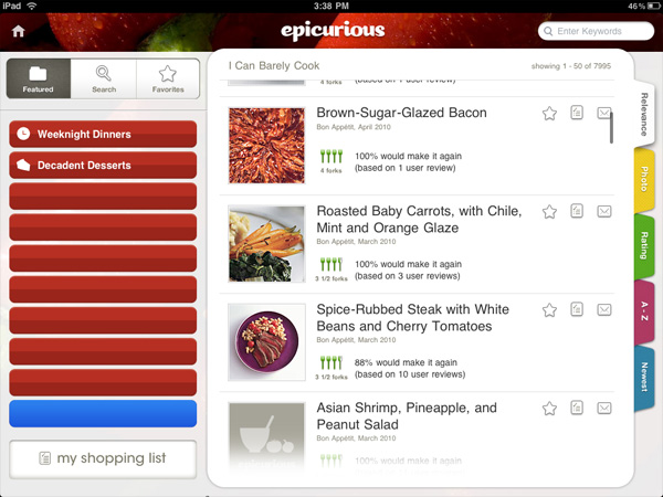
This app is a chef's aid, a recipe app. You can pick from different categories of food, browse lists of recipes by user ratings (updated over the internet) and it'll even put together a grocery list for you based on the recipes you've selected. The UI looks nothing like any smartphone, notebook or desktop application.
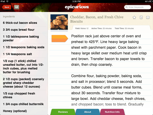
In fact, it doesn't even look like any Apple application either. It's perfectly unique and is tailor made to its job. It's an extension of Steve Jobs' take on the iPhone keyboard. For years smartphones had physical keyboards that were present in the same configuration regardless of what app you were running. The iPhone helped change that. For decades applications have all conformed to their underlying OS and its UI constraints. The iPad is Apple signaling the end of the cookie cutter, conformist UI.
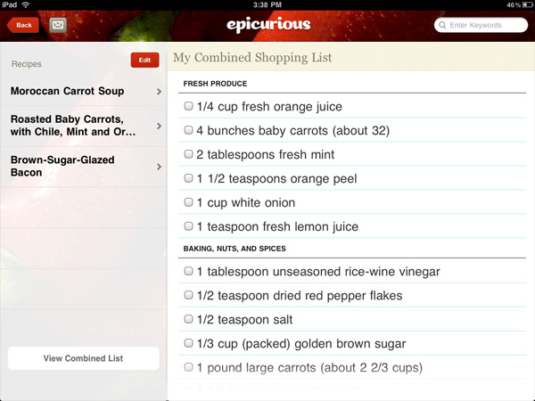
Five years ago you might buy/laugh at a gadget that just does the function of the Epicurious app. Today you can run it along with thousands of others on the iPad. It's like the transition from fixed function silicon to general purpose processors. The iPad is the general purpose gadget.
ABC's player app is the same way. It looks nothing like the Epicurious app, or anything else on the iPad. You almost forget that you're using the iPad when you're using an app like this, your focus is entirely on the content.

That's just the first thing that came up, I don't actually watch it, I swear
This sort of innovation is unfortunately too few and far between on the iPad today. I don't doubt that it will come, but it's just not here yet in quantity. Most developers just got access to the iPad on This is why everyone keeps talking about the promise of the platform. Unfortunately spending (at least) $499 on the promise of more excellence to come is something only a habitual early adopter can afford to do. In many ways this echoes the original iPhone's launch. I feel like the iPhone made a stronger case for itself on day one, and viable iPhone competitors were years out rather than 0 - 12 months out in the case of the iPad.
The App Store, The Robbing Continues
The only way to get apps onto the iPad is through the app store. Like the iPhone, you have an app store link right on your home screen. As long as you entered your iTunes Store user name at some point all you'll need go do is provide your password once and buy all the apps you want. The problem is price.
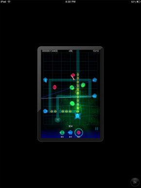
On the iPhone the majority of apps are in the $0 - $5 range. While these apps can run on the iPad, they look downright terrible. You either run them at native iPhone resolution which is too small on such a high res screen or double the resolution and make everything look way too pixellated.
What's more annoying about these iPhone applications on the iPad is that they don't rotate at all - getting landscape or portrait right is entirely up to you. For a device that now makes landscape and portrait functionality front and center, this is puzzling.
 |
 |
There isn't a perceptible framerate drop when you do enable the 2x scaling mode of the older apps; it's obvious that the scaling is done in hardware with a fair amount of acceleration. That said, all the little design flaws that developers would like that you probably never notice shine out - for example, images in the application are scaled smoothly, while otherwise bitmapped elements look blocky. You'll find that in practice the iPhone OS application support is largely a novelty, and that iPad optimized apps are greatly preferred.
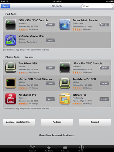
iPad Apps and iPhone Apps - Segregation at work
This is where the App Store both helps, and creates some confusion. Applications can either be iPad only (these often sport an "XL" or "HD" in the name), or universal, meaning the same application purchase entitles you to a version on the iPad and iPhone. Universal applications are denoted by a small + in the top right corner. In this circumstance, if you've already invested in a particular application, and the developer has updated the app to be universal, you get a two for one deal with a proper iPad version, and the iPhone version. What's annoying is that you have to do this process manually - it'd be extremely helpful if the App Store presented a list of universal applications you've already purchased (on either the iPad or iPhone) for installation.
So, yes you can run old iPhone apps, but no you wont want to. What you will want however are shiny new iPad apps that run at full res. Unfortunately these all seem to start at $9.99. I don't even want to know how much I've spent on apps in the past few days, and most of them aren't even that good. They each just fulfill some specific need that the iPad doesn't otherwise do on its own. This is the strength of the platform, but the pricing just feels wrong.
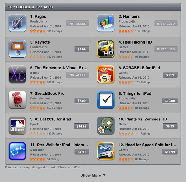
Apple justifies charging more for iPad apps because they are deeper than their iPhone counterparts. However, in many cases the depth is just an illusion of nice graphics and a great touch Interface. There are other problems as well. The iPad version of Pages for example provides no way to wirelessly share documents with your desktop or notebook. And if you use some features in the OS X version of Pages they get lost upon importing into the iPad version.
The app store is a cash cow for both developers and Apple. While I could get behind the pricing on iPhone apps, I don't believe that iPad apps as a whole justify their prices. The platform is new so this could change. Either way plan on spending a good $60 - $120 on apps after you get your iPad.
Video Playback: Almost Perfect
The iPad supports hardware acceleration and playback of up to 720p H.264 Main Profile (L3.1) video content with AAC audio. It's pretty much guaranteed that you'll have to transcode anything you have to an iPad friendly format. With a fast enough desktop, this isn't an issue. Expect to dedicate anywhere from half an hour to a few hours to do it right on a fast machine depending on core and thread counts. While I never understood the appeal of watching movies on an iPhone, with the iPad I want all of my video content on there. The screen is big enough and looks great. Not to mention that battery life is way better than anything you'd get out of a netbook or notebook.
The problem is that the iPad's video playback support isn't universal. You do have to take that extra transcode step, which means you can't just copy your videos from your desktop or file server. This is one area where the incoming wave of Tegra 2 tablets and Microsoft Slate computers will undoubtedly hold an advantage. It's also an area that Apple will never improve in thanks to its close relationship to content providers.
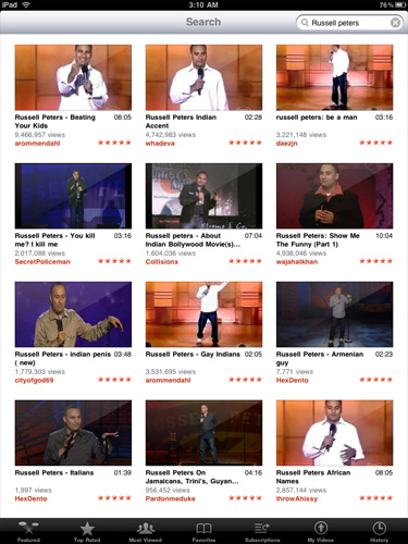
Transcoding isn't the only way to get content onto the iPad. Websites or apps that use HTML5 video are also well supported. The ABC Player app is the perfect example of what could be done with the iPad. You have a standalone app that streams all of the shows you want to watch. There are obvious drawbacks (e.g. Limited episode selection) but the experience is great.

Castle via the ABC Player app
If you ever find yourself watching more TV on your desktop or laptop, then you'll love the iPad's potential here. I'm not a fan of selling things on the promise of a better future (e.g. PhysX), so keep in mind that today you can't do things like watch Hulu on the iPad. The only type of streaming video support is HTML5, not Flash. While a Hulu app is apparently in the works, it's not there now.
Will the iPad change the way you watch TV and movies today? No. Could it? Sure, but so could a TV that made me pancakes. Neither is ready yet or guaranteed.
A Giant iPod
There are very few things Apple makes that can't be used as an iPod, and they are mostly cables. The iPad has a great looking version of the iPod app from the iPhone. The larger interface actually works well if you've got a lot of music and cover art.

Playing music works as expected with some updated widgets on the interface (e.g. Volume control). It's a clean UI which is really a running theme on the iPad.
You can create genius playlists if you're horribly indecisive about music like me. The iPod app will look at your music and generate its own playlist based on as little as selecting one song you like. It's like a Pandora of your own music.

There's a headphone jack up top (but no Apple supplied ear buds) or you can rely on the iPad's two internal speakers. They don't sound terrible given their size, just don't go in with high expectations. They are enough for listening to music you work or surf.
Rushed but for What?
I always got the impression that Apple works as an infinitely configurable set of resources rather than a set of distinct teams. In order to make the iPhone launch a success in 2007 Apple pulled developers off it's OS X team. The iPhone launched on schedule, but OS X 10.5 was pushed back.
Leading up to the launch of the iPad, Apple has been quiet on other fronts. But with the iPad now here, and with clear evidence of it not being complete, I suspect that Apple diverted some of its resources to work on the next version of the iPhone OS. Losing ground to Google is a dangerous situation to be in. I believe this is why there are some rough edges on the iPad (e.g. Some choppy animations, missing wireless file sharing) and why we don't have things like a clock or calendar app from Apple.
Crashing is also not uncommon on the device. It's mostly a problem with newer 3rd party iPad apps but I've seen it with Apple's own apps as well. It's not crippling but the iPad has crashed more on me than my iPhone ever has. This sounds like it's a software issue and again contributes to the rushed theory.
The iPad Case: Overpriced and Imperfect but Necessary
I made it about 30 minutes into owning the iPad before I realized that you need a good way of propping it up. Either for typing on or using it as a display to watch a video on, the iPad needs a stand.
Of course integrating one would ruin the industrial design, so Apple took the next best route: a case that doubles as a stand.
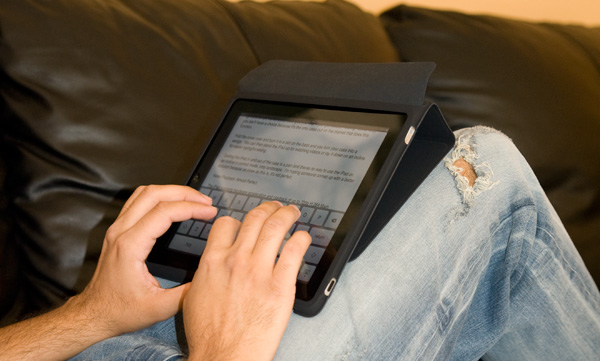
It costs $40 and from the texture it feels like you're getting your money's worth. But the light and simple construction also give you that "I just got robbed" feeling. Either way, you don't have a choice because it's the only case out on the market that does this function.
Fold the cover over and tuck it in a slot on the back and you turn your case into a wedge. You can then stand the iPad up for watching videos or lay it down on an incline for easier typing/browsing.
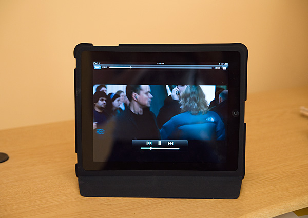
Getting the iPad in and out of the case is a pain and there's always the feeling that you're going to tear it. There's also no way to use the iPad on an incline in portrait mode, only landscape. I'm hoping someone comes up with a better solution because as close as this is, it's not perfect.
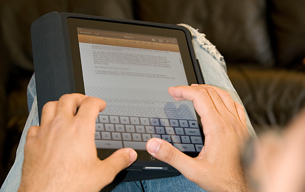
The case wedge doesn't work in portrait mode, unless you like typing on a left to right decline
iTunes, You're Getting Old
Despite every iPad shipping with WiFi, all syncing is still done using a cable and iTunes. The application is quickly bloating into something it was never intended to be. Long term I’m not sure what Apple’s plans are, but I can’t see this being the ideal way to sync your content.
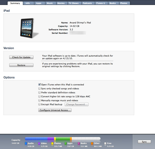
The underlying file system on the iPad, like the iPhone is completely hidden from the user. It's not such a big problem for the phone but on the iPad it does take some getting used to.
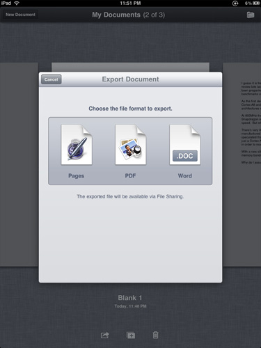
Each application manages storage on its own. Pages for example sticks your docs in a place called My Documents that's only accessible from Pages. You can use Pages to email or export files to PDF, desktop Pages or Word formats. Unfortunately if you don't email the exported file you have to sync it with iTunes in an awkward file sharing section.
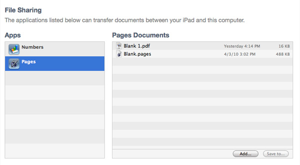
There's no reason Apple can't enable some sort of wireless sharing here as this syncing to iTunes requirement is ridiculous.
The Silicon - Meet the A4
Before the first iPad was ever unboxed, photos had already leaked of its dissection. Admittedly, I was relieved as it meant I didn’t have to risk destroying mine to figure out how to get inside the chassis. Why was getting inside Apple’s new tablet such a big deal? Because it’s using Apple’s brand new SoC.
It’s called the A4 because it is the 4th generation SoC designed by Apple. That would make the silicon in the iPhone 3GS the A3, the A2 would be what’s in the iPhone and perhaps A1 was an older iPod chip? Either way, the A4 was the first we heard of Apple’s naming system.
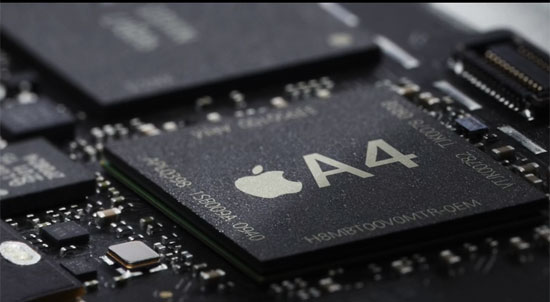
For months leading up to the iPad announcement everyone assumed that Apple’s acquisition of PA Semi meant that the company was going to ditch Samsung and come forth with its own killer SoC. Would it be an out-of-order Cortex A9 design? Or would it be truly custom, similar to what Marvell or Qualcomm have done with their Armada and Snapdragon lines?
As with everything involving the iPad, rumors of the device’s silicon ran rampant. But the idea of Apple doing their own microprocessor architecture for the iPad was disappointing to me. To understand why, we have to look at Apple COO, Tim Cook’s recent statements on why Apple has been successful:
“We are the most focused company that I know of or have read of or have any knowledge of. We say no to good ideas every day. We say no to great ideas in order to keep the amount of things we focus on very small in number so that we can put enormous energy behind the ones we do choose.”
Tim was talking about products there, but I believe his statement is applicable to the A4 as well. Apple is not a microprocessor company, nor does Apple want to toss its hat in with the likes of Intel, NVIDIA, Qualcomm and TI as an SoC maker. History has shown us that the only way to be a successful microprocessor company is to be able to subsidize the high cost of designing a powerful architecture over an extremely large install base. That’s why x86 survived, and it’s why the ARM business model works.
Designing high performance SoCs just for use in the iPad and iPhone just doesn’t make sense. In the short term, perhaps, but in the long run it would mean that Apple would have to grow the microprocessor side of its business considerably. That means tons of engineers, more resources that aren’t product focused, and honestly re-inventing the wheel a lot.
The fact that the A4 appears to be little more than a 45nm, 1GHz Cortex A8 paired with a PowerVR SGX GPU tells me that Apple isn’t off its rocker. I don’t exactly know what Apple is doing with all of these CPU and GPU engineers in house, but licensing tech from the companies who have experience in building the architectures is still on the menu.
The A4 is a typical smartphone SoC. It’s got CPU, GPU and DRAM all on a single package. It also appears to be the same size as your typical smartphone SoC, meaning there’s a good chance we’ll see this thing in the next iPhone. The A4 has 256MB of on-package DRAM, just like the current iPhone 3GS SoC. Remember that memory is used for the OS, all applications as well as video memory. It’s a testament to just how lightweight the iPhone OS is.
The iPad and its Performance
Apple knows how to make things feel fast. It’s all about making animations as smooth as possible and making sure that the UI always responds consistently. Apple isn’t perfect in this regard, but it does pay more attention to detail here than most other companies.
On the iPhone, scrolling is always smooth, swiping between home pages feels quick, apps launching are always well animated. The same is (mostly) true for the iPad, but thanks to a faster processor, many of these animations are physically faster. Bringing up the home screen is lightning quick, as is swiping between them. Scrolling is also very smooth, so much in fact that I found myself scrolling through emails and pages just because the animation was done very well.
There are some rough edges of course. While swiping between home screens is nice and fast, bringing up the quick search screen is choppy (not Android choppy, but choppy for the iPhone OS). The same is true for some other apps, particularly 3rd party ones. The latter point makes sense given that developers haven’t had much time with the device, but Apple not ensuring a perfectly smooth UI across the entire OS is telling.
Apple tends to move engineering resources around the company. The iPhone launch delayed the OS X launch that same year. And the iPad launch surely had some impact on other products. Or is it the other way around? Later this week we’ll see Apple preview version 4 of the iPhone OS, which implies a release sometime in the coming months (June?). An on-track iPhone OS 4 release could explain some rough edges with the shipping iPad, as well as why we don’t seem to have a plethora of amazing apps from Apple at launch.
Despite my nitpicking, this thing is definitely faster than the iPhone 3GS and even the Google Nexus One. Surfing the web, loading applications or generally just interacting with the device. Going to a 3GS from a Nexus One feels slow, going to a 3GS after using the iPad just feels wrong.
But with a larger screen you get the desire to want to do more and expect more from the iPad. I would say that in this sense the performance is a letdown. The A4 is speedy but not quite fast enough for this size of device.
| iPad (Apple A4) | Google Nexus One (Qualcomm QSD8250) | iPhone 3GS (ARM Cortex A8) | iPhone 3G (ARM11) | |
| Manufacturing Process | 45nm | 65nm | 65nm | 90nm |
| Architecture | In-Order | In-Order | In-Order | In-Order |
| Issue Width | 2-issue | 2-issue | 2-issue | 1-issue |
| Pipeline Depth | ??-stage | ??-stage | 13-stage | 8-stage |
| Clock Speed | 1GHz | 1GHz | 600MHz | 412MHz |
| L1 Cache Size | ?? | ?? | 32KB I-Cache + 32KB D-Cache | 16KB I-Cache + 16KB D-Cache |
| L2 Cache Size | ?? | ?? | 256KB | N/A |
| GPU | PowerVR SGX | Adreno 200 | PowerVR SGX | PowerVR MBX |
To figure out where the iPad falls in the grand scheme of things I ran a number of web page load tests and browser benchmarks. To remove the internet from the equation, I loaded all pages off of a server on my own network. This is as close to a pure CPU and OS/browser benchmark as we’ll get.
Given that the iPad runs off smartphone hardware, the obvious comparisons are the iPhone 3GS and Google’s Nexus One. The former is based on a 600MHz Cortex A8, while the latter uses Qualcomm’s 1GHz Snapdragon QSD8250 running Android. Oh and there’s just one more thing:
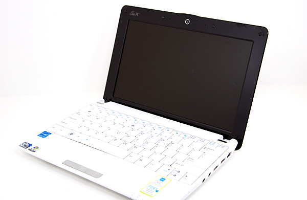
This is ASUS' Eee PC 1001P. Priced below $300 it is the epitome of the netbook. Low cost and functional, but without looking overly cheap. Based on Intel’s Atom N450 processor this should put things in perspective. I ran the same set of benchmarks on it that I ran on the rest of the platforms. I used Chrome running on Windows 7.
| Apple iPhone 3GS | Google Nexus One | Apple iPad | ASUS Eee PC 1001P | |
| AnandTech Front Page | 4.5s | 4.3s | 3.1s | 1.2s |
| CNN Front Page | 5.4s | 4.4s | 3.9s | 2.8s |
| CNN Front Page 3 | 8.7s | 6.8s | 6.3s | 3.5s |
| 2.5s | 2.4s | 2.0s | 1.4s | |
| MSN | 10.5s | 5.1s | 5.0s | 2.8s |
| Yahoo! | 1.9s | 1.6s | 1.4s | 0.8s |
| Engadget | 15.0s | 11.6s | 11.1s | 4.8s |
To make this data easier to read I averaged all of the numbers for each device, normalized them to the iPhone 3GS (in terms of % faster) and put the data in a graph:
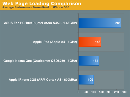
And now you see why I said the A4 does well against smartphones, but doesn’t cut it for the screen size of the iPad. While the iPad is 46% faster than the iPhone 3GS and 14% faster than the Nexus One on average, the Eee PC is 87% faster than the iPad. It is noticeable!
Real world JavaScript performance is also no contest between the A4 and Intel's Atom:
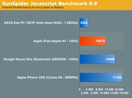
If Apple doesn't have plans to use Moorestown (or a derivitive) in its iPad at some point, I would be sorely disappointed in the company's ability to make intelligent hardware decisions.
I will give Apple credit, the iPad feels quick in most cases, which is probably why the sacrifice to go with a lowly Cortex A8 was made. However, when it comes to browsing the web, there’s a tradeoff. It’s much better reading web pages on the iPad, but it’s much faster on the Eee PC.
The comparison gets more complex when you look at things like application launch times. It takes the iPad 3 seconds to launch Pages, and less than 1 to launch Safari. If the application was previously in memory, the Eee PC can fire up Chrome in less than a second, otherwise it takes longer depending on what Windows decides to do with the disk at that moment. And launching Word from scratch takes much longer than 3 seconds.
Apple is relying on solid state storage and a very lightweight OS while netbooks usually have terribly slow hard drives and a bulky software stack. It’s a ginormous tradeoff. Web pages load quicker on a netbook, but are easier to read/navigate on the iPad.
What Apple absolutely needs in here is an Atom CPU. Apple buys itself a lot of leeway by using a very lightweight OS, but when a web page still takes a dozen seconds to load - you feel the pain. While I realize that Atom hasn't been suited for such an application until now, there's no reason Apple should've picked the A4 over Moorestown. Moorestown can fit in devices far smaller than the iPad, and would make this thing perform more like (and better than in some cases thanks to the OS) a netbook. I laughed when Jobs said that netbooks don't do anything well. While I'd agree a lot of the time, here they do seem to load web pages faster than the iPad.
Honest Apple: Battery Life
I mentioned this in my iPhone 3GS review and I believe it bares repeating: Apple's battery life estimates have been ridiculously accurate over the past couple of years. I swear Apple must have my office bugged because my battery life numbers almost always equal theirs and they have no access to my test files.
To test battery life on the iPad I ran a modified version of the process I use for smartphones. I use the WiFi connection to browse a series of 20 web pages varying in size, spending 20 seconds on each page (I timed how long it takes me to read a page on Digg and came up with 36 seconds; I standardized on 20 seconds for the test to make things a little more stressful). The test continues to loop until the battery dies. This test is designed to simulate a relatively heavy, but realistic data load on the phone. We're stressing the WiFi radio, SoC, memory and display subsystems here. This should also be the sort of battery life you get when you are using any apps that use data (but not 3D acceleration). The display brightness was set to 50% on the iPad.
That's the test I use for smartphones, but to make it a little more stressful on the iPad I continuously played music using the iPod app, one of the only apps that's allowed to run in the background. I also told the mail app to automatically check my AnandTech email account every 15 minutes. I get a good amount of mail so this constant checking would add another realistic component to the workload. I also ran this same test on ASUS Eee PC 1001P:
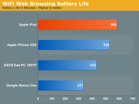
The iPad came in just shy of Apple's 10 hour claim. At 9 hours and 45 minutes, it's long enough to get you through the greater part of a day. But calling Apple's battery estimates conservative is misleading. A single charge won't last you all day.
The iPad does last longer than ASUS' 1001P, however ASUS tells us that the 1005PE will buy you another 2 hours of battery life for an extra $79.
What about watching movies? Our resident smartphone expert Brian Klug put together a 6 hour loop of The Bourne Ultimatum. This was from a 1080p source but re-encoded using Handbrake's Normal profile resulting in a 1.3GB 720p rip that was looped three times.
I imported the movie into iTunes, synced it to the iPad and looped the already 6 hour loop until the iPad died. Display brightness was set to 50%, auto brightness control was disabled, automatic email downloading was also disabled.
Video playback is actually a fairly light use case. In these SoCs there's usually a dedicated video decode block, most likely the PowerVR VXD (same as in the iPhone 3GS). This block decodes each frame and sends it to the display output engine. The only things working in this case are parts of the CPU, the video decode engine, memory bus and the display engine. There's no 3D rendering and the vast majority of the CPU is idle. With this in mind, it's no surprise that the iPad can last 13.6 hours when playing back a 720p H.264 movie.
| Apple iPhone 3GS | Apple iPad | ASUS Eee PC 1001P | |
| H.264 Video Playback | 9.5 hours | 13.6 hours | 5.3 hours |
The iPhone 3GS however can almost hit 10 hours performing the same test. This gives you an idea of how much power the display is consuming on the iPad. The netbook doesn't stand a chance by comparison. The iPad was made for watching lots of movies on a single battery charge.
My final battery life test was a 3D gaming benchmark. I ran Real Racing HD on the iPad (and Real Racing on the iPhone) until the devices died. The cellular network was turned off on the iPhone 3GS and brightness was set to 50%.
Anything GPU intensive is going to be the worst case scenario for these SoCs. Here we’re stressing the CPU, GPU and memory subsystem. The added load is reflected in the battery life numbers:
| Apple iPhone 3GS | Apple iPad | |
| 3D Gaming | 3.9 hours | 8.8 hours |
The iPhone 3GS approaches 4 hours, while the iPad manages almost 9 hours while gaming. I’d also consider this to be a best case scenario gaming benchmark. A more intense 3D game could easily drop these numbers even further.
USB Charging
There's been a lot of discussion about the iPad's ability (or lack thereof) to charge from most USB power sources. Even among accessories, the compatibility situation ranges from relatively to completely uncertain.
Let's start from the beginning though - it isn't like you're going to be unable to charge the thing. The iPad ships with a beefy 10.71 watt (5.1 volt, 2.1 amp) USB power supply and a heartier-than-normal feeling USB dock cable. Given the device's relatively long battery life (as we've already demonstrated), it isn't like charging is going to be something you'll do more than once a day. But Apple has left the charging situation uncharacteristically vague.
We tested charging with a number of dock connector charger accessories we had, and found the state of things confusing. Let's start with the good; Apple's ultracompact USB power adapter, the one shipped with the iPhone 3G and 3GS, does charge the iPad. If you've still got any laying around, the older, larger iPod chargers that have USB charging circuitry also work. Interestingly, both of these power adapters are only rated at 5 watts.
Support for charging from accessories from 3rd parties, however, varies wildly: devices that support firewire-only charging definitely won't work - the iPad lacks that circuitry the same as iPhones and iPod Touches. Other adapters that lack Apple-specific charging circuitry also don't work. Third party battery packs also won't charge the iPad.
Car chargers are a mixed bag - Griffin's PowerJolt SE car charger, sold at the Apple Store, doesn't charge the iPad at all. However, Belkin's Micro Auto Charger (rated at 5 watts), also sold at the Apple Store, does charge. Interestingly, the Griffin has a hard connected dock connector, while the Belkin has a USB termination and aftermarket dock cable - it's likely that the iPad favors USB-based chargers rated at or above 5 watts.

The iPad is picky about its power - it's something of a connoisseur
On the desktop side, charging is even more of a mixed bag. If you've got a PC, you're probably out of luck unless motherboard supports the USB charging specification. Remember that USB 2.0 by default supports 500 mA of current at 5 volts for a maximum of 2.5 watts. From what we've seen so far, at least 5 watts is required for the iPad to charge. Newer USB ports that support the battery charging specification can supply up to 1.5 amps at 5 volts, for a maximum of 7.5 watts. From what we've seen, it's likely that 5 watts is the requirement for USB charging to work properly. Apple's iPad charging knowledge base document mentions that a "high-power USB port" is required for charging, but neglects to enumerate what computers support the standard, or what standard they're calling high-power. Apple notes that "many recent Mac computers" support the high-power USB port charging standard, and that "most PCs or older Mac computers" will charge the iPad when it's in sleep mode.
We tested with a MacBook Pro 2,1 (pre-unibody Core 2 Duo), Mac Pro 4,1 (Nehalem), Latitude XT, and desktop with an EVGA X58 SLI - none of them charged the iPad over USB while powered on or in standby. It's a step backwards that the iPad discharges while syncing, and keep discharging if you leave it plugged into a non-supported USB port. Remember to plug it back into its special beefy power supply, or you'll likely be left without a working iPad.
The iPad a Super Head Unit is Not
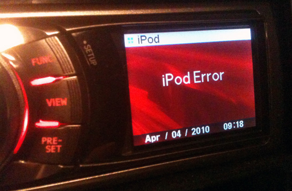
Unfortunately, it looks like the dock connector circuitry on the iPad does not support car head units. We tested with a JVC KD-PDR40 and an Alpine iDA-X001 (which Alpine touts was designed in part with Apple to emulate the iPod interface), and both resulted in the following notification on the iPad:
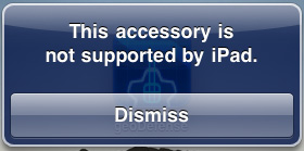
Bad news for people with aftermarket head units
The Alpine iDA-X001 showed the following:
While the JVC KD-PDR40 constantly reported "reading" as its status:

It seems that, for whatever reason, the iPod playback hardware and software playback paths are not present on the iPad. This is disappointing, especially considering the number of car enthusiasts hoping to use the iPad as a super-sized head unit. In fact, much of the initial speculation was that vehicle integration would be part of the iPad's secret sauce. Based on these results, that obviously was never the intention.
Reading Rainbow
The first time you launch the App Store, it prompts you whether you'd like to install the iBooks application. It's puzzling that iBooks isn't installed by default - perhaps it wasn't finished by the time Apple started flashing EEPROMs for production. Whatever the case, Apple definitely wants you to install their books and reading application immediately upon launch. Until something better comes out, there admittedly isn't any reason you shouldn't.
iBooks is fairly minimalist in its initial presentation, there's no organization or categorization to speak of, just virtual shelves that your "books" sit on. It'd be nice to have some organization here, lest the same kind of icon hell happen with books instead of applications now.
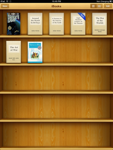
I totally put my real books in bookshelves with their front covers facing out, too
Inside, Apple has crafted a virtual book layout complete with some flashy 3D page turning animations. There's even transparency on the backsides of pages when viewing them in portrait mode.
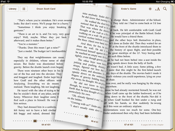
Ooh look at the flashy page turn animations
Controls for brightness, text size, and search adorn the top corner, and a slider at the bottom lets you quickly scrub through the book. You can't flick pages quite as fast as you can in a real book, but it's decently fast. Tapping on words in the body of the text brings up the normal copy dialog, but there's also dictionary, bookmark, and search. Bookmarking puts a faux highlighter mark on the selection, and makes a bookmark. Dictionary pops up an OS X dictionary widget-like popover with the word's definition. Search, well, searches.
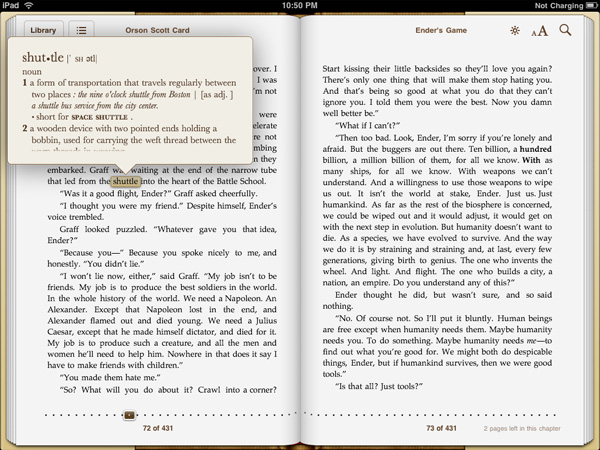
I regularly ride my space shuttle to Boston, er, what?
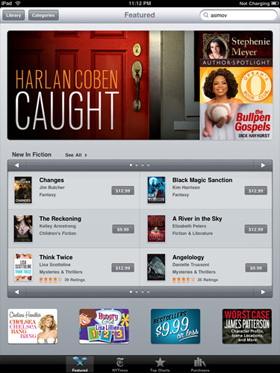
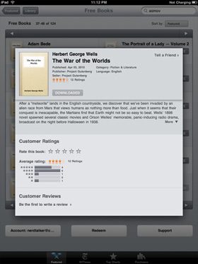
The store itself is relatively limited in scope this far - searching through it for many of the classics I love revealed that they weren't yet included. Free books from Project GutenbergOrganization and appearance is just like the App Store, except with books. That means ratings, categories and featured are all there as well. The reviews themselves are still getting fleshed out; it's a bit unnerving to see one star ratings on timeless classics, but all of that same goodness from the App Store is here in the book store. Nominal price seems to be somewhere around $9.99, though prices are bracketed by the occasional $14.99 or $8.99 book.
 |
 |
Books sync back to iTunes, but you can't open them. In addition, it's apparent that the book store is segmented from the App store somehow, as you cannot buy books in iTunes from the iTunes Store and load them on the iPad. The iBook application fully supports the ePub format for books as well.
Other Reading Apps
If reading through iBooks isn't your thing, there are other ways of consuming print media on the iPad, but for those, you'll have to go install an app.
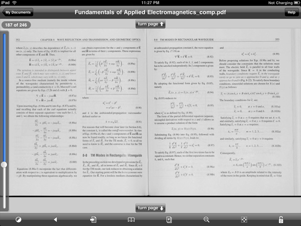
Case in point are PDFs; if left to using the OS' PDF reader, your only options are either browsing online or as email attachments, and both of those get old fast. Though the default reader works, its typical Apple minimalist style leaves out just about everything that makes modern PDF readers, modern. You can view the document; that's it. If you're serious about reading PDFs, one of the best applications for the iPhone was GoodReader, and its developers launched an iPad compatible version day one. Layout is essentially the same as it was on the iPhone version, just larger and more readable.
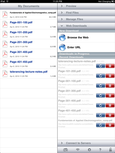
PDFs and Text files can either downloaded from the web or email, or loaded over WiFi, WebDAV, Google Docs, Dropbox or FTP, and are then stored locally. In addition to being noticeably faster than the OS' PDF viewer, there's also an interface complete with bookmarks, search, view, reflow, and even auto scrolling. If you've already got an expansive library of books or notes in PDF form, this is the optimal way to view them for now.

For students, the majority of material is passed down in PDF form; it's nice to finally see a polished document reader for one of the most veteran document formats. In practice, this is the way that iPhone OS' PDF reader should work out of the box.
Of course, there's also the Kindle app which has adopted a similar style to the iBooks app, complete with animated 3D page turns, a grid layout, and the like. It's a great utility if you're already invested in a virtual library of Kindle books. If you haven't seen it by now, there's also the Marvel comic book reader. The iPad's usefulness as a book and print media reader is still evolving, but the primary players are still News.
Media - News
The iPad has become something of a messiah for mainstream print media hoping to finally offer a brave new business model for media consumption. Basically all the major press has their own dedicated newsreader or news-zine application, and this is simultaneously great, and destructive for the platform. On one hand, the iPad is a unique way to consume media tailored to a common device form factor - it's no coincidence that the thing is roughly the size of a magazine. On the other, each of the experiences media venues offer is radically different. One thing is for certain, it's unclear what users will ultimately prefer - tailored experiences delivered through venue-specific applications, or simply getting the same content online.
Of course, there are strings attached in the form of subscriptions. There are two ends of the spectrum here - one offers free media, the other is a subscription or issue based model for all your reading habits. Applications like NPR, Bloomberg, BBC News, NYT, Reuters, USA Today and the Associated Press all offer AD-subsidized or essentially free media consumption. There's the occasional inline or application launch advertisement, but most of it is relatively unobtrusive.
Wall Street Journal, Time, GQ and others instead only offer in-application subscription or purchase. Will people consume media and tolerate the occasional AD, or is subscription the only way to monetize the iPad? The subscription model battle that some media venues are hoping will save their publications will likely be fought partly on the iPad and other converged distribution platforms.
Utility, Entertainment and Social Media
At least thus far, it seems as though a lot of applications have taken a nod from Apple's Mail application design - a quarter width tab at left with information, and a dominant panel for more focus at right. It's obvious that developers used to working on the relatively cramped layout of the iPhone still haven't found the optimal use layout for the iPad's larger screen, but this two panel approach nearly mitigates lack of multitasking for some use scenarios.
The best of example of which is side by side Twitter with web browsing. If any of you are like me, you likely browse with a Twitter client open on one side of the screen and a browser on the other - offering you a glance at what's going on alongside the program in which to view it. This is exactly what TweetBrowser offers, and I think it's the kind of new use scenario that will distinguish the iPad from its smartphone brethren. In time, we'll likely see more efficient use of screen real-estate in other applications, which TweetBrowser does already.
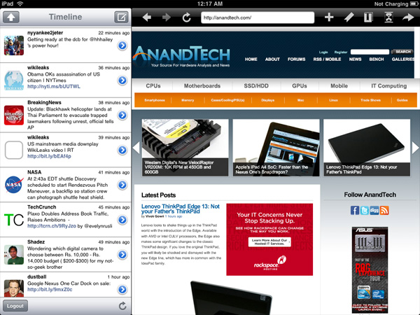
TweetBrowser - Best of all, it's free
Another awesome use of the newfound real-estate is in TweetDeck for iPad. Landscape mode offers a view of all your default tabs and searches, while portrait mode lets uses the vacant space at top to display tweets in detail view, or a browser for links.
Gaming on the iPad
The majority of premiere launch titles for the iPad were gaming focused. Partly because this shows off the device's additional processing power with the A4, but also because the majority are only marginally different from the iPhone version, instead offering native resolution.
First is N.O.V.A. HD, an FPS title that is largely unchanged from the iPhone version except for supporting higher resolution. It runs virtually flawlessly on the platform, despite the larger resolution. The only major annoyance here is that the title doesn't appear to work with any landscape orientation you choose, and Apple's iPad/Case accessory chose the complete opposite landscape view by default.

It's insanely hard to take action screenshots, I discovered
The title performs flawlessly performance wise, though playing an FPS title with look, movement, and fire controls all fighting for your two hands and 10 fingers is still challenging.
Next is Flight Control HD, which continues to do what the original title did well.
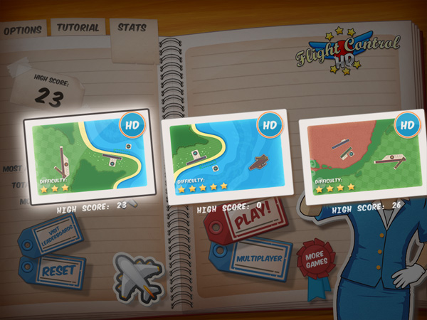
Bigger maps are "HD" - Old maps still linger around too
Namely, cast the player as an air traffic controller managing exponentially busier and busier airspace in a 2D world. It's the same that we've seen before, just bigger, more complicated, and scaled up. It's a high profile game for sure, but the approach is safe. While it'd be pointless to destroy what made the game good, there just isn't anything new that the iPad's form factor contributes other than a bigger screen.
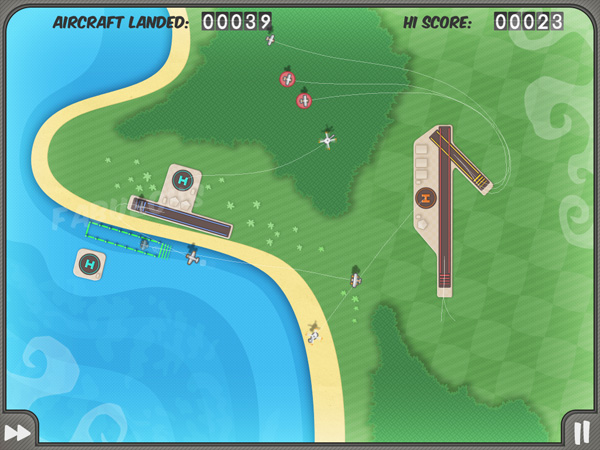
It's easier on the bigger screen, until it throws even more at you
There's also Real Racing HD, which looks very high resolution on the platform, though it too is ultimately dependent on a control scheme that's at times difficult. Rotating the screen to drive makes an otherwise pretty normal arcade style racing game surprisingly difficult. There are plenty of driving assists, including automatic braking, and these ultimately save the game from being too complicated to play easily.

Tilt to drive - that's for steering and gas
Worms has long been ported to the iPhone platform, and although its control scheme is initially challenging, it's probably the one that best leverages the iPad. I found the title difficult for the first few plays, and it's got a steep control learning curve, but execution is fun and engaging. The title also looks very crisp on the iPad, though there was the occasional framerate stutter.

The holy hand grenade remains my weapon of choice
Probably next on the list of engaging titles that offer unique control schemes is Command and Conquer: Red Alert. The iPad's display is finally large enough to really allow developers to make titles that are rich and immerse, and not mere novelties. The game still has a bit of roughness around the edges - sounds are sometimes a bit low fidelity for my taste, and there's a lot of speech events that are very very redundant. But the title is strong when it comes to user interaction.

That selection box was made with multitouch
For example, selecting a group of users can be accomplished by either clicking a box, and then dragging a selection (this is a mouse convention), or by using a multitouch gesture (Yes! Finally!). Three points define a selection square, and units within the square are automatically selected. It's a gesture that's natural, super fast, and the exact kind of new use scenario I want to see more of on the platform. Developers need to re-think every bit of preconceived interaction notions from the desktop. Erase of all of it.

If you sucked at RTS, you'll still suck at iPad RTS
Is the iPad a gaming platform? Definitely. Even if you argue that it isn't a fully fledged, integrated one, iPhone games remain the platform's top grossing commodity. The iPad's larger screen and increased processing power will only further amplify that trend, but only if developers can create compelling UI leveraging the iPad's multitouch screen and lack of hardware buttons. Some titles are going to be challenging to pull off, others lend themselves entirely.
Final Words
Apple drew a line in the sand with the iPad. It set expectations for performance, price point, usability, ergonomics, display and quality of apps. It's rare that Apple does this. Normally Apple capitalizes on the mistakes of those who came before it by using failure as a blueprint for success. The fact that Apple is taking a different route with the iPad does say something about where Apple views this business going. As the computing market grows and incorporates new users, the need for simpler as well as more powerful/complex compute devices grows. Apple appears to be going after the former early on. Perhaps it wants the iPad to be to the tablet, what the Eee PC was to the netbook.
As a piece of hardware, the iPad generally does its job well. We could always use more processing power, which is made more evident by the larger screen and thus higher user demands on the system (Intel did have a point with restricting Atom's usage to smaller screen devices only). The lack of any integrated camera is bothersome but I doubt at this point we'd have a great video chat application to use given the current state of the iPad app union.
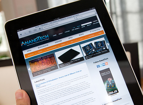
The nickel and diming on accessories is annoying, especially given that you'll probably need at least one of them. Not to mention that you should be prepared to spend at least 10 - 20% extra on apps as soon as you get the device. Apple did a good job with the $499 entry level price point, but the extras and any additional flash memory you might want come at extortionist prices. I don't expect Apple to really do anything about it given there's no competition in this segment right now.
It's an issue because the iPad can't currently replace any existing device you own. It lacks the voice features of a smartphone, and it lacks the flexibility/performance/ergonomics of a notebook. This is a 2nd, 3rd or 4th computer, and as such the expenditure is in addition to your existing computer budget.
Although it doesn't replace any of your existing devices, there are some things the iPad does much better than anything you might own today. Web browsing, photo viewing, reading email, any passive usage scenarios where you're primarily clicking on things and getting feedback, the iPad excels at. You do lose Flash support so if that's an issue to you stop now. But personally, I don't find the lack of Flash a problem assuming that companies like Hulu are working on HTML5 versions of their web portals.
I do like the idea of the away-from-the-PC (or Mac) computing the iPad offers. It's a different type of device; one that's more comfortable to just read websites on, or lightly peruse email with.
I can see myself leaving the notebook at home and taking the iPad on some short trips, both business and personal, as long as I don't need to do any photo editing or publishing from the road. For my purposes, I'm better served by the forthcoming 3G model. But I'd still need my desktop, and I'd still need my notebook for when I needed to get actual work done on the go. This goes back to my earlier point though, the iPad is a luxury, a convenience, not a necessity. It augments my current digital lifestyle and I'd argue that it improves it, but it doesn't replace anything in it.
That could quickly change depending on the types of apps we see crop up for the device. Photographers are already very interested in the device, but you'd win their hearts if you could make the iPad a productivity tool. Home automation is just begging to be enabled via the iPad. Companies like Crestron and AMX supply ridiculously poor touch screen interfaces to their very expensive home automation installations. The iPad would be the perfect HA controller. It's a great information consumption device today, and with the right developers working on it (many of which are) it could be a great productivity device tomorrow.


