Original Link: https://www.anandtech.com/show/1648
AnandTech Guide to Better Photos: Post-Processing
by Stephen Caston on March 18, 2005 3:45 PM EST- Posted in
- Digital Camera
Index
Welcome back to another guide to better photos here at AT. In our past guides, we have looked at techniques that can be applied to take better pictures. In this guide, we will be focusing on ways to improve the photos that you have with the use of Photoshop or Photoshop Elements. If you don’t already have one of these programs, and you are at all serious about photography, you should really consider checking them out. Photoshop Elements 3 is a reasonably-priced alternative to Photoshop CS that offers many of the same features.The quality of a picture right out of the camera will vary depending on the camera that you are using and its internal processing settings. For example, consumer digicams tend to produce images with high contrast and sharpness while higher-end models tend to be more conservative. It is a common misconception that every image needs to be post-processed. Depending on your camera’s settings and partly on your photographic ability, you may find that some pictures will look great right out of the camera. In such a case, there is no need to feel bad for not post-processing your images. However, it is far more likely that when you look through your photos you will see some that need straightening, lightening, higher saturation, red-eye reduction, sharpening, etc. This guide is designed to help you post-process your images with simple steps to produce impressive results. Feel free to work with our samples as we go through this guide. It will help you get a better idea of how each process is applied.
Getting Ready
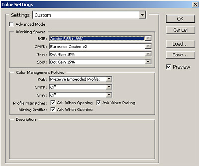
Before we jump right into editing, there are a couple of things that are very important to do. First, we highly recommend making a backup of your original image. Whether it’s to a CD, DVD, external hard drive, etc., just make sure that you have the original in a safe place and only work on a copy. By doing this, you are giving yourself the option to start over with the original. The second thing to do is to set the RGB color space in Photoshop. By default, Adobe Photoshop will use the sRGB color space. If your original images are in the sRGB color space, you can simply leave it as is (most consumer cameras shoot in sRGB). The sRGB color space is best suited for viewing images on a monitor (such as on a web page). Higher-end cameras often have the option to shoot in either sRGB or Adobe RGB. If your images are in the Adobe RGB color space, you should configure your Photoshop working space as Adobe RGB (1998). The reason for this is that the Adobe RGB color space has a much wider gamut than sRGB – meaning that you can work with a larger range of colors.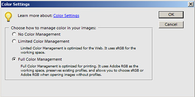
Photoshop Elements 3.0
Click to enlarge.
In Photoshop CS, go to the Edit menu and select Color Settings. As you can see, the color settings dialog in Photoshop CS is a bit more involved than it is in Elements. Here, you will just select Adobe RGB (1998) or sRGB from the RGB pull-down menu in the “Working Spaces” section. If you use Adobe RGB to edit your images and you want to display them on the web, you’ll have to remember to convert the image back to sRGB after editing it (which we’ll discuss later). We should point out that if your images were taken in the sRGB space, you won’t gain anything by selecting Adobe RGB.
Cropping
After backing up your image and setting the appropriate color space, one of the first things that you will want to do is crop the image. At this point, if your image is a bit crooked, we can kill two birds with one stone. Also, since the Crop tool works the same in both Photoshop and Elements, we’ll discuss cropping as it pertains to both versions. In our example below, we will straighten our image with the Crop tool.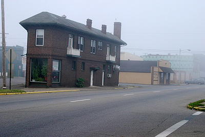
Crooked image
Click to enlarge.
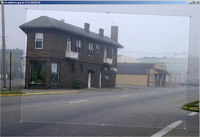
Rotating the crop box
Click to enlarge.
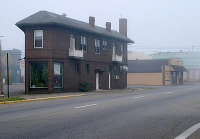
Straightened and cropped image
Click to enlarge.

Options palette
Click to enlarge.
Basic Color Correction
In this section, we are going to discuss one simple way to remove color casts from your images. Although this method cannot always correct heavy color casts, it does a very good job with subtle ones. It can also add a good amount of contrast to your image. This method assumes that your image has a point that should be pure black and a point that should be pure white. If your image is comprised of all subtle midtones, you might want to skip this method.When most people think of color correction, they might think of the “Color Balance” option under the Image/Adjustments menu in Photoshop. Unfortunately, using the “Color Balance” option can be very imprecise. Our method takes the guesswork out of the process so that you can simply find and specify the white and black points of your image. In this method, we will be using the Curves dialog box. Although Photoshop Elements does not offer Curves out of the box, we ran across this interesting website that shows you how to get some Curves functionality in Elements. However, since this Curves manipulation works a bit differently, we will be focusing on Curves in the standard version of Photoshop.
1) Open up the image that needs some color correction and set the view to “Fit to Screen”.

Original image
Click to enlarge.
2) Click the “New Adjustment Layer” icon (half white/half black circle on the layers palette) and select “Threshold”.

Create a new adjustment layer (Threshold)
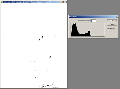
Find the black point
Click to enlarge.
5) Hold down the mouse button over the Eyedropper tool on the Tool palette. Then, select the Color Sampler Tool from the flyout menu.

Select the Color Sampler Tool
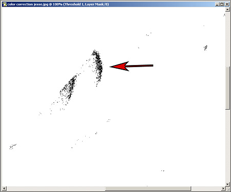
Sample the black point
Click to enlarge.
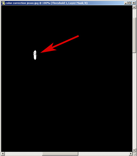
Sample the white point
Click to enlarge.
9) We can either work directly on our image or we can use a Curves Adjustment layer. The benefit of using Curves on an Adjustment layer is that we can always go back and edit the Curves layer or delete it entirely. If you decide to work directly on the image, you will not be able to change the Curves settings later. So, click on the New Adjustment Layer icon and select Curves.
10) The first thing that we want to do is to tell Photoshop how to define “Black” and “White”. Starting with black, double-click the black eye-dropper icon on the left (circled in red in the image below).
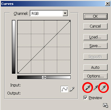
Curves dialog
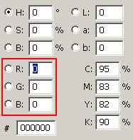
Define RGB values
11) Now that you have defined the RGB values for black and white, we can tell Photoshop where these points are in our image. From the main Curves dialog, select the black eye-dropper tool. Now, move over to your image and click on the sample point for the darkest part of your image. Then, click the white eye-dropper tool and select the sample point on the brightest part of your image. You can also use the “ Set Gray Point” eye-dropper if you have a neutral midtone in your image. If everything went as planned, you should see a difference and an increase in contrast. If you make a mistake at any point and want to start over, simply hold down the Alt key (Mac: Option) and the Cancel button will turn into a Reset button.

Image after setting black and white points
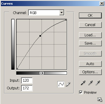
Brightening midtones
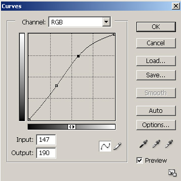
Creating an “S-Curve”
 Before curve adjustment |
 After curve adjustment |
| Click images to enlarge. | |
Levels
Almost every photo can benefit from a levels adjustment. We are going to show you some examples that demonstrate how a levels adjustment can bring life back into your photos. This is particularly effective for images that are too dark. The levels command in Photoshop and Elements allows you to remap the brightness levels in a photo resulting in a high contrast image.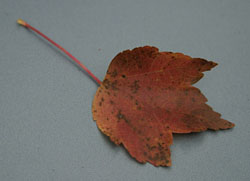
Original image
Click to enlarge.
1) Open the Levels dialog by pressing Ctrl-M (Mac: Command-M). Again, you could just as easily use a Levels Adjustment Layer if you think that you might want to alter it later. The first thing that you will see is a histogram. A histogram displays the brightness of an image starting with the darkest information on the left to the brightest information on the right.
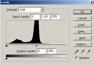
2) Click on the black slider on the left directly under the histogram (circled in red below). Slowly drag the slider to the right.
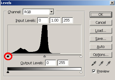
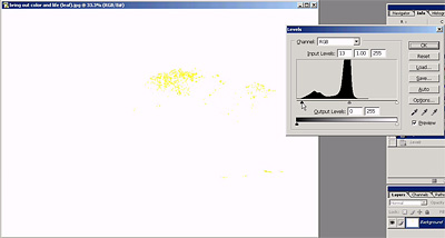
Dragging the black slider to the right while holding “Alt”
Click to enlarge.
Now, use the same technique to drag the white slider to the left and stop just before clipping any color channels. You should already see a tremendous difference if your photo is anything like ours.
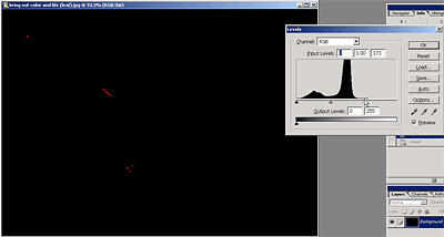
Dragging the white slider to the left while holding “Alt”
Click to enlarge.
Here are the results that we achieved by simply adjusting the black and white sliders:
 Original image |
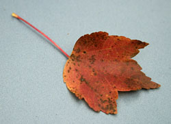 Image after levels adjustment |
| Click on above images to enlarge. | |
 Original histogram |
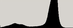 Histogram after levels adjustment |
You can clearly see how we’ve “stretched” the histogram to cover more of the brightness range. This has increased the contrast and given the photo more “pop”. Below is a final comparison where we pulled the white slider just a bit further to the left. Although this causes some slight color clipping, it is hardly noticeable and the effect is just what we wanted.
Red-eye Reduction
Given the time and patience required, everyone could remove red-eye by hand using a paint brush in Photoshop or Elements. The point of this section is to show you how to do it as quickly as possible. Since the technique is a bit different between the two programs, we'll explain the process with Photoshop and Elements separately.Here is the original image we will be working on.
Photoshop (CS)
1) Open the image with the red-eye problem and set the magnification to "Actual Pixels" so that you can get a good look at those red eyes. In our example image, the resolution of the original file is only 1 megapixel, so we are going to magnify the image by 300%. Next, hold the left mouse button down on the "Healing Brush Tool" and select the "Color Replacement Tool" from the flyout menu.
Color Replacement Tool
3) Select a brush that is about the size of the red-eye area and click once in the center.
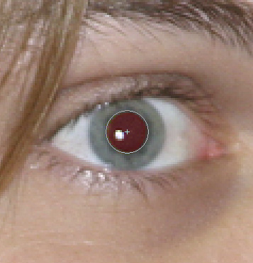
5) As an optional final touch, we like to get the Burn tool from the tools palette to darken the pupils a bit.
Photoshop Elements 3
1) Select the Red-eye Removal Tool from the tools palette.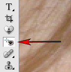
Red-eye Removal Tool
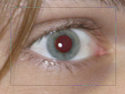
Drawing a box around the red-eye area
 Photoshop CS |
 Photoshop Elements 3 |
| Click images to enlarge. | |
Sharpening
If you didn't know already, one of the best sharpening tools available in Photoshop and Elements is called Unsharp Mask (under the Filter\Sharpen menu). It should always be one of the very last things that you do to an image after editing and resizing. Because sharpening is such an important part of making a good image look great, we are going to give you some basic input boundaries for the Unsharp Mask (USM) dialog. Also, because we often see over-sharpened images on the web, we are going to provide some examples of what over-sharpened images look like.First off, do all your exposure adjustments, color correction, etc. Resize your image for whatever application for which you intend the image to be used. Our example below is going to be used for the web, so we have resized it to 535x800 pixels (the thumbnail is 300x449 pixels).

Original image
Click to enlarge.
2) Open up the USM dialog by going into the Filter\Sharpen menu.
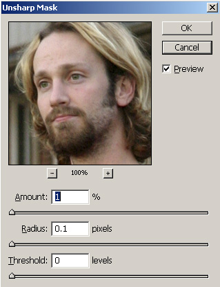
PUSM dialog
3) In the image below, we indicated a moderate Amount of 150%. By choosing a Radius of 1, we were able to bring some definition into the eyes. For the Threshold, we specified 4 to keep the background grain from being sharpened too much.<

Click to download sharpened image.

(Amount 255%, Radius 2, Threshold 6)
Hold mouse over image.
Color Space
Color space is a topic that can and does fill entire web sites and books. In fact, it can easily give some people headaches and hours of frustration while trying to get their images to look the same on different mediums (print, screen, etc.). At the beginning of this guide, we recommended setting the color space to Adobe RGB 1998 if your images were shot in the Adobe RGB color space. Let’s say that you started out editing an image in Adobe RGB, but now you want to upload that same picture to your web site. The most common mistake that people make is to just upload the image without changing the color space to sRGB. Without giving you a headache, we are going to show you how to get your images to look right on the web.First of all, you should know that these color space issues mostly arise from the ability of some cameras (mostly higher-end) to shoot in the Adobe RGB color space. If your camera only shoots images in the sRGB color space, you should just leave Photoshop’s color space as sRGB and be done with it. By doing so, you won’t need to worry about conversion for the web.
Whenever you save an image in Photoshop or Elements, the dialog box will have an option to tag the file with the ICC (International Color Consortium) profile. The screenshot below is from Photoshop CS, but it may not be available in some earlier version of Photoshop.
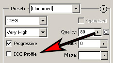
“Save for Web” dialog showing ICC option
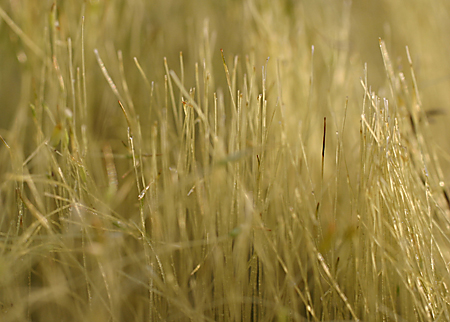
Original image is tagged Adobe RGB
Rollover image is tagged sRGB
Hold mouse over image.
Given that most browsers are not color aware, the only way to win in this color struggle is to make sure that all your images are sRGB before uploading them to the web. Fortunately, this process is very simple provided that you are not using Elements. For some reason, Adobe decided not to include the option to convert color profiles in Photoshop Elements. For that reason, the steps below will only work for the standard version of Photoshop.
1) Open up your Adobe RGB image and select “Image\Mode\Convert to Profile”.
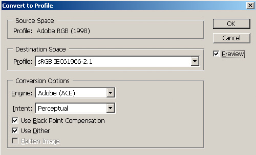
“Convert to Profile” dialog box
That’s it! Now, you can save your image and post it on the web. If you use the “Save for Web” option (to optimize the file size), you can check the “ICC Profile” box to embed the sRGB profile. This will add a little bit to the file size, but this way, you can be sure that people with color aware applications will view the image with the appropriate colors.
Hopefully, this color space thing didn’t give you too much of a headache. After familiarizing yourself with the concepts, it will become much easier to think about color space. Unfortunately, there’s no way around learning this stuff if you want to have consistent color in your images. Now that you’ve read through this guide, we are certain that you can apply some of these ideas to your own images to make them better. Even if you just apply the Levels method, you will be on your way to much more impressive results. In future guides, we have plans to cover more Photoshop techniques and tricks. As always, let us know if there is something in particular that you’d like us to cover. Happy Photoshop-ing!

