Original Link: https://www.anandtech.com/show/10896/the-apple-watch-series-2-review
The Apple Watch Series 2 Review: Building Towards Maturity
by Brandon Chester on December 20, 2016 8:00 AM EST- Posted in
- Apple
- Wearables
- Apple Watch
- Apple Watch Series 2
Back in the first half of 2015 Apple released the first version of the Apple Watch. The Apple Watch was a long-rumored product, often referred to as the iWatch before its release. At the time, it represented the best attempt that I had seen to provide a compelling smartwatch experience, but it was clearly a first generation product with flaws and shortcomings. It was not unlike the iPhone 2G or the iPad 1 in that regard, and for all the things it did well, there were other parts of the experience that really didn't deliver. While this shouldn't have been unexpected given the nature of first generation products, when a device is surrounded by so much hype for so many years, expectations can begin to run wild. On top of that, certain aspects like application performance were not up to the standards that are expected of a shipping product. In our review of the original Apple Watch we concluded that it was a good first attempt, but obviously flawed, and that ordinary consumers should wait for future iterations.
Jumping to the present, Apple is back with the second generation of the Apple Watch, the aptly named Apple Watch Series 2. The launch of Apple Watch Series 2 comes two years after the original announcement of the Apple Watch. Even when you consider the six month gap between the first Apple Watch's announcement and launch, this still represents a longer time between versions than the yearly cadence that we've come to expect for many other products. Having a product in the market for one and a half years is a good span of time to observe how users are making use of it, what features they are and aren't using, and what parts of the experience create friction. For a first generation product this kind of information is essential to make the necessary improvements in future iterations, as taking the product in the wrong direction could doom its future prospects entirely.
In addition to the improvements made in watchOS 3, Apple Watch Series 2 includes a number of hardware improvements. While one might think that specs are entirely irrelevant in a smartwatch, that actually couldn't be farther from the truth. Many of the issues with the original Apple Watch stem from various limitations in the hardware, particularly the slowness of the CPU and GPU. With Series 2 Apple has a chance to address many of these problems. I've compiled a table below with the specifications of both sizes of the original Apple Watch compared to their successors in Series 2.
| Apple Watch 38mm | Apple Watch 42mm | Apple Watch Series 2 38mm | Apple Watch Series 2 42mm | |
| SoC | Apple S1 CPU: 520MHz Cortex A7 GPU: PowerVR Series5 |
Apple S2 CPU: 2 x 520MHz Cortex A7 GPU: PowerVR Series6 'Rogue' |
||
| RAM/NAND | 512MB LPDDR3 (?) RAM / 8GB NAND | |||
| Display | 1.32" 272x340 OLED 450 nit brightness |
1.5" 312x390 OLED 450 nit brightness |
1.32" 272x340 OLED 1000 nit brightness |
1.5" 312x390 OLED 1000 nit brightness |
| Size / Mass | 38.6x33.3x10.5mm 25/40/55g (Alu/Steel/Gold) |
42x35.9x10.5mm 30/50/69g (Alu/Steel/Gold) |
38.6x33.3x11.4mm 28.2/41.9/39.6 (Alu/Steel/Ceramic) |
42.5x36.4x11.4mm 34.2/52.4/45.6 (Alu/Steel/Ceramic) |
| Water Resistance | IP67 "Splash proof" | Water resistant up to 50 meters | ||
| Battery | 0.78Whr | 0.93Whr | 1.03Whr | 1.27Whr |
| Connectivity | 2.4GHz 802.11 b/g/n + Bluetooth 4.0 | 2.4GHz 802.11 b/g/n + Bluetooth 4.0, GPS | ||
| Launch OS | watchOS 1 | watchOS 3 | ||
| Price | $349/549/10,000 (Alu/Steel/Gold) |
$399/599/12,000 (Alu/Steel/Gold) |
$369/549/1249 (Alu/Steel/Ceramic) |
$399/599/1299 (Alu/Steel/Ceramic) |
The exterior design of the Apple Watch is clearly something that has been locked in for several generations. As you can see above, Apple has increased the size of watch slightly with Series 2, but it's not something that can really be noticed in practice, and it doesn't break compatibility with existing watch bands which is good news for anyone upgrading from the original Apple Watch. The water resistance of the case is also greatly improved, having gone from the vague "splash proof" rating in the original model to being rated for water resistance up to a depth of 50 meters. The jewelry-focused gold Edition models are also gone, replaced by a ceramic model at 10% of the price.
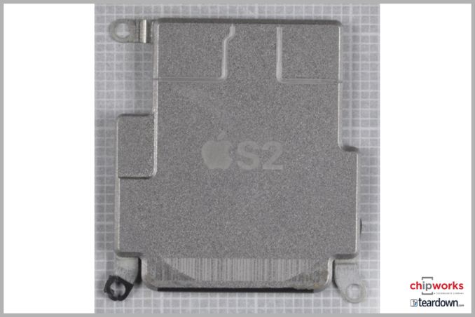
Apple S2. Source: Chipworks
Internally, Apple has made some key changes that have a profound impact on the user experience. The most obvious is the new chip powering the watch. Apple's S2 SiP now has a dual core processor and an improved GPU. Apple rates it as 50% faster for CPU-bound workloads, and twice as fast for GPU-bound workloads. Apple has been known to state smaller gains than the theoretical doubling of performance when moving from a single core to a dual core CPU, and based on some investigation it appears that Apple has simply doubled up on CPU cores, adding another 520MHz ARM Cortex-A7 core to complement the first. Single-core/single-threaded performance appears unchanged, so getting better performance out of the S2 means putting that second core to work.
As for the GPU, this is much harder to pin down. It's most likely the case that the Apple S1 SiP used the PowerVR GX5300 GPU, and I suspect that Apple is using Imagination Technologies' newer PowerVR "Rogue" architecture - likely some variant of the G6020 GPU - in the Apple S2. I say variant, as Apple's recent work with GPUs in their SoCs could be indicative that Apple does not need to use Imagination's reference design.
Like the S1, the S2 is paired with 512MB of RAM. It's again hard to verify that this is LPDDR3 memory so I've marked that as speculative in the chart. I did want to note that other sources have reported 1GB of RAM for the S2, but I am fairly sure that this is not the case. iOS, and subsequently watchOS, provides an API for developers to query the number of CPU cores and amount of RAM available in the device, and it confirms that Apple has not increased the amount of RAM available in Apple Watch Series 2.
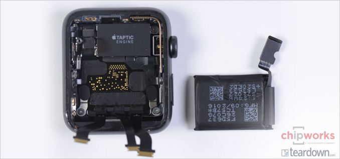
Apple Watch Series 2 42mm battery. Source: Chipworks
Another major internal change is the battery. Apple has increased the battery capacity on the 38mm model by 32%, and the 42mm model by 36%. This will do well to offset the increased power requirements with the introduction of GPS in the Apple S2 SiP. Apple still rates the battery life for Series 2 at eighteen hours, and in my experience you could wear the watch for two days before having to recharge as long as you don't do too many workouts. However, I still charge it each night, and we're still not close to the point where you can wear a smartwatch for a week with both daytime tracking and sleep tracking.
The last major hardware change in Series 2 is the display. Apple still uses a 326ppi OLED panel on both models, with the 38mm casing having a 1.32" display and the 42mm casing being a larger 1.5" display. What has changed is the peak brightness. One of the issues I encountered with the original Apple Watch was an inability to see what was on the screen when there was heavy glare. This was even more pronounced on the steel versions that use sapphire glass, which is more reflective than the Ion-X glass on the aluminum models. Apple rated the original Apple Watch displays at 450 nits of brightness, and with Series 2 they claim to have increased this to 1000 nits, which is an enormous improvement.
Given that the Apple Watch is still a relatively new product, it's likely that many people have still not interacted with one before. Because of that, and the very personal nature of watches, it's worth covering the design in more detail, and so I'll talk about that next.
Design
A watch is deeply personal in a way that smartphones generally are not. A smartphone goes into your pocket, while a watch is always visible on your wrist. Because of this, smartwatches end up being closer to clothing and jewelery than technology from a design perspective, and this makes getting the design right absolutely essential. That being said, smartwatches are not just digital watches that do some extra things, and simply copying the design of traditional watches can end up missing the opportunity to re-think how watches are made when designing a smartwatch.
The rectangular design of the Apple Watch will definitely be a point of contention for some people. Generally traditional analog watches have used a circular face because the clock is made up of vertical poles that are fixed at one point and rotate around it. While mimicking this would be a great way to make the Apple Watch look exactly like a traditional watch, it would also cripple the information density on a canvas where space is already severely limited. On a round display, any application that displays text is effectively limited to the space of a rectangle drawn within the circle, which means approximately 30% of the area is wasted in the best case. Round displays also preclude the use of table view interfaces, which are of immense importance when designing apps for space-constrained devices. Given these issues, it’s not surprising that Apple went forward with a rectangular design for the Apple Watch and its display, even if it puts the Apple Watch out of sync with many regular watches.
The one other area where the Apple Watch departs from the standards of traditional watches is its thickness. To be honest, this hasn’t posed an issue for me in general use, but several people I know have commented on the watch being significantly thicker than their regular watches. In the case of Apple Watch Series 2, the thickness has actually increased from that of the first generation, but I haven’t been able to notice this in practice despite moving from the first generation model to Series 2. As someone who wasn’t used to wearing a watch, getting used to having something on my wrist required a great deal of adjustment on its own, and at some point I simply got used to it being there and didn’t have to concern myself with its mass or thickness.
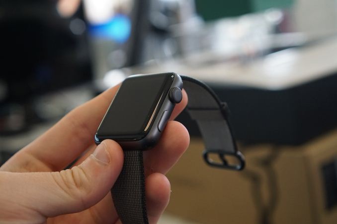
While there are some physical changes like the increased thickness, the overall aesthetics of the Apple Watch Series 2 are the same as the first generation. Although Apple has changed the functionality of the controls in watchOS 3, the watch retains the Digital Crown and action button on its right side. The Digital Crown is Apple’s solution to the problem of touch input on a smartwatch covering up all the content on the screen. It can be used to scroll vertically or horizontally through screens and individual menus, as well as to zoom when contextually relevant. In the context of a rectangular watch this is definitely the best solution I’ve seen so far, but Samsung’s Gear S3 definitely deserves a mention for applying a similar concept to their round watch where the bezel around the screen can be rotated to navigate through the UI. For users who have never had a chance to interact with the Apple Watch, it’s worth mentioning that the Digital Crown isn’t controlled like a knob by pinching it with two fingers and rotating. It has just the right amount of friction to allow rotation by rolling your finger across the top of it, without also running into problems with it being accidentally triggered.
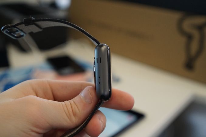
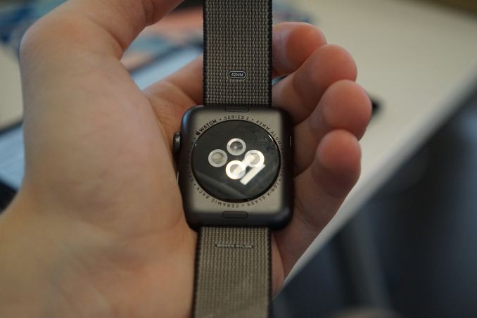
The left side of the chassis has a pair of vertical slits, as well as two drilled holes. Like the first Apple Watch, the slits are for the watch’s internal speaker, which provides much better audio quality than you’d expect from such a tiny device. As for the two drilled holes, the second hole did not exist on the original Apple Watch and was something of a mystery when Series 2 first launched. The original Apple Watch generally did a good job of capturing the user’s voice, but there’s always room for improvement and so I originally assumed that it was for a second noise-cancelling microphone. However, the hole is actually a barometric vent to allow accurate measurements of altitude even with the Series 2’s more waterproof design. Apple does not explicitly advertise that the Series 2 comes with a barometer, but teardowns of the watch have confirmed that it includes one.
Like the original Apple Watch, the casing of the Apple Watch Series 2 comes in three different materials. Unlike the original, these are only segmented into two product lines rather than three. With the first Apple Watch, the aluminum models were the Apple Watch Sport, the steel model were just called Apple Watch, and the gold models were Apple Watch Edition. For Series 2, Apple has consolidated the aluminum and steel models under the Apple Watch title, and the Apple Watch Edition is now a white ceramic model priced at $1249 for 38mm and $1299 for 42mm. $1249 is still quite a bit more than the entry-level aluminum Series 2 model which is $369, but it’s substantially less than the $10,000 starting price of the gold Edition model.
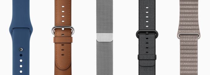
From left to right: Sport, Classic Buckle, Milanese Loop, Woven Nylon, Leather Loop
While the case provides one half of the Apple Watch’s design, the watch bands provide the other. The Apple Watch launched with a large selection of bands, and that selection has grown over time. Our original Apple Watch review was based on the 42mm steel Apple Watch with the silver Milanese Loop band. For this review the watch I was given came with the black Woven Nylon band, which is a newer band that didn’t exist at the time the original model was launched.
To be quite honest, I’m not a huge fan of the Woven Nylon band for the Apple Watch. My original Apple Watch that I bought for investigating app development and familiarizing myself with the operating system was a first generation Apple Watch Sport with a black Sport Band. At a visual level, there’s nothing that’s really wrong with the nylon band, and it’s not uncomfortable to wear. What I dislike about it is the fact that it doesn’t go well with Apple Watch Series 2’s improved waterproofing, because it absorbs water, which makes it unsuitable for activities where the watch will be submerged as the band will be unpleasantly damp for a long period afterward. The sport band didn’t absorb water, and in fact, any water on its surface would drop off within a matter of seconds.
The Woven Nylon band also isn’t holding up as well as my Sport Band did, with the stitching becoming worn at the edges as well as where the plastic pin passes through the holes in the band to complete the loop. I would suggest opting for the model with the Sport Band when purchasing the Apple Watch, and if you’re looking into additional bands, I think the Classic Buckle, Leather Loop, and Milanese Loop bands are nice steps up from the Sport Band without breaking the bank. Series 2 is also completely compatible with existing bands, so if you’re upgrading from the previous model you don’t need to buy new bands unless you're also changing the size of the case.
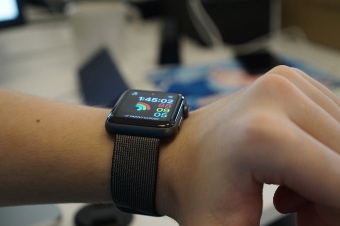
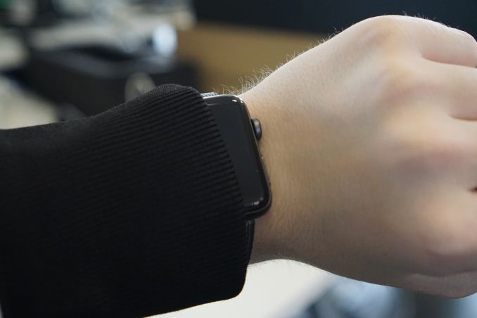
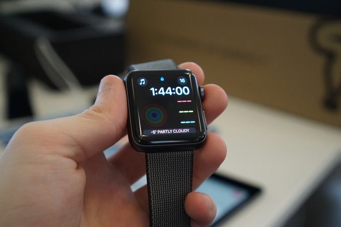
Smartwatches are not compatible with winter clothing
Apple Watch Series 2 carries on the same design as the original model. If you’re not a fan of wearing a watch, or you didn’t like the original Apple Watch’s design, Apple Watch Series 2 isn’t going to do anything to change your mind. If you’re a fan of Apple’s design direction with the Apple Watch, then Series 2 will keep you happy. Based on Apple’s history I don’t think it will be surprising to see them aggressively drive down the thickness of the case in a later version, but right now the battery life constraints of a smartwatch mean that this sort of form-factor and case size won’t be going away in the near future.
Display
On the surface, the need for a good display on a smartwatch may not be as evident as the need for a good display on a laptop or a smartphone. After all, your watch is tiny, you don’t do any color-critical work on it, and you generally only glance at it for short periods of time. However, even from the perspective of sharpness alone, the difference between a good smartwatch display and a poor one is immediately evident. While smartwatches go beyond the functionality of a traditional watch, at the end of the day they exist to tell the time, and in many cases they do so by mimicking the interface of an analog watch. When trying to digitally represent a physical object that everyone is familiar with, any issues in the representation will be obvious. In the case of a watch, you have to render thin straight lines with a level of sharpness that is competitive with a physical object that will obviously not have any sort of aliasing at all.
To give some perspective, I wore the Huawei Watch back in 2015. It has a 1.4” 400x400 circular OLED display. This gives it a pixel density of 286ppi, which doesn’t sound that bad for a watch. However, that’s 286ppi on a PenTile OLED display, which is significantly different from 286ppi on a standard RGB display. When you factor in the artifacts that PenTile causes on the edges of lines, along with the reduced red/blue resolution, it’s really not an exaggeration to say that the rendition of lines and text on that screen is, at best, equivalent to Android devices from six or seven years ago with 200-230ppi RGB displays. This is clearly not a sufficient level of sharpness to mimic the interface of an analog watch, and it’s certainly not suitable for rendering fonts at the small sizes required to fit information onto such a small display.
In designing the original Apple Watch, Apple was clearly aware of the issues that would arise if the display did not have a sufficient level of sharpness. At the same time, the Apple Watch was Apple’s first device with an OLED display, and using OLED has traditionally come with the issues of the PenTile subpixel arrangement that I outlined above. In designing their own OLED display, Apple managed to avoid these issues by pushing a pixel density equivalent to that of their iPhones, while also avoiding the use of a PenTile subpixel matrix.
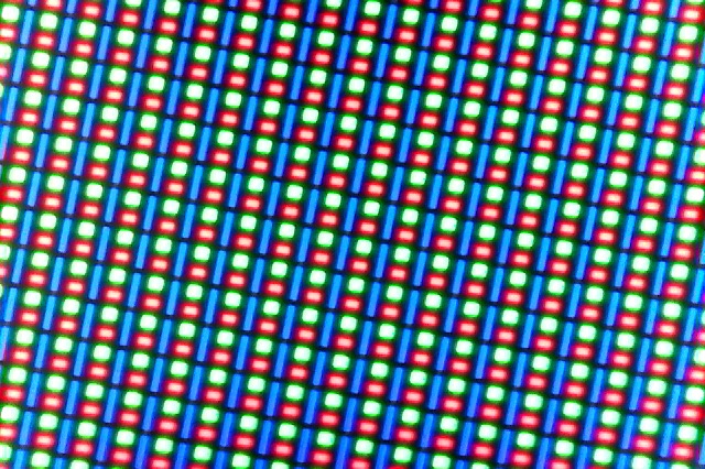
The image above shows that Apple’s subpixel arrangement does have three subpixels for each pixel, which means that the red/blue resolution is just as high as the green resolution. This arrangement is similar to that of Samsung’s S-Stripe pattern, which uses three subpixels per pixel but with different sizes for each subpixel, and an arrangement that places the blue subpixel vertically where the green and red subpixels are horizontal, rather than having all three oriented in the same way. This arrangement is not perfect, and it does have some visual issues that are not as obvious on a typical RGB display, such as more noticeable chromatic aliasing on the edges of lines. However, the overall sharpness is essentially equivalent to that of a standard RGB display, and in practice the Apple Watch is far sharper than any Android Wear watch that I’ve seen, with the only true competitor being Samsung’s Gear S2/S3 which sports a 302ppi S-Stripe AMOLED display.
As I mentioned before, nobody is going to do any color-critical work on their Apple Watch. However, we’ve seen in the past how Apple values color accuracy across their devices, and the first generation Apple Watch was actually more accurate than many smartphones at the time. If you’re going to ship a color display, it’s worth trying to achieve some level of color accuracy so applications will actually look like they did when developers and designers created them on their own calibrated monitors. The Apple Watch also allows you to view photos synced from an iPhone, and it’s not a good experience to have photos look wildly different based on the device they’re viewed on.
Testing display accuracy on the Apple Watch presents issues that don’t exist on smartphones, with the most significant being that you cannot manually set the brightness. The display has three brightness settings, but this just serves to bias the auto-brightness curve, and you cannot actually set a fixed brightness like on a smartphone. This doesn’t really present a usability concern, as the auto-brightness algorithm works very well, and manually setting brightness would just lead to situations where the display is too dim or too bright for the environment. However, it does make it challenging to match our standard testing brightness of 200 nits. Fortunately, I was able to create a lighting situation that set the display to 203 nits and kept it there, and from there I was able to use an application I created for our internal use to run through the display patterns without the display shutting off and adjusting its brightness accordingly.
The first area I wanted to tackle was the display’s peak brightness. The first Apple Watch had a peak brightness of around 450 nits at 100% average picture level (APL). This means that when the display was pure white the brightness was 450 nits, and the nature of brightness on OLED displays means that in many scenarios the brightness was actually higher than that due to watchOS’s dark interface style.
With Apple Watch Series 2, Apple is advertising a peak brightness of 1000 nits. This is quite a claim, and the instant I heard it I suspected that it would not be applicable at 100% APL. It’s worth noting that Samsung reached such brightness levels on the Galaxy Note 7, but this only occurred when the display APL was 1%, which means that the display output was equivalent to 1% of pixels being white and the rest being completely black, which is a worthless data point because such a scenario would never occur.

As you can see in the chart above, Apple is actually able to reach this level of brightness with an APL of 50%, which means that half the display was lit up to 100% white and the other half was black. This is very impressive, and as I mentioned above, watchOS often is much darker than that, so this level of brightness can generally be achieved by the display when necessary. I cannot keep the display awake long enough in order to see how long this can be sustained, but that’s also indicative of the Apple Watch’s interaction model making it unnecessary to sustain this level of brightness for a long period.
As for the display at 100% APL, it still reaches an impressive 778 nits. This is much brighter than the first generation Apple Watch, and the difference in visibility outdoors is immediately apparent when comparing the two.
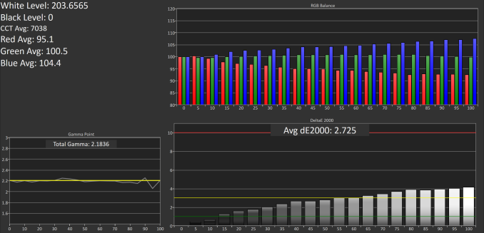
Next up is our standard greyscale accuracy test. It’s clear that the Apple Watch is skewed toward blue, which is interesting given that the blue emitters have the shortest lifetime and are the least efficient, so I’m unsure why Apple would calibrate the display in this manner. However, the gamma is quite straight, and tracks closely with the target of 2.2. Ultimately the average error is below three, and most of the error comes from the bias toward blue. I cannot think of any scenario where this would pose a usability issue, and it’s actually impressive to see Apple putting this level of effort into calibrating their watch.
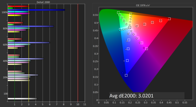
Saturation accuracy is generally quite good. The errors with blue contribute to most of the overall error, with all other colors coming in at a DeltaE of three or lower. The overall error is 3.02, and if blue was more accurate it would be significantly lower. It’s worth noting that the accuracy is very similar to that of the original Apple Watch unit that we reviewed, and I’d be interested in finding out why Apple is calibrating the displays in this manner.
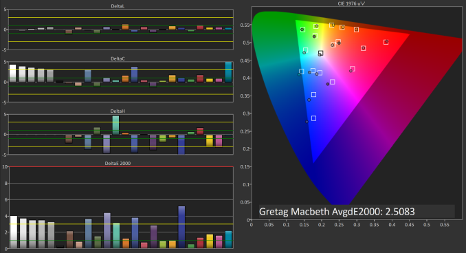
Finally, we have the GretagMacbeth ColorChecker test, which examines the accuracy of a selection of surface colors that occur naturally. In this test Apple Watch Series 2 also does very well, with an average error that would probably be suitable for amateur photo work, and much better than one would expect from a watch. The major errors are in the greyscale shades and colors that have a significant blue component, which isn’t surprising when you consider the results of the greyscale and saturation tests.
The original Apple Watch’s display was quite impressive for a first-generation OLED display from Apple, as well as Apple’s first ever smartwatch. At the time, the one major issue with the display was that the peak brightness wasn’t enough to overcome reflections on the display, especially when outdoors. This was especially true of the sapphire models which have a higher reflectance than the less expensive models that use standard glass on the display. Apple Watch Series 2 basically overcomes this by pushing the brightness to a level where it can overcome the reflections on the glass. The display could definitely benefit from an improved anti-reflective coating as well, but simply pushing brightness does work as a solution on its own.
Given Apple’s recent improvements in display technology, the one area I expect to be targeted for improvement is the color gamut on the display. Again, this honestly isn’t that relevant on a watch, but it mostly comes down to maintaining the same rendering across all Apple devices. With Apple deploying their Display P3 color space on their Macs and iOS devices, it makes sense to bring it to the Apple Watch as well so designers can use the same set of colors across all devices. At this point I think it’s merely an issue of power consumption, as we’ve seen that properly tuned OLED displays can handle covering the gamut defined by DCI-P3 with little difficulty, but pushing a wider gamut incurs a power penalty that a smartwatch can’t really afford.
Beyond that, I really can’t find anything wrong with Apple Watch Series 2’s display. The display of the original Apple Watch was already very impressive, and Apple Watch Series 2 is even more so. As far as sharpness goes, Apple is still leading in this space, and they can now push the brightness higher than an OLED TV with HDR support. It’s honestly kind of crazy that this is the level of quality that one can expect from a watch, especially because you aren’t even guaranteed it on smartphones or computers that cost substantially more.
Rethinking watchOS
watchOS 1 was good as a first attempt at creating an operating system for smartwatches, especially when one considers that the idea of what a smartwatch is was still up in the air at that time. However, there were obvious issues with the interface, and when I think about the changes that Apple has made since that time it’s apparent to me that these issues stemmed from that unsureness about what would actually define smartwatches as a product. watchOS 2 didn’t really make many big improvements to the overall UI and interaction model on the Apple Watch. It only came out around half a year after the launch of watchOS 1, and much of the focus was on fixing the really serious flaws in the operating system, as well as deploying the WatchKit API so developers could design applications that actually run on the Apple Watch's hardware instead of remotely on the paired iPhone.
With watchOS 3, Apple is taking the opportunity to re-evaluate initial decisions made about how watchOS works. After one and a half years since of the Apple Watch being in the hands of consumers, there’s a better understanding of how users actually use smartwatches. It turns out that some of the big features that Apple advertised with the original Apple Watch have basically gone unused, and have been de-emphasized in the operating system as a result. In doing so, Apple has opened up parts of the interface for new features to be added based on what features users actually do utilize.
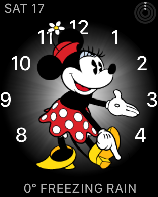
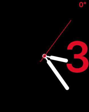
When upgrading to watchOS 3 or starting up a new Apple Watch, the interface looks just like watchOS 1 and 2. However, there are some obvious changes that Apple has made, starting with the addition of new watch faces and complications. There are two new Activity watch faces, along with a Minnie Mouse watch face to complement the existing Mickey Mouse face, and a new minimalistic watch face called Numerals. Apple has also made it easy to switch between watch faces by swiping from the edges of the display. I’ve found this to be quite useful, as I like having the Activity Digital face available, but it’s quite dense with information so I often use the Numerals watch face and swipe over to Activity in a situation where it’s more relevant. This wouldn’t be feasible with the previous model of force touching the display and swiping over to another face, which still exists but is really only useful to access the customization options for each face.
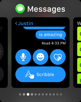
Beyond the watch faces, users will notice changes when they first try to open the old glances screen or the friends screen that was triggered by the pill-shaped button on the side of the case. Both of these functions no longer exist in their original form. In the case of the friend screen, you can now send messages and use Digital Touch to communicate with anyone via the Messages app. This definitely makes it more difficult to access these features compared to before where it was a single button press away, but in my experience the only time I ever saw that screen was by accident when the watch failed to recognize my double tap on the side button to access Apple Pay.
As for glances, the screen has been removed from the operating system, but the core idea lives on in another form. In theory, glances provided a way to quickly access relevant information from applications. In practice, they often ended up being a strange middle point between the concept of a complication and a full blown app. In some situations, they would display information relevant to the current context, like the current song in the now playing glance, or the weather in the weather glance, and you could tap them to open their associated application. Others like the heart rate glance didn’t have any associated application, and basically acted like an application that was only accessible from the glances screen. There was also the issue of applications not being loaded when tapping on a glance, which would lead to a huge delay and sometimes a loss of context when the application finally loaded.
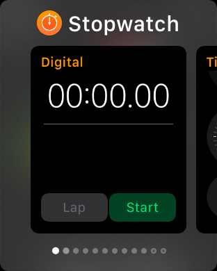
watchOS 3 introduces a new app caching model that makes glances obsolete for the most part. However, it’s still necessary to have a way to quickly access commonly used applications. To solve this problem, Apple has introduced a new app switcher called the Dock which can be accessed using the pill-shaped button that was previously used to access the friend screen. This screen can have up to ten applications which are selected by the user, plus one slot for the most recently used application that isn’t pinned in the list. These applications are kept cached in memory, which means they can be rapidly resumed when opened. This provides quick access to common applications, while also solving many of the issues that the Apple Watch has had with long app load times. In general, you’ll only use a small number of Apple Watch applications frequently, and being able to keep ten of them cached in memory with near-instant loading alleviates the load time issues for those key applications.
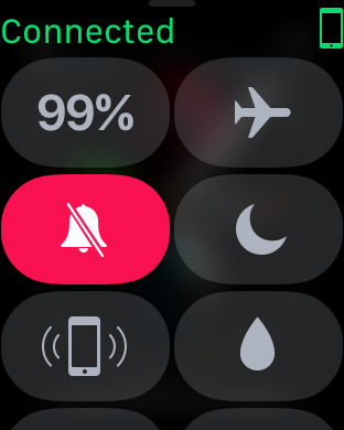
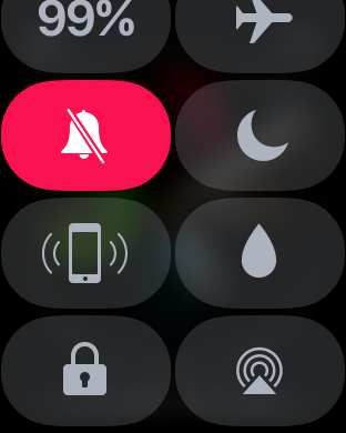
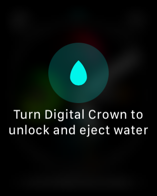
With Glances gone, Apple was able to make a new screen accessible by swiping up on a watch face. The new screen is essentially a version of Control Center for watchOS, and it expands upon a similar feature that existed in the Glances screen in previous versions of watchOS. By implementing the screen more like an application and less like a glance, Apple is able to add more functionality by making it a scrollable layout. There’s now a view that displays the current battery level, which is useful now that there’s no Glance to provide the same information. There’s also a button to manually lock the watch, and on the Series 2 a button that is used to eject water from the casing via the speaker after the watch has been submerged.
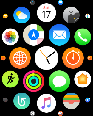
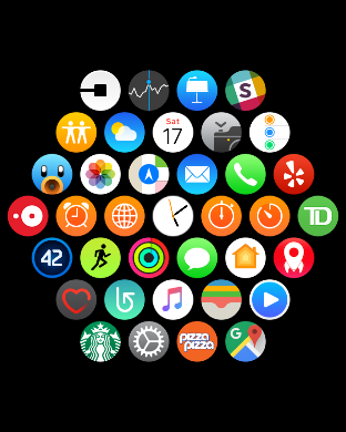
Pressing the Digital Crown still brings you to the Carousel screen, but as I mentioned above, the Dock provides access to most of the apps that a person uses frequently, so it’s not often that one has to go to the Carousel and try to tap on tiny icons to open apps. With that in mind, it is kind of odd that the button which is most analogous to the iPhone’s home button brings you to a screen that you rarely want to go to, but I suppose that the removal of the friend screen meant that putting the Dock in its place was the most reasonable decision rather than also changing how Carousel is accessed just so the Dock would be tied to the Digital Crown.
In general, the new application caching in watchOS 3 has made applications genuinely useful where they weren’t previously simply due to long load times or issues with the app never loading at all. The improvements made to the SiP in Series 2 also play a large role in speeding up app load times when apps aren’t cached in memory. However, as someone who used the original Apple Watch on watchOS 1 and 2, the awful performance back then has essentially conditioned me to not use applications on the watch, and I’ve had to actively think about using the apps on the watch now that they’re actually reliable. This won’t be an issue for new adopters, but I think anyone who is familiar with the original app experience on the Apple Watch will have the same aversion to using the apps that I do. In that sense, it’s important for Apple to maintain the quality of the user experience in order to mend the trust of users who were turned away by the problems that existed in the past.
Health and Fitness
The original Apple Watch definitely emphasized health and fitness as part of the experience, but I think Apple actually underestimated how significant its role would be. There are many fitness trackers on the market, and many sell for a fraction of the price of a smartwatch. A smartwatch is not a dedicated fitness tracker, but users expect that it will be as useful for tracking health and fitness statistics as a dedicated fitness tracker. Of course, there are limitations in areas like sleep tracking due to the battery life that a smartwatch can achieve, but in general, a smartwatch should aim to be as good as the best fitness tracker in addition to all the other functionality it provides.
watchOS 3 comes with some useful additions related to fitness tracking, with some tying in to hardware improvements made with Apple Watch Series 2. While I’ll be covering these, I also have some thoughts to share based on my own experience with health and fitness tracking on the Apple Watch and how that has impacted my daily life.
When the Apple Watch was first announced I wasn’t sure if it would appeal to me because I was not particularly interested in fitness, and it seemed like I’d be paying for a number of fitness-related features that I wouldn’t use. This was my impression for smartwatches in general, but the Apple Watch was more expensive than the Android Wear devices available at the time. I eventually did get the least expensive model of the original Apple Watch for below its typical price, which I was able to justify as necessary to familiarize myself with the OS and to examine smartwatches as a development platform. At that time, I was still really skeptical that any of the health and fitness features would benefit me.
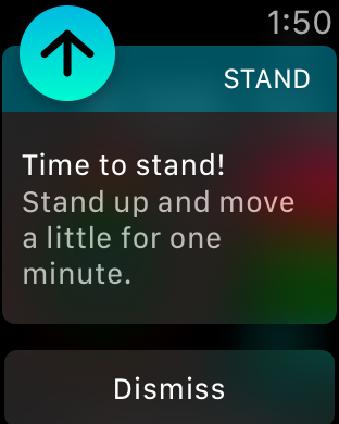
As time went on, I found myself making greater use of the fitness abilities built into the Apple Watch. For example, I originally felt that the reminders to stand up each hour were just a nuisance, but they made me think about how I often spend long periods working at a computer without standing up or really moving at all. At this point I still don’t obey them every time, especially if I’m in the middle of something when I get the notification, but I put in a greater effort than I did when I first got the watch. Similarly, I began to focus more on meeting my other activity goals, and I started using the Workouts application to track my activity when jogging or cycling.
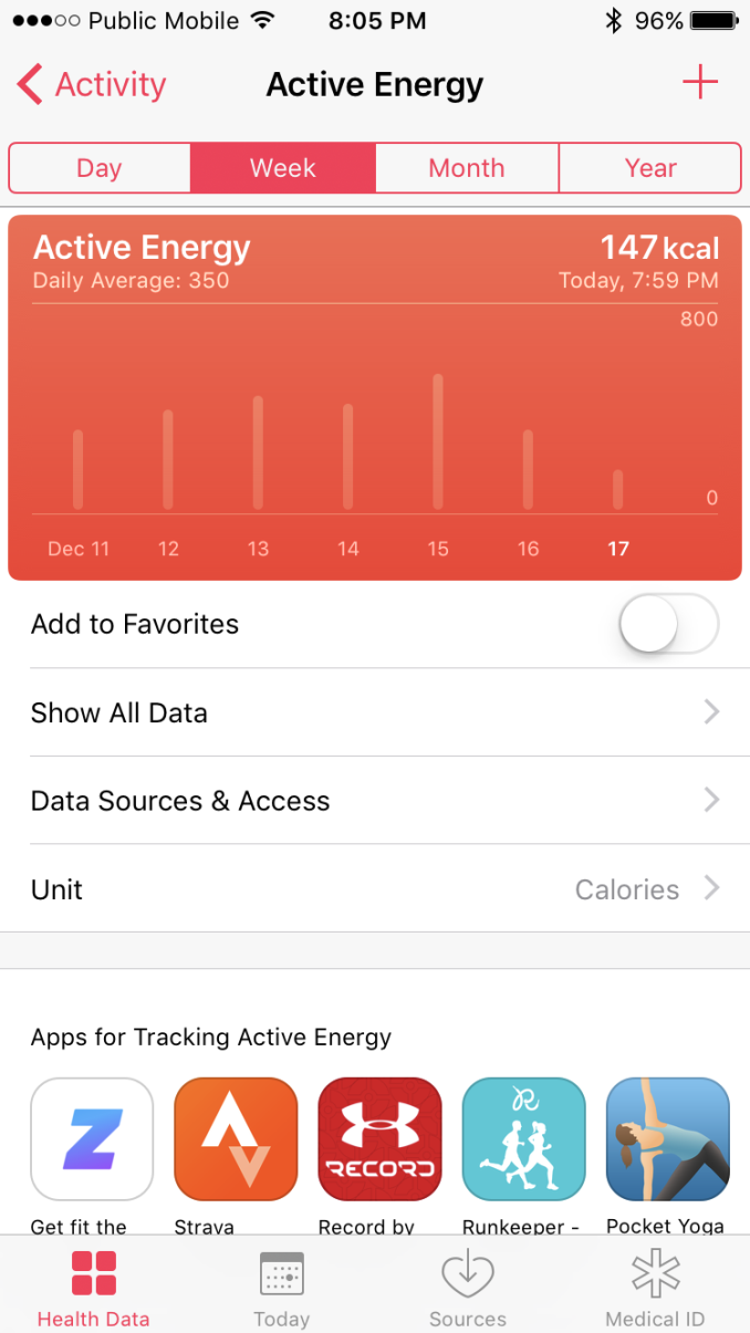
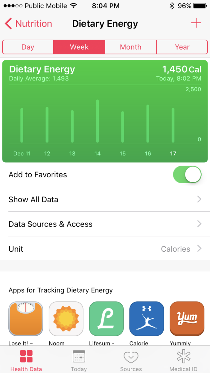
A tipping point for me came earlier this year when I realized that I weighed thirty pounds more than I did one year prior. At that point I realized that I needed to make some serious changes regarding my diet and how much exercise I was doing, and the Apple Watch played a big part in both of these. Due in no small part to drinking large amounts of soda, I was taking in somewhere around 3000 calories every day without even realizing it until I actually did the math. However, as someone who clearly had never really kept an eye on their diet, I had no idea what I should bring that amount down to in order to have an overall deficit.
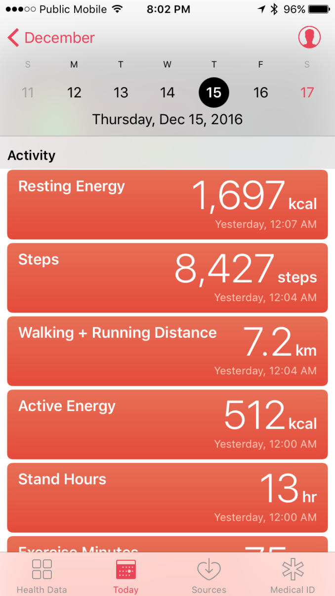
Because the Apple Watch monitors your movement and your heart rate, if you provide the iOS Health application with your mass and height it can provide an idea of your resting and active energy, which gave me exactly the information I needed to set my calorie targets. The Health app also serves as a journal to keep track of my calorie intake, along with specific information about what macronutrients are contributing to it. Combined with the Apple Watch’s Activity goals, I had created a set of health and fitness rules that would put me on the right path to meet my goals. Right now I’m about 75% of the way toward my target body mass, and I can safely say that I don’t have the conviction to keep on track without these technologies constantly keeping me in check.
While this story may not be directly relevant to you, I wanted to share it because I’m confident that I’m not the only one who thought they wouldn’t care at all about the health and fitness features of Apple Watch but discovered that it actually had value for them. Even if you aren’t heavily interested in fitness, the Apple Watch’s activity goals are a fun and non-intrusive way of ensuring that you get enough exercise, particularly as the winter days get colder and staying inside all day becomes increasingly enticing. I suppose the point I’m trying to make is that you should keep an open mind, as you may care about these things more than you currently realize, especially once you have something there to remind you about them.
It's hard to meet your Activity goals when you wake up at 3pm on a cold and rainy Saturday
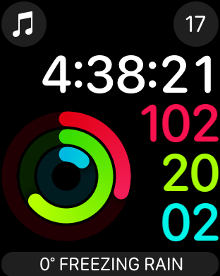
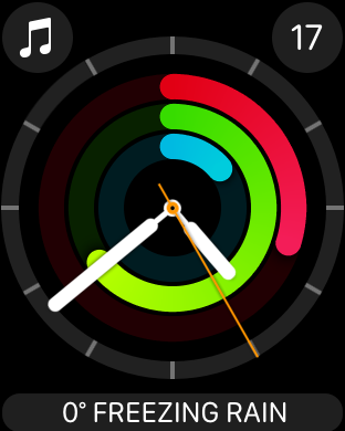
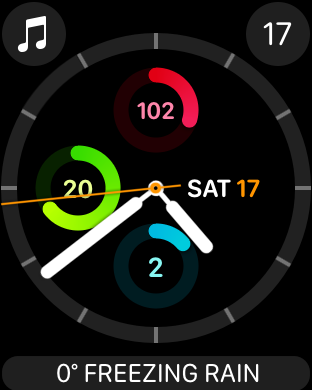
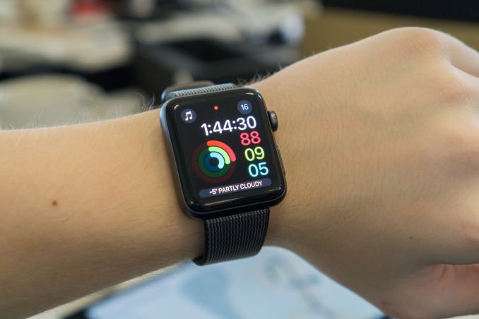
Now, as I mentioned before, watchOS 3 and Apple Watch Series 2 come with some improvements for fitness tracking. I’ve already touched on the new Activity watch faces which put your Activity rings right in your view when you look at your watch. Of course, there was always an Activity complication, but it was much more difficult to check the status for the three individual goals with a tiny complication than it is with a dedicated watch face. Something I didn’t show earlier is that the Activity Analog face actually comes in two styles. The first has the three rings styled as they normally are, with the Move ring encircling the Exercise ring and the Stand ring in the center, while the second places each ring as a subdial. I personally use the first arrangement, but the subdial face is a nice throwback to traditional watches.
Apple Watch Series 2’s improved waterproofing allows it to be submerged at a depth of 50 meters. The original Apple Watch was generally able to survive a short time in the pool or taking a shower, but Apple didn’t explicitly advertise it as anything but water-resistant. With the Apple Watch now being officially waterproof, Apple has been able to add new workouts for open water swimming and pool swimming. I tend to avoid jumping into water in the winter, so I haven’t had a chance to test these modes, but as far as water-resistance goes I never had an issue with the original Apple Watch so I’ve had nothing to fear with Apple Watch Series 2. I did want to go back to the point I made earlier about the bands, as I’ve really been avoiding getting the watch wet due to how unpleasant it is to wear the nylon band after it absorbs water. If you plan to bathe, shower, or swim with Apple Watch Series 2, choose the Sport band.
Another new capability enabled by hardware improvements in Series 2 is accurate position tracking done directly on the watch. The Apple S2 SiP has integrated GPS, which means that it’s not necessary to bring an iPhone along on workouts. When you combine this with the Apple Watch’s ability to store music locally and play to Bluetooth headphones, it really makes it possible to go out for a run with music using only the Apple Watch. I’ve personally done this a number of times using Bluetooth headphones, and with the AirPods now shipping I would imagine that more users will try this out.
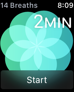
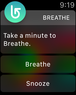
The last new health-related feature that I know of in watchOS 3 is the Breathe application. As its name suggests, this application encourages you to take time to relax and focus on deep breathing. By default, the app will also prompt you every four hours to take time to breathe. The idea behind this is that it can help with managing stress. Based on my own research, opinions are somewhat mixed on whether this is effective, but I did come across some reputable studies that showed a possible relation between this type of exercise and reduced stress. However, I’ve turned it off, and Apple’s quoting of a known charlatan when explaining its purpose at the launch event has done absolutely nothing to give me confidence in its efficacy. To each their own, but Breathe is one Apple Watch feature that I’ve been going without.
Overall, both watchOS 3 and Apple Watch Series 2 bring noticeable improvements in the health and fitness tracking experience. watchOS 3 now allows you to have your fitness goals at the forefront of the UI, and Apple Watch Series 2 gives you true waterproofing and accurate route tracking without the need of an iPhone. Syncing music to the watch means you can listen to music on a run without having a phone moving around in your pocket or strapped to your arm, although until the watch gets cellular you won’t be able to escape needing the paired iPhone for everything. Even so, Apple is definitely trying to hit and exceed the standards of the best fitness trackers, which is essential in a good smartwatch.
Designing Apps For watchOS
The Apple Watch is one of Apple’s newest development platforms, and the realities of the hardware as well as the nature of how a user uses a watch make it very different from developing for iOS or macOS. Much like iOS, watchOS quickly moved away from the development model that was introduced at launch. The iPhone launched without the App Store or UIKit, and developers were essentially told to make web apps. It only took one year for that plan to go out the window, with Apple introducing the iOS SDK for native apps, which has had a huge impact on the success of the iPhone.
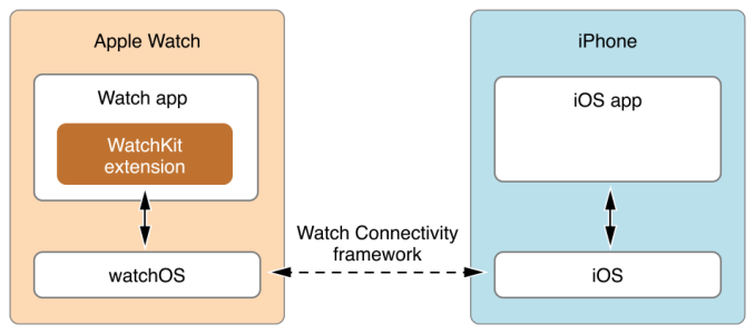
With watchOS 1, Apple’s application model really treated the watch as a remote terminal. Building apps for the Apple Watch really meant building an extension of your iPhone app which would run on the iPhone but display on the watch. The inevitable outcome of this strategy was obvious even before developers started making apps, as there’s simply too much latency introduced when controlling the UI on one device connected via Bluetooth to another device that is actually executing code.
Fortunately, this app model was thrown out even more quickly than the original iPhone’s model of using web applications. The first Apple Watch was released in April of 2015, and two months later at WWDC Apple announced that watchOS 2.0 would support native apps when it launched in September of that year. Of course, supporting native apps was not a silver bullet to fix the issues with applications being slow and performing poorly, which should have already been clear based on Apple’s own applications suffering those same issues at times. However, moving away from the pure extension model did help to improve performance, especially when combined with the new application caching in watchOS 3.0. Essentially, the changes in the application model since the initial release have moved much of the burden for performance improvements onto the hardware, and I’ve already mentioned how much faster the whole experience is on Apple’s new dual core SiPs with their improved GPUs.
Having experience with iOS and Android development, and having been exposed to WatchKit by making our watchOS display testing application, I thought I’d share some of my thoughts on watchOS as a platform for developers. I'm not going to talk much about the API itself, as it wouldn't really make sense for anyone who isn't an existing iOS developer, and anyone who is doesn't need me to give them a watered down half page summary of things they can read in the developer docs. The only thing I will say is that Apple's main competition is an OS where the developer API is in pure C, so from an implementation perspective even the original system for making watchOS apps was years ahead of the competition.
One of the main things I found interesting about developing for watchOS is how interfaces are designed. In hindsight, the original decision to used fixed layouts for iPhone applications was an incredibly shortsighted and poor choice. No doubt many users remember letterboxed applications on the iPhone 5 due to fixed 3:2 layouts being shown on a 16:9 display, and even now there are iPhone apps and iPad apps that have to be upscaled to work on larger modern devices even if the aspect ratio matches, because their interfaces were designed for a single resolution.
The Apple Watch puts Apple in an interesting position. On one hand, they don’t really need to worry about people’s wrists getting larger, and so the size of the display isn’t going to change significantly. On the other hand, there needs to be some room to change things if needed in the future, and the Apple Watch already comes in two sizes with two different resolutions, which means there’s more variety in the displays now than there was for the first three years of iOS devices. The solution Apple has settled on is somewhere between the fixed layouts of early iOS applications, and the pure constraint-based layouts of modern iOS applications that use Auto Layout.
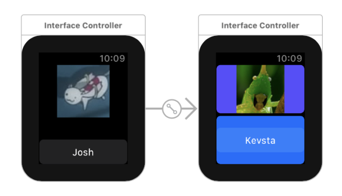
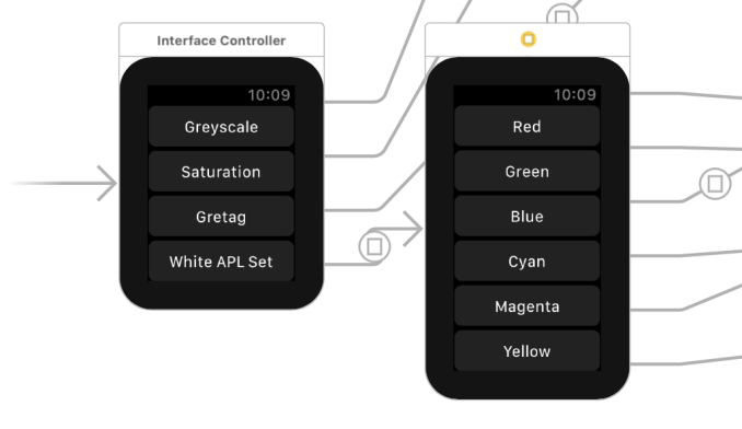
When positioning the UI elements in an Apple Watch application, you essentially get to choose the horizontal and vertical alignment, along with some attributes related to the size. You can set a fixed size, but this is generally only a good idea for images and other bitmaps where there really is an intrinsic size. For other situations, it’s best to just let the system size a control to fit the content, or if setting it directly, by sizing it relative to the size of the container to avoid the pitfalls of hardcoded sizes should the resolution or size of the display change in the future. Apple also provides groups, which allow you to divide the screen into sections that other controls can be positioned within. This can be helpful when trying to align something in a way that the standard top/left/right/bottom/center options for positioning relative to the entire screen don’t accommodate for, while still making a layout that works independently of the display size and resolution. On the right side of the image above you can see a case where the screen is split into two containers and objects are aligned relative to that.
Another interesting thing about UI design on the Apple Watch is that layouts have implicit vertical scrolling. Vertical scrolling has always been needed on mobile devices due to the limited space available, but this has always been something that you have to actively implement, generally through the use of a UIScrollView or the more structured UITableView and UICollectionView classes. Most mobile applications make use of these, even apps like the iOS weather application where the customization of the cells is so heavy that you don’t even see the UI as being a table. However, if you do not make use of these, the interface will not automatically allow for scrolling if you position views off the edge of the display.
Because the amount of space on the Apple Watch is so limited, Apple essentially treats every screen like a scrolling view if needed. A standard TableView API is provided for cases where you actually want to structure things in table form, but for all other cases you can simply place as many elements stacked vertically as needed to construct the interface, and the system will make it scrollable if needed. Xcode’s Interface Builder also makes this fairly obvious by extending the size of the preview to indicate that they can’t fit within the standard area. In addition to vertical scrolling on a screen, the process of implementing paging so users can swipe horizontally between screens involves zero lines of code and can be done within a few seconds in Interface Builder.
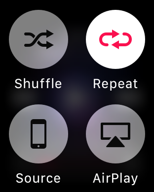
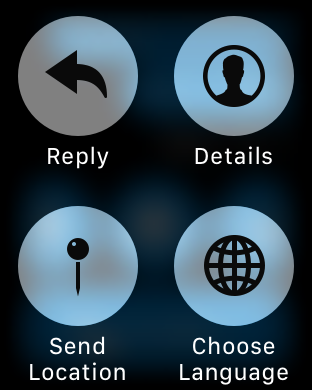
Of course, not everything about the watchOS interaction model is perfect. As I mentioned earlier, Force Touch often ends up being a way to implement mystery menus that the user won’t discover naturally. As long as you follow Apple’s guidelines of using Force Touch to implement navigation between sections or contextual commands you’ll generally be okay once users discover how Force Touch works in your app, but that doesn’t solve the problem of users having to consciously Force Touch in every single new app just to figure out if it’s implemented, and what function it performs if it is. The very nature of using Force Touch to bring up these menus leads to this situation, as there are no visual cues that allow the user to discover the menu through other means. This may just be one of the limitations when adding functionality to a device with such a small amount of space on the screen, but I still feel that there has to be a better solution than this.
Despite my misgivings about Force Touch introducing menus with poor discoverability, the interface and interaction models for watchOS are generally well suited to the Apple Watch’s small screen. Apple essentially gives you scrolling and paging views for free, which removes a ton of overhead that would exist if developers had to implement full TableView classes with their data source and delegate objects, and separate page view controllers to manage groups of Interface Controllers. The layout system itself also gives developers sufficient control over the placement of objects on the screen, while also being flexible enough to scale to both sizes of the Apple Watch, and any future watchOS devices that may come in new sizes or resolutions.
Final Words
In many industries, but especially in technology, there's a common wisdom about waiting for the second or third iteration of a product before purchasing it. This is based on the idea that the first version of a product will often be the most flawed or compromised - a product still trying to find its footing - and future iterations will benefit from improved technology, as well as fixes for flaws that were found in early versions. At the same time, there have to be some people who are adventurous enough to adopt bleeding-edge technology, or the first version of a product would simply fail in the market and there wouldn't ever be a second version.
This situation has played out for every iOS and iOS-derived device that Apple has created. The original iPhone was quite a technological marvel, but it was crippled by its lack of 3G networking, and its price was exceptionally high. With the iPhone 3G and 3GS, Apple addressed many of the issues that existed with the iPhone 2G, and by the time of the iPhone 4 the refinement was essentially at the same level that we expect from smartphones today. The original iPad was an interesting idea, but it was quick thick and heavy, and the hardware used at the time was not up to the task of powering such a device, sending it to end of life status after only two major updates. Only one year later, the iPad 2 addressed both of these issues, future versions brought faster hardware and higher resolution displays, and by the time of the iPad Air it reached a level of refinement where further versions have been much more iterative changes.
The first Apple Watch was definitely in the same situation as the iPhone 2G and the iPad 1. It was the first version of a brand new product, bound by serious hardware limitations and many unknowns about how consumers would come to use it. Like the iPad 1 it has received two major OS updates, and I don't expect it to go any farther. I talked earlier about how Apple had an idea of how the Apple Watch would be used, but clearly overestimated the appeal of some aspects and underestimated the appeal of others. The Apple Watch Series 2 focuses more on these aspects such as fitness with its GPS and true waterproofing, while watchOS 3 fixes many of the software issues that existed in the previous two versions.
The Apple Watch is still very much a companion to the iPhone. Even with the addition of GPS, it isn't close to being able to stand on its own. You can avoid bringing along the paired iPhone for workouts, and the watch can pull data from the network in some cases using its built in WiFi, but in general having the iPhone nearby is a requirement to actually do anything. Bringing cellular to the Watch would make it significantly less-dependent on the iPhone, but that also comes with a power and a space penalty, both of which are heavily constrained with a smartwatch.
Even if Apple were to bring cellular to the Apple Watch, I question how beneficial it would be for the experience given the two drawbacks I mentioned above. I can't think of many cases where I don't actually have my phone, so I don't know why I'd pay to maintain an additional cellular line for my watch when my phone was usually available to handle network activity. Additionally, adding cellular wouldn't remove the tight connection between the two devices, as the Apple Watch's settings and backups exist on the paired iPhone, and all of its applications are extensions of iPhone apps. This model makes it clear to me that Apple isn't planning to make the Apple Watch a standalone device any time soon.
As a companion to the iPhone, the Apple Watch works quite well. For me the Apple Watch is a timepiece, a hub for relevant information and notifications, a music player, and a health and fitness tracker. I've long since gotten used to having something on my wrist, and in fact I find myself checking my bare wrist out of habit when I've taken the Apple Watch off. Being able to check the time, the weather, the date, and other information simply by raising your wrist is just a convenience, and it's nothing your iPhone can't do as well, but it's a convenience that I wouldn't want to give up now that I have it.
Using Apple Watch as a music player is probably a more niche use case, but it does apply to me. It really seems like the natural replacement of the current iPod Nano, which is of a similar size. Of course, there's no headphone jack, but I've been using Bluetooth headphones for seven years so that doesn't present a problem for me personally. Even if you use your iPhone for music, the Apple Watch provides a quick way to access playback controls, especially if you have the Music application set as a complication or kept in the Dock. I suspect that more users will end up utilizing the standalone Music playback abilities of the Apple Watch now that the AirPods are shipping to consumers, but only time will tell.
Last, but not least, are the Apple Watch's health and fitness tracking abilities. When the Apple Watch first launched I thought I would just turn these off and forget about them, but my own poor health choices have led to me relying on them to keep myself on track. Having something constantly monitoring me is essential in figuring out how many calories I'm burning on a daily basis, which is how I decide what I'm going to eat. Workouts also provide me with various statistics about my jogging and cycling that I had always wondered about but had never been able to track. As the days get colder, having the Activity rings on the watch face is also a constant reminder that I need to keep active even if I'm staying inside to keep warm. Many of these things basically come down to the Apple Watch pointing out flaws in my personality that I won't improve of my own volition, and I'm okay with that because it produces results.
While I'm talking about the core aspects of the current Apple Watch experience, it does bear repeating that some things that Apple thought would be a big part of the experience have really fizzled out. I haven't found myself using it as a communication device except for taking phone calls, and Apple has de-emphasized communication as a feature in watchOS 3 accordingly, so I expect I wasn't alone. Similarly, I think issues with watchOS and the original Apple Watch's hardware have damaged the image of the Apple Watch as an app platform, and as someone who used the original I really haven't gotten used to using applications because in the past they just never worked.
As for development, I think it's fair to say that the Apple Watch hasn't yet proven itself as a developer platform. However, WatchKit is a really interesting and well thought out API for designing and developing apps for the smartwatch form factor. Despite the quality of the API itself, there's clearly still uncertainty over what an Apple Watch app should even aspire to do. I think not making a watchOS app at all is a valid decision for many iPhone applications, and that's an important decision for developers to make because it's an investment of time and money, and there are several applications that offer watchOS apps without any compelling functionality.
Ultimately, both watchOS and the Apple Watch are still in their early days, and the software will grow and improve over time as the hardware becomes faster and more efficient. The Apple Watch Series 2 really reminds me of the iPad 2. It tackles the areas where its predecessor faltered, and provides a much better experience as a result, but there's still that lingering early adopter feeling that even greater improvements are coming in the next generation. I would imagine that future series of the Apple Watch will bring additional sensors for tracking health information, thinner casings, and hopefully better battery life so features like sleep tracking will be possible. While there's always something to look forward to in future versions of a product, I think the Apple Watch Series 2 does provide a compelling experience right now, and for iPhone users interested in a fitness tracker or a smartwatch it should be high on your list of devices to consider.

