Original Link: https://www.anandtech.com/show/10611/the-ios-10-review
The iOS 10 Review: Refining the iOS Experience Both Over & Under the Hood
by Brandon Chester on September 13, 2016 12:00 PM EST
The momentum of the mobile space has changed in the past year. As the market for high end smartphones approaches saturation, the focus on the software side has moved from massive feature expansions to refinement and optimization. We saw great examples of this with both iOS and Android over 2014 and 2015. Whereas iOS 8 and Android Lollipop were heavy with feature releases, iOS 9 and Android Marshmallow were much lighter. Following up to a large feature release provided both teams a good time to reflect upon their development directions and a focus on improving the user experience.
2016 marks a very special year for iOS. After launching as iPhone OS back in 2007, iOS has gone through many iterations and a name change, and has now arrived at version 10. Although version numbers are somewhat arbitrary – Apple has been on macOS 10 for sixteen years now – the tenth major release for an operating system is still an important and exciting milestone. It means that a platform has withstood the test of time, and ideally has had ample opportunity to mature. At the same time however, because it’s a milestone, it’s a reflection on both the past and the future; what has come before, and what is yet to come. For Apple and its eager customer base, iOS 10 embodies this well: the company is in a position where they need to deliver a substantial update, if for no other reason than to satisfy expectations.
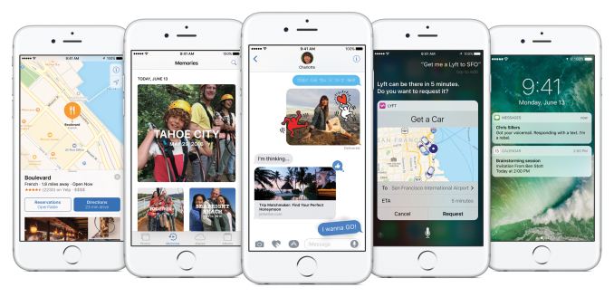
With iOS 10 it's difficult to describe what Apple has focused on. It's really one of those OS releases that makes changes to every part of the system. There are big design changes, and big app changes, plus new features and APIs so developers can make even better applications. On top of all that there are performance improvements to bring back the smoothness to areas where it was lost during Apple's rapid redesign and feature boosts in iOS 7 and 8.
With feature-rich releases it can often be difficult to decide where to start the discussion. To keep in line with my previous iOS reviews I'll start off with a look at what changes Apple has made to the iOS UI before moving on to feature changes at the app level and then finishing with changes at the developer level. Without any further delay, lets dive into the new refined design of iOS 10.
The Evolution of Apple's Design
For its first six iterations, the design of iOS remained fairly constant. The original design made heavy use of skeuomorphism, with interface elements mimicking real life objects and surfaces. Game Center had green felt like a game table, the calendar had wood borders and simulated paper pages that could only be viewed one at a time. Perhaps the most ridiculous situation was the Contacts application on iPad, which had black borders on the top and bottom because the application itself had to mimic the dimensions of a book or a planner. This type of design was helpful when introducing the world to multi-touch interfaces, but as time went on it became impossible to ignore how they imposed the same limitations of the physical objects they mimicked onto the device's digital interface.
There's more history beyond the design shift from iOS 6 to iOS 7, but the changing of Apple's executive positions isn't really interesting or relevant from a consumer perspective. Suffice to say, iOS 7 brought about the first major redesign in the history of iOS, and that design had to be put into place in a very short span of time. Because iOS 7 was a rapid redesign, it didn't have the level of refinement that one could expect from a mature user interface. The beta cycle for iOS 7 made this very clear, with the first releases using incredibly thin font weights that Apple soon thickened as feedback came in from developers and users about the poor balance between aesthetics and usability.
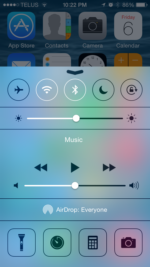
Perhaps one of the biggest changes in iOS 7 was the removal of the lines and borders that had previously been used to separate the different parts of the interface. While iOS 6 made it very clear that a button was a button by giving it shading, a drop shadow, and a border, in iOS 7 a button was just some text or a glyph sitting on a view. Views themselves often didn't have obvious separators either. As Apple refined their design in iOS 8 and iOS 9 it became more obvious which parts of the UI represented buttons and other views that the user could interact with, and Control Center provides a good example of this.
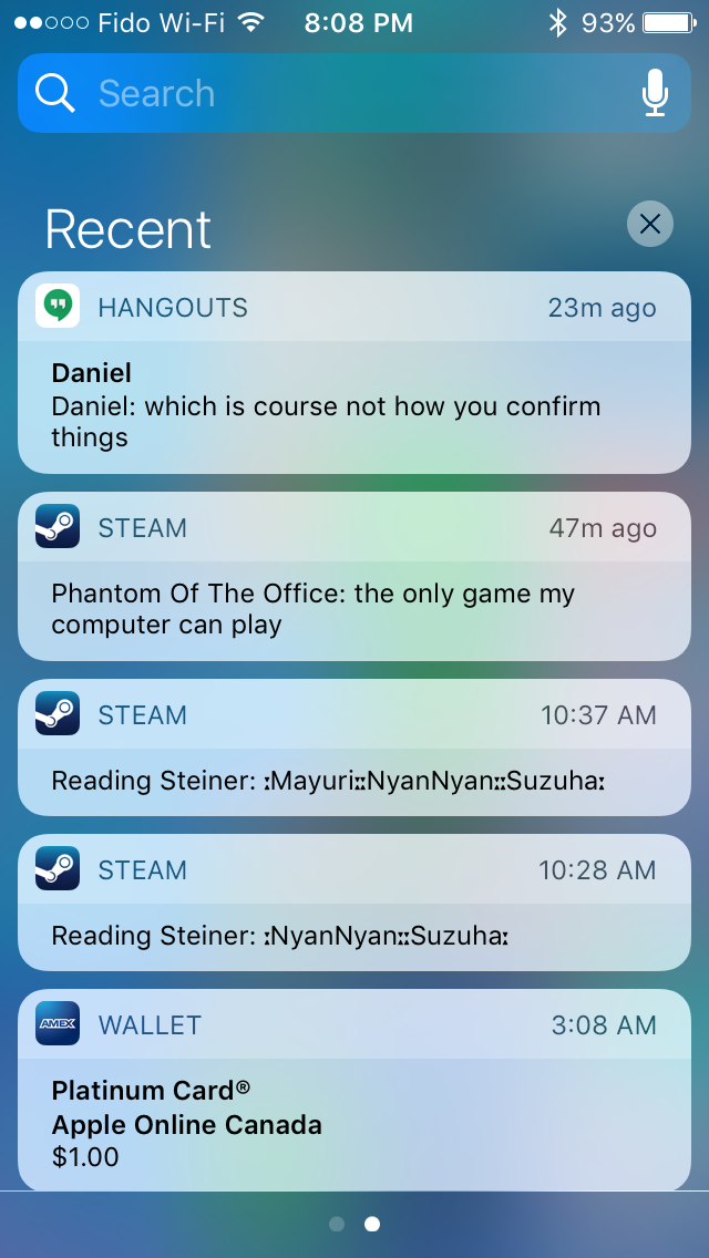
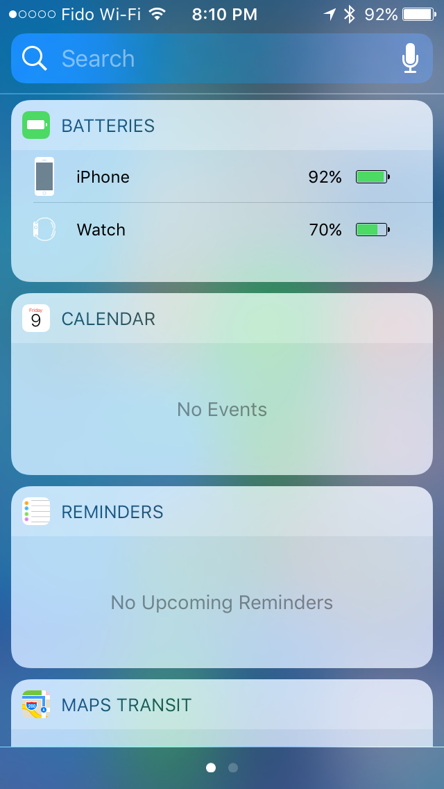
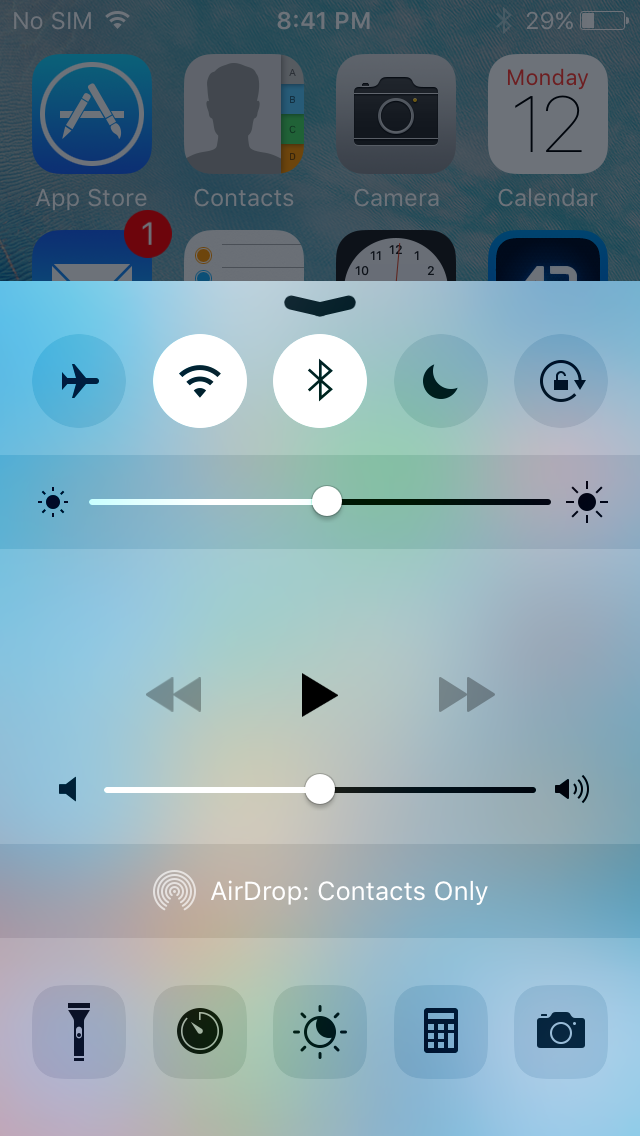
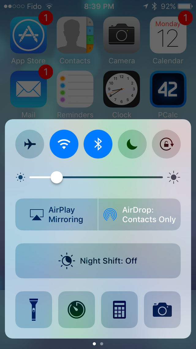
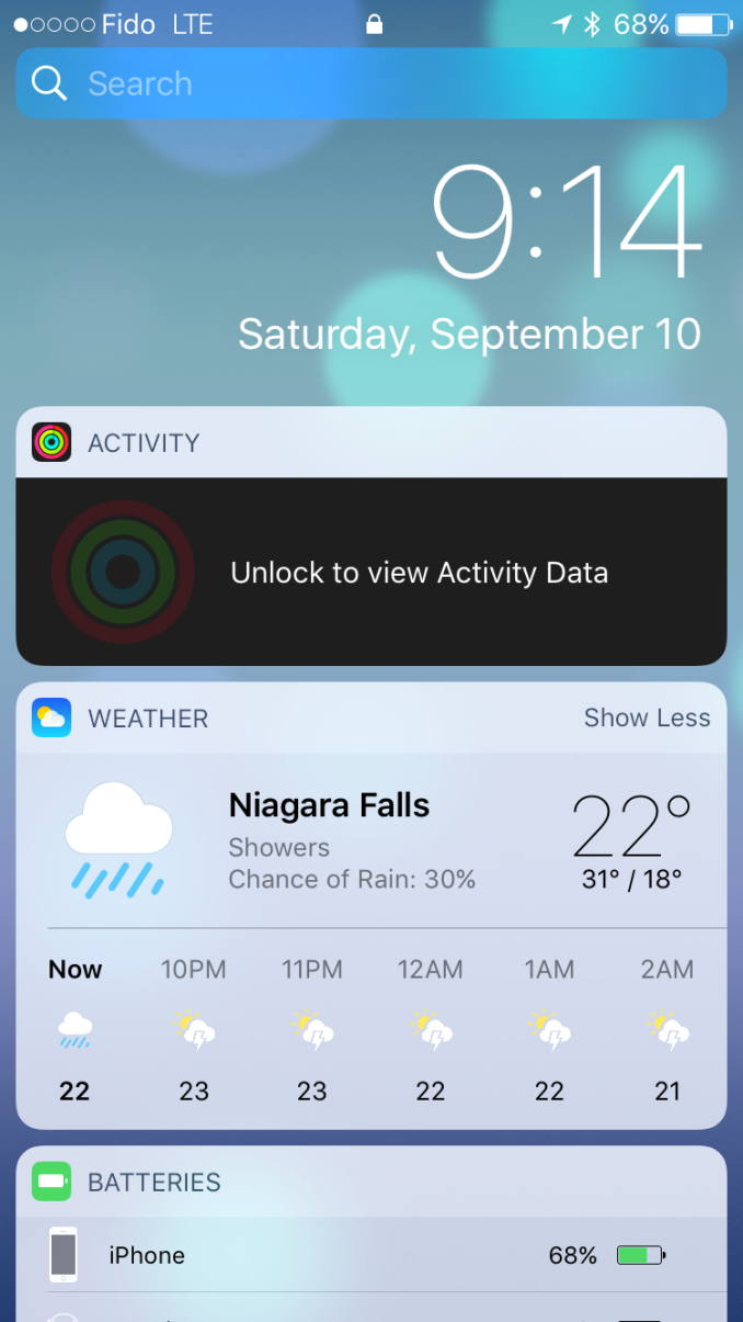
iOS 10 brings the biggest change to the design of iOS since iOS 7. iOS 7 pushed the design ideology as far as possible, and it ended up going too far by making it difficult to distinguish different parts of the UI. iOS 10 takes a step backward from that and finds a middle ground between the bleeding edge design that iOS 7 adopted and the more segmented design of an OS like Android or earlier versions of iOS. To illustrate what I mean, I've included some screenshots below illustrating how key areas of the interface have been revamped in iOS 10, including the previously mentioned Control Center.
As you can see, iOS 10 makes it much more clear how different views are separated from each other using what could be described as bubbles or cards. The use of cards seems like something many operating systems are moving toward, with Android using paper-like cards for the UI ever since the original launch of Google Now. In Apple's case, the cards replace what were previously rectangular views that bordered the edges of the display with sharp corners and minimal separation between elements. In the case of notifications and widgets, what were previously sections in a table view with completely transparent backgrounds are now individual bubbles for each item. The improvement to clarity here is pretty obvious, and having a separate card for each item makes it more obvious that they're a tappable element
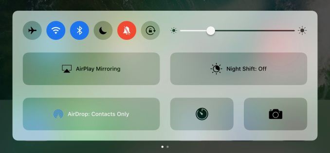
Control Center receives significant visual and functional changes as well. Like notifications, it's no longer a rectangular view, and is instead a card that comes up from the bottom of the display. Apple has continued their trend of making the distinction of buttons and their selection states more obvious as well. In iOS 7 the buttons were just icons that turned from black to white when tapped, and in iOS 8 apple removed the borders and instead distinguished the icons by using a different transparency effect to separate them from the background view. They also used a full white fill to indicate selection instead of changing the button outline from black to white. In iOS 10, the buttons are now even more distinct, with an ExtraLight VisualEffectView being used for the background and the buttons using something closer to the Light VisualEffectView setting. It's now much more obvious when buttons are selected as well, with the fill color being blue and the inner glyph changing from black to white.
The other big change to Control Center is the new layout. Previously Apple placed all controls on a single view, but in iOS 10 Control Center now uses a PageViewController to place the toggles and settings on one section, and the music and Airplay audio output controls on the other. This allows Apple to increase the size of controls that were difficult to hit, such as the sliders for music playback and brightness. However, they've made some very questionable decisions with the size of buttons. I don't understand why Night Shift needs such a giant button when it's still just a toggle like the four buttons below it. This situation gets even more ridiculous on the iPad, which still uses two separate pages and just has comically large buttons in both sections. There's no reason the controls couldn't have been fit onto the screen at once, and UIKit's PageViewController class provides a really simple way to achieve exactly that functionality when space permits.
What is nice about the larger buttons is that you'll rarely have issues hitting the music controls. Having the second page dedicated to music means that the scrubber and buttons can be much larger, with more spacing between to prevent tapping the wrong thing. Control Center also remembers your last page so if you generally use toggles or music more it will remain positioned on that page when you bring it up again. As far as usability goes, the new Control Center is a definite improvement. I prefer the new aesthetic as well, but I find some of the size and layout choices to be questionable, especially on the iPad.
The same design changes that you'll find to Control Center and notifications exist across the entire OS. Views that were previously rectangles that bordered the edge of the screen are now floating rounded rectangles, which I generally refer to as cards even though Apple hasn't really given them an official name. The use of translucency has also been toned down in a manner of speaking. Areas that used VisualEffectViews still do so, but Apple has changed many to use the more opaque ExtraLight transparency style rather than the Light or Dark styles. In fact, everything seems to have moved up a step, with the use of Dark VisualEffectViews being almost entirely removed except for a certain part of the Maps app, having been replaced with Light views, and Light views being replaced with ExtraLight.
The design of iOS 10 still traces back to the original design principles put in place with iOS 7, but with a level of refinement that simply wasn't possible with the rapid redesign that Apple did in 2013. iOS 7 really pushed its design to the edge, with gratuitous use of transparency, no shadows, no textures, no gradients, and nothing but thin lines to separate the various parts of the interface. iOS 10 recognizes the value of separating different views into different sections, and in doing so makes it clear which objects can be interacted with and which are static.
Rethinking Widgets
Widgets have been a key part of Android since its earliest days, but iOS has never adopted them in the same manner. With iOS 5 Apple introduced Notification Center, which included two widgets of sorts that pulled information from the Weather and Stocks apps. These really just existed to give a quick update on information when you went to check notifications, and they weren't a persistent part of the home screen like widgets on Android are.
Fast forward to iOS 7 and widgets received an overhaul. They still existed in Notification Center and couldn't really be customized, but they now formed what Apple called Today view, which existed on a separate page from notifications and provided relevant information relating to upcoming meetings and reminders, stock prices, and the weather. With iOS 8 Apple opened widgets up to developers, allowing anyone to present relevant information as a section in the Today view. Of course, this kind of customization was new for Apple and for iOS, and there was conflict between Apple and certain developers who had created widgets that provided functions beyond what Apple had originally intended.
To be honest, I think widgets have provided a poor user experience on both iOS and Android, although for different reasons. My problem on Android is that widgets have no standards for design, padding, and appearance, and so your home screen turns into a mess of mismatched widgets. iOS resolved this by providing a standard interface for widgets that developers would simply provide a view for, and widgets were not placed among the app icons which helped cut down on clutter. Unfortunately, the solution of putting widgets in Notification Center only worked in theory, and in practice you never end up pulling down Notification Center to check your widgets. Android got it right by putting them in the launcher, but there needs to be a better solution for organization and visual uniformity.
iOS 9 actually presented a solution to the widget problem on iOS, although nobody would have known at the time. In my iOS 9 review I talked about the new search screen to the left of your first home screen. This screen had a number of fixed widgets, such as Siri app suggestions and content pulled from News. At the time I remarked on how similar this screen was to Google Now, but that it really didn't provide value to the user and seemed poorly thought out. In iOS 10 that screen has been scrapped to make room for a new space just for widgets.
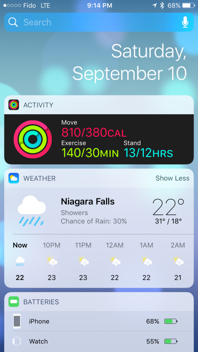
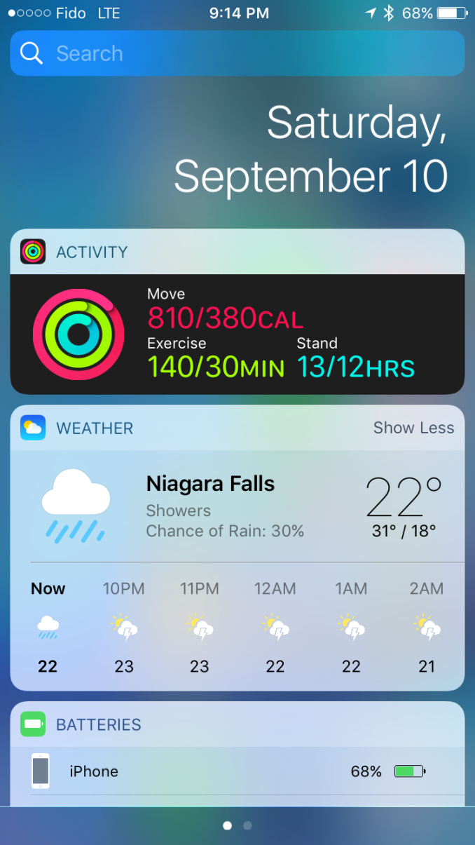
The widgets screen on iOS 10 exists in three places. You'll find it on the redesigned lock screen, on the home screen, and in Notification Center. In all three cases you access it by swiping right, which provides a uniform way to access widgets from any part of the iOS UI. In every situation the interface changes slightly. In Notification Center you have a blurred background, and on the lock screen you get the current time and battery charge rather than the date. The iPad gets some additional tweaks in landscape mode, with the widget layout expanding into two columns to take advance of the available space.
In addition to the new interface, Apple has added some useful widgets that didn't exist in iOS 9. The new weather widget is great, with the current weather and chance of rain being shown in the condensed view, and the expanded view showing the weekly forecast. There's also a widget for the Activity app which shows your current progress toward your three activity goals. Maps also receives some really helpful widgets, including one for transit which allows you to check if there are any service advisories on your favorite transit lines, which has already helped me avoid delays due to subway and streetcar closures that I would not have thought to check for otherwise.
Widgets in iOS 10 provide a much better experience than they did in iOS 8 and 9. Replacing the useless search screen to the left of the home screen with a widgets page was a good move on Apple's part, and in my view it provides the best overall widget experience on a mobile platform because the design and size of widgets are consistent, and they don't have to share space with application icons. I've definitely used the widgets more during the beta period than I ever did during the two years that iOS 8 and 9 were the latest versions of iOS, and I'm sure that I check them more times in a single day than all the times I checked the search screen that they're replacing. Getting users to actually use widgets puts more pressure on developers to offer their own, so it'll be interesting to see if more apps begin to offer widgets after the release of iOS 10.
Expanding 3D Touch
3D Touch was perhaps the most interesting thing about last year's iPhone 6s. Apple's pressure sensitive screen technology quite literally added another dimension to the touch experience on mobile devices. Like most of Apple's new technologies, the initial implementation of 3D Touch features in the OS was fairly limited, and there was basically no API for developers. You could create a hack of sorts by subclassing UIGestureRecognizer and playing a specific AudioToolbox sound to trigger feedback from the Taptic Engine, but Apple didn't provide official support for 3D Touch beyond the Peek and Pop interactions to preview content from a ViewController without actually navigating to it.
Presenting a new technology with an initially limited or non-existent API is nothing new for Apple. When Touch ID launched it was only able to unlock your phone and authorize App Store payments. Since that time it has been opened up to developers for handling authentication in their own apps, and Apple has expanded its use to cover authentication when paying with Apple Pay. With Apple's history of waiting to expose APIs for their new technologies, it's not surprising that iOS 10 is where 3D Touch gets a full-featured API for developers to use.
As I mentioned before, in iOS 9 developers were limited to using 3D Touch for Peek and Pop actions, as well as for Quick Actions from the homescreen by pressing on their app icons. This is still a large part of the 3D Touch experience, and Apple recommends that all developers implement 3D Touch in their application on tappable views that navigate somewhere else, such as tapping on a TableViewCell to move to a new ViewController.
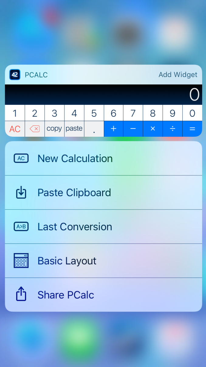
Right now neither Peek and Pop or Quick Actions have changed a great deal, although Apple has seemingly altered the timing functions for the animations that play for these interactions, which makes them feel more responsive and aligned to the amount of force that you're applying. Quick actions on the home screen can also show widgets that your application provides, along with a button to add it to the widget screen if you haven't done so. This is actually the fourth place in the OS where widgets are accessible, and it's quite an elegant solution to avoiding the clutter that mixing widgets and app icons creates, while also expanding 3D Touch's ability to provide access to relevant information rapidly.
The new UIPreviewInteraction class allows developers to move beyond Peek and Pop to use 3D Touch for customized actions in their applications. The kind of UI that this can enable really depends on the application, and the opportunities for customization are limitless. The most common type of interaction that 3D Touch is useful for is displaying a screen where the user can select an object which then triggers an action in the previous screen and returns back.
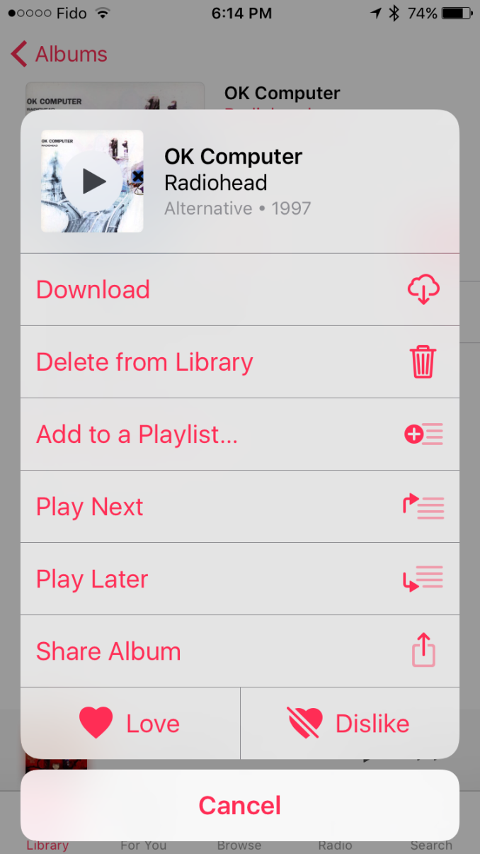
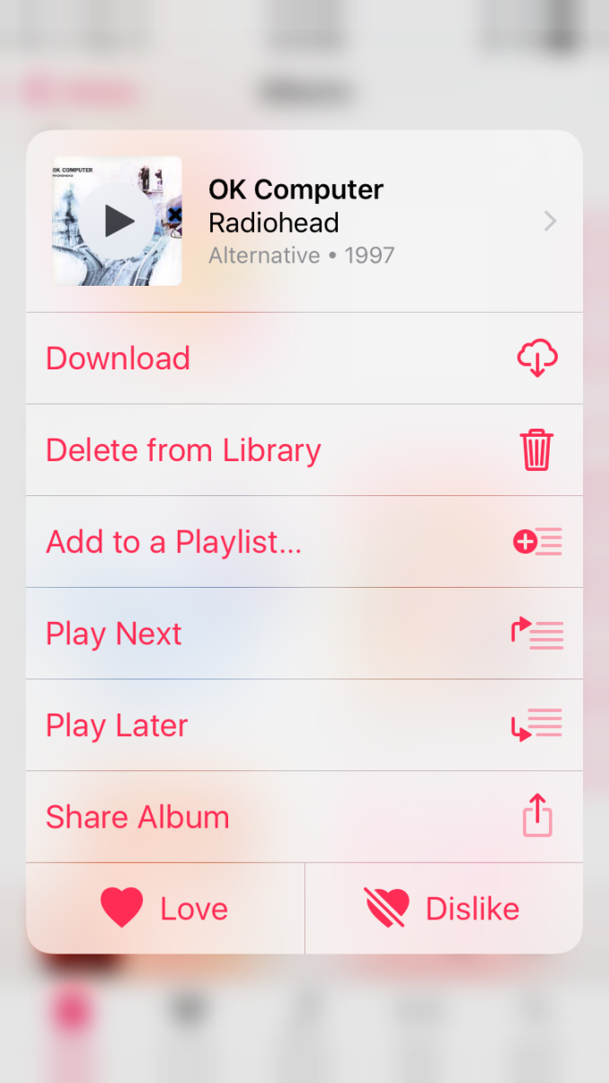
In iOS 10 I've noticed an example of this type of interaction in the Music application. In the new Music app there is a three dot overflow button next to your album art when you open an album. This brings up a Action Sheet with various options, such as adding it to a playlist or setting it to play next. These are actions that apply to the entire album, and it's inconvenient to have to navigate into the list of songs just to get this menu up, set it to play next, and then navigate back out. 3D Touch solves this by defining a custom action on the album cover cell in the CollectionView. By pressing down on the album cover the application creates the exact same view as the overflow menu, giving you access to all the available options. In addition, the menu is designed so that you can move your finger to the appropriate action and then release to select it, which means you don't have to remove your finger from the display. It's a very natural interaction to follow a 3D Touch press, and it lets you quickly access and select one of the actions in a much quicker manner.
It will take time for developers to implement support for custom 3D Touch actions in their applications. Adding support for basic Peek and Pop is incredibly simple and so it already has good adoption among popular apps. Now that Apple has more than two devices with support for 3D Touch there will also be more incentive for developers to find the areas where this kind of interaction can improve the user experience and actually implement it. Only time will tell how widespread 3D Touch becomes adopted in applications, but I think the improvement to user experience is substantial enough to warrant the effort required to do so.
Extending iMessage
The Message app is the most used application on iOS. This isn't really a surprise when one thinks about how people use their phones, but it does identify an area that the developer community hasn't been able to tap into despite users spending a great deal of their time there. For someone like me, it was difficult to imagine that there really was anything that developers could do with iMessage, as my use case is just sending images, videos, and text in the same way that you could with SMS and MMS. Of course, I make use of some other convenient features like group chats, read receipts, etc, but none of these areas seemed to present a way for third party developers to add value. Of course, that's when I think about how I use messaging, but there's a whole world of messaging beyond the most basic functionality that SMS and iMessage provide. Apple is tapping into those ideas for iMessage in iOS 10, and they're bringing developers along for the ride.
Apple has taken a two pronged approach to upgrading iMessage in iOS 10. The first are the features that come by default, the features that are part of iMessage itself. I actually covered some of these in my macOS Sierra preview, although in a limited manner as macOS Sierra is not capable of using most of the new features itself and is just able to receive messages that use them. The two main features added to iMessage by default in iOS 10 are message effects and Digital Touch messages.
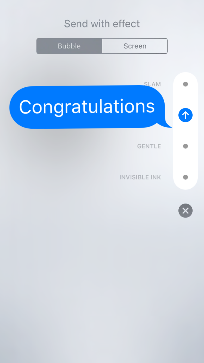
Message effects work as you'd expect, with animations that can be applied to the actual message bubble itself or as an effect that plays in the background behind the scrolling list of messages. For bubble effects Apple provides an invisible ink effect that requires you to swipe across the message to reveal it, a gentle effect with tiny text, a loud effect which enlarges the bubble for a moment when it's viewed, and a slam effect which crashes the message into the screen, complete with dust effects as it touches down. As for screen effects, you have balloons, confetti, lasers, fireworks, and a shooting star. There's not a whole lot else to say about message effects, as other messaging apps have implemented these features before. If you're a fan of them then you'll be happy to see them brought to iMessage, and if you're not you'll just have to hope all your contacts feel the same way.
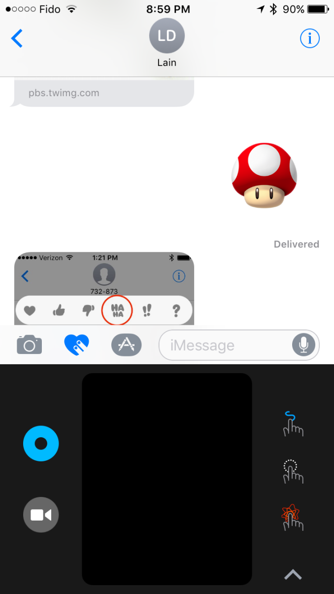
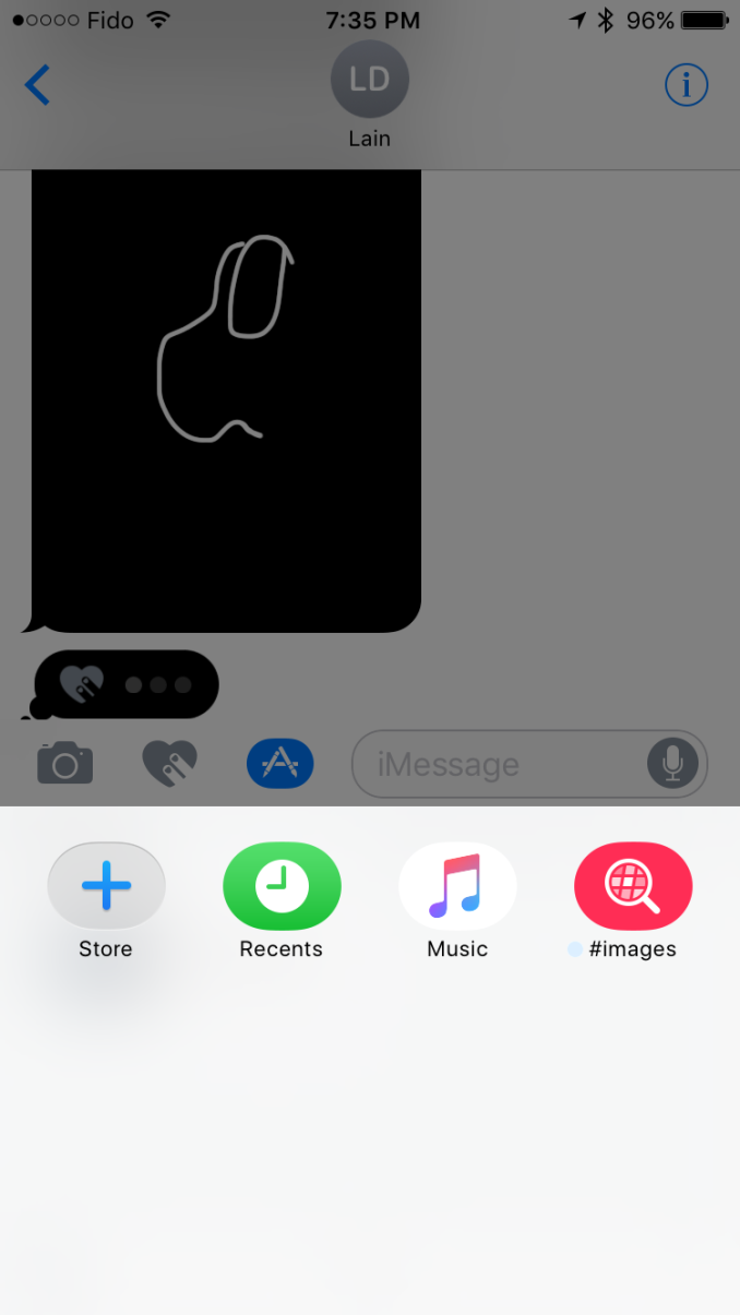
Anyone who has used an Apple Watch will be familiar with Digital Touch. In this case it has been modified since you're using it from an iPhone instead of a watch, and the list of things you can send have been expanded as well. To bring up Digital Touch you simply tap the icon with two fingers on a heart which sits next to the text entry field. Once you do so you'll be presented with a condensed version of the Digital Touch UI in the space where the keyboard would normally be. This UI works in a similar manner for iMessage apps, although I'll touch on that more in a bit.
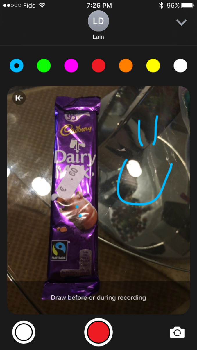
In the condensed UI there's a small drawing canvas where you can perform Digital Touch actions. On the left side you have a button that allows you to change the color of the pen used when drawing, and below that is a camera button which expands the UI and allows you to draw on top of a photo taken with the camera.
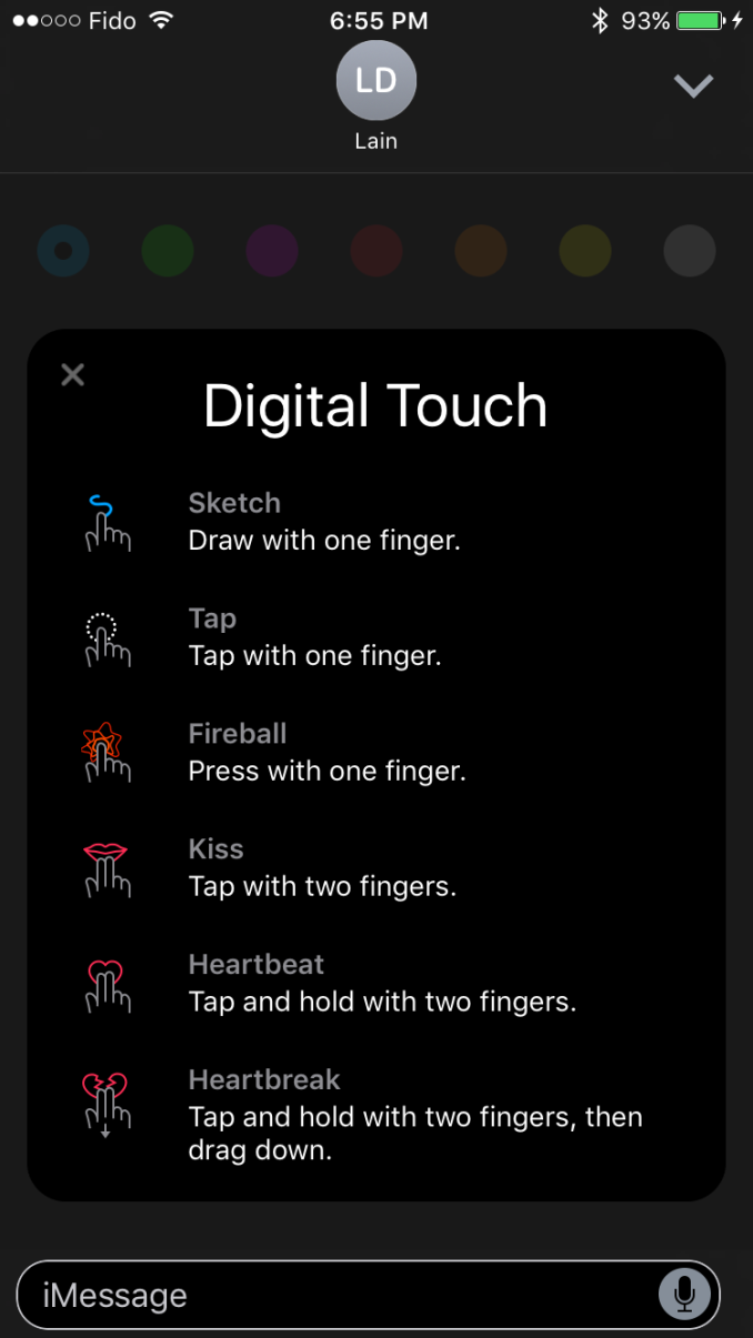
The expanded UI will first show a preview of all the actions you can perform. These all work in the condensed UI as well, but you may not know about all of them until you bring up the expanded version as the condensed view only shows three actions on the right side and switches between two sets every few sections to show all six. To be honest, the Digital Touch interface is kind of confusing, and I wouldn't be surprised if it receives some tweaks in future minor updates to iOS 10. I'm don't really much value in Digital Touch on the iPhone either, especially since actions like tapping don't translate well from the Apple Watch where it would actually trigger the Taptic Engine to simulate your wrist being tapped.
The second side of the iMessage improvements is the creation of a developer ecosystem centered around iMessage. This API will allow developers to create their own mini-applications that run inside of iMessage. This really covers three types of applications, the first of which being sticker packs, the second being interactive messages, and the third being other types of apps that work with media. You can see an example above of the new Super Mario Run sticker pack which is available in the iMessage app store. Interactive messages cover applications that send messages with content which can then be opened by the receiving user in the corresponding application. Apple's example was sending a message with the menu for a party being planned, which can then be modified and commented on by the receivers. Finally, the other category of app is for working with media, and an obvious example is implementing a GIF application for sourcing reaction images in the iMessage app itself.
I'm not really someone who makes heavy use of emoji or effects in message apps, and so I don't have a whole lot else to say about the changes Apple has made to iMessage in iOS 10. However, the popularity of these features in other messaging apps makes it clear that many users value these capabilities, and so it makes perfect sense for Apple to bring them to iMessage. Most interesting for me is the idea of the iMessage App Store, and whether or not it's going to be possible to monetize applications like sticker packs. Line has already shown that people will pay money for such things, but that relies on developers not rapidly creating a race to the bottom for prices, which is what has happened in the iOS App Store to an extent. Like many of the new technologies that Apple introduces in new versions of iOS, only time will tell how things play out.
Swift Playgrounds
The iPad Pro has become a big part of my daily life. When I'm working, the 9.7" iPad Pro goes everywhere with me as a device for development and taking down information using either Apple Pencil or typed notes. When I'm in classes, the 12.9" iPad Pro is indespensable due to its ability to have two regular size class apps on the screen at the same time, which allows notes to be taken with Apple Pencil while a digital textbook or lecture slides are open on the other half of the display. For me the iPad Pro has replaced my laptop in every way except for one, which is my actual development work. As someone who does mobile development and writes C code for university courses, there's no way to escape using a laptop or a desktop computer to access XCode and Android Studio.
Some people may be wondering why Apple hasn't just brought XCode to the iPad. The simplest explanation is honestly just that bringing the entire IDE to iOS is an enormous undertaking. Apple has brought versions of their software to mobile before, like the iWork suite, but bringing XCode is a whole other story. In many ways it is not clear how to translate the interface of an IDE to a multitouch device like an iPad, and from a functional perspective it would certainly be difficult to bring over all the features that actually enable app development, many of which are just a GUI fronts for tools that are executed in the Unix shell behind the scenes. Allowing a user application to compile code and execute it also presents many questions and concerns regarding security. The list goes on and on, but suffice to say, bringing the entirety of XCode to the iPad is not a trivial feat and it's not near as simple as just making a new UI that works on iOS.
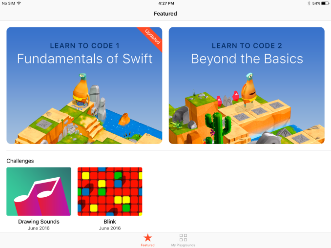
Bringing XCode to iOS might be too large of a project to do without some initial work in place. In many ways, that's where Apple's new Swift Playgrounds app for the iPad fits in. It has two functions. The first is to provide a fun and easy way for new programmers to learn programming concepts. To do this, Apple has provided a way for people in the development community to publish books for Swift Playgrounds that teach users by having them complete programming tasks in a fun and interactive way.
Apple provides two such books for learning the basics of the Swift language. In them you control a character called Byte who must be moved around a 3D world by walking and traversing through portals to collect gems and activate switches. It's a very interactive way of learning to program, and the books start out with the very basics of programming. Once you've gone through the basics, the sections begin to cover more advanced topics including debugging, algorithm design, and function generalization. There's also some coverage of algorithm efficiency, which is often not discussed enough in formal education or online programming courses. If you're someone who is interested in learning to program and you own an iPad, I definitely recommend checking out Swift Playgrounds. With any luck there will be additional books added by the community to cover more specific topics, such as actual iOS app development.
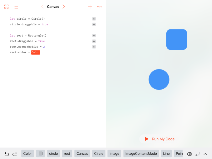
If you're already familiar with iOS development and UIKit there's still a lot that you can get out of the Playgrounds app. The second purpose of Playgrounds is to give programmers a way to test out ideas in a quick and easy manner. That was the point of XCode Playgrounds on the Mac as well, but with it available on the iPad there's now a way to test ideas even if you're not at your computer. When Apple originally announced Playgrounds I assumed it wouldn't have much use for existing programmers due to UIKit being unavailable or accessible only in a limited manner, making it essentially impossible to prototype ideas that will later be put into real applications. It turns out that this assumption was completely wrong, and from what I can tell the entirety of UIKit is available in Playgrounds, along with direct access to the underlying C-based APIs like Core Graphics and Core Animation.
In the video above I've shown how some UIKit APIs can be used in Swift Playgrounds on the iPad. Since UIKit is available, it would actually be possible to write an application of sorts within Swift Playgrounds, although as of right now I haven't experimented enough to say what sort of sandboxing limitations may exist on APIs that send or receive data over a network. In my video above you can see that creating your own playground presents the same split interface between the code editor and the live view. You can actually long press the separator between the two and move it to bring the editor or the preview into fullscreen, and it uses the same sort of UI as multitasking on the iPad so it's a familiar interaction.
For my demo I've made a UIView subclass which also draws a button and a second view that I have poorly masked to look like a circle and filled in with red. My intent was that the circle would pulse inward and outward when the button was pressed. As you can see, I actually made a mistake before recording and started animating the outer view pulsing in and out. Since I was already recording I felt it would be a good opportunity to show the code editing in XCode Playgrounds, so I fixed the bug in the middle of the video and made the circle pulse properly as it should have. This is just a very basic example of what can be accomplished using Playgrounds, and I expect that developers who start working with ViewControllers or bring in Apple's other APIs like SceneKit will be able to create some amazing things on their iPads using Swift Playgrounds.
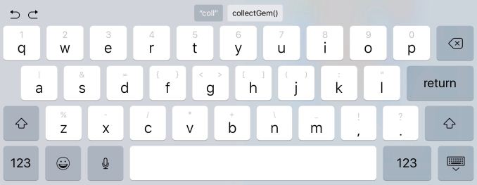
Experienced programmers may be wondering how well the iPad works as a device for programming given that it doesn't have a physical keyboard or any sort of mouse pointer. Apple has actually done a good job of making the iPad's touch interface usable for programming in Swift Playgrounds. The most significant work has been done to the keyboard. It's a special keyboard with shortcuts to common programming symbols that aren't normally accessible on the iPad's keyboard without going into the symbol menu. To access them you simply put your finger on the key and pull the symbol toward you. This is helpful for accessing certain symbols, but it's still not as fast as having dedicated keys. Thankfully, the editor does a good job of automatically placing braces and matching brackets, and there's also a library of pre-formatted code blocks with placeholders so you can quickly drop in a loop or a control flow statement.
The only big issue with the on screen keyboard is that it takes up a great deal of your workspace. To help mitigate this when users don't have a physical keyboard, the shortcuts bar remains visible on the bottom of the screen unless explicitly dismissed after the keyboard already has been. The autocompletion is also very good, to the point that you can often do your work without actually having the keyboard up. Apple also provides buttons to create a new line or erase an entire line when editing in this mode.
While I said that Swift Playgrounds on iPad has two functions, it's more accurate to say that it has two user-facing functions. I think it has a third function which is specific to Apple, which is to lay groundwork for an eventual version of XCode that will run on the iPad. Swift Playgrounds provides a risk free way to test what the iPad can do with regards to writing and running code, and it allows Apple to experiment with new UI and functionality ideas without having to make the sort of stability and support promises that officially bringing XCode to the iPad would require. Most importantly, it allows Apple to think through what sort of security model is required to allow actual app development on the iPad.
Right now Swift Playgrounds already allows you to do impressive things as a programmer, and for me it is a great tool for testing ideas that come to mind when I'm away from my development machine. Having access to UIKit is huge, and it means that Apple is already giving programmers access to the same API set that is used to develop iOS apps in XCode on the Mac. Expanding this into an actual IDE that can be used to program applications requires Apple to integrate Interface Builder and Clang, plus Apple's own solution for code signing. Of course, even with those, an initial release of XCode for the iPad would be rather simple compared to its macOS counterpart, but the foundation of the IDE will have been laid out to be expanded on in future updates. With Swift Playgrounds Apple has already laid a great deal of that foundation, and I think it's very likely that you'll be able to develop iPad apps on your iPad itself in the not too distant future.
Animations
As someone who does work in mobile development for iOS and Android, the one thing that has really stood out to me is how accessible Apple's API for animations is. iOS uses an implicit animation API, which means that the programmer changes the properties of views and the operating system handles the interpolation, potentially with the developer defining what sort of timing function is used. What's most useful is that the property changes are just defined within a block of code, unlike the ridiculous APIs on some other platforms which have you specify layouts and property changes in XML files. This makes it incredibly easy to create animations that move views around the screen, resize them, and change properties like their color and alpha.
While animations on iOS are quite easy to create, the API is not perfect. In the work I've been doing over the last four months I've actually run into two problems that Apple has addressed in iOS 10. The first is the issue of spring animations. The existing API for spring animations on iOS looks like the following:
// Animates with a spring effect

UIView.animate(withDuration: 1.0,

               delay: 0,

               usingSpringWithDamping: 0.8,

               initialSpringVelocity: 1.0
Now, anyone who has taken some sort of higher level math or physics course will probably notice something strange about this function. This function takes a damping value and an initial velocity for the spring. However, it also takes a duration value for the animation. This doesn't really make sense, because the duration of motion of a spring is dependent on its damping, stiffness, and mass properties. A proper spring animation API should not take a duration value; the duration should be a function of the spring properties. Because of this oddity the UIView spring animations API produces animations that have an artificial feel to them, and they rarely look like the true motion of a spring.
Interestingly enough, Apple's internal Core Animation API for spring animations works using the spring properties and doesn't take a duration. The strangeness of the UIView spring API isn't exactly unknown to its creators either:
@smileyborg Yeah. And, uh, I'm sorry.
— Andy Matuschak (@andy_matuschak) September 19, 2014
In iOS 10 Apple has introduced a new class called UIViewPropertyAnimator. While I'm not going to go into the specifics of UIViewPropertyAnimator as they aren't directly relevant to non-developers, there are a few interesting things about it. The first is that it provides a new way of performing spring animations, and like Apple's internal API, it uses the physical properties of the spring to determine the duration of the animation. This should greatly improve how natural spring animations feel in third party applications,
The second big issue I've run into is that there's no really good way to pause them or reverse UIView animations them. This doesn't sound like a huge issue when you consider simple animations. If you move a view 500 pixels left and you want to reverse it, then just move it 500 pixels to the right. It ends up being the same code but done in reverse. However, things get a lot more difficult when you have more complex animations, particularly in cases where you define specific keyframes for an animation. Any logic that you need to trigger after an animation also has to be reversed, and with each of these things the workload increases dramatically. My own example involves an eighty line keyframe animation to open a menu, which then had to be programmed in reverse to close the menu in the same manner. Naturally, this is also a source of bugs if something isn't done correctly in the reverse animation, and that creates an additional layer of difficulty and complexity.
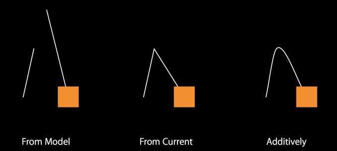
With UIViewPropertyAnimator developers now have a way to control their animation as it progresses. The object has properties that specify the state of the animation, and it can be paused, reversed, and stopped at any point in the animation. This is a great improvement over the existing API, and it will allow developers to create more complex animations without having to worry about also creating the reverse logic. The API also provides a very easy way to create additive animations. For example, in the middle of an animation a developer could then add an animation that moves the views to a new position, and the API will take care of interpolating from the current state in the middle of the current animation to the new position specified in the added animation.
One last interesting point about UIViewPropertyAnimator is that it provides a way for developers to create and use their own timing functions. The timing function specifies how the state changes progress during the duration of the animation. For example, you could have an animation where a view moves a great distance during the start, but then slows down and takes much longer to reach its final position. Previously it was not really possible to do this, except with complicated timing work involving keyframes or chaining animations. While I doubt many developers will make use of this, it's a very helpful API for the cases where a developer wants to have control over the animation interpolation to give it a very unique look and feel.
Web Performance
With every release of iOS Apple makes performance improvements to the platform's underlying technologies. One of the areas where performance is often improved is Nitro, which is Apple's JavaScript engine. I always like to take a quick look at JavaScript performance on a newer and an older iOS device when Apple updates to a new major version, so I've run our standard smartphone review web benchmarks on the iPhone 5s and iPhone 6s running both iOS 9.3.5 and iOS 10 to see if there are any significant improvements.
| iPhone 5s | iPhone 6s | |
| Kraken (time in ms) | iOS 9.3.5: 3372 IOS 10: 2956 |
iOS 9.3.5: 1706 IOS 10: 1504 |
| WebXPRT 2015 (score) | iOS 9.3.5: 115 IOS 10: 117 |
iOS 9.3.5: 207 IOS 10: 203 |
| Jetstream (score) | iOS 9.3.5: 57 IOS 10: 54 |
iOS 9.3.5: 119 IOS 10: 124 |
Overall there isn't much of an uplift in JavaScript performance going from iOS 9.3.5 to iOS 10. Kraken seems to show a small gain, but in WebXPRT and Jetstream the scores flip between favoring iOS 9 and iOS 10 depending on device, and the gaps are so small that they can be attributed to testing variance. Given that Apple has made some very big leaps in JavaScript performance during the last couple of years it's not really a surprise that the pace has slowed down.
Scrolling Performance
Something iOS has typically been known for is smooth scrolling performance. Apple's own standard is that views should animate at 60fps, which makes sense given the fact that iOS devices all use 60hz displays. There was a time where you really could expect near-constant 60fps animations throughout the system, barring really poorly designed applications. However, in recent years with increasing resolutions, greater pressure on the hardware, and more advanced visual effects, the smoothness of iOS has definitely degraded. Much of this has to do with the greater complexity of modern UIs, particularly ones that make heavy use of translucent views with blur.
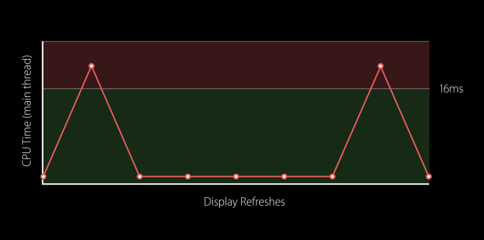
In iOS 10 Apple has recognized that problems in their own APIs have played a part in dropping scrolling performance on iOS. This again goes back to the fact that views have become more complex on iOS in recent years. In the past, Apple's TableView and CollectionView APIs have prepared cells for rendering right before they are about to be displayed on the screen, and are removed right when they exit the screen. This doesn't pose a problem for something basic like a table cell with a couple of labels, but with complicated cells that use translucency, load high res images, and even have animated subviews, this method of rendering simply doesn't cut it. You can even have cases with CollectionViews like the iOS Photos app where you have to bring on many cells at the same time, all of which need to be set up individually. It's important to remember that there's only a ~16ms interval between frames, and the work to set up the UI for the next frame has to be completed in an even smaller period of time than that to manage a constant frame rate of 60fps.
To improving scroll performance Apple has changed the cell lifecycle in CollectionView and TableView APIs. As I mentioned before, the previous API essentially did everything relating to cell creation right before it was to be displayed on the screen, and cell removal right after it exited the screen. This caused two key issues. The first is that in the case of a CollectionView with many columns, every cell is rendered at once at that moment. This is a big cause of frame drops, as the hardware simply cannot render all the cells in time for the next frame. The second issue was the situation where a cell would exit one side of the screen and quickly be brought back on. This situation occurs frequently when a user accidentally scrolls past the item they were looking for in a list. In this case, the cell would have to be recreated from scratch despite having been on the screen only a moment before.
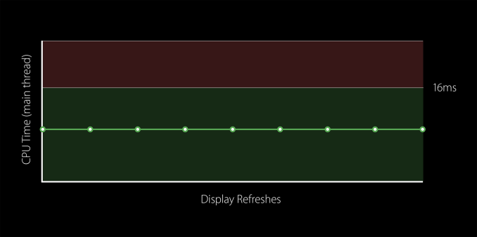
The iOS 10 APIs now spread out the work done during the lifecycle of a cell. Cells are now setup well before they need to be rendered, and the display process is spread out so a row of many cells doesn't need to be rendered at the exact same time right before they need to be shown on the screen. Cells are also kept for longer after they exit the screen, which means if the user quickly scrolls back the cell display method can simply be called again rather than having to get a new cell from the reuse queue, set it up, and draw it.
It honestly surprises me that Apple didn't make these changes sooner, because the impact on performance is dramatic. The iPhone 5s on iOS 10 has better scrolling performance than it ever has in the previous three years. This sort of thing is difficult to profile well even with XCode and Instruments, but I think it'll be immediately obvious to users that performance is improved, especially for users of older iOS devices that haven't had such a good time after being updated to iOS 8 and iOS 9.
Final Words
iOS 10 marks a major anniversary for iOS. Originally launched as iPhone OS way back in 2007, iOS has come a long way from its original iteration. iPhone OS 2 brought the App Store, while iOS 4 brought the iOS name. iOS 5 brought Notification Center and many new APIs, and iOS 6 brought Apple Maps. With iOS 7 a brand new design was created, which has been iterated on since then in iOS 8 and iOS 9.
Now after nearly ten years we have iOS 10. iOS 10 is a very big release, and there's far more to it than what I've been able to cover in this review. Many parts of the OS have received subtle tweaks to their appearance, while some apps like Maps, Music, and News have received complete redesigns. It's impossible to cover all of the changes Apple has made, and users will end up discovering them for themselves over time after they update their phones.
iOS 10 comes with a new design of its own. It's definitely an evolution of the design put in place with iOS 7, but the level of refinement is far greater than in iOS 8 or iOS 9. iOS 7 took Apple's new design principles as far as they could go, and the interface ended up being a bit too abstract to be intuitive. Since that time Apple has taken a step back by making parts of the UI that can be interacted with more pronounced, and in iOS 10 they've stripped out many of the UI's hard edges and replaced them with rounded corners and cards that contain the contents of views. It definitely takes inspiration from the evolution of other operating systems like Android, but the end result still feels distinctly Apple and fits in great with the design of iOS.
iOS 10 brings some great new features. Again, I haven't nearly been able to cover them all, with the most notable omission being the changes made to the Photos app. Thankfully, I actually covered all the new features previously in my preview of macOS Sierra, and all the features there have made their way to Photos on iOS. Messages is definitely the other tentpole feature of iOS 10. Apple has taken a great deal of inspiration from other messaging apps to add functionality to iMessage. Most of it is just visual, with new message effects and Digital Touch being brought over from the Apple Watch. The inclusion of iMessage apps will allow for functional improvements as well, with messages that hook into iOS applications to allow the sharing of content. What developers do with iMessage apps remains to be seen, but the fact that Messages is the most used application on iOS makes me confident that the adoption will be quite strong.
As a developer, the most exciting thing that iOS 10 has brought is Swift Playgrounds for the iPad. When I first heard about the app I assumed it would only be useful as a tool for teaching basic programming concepts. That assumption was completely wrong, and I underestimated the app in two big ways. Apple's included books already go beyond what I expected to be taught in the learn to program guides, and the ability to create books for other users to download means that online programming courses and tutorials can use Swift Playgrounds to teach any concept they want in a fun and interactive manner.
The other way I underestimated Playgrounds was assuming that it wouldn't be useful to existing iOS developers. I didn't think that Apple would make UIKit available in the app for developers to use, but I was wrong. Swift Playgrounds on the iPad is actually a great tool for prototyping and testing ideas when you're away from your development machine, and the availability of UIKit means that you can use the same APIs that you use for designing real applications. I don't have any doubts that Playgrounds is the first step on the road to XCode for the iPad, and I don't think it'll take long for that to become a reality.
iOS 10 is a fitting tenth anniversary release for iOS. It brings enough refinements to the UI that you could call it a redesign in its own right, includes big changes to core parts of the experience like Messages, Photos, and Siri, and it has laid the foundation for a future where you can develop for iOS using iOS devices. On top of all that, it brings stability and smoothness to a level that I haven't seen on iOS since long ago with iOS 6 on the iPhone 5. Users of older and newer iOS devices alike will enjoy iOS 10, and with some great new APIs for developers to use in their apps the experience for users is only going to get better as time goes on.

