Original Link: https://www.anandtech.com/show/6959/google-maps-gets-a-major-ui-facelift
Google Maps Gets A Major Upgrade, Promises Interstellar Accuracy
by Saumitra Bhagwat on May 15, 2013 2:36 PM EST- Posted in
- Google IO
- Google Maps

Even without any new hardware announcements, Google's opening keynote at I/O '13 this morning was an absolute treat on the software front, and even more so for developers. Notwithstanding the enhancements to Google Maps on the mobile front, the massive update to Google Maps for non-mobile devices was definitely the highlight of the morning.
Most of us have probably seen the gradual progression of Google Maps ever since it launched, but today's update brings to the table an entirely new design paradigm, promising a holistic user interface, allowing users to focus on tasks at hand and not be distracted by traditional UI elements; the map is the UI.
I was never really a big fan of the current iteration of the Google Maps UI, not because it was confusing at times or the sidebar wasted valuable screen space, but because the UI often turned out to be unintuitive, progressively increasing my reliance on more constrained mobile mapping solutions. Google's re-imagination of their entire mapping experience this morinng really ticks the box for most of my gripes with Google Maps, if not all of them. The new Google Maps is built using the latest web standards, leveraging vector maps support and promising an extremely snappy user experience in the browser environment, with no plugins required.
The user interface is uncluttered, almost pristine, allowing users to focus on the content, with just the search bar on the top left corner. All search results are displayed on the map simultaneously, with finer descriptions for top results, allowing users to delineate them easily. Integration with Google+ pulls up places that your friends have reviewed or liked, making it that much more easier to pick your perfect destination. The search bar is dynamic, providing contextual options, based on the search results. Once you have decided on the place, you can also access indoor imagery (if available) of the establishment to resolve any outstanding doubts, if any. And since the results are sourced from other Google services, they are dynamic and ever-evolving, only getting better as time progresses. Another neat feature highlights similar and related places on the map once a desired place has been selected, making it easier to plan your itinerary for places you are visiting.
Getting directions to a place has also been streamlined, by highlighting the relevant routes and automatically displaying available public transit information using an intuitive UI, allowing users to compare driving times versus public transportation times, to plan trips with granular precision. This feature will be very useful in cities like Chicago with well established public transportation systems, where the new public transit scheduling UI will add a whole new level of precision when it comes to planning your trips.
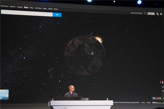
On an international front, the new Maps experience integrates stunning panoramic views of available locations, including relevant crowd-sourced imagery and viewpoints, including Photo Sphere integration. Google has also promised support for the Oculus Rift and the Leapmotion Controller, for those of us slightly ahead of the technological curve. Google has also added other interstellar features, where zooming out a bit further presents a blissfully accurate rendering of our planet, including accurate real-time cloud and planetary data.
All in all, this is unequivocally the biggest upgrade to Google Maps in recent times and most likely helps Google leapfrog any advances by Microsoft or Apple to their mapping platforms, at least in the near future.
So go on and sign up for the preview now. Google has promised invites to start rolling out tomorrow morning.


