Original Link: https://www.anandtech.com/show/6718/microsoft-office-365-review
Three Months with Microsoft's Office 365
by Vivek Gowri on January 31, 2013 11:59 PM EST- Posted in
- Microsoft
- Cloud Computing
- Office 2013
- SkyDrive
Windows and Office. It’s a duo that has made up the core of Microsoft’s business since before I was born, and remains the cornerstone upon which the rest of the company is built. And so it has gone, for as long as I can remember: with each new version of Windows, a refreshed edition of Office to go along with it.
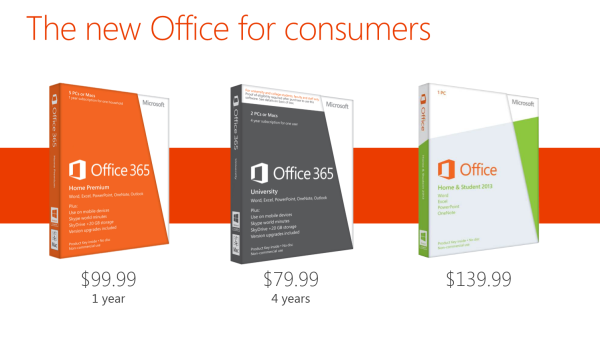
This year, we’ve got Office 2013. We’ve obviously had some experience with it in Windows RT form, and I spent a fair amount of time using the Office 15 Consumer Preview last year (in fact, I wrote my Masters thesis in Word 2013 Preview). In the grand scheme of things, it’s a pretty major change, with the biggest probably being the move towards a subscription-based model, though you can still buy Office in a traditional retail boxed edition with a standalone license. There are four different options for the standalone version of Office 2013: Home & Student (Word, Excel, PowerPoint, OneNote, $139.99), Home & Business (adds Outlook, $219.99), Professional (adds Publisher and Access, $399.99), and a volume-channel only Professional Plus with InfoPath and Lync for large businesses.
The interesting part is Office 365, which involves paying on a yearly basis for multi-device licensing and cloud storage. It’s worth clarifying the naming scheme here: Office 2013 refers to the latest version of the Office suite, while Office 365 refers to a subscription service that provides Office 2013 applications. Office 365 Home Premium and Office 365 University both come with the same set of programs (Word, Excel, PowerPoint, OneNote, Outlook, Publisher, Access) along with 20GB of SkyDrive storage, 60 Skype minutes, and multiple device installations (5 for 365HP, 2 for 365U). It’s a pretty sleek system, with all of Microsoft’s cloud services leveraged to provide a seamless experience. Obviously, this isn’t the first time we’re seeing cloud-based document storage and backup, but the SkyDrive integration in Office 365 is much deeper than we’ve seen in the past.
Now, with a subscription model, pricing is obviously key. I think Home Premium’s yearly $99.99 fee is a bit ambitious, but the University edition at $79.99 for four years is actually a pretty great deal. The only downer with 365U is that it only has support for two device installs, as opposed to five with Home Premium, but that’s the price you pay for getting an 80% discount. A university ID is, naturally, required at the time of purchase. (Thank god that most of my friends are still undergrads.)
| Office 2013 - Consumer Editions | |||||
| Variants | Office 365 Home Premium | Office 365 University | Office Home and Student 2013 | ||
| Price | $99.99 | $79.99 | $139.99 | ||
| Subscription Time | 1 year | 4 years | - | ||
| Device Installs | 5 | 2 | 1 | ||
| SkyDrive Storage | Free + 20GB | Free + 20GB | Free (7GB) | ||
| Skype World Calling | 60 mins | 60 mins | - | ||
| Office Programs | Word, Excel, PowerPoint, OneNote, Outlook | Word, Excel, PowerPoint, OneNote, Outlook | Word, Excel, PowerPoint, OneNote | ||
Let’s focus on Home Premium for now, as it’s the version that we’re testing and also the most relevant consumer product in the entire Office 2013/365 lineup. At $99/year, it offers a lot of value if you’re planning on using it on 4-5 devices, but if you’re only putting it on one or two devices, that sounds a bit steep. If it were in the $50-80 per year range with two or three licenses included and additional device installs available for $10 each or so, that’d be much easier. This also eliminates the problem for users wanting to install it on more than 5 computers. As presently constituted, to get more than 5 device installs, you need to buy another Office 365 subscription using a different Microsoft ID. With a typical family of four, it’s not even that difficult to think of having more than 5 computers, even if my occupation makes my household collection of computers a bit of an exception. Basically, it’d be nice to see a bit more flexibility in the plan with regards to the number of licenses available, along with this being reflected in the pricing scheme.

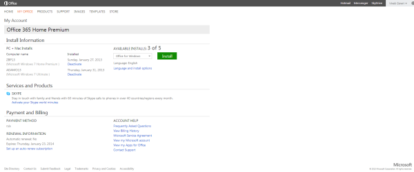
Setup is painless, with a simple executable (or .dmg for Mac installs) downloaded after creating or signing in with a Microsoft ID and entering your serial number. There is no DVD-based install, that has been retired in favor of purely digital distribution. The awesome thing here is that you can start using Office applications almost immediately, with many of the installation tasks being pushed to the background. Compared to the lengthy Office installs of old, this is a vast improvement.
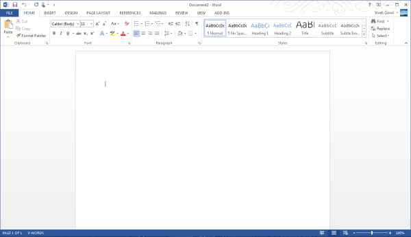
Generally, Office 2013 works pretty similar to Office 2010, with an interface heavily reliant on the ribbons. Now, I’ve always been a fan of the ribbons, which I thought were a good idea in Office 2007 but really came into their own with Office 2010. It’s been six years since they debuted, so anyone that is still complaining about Ribbon UI should really get over it, especially now that Windows Explorer uses it as well.
The aesthetic has been updated to match the Metro visual style that forms the basis of the Windows 8 and Windows Phone 8 UIs. This visual style has left me a bit cold in Windows 8 Desktop - I like the UI chrome in Windows 7, I feel it gives the interface some three-dimensionality and offers more natural interactions. But in Office, the chromeless aesthetic is awesome. I think it works really, really well in Word and PowerPoint especially, where the starkness and simplicity of the UI (particularly in the hidden command or hidden Ribbon modes) gives you a very blank slate to work from. It’s clean and pure in a very fundamental sense, with no visual distractions at all in the UI.
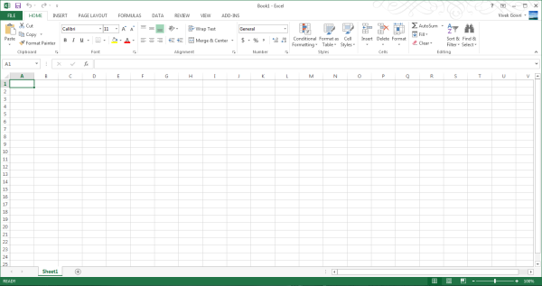
I’ll also note that the refreshed interface has little to no effect on Excel, which has looked and felt exactly the same since I first used it in Office 97 as a five year old. It’s like the Porsche 911 - no matter what changes under the hood, externally it has looked the same for decades it seems like. Not that it’s a bad thing, since I love the 911 and love-hate Excel, but it’s worth mentioning nonetheless.
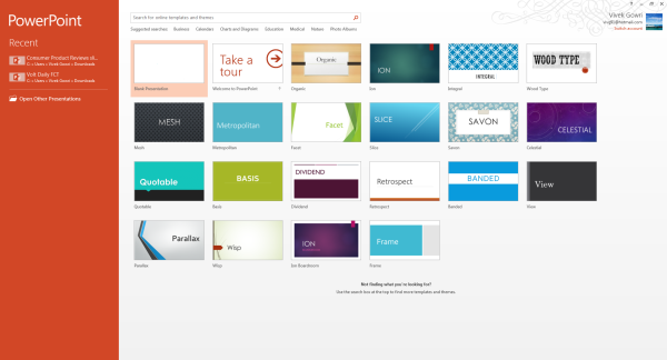
Generally, it seems like the Office 2013 has a much stronger focus on the visual style of the content being created than I’ve noticed in previous editions of Office. There’s much more aesthetic polish, with rich templates that aren’t worthless like they have been in many previous editions of Office, nicely styled titles and headers, and many more document design capabilities. Until you use it, it’s really difficult to overstate how much cleaner documents that come out of Office 2013 look. It’s now much easier to create content that are visually pleasing - documents and presentations that just look good and are easy to read without needing to spend a ton of time on formatting.
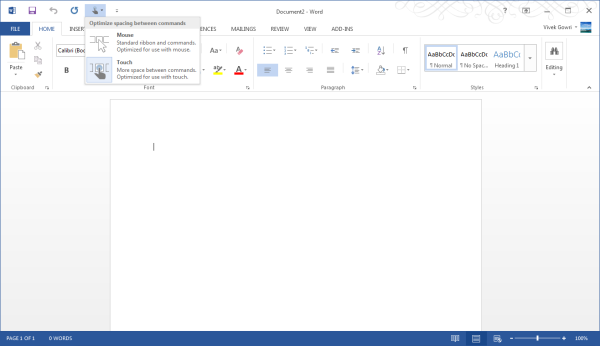
Microsoft is including two input modes: mouse (Office as we know and love it) and touch, which expands the size and spacing between menu options for a more finger-friendly interface without dumbing it down. Look closely at the below screenshot versus the one at the top of the page to get an idea of what I'm talking about. It’s decent to use, but obviously, creating content using the touchscreen keyboard is an outright pain, so this is more for navigation, minor editing, and formatting changes. You will obviously get more out of any office suite with a traditional keyboard and mouse setup, but the new Office at least has a more touch-centric UI as an option.
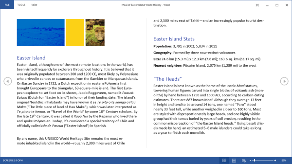
Word 2013 has a couple of nice features worth calling out. One is a viewing mode designed specifically for reading, which is pretty similar in theory to Reader mode in Safari, with text reflowing in columns to fit the display and all navigation and editing tools being hidden to present the document in a consumption-centric manner. The other is much better handling of PDFs - Word 2013 can now open PDFs and treat most content (text, tablets, formatting) exactly the same as standard Word docs. If you’ve ever had to deal with the nightmare of copying content from PDFs to Word, this is wonderful news. Unfortunately, now I’m done with college; it’s unfortunate that Microsoft didn’t decide to implement this in Word 2007 when it would have been legitimately useful to me. (Sidenote: perhaps this is a sign that I’m getting old, but I’ve had a number of moments in the first month of this year when I see new tech products and think to myself “Damn, I would have killed for that 5 years ago when I was an undergrad.”)
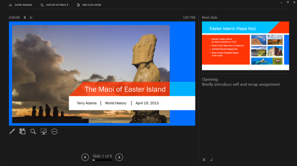
PowerPoint comes with significantly better audio and video media support, the ability to add pictures from online directly to the presentation instead of having to save and insert them, a new presenter view when you have a second screen (which is done automatically), more (and better) themes, some cool new transitions (in a category called “Exciting”), and better sharing and editing tools.
Excel’s improvements are primarily related to new charting options, but also a couple of new data tools. The new chart object styles are awesome, and the customizability of the data point styles and transparencies is much easier than it used to be. Other than new content and the visual refresh, the way you interact with the software hasn’t fundamentally changed much with the added features, which is why I’m kind of glossing over Excel and PowerPoint. They’re evolutionary improvements that don’t radically alter the user experience.
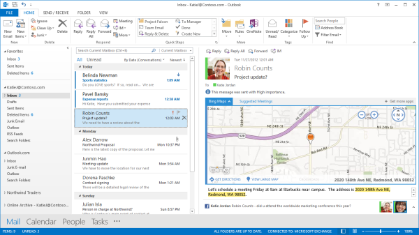
Outlook has been redesigned to look like a much more powerful version of the Windows 8 Mail application, with a colour scheme change from gold to blue. Inline replies are now the default, there are plenty of animations, and social networking integration is being touted as one of the more important new features. Clearly, this is not my father’s Outlook we’re talking about. It takes some of the better features from current mobile mail applications and integrates them into what was already the gold standard in desktop mail programs. There are new flyover boxes (called Peeks) to quickly show you schedule, calendar, or contact details without switching windows. The contact manager also does a better job of consolidating multiple contact details into a single card to reduce duplicates. Faster search, better filtering, and new views and in-line attachment and Bing map previews make the 2013 edition the sleekest and easiest version of Outlook yet. After using Outlook for a few days, going back to the Mail app is just a painful and torturous exercise.
With Office 2013, OneNote is making the jump from interesting and useful Office application to really being a vital component of the Office suite. With the rise of tablet computing and the touch-centric nature of Windows 8, this is understandable, particularly since most of the Intel-based tablets are coming with Wacom, N-Trig, or other active (pen-input) digitizers and even the Windows RT slates work well when paired with capacitive styli. That most Windows RT slates don’t come with capacitive pens out of the box is a failing of the device manufacturers, since the platform really lends itself to pen input.
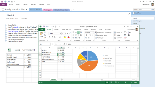
OneNote 2013 features a lot of cross platform integration, with easily embedded objects and Office files (which automatically update when changed). So, if I was to put an Excel grocery list file into OneNote, any changes I made to it in Excel would be reflected in OneNote as well. Outlook meeting integration gives OneNote much more scope in the business realm than it previously had, particularly when combined with the improved search and linked audio features. Better inking, photo snipping, auto-save, and a full-page reading view just improve what OneNote was already great for.
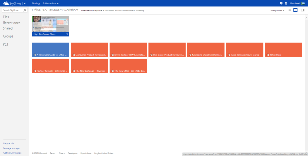
How big is Microsoft pushing the cloud integration in Office 2013? After signing into a Microsoft account, SkyDrive is the default save location in all Office apps, replacing the local My Documents folder. That’s an important distinction, because SkyDrive is a huge part of the Office 365 message (and likewise, Office integration is a huge part of SkyDrive’s appeal).
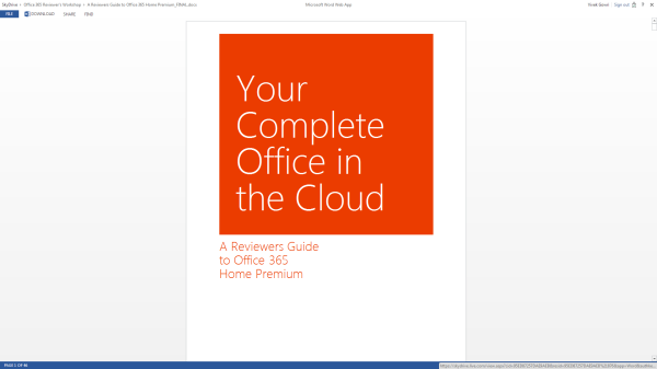
Combined with Office Web Apps in SkyDrive, the Office+SkyDrive combination is actually a pretty powerful way of creating and editing documents and presentations from the web, much more so than Google Docs is. And in that, I think Office 365 makes some huge strides in matching the convenience factor of Google’s purely online document creation tools, except with all the versatility and formatting power that comes with proper Office.
Sharing files from SkyDrive is also a breeze, much like Dropbox. And honestly, between the cheaper storage upgrades and Office integration, SkyDrive looks like a pretty compelling option for cloud storage when compared to Dropbox. Microsoft is doing a good job of leveraging its own products and services for better online integration, and that’s really one of the main stories in the new Office.
I’m coming away from Office 365 a big fan of the Office 2013 suite, along with a newfound appreciation of SkyDrive. The combination is a potent one, and could make the lives of students and professionals much, much easier. Unlike many Microsoft software redesigns of years past, including Windows 8, I don’t have too much in the way of misgivings about this one. The improvements are pretty comprehensive, and offer a more streamlined, polished, and visually refined user experience. That’s about all you can ask from an office suite.
My real questions center primarily around the subscription model. And even that is mostly limited to single or dual user families that don’t have access to a University subscription or Microsoft’s historically lenient home use agreements for commercial licenses. The $99 yearly price for Office 365 is pretty steep if you don’t make use of either the multi-computer install capabilities or the cloud services. I’d say in that case, you’re probably better off just getting a standalone Office 2013 license and signing up for a SkyDrive account which comes with 7GB of free storage. If you really need more storage, the 20GB upgrade only costs $10 per year, which isn’t bad at all. Or, alternatively, you could pay a student to get you an Office 365 University serial number on the cheap. [Update: I was joking about this part, sorry if it didn't come across that way. Yes, it violates the EULA, so no, don't do this.]
Other than that? It’s great. If you’ve got 4 or 5 computers to install Office on, $99/year isn’t bad at all, and for students that can get the University license, $79 for 4 years is a bargain considering that it comes with 20GB of SkyDrive storage for that four year stretch of time. If you have Office 2010 and are happy with it, I wouldn’t say you need to upgrade though the cloud integration makes that a compelling option, but for users of any previous edition Office, I’d seriously recommend making the transition.


