Original Link: https://www.anandtech.com/show/4266/blackberry-playbook-review
The BlackBerry PlayBook Review
by Anand Lal Shimpi on April 13, 2011 9:00 PM EST- Posted in
- Smartphones
- RIM
- BlackBerry
- PlayBook
- Mobile
- Tablets
I suppose it's fitting that I should be the one to write our PlayBook review. Before Android and the iPhone, there were two mobile platforms/devices that I was hugely fond of: the Palm V and my BlackBerry. In fact, it wasn't until the iPhone that I finally let go of my last BlackBerry - moving on from the email era into the smartphone age.
Today's BlackBerry is of course very different than the devices I used in college. And the PlayBook is unlike anything RIM has ever done.
I don't believe any tablet maker has perfected the formula just yet. I made that abundantly clear in our review of the iPad 2. While you can't argue that Apple is the forerunner in the smartphone based tablet space, over the long term I still believe this is anyone's game. Remember, the leaders in the early days of the PC industry weren't the ones who ultimately dominated the mature market.
What follows is our review of RIM's first attempt at building a tablet. The PlayBook is far from perfect, but there's a foundation here that can be built upon if RIM has a good roadmap and good execution. And if you're a BlackBerry user, there's a lot of synergy to exploit.
| BlackBerry PlayBook Pricing Comparison | |||||
| 16GB | 32GB | 64GB | |||
| WiFi | $499 | $599 | $699 | ||
Let's get to it.
The Hardware
If we view the primary difference between the first and second generation of smartphone based tablets as being ergonomics and performance, the PlayBook falls squarely in between the two.
At 10mm thick the PlayBook (7-inch display) is more iPad 1 (9.7-inch) or Xoom (10.1-inch) than iPad 2 or Galaxy Tab 8.9, but what RIM lacks in thinness it makes up for in overall size. The PlayBook is an almost-pocketable tablet. Bigger than the 5-inch Streak and even bigger than the 7-inch Galaxy Tab, the PlayBook isn't a pain to port around. The PlayBook is small enough to snugly fit inside the outer pocket of a long men's winter coat or a lady's purse. While I definitely don't carry my iPad everywhere, if it were more functional I could see carrying the PlayBook with me more often than any other tablet.
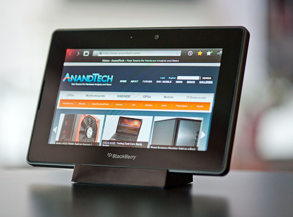
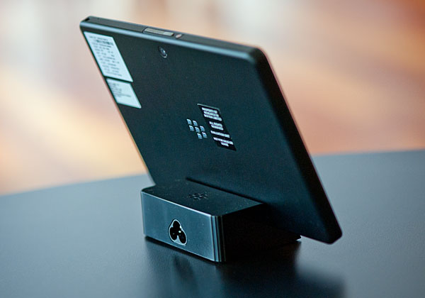
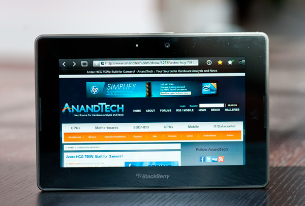
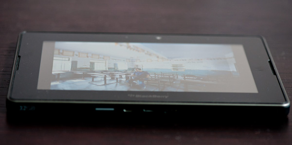
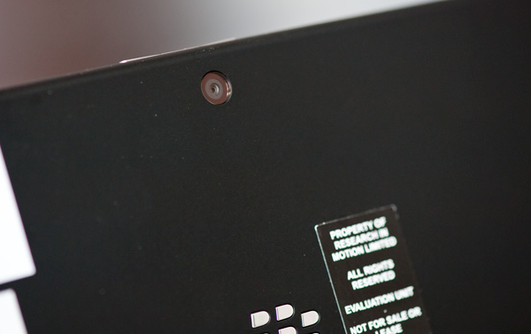
The PlayBook's styling is modest, even for BlackBerry standards. The front has a single BlackBerry logo along the bottom bezel and a visible camera lens but that's it. Around back you've got RIM's logo, a larger lens for the rear-facing 5MP camera sensor and a sea of black.
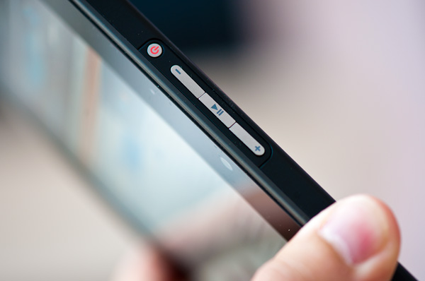
The only buttons on the device are along the top of the PlayBook: power, volume down, pause/play and volume up. The power button is flush with the surface of the PlayBook's edge. You basically need a pointy finger nail (which I typically don't have) to press it easily and as a result the power button was pretty much useless to me. If you can manage to hit it the power button will lock the PlayBook, otherwise you'll have to leave the tablet idle until it automatically goes into standby. RIM tells me that final versions of the PlayBook will have this power button raised by 0.8mm, enough to make it easily clickable.
Press and hold the power button and you'll be greeted with a PC-like choice to either power off the PlayBook or restart it. I'm not sure how frequently RIM expects you to do the latter, but when testing it's a nice feature to have.
The volume up/down buttons work as expected, although the volume level itself doesn't seem to be very linear. There's a single 1/8" headphone jack up top, near a port for the PlayBook's microphone.
The PlayBook features a pair of pretty loud stereo speakers on the front of the device. Being used to the iPad's single speaker, the PlayBook's two speakers are nice.
Charging is always an issue on these USB devices. You can take Apple's approach and charge over USB, which unfortunately can take a while to fill up a tablet's battery. You also run into issues with older computers that don't support the USB Charging spec, resulting in charging-only-while-sleeping like the iPad. Then there's Motorola's approach with the Xoom where you don't charge over USB but have a dedicated port for an AC adapter. Charging times are significantly reduced but now you need to carry around an extra adapter with you wherever you go. RIM arrived at what's quite possibly the best solution. The PlayBook will charge over USB and it also features a higher amperage quick-charge port for use with some of its accessories.
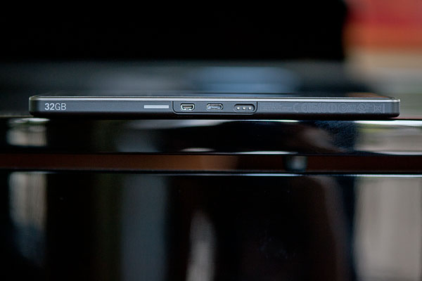
The battery is of course not removable and there's no USB port or SD card reader.
The Form Factor
The PlayBook is only slightly larger than Samsung's 7-inch Galaxy Tab and maintains the same 7-inch screen size (albeit with a functional border around the screen). Given my complaints about current tablets not being incredibly portable compared to a smartphone, you'd think that I'd love the PlayBook's form factor. To be honest, for portability, I do.
| Tablet Specification Comparison | |||||
| Apple iPad 2 | BlackBerry PlayBook | Motorola Xoom | |||
| Dimensions | 241.2mm x 185.7mm x 8.8mm | 194mm x 130mm x 10mm | 249.1mm x 167.8mm x 12.9mm | ||
| Display | 9.7-inch 1024 x 768 | 7-inch 1024 x 600 | 10.1-inch 1280 x 800 | ||
| Weight | 601g (WiFi only) | 425g | 730g | ||
| Processor | 1GHz Apple A5 (2 x Cortex A9) | 1GHz TI OMAP 4430 (2 x Cortex A9) | 1GHz NVIDIA Tegra 2 (2 x Cortex A9) | ||
| Memory | 512MB | 1GB | 1GB | ||
| Storage | 16GB up to 64GB | 16GB up to 64GB | 32GB + microSD card | ||
| Pricing | $499 up to $829 | $499 up to $699 | $599 - $799 | ||
While I'm almost never tempted to bring the iPad with me when I'm going around town, the PlayBook is a far easier sell. It's almost pocketable (and actually pocketable if I'm wearing a big jacket) and isn't too heavy.
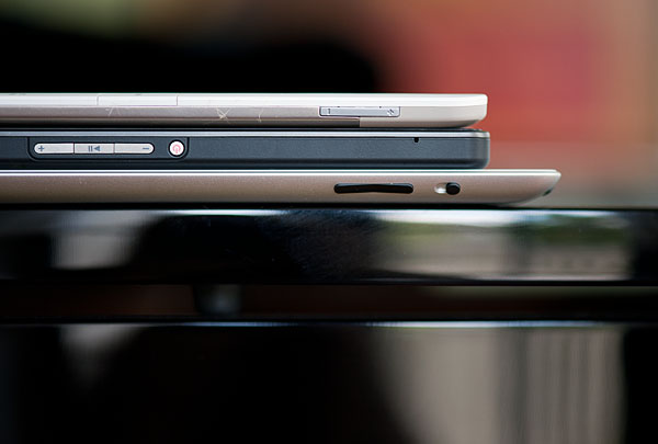
From top to bottom: Amazon Kindle 2, BlackBerry PlayBook, Apple iPad 2
Even when I'm not out and about, the PlayBook is quite usable as a content consumption device. In portrait mode fonts are a bit too small for me to read comfortably on the couch but in landscape it works well as a reddit browsing machine.
It's in the couch-lounging usage model that the PlayBook does fall short of the iPad or Xoom. But in terms of portability the PlayBook is clearly a much better balance of functionality and mobility. If you read between the lines you'll come to the same conclusion I have: neither the PlayBook nor the iPad is the perfect form factor for a tablet. Further more, I'm not sure there is a single perfect tablet form factor.
Apple tends to be a one-size-fits-all company when it comes to iOS. You want a smartphone? That'll be a 3.5-inch screen on an iPhone. Want a tablet? 9.7-inch iPad. It's interesting given how carefully Apple selected its four notebook sizes: 11, 13, 15 and 17-inches.
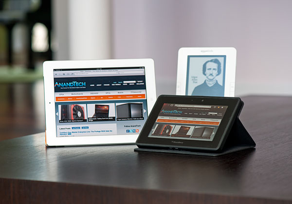
Clockwise: Apple iPad 2, Amazon Kindle 2, BlackBerry PlayBook in Convertible Case
Ultimately I don't think tablets will fall into the one-size-fits-all category. Instead I believe they're ultimately headed for some sort of a convergence with netbooks or notebooks. Today that's difficult to see because they lack a common hardware ISA, OS and even apps, but you don't have to look too far into the future to see those problems going away.
While I appreciate the PlayBook's portability and would definitely carry it around more than an iPad, it's not as nice to use laying back on a couch. The screen is too small to comfortably read in portrait mode and even in landscape things can get a bit cramped.
RIM's market research shows a clear preference for portability, hence the PlayBook's introductory 7-inch form factor. However RIM also pointed out that the BlackBerry comes in all shapes and sizes, indicating that the PlayBook would ultimately be available in different form factors as well. RIM also indicated that the 7-inch PlayBook may not be the smallest size offered either. Clearly RIM views the tablet market much like the notebook market: there will be ultraportables and there will be workhorses, with tons of choice in between. The 7-inch PlayBook is merely a starting point. Assuming RIM can fund the projects, we'll likely see both larger and smaller siblings in the future.
A Functional Bezel
The PlayBook supports all of the basic gestures we've come to expect from mobile devices with a capacitive touchscreen. There's flick to scroll, pinch to zoom and pretty much anything else you'll encounter on an iOS or Android based device. What RIM adds with the PlayBook are gestures that originate in the bezel of the device.
Any gestures within the 7-inch LCD area control the currently running app. Any gestures that originate in the bezel around the screen however are a different story. The first is the unlock gesture. Swipe up/down, left/right or the opposite direction when the PlayBook is asleep and you'll wake it up. There's no support for passcode locking and no physical unlock switch (although the power button will work in a pinch) - all you need to do is take one finger starting from a point on the bezel and slide it up or across. I've noticed that you have to be pretty committed when unlocking, anything less than swiping up/across 50% of the screen won't register as an unlock swipe. I suspect this is to ensure that no accidental swipes unlock the PlayBook when in your pocket/purse/othercavity.
Once unlocked, a swipe up from the bottom bezel will do one of two things depending on the state of the PlayBook. If you're at the home screen, swiping up from the bottom bezel brings up the entire app launcher instead of just the top row of apps. If you're in an app, a swipe up will reduce the active app to a thumbnail, expose the webOS-style task switcher and display a part of the home screen.
Swipe from the top bezel downward within an app and you'll either reveal a contextual menu for the app or you'll pull down the system settings page.
What about the left/right bezel? That's what you use to quickly switch between apps of course. Imagine an infinitely wide desktop where your viewport is big enough to hold on full screen app. To get to any active (even paused) app to the left or right of what you're currently looking at, just swipe left (or right) beginning in the bezel and you'll swap apps. If you only have one app running the OS will try to animate your current app sliding away but it'll bounce back, as if to tell you that you've reached the end of the horizontal list.
The bezel gestures don't stop there. Swipe up from the lower left corner and you'll bring up the PlayBook's virtual keyboard, in any app. This is a particularly puzzling gesture because you can bring up the keyboard even in apps that can't use a keyboard. And no, the keyboard shortcuts from the BlackBerry OS don't work on the PlayBook.
The lower right corner doesn't do anything but swipe from either of the upper two corners and you activate what RIM calls the peek gesture. The peek gesture gives you a quick look at the top status bar - including any notifications, date/time and battery status.
The bezel based gestures work well on the PlayBook although I'm not sure how long term of a solution this will be. Users tend to prefer thinner bezels - a direction I ultimately see all tablets going.
QNX: The PlayBook OS
A year and a half ago RIM jumped on the opportunity to purchase an OS vendor called QNX (pronounced Que-NIX, like UNIX with a Q in front). RIM saw a growing gap between its BlackBerry OS and what Apple/Google were working on and realized it needed something new to effectively keep up with the joneses. The age old debate between build vs. buy kicked in to high gear and RIM took the route with less internal risk: acquire QNX.
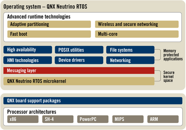
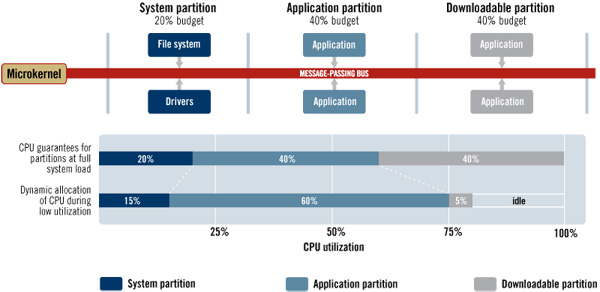
QNX's Neutrino 6.5 OS is the basis of the BlackBerry Tablet OS running on the PlayBook. QNX features a very small (by modern standards) microkernel of around 100K lines of code. By comparison the modern day Linux kernel is around 14M lines of code. QNX argues that by limiting the scope of the kernel it can ensure greater stability and less vulnerability to bugs in the code. QNX is functionally a modern OS, however everything beyond the base kernel is supplied in the form of separate, self contained services. Even drivers are excluded from the microkernel.
QNX is, as a result, a very modular operating system. Additional features are added simply by bundling extra services, however for specific markets you don't incur any complexity or security penalty as unneeded services are simply turned off.
Because it's so modular, QNX has no issues being used in everything from the PlayBook to high end Cisco routers. Obviously the requirements of a tablet are very different from a router, so RIM actually implemented an updated version of QNX 6.5 into the PlayBook with some tablet specific features. The QNX team worked on improving media playback and GPU performance in QNX, features that will eventually make their way into QNX 6.6.
Another benefit of the modularity of QNX is that each service runs effectively sandboxed. A crash within a single service won't bring down the whole OS. Restarting a single crashed service can be done quickly. A small kernel should also be able to boot quicker, however the PlayBook itself has a longer boot time than Honeycomb because the entire OS image is validated using a crytographic hash on boot up. As a result of this image validation, the PlayBook will always boot into a known secure environment. Should the image validation fail, the PlayBook will typically install a previous known-good copy of the kernel stored on a separate partition.
Communication between services/processes happens via a structured messaging system. This is of course one of the benefits of a microkernel OS: inter process communication is usually quite good, because it has to be.
In QNX every task or thread has a priority. While a handful of priorities are reserved for system level events (to prevent an app from taking priority over refreshing the screen for example), everything else is defined by the caller. QNX argues that unlike in monolithic non-realtime OSes, task/thread priorities are nearly always respected here. Inevitably you'll have a number of tasks that have the same priority, and there the scheduler will just round robin between them. The one guarantee QNX offers is that any task with a higher priority will execute in accordance with that priority. This is ultimately what makes QNX a realtime OS.
Large monolithic OSes often give you the same promises, however QNX argues that they don't always hold true to them. There's always some system process that's interrupting things or a runaway task that prevents your screen from updating as quickly as you need it to. These days with hefty multi-core CPU architectures, hiding scheduling latency due to a system process interrupting something else isn't too difficult. On tablets/smartphones it's more of a problem given limited CPU resources, but ultimately it'll diminish there as well. There is arguably a power efficiency benefit here but at a high level that's a difficult thing to measure.
The QNX OS itself has been ported to everything from x86 to PowerPC. Although the PlayBook uses an ARM based OMAP 4430 today, it looks like RIM is pretty open to moving to other microarchitectures should the need arise.
File System
On the PlayBook RIM implements the latest version of the QNX file system. The setup supports 64-bit LBAs (effectively no limit on single file size given current NAND capacities) and 1K file names.
File system performance is difficult to measure at this point given that we're dealing with pretty low performance NAND as well in devices like the PlayBook.
TI's OMAP 4430
You have to hand it to NVIDIA, up until the launch of the iPad 2 if you were talking about a dual-core tablet or smartphone you were likely talking about something running the Tegra 2. Both Qualcomm and TI are late to the dual-core SoC game, but with the PlayBook we have the first shipping device based on TI's Tegra 2 competitor: the OMAP 4430.
At a high level the 4430 looks a lot like the Tegra 2, but dig a little deeper and you'll see that the SoC should be faster overall.
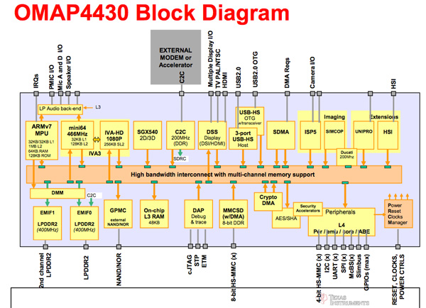
Like the Tegra 2, TI's OMAP 4430 has a pair of ARM Cortex A9s running at up to 1GHz with a shared 1MB L2 cache. Unlike the Tegra 2 however, TI implemented ARM's Media Processing Engine which gives it both a pipelined FPU as well as support for ARM's NEON SIMD instruction set (think SSE but for ARM SoCs). It won't be until Kal-El before NVIDIA brings NEON support to its SoCs.
On the GPU side TI uses a PowerVR SGX 540 by Imagination Technologies. The SGX 540 has four USSE pipes (SIMDs) each capable of up to two MADs per clock.
| Mobile SoC GPU Comparison | |||||||||
| PowerVR SGX 530 | PowerVR SGX 535 | PowerVR SGX 540 | PowerVR SGX 543 | PowerVR SGX 543MP2 | GeForce ULP | Kal-El GeForce | |||
| SIMD Name | USSE | USSE | USSE | USSE2 | USSE2 | Core | Core | ||
| # of SIMDs | 2 | 2 | 4 | 4 | 8 | 8 | 12 | ||
| MADs per SIMD | 2 | 2 | 2 | 4 | 4 | 1 | ? | ||
| Total MADs | 4 | 4 | 8 | 16 | 32 | 8 | ? | ||
| GFLOPS @ 200MHz | 1.6 GFLOPS | 1.6 GFLOPS | 3.2 GFLOPS | 6.4 GFLOPS | 12.8 GFLOPS | 3.2 GFLOPS | ? | ||
At the same clock speed, the SGX 540 has the same theoretical compute potential as the GeForce in NVIDIA's Tegra 2. The SGX 540 is a tile based renderer and thus tends to have an appreciable memory bandwidth advantage in current smartphone/tablet gaming workloads.
TI's memory interface is often touted as a significant performance advantage for the OMAP 4430. While NVIDIA has a single 32-bit LP-DDR2 interface, the OMAP 4 embraces a dual-channel (2 x 32-bit) LP-DDR2 interface giving it twice the theoretical bandwidth of what you'd get on a Tegra 2. NVIDIA argues that its bandwidth efficiency is high enough on the Tegra 2 that you don't need two channels, but it's honestly difficult to really validate claims like that.
The other major piece of the OMAP 4430 is its video engine, something TI calls the IVA 3 multimedia accelerator. This hardware encode/decode engine is what makes full 1080p30 playback and recording possible on the PlayBook. As you'll see in our video tests, the PlayBook is the first ARM based tablet we've used that can decode a 1080p H.264 High Profile video stream.
Overall the OMAP 4430 has the specs to be performance competitive with anything else out there today, definitely anything Tegra 2 based. Apple's A5 still has a much faster GPU but from a CPU standpoint, the PlayBook should be competitive. Any non-3D performance differences would likely be due to software optimization, not hardware limitations.
A New Home
Like many things, when talking about home screens there's a spectrum of options. On the simplest end we've got Apple with iOS, and for the ultimate in complexity there's a full blown desktop OS like Windows or OS X. In between there's Android and somewhere between iOS and Android we have the PlayBook OS.
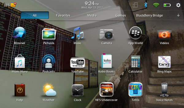
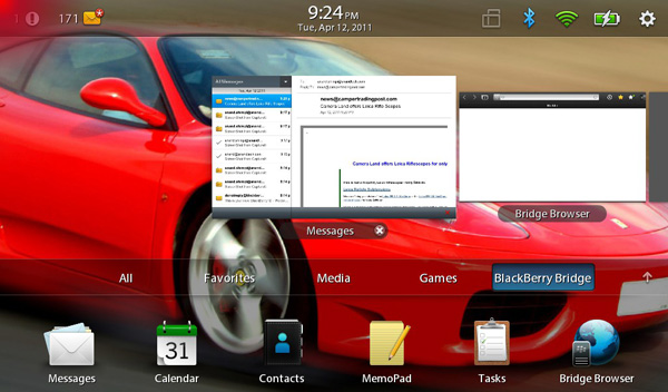
The default home screen is your typical grid of apps. You can collapse the grid down to a single row of six icons in landscape mode, or view the full grid. RIM provides five tabs to help sort through apps: All, Favorites, Media, Games and BlackBerry Bridge (the latter only appears if you have Bridge enabled).
There's no support for folders, although you can rearrange icons and uninstall apps directly from the home screen the same way you would under iOS.
App launches are unfortunately a bit high latency. Select an app and you'll first see it launch as a thumbnail, then zoom in and finally run full screen. The whole process takes a couple of seconds but it feels longer than firing up similar iOS or Honeycomb apps.
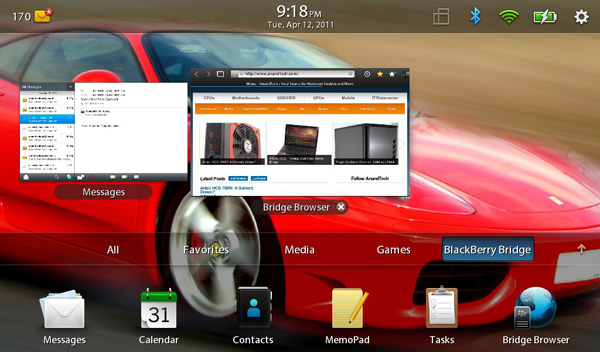
Above the app grid is the multitasking UI, although you need to have at least one active app to see it in action:
Multitasking is smooth and well executed on the PlayBook. To switch between active apps just swipe left to right (starting from the left or right bezel, inner-screen swipes are application specific). You can also swipe up from the bottom bezel (the unlock gesture) while you're in an app to bring up a horizontal list of thumbnails of currently running apps. When in this thumbnail view you can swipe left to right to scroll through the list of apps, flick up (or hit the x) to quit apps and tap on a thumbnail to select and switch to an app. It's all clearly very webOS inspired, although I will say that webOS still feels a bit better in this regard.
Apps continue to run while you're deciding what to switch to. For example, if you're playing a video the player thumbnail will continue to animate while you select your next app. Only once you've selected that app will the video player pause.
RIM also gives you the option to control how background apps behave. By default background apps are paused once you switch away from them, however you can set them to keep running all the time or pause immediately upon activating the task switcher.
Scrolling through running apps is (for the most part) very smooth, with the UI running at 60 fps. The multitasking UI is extremely well done and honestly one of the most impressive parts of the PlayBook experience.
Notifications
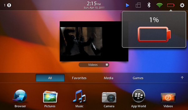
With no email or calendar apps, the PlayBook doesn't have a whole lot to notify you of. Presently the only notifications the PlayBook will deliver have to do with remaining battery capacity.
Notifications on the PlayBook work by coloring a corner of the screen (I've seen this happen in both the upper left and upper right corners) if you're in a full screen app. Use the peek gesture to reveal the status bar and you'll see a little icon representing the app that spawned the notification. As I just mentioned, the only notifications that exist today are from the OS telling you that your battery is low but ultimately you'll see notifications from other first and third party apps here.
PlayBook's notification system is clearly a work in progress. Currently if you're charging a fully discharged PlayBook you'll get a notification every 1% between 0 and 6% telling you that the battery is low as you charge it. Also the only notification color supported today is red, which works well for "hey you're running out of battery life!" but not so well for "hey you just got 3 emails".
The notification system on the PlayBook has the potential to be decent. I expect that RIM will tweak the notification system over the coming months to accommodate other applications and services using it. The foundation is solid and RIM seems to be listening to feedback so I have hope for this working well.
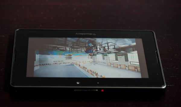
There's also a notification LED on the front of the PlayBook, to the left of the front-facing camera. Today all it does is glow red when you turn on the PlayBook, but you can eventually expect it to have more BlackBerry-like functionality as RIM rolls out other things that can notify you (think emails).
The PlayBook Browser
Two years ago RIM acquired Torch Mobile, a development house that happened to be a significant contributor to the WebKit project. WebKit also happens to be the foundation for both Google Chrome and Safari (both Mac and iOS versions). Torch Mobile had its own WebKit based browser called Iris, which eventually got folded into BlackBerry OS 6.0 and launched with the BlackBerry Torch.
The PlayBook expands upon Torch Mobile's work with one of the strongest parts of the BlackBerry tablet experience. The PlayBook's browser technically supports tabs however the tab bar isn't always visible as it is with Honeycomb. The PlayBook handles browsing multiple web pages better than the iPad, but not nearly as well as the Xoom.
Scrolling is incredibly smooth, even on Flash enabled web pages. Scroll down too quickly and you'll get an empty screen that takes a moment to catch up with your scrolling. It's not uncommon to see this on iOS, it happens less with the iPad 2 and it seems to happen more with the PlayBook.
Web page compatibility is ridiculously good with the PlayBook's browser, partially due to RIM's excellent implementation of hardware accelerated Flash 10.2. Corner cases that wouldn't work on Android or iOS work perfectly on the PlayBook. While I personally prefer the UI of Honeycomb's browser and the size/screen of the iPad 2, the PlayBook probably offers the best browsing experience from a pure software standpoint of any of the tablets.
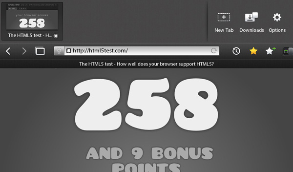
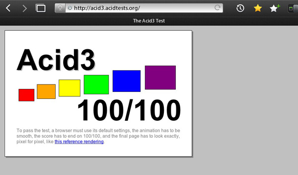
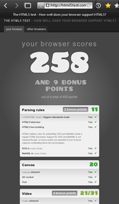
RIM's tablet browser passes the Acid3 test and scores higher on the HTML5test than both the iPad 2 and Honeycomb. The PlayBook user agent comes up as: Mozilla 5.0 (PlayBook; U; RIM Tablet OS 1.0.0; en-US) AppleWebKit/534.8 (KHTML, like Gecko) Version/0.0.1 Safari/534.8+.
Nearly all websites treat the PlayBook as a desktop browser and don't force you to a mobile version of the site. This is true for video sites as well, like Hulu and YouTube.
Having full Flash functionality built in to the browser is nice. You can disable Flash entirely if you want to, but leaving it enabled doesn't really impact performance all that much - even scrolling with Flash ads in place remains pretty smooth.
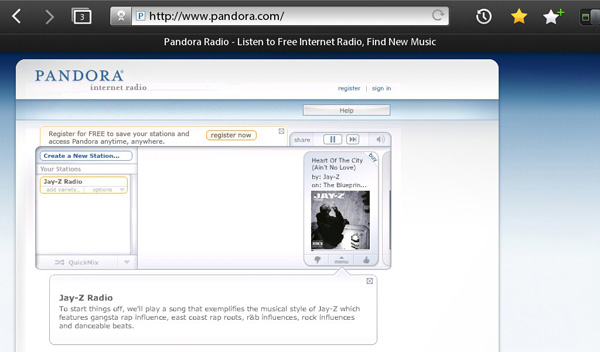
Sites that depend entirely on Flash work on the PlayBook, although controlling pure Flash sites can be a problem. Case in point: Pandora. The web version of Pandora is fully functional on the PlayBook, albeit slow to load. The trouble comes in when you try to use Pandora's integrated scroll bar or actually switch stations. Pandora is optimized for a mouse driven experience, not a touch UI, resulting in a lot of frustrating tapping and really slow scrolling. It's workable, but definitely not desirable.

This is full screen Flash on the PlayBook
Flash video players also work on the the PlayBook within its browser. I was reading an article on abcnews.com the other day with an embedded video. I just tapped the video and it started playing immediately. The same for embedded Hulu videos in Facebook. The YouTube website also works, although RIM ships the PlayBook with a dedicated YouTube client for better browsing.
The problem with embedded Flash video is the same as the Pandora issue: control. You can't really hover to expose controls with a touchscreen so what you end up doing is a lot of quick tapping to try and bring up controls, change the setting you want and get back to playing the video. It's frustrating and doesn't work all of the time. None of this is RIM's fault, but now that tablets are at the point where they can start to behave like notebook/desktops web developers will have to rethink the way they build websites. The web is still the unifying platform between all OSes, it's just a few steps behind in becoming touch optimized.
Browser Performance
The Torch Mobile acquisition might imply that the PlayBook should have not only the most compatible browser on the market but also the highest performing one. Unfortunately that's not exactly the case. Despite having a comparable SoC to Apple's iPad 2 and something that should be faster than the Tegra 2 in the Motorola Xoom, the PlayBook (on average) performs more like an iPad 1/Xoom hybrid than an iPad 2 in our web page loading tests.
Let's start with the low level javascript execution performance tests: sunspider and BrowserMark.
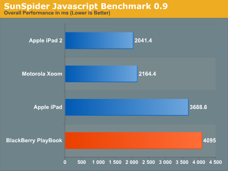
Here's something interesting. The PlayBook actually does a lot worse running SunSpider 0.9 (something we keep around so you can compare our numbers to our older smartphone results) than running version 0.9.1. I'm not sure what's the root cause but here's a look at the iPad 2 vs. PlayBook under SunSpider 0.9.1:
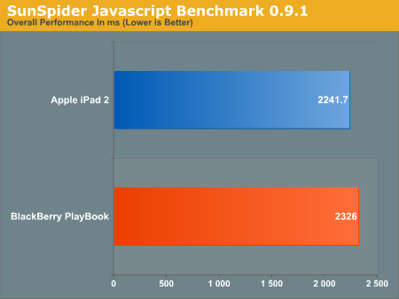
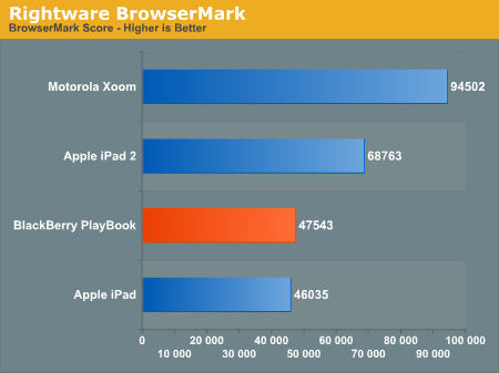
In BrowserMark the PlayBook is about the speed of the original iPad with a single Cortex A8. To me this sounds like there's just a lot of optimization work that has to be done on the browser's javascript engine, something both Apple and Google have worked on extensively over the past year.
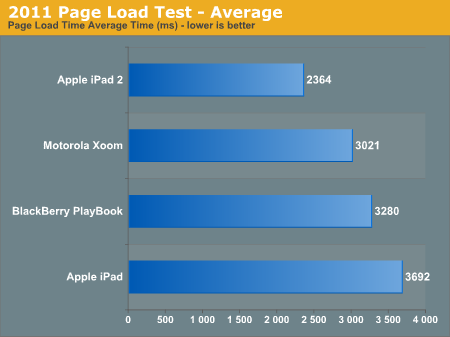
Actual timed web page loads (without Flash) look a bit better for the PlayBook. On average the PlayBook managed to load our test pages (stored local on our network) faster than an original iPad but slower than the Xoom, and no where near as quickly as the iPad 2. If you look at the performance breakdown, the PlayBook handles some web pages nearly as well as the iPad 2 and others render slower than on the original iPad.
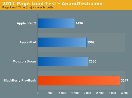
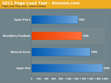
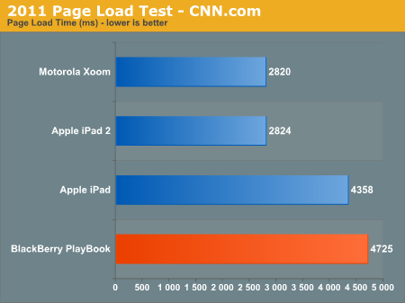
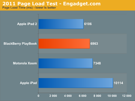
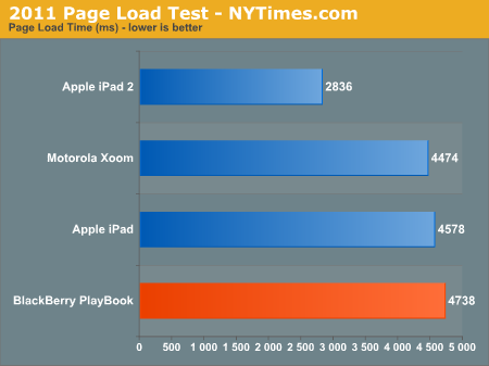
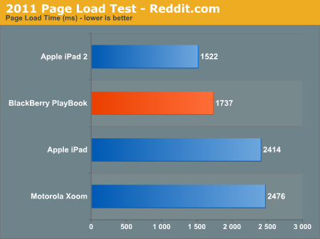
Our tests really stress the hardware/software since the pages are delivered as quickly as possible without any network delays. Outside of our test environment I'd say the PlayBook experience does mirror the performance tests. Browsing isn't slow by any means, but it's not exactly iPad 2 quick.
RIM tells me that its intentions are to have industry leading browser performance and that there's a lot of room for optimization left on the PlayBook. I believe that there's a lot more that can be done here, the question is how quickly will RIM get around to doing it.
HDMI Out: The Best Yet
The PlayBook has the best implementation of HDMI output I've seen on a tablet thus far. You get full blown UI mirroring, but within certain apps you can toggle presenter mode.
With presenter mode enabled you can actually display one thing on your external monitor/TV over HDMI, and continue to use the PlayBook without interruption. This is particularly useful for pushing videos out to an external display for others to watch while you're getting work done on your PlayBook.
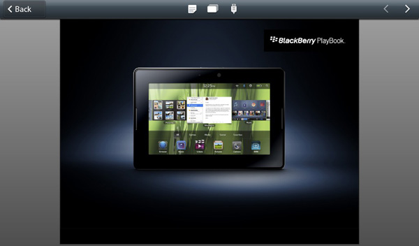
Top bar, third icon, enables presenter mode

Switch to videos on the PlayBook, hit the icon in the upper right to switch HDMI output to the current video
Presenter mode is supported by the Videos app and Presentations to Go.
With presenter mode enabled and playing a video there's actually no slowdown on the PlayBook itself thanks to full hardware decode offloading and tons of available memory bandwidth.
Keyboard
The PlayBook's virtual keyboard is pretty standard fare. By default you have a QWERTY keyboard with all of the alphabet present, although RIM gives you the option of switching to QWERTZ and AZERTY layouts. You can tap and hold on vowels to bring up accented letters.
Numbers and symbols are available through a modifier key:
The number and symbol layout is a bit odd compared to iOS and Honeycomb but other than that I don't really have any complaints about the layout of the virtual keyboard.
While it's possible to type on the PlayBook, it's not quite as easy as on a larger tablet for obvious reasons. And thanks to the combination of overall size and gesture bezel, I found myself hitting the bottom bezel instead of space quite frequently.
One thing you can do on the PlayBook that isn't too comfortable/possible on larger tablets is two-thumb-type in portrait mode like you would on a smartphone.
RIM doesn't support any real time autocorrection. I complained about Apple dialing back autocorrection in iOS for the iPad, I gave Google props for letting you customize autocorrection aggressiveness in Honeycomb, but RIM seems to avoid the issue entirely by just not doing it. I understand the reasoning behind dialing it back - the sort of typing you do on a tablet is a bit different than on a smartphone, but I still believe that with a dictionary that is well customized to your vocabulary autocorrect can be a boon to typing speed on virtual tablet keyboards.
Although there's no autocorrect, system-wide spell check is supported by the PlayBook OS. Misspell a word and you'll get a familiar red underline. As long as you're running a non-BlackBerry Bridge app, tapping on the word will pop up a list of possible replacements. There's no way to control the dictionary and I haven't found a way to make it learn words either. Whereas Apple and Google really focused on the virtual keyboard experience, it feels like it's a work in progress for RIM.
I managed to get a Bluetooth keyboard working with the PlayBook, so if you need to do a lot of typing there's always the physical keyboard option. RIM doesn't specifically offer a Bluetooth keyboard however anything that supports the standard should work.
With a Bluetooth keyboard you can type without having the virtual keyboard on-screen but you still need to use the touch screen to interact with apps and switch between them.
No General Email Client, Calendar or Contacts until Summer 2011
The PlayBook launches as a WiFi only tablet. This summer we'll see the first PlayBook with a cellular data connection on Sprint's WiMAX network, followed by HSPA+ and LTE versions later this year.
Cellular connectivity isn't the only thing that's coming later unfortunately. In its current incarnation, the WiFi PlayBook doesn't ship with a dedicated email client, calendar or contacts app. Given how frequently I say that email and web browsing are two killer apps for tablets, this is bad for the general consumer.
I specifically mention the general consumer because if you have a BlackBerry running BBOS 5.0 or later, my complaints don't entirely apply. I'll explain more later.
When email and PIM are brought to the PlayBook, you'll be able to get the same BIS/BES experience you do with BlackBerry smartphones. RIM also indicated that you might be able to get a more typical tablet data plan if you'd like and circumvent BIS/BES entirely.
The bottom line is that today the PlayBook can't store contacts, it can't organize your day and you can't use it to check emails using anything other than your web browser. RIM's explanation? Most users who buy tablets don't buy it for push email, most are on WiFi, and if you're not getting push email then a web client is probably ok. I don't agree with this assessment, and clearly RIM doesn't completely agree with it either, so we'll eventually get all of these things for the PlayBook later this summer alongside the release of the WiMAX PlayBook.
Existing BlackBerry customers (running OS 5.0 or later) will get a version of the experience sooner using BlackBerry Bridge.
BlackBerry Bridge
The first era of the mobile revolution was about apps. Quantity, quality, method of delivery, everything that related to the apps on these devices is what really helped accelerate adoption of platforms like Android and iOS. While we're not quite done with the first era, the next era will be one of synergy between devices. Today there's simply no good way to seamlessly share all of your data (both static and active) among all of your computing devices (PC, tablet and smartphone). Cloud services help bridge the gap but what about some of the basic use cases? Let's say I've got a few tabs open in Chrome on my PC and I decide to take a break and read those websites on my tablet. There's no way to quickly take my current operating environment with the apps/tasks I've got open and transition them to another device.
Everyone who is anyone in the mobile space is working on device synergy, although very few attempts have been demonstrated publicly. HP's touch-to-share is an early example of synergy between devices, although it's presently limited to sharing URLs between webOS phones and the TouchPad. You can see how HP is in a good position however to extend that sort of synergy to its desktops as well. The same goes for Apple. Google wouldn't have too hard of a time doing it, assuming you're running mostly web apps on your PC and store state in the cloud.
RIM's first attempt at device synergy targets its loyal (whether forced or by choice) customer base: BlackBerry users. In the enterprise, the BlackBerry does a handful of things extremely well. The features are apparently attractive enough to actually force some users to carry two smartphones: an iPhone/Android phone for personal use and a BlackBerry for work.
The PlayBook solution is called BlackBerry Bridge. At a high level it's a 256-bit AES encrypted link over Bluetooth between the tablet and any BlackBerry running OS 5.0 or later. This encrypted link is then used to manage data stored on the BlackBerry using the PlayBook. In essence, the PlayBook becomes a larger window into your BlackBerry.
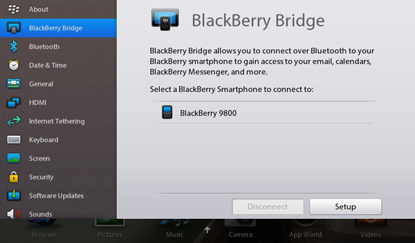
To enable BlackBerry/PlayBook interoperability you have to do two things. First, on the PlayBook, go to the BlackBerry Bridge settings page and enable the option. You'll be taken through steps to get the Bridge app onto your BlackBerry and finally pair the two devices. RIM just enabled Bridge support within the past 24 hours so the process is a bit more complicated for reviewers than it will be for customers. While an end user should be able to just scan the QR code displayed on the PlayBook with a BlackBerry, I had to login to RIM's beta site and manually download the app as well as jump through a few additional hoops.
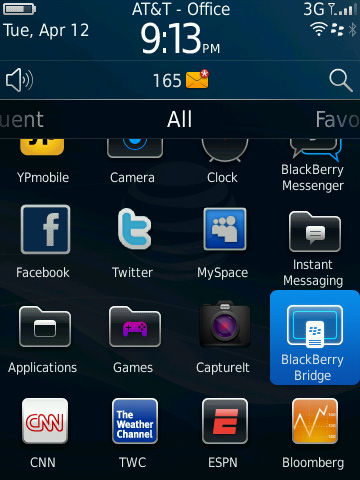
The pairing process is pretty simple, pretty typical for a Bluetooth pair. You'll get a pin on both devices, make sure they match, hit go and you're all synced up.
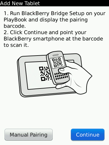
Once paired, you can lock your BlackBerry and set it aside. The PlayBook now gives you full access to messages, calendar, contacts, memos, tasks and even your BIS/BES connection for browsing the web. Again, the link between the BlackBerry and PlayBook is 256-bit AES encrypted so you don't sacrifice any security in doing this.
The default PlayBook home screen has four categories for apps: All, Favorites, Media and Games. Enabling Bridge adds a fifth category: BlackBerry Bridge. All apps in this category pull their data from your BlackBerry and don't store anything on the PlayBook itself. Once you end the Bridge session, all data goes away. Even when you're using the PlayBook anything that comes from your BlackBerry is stored temporarily in memory and encrypted during its stay on the tablet. RIM's goal here is to allow the PlayBook to be introduced into a secured enterprise environment without compromising that security.
All internet/intranet data you access through a BlackBerry Bridge app goes over your BlackBerry internet connection, which means it all goes through BIS/BES and is thus fully encrypted. There's obviously a performance penalty, but if you need the added security, it's there.
BlackBerry Bridge apps are all choppier than regular PlayBook apps, something you notice even when you scroll over them in the task switcher. Scrolling over PlayBook apps is typically pretty smooth but get to the first active Bridge app and the animation frame rate drops a bit.
BlackBerry Bridge Messages
By default the PlayBook has no thick email client, something RIM will rectify this summer in an update to the PlayBook OS. BlackBerry Bridge however gives you full access to all messages received by your BlackBerry via the Messages app.
The Messages UI is pretty standard for a tablet email client. There are two columns, one for your inbox and one for the currently selected message. In portrait mode only one column is visible at a time.
You can do most of the basics from the Messages app: search, compose, delete, forward, reply, flag and move. Curiously absent is the ability to mark all items as opened like you can on a BlackBerry. You can go into multiple-selection mode just like on Android/iOS and mark items as opened that way, but there's no mark all option unfortunately.
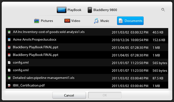
You can send attachments via Bridge from either the PlayBook or BlackBerry, but you can't open them currently
Selecting multiple items in the Messages app is considerably slower than other aspects of the PlayBook UI. Given how fast and smooth everything else is, any sluggishness is that much more pronounced.
Calendar, Contacts, MemoPad and Tasks
The Bridge Calendar app isn't particularly beautiful, but it's functional. You can create and view appointments, which are again stored only on your BlackBerry. Unfortunately any reminders set in your calendar don't currently propagate to the PlayBook, they'll appear on your BlackBerry but not on the tablet. RIM clearly has work to do here.
The Contacts, MemoPad and Tasks apps are all self explanatory. Any data you create/access here lives solely on the BlackBerry, the PlayBook is simply a more user friendly viewport into your work world.
The notification problem exists for the Tasks app as well. You can have a reminder set for a task but you'll only be notified on your BlackBerry.
BlackBerry Bridge Browser
Remember that all Bridge apps use your BlackBerry's encrypted internet connection to get to the outside world. If you need that added layer of security for web browsing, just fire up the Bridge Browser.
The Bridge Browser app itself is just as functional as the standard PlayBook browser. You can even run the PlayBook's browser and the BlackBerry Bridge browser in parallel, using one for unencrypted web traffic and the other when you need additional security. The only difference between the two browsers is what path your packets take: WiFi or Bluetooth-to-BlackBerry-radio.
Free Tethering and the Enterprise Play
I've mentioned several times that BlackBerry Bridge apps use your BlackBerry's internet connection for data. A side effect of this arrangement is that when bridged to a BlackBerry, any data accessed by your PlayBook comes for free - without an additional tethering plan. The implications here are huge.
For starters it means that you can introduce a PlayBook into your workflow without incurring any additional data costs. I asked RIM whether carriers would be ok with this arrangement, however the best answer I could get is that they couldn't do anything to stop it - the packets all look the same. Granted we've seen carriers crack down on unauthorized tethering so we'll see how this one plays out, but RIM is adamant about free tethering to your BlackBerry (with BIS/BES enabled) being a selling feature of the PlayBook. And it works very well today.
The other major advantage of BlackBerry Bridge is for enterprise users. Since no Bridge content is actually stored on the PlayBook and since the Bridge connection is 256-bit AES encrypted, you shouldn't need a visit to IT to use a PlayBook with your work issued BlackBerry. Corporate policy about bringing personal devices on campus aside, there's no technical reason that the PlayBook/BlackBerry Bridge setup would need to be vetted before it can be used as a supported work platform. As long as you're allowed to install the BlackBerry Bridge app on your BlackBerry, the configuration should be supported and just as secure as your BlackBerry alone. And yes, you can disable Bridge from your BlackBerry as well as from the PlayBook. Once the bridge is disabled, all content from your BlackBerry disappears from the PlayBook:
The PlayBook/BlackBerry Bridge experience, although not as speedy as the rest of the OS, is impressive. If I had to carry a BlackBerry, the PlayBook might make for an interesting accessory that I could use for both work and personal use.
Clearly RIM will bring QNX to all BlackBerry devices at some point, and I suspect we'll see elements of the UI moved over as well. Until then however, BlackBerry Bridge offers a more consumer friendly experience to corporate users who are locked into the BlackBerry platform. It's a pretty smart move on RIM's part. Making it easy for enterprise customers to use PlayBooks is one thing though, convincing them to part with the money is a different issue entirely.
Memory Limits
Despite the PlayBook having a 1GB of LP-DDR2 memory on-board, this thing can run out of memory quickly - particularly when multitasking with BlackBerry Bridge apps. If you've got a web page loaded in the Bridge Browser, you'll only be able to open a maximum of three other Bridge apps before you run out of memory. For example, I had AnandTech loaded in the Bridge Browser with Messages, Calendar and Contacts open alongside it. If I tried to open MemoPad or Tasks the apps would quit instantly. It's only after I closed the Bridge Browser that I could launch additional Bridge apps. I don't think we're actually using a full gigabyte of memory, but I do think that I'm bumping into whatever portion of memory is reserved for Bridge apps in the above scenario.
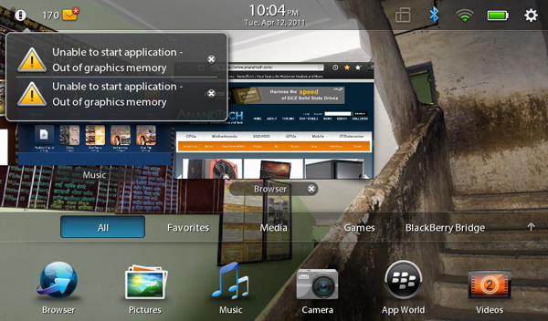
Open up enough non-Bridge apps and you'll quickly run out of graphics memory. If you're lucky, you'll even get a nice error or two from the OS:
The biggest GPU memory hog appears to be the browser, particularly with a full web page loaded. RIM appears to keep the entire web page in memory rather than do the old take a picture of the app and display it as a thumbnail trick. As a result having a loaded web page in the browser, even if it's just in the background, eats into your limited available GPU memory. Just as there's performance tuning that has to be done on the PlayBook, there's also a lot of memory usage tuning that must be done as well.
WiFi Sharing
The big joke about the iPad is that despite being Apple's premier "post PC era" device, you start out using it by plugging it into your PC. Har har. The PlayBook is a bit more advanced.
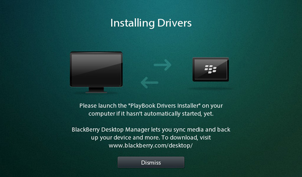
Out of the box the PlayBook is fully functional with two methods of getting data on/off your device. There's the somewhat traditional way, using a USB cable. RIM ships the PlayBook with both Windows and OS X driver support by default. Connect it via USB to your Mac or PC and it'll appear as a removable storage device. RIM was clever enough to have the initial partition that's mounted autorun an executable, prompting you to install the BlackBerry Device Manager.
Once installed, the PlayBook will appear as a shared drive on your computer. You can copy to/from it the same way you would any other network share. The PlayBook exposes three shares that you can access: certs, print and media. Media is where pretty much everything is stored - documents, downloads, photos, videos, everything. You can copy files to/from this share without issue, and it works from both a PC or a Mac.
If you want an even more traditional sync experience, there's also the BlackBerry Desktop Software - also available for PCs and Macs. Unfortunately the current version of the BlackBerry Desktop Software doesn't support the PlayBook so I couldn't thoroughly test it.
You may wonder why the PlayBook appears as a network share rather than a traditionally mounted USB device. For starters, it lets you get around Apple's whole eject-to-remove silliness. Pull a USB mass storage device without first ejecting it under OS X and you'll get a stern warning about potential data loss from your Mac. Network shares don't suffer the same fate. Unplug the PlayBook whenever you want and your Mac won't complain.
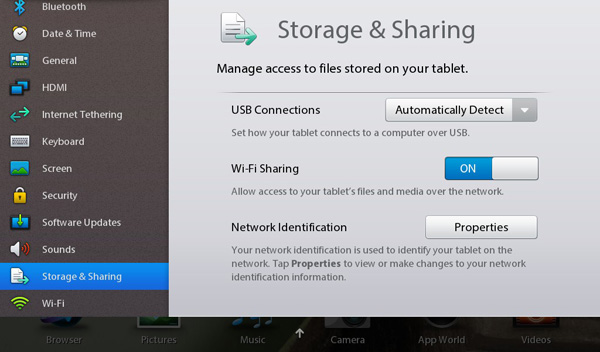
The bigger reason for RIM going the network share route is because the PlayBook supports access to its shared volumes over WiFi as well as USB. Flip a switch in the Sharing settings page, supply an optional password and you've got the same full access to the PlayBook's NAND.
The PlayBook doesn't even have to be awake for WiFi sharing to work, it implements some form of wake on LAN. With the PlayBook in standby, hit it over the network and after a short wakeup period (~5 seconds) you'll have full access to the device. The only requirement is that your PlayBook is connected to the same network as whatever device you're trying to access it from.
When it works, WiFi sharing is great. I only have two complaints: speed over WiFi is atrocious and I can't always get WiFi sharing to work, although the latest update seemed to reduce the number of issues I've had.
Pretty much no smartphone or tablet we've tested is particularly speedy over WiFi. Even the Motorola Xoom, at the top of our performance chart, manages a meager 36Mbps. Part of this has to do with the fact that all of these devices are power rather than performance optimized and part of it has to do with NAND performance limitations. The PlayBook is even more disappointing in this regard:
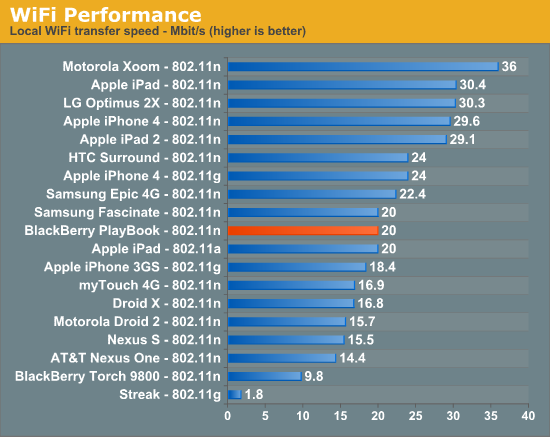
The fastest I could ever write to the PlayBook over 802.11n (~5 feet away from the access point) was at 20Mbps. Typical speeds were closer to 16Mbps however. RIM tells me that there's still a lot of performance tuning that has to be done within the OS and WiFi stack. It expects the PlayBook's WiFi performance to improve, however today it is a known issue. Poor WiFi performance is more frustrating on the PlayBook because of how useful WiFi sharing is.
The PlayBook is pretty hands off when it comes to letting you use the device while you're copying data to it. I tried copying a folder full of photos over to the PlayBook while browsing the same folder on the device, unfortunately in one instance this did cause the photos app to crash. On the bright side, the crash was pretty graceful - there was no error, just an app exit. Relaunching the app worked perfectly afterwards.
I have run into situations where I simply couldn't connect to the PlayBook over WiFi. If the connection failed after two attempts, I usually had to toggle WiFi sharing on/off on the device before it'd start working. With the latest software update I received just over 24 hours ago I've run into this problem a lot less frequently. We'll see if it continues to behave well.
I am impressed with RIM's cross platform support (at least from a Mac/Windows perspective) as well as its embracing of WiFi sharing. I personally would rather just copy data over to my tablet like I would any other computer, having to go through a separate sync app should be optional.
Apps and Development
Everyone loves to repeat Apple's iOS app number verbatim: "65,000 iPad apps and counting" was the talking point after the iPad 2 launch event. In reality, that's hundreds of times more than the number of apps you'll actually use on a regular basis. Most of the really popular apps are cross platform, at least when it comes to iOS and Android. There are definitely iOS exclusives just as there are Android exclusives, perhaps more of the former than the latter but ultimately I don't put too much weight on quantity of apps. If there's something in particular you want that doesn't exist for one platform but does for another, that's worth talking about.
The PlayBook app experience, at least on day one, unfortunately isn't anywhere near that of what you get on Honeycomb. So if you felt that Honeycomb was under-supported by 3rd party apps at launch, the PlayBook will disappoint you.
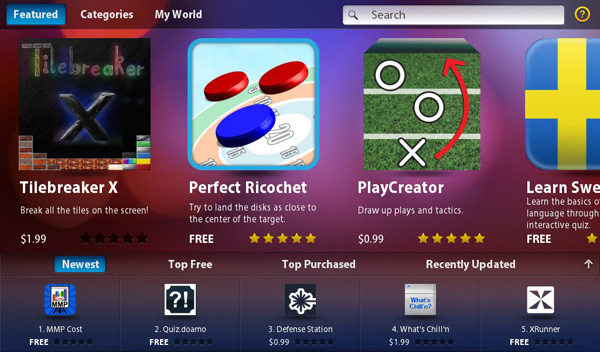
Let's first talk about App World - RIM's app catalog on the PlayBook. Apps are divided into categories and you can of course look at the top free, top purchased, newest and recently updated apps. I haven't encountered an app that needs updating so I'm not entirely sure how that process works yet.
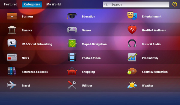
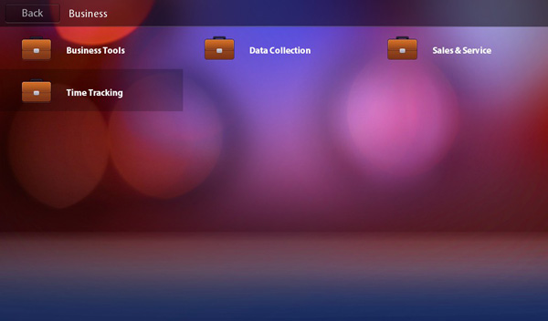
Browsing for apps by category is a bit more complicated than I'd like. Each category seen in the screen below has a handful of subcategories:
I've noticed that app categorization doesn't always match up with the sub categories properly. There is of course full text search in App World, which seems to work well except that there just isn't that much to search for today.
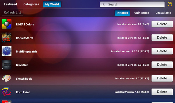
One nice feature of the App World app is the My World page. Here you get a list of everything you've installed on the app (including size and version number) and you're given the option of deleting apps from here.
RIM also provides you with a list of apps you've deleted and gives you the option of reinstalling any of them. So if you deleted something you end up missing, you don't have to go searching for it again - it's just in the uninstalled tab in My World. Deleted/uninstalled apps don't physically reside on your device so they'll have to be re-downloaded, but the convenience is still nice.
You don't need to login with your BlackBerry ID to download free apps, but anything you have to purchase requires an authentication step.
App World is one of the few first party apps that just isn't very smooth. Animations are choppy and the whole thing just begs to be optimized. I can't stress enough how having a mixture of 60 fps and sub-30 fps frame rates on the same tablet somehow stands out more than if the device were just consistently below 30 fps.
RIM sent along a list of companies that are working on PlayBook apps, however I don't have specifics as to what they're working on or when it'll be released:
· Adobe Connect & Lifecycle
· Airplay
· Atari
· BoxTone
· Cerner Corporation
· Digital Chocolate
· EA
· eBay
· EpixHD
· Evernote
· FGL
· Fortune
· Gameloft
· Globe & Mail
· HFMUS - Car and Driver magazine
· Huffington Post
· Loblaws
· Mattel
· MediaFly
· OpenText Everywhere
· Post Media
· Salesforce.com - Chatter
· ScoreMedia (ScoreMobile)
· Slacker Radio
· Sports Illustrated
· Telicost (Anomalous Networks)
· The Weather Channel
· The Weather Network
· Time
· Unity3D
In terms of developing apps for the PlayBook you really have three options: the WebWorks SDK, BlackBerry Tablet OS SDK for Adobe AIR and native C/C++.
The WebWorks SDK enables HTML5 and JavaScript based apps to run on the PlayBook, similar to what the original apps for iOS were like. The Tablet OS SDK for Adobe AIR lets you bundle and target the PlayBook with apps you've built using Adobe Flash Builder. And finally, the highest performance option is to obviously write native C/C++ targeting the PlayBook.
There is a fourth method of getting apps onto the BlackBerry PlayBook, using an as-of-now unreleased Android App Player. RIM is working on a port of Android that will run on top of QNX, abstracted from the underlying hardware/software (think VM). The Android App Player should be able to run all apps that work on Gingerbread (Android 2.3). You won't get access to the Android marketplace, developers will still have to package and send all apps to RIM for signing - but it should allow existing Android developers to avoid a full blown code re-write in order to get their apps working on PlayBook right away.
It's still far too early to see how successful this is going to be and I do have concerns about performance (the layer between QNX and Android is bound to cause a performance impact). Of course Android apps won't have direct access to hardware so things like 3D games are likely going to be too slow to work at all. It's an interesting option but I'll reserve judgement until I see it implemented in a shipping device. At this point I wouldn't assume that the PlayBook is just going to give you a great Android app experience as well as a great PlayBook experience. I think that's simply too far fetched.
The Screen
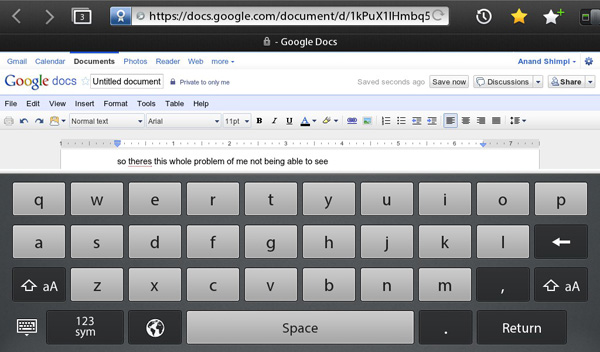
The PlayBook's 7-inch panel has a 1024 x 600 resolution, which for the most part works well for content consumption. Web pages fit nicely, although as I mentioned earlier, in portrait mode you'll need to do a lot of zooming to easily read content. Where the PlayBook's resolution falls flat is when you've got a lot on the screen. Here's what happens when you have a keyboard open in landscape mode on a web page:
In Google docs that leaves you with a single line of text above your keyboard. The same happens elsewhere, although it's less of a problem in Documents To Go.
I've complained in the past about the input problem on tablets, and I do believe it's actually worse on the PlayBook thanks to its cramped screen size. If anything, the PlayBook is even more optimized for content consumption than production of any sort.
Touch sensitivity could also use some work on the PlayBook. While the capacitive touchscreen is normally fine, I've definitely had to double or triple tap to activate controls (particularly small ones) moreso on the PlayBook than on either the iPad or Xoom.
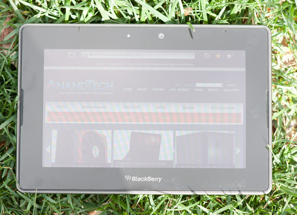
Like Apple, RIM put its focus on the PlayBook's display, which is very bright:
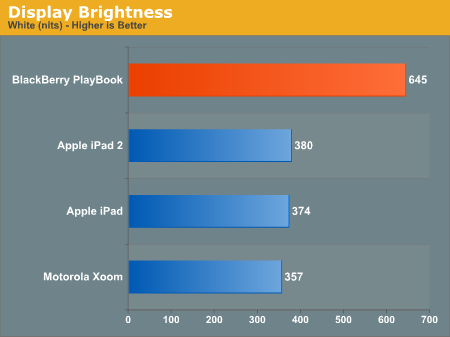
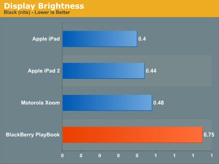
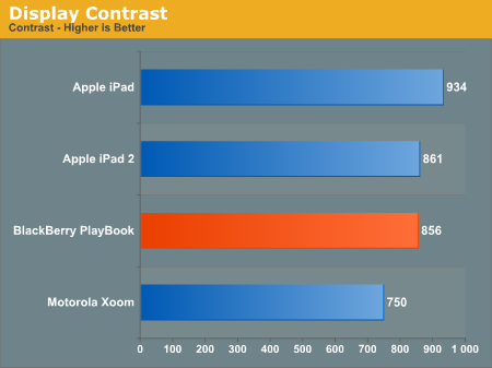
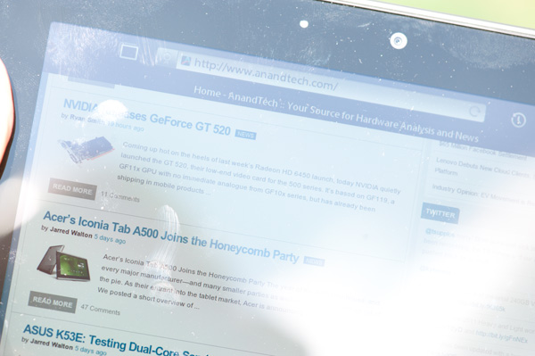
The PlayBook's brightness is high enough that we finally have a tablet that's usable outdoors in direct sunlight:
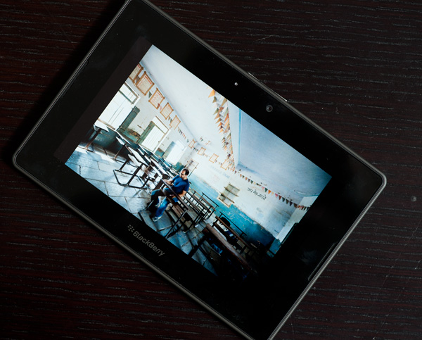
Viewing angles are also reasonable:
Camera
The PlayBook comes equipped with a 3MP front-facing camera and a 5MP rear-facing camera. Neither sensor is aided by any sort of Flash. The rear sensor is 4:3 and captures at 2592 x 1944 for full resolution. By default the PlayBook shoots in 16:9 which results in a cropped 2592 x 1456 (3.7MP) image.
Image captures from the rear sensor are high contrast but typically lack sharpness. I've also noticed that it's not too difficult to trip up the white balance algorithm, at least outdoors.
RIM takes a page from Apple's playbook and bumps up the contrast to make up for inherent limitations in the camera sensor.
The front camera also has a 4:3 ratio sensor, capturing natively at 2048 x 1536 (3MP). In 16:9 mode you just lose some vertical resolution as the sensor is cropped to 2048 x 1152 (2.35MP).

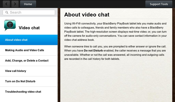
The front facing sensor is unusually good indoors without a lot of light. You still can't take photos in pitch black but with a little bit of ambient light you can generally get a pretty bright image out of the front facing camera. RIM will eventually enable video calling between PlayBook users, however it's not functional on the review build of the PlayBook software.
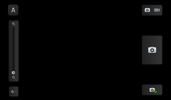
The camera app itself takes about 3 - 4 seconds to start and has a pretty simple UI. There's a button to switch between stills and video recording, a slider for digital zoom, a shutter release button, a location toggle and a button to switch between front and rear facing cameras.
It takes about two seconds to switch from the rear to the front facing camera, and about 1.8 seconds to capture an image. While it may not sound like a lot, the capture latency is high enough that you have to make sure you hold the PlayBook still for those 1.8 seconds otherwise you'll end up with a shifted image.
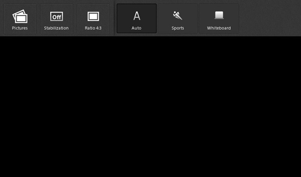
The camera app supports minimal customization. You can change aspect ratio, turn on image stabilization and choose either auto, sports or whiteboard for camera presets.
Videos
Both the front and rear sensors can shoot video at 480p, 720p or 1080p at 30 fps. Videos are shot at 720p by default.
Captured video actually doesn't look too bad. The lack of sharpness I complained about in the stills is somewhat masked by motion and what we get instead is a pretty reasonable platform for shooting video, at least for sharing on the web.
Pictures
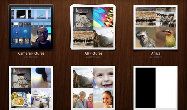
One of the few first party apps that ships on the PlayBook is called Pictures. As you might guess, it's where you can access all photos you've taken with the device as well as copied to it. Photos have to be placed in the /media/photos directory on the PlayBook but once present, they're automatically added to the Pictures library.
Albums are created according to folder name. There are no fancy preview gestures to peek at what's in an album, however once you're viewing an image you can of course zoom in/out using stretch and pinch gestures. There's a simple slideshow mode that flips through photos rather quickly, although there's no way to control the slideshow interval. I normally feel like slideshows proceed too slowly by default but on the PlayBook I'd argue that it flips through pictures too quickly.
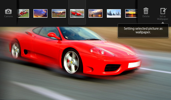
When viewing a single picture a top-down bezel swipe brings up the ability to delete the photo, scroll through the list of photos in the current album, or set the photo as wallpaper. You can also launch the camera app from here.
The Pictures app is pretty standard fare although there isn't much in the way of sorting or customization options. It requires that you've got your photos pretty well organized by folder as there's no way to view photos by date and definitely no face detection. Common file formats are supported (JPEG, PNG, GIF) while RAW files aren't (at least from a Nikon D700 and Panasonic GF2).
Music
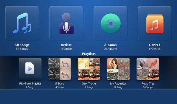
There's a pretty standard music player app on the PlayBook:
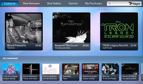
RIM worked with 7digital to provide direct-to-device MP3 sales. Songs are DRM-free and are priced at $1.29 per download:
Video Playback: High Profile Supported
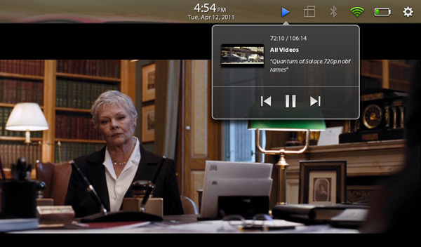
Videos, like photos, must be stored a specific directory (/media/videos) for the Videos app to find them. The PlayBook supports .avi, .mp4 and .m4v file extensions, unfortunately there's no support for .mkv containers. The lack of .mkv support is particularly disappointing on the PlayBook because TI's OMAP 4 is actually capable of playing High Profile 1080p content in addition to videos encoded to base and main profiles.
While you will see lower battery life when playing back High Profile 1080p content, you at least don't sacrifice any performance in doing so. I didn't encounter any dropped frames regardless of encode complexity on the PlayBook. Admittedly I didn't push really high bitrates (my 1080p test was encoded at roughly 10Mbps), but even getting to this point is pretty impressive.
Maps
Microsoft's Bing powers the default search engine and maps app on the PlayBook. While the search engine is configurable, there's no option to prefer Google Maps instead.
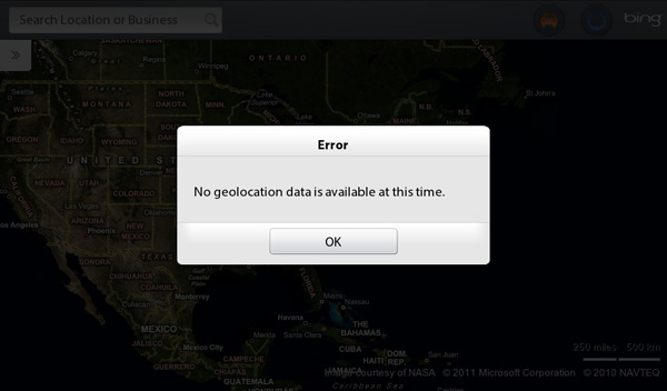
Although the PlayBook has GPS and WiFi support, the current build of the PlayBook software doesn't support location services. As a result the maps app is only useful for looking up directions, but not telling you how to get to your destination from your current location.
The Bing Maps app is reasonably quick but not as fast as Maps on the iPad 2 or on the Motorola Xoom.
Battery Life
With no native email client we had to modify our general use battery life test a bit for use on the PlayBook. Here we're just playing MP3s and going through our (non-Flash) web browser battery life test, there's no active email checking in the background (which is present on both the iPads and Xoom in this chart).
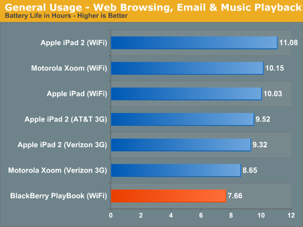
General usage battery life, at least today, appears to mirror that of the Motorola Xoom. At 7.66 hours of battery life the PlayBook is noticeably worse than the competition, and that's without checking emails in the background as well. Over 7 hours is still enough to get you through the majority of the work day, but heavy users should plan on charging the PlayBook at least once a day.
Video playback is a bit better. Running the same 720p base profile test as the rest of our tablets, the PlayBook managed 9 hours of video playback - comparable to the Xoom.
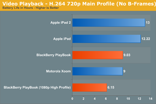
I also threw in battery life when running a 1080p main profile clip, something the other tablets can't do. There is definitely a negative impact on battery life for more complex videos, so keep that in mind if you plan on taking advantage of the OMAP 4430's flexible video playback support.
Accessories and Charging
RIM sent along some of the PlayBook's accessories: the BlackBerry Convertible Case, BlackBerry Rapid Charging Pod, Neoprene Sleeve, and BlackBerry Skin.
The Neoprene Sleeve and Skin are pretty standard fare. The BlackBerry Skin is incredibly soft and it seemed to fit the PlayBook a little loose, but it gets the job done if you want something low profile. The Sleeve is a good accessory if you need to protect the PlayBook during transport, but not during use.
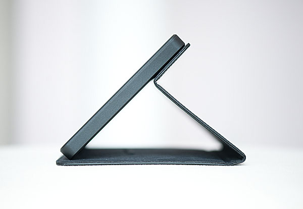
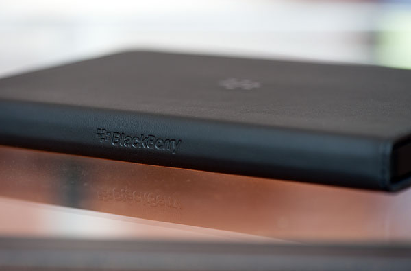
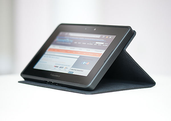
What I really liked however was the Convertible Case. A well built case, the Convertible turns the PlayBook into something that looks and feels like a a thick Moleskin notebook. The case material is soft and feels high quality, and the PlayBook fits snug inside it. You can flip the cover around to turn the case into a stand for the PlayBook.
Unfortunately there's no smart cover-like functionality, magnets would've been really useful here. My only complaint is that although there's a cutout for the rear camera, you need to leave the front cover dangling when shooting, otherwise it'll cover the rear camera.
The Rapid Charging Pod is a nice looking dock for the PlayBook. It only works in landscape mode as it hooks up (magnetically) to the PlayBook's quick charge port. You can get a 90% charge in 2 hours, however the remaining 10% takes an additional hour. By comparison, the standard AC adapter over the USB port takes about 4 hours for a full charge and around 3 to get to 90%. The biggest issue with the Rapid Charging Pod is that you don't get HDMI output while docked since the HDMI port is covered.
Updates and Platform Readiness
I picked up my PlayBook review sample six days ago, it'll be available for purchase both online and in-store in six more days. Since then there have been two OS updates and RIM tells me that there are more even planned between now and when the PlayBook ships. In the tablet space the pressure is on to get hardware and software out as quickly as possible. Apple has a tremendous lead here that none of its competitors want to allow to grow into something unsurmountable. Releasing something is better than releasing nothing; it helps get the kinks out and it's much easier to iterate once you have a base of something to iterate from.
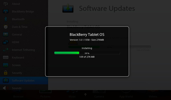
RIM told me to expect updates as frequently as every 6 - 8 weeks, however it would not commit firmly to that schedule. Updates are delivered over WiFi and appear to be full OS upgrades rather than byte diffs. The past two updates I downloaded for the PlayBook were around 256MB in size.
I have to say that based on the aggressive update schedule and key missing features (dedicated calendar & email clients), unless you're an existing BlackBerry user you're better off waiting to buy a PlayBook until we see some bigger updates for the platform.
I already mentioned that this summer we'll see dedicated email, PIM and calendar support. Performance and stability improvements are also on the roster, although I admittedly haven't had many stability issues outside of running out of memory.
Final Words
One mistake I believe a lot of members of the press make is assuming that today's two-horse race is representative of the future of this industry. While Apple and Google are clearly out to a substantial lead, there are still more revolutions that will take place between now and when the mobile market finally matures. I'm not saying that Apple or Google won't end up on top, I'm just saying that it's not guaranteed they will either.
If you accept the philosophy that current leaders don't dictate future winners, then the market becomes much more interesting. For starters, it treats everyone as a potential leader. It also lets you focus on the value each player brings to the table, rather than the efforts of one.
The PlayBook is a reasonable experiment for RIM, but I need to see more to really recommend the tablet. We've been burned one too many times by companies serious about this market that have just fallen short on promises to keep things updated (ahem, Microsoft, Palm). RIM is hinting at something new every 6 - 8 weeks, and if that's truly the cadence then we very well might see the PlayBook turn into a significant player by the end of the year.
RIM definitely has the existing market to sell into. In fact, I'd say about the only type of user who should consider a PlayBook on day one is someone who already has a BlackBerry. If you have a BlackBerry and can't give it up but want a better browsing/media playback/consumer experience alongside it, the PlayBook is an excellent path to that. RIM was very smart in its implementation of BlackBerry Bridge. Keep all sensitive data on the BlackBerry, encrypt its connection to the PlayBook, but let you use the PlayBook to bring you what you're missing from the Android/iOS experience without having to carry two phones. Even though you're adding a second device to your mix, the PlayBook at least gives you a larger form factor to work with when you can use it.
It's everyone else that RIM really needs to convince. For your general consumer, the PlayBook is just missing apps (no email, no calendar, no Netflix, no Twitter). Although RIM would have you rely on webmail, I just don't believe that's ideal when both Apple and Google are shipping tablet optimized email clients today. RIM clearly has a plan to address these concerns, I'm just curious to see how long it takes to mature the PlayBook.
Ignoring immediate purchasing decisions, there are some things that RIM has done very right with the PlayBook. Full frame rate playback of 1080p High Profile H.264 content is a huge win. NVIDIA is promising this with Kal-El but RIM and TI deliver it here today. The only thing that's missing is support for .mkv containers and more audio codecs before we can really start putting tablets through our media streamer test suite.
With the exception of BlackBerry Bridge apps, multitasking is ridiculously smooth on the PlayBook. I've never been happy with Apple's multitasking UI and I've been dying for someone to copy webOS since its introduction, so kudos to RIM (and Palm). RIM does have to work on reducing application launch time and providing a consistent 60 fps experience across the OS. The issue with a super smooth UI is that the times when it isn't perfectly smooth really stand out.
I'm glad to see RIM experimenting with form factors. After using the Galaxy Tab 8.9 at CTIA I felt that may be the perfect balance between portability and functionality. The 7-inch PlayBook doesn't do the balance between functionality and portability as well, but it is small enough to actually carry around with me on a semi regular basis.
Battery life could use improvement. I'm not sure if this is an OS thing, battery capacity limitation or SoC problem, but it's real. While I don't normally have to worry about charging my iPad regularly, I do have to worry about charging the PlayBook.
There's a lot to like about the PlayBook, but unless you're an existing BlackBerry user you're better off waiting to see where RIM takes this thing.

