Original Link: https://www.anandtech.com/show/3632/anands-google-nexus-one-review
Anand's Google Nexus One Review
by Anand Lal Shimpi on April 3, 2010 3:40 AM EST- Posted in
- Smartphones
- Mobile
I get inspiration to write from the strangest places. It can be a conversation, an observation or just music. I say it’s from the strangest places because the inspiration doesn’t result in a painting or a photograph, it ends up in the structure or body of a review of some piece of technology. Whether it’s a CPU review, SSD article or even just a cookie cutter article, it all starts with something that gets me in an excited-to-write mode. It’s rarely the product, but rather the thought of writing about it that gets me going. Provided I have the right inspiration.
Most of the time you all scare the crap out of me. I want to impress, I want you guys to be happy with what I write. I want every article to be the most well received thing ever. Every writer wants that. No one ever gets it. So when I see comments telling me that you’re eagerly anticipating my Nexus One review, I get a turtle complex. And not the ninja kind.
Although I’ve used and owned (briefly) plenty of Android devices since the platform launched in 2008, I’ve never sat down to actually review one. Going into today’s review I wasn’t even sure what approach I should take. You’ve been asking for an iPhone or Windows Phone 7 style treatment of the platform, but our coverage of both of those things happened when the platforms were just being introduced - not 17 months later.
Then came the inspiration. I was talking to our newest smartphone editor, Brian Klug, about the review and he gave me the angle. For Brian, today’s review wasn’t so much about exploring every corner of the Android OS but rather properly conveying the feel of the OS and how it differs from the alternatives in the market today. So while I’m going to definitely do the former, I want to tackle the latter early on because ultimately I believe that’s what will determine whether or not Android is for you.
Boxus One
You can't buy a Nexus One in any store, your only route is to go through Google itself. Even though there are versions for T-Mobile and AT&T's networks, those carriers don't sell the phone on their websites either.
The ordering process is very simple and you have the option to engrave two lines of text on your phone at no extra charge (doing so voids your ability to return the Nexus One for a full refund). You have two purchase routes. You can either buy the phone unlocked for $529 (AT&T and T-Mobile versions are available), or you can sign up for a new 2-year agreement with T-Mobile and get the phone subsidized for $179. An AT&T subsidized version isn't available at this time.
Google lists both Verizon and Vodafone versions of the Nexus One shipping in the Spring. For today's review I'm looking at the AT&T version of the Nexus One.
Apple has started a trend of companies spending entirely too much on packaging. We all wrote about how good Apple's packaging was, and now everyone spends much more on packaging just to have it thrown away. I swear someone just played a huge practical joke on us, er or Google, or Apple...I'm not sure.
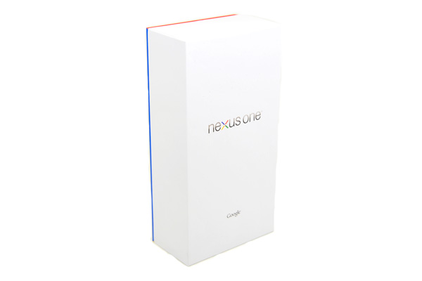
The Nexus One comes in a pretty white box with a splash of color. Inside you find the usual combination of manuals, more boxes and nice feeling packaging.
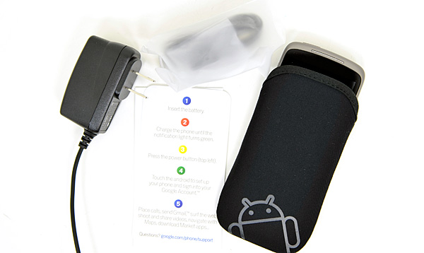
The Nexus One ships with a wall charger, earbuds and a separate USB cable for connecting to your computer. You also get a neoprene case.
Experiencing the Nexus, Without Whoopie
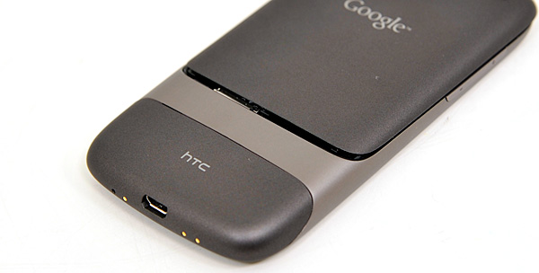
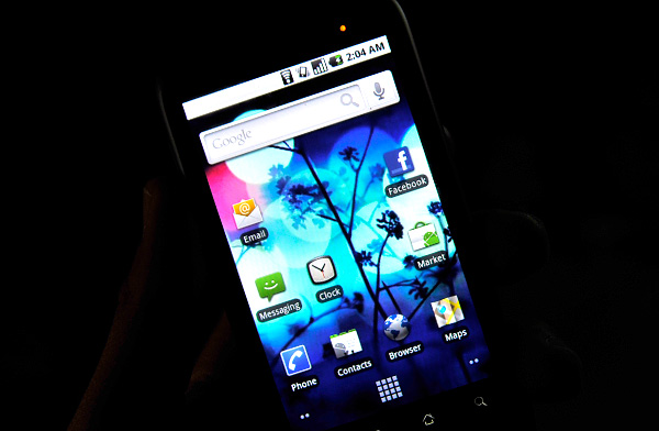
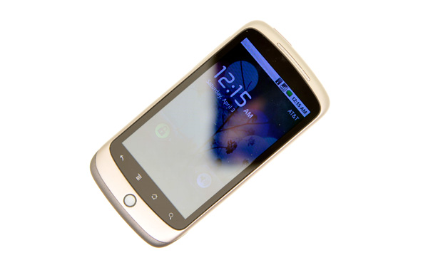
Announced in January 2010 and just updated last month to include support for AT&T's network, this is Google's Nexus One manufactured by HTC:
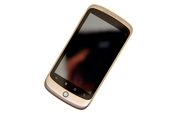
It's got a Qualcomm Snapdragon QSD8250 SoC (more on this later), 512MB LPDDR1, 512MB flash (where apps and the OS are stored), 4GB microSD card (for music/movies/photos) and boasts a 800 x 480 3.7" AMOLED screen.
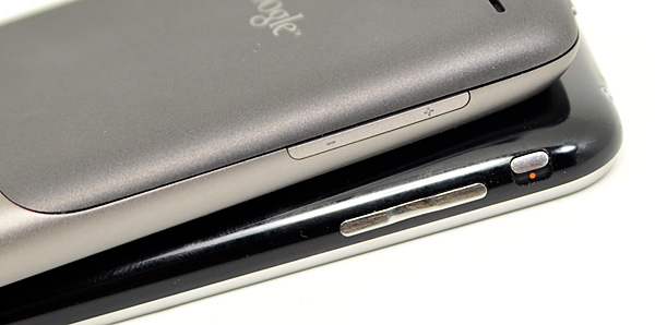
The design is definitely not as cohesive as the iPhone, but here’s one area where Apple’s ID doesn’t really pay off - for a device that spends most of its life in your pocket, hand or next to your face - styling loses its value pretty quickly. The iPhone looks sleeker, but I’ll take the upgraded functionality of the Nexus One’s camera with flash any day.
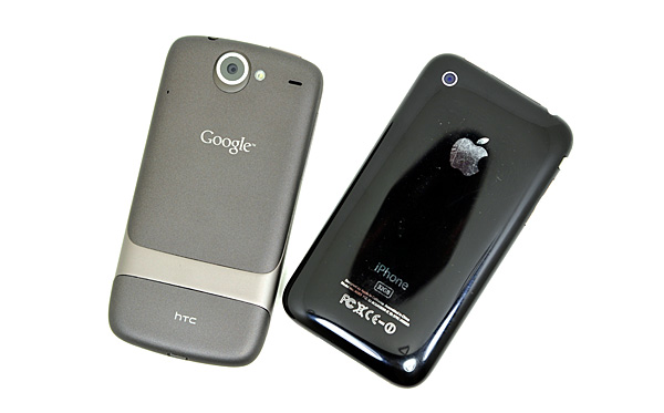
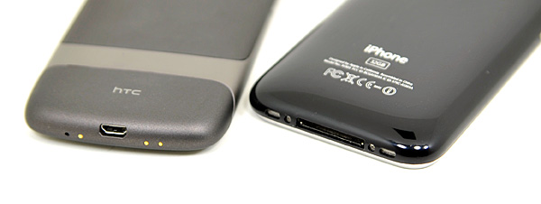
The Nexus One is narrower, thinner but longer than the iPhone. The dimensions are as follows:
| Google Nexus One vs. Apple iPhone | |||||
|
Apple iPhone 3GS (ARM Cortex A8)
|
Google Nexus One (Qualcomm Snapdragon QSD8650)
|
||||
| Height | 115 mm (4.5") | 119 mm (4.7") | |||
| Width | 62.1 mm (2.44") | 59.8 mm (2.35") | |||
| Depth | 12.3 mm (0.48") | 11.5 mm (0.45") | |||
| Weight | 133 g (4.7 oz) | 130 g (4.6 oz) | |||
The form factor is both better and worse. Making the Nexus One thinner means that it’s more comfortable to hold up to your head as a phone. You don’t succumb to the iPhone conversation fatigue nearly as quickly. The downside is that the virtual keyboard is narrower, making typing more difficult than the already painful to learn (for some) iPhone keyboard. Personally, I don’t think the tradeoff is worth it. While I believe the Nexus One’s form factor is closer to ideal for carrying around, its keyboard (in portrait mode) is worse off because of it.
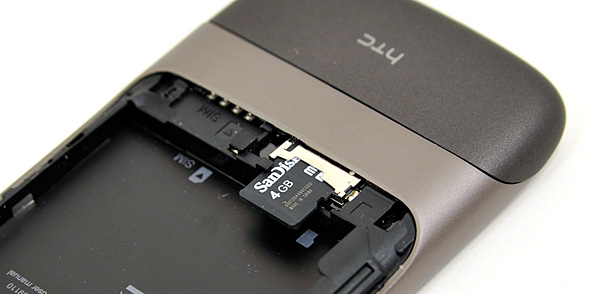
This is a normal smartphone after all, so you do get a removable battery. The back cover slides off to reveal a battery, micro SD card slot and SIM card slot. The removable battery is an important addition as you'll soon see. The Nexus One ships with a 4GB micro SD card from the factory.
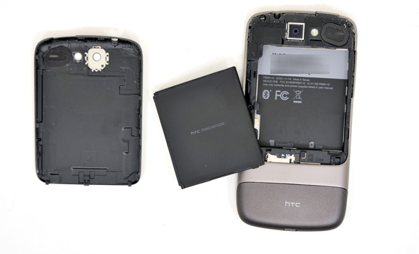
Charging is done using a micro-B USB cable. Google provides one cable, one power adapter and a set of headphones in the box. The packaging is easily comparable to anything Apple ships. Even the plastic wrap around the cables feels soft to the touch.
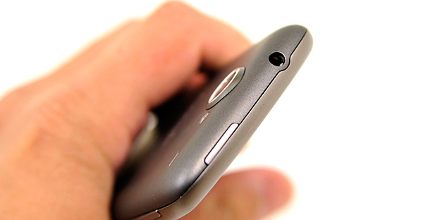
You get a standard 1/8” headphone jack up top and to the left of it is your power/lock button. Initial boot on the Nexus One does take a while, I timed it at 48 seconds (that's PC-length!).
As with all other Android phones, you need a SIM and a Google account to make the Nexus One work. Simply typing in your existing Google/Gmail account works, or you can register through the phone’s interface. All syncing with the phone is done over the air and with Google’s servers.
Google doesn’t have a desktop OS (yet), and no thick client desktop apps. Rather than rely on building bridges between its smartphone OS and the desktop applications of its competitors, Google relies entirely on its cloud based services for syncing. Gmail, Google Contacts, Google Calendar, these are your new best friends. Already use all of them? Perfect - your Android phone syncs with your account and you’ll get all of your mail, contacts and calendar events immediately. If you don’t already use them then it’s a lane change. Not a difficult adjustment to make, but transitioning from desktop apps to something entirely cloud based does take some getting used to if you haven’t made the jump prior.
The Home Bar
The Nexus One has three physical buttons: a power/lock button at the top, volume rocker on the left side and a trackball/button on the face.
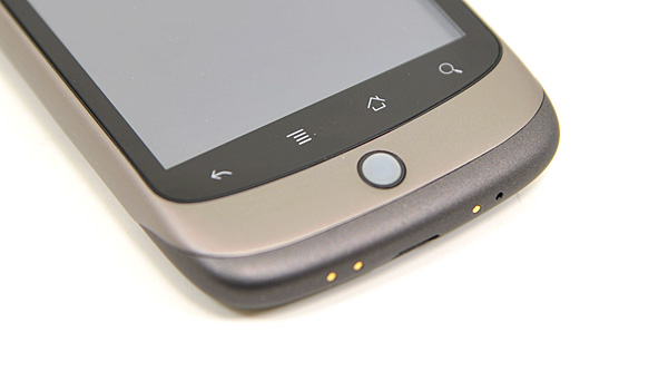
The trackball is mostly useless. The Nexus One has a 3.7” multitouch screen for a reason, and it’s way quicker to use the screen than to use the trackpad for scrolling. There are some limited situations where the trackball can be useful, for example while playing games. The iPhone has no useful physical buttons for gaming, the Nexus One’s trackball is better for moving a character around than a virtual d-pad.
Above the trackball there are four touch buttons with fixed functions: back, menu, home and search. By default all provide haptic feedback when activated. In other words, they vibrate a bit when you touch them. It’s a fine feature but it’s nowhere near the feedback you get from physical buttons if that sort of thing matters to you. The buttons also give you the same feedback regardless of whether or not their operation is permitted in the current mode (e.g. hitting the contextual menu button when no such menu exists).
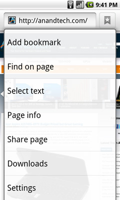
The back button is useful and works as intended, it goes back a screen. The menu button takes some getting used to. The best way I can describe it is like a right click. You get a contextual menu depending on what app you’re running. At the home screen it lets you pop into Android’s settings, add application shortcuts, change wallpaper, view notifications and search. In the email app the contextual menu lets you refresh your inbox, switch to a different folder, change settings, etc...
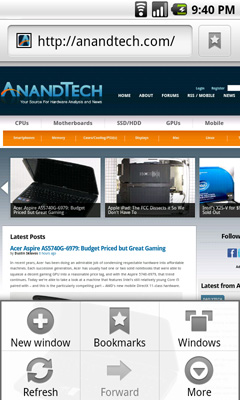
The contextual menu in Android's Browser app
This is where Android’s more PC-side comes out to play. Apple and Palm for the most part try to keep these sorts of menus away from you. Apps are purposefully not very deep and settings are all controlled through the settings screen, not from within an app. Functionality is driven by the UI. Android takes a more application centric approach. Neither is right or wrong, but both approaches have their pros and cons. I’d argue that Apple/Palm’s approach is better suited for something that’s going to be used as a passive device. Something you’re quickly scanning emails or text messages on. Google’s take is more PC-like. Give the users the options they want, where they want them, even at the risk of UI simplicity.
The Apple method runs the risk of limiting functionality, while Google’s risks turning the UI into a cumbersome mess. Neither is there today, but left unchecked that’s where they’d end up.
Moving on, the home button works as expected, it takes you to your home screen. The search button is particularly interesting because it is one Android feature that Microsoft copied in Windows Phone 7. Hitting the search button brings up an autocomplete enabled Google search box. Hitting go, launches the web browser (very quickly thanks to Mr. Snapdragon) and displays your search results.
What MS is proposing for WP7 are contextual search results that are formatted for the smartphone. Akin to a search app if you will. Search for GeForce GTX 480 and get a normal listing of websites. Search for dentists and get a smartphone formatted list of dentists in your area. Granted MS’ proposal is just that, a proposal, while Android is shipping today. Enabling similar functionality though shouldn’t be hard for Google. I’d love to be able to search, pull results from the web, but have the results presented as more of an app.
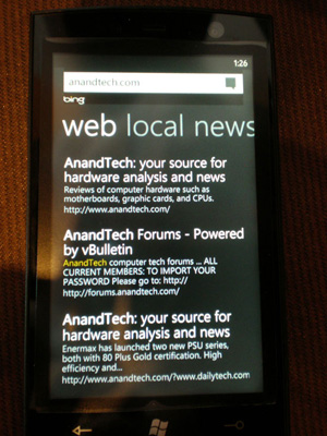
Windows Phone 7 Search
The search function will autocomplete things like address book entries, but it won’t automatically search your email for you. While the iPhone’s search function is more focused on searching your device, Android is more interested in helping you search the web. Google has a search engine, Apple doesn’t, the distinction makes sense.
It’s Mac vs. PC All Over Again
Until Windows Phone 7 arrives, Palm fixes its issues or MeeGo starts shipping in earnest, the inevitable comparison is between Android and the iPhone OS. And in my weeks of using Google’s Nexus One, I can honestly say that the differences really boil down to much of the same things that separate PC and Mac users.
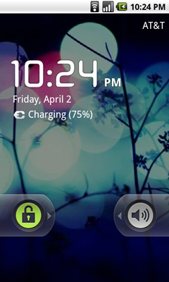
The Mac vs. PC analogy starts as soon as you look at the unlock screen for the phone. Here’s what you see on Apple’s iPhone vs. Google’s Android:
|
Google Nexus One
|
Apple iPhone 3GS
|
 |
 |
The iPhone allows for a single interaction: unlock the phone. The Nexus One gives you two: unlock or toggle sound on/off. The divergence continues once you unlock the phones:
|
Google Nexus One
|
Apple iPhone 3GS
|
 |
|
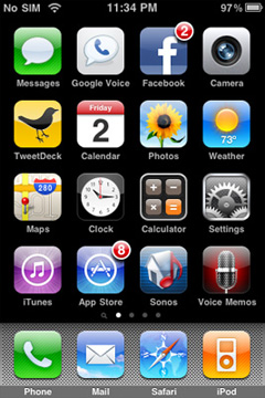
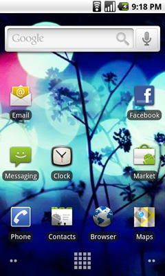
Apple’s home screen is a structured list of icons. Each swipe reveals another page that looks the same. You can customize placement of the app icons, and control what appears in the bottom row of four, but ultimately you’re flipping through a virtual index of your applications.
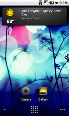
The Nexus One’s home screen is much more configurable/versatile. You start out with a u-shaped arrangement of icons. At the top, a Google search widget. Your home screen starts in the middle, you can swipe two screens to the right or left. On the iPhone you’re basically reading a book, on the Nexus One you’re navigating a field.
Swipe right to left and you’ll see a Gmail and Gtalk icon. Swipe left to right instead and you’ll see a weather widget and some more icons. The weather widget tells you the weather wherever you’re currently located (GPS/cellular network triangulation ftw) as well as gives you the latest news headlines all updated in real time.
 |
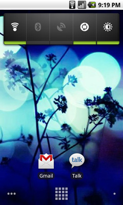 |
Apple’s predictable UI allows no room for quick ways to disable things like Bluetooth or 3G. The Nexus One ships with a Power widget that lets you quickly toggle WiFi, Bluetooth, GPS, auto syncing and auto brightness control. The only thing that’s missing is a quick way to disable 3G.
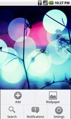
The remaining pages ship barren. It’s up to you to add items to them. You can do so by hitting the Nexus One’s contextual menu button and then clicking Add. You can add shortcuts to applications or interactive widgets. On the iPhone the only way you get something onto one of the home screens is by downloading/installing the app. There are no widgets, no concept of shortcuts, Apple abstracts all of this from the underlying software. As far as the user is concerned you install apps to the home screen and that’s how you access them. That’s your file system. Point, touch, access.
 |
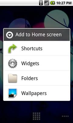 |
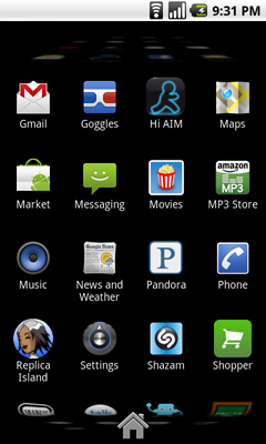
In Android it’s all a little less abstracted. Your home screens are like virtual desktops. True, you don’t run applications on them, but the widgets are similar enough. You create shortcuts to applications for easy access. If you want a list of all of the apps on your phone, just click the virtual button at the bottom of your home screen:
This is more of the traditional iPhone presentation, except instead of swiping to see more pages of apps you scroll down. As you scroll the vanishing list wraps around an imaginary cube to give the UI more depth.
|
Google Nexus One
|
Apple iPhone 3GS
|
 |
 |
The fundamental difference in approach to UI really shows how Google and Apple view the smartphone. Apple views it as a passive extension to the desktop/notebook. You use it when you want to make a call or quickly access a program or application. Your primary sources of information consumption are in other forms (e.g. desktop, notebook, tablet).
Google’s view is a bit more ambitious. Not having a desktop/notebook platform (yet) to rely on, Android’s role is understandably more pronounced. You get more customization and personalization options. The focus isn’t on simplicity, but rather customizable functionality. The sort of flexibility you’d expect out of a larger computing device, but on your smartphone. Again, it makes sense because Google doesn’t currently offer a larger computing device.
Those who cried foul when Apple tied everyone’s hands with the iPhone OS, those who listed everything that Windows Mobile could do that Apple couldn’t, if you are one of these people then Android is a far more natural fit. Those who wanted the focused simplicity the iPhone offered on the other hand, will probably feel a bit uncomfortable with Android.
Made for Google, by Google
From the very start you're made well aware that the Nexus One, as any other Android phone, is built for tight integration with Google's online services. Things like Google docs, Gmail, Google Talk and Google Voice are all well coupled to the OS. To even start using the device you have to provide or sign up for a Google account. While this is what all companies in Google's position have tried to do (Microsoft pushing Live and Hotmail, Apple pushing Quicktime, iTunes, Mobile Me) the difference here is that virtually all of Google's services are among the best in their class, and they're all free.
I can't really complain about Android's integration with Google apps other than to say that I feel like I'm contributing to making an entity that is seemingly innocent today, even more powerful. Maybe one day we'll pay for giving Google so much power and access, but for now just enjoy the convenience.
 |
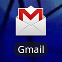 |
The integration is visible on so many levels. For example, instead of just a single Email icon you have two apps: a Gmail app and an Email app. Distinguishing between Gmail and Email? Interesting.
 |
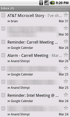 |
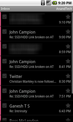
By default the Gmail app lives on its own homescreen but obviously you can move it anywhere. The two apps work pretty much the same way but the Gmail app is obviously more flexible. You can search your inbox, you get a grey instead of a black background and of course Gmail on Android supports push. Otherwise, the two apps are rather similar in functionality.
There's integrated Google Talk support, which is also a welcome change from the iPhone's lack of any integrated messenger (you have to rely on 3rd party apps for that). You get new messages and chat invitations as notifications in the upper left hand of your screen just like you would a text message or a missed call.
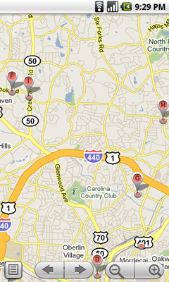
Google Maps ships with the device and it's ridiculously fast. There's finally multitouch support in the app so it's just as functional as the Maps application on the iPhone, it's just faster on the Nexus One.
 |
 |
Google Maps for Android also fully supports the Nexus One's integrated GPS and compass, so you have an idea of exactly where you are and what direction you're facing. While these are both features echoed on the iPhone, Google one-ups Cupertino by offering a built in, free of charge, navigation app that integrates with Google Maps.
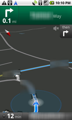
That's right, you get turn by turn navigation directions with voice for free with the Nexus One. The obvious limitation is that map data is streamed to the phone in real time and not stored on the device like on a dedicated portable nav unit. So if you're in a location where you don't have data access then you do lose navigation.
Nav can run in the background
The turn by turn directions work quite well, although you'll need to remember that the loud speaker on the Nexus One is on its backside so keep it free of obstruction if you're trying to hear the directions.
All in all it's a huge improvement over what the iPhone offers. Turn by turn navigation support can be enabled on the iPhone through 3rd party applications (expensive ones at that), so this isn't a feature that will ultimately drive users to the Nexus One, but it's one that is definitely appreciated.
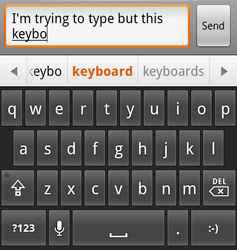
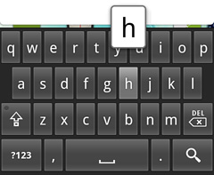
The Keyboard: Form Factor vs. Speed
I was a Blackberry user for years before the iPhone. While I appreciated the look and feel of Windows Mobile devices nothing could ever replace the functionality of my Blackberry at the time. One trend I noticed however was with every new generation of Blackberry, the form factor got smaller and the keyboard became just slightly less usable. As Blackberries got narrower, the key spacing dropped and my peak typing speed dropped a bit. It never fell too much, but it was an annoyingly consistent trend. I was always fine upgrading because the newer phones usually had enough going for them that I was willing to make the sacrifice.
Using the Nexus One’s keyboard, I was reminded of the same feeling. While it’s a purely virtual keyboard, the key spacing isn’t quite as wide as the iPhone’s because the device is just slightly narrower. As a result, I can’t type as fast on the Nexus as I can on the iPhone. With a good amount of practice it’s possible to be quick on the keyboard. Using the keyboard in landscape mode was a lot more comfortable to me, unfortunately there’s hardly any remaining screen real estate when you do so.
The narrower keyboard is a side effect of the narrower device, which does make holding it up to your head to make a phone call more natural feeling than most smartphones, the iPhone included. It’s very difficult trying to strike a balance between smartphone perfection and comfort. Dell’s upcoming Mini 5 has an incredibly useful 5" screen, but it comes at the expense of not being very pocketable.
The Nexus One's keyboard is also missing multitouch support, which is something that the iPhone's keyboard originally lacked as well. This is mainly an issue if you're just transitioning from a physical keyboard and are used to having one key pressed as you're selecting the next key on the keyboard. I struggled with the lack of multitouch on the iPhone keyboard initially but by the time Apple added it in, I'd gotten used to not having it.
|
Google Nexus One
|
Apple iPhone 3GS
|
 |
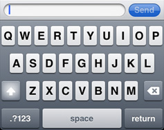 |
Like most smartphones, the Nexus One will attempt to autocorrect your spelling mistakes as you make them. By default there’s a bar of words that appears under your text input box as you type. The spelling correction appears to be based on length of word and letters used, but not the location of those keys on the keyboard. For example, typing yjomh instead of thong won’t autocorrect, although on the iPhone it will. Overall the autocorrection and thus typing on the iPhone is better than on the Nexus One. With the iPhone you can really just type and mostly forget about mistakes (assuming you take the one finger, one thumb, two thumbs approach and really grow accustomed to the device over about a week). The Nexus One comes close, but it still ends up feeling like it’s using a dated form of text entry/correction compared to the iPhone.
This is a major issue because with any device this narrow, the pad of just one of your thumbs will cover up a huge section of the keyboard. You can either slowly peck at it or rely on the phone to be as smart as possible in figuring out what you’re typing. Apple simply does this better.
 |
 |
There are other slight differences between Google and Apple’s virtual keyboards. Both magnify the key you’re pressing, but Apple connects the magnified key to the actual key you’re pressing - it’s a slight UI addition that does make it look nicer. Google does a better job of indicating that there are alternate versions of a letter by putting an ellipses after any key this applies to.
Notifications: Better than Apple, Worse than Palm
When Apple introduced its notification system on the iPhone, I was pleased. If you’re using your phone and you get a SMS, a little bubble appears on the screen and you get to read/dismiss the SMS:
That was three years ago. The iPhone can do a lot more now and the notification system is beginning to show its age. It’s annoying if you’re trying to do something else with your phone and you keep getting notifications. And it doesn’t scale well to getting tons of notifications, you’re just shown the most recent with no indication of what came before it.
Palm improved on Apple’s system by claiming a line or two of screen real estate and displaying notifications at the bottom of the screen. It was far less intrusive than Apple’s method but still gave you the same functionality. If you wanted to see more, just tap the notification bar and you see more of the message. This works for IMs, text messages, etc...
Notifications on the Palm Pre at the Bottom
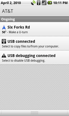
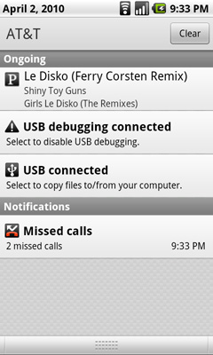
Google takes a similar approach to Palm, although you don’t lose any additional screen real estate. The upper left hand corner of the screen is reserved for notifications. It’s a part of the status bar so there’s no screen resizing at work. If you get a message, missed call, IM, or anything you get a preview in this corner. The entirety of any message is displayed here; if it can’t fit on a single line, the message appears piecemeal.
Notifications can build up over time. Here we have a missed call, USB connection message, debug mode message and Pandora running in the background all at the same time:
Kinda crowded, right? Here’s where it gets awkward. To see all of your notifications simply place your finger at the top of your screen and drag down. You’ll reveal all of your notifications in list form:
It feels awkward if you’re used to using any non-Android phone. It’s functional, it gets the job done, but it’s just a strange UI construct. In fact, Android is riddled with such things.
Enter the Snapdragon
These days pretty much any new smartphone that launches seems to have a Qualcomm Snapdragon SoC in it. While I've covered ARM's Cortex A8 before, I've never really talked about the Qualcomm Snapdragon before. Let's change that.
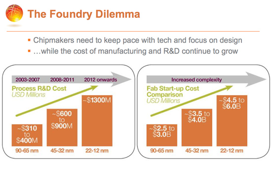
ARM is a different sort of microprocessor company than the ones we're used to covering. AMD and Intel design the instruction set, microarchitecture and ultimately do everything up to (and including for Intel) actually fabbing the chip. Owning the entire pipeline from ISA (instruction set architecture) all the way down to manufacturing is expensive. The graph below shows the rough costs of simply keeping up with fab technology every two years:
That's not really feasible for most companies. In fact, AMD recently got out of the fab business partly because of the incredible costs associated with it. Actually designing these architectures is a tough job. It'll take a large team of highly talented engineers multiple years to crank out a good design. Then you've got to test the chip and ultimately, you have to sell it.
Now it's hard to sell just a microprocessor, which is why both AMD and Intel offer a full platform solution. You can buy graphics, chipsets, SATA controllers, basically everything but a motherboard from these companies. It's difficult for a company to offer such a complete solution.
To sell the chips you need customers, you need to be able to deliver on their schedules and keep the whole machine running. Fabs, engineering, testing/validation, sales and marketing - it's an expensive business to run.
There's rarely room in any mature market for more than two competitors. And among those two competitors, there's never room for both to behave the same way. This is why AMD and Intel have wildly differing approaches to microprocessor architectures at the same process technology node. ARM can't follow in Intel's footsteps, so the alternative is to cut away the excess and remain focused.
Which is exactly what ARM does. ARM will sell you one of two things: a processor architecture, or a license to use its instruction set. The majority of customers take the former. If you're a processor licensee this is how it works.
At the core ARM creates an instruction set, just like Intel and AMD use x86, ARM has its own ISA. Next, ARM will actually create an entire processor designed around this instruction set. For example, the Cortex A8 is an ARM design based upon the ARMv7 ISA - just like the Core i7 is based upon Intel's x86 ISA.
This processor is tested, validated but not manufactured by ARM. Instead, ARM will give a licensee everything it needs to integrate this CPU core into its own design. Remember the part about needing a platform? It's usually up to the customer to grab a GPU, video decoder, image processor, etc... and put them all on a single chip with the ARM core they've just licensed. This way ARM doesn't have to deal with the complexities of lining up five different roadmaps and delivering a chip that its customers want. ARM provides the CPU, Imagination or some other company will provide the GPU IP and so on and so forth. Everyone gets a chip tailored to their needs.
Like I said, the majority of companies take this route. It's more cost effective because you don't have to do the CPU design yourself. You do lose a bit of a competitive edge, as your competitors can easily license the same cores you do. So you can differentiate based on how well you integrate all of this IP, what tradeoffs you make vis-a-vis power vs. performance vs cost, or marketing prowess, but not on base architecture. Take this route and you do run the risk of your chips performing the same as your competitors. Companies like TI (OMAP3, OMAP4) and Samsung (S5PC100) are ARM processor licensees. They license ARM11, ARM Cortex A8 and ARM Cortex A9 cores and integrate them into SoCs along with a GPU, video decoder and other IP that they source from various companies.
Samsung's S5PC100 is based on the Cortex A8 licensed from ARM
With as many players as there are in the SoC market, differentiation is key. For customers looking for more gain at the expense of increased risk, ARM offers a second option: an architecture license.
An architecture license means that you have the right to use the underlying ISA. AMD and Intel have broad cross licensing agreements in place that allow them both to produce x86 processors using instructions introduced by each maker. I don't have a license to the x86 ISA so you and I can't go out and sell our own x86 CPU tomorrow. Sorry.
Companies like Marvell are architecture licensees. They take an ARM instruction set (e.g. ARMv6, ARMv7) and use their own engineers to build a microprocessor around it.
This is a much more costly and risky approach. Building a CPU isn't easy, in fact the faster it is, the more complex and difficult the task becomes. Even companies that have tons of experience doing it screw up from time to time. It takes a lot of time, requires smart folks and you have to pay them good salaries. The upside is that with a bit of effort, you can outperform ARM's own designs. As with most things in life, the larger the risk, the larger the upside.
This is the route Qualcomm took.
Inside Snapdragon is a Scorpion
Several years ago Qualcomm assembled an architecture team in the Research Triangle Park in NC, coincidentally around 30 minutes from where I live. One of their tasks was to design a high performance CPU core around the ARMv7 instruction set. They called it Scorpion.
While the Scorpion core is normally referred to as a Cortex A8, Qualcomm views it as more of a Cortex A9 competitor. The truth, as always, lies somewhere in between. Like the Cortex A8, Scorpion is a dual-issue in-order microprocessor architecture. As I mentioned in my iPhone 3GS article, you can think of it as a modern day Pentium processor (but not an Atom).
Qualcomm claims the ability to do some things out of order, but by and large the pipeline is in order which ultimately keeps it out of the A9 classification.
Qualcomm hasn't shared much about the base architecture other than to say that it's definitely not based on the Cortex A8. It might have a deeper pipeline than the Cortex A8 to help it reach higher clock speeds. Unlike the ~600MHz target the A8 will hit at 65nm, Qualcomm's Scorpion will run at 1GHz at 65nm.
Scorpion also implements the NEON extensions to the ARMv7 ISA, although Qualcomm's implementation is a higher throughput version of what the Cortex A8 offers. It's my understanding that NEON isn't very widespread in usage today, so I'm not sure that Qualcomm's advantage here matters just yet.
Cache sizes are unknown but I'd expect that they're competitive with what we've seen from competing Cortex A8 implementations. Ultimately everyone is bound by die size and power consumption at 65nm.
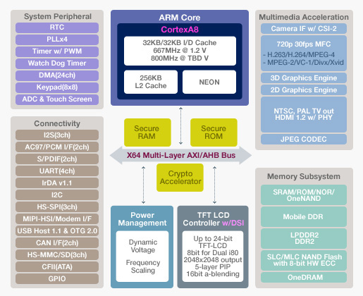
Qualcomm integrates the Scorpion core in its Snapdragon SoC. The version of Snapdragon in the Nexus One is the QSD8250. This SoC includes a 1GHz Scorpion core and an integrated 3G modem. The QSD8650 will be used in the Verizon version with support for EVDO and CDMA 2000.
Qualcomm's integrated modem is a very different approach from what we've seen from companies like NVIDIA, Apple/Samsung and TI. Those companies rely on an external modem solution to reduce time to market. Qualcomm's response is to instead offer an SoC that integrates support for all major wireless standards. The QSD8250 used in AT&T's supports GSM, GPRS, EDGE and HPSA networks. The QSD8650 supports CDMA2000 1X, 1xEV-DO Rel 0/A/B, GSM, GPRS, EDGE and HSPA wireless networks.
When I spoke with Qualcomm one message it stressed was how calculated the timing of Snapdragon was. It's not by accident that all of the major Android phones being announced today use Snapdragon, it's because of very careful timing and planning that Qualcom was able to hit this bulge in the market. Most SoC makers would cite time to market as a reason for not integrating a modem into an application processor, it's clear that Qualcomm faced that challenge and took timing very seriously with Snap Dragon.
The CPU side of the Snapdragon SoC is fast. Faster than what's in the iPhone 3GS, Palm Pre and Motrola Droid. Unfortunately there are other issues. Qualcomm scaled up processing speed but didn't increase memory bandwidth. The Snapdragon still has a 32-bit LPDDR1 interface, giving it the same memory bandwidth as its competitors despite boasting a much higher clock speed.
The even bigger problem with Snapdragon is its use of the Adreno 200, a dated and slow GPU Qualcomm acquired from ATI a couple of years ago. Luckily for Qualcomm, intensive 3D gaming hasn't really taken off on smartphones just yet but here Snapdragon is at a disadvantage to the Samsung and TI SoCs that use Imagination Tech's PowerVR SGX.
So the Nexus One has better CPU performance, identical memory bandwidth and worse GPU performance compared to the iPhone 3GS. Nothing is ever easy in this world.
Later this year Qualcomm will introduce its 45nm Snapdragon SoCs. These will range from being simple clock bumps of the 8650 in the Nexus One with LPDDR2 support, to full fledged dual-core versions with a much higher performance 3D core. Qualcomm also confirmed its intentions to move to an out-of-order architecture at some point in the future. I'd expect to hear more about that next year.
The Display, My Love, the Display
If there’s one aspect of the Nexus One that makes the iPhone 3GS feel really dated it’s the display. Let’s look at the basic specs:
| Google Nexus One vs. Apple iPhone | |||||
|
Apple iPhone 3GS (ARM Cortex A8)
|
Google Nexus One (Qualcomm Snapdragon QSD8250)
|
||||
| Screen Technology | LCD | Active Matrix OLED | |||
| Screen Diagonal | 3.5" | 3.7" | |||
| Resolution | 320 x 480 | 480 x 800 | |||
| Pixels per Inch | 163 ppi | 252 ppi | |||
For very similar screen sizes (the Nexus One is narrower but longer than the iPhone), Google offers a huge increase in resolution. It makes sense given that the iPhone 3GS is still using the same resolution panel as the first iPhone back in 2007.
Recently Luke Hutchison published an excellent article at Ars Technica explaining the subpixel makeup of the Nexus One’s display. Most display technologies we’re used to reproduce colors by using a combination of red, green and blue. Instead of evenly distributing RGB subpixels across the display, the Nexus One has a combination of RRG or GBB for each pixel. This optimization is put in place most likely to reduce manufacturing cost or increase lifespan of the display.
Either way, you’re not getting complete color data on a per pixel basis. Now I won’t get into the argument of whether or not Google should call it a 480 x 800 display. It technically has that many pixels, it’s just that their makeup is a bit odd.
Google also does some pretty standard tricks to make the display look even more impressive. You get oversaturated colors and the usual trickery you can find in the TV section at Best Buy. Whites on the Nexus One aren't quite white but rather a cool blue and reds are often too red.
Compared to the iPhone, indoors, the Nexus One display is just incredible. If there are two things you could describe the Nexus One display as they would be: high contrast, and sharp. Indoors, and above 50% brightness, it’s honestly the best looking display I’ve ever seen on a smartphone. The colors are ridiculously vibrant and they pop because of the super deep blacks.
It really looks that contrasty.
The AMOLED display has no backlight, and thus it’s far more power efficient to display lots of black than it is to display bright whites. For this reason many of the applications use black backgrounds. For example, here’s the email app in Android vs. the email app in iPhone OS:
|
Google Nexus One
|
Apple iPhone 3GS
|
|
|
 |
Given that Android is a fairly mainstream OS and not a pornsite, white text on a black background is generally unexpected. Unexpected, but not more difficult to read. The high resolution and incredibly contrasty AMOLED display make sure of that.
In direct sunlight, the lower part of the picture above is what the Nexus One looks like
Outdoors it’s another story entirely. In direct sunlight, the display is mostly useless at its default brightness settings. With the brightness cranked all the way up it’s still washed out but at least legible. Which brings me to my next point. The auto brightness control on the Nexus One is frustrating.
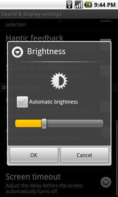
It automatically adjusts display brightness based on ambient light, but it generally picks a brightness that’s too low for my tastes. I just ended up disabling the automatic control and picked something that was around 50 - 100% brightness depending on what I was doing with the phone. I would like the option to have the auto brightness control pick settings that are a little less conservative.
Touch the Screen
Touchscreens have gotten much better over the past couple of years since the iPhone’s introduction. The Nexus One’s touchscreen is very close to as responsive as the iPhone’s but with some annoying issues. There are some situations where holding the Nexus One in one hand and swiping with my thumb won’t let me swipe between screens, and other similar accuracy issues. Getting the home bar buttons to recognize taps is also a pain at times. The touchscreen is definitely usable, just not as good as the iPhone's.
Performance: Faster but Choppier
Much like the display, the Nexus’ performance can be frustrating at times. First, the bad. Switching between pages on the home screen and scrolling through applications is downright choppy. The scrolling process isn’t slow, but the animation isn’t smooth - which makes the phone feel slower than it is. It’s a framerate issue that’s been present on every Android device I’ve used (for the life of me I can’t remember whether or not it was present on the Motorola Droid). It varies depending on the app as well. Scrolling through contacts is perfectly smooth, scrolling through Facebook isn’t. I doubt it’s a hardware issue but rather a software optimization/driver problem. Why it hasn’t been fixed by now is anyone’s guess.
Another inexplicably slow part of the Android experience involves getting the virtual keyboard to appear. The keyboard appears whenever you tap in a text input box. Doing so upon first entering an application (e.g. the SMS app) usually takes several taps before it’ll actually respond. It’s frustrating beyond belief and inexcusable given the horsepower of the Snapdragon SoC in the Nexus One. Again, this just seems to be a software optimization issue rather than an inherent platform limitation.
Now the good news. When launching and interacting with an app the Nexus One feels lightning quick, going back to the iPhone 3GS afterwards feels much slower. Applications respond with a sense of urgency that no other smartphone I’ve used can offer. This is a pure clockspeed thing thanks to the 1GHz Snapdragon from Qualcomm.
| Applications Processor Performance | |||||
|
Apple iPhone 3GS (ARM Cortex A8)
|
Google Nexus One (Qualcomm Snapdragon QSD8250)
|
Advantage Nexus One | |||
| Load www.anandtech.com | 6.9 seconds | 6.7 seconds | 3.0% | ||
| Load www.digg.com | 12.5 seconds | 9.0 seconds | 38.9% | ||
| Load www.arstechnica.com | 12.1 seconds | 10.8 seconds | 12.0% | ||
| Load www.engadget.com | 17.7 seconds | 13.3 seconds | 33.1% | ||
| Load www.gizmodo.com | 20.8 seconds | 13.7 seconds | 51.8% | ||
| Load www.techreport.com | 6.2 seconds | 5.0 seconds | 24.0% | ||
| Launch Web Browser | 0.7 seconds | 0.7 seconds | 0.0% | ||
| Launch Email App | 0.7 seconds | 0.7 seconds | 0.0% | ||
| Launch Maps App | 5.0 seconds | 2.0 seconds | 150% | ||
| Launch Camera App | 2.8 seconds | 2.0 seconds | 40.0% | ||
Loading web pages proved to be anywhere from 3 to over 50% faster than the iPhone 3GS. Launching simple apps didn't move any quicker on the Nexus One, but firing up the Maps and Camera apps (and waiting for them to be usable) was much faster on the Nexus One. The more processor intensive the task, the more the Nexus One can flex its muscle.
Those applications that spawn other apps (e.g. clicking on a Google Maps link in the browser and having it spawn the Maps app) also do so very quickly. If it weren’t for frame rate issues, the Nexus One would be perfect from a performance standpoint.
It’s weird, the flexibility that Android offers is very PC like. And by that, I mean that the platform really does feel like a condensed version of Windows or Linux running in a smartphone. Unfortunately, the weird quirks also seem to come with the package. In fact, I’d say Android really does feel like a more modern version of what Windows Mobile used to be rather than an iPhone, webOS or Windows Phone 7 competitor.
The Browser
Web browsing is a pleasure on the Nexus One. The Android browser is WebKit based like Chrome, and Safari on the iPhone, and for the most part it behaves like the iPhone browser.
Pages load incredibly fast thanks to the Snapdragon SoC, unfortunately the choppy framerate while scrolling is very evident when using the browser. The screen is also perfect for viewing web pages although if you're actually trying to read anything you'll probably want to be in landscape mode.
The browser also offers more features than its iPhone counterpart (notice a trend?), you get the ability to search for text on a page and a download manager as well. The browser supports plugins and a laundry list of settings that are simply not present on the iPhone.
 |
 |
Managing all of these options does make the Android browser a bit more complicated. For basic browsing the functionality is the same as the iPhone, but to access any of the extras I mentioned above there are a couple more levels of menus you need to navigate through. Refreshing a page for example takes two presses instead of one on the iPhone. Accessing the download manager takes three.
Overall the screen and the faster SoC make web browsing on the Nexus One amazing compared to the iPhone. The biggest issue is that scrolling through web pages is choppy, which unfortunately detracts from how quick the phone feels.
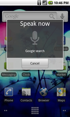
Voice Recognition Beta...on your phone?
Spread throughout Android on the Nexus One is this icon:

It's a microphone and tapping it brings up this screen, allowing you to speak your input instead of type it:
 |
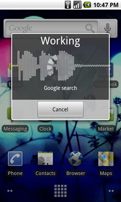 |
Google will warn you that it's an experimental feature and may not work right, but in practice it seems to work very well. You can perform Google searches and dictate text messages. Apple offers a more limited voice recognition feature on the iPhone 3GS without dictation support as you may remember. As with most of the differences between these two platforms, Google's implementation of voice is more flexible while Apple's is more polished.
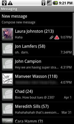
The Messaging App
Android's messaging app is very similar in function to the iPhone SMS app. Conversations are stored per contact and as an improvement, you even get a count of how many messages are in each conversation.
 |
 |
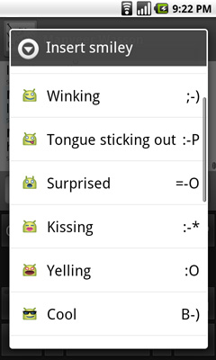
As an added bonus, the keyboard in the messaging app has a built in smileyface key. And all emoticons are little Androids showing various emotions, it's great.
You can turn on voice input using the messaging app keyboard as well. Google warns that it's a beta but in practice I found that it worked very well. It would be even more useful if there was a quicker way to turn on voice input (perhaps a physical button?) and if you didn't have to hit the voice recognition button whenever you wanted to start transcribing a message, but it's a start.
You can attach audio, pictures or videos, it's just not very obvious how to do it. While Apple provides a single camera icon (and no way to attach an audio file from within the SMS app), Google relies on you hitting the contextual menu button to bring up the attach option. Again we see that different of approach rearing its head.
I did run into one annoying issue with trying to SMS a contact. Laura is in my phone with a home number, mobile number and iPhone number. The SMS app won't let me message her iPhone number, whenever I type her name in all I see is the option to SMS her mobile number. I have to manually type in her iPhone number and then it fills in her name. I wouldn't read too much into the issue other than Android appears to default to SMSing whatever number you have listed as mobile for a contact.
All I Need is One Mic
The Nexus One has two microphones, one at the bottom of the unit and one on the back. The two are used in tandem to calculate and remove background noise while you're talking. In practice no one told me I sounded any more clear or loud using the Nexus One compared to my iPhone 3GS. I'm not doubting that it works, it's just a subtle thing in my experience thus far.
The bigger difference to me was the volume/clarity of incoming calls compared to the 3GS. The Nexus One holds a definite advantage here. Signal reception also wasn't an issue.
There's a speaker on the back of the device that's used whenever you activate the speaker phone or play audio. Sound quality and volume are ok, nothing to write home about. I prefer the iPhone 3GS' speakerphone.
Unlike the iPhone there is no rocker switch to quickly put the phone in silent mode. Instead you have to swipe to silence the phone on the touch screen, which isn't easy to do with the phone in your pocket. The vibrating motor in the Nexus One is also hard to feel with the phone in your pocket.
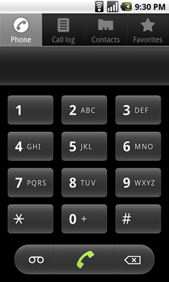
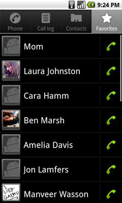
The Phone App
Android’s phone app is very similar to what Apple and Palm offer. Along the top of the app you have phone, call log, contacts and favorites buttons. The favorites list is my, er, favorite as it auto populates based on who you call and who calls you most frequently; you can manually add people here but I found that it wasn't necessary, the phone was smart enough to put my favorite people in the list for me.
The contacts list is another one of those lists that features smooth scrolling - no jerkiness here, just butter at room temperature. Once you start scrolling you also get a little widget you can drag up/down the screen to quickly find the contact you want. It’s not as obvious at first as the iPhone equivalent, but the widget itself is larger and overall more usable than using the tiny list of letters on the iPhone.
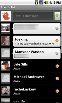
Any contacts that appear here who are also on your Google Chat friends list will have their current chat status appear in real time.
That’s two panes of win for the Android Phone app.
The dialer is pretty straight forward. There is no visual voicemail so you’ll have to hit the dedicated voicemail button to check your messages the old fashioned way (there is an alternative that we’ll get to in a moment).
 |
 |
The call log is a straight up log of all of your calls, both incoming and outgoing with no way of filtering. The incoming/outgoing icons don’t really make a whole lot of sense to me - outgoing is a green arrow pointed up at 45 degrees, incoming is a blue arrow pointed down at 225? (Update: ah, I get it now. Apparently I'm slow. The blue arrow points inwards towards you when you're holding the phone. Green arrow points away. Red arrow attempts to point towards you but "misses". Clever.)
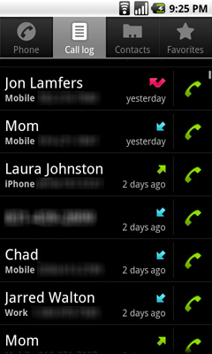
Tapping on a call in the log brings up information about the call. Time, duration, phone number. No location information is provided. From here you can also SMS or email the contact if it’s in your address book, and if it’s not you can add it. If you tap on the phone icon to the right of the call, you’ll go ahead and call that number again.
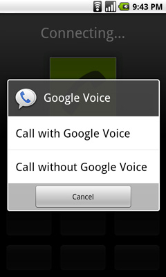
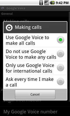
The Nexus One’s dialer integrates p-e-r-f-e-c-t-l-y with Google Voice. Using the Voice app you can configure your phone to always dial using your Google Voice number and from that point on, any call you make will appear to come from your GV number. You can even set the Nexus One to only use GV for international calls, or to ask you every time you make a call. It’s great integration, and if you use Google Voice you’ll love how it works on Android.
 |
 |
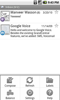
I mentioned the alternative to visual voicemail earlier. If you rely on your carrier to provide voicemail then you’re stuck with the old fashioned option. Rather than copying Apple, Google relied on its own robust Google Voice infrastructure to provide a real alternative to voicemail. Android’s Voice app (it comes preloaded on the Nexus One) adds a fully featured interface to Google Voice. You get your voicemail, in a list format just like you do your email. Your voicemail is automatically transcribed for you, so you can just read it if you’d like. The transcription works really well. You can playback your voicemail in whatever order you’d like. And unlike the iPhone’s visual voicemail, your messages are never deleted if you accumulate too many.
You can also send SMSes through the Voice app, although there isn’t similarly sweet integration between Google Voice and the Android Messaging app in this regard. The SMS interface in the app itself is a lot like the Messaging app so you’re not losing any functionality, it’s just not all in one place.
There’s Pretty Much an App For That
Apple’s App Store has over 100,000 apps in it. Google’s Android Marketplace has 30,000. Apple wins, right? Wrong.
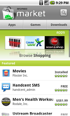
This isn’t a Palm Pre. There’s pretty much an app for everything you’d need on Android. Every app I use on my iPhone has an Android version, most of the time by the same developer. Pandora, Facebook (this one even comes preloaded on the Nexus One), Sonos controller, XBMC Remote, they’re all there and they all work just as well as the iPhone versions.
 |
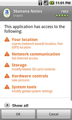 |
Before you download any app Google gives you a scary list of everything that the app accesses. Ultimately there's not much you can do about the list but it at least informs you about what the application will access.
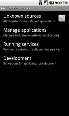
You also have the option of running apps sourced from outside the Marketplace, something you can’t get on the iPhone unless you jailbreak it. Simply check a box to enable running non-Marketplace apps. If you’re down to tinker around with your device, the Nexus One allows it without making you feel like a criminal.
 |
|
Also unlike the iPhone platform, Android Apps are able to run in the background. The best example of this is being able to run the Pandora app, then switch to your home screen and send SMSes or respond to emails without interrupting audio playback. Granted this will impact the already not-so-great battery life of the device, but Google at least gives you the opportunity to do it. In the case of an app running in the background, you get a little icon in the notification area letting you know what’s running.
Camera
The built in camera on the iPhone is frustratingly bad. It’s better than no camera at all, and the improvements made to the 3GS camera are welcome, but it doesn’t hold a candle to what’s in the Nexus One.
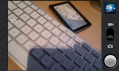
The camera app launches quicker on the Nexus One and seems to boast a higher framerate while you’re just panning around preparing for your shot. There is no tap-to-focus control like what you get on the 3GS, just point and click the shutter button. The (virtual) shutter lag is still present, but far less than what’s on the 3GS. From a performance standpoint, it’s good.

Image reviewing in the camera app is silly. No gestures are supported, you have to tap left/right arrows to cycle through images.
As far as picture quality goes, it’s not bad at all. Definitely an improvement over the iPhone 3GS, but not as good as a standalone point and shoot. The built in “flash” is useful in improving picture quality in less than ideal lighting conditions, but it can’t work miracles obviously.

Indoors. Shot using the Nexus One (cropped & scaled)
Switching between still and video modes on the camera is so much quicker than on the 3GS. It’s almost to the point where you shouldn’t need to switch modes at all and just choose picture or video with a different shutter button.
The Gallery Application & Music Playback
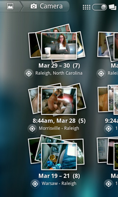
All of your photos and videos are stored and played back using Android’s Gallery app. Google toyed with some neat UI effects to make this much less of a boring app, but fundamentally it just gets you to your content.
 |
 |
MP3s are played back using the Music app, and again its function is pretty straight forward. The iPhone uses iTunes as its obvious music store of choice, while the Nexus One uses the Amazon MP3 store. You get the same basic functionality for searching, previewing and purchasing music.

Android's Gmail app is also pretty straight forward. By default it checks the Google account you setup when you first turned on the phone, but you can add more accounts as necessary.
Both the Gmail and Email apps work fairly similarly, although only the former supports full text search putting it at an unfortunate disadvantage to the iPhone.
The Gmail app does support push, making it perfect for anyone who does rely on Gmail as their primary email provider. As I mentioned before, it's only because Google's web apps don't actually suck that this works out. This is one of few times where total integration makes sense.
The Gmail/Email UI isn't as gesture heavy as it is on the iPhone. Swipe up/down to scroll but to delete you have to check boxes next to messages and hit the delete button that comes up. It's quicker than the iPhone for batch deleting, but slower for removing just one message. On the plus side, it's more difficult to accidentally delete a message because of this.
Messages are automatically downloaded from the server as you reach the end of a screen of messages. All in all, it works pretty well.
Some have complained about how many taps it takes to switch between accounts on Android. Personally it's not a huge deal since I don't maintain that many different email accounts, but you do get a combined inbox if you'd like. I do agree that since you don't swipe to delete, you should be able to swipe to switch inboxes in message view mode.
Despite the high resolution screen, responding to an email is cluttered with UI elements that take up far too much real estate. Quoted text is always off screen.
Syncing
The concept of syncing is quickly changing. On the Nexus One your contacts and calendar are synced over the air using your Google account. Windows, OS X and Linux all have routes to sync your existing contacts with your Google account, so the import process isn’t painful at all.
You can put the Nexus One in USB storage mode, in which case it’ll appear as a USB storage device where you can quickly copy files to the SD card you have installed in the device.
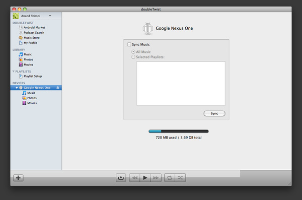
There are other third party apps you can use that perform more traditional syncing options (e.g. The Missing Sync, doubleTwist) if you miss them.
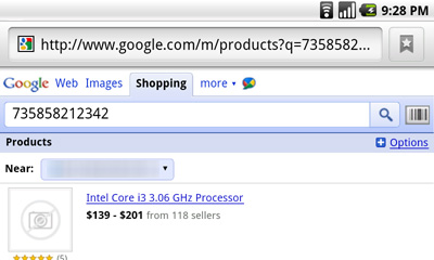
Barcodes & Goggles - Making Science Fiction Reality
The best way I can put this is that the Nexus One likes to do math on things. If anything it’s a testament to Moore’s Law and the fact that we can do more in the palm of our hands today than we could do on our desks a decade ago.
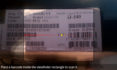
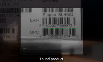
Android has a built in barcode processing library that it can use alongside the Nexus One’s integrated camera to act as a fancy barcode scanner. The combination has two major implications:
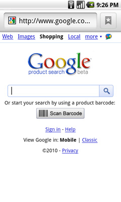
1) There are many applications that allow you to scan any barcode (e.g. off a book at a bookstore or an Xbox 360 at Walmart) and return pricing results. Google’s own shopping website when browsed with an Android phone has a scan barcode button that will activate your phone’s camera and return Google Product Search results. This doesn’t bode well for brick and mortar retailers, but it’s great for walking into Best Buy and quickly finding out if something you want is cheaper online.
2) You can also use the barcode scanner to download apps from the Android Marketplace. You may have seen QR codes before:

Open any barcode scanner application and point the camera at the QR code and your phone will automatically take you to that application in the marketplace.
While the iPhone does have barcode scanning abilities, the infrastructure doesn’t appear to be as well built as what’s in Android. That being said, I thought I’d be using this feature a lot more than I ended up doing.
Such interwoven barcode scanning is super neat at first. I found myself scanning everything physically possible.
Price comparisons in stores are nice, but I rarely shop in brick and mortar stores. If I do, I usually need whatever it is I’m shopping for right then and there so any mobile price comparison doesn’t help. I suspect that for a slightly more mainstream user, this feature has more value.
In downloading Android apps, I find it faster to simply use the marketplace. The exception being if I see a news post about an app I’d like to try out, usually there’s a barcode I can scan in the newspost. The capture and scan of the barcode usually takes long enough (gotta hold your hand still) to make it no faster than just using the marketplace app though. In this case, the Nexus One gets more points on paper but not as many in real world usage.
Google also ships the Goggles app on the Nexus One’s Android build. Similar to the barcode app, Goggles performs a rudimentary image search for anything you point the camera at. It works really well for things like logos right now, but it’s not powerful enough to do much more.
Ultimately the strength in these two apps comes in their ultimate end goal: the ability to point your smartphone camera at anything and find out exactly who or what it is. See a funny looking animal walking around? Point, search, ah-ha results! Does that person look familiar to you? Point, scan, done. We’re not quite there yet but given Google’s data mining origins, it makes sense that its start begins with Android.
Battery Life: Unimpressive
The iPhone doesn't have a very long lasting battery. Before my iPhone I was a Blackberry user; my battery lasted for days. With the iPhone, especially while I'm traveling, I have to keep charging it throughout the day or risk a completely dead phone by 6PM. The Nexus One is worse.
To test battery life I ran the same suite of battery life tests I have been using in our smartphone reviews for the past couple of years:
The wireless web browsing test uses the 3G or WiFi connection to browse a series of 20 web pages varying in size, spending 20 seconds on each page (I timed how long it takes me to read a page on Digg and came up with 36 seconds; I standardized on 20 seconds for the test to make things a little more stressful). The test continues to loop until the phone dies. This test is designed to simulate a relatively heavy, but realistic data load on the phone. We're stressing the modem/WiFi radio, SoC, memory and display subsystems here. This should also be the sort of battery life you get when you are using any apps that use data (but not 3D acceleration). The display brightness was set to roughly 30% on the Nexus One and 50% on the iPhone.
The H.264 movie playback test loops a 480 x 208 632Kbps re-encode of Slumdog Millionaire until the phone dies. The majority of the device is idle during this test stressing the memory subsystem, video decoder, audio decoder and display more than anything else. The display brightness was set to roughly 30% on the Nexus One and 50% on the iPhone.
The talk time test measures battery life over the course of a conversation between the phone being tested and another phone. The conversation is actually an MP3 playlist on repeat played into the microphone of the phone being tested. The display was disabled.
| Battery Life | |||||
Apple iPhone 3G |
Apple iPhone 3GS |
Google Nexus One | |||
| Wireless Web Browsing (3G) | 4.50 hours | 4.82 hours | 3.77 hours | ||
| Wireless Web Browsing (WiFi) | 6.67 hours | 8.83 hours | 5.62 hours | ||
| H.264 Movie Playback | 4.70 hours | 9.65 hours | 6.67 hours | ||
| 3G Talk Time | 4.82 hours | 4.82 hours | 4.67 hours | ||
Despite having a larger 1400 mAh battery, the Nexus one proved to have worse battery life across the board than the iPhone 3GS both in my tests and in my day to day usage. The only redeeming quality here is that you can easily swap out spare batteries, while the iPhone requires a 3rd party external battery if you need more juice on the go.
Talk time is lower than on the iPhone 3GS. Using the 3G data or WiFi connections both result in the phone dying faster than the 3GS. Even H.264 video playback discharges the Nexus One's battery faster.
I'm not sure if it's the AMOLED display, the Snapdragon SoC or just inefficiencies in Android but the battery life story isn't a good one.
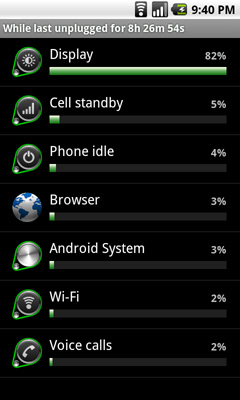
Android does have a power consumption page that shows what percentage of battery drain can be attributed to various components in the phone (e.g. display, OS, specific apps, idle time). It’s not granular enough for my needs but it’s a great way of showing users, at a high level, what’s killing the battery.
Final Words
I've never felt such a lengthy review was so incomplete by the time I reached the end. There's not much more to be said about the Nexus One itself. The hardware is fast, the frame rate issues are annoying and do detract from the overall experience. The screen is beautiful, the form factor great to hold but not my favorite to type on. Battery life is a sore spot if you actually use your phone a lot. You get everything you need with the Nexus One out of the box, which you should given that if you want to use it on AT&T's network or buy it sans contract it'll cost you $529.
Where I do have more to say, but limited time to do it is on the software side. There's just so much to the Android platform and so many great apps out today. Far too many for me to include in a single review. Former AnandTech Editor and DailyTech Editor at Large, Kris Kubicki heard I was reviewing the Nexus One and told me to check out Google Sky Map. This Android app lets you point your phone at the night sky and it'll map out constellations for you. Speaking as someone who has never been able to find constellations on his own, that's just cool.
I understand that you can make the same argument for the iPhone and its app store; I guess the maturity of the Android Marketplace really surprised me. Apple may have the sheer number advantage, but I'd argue that the quality apps are just as prevalent on Android as they are on the iPhone (although 3D gaming does appear to be more of an iPhone strength at this point and going forward).
The buck doesn't stop there, Android as a platform is extremely powerful and has been on a very steep ramp. The roadmap going forward, from what I've heard, looks quite strong. And we see where it's going. The barcode scanning applications, image searching, voice recognition - Google wants Android to eventually power the sort of device that can do things we've only been able to see in movies.
The only faults I have with Android really boil down to its polish and fragmentation in the market. Not all Android devices currently support the same Android builds, which is something that Google apparently plans on addressing this year. There are also many manufacturers that offer their own skins on top of Android, which leads to interface fragmentation as well. With the iPhone, webOS and eventually Windows Phone 7, you get a consistent experience in anything that uses the OS. The same can't be said for Android.
The flexibility and power at your fingertips is addictive however. The integrated Google Voice support alone may be enough for some to run out and buy a Nexus One. Android's pros list actually reads a lot like a modern take on Windows Mobile with a touch of iPhone flair, rather than a direct iPhone competitor.
On the other side of the fence you have Apple with a very closed platform, with a very consistent UI and extreme attention to detail. All UI transitions are as smooth as possible, no application is too deep, it's just a very clean and focused device for when you're not around your desktop or notebook.
It's really all about functionality. Google offers more out of the box, making the Nexus One more like a computing device and less like just a smartphone. I suspect that many will prefer that, while others will still not be swayed if they value a cleaner, more focused interface. Just like there are Mac users and PC users, there are iPhone users and Android users. It's not that Android is an iPhone alternative, it's that Android is a completely different approach to what Apple offers.
On paper, Android and the Nexus One offer all of the value. You get more out of the box, you get features like Google Navigation, Google Voice and you get a platform that can do pretty much anything you'd want. Honestly, on paper, the iPhone is a tough sell. It's got slower hardware, less flexibility and you have to pay extra for what Google will give you for free. It's actually very similar to the Windows Mobile vs. iPhone debates from 3 years ago. What sold folks then was Apple's UI advantage, and Android is no slouch in that department.
Many of the same value/openness arguments are made against buying Mac computers over PCs. Ultimately what sways users is how much they appreciate Apple's way of doing things. Clearly not everyone does, but I suspect that there are enough who do to keep the iPhone strong despite Google's serious lead in functionality/bang for your buck.
These two platforms are very polarizing. I have friends who would clearly not work well with an iPhone and others who wouldn't enjoy the Nexus One. It really boils down to what you value most as there's no clear cut answer for everyone. Personally, there are things I love about the Nexus One, and things that I still prefer on the iPhone. If Google or Apple would just copy and improve upon the Pre it would be a much easier decision for me :)
Going forward, Google will have to reign in some of what makes Android so flexible today to avoid it turning into another Windows Mobile. And Apple will have to embrace some of what Google is doing to prevent iPhone from turning into what Apple's products were in the 1990s.


