Original Link: https://www.anandtech.com/show/9622/hands-on-with-the-ipad-pro-and-ipad-mini-4
Hands on With the iPad Pro and iPad Mini 4
by Joshua Ho on September 10, 2015 8:00 AM EST- Posted in
- Apple
- Mobile
- Tablets
- iPad Pro
- iPad Mini 4
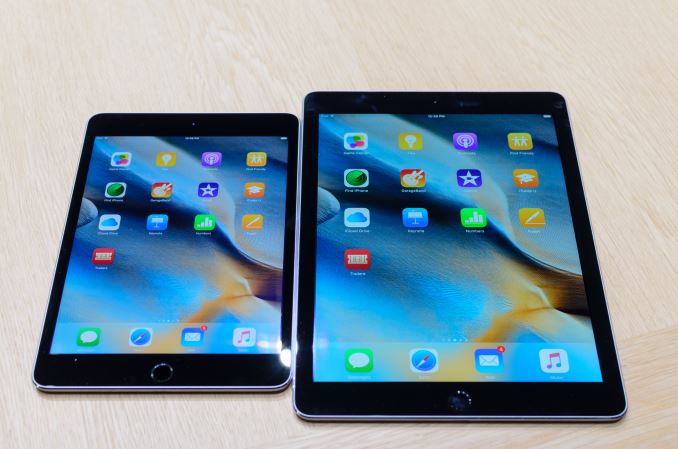
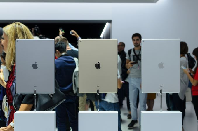
While the iPhones are an important aspect of Apple’s September annual announcements, the real surprise of the show was the iPad Pro and iPad Mini 4. For those that aren’t up to speed with the basics of these two tablets, the iPad Mini 4 was only mentioned in passing in the announcement but it effectively gives you the iPad Air 2 with an A8 SoC in a mini formfactor. This means that the display is now close to 100% sRGB and there is the iPad Air 2 anti-reflective coating on top. I’m not sure if the iPad Mini 4 makes the jump to an IGZO display for better battery life, but the iPad Mini 4 is now the closest it’s ever been to the iPad Air sibling.
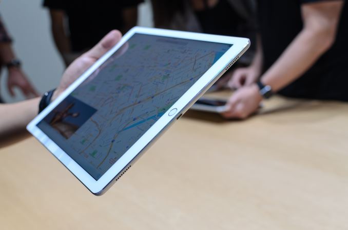
The iPad Pro received an enormous amount of event time, and given just how big of a departure it is from previous iPads, I can understand why. The move from 9.7 to 12.9 inches really does make the iPad Pro far better for content consumption and productivity purposes. The increase in size does make it harder to maneuver when used purely as a multi-touch tablet. While a 9.7” tablet like the iPad Air 2 could be used for reading in bed or something similar, I have a feeling that the iPad Pro might be uncomfortable when using it for similar purposes. The tablet is definitely light though, as the density feels similar to the iPad Air 2 but scaled up to the larger size.
Outside of simple size and weight, the display of the iPad Pro was genuinely impressive in person. It looks like the AR coating used is similar to the iPad Air 2, and because the pixel density was maintained from the iPad Air despite the larger display the average longer viewing distance meant that it’s really much harder to make out pixels from a normal viewing distance than before. For watching movies and other forms of media consumption I was unable to test the speakers properly in the demo area, but I look forward to really trying out the speakers in a more private and quiet environment that I suspect most people would be using these speakers for.
While the iPad Pro looks like it would be a solid tablet for gaming and other intensive apps given the A9X performance claims, quite frankly it would be a rather boring tablet if it was just a bigger iPad Air. Fortunately, it seems Apple has recognized that a pure multi-touch experience on the laptop isn’t enough and has created two accessories that are arguably integral to what differentiates the iPad Pro from most tablets. The two accessories are the keyboard cover and stylus, or what Apple calls the Smart Keyboard and Apple Pencil.
If you were to purely look at the feature set as a check box to be filled, it probably goes without saying that this iPad Pro sounds an awful lot like the Surface Pro. To some extent the comparison is fair, but in others it really fails to capture the differentiation that Apple has created here in terms of user experience and product design. The keyboard is probably the first, and most common accessory that will be used.
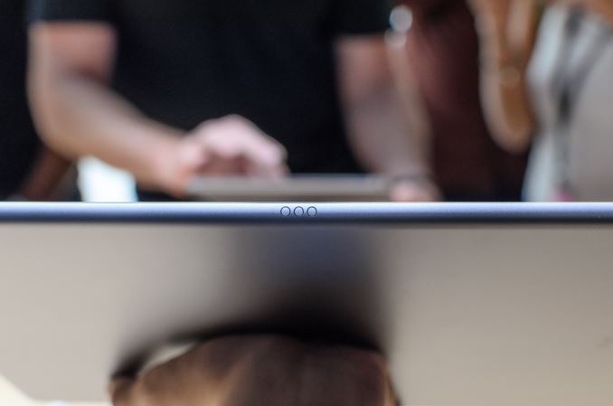
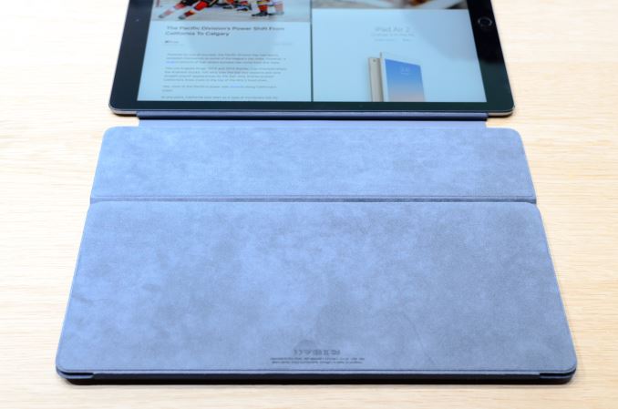
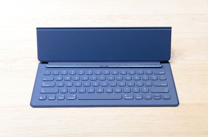
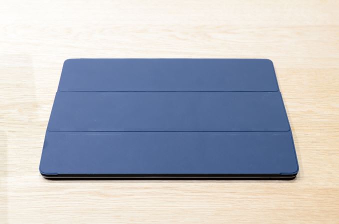
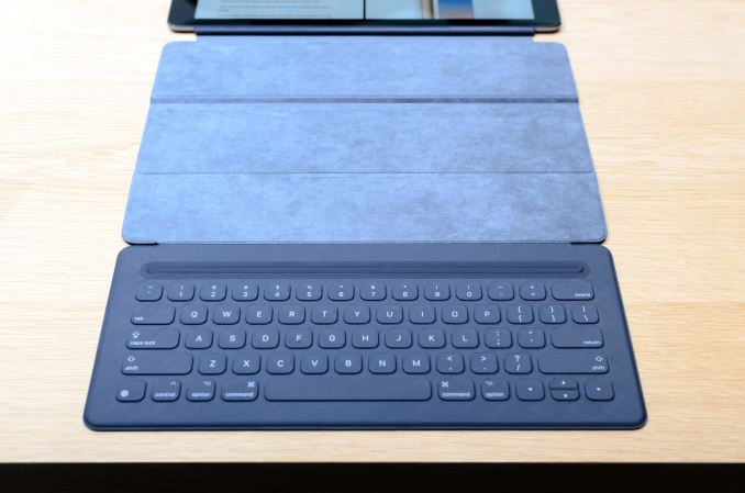
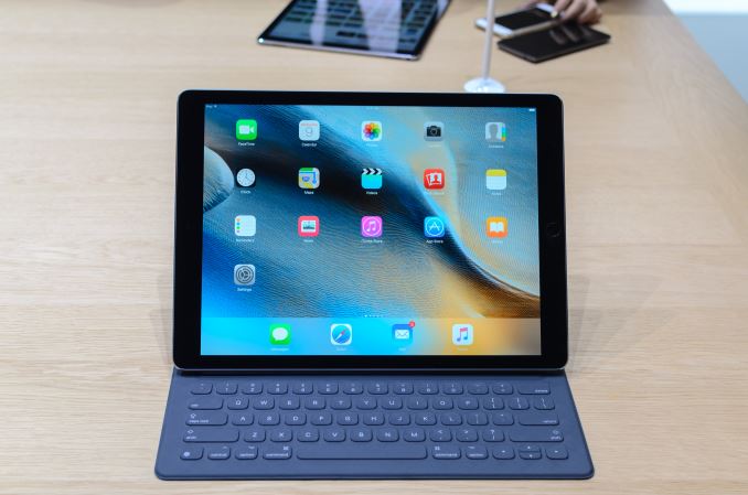
The Smart Keyboard is effectively a flip cover case, which unfolds into a stand and a keyboard when in use but otherwise is just a normal flip cover. I was surprised by how good the keyboard feels in practice as the keys feel almost identical to the Macbook. Obviously, this means that there’s basically zero travel available in the keys, but after spending enough time writing long paragraphs on a smartphone with no haptic feedback or sound feedback I really don’t see the value in long keystroke travel or similar things for text input when it comes to mobile devices. I was able to type at 40-60 words per minute almost immediately without a lot of effort, and I suspect that with practice it would be well within reason to reach 90-100 words per minute with this keyboard. One issue I did notice is that the keyboard feels like the keys are spaced out a bit far compared to most laptops today, which might take some getting used to.
This keyboard cover also doesn’t have a trackpad or any way to adjust the angle at which the tablet is mounted. I suspect the missing trackpad is for the better though if my experiences with the Surface Pro trackpad is anything to go by. I do think that Apple missed an opportunity here to do an adjustable angle dock, but I suspect that trying to use the iPad Pro on a lap with the keyboard dock would be a bad idea because gravity is pretty much the only thing holding the entire setup together. On a table, the single angle isn’t a huge problem and I suspect that there were other engineering considerations that made it hard to justify a multiple-angle stand within the cover.
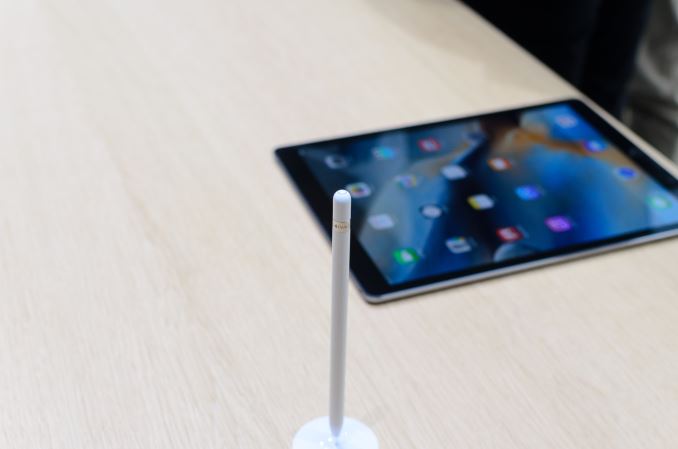
The other aspect of the iPad Pro is the Apple Pencil. This is effectively a stylus, but I suspect the connotation that comes with a stylus is the reasoning for calling this something other than a stylus. In this case, Apple has actually done something surprisingly different with Apple Pencil. We often talk about stylus input as a sort of checkbox feature but a good stylus needs to have the right level of friction on the writing surface to feel natural, along with a wide pressure sensitivity range, high precision, low input latency, and strong palm rejection.
In terms of friction on the glass, the Apple Pencil feels right, with a level of friction that approximates writing with a pen or pencil on paper. The pressure sensitivity range is significant, and at the low end it’s sensitive enough that even the slightest touch of the tip to the display will register input. At the high end, it seems that the pressure range ends a reasonable amount before I’m starting to cause the display glass to flex or the display itself to discolor. It’s good to see that the maximum pressure isn’t something that’s so high that it quickly causes fatigue, which can be a problem in some implementations.
The precision of the stylus is as good as it can get, with pixel-level accuracy. I never felt like there was any kind of stair-stepping or odd interpolation of my input. The input latency is also extremely low, to the point where the inking is pretty much right where the tip is instead of lagging a quarter of an inch behind. Palm rejection also works without any problems as far as I can see, but edge cases could still be a problem without further testing to confirm this.
Angle-dependent input seems to be one neat feature that you could read on a spec sheet and forget about, but after spending a few minutes with it I realized this is actually an incredible feature because it adds an element to the stylus user experience that was present in a pencil/pen/marker but absent in any stylus implementation to my knowledge in a mass-market mobile device. I really think that this will be a feature that takes the Apple Pencil from just a good stylus implementation to the best stylus implementation in the industry.
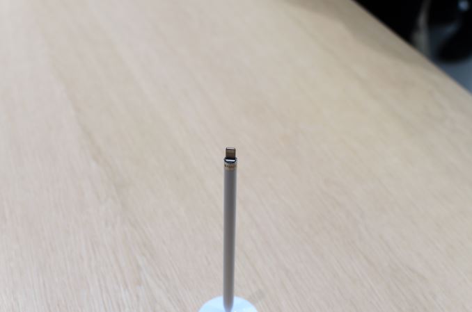
The design of Apple Pencil in terms of industrial design is also well-executed. The plastic body is much wider than most pen implementations that I’ve seen, with allows for a more comfortable grip in extended use. The weight is also a pretty good approximation of a pen, which also helps with ergonomics. The use of a Lightning connector on the pen itself is a smart idea as the idea of regularly replacing a battery in a stylus to use it sounds absurd when a normal pen or pencil doesn’t really need anything similar. I am concerned about the potential for problems with the use of a male connector though, as it seems like a part that could be easily damaged if the tablet is dropped while the pen is charging from the iPad Pro.
However, the Apple Pencil isn’t perfect from what I can tell. There are two issues that I noticed over the course of my hands-on time, but both aren’t really going to ruin the experience by any means. The first is that Apple Pencil is glossy plastic. While I’m not looking for anodized aluminum or anything similar, glossy plastic will definitely acquire an oily feel to it almost immediately after light use, regardless of how often you wash your hands. I suspect some kind of hard rubber sleeve over the pencil would pretty much solve this problem though. The other minor problem is that Apple Pencil lacks any other buttons, but in discussions with people that actually use Wacom styluses extensively this isn’t necessarily a real problem. It’s also worth noting that Apple Pencil must be paired to an individual iPad Pro, so you can’t just pick up any Apple Pencil and immediately start writing on any iPad Pro.
Overall, I was definitely impressed by the iPad Pro. In the iPad Air 2 review I said that I felt like the iPad was missing in productivity and other applications. With the iPad Pro, Apple has tackled this problem in a very big way. The iPad Pro is still a good tablet like the iPad Air 2, but the addition of the keyboard cover and Apple Pencil opens up a lot of new applications along with significantly improving the user experience of pre-existing ones. It remains to be seen whether this will revitalize the stagnating tablet market, but given the new applications for this tablet I suspect the iPad Pro will at least have a dedicated following.

