Original Link: https://www.anandtech.com/show/8283/google-play-app-updated-to-4913-with-material-design-app-pages
Google Play App Updated to 4.9.13 With Material Design App Pages
by Brandon Chester on July 22, 2014 8:30 PM EST
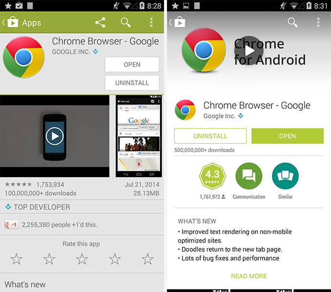
Google has begun the rollout of an update to the Google Play application on Android. At first glance the update doesn't seem to have any big changes. The sliding menu is the same, and the Play Store home page is the same as it has been for a while. Once you actually navigate to the page for an app it's very clear that this is a bigger update than a quick glance lets on. Google has redesigned the app pages with new animations and a new design to fit in with their new Material Design style.
Old Google Play on the left, new on the right.
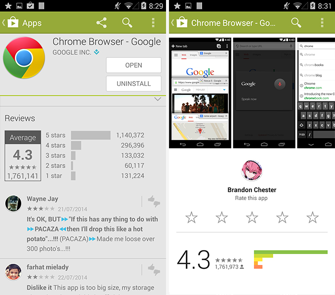
As you can see, the new design is much different and this applies to almost every aspect of the design from the colors to the shapes to the animations. The first thing that stands out is the change in background color from grey to white. While this is a matter of personal preference, I find the white much more appealing than the grey. Google has also shifted around many parts of the application. The positions of app screenshots and the app changelog have been moved to put better focus on the actual information on the page. Apps that have a video trailer will have it prominently displayed at the top. The changes to animations are difficult to describe in photos but what can be said is that they take advantage of the idea of layers and objects in Material Design. As you scroll downward the page gradually begins to cover up the space where the trailer was as it is pushed offscreen. When selecting "read more" in the app changelog the top and bottom sections of the app are pushed offscreen and the user is greeted with a fullscreen view containing only the relevant information about the app description, changes, and developer info.
Upon scrolling down you can see that Google has increased the size of the application photos. With the video trailer moved to the top of the application there's also much more space to display screenshots which is good for developers hoping to show off their application. Google has also added more color to the application by color coding the bars that represent the ratings given by users. The overall app itself also has fewer horizontal lines separating sections which leads to a much cleaner look, particularly in the reviews section of the app page. Finally, Google has moved the share and Google+ buttons down beneath the reviews section from its previous position right underneath the app screenshots.
This update isn't quite the complete Material Design overhaul that users are excited for. That will likely come closer to the time that we see Android L released in the fall. But for now it gives good insight into where Google is headed with app design and what can be looked forward to for all of Google's apps going into the future. As with all of Google's app updates, it may take some time for the new application to reach your device.


