Context
Nothing exists in a vacuum, certainly not any of the products we review. The context of our subjects has a lot to do with what’s expressed in our reviews, even in the stark light of data. Scores alone are never enough, we juxtapose the latest widget to hit our bench against its most likely competition, against its predecessors, and against anything else that might make sense. We think about the era in technology, the trends that pervade the market, and where they’ll take us in the coming months and years. We ask what the market’s demands are, and where they’re going to be later, and discuss how the subject handles those present and future demands. That’s no different here, but we could almost imagine foregoing the Pixel’s context and telling its tale absent its past, so disparate it seems from the Chromebooks that came before. But then we’d miss some of the most interesting bits.
The PC market has been in decline for sometime. There’s an argument to be made that the move to mobile has negated the need for a proper personal computer, and yet, it remains the exception to hear that someone has rid themselves of all their desktops and laptops and lives and works entirely on tablets and smartphones. That day might be ahead, but for now, few are the power users that manage to work and write on their iPads; and most of them have a keyboard dock tucked in their bags somewhere. For most the tablet remains a consumption device; less cumbersome than a laptop for reading, web browsing and watching video. Tablets are the future, though, right? Microsoft seems to think so. Apple has certainly made its case. So with the PC preparing its swan song, what would compel Google to chime in with a stripped out operating system that consists almost entirely of a browser that can be run on any of the current platforms?
There’s a different argument that can be made about the PC’s decline. The operating theory when purchasing a computer was always to buy more hardware than you presently needed, so three or four years down the road your computer was still useful. Software advances outpaced hardware, and so an early Pentium II with just a few megabyte’s of RAM that ran Windows 98 just fine in 1998 didn’t do well with Windows XP just a few years later. Intel’s Core processors changed all of that. A Dell E1505 (my own, in fact) specced with the first Intel Core Duo processor handles Windows 8 just fine. Though they served no one terribly well, netbooks popularized the idea that most users needs could be (somewhat) met by even modest hardware. Intel’s Ultrabook initiative drove the price of lightweight but well performing laptops down under $1,000 and even further still. And still for most users, the modest performance of a ULV processor is more power than they really need to consume media, edit documents and click away in a browser.
Google’s first round of Chromebooks were netbook slow. The stripped down experience was better than stuffing Windows into those tight confines and running Chrome atop that, but the applause ends there. The next generation added incremental performance increases, but was just as mired in performance that didn’t quite reach that “just enough” threshold. The most recent models, the Acer C7 and the Samsung Chromebook (XE303) were stark departures in price and performance, with the Samsung model even adding a hint of style. We liked those models, and praised their almost disposable pricing. These models represented a great ground floor for Chromebooks, just enough performance, and pricing that reflects that. I think we expected to see variations of these models iterate into the future, with performance improving each year. We could even see a path where more and more users would choose Chromebooks in lieu of other second machines, we could see these being successful with the right crowd. I don’t think any of us expected this.
Design and Specifications
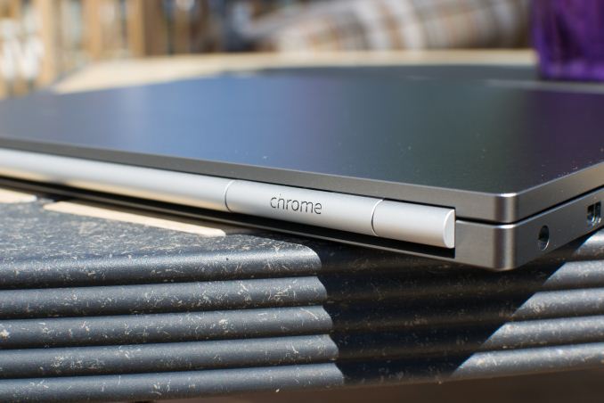
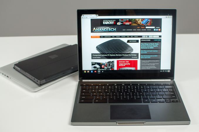
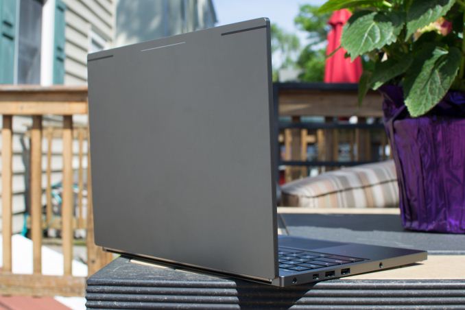
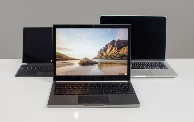
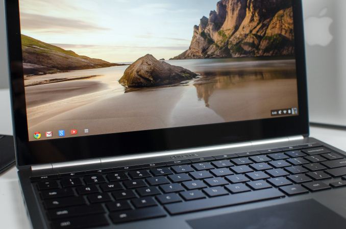
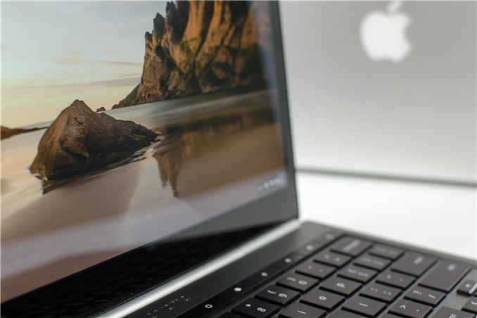
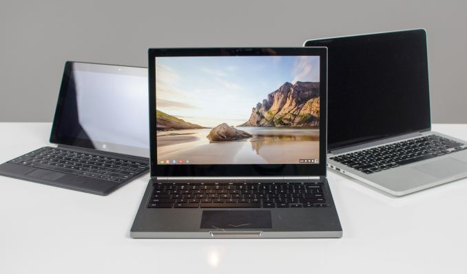
The Chromebook Pixel is a well cut suit. I’m cribbing the metaphor, but that’s exactly what the design of the Pixel evokes. The lines are simple, but elegant. The color would look great over a plain white shirt, and, perhaps, an orange silk necktie. The austerity of the design, actually lends the Pixel an outsized feel. This is after all a small notebook, fitting within the profile of the 13" MacBook Air. Put it out of context, though, and the aluminum surfaces seem to go on for ages. Only when you wrap your hand around an edge that you realize it's so small, so thin.
|
Chromebook Pixel Comparison |
|
|
Chromebook Pixel |
13-inch MacBook Pro with Retina Display |
13-inch MacBook Pro |
13-inch MacBook Air |
|
Dimensions |
0.64 x 11.72 x 8.84" |
0.75 x 12.35 x 8.62" |
0.95 x 12.78 x 8.94" |
0.11 - 0.68 x 12.8 x 8.94" |
|
Weight |
3.35 lbs (1.52 kg) |
3.57 lbs (1.62 kg) |
4.5 lbs (2.06 kg) |
2.96 lbs (1.35 kg) |
|
CPU |
Core i5-3337U |
Core i5-3210M |
Core i5-3210M |
Core i5-3427U |
|
CPU Cores/Threads |
2/4 |
2/4 |
2/4 |
2/4 |
|
L3 Cache |
3MB |
3MB |
3MB |
3MB |
|
Base CPU Clock |
1.8GHz |
2.5GHz |
2.5GHz |
1.8GHz |
|
Max CPU Turbo |
2.7GHz |
3.1GHz |
3.1GHz |
2.8GHz |
|
GPU |
Intel HD 4000 |
Intel HD 4000 |
Intel HD 4000 |
Intel HD 4000 |
|
System Memory |
4GB DDR3L-1600 |
8GB DDR3L-1600 |
4GB DDR3-1600 |
4GB DDR3L-1600 |
|
Primary Storage |
64GB iSSD |
128GB SSD |
500GB 5400RPM HDD |
128GB SSD |
|
Optical Drive |
N |
N |
Y |
N |
|
Display Size |
12.85-inches |
13.3-inches |
13.3-inches |
13.3-inches |
|
Display Resolution |
2560 x 1700 |
2560 x 1600 |
1280 x 800 |
1400 x 900 |
|
DisplayPort/Thunderbolt Ports |
1 |
2 |
1 |
1 |
|
USB Ports |
2 x USB 2.0 |
2 x USB 3.0 |
2 x USB 3.0 |
2 x USB 3.0 |
|
Other Ports |
SD reader, headphone out, SIM slot |
SDXC reader, HDMI out, headphone out |
GigE, FireWire 800, SDXC reader, headphone out |
SDXC reader, headphone out |
|
Battery Capacity |
59 Wh |
74 Wh |
63.5 Wh |
50 Wh |
|
Price |
$1449 |
$1499 |
$1199 |
$1199
|
The back, we’ve mentioned, is filled with that long silver hinge. On the left side are two USB ports, one DisplayPort, and the power and headphone/microphone port, which remarkably are cut to be the same size, with black trim filling out the microphone port. That detail is indicative of the time and attention paid to even the smallest components. On the right is the SD card slot, and the SIM tray on the higher SKU. The front is bare but for the indentation for opening the lid. The bottom is a large plain panel, with small rubber feet at the far corners, and the necessary labels and whatnot.
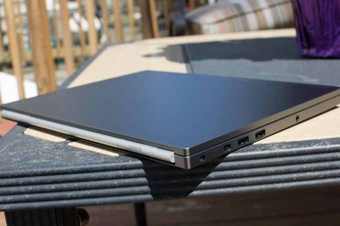
The Chromebook Pixel is gorgeous to the understated crowd. Not flashy, not cheap. As alluring as Cupertino’s finest designs. The flashiest part of the design isn’t that gorgeous display; it’s the light show going on when the lid is up. If I ever saw one in the wild, I could imagine the pulsing blues, greens and reds would catch my eye quickly. I’d want to know what it is, who makes it, where I can get it. If you didn’t know the company behind ‘chrome’ you’d have few clues from just looking at the design. That is until the lid is closed and the LEDs pulse briefly with Google livery. It is gorgeous, it has a super dense display, is stuffed with great technology, starts at $1299... and it’s running a browser.
I’m not going to lie, I was excited about this product the moment I saw that cheesy leaked video a few weeks before the announcement. At the time, I hoped it was still several months away from release, with plans to build it on Intel’s Haswell SoC or a quad-core ARM Cortex-A15 SoC. I also hoped it would be priced competitively with Ultrabooks, somewhere north of $500 but under $1000. In a way, I still wish all those things were true.
Comparing spec sheets the Pixel falls in a weird place. The dual-core Ivy Bridge is a little on the light side, with a base clock of just 1.8 GHz and a max turbo clock of 2.7 GHz, this 17 W part is similar to what you’d find in the 13” MacBook Air but just behind what you’d find in a lot of current Ultrabooks. The display is unique amongst modern laptops with its 3:2 aspect ratio, though when you take the dock bar into account it actually works out to a more traditional 16:10. If you like the taller screen, rest assured there’s plenty of ways to tweak the settings and get full use of the whole screen. The 12.85” screen beats the 13” MacBook with Retina Display in pixel density, both due to its smaller size and slightly higher resolution (2560x1700). We’ll go into more detail on that capacitive screen later, but it is surely a big reason for the price premium, and a big part of what makes this an aspirational model.
_575px.jpg)
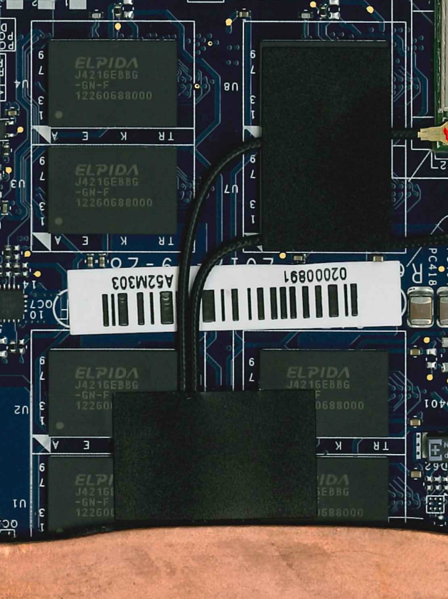
The limited SSD storage comes courtesy of SanDisk’s iSSD solution, which is a big step up from slow eMMC solutions, but means moderate performance and no upgrade potential. You won’t be slipping additional SODIMMs into this thing either, the RAM is soldered on, with the only part that might be user replaceable being the daughter card containing the LTE radio. The battery is beefy compared to the 13” MBA at 59Whr, but falls short of the Retina MBPs, which goes some way to explaining the limited claimed battery life. Weight falls almost perfectly between the 13” rMBP and MBA, indeed the Pixel's design could give Apple a few ideas for a Retina MacBook Air.
Status
Let’s spend a minute talking about status symbols. In every culture, certain things become elevated as carrying value and importance above and beyond themselves. In more heroic times, a scar denoted meritorious service in battle. Being fat in the dark ages was as good a symbol of wealth as Gucci handbags are today. Fashionable accessories are status symbols today, which is as clear a sign as any that ours is a materialistic and wealth obsessed culture. Harsh, maybe, but not all status symbols are as vain.
Gadgets have long been status symbols, as far back as the Motorola brick phones, and further back to color televisions and FM radios. Technology itself is insufficient to be a status symbol, though, because while a $1200 purse will remain unattainable for the masses, every technological bauble will eventually be mass produced and sold at Walmart. For a gadget to be a status symbol it needs more than just hardware and software, though missing on either of those can be crippling. Status symbols are sexy. They’re unique, though that quality is often short-lived. And, they’re expensive. The Motorola StarTac was a status symbol. The HP LaserJet 1200 was a status symbol. Sony’s earliest HDTVs were status symbols. And then, of course, there’s Apple. Apple breeds status symbols. Every category they’re involved in is trendsetting in style, provides a laudable user experience, and commands a premium over their competitors.
Google, is almost utterly absent from the lengthy list of status symbols. To some degree, that has been part of the company’s ethos. Their goal has been to provide users with the best user experience possible, and at the best price possible, which is as often as not: free. Making something free can really boost early uptake, but it doesn’t make for a good status symbol. Even Google’s Nexus line has really only built status symbols for the gadget inclined, I doubt my wife could spot a Galaxy Nexus from across a room, let alone the Nexus 4. Google is a services company. They develop search tools, mail clients and cloud-based solutions. They help you keep your schedule, catalog your work and life, find a decent Chinese take-out near by, and play some Angry Birds while you wait for your order to be ready. They’re useful, essential even, but boring, and unlikely to sell something that you crave in an entirely illogical and excessive manner. Right?

It ships in a typically minimalistic box. I don’t mean typical for Google, I mean typical for an industry that has learned that gaudy packaging is more likely to hinder than help sales. Though it looks like you’d push one recessed end of the package out to slide the box from its sleeve, entry is actually made by lifting a flap held in place by magnets. I’m a cheap date when it comes to packaging. Magnets will always win me over. Once revealed, the grey slab is irresistible. It wins you over before it does anything but sit there. The exposed hinges are masked by a silver barrel that runs the width of the device. The aluminum is cold to the touch, and the only flourish is the LED strip lower down the lid, dormant, but nonetheless exciting for its potential. It’s lighter than you expect when you lift it, and feels solid; not simply in the sense of its rigidity, it feels like a block of aluminum weighing just north of 3 pounds. Right angles abound but are softened with chamfered edges making it comfortable to hold and touch. Its meager thickness is uniform across its length, and the weight is similarly balanced, avoiding the rearward bias of other notebooks. Almost without thought I find myself torquing and flexing against the device; my hands struggling to elicit a single creak or bend from the frame. Setting it down and lifting the lid, it boots in a breath, and reveals an image so rich with detail I’m drawn closer to get a better look. Chromebook or not, the Pixel is a status symbol. And I want it.
Utility
Every time we revisit Chrome OS we ask ourselves “Can we work with it?” As a writing tool, there's no question. The hardware and software limitations of earlier Chromebooks was like slipping blinders on. No distractions, just you and a writing web app. That’s not all you can do with Chrome OS, though; web apps are becoming more powerful and appeal to users because of their ubiquity. Any modern device with a browser can run a web app and offer the same experience no matter the device context. The appeal is currently primarily for developers who don’t have to worry about keeping separate branches of their code updated and optimized on different platforms. As HTML5 and Java progress, the apps built with them will both be more capable, and better able to tap into local resources for compute and data. You could almost imagine a chart that parallels Intel’s “Compute moves to zero” chart, where instead of measuring size, you’re measuring the limitations of browser-based code. So, once anything can happen in a browser, why not live entirely in the browser? Simply put, because we’re not there yet.

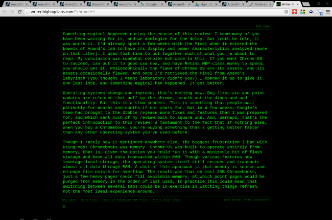
Web app Writer, a very minimalist text editor
Why not Android?
The argument goes something like this: Google has a great browser, and a great app platform, they should combine them in a laptop. Thus, the Chromebook should become the Androidbook. It comes up every time a new Chromebook is announced. It’s an idea not entirely without merit. Android runs on ARM and x86 chipsets. It runs Chrome. It has an enormous stable of apps. But that all misses a key fact: laptops aren’t phones or tablets. Chrome OS works because the PC is an utterly different user experience than mobile. And Google believes the conceits of a desktop environment can be best served by just one app: Chrome.

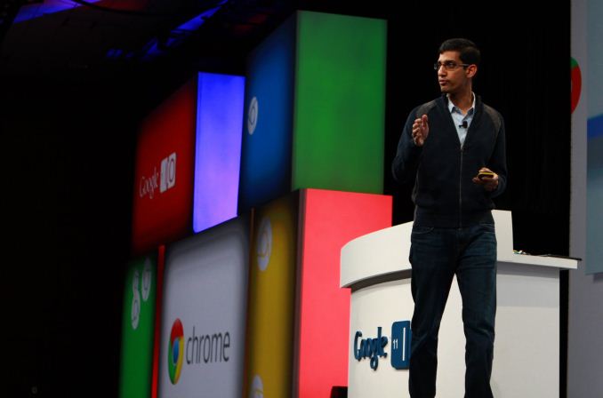
Google SVP Sundar Pichai, introducint Chrome OS at Google I/O 2011
Despite singing this song since the introduction of Chrome OS in 2009, the recent musical chairs at Mountain View has lead many to revive speculation of a future Android/Chrome OS marriage. Andy Rubin, father of Android, is tucked away in some Google skunkworks, and Sundar Pichai caretaker of Chrome OS now manages both experiences. Bringing all of the user facing software divisions under one leader makes sense to me, and not as a harbinger of fusion. During the last 18 months Google has gone through an extensive redesign of all of their assets, trying to bring a unified style and user experience to every product they offer. That experience has been lead by teams in Rubin’s and Pichai’s divisions, along with teams for GMail, Google+ and Search, and all the other products Google offers. But the only division that handles discrete software, and not just services and websites, were Rubin’s and Pichai’s. Bringing those two groups together for closer collaboration makes sense from a design and philosophy standpoint. Merging the very functions of the two into one monolith does not.
Chrome is about the best web experience possible, no matter the platform. Android is about a mobile software and compute experience that relies on apps and integration with Google services to offer utility. Those are two separate directives, the web and apps, and Chrome OS is the purest distillation of the Chrome experience. Shoehorning Android into the Pixel wouldn’t offer the best of both worlds, it would mean forcing a portrait app designed for a phone onto a really nice notebook. If fragmentation remains an issue for Android developers, imagine what happens if you ask them to design their apps to work on phones, tablets, televisions and notebooks. It wouldn’t be pretty.
Utility Continued
For many of us, browsing is about communication and consumption. We watch movies and listen to music in a browser. We chat with friends, send e-mails, engage with our social networks and even partake in video chats and telephony through our browsers. And, of course, we read and peruse images. If we’re going to get work done, though, we need to do more than just communicate and consume, we need to do produce. That means opening an honest to goodness application. Right?
Writing has always been one of Chrome OS’s strong points, and in earlier reviews we mentioned that the limitations of the OS actually helped make this an excellent writer’s tool. It’s hard to not write when all you have is a text field. Plenty of writing apps are just a click away, like the excellent Google Docs, Microsoft’s Office 365 and the minimalist Writer. The advent of Packaged apps is opening the opportunities for more immersive apps that step outside of the browser window. Txt is an early favorite, simple but adaptive, and it isn't stuck in a tab.
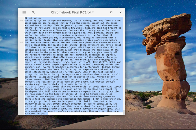
<TXT>, a packaged app
Most publishing, web and otherwise, needs more than just text. A few years ago, there was an explosion of excitement around image editing web apps, and everyone and their mother joined the fray, including Adobe and Flickr. Since then, the hype has died down, and the innovation. There are two factors that limit the appeal of these apps. First, there are limitations regarding file size and type. This is mostly owing to bandwidth concerns, both for the user and for the service host. If we had carte blanc to upload all our massive RAW files into an online editor and then edit them and save multiple copies, as we do on our local apps, we would end up with gigabytes of transferred data. So, even on paid apps you’re often limited to a medium sized JPGs, enough for web publishing to be sure, but given that high DPI content has truly arrived this approach is limiting.
The second limitation is in the apps themselves; they’re just not... enough. Several apps take the wizard approach that you might be used to from the likes of Shutterfly. Upload your images and then make modest edits in an interface that’s simplified and easy to navigate. Great for modest work, not so great if you’re planning on doing some serious editing. Want granular control of an image’s rotation? In Lightroom you grab that rotation slider in the Crop tab and adjust it to your comfort; in several image editor web apps, you’re only option is to rotate by 90 degrees at a time. So, yeah, that’s not going to cut it. There are more feature complete apps, but they come at an almost unbelievable cost: Flash. Pixlr is a great example of a web app with a desktop UI, driven by Flash, though the software itself is still limited to JPGs. So, for now, we’re hopeful for the future of photo editing web apps, but it isn't quite there... yet.
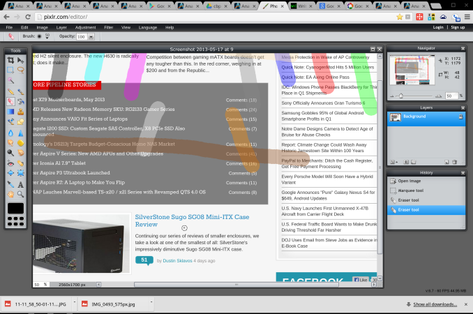
Photo editing app Pixlr, driven by Flash
So, you can write, but not do pictures. Video? Not quite yet. Development? That only requires a text editor, right? We thought about a variety of work flows and almost all ended with users putting the included Chrome Remote Desktop to use, to boot up some missing app or function. Even web developers would find themselves hampered by the inability to test IE or Firefox compatibility, and by the limited number of browser based IDEs rolling out. In the end, what we felt comfortable with remained writing and consumption. Those experiences are great, truly, but utility remains a sticking point. It may be time for Google to step-in and start to develop their own advanced productivity tools. Provide a powerful imaging tool and this becomes a powerful web publishing device. Provide the ability to emulate different browsing environments and we might see developers flock to Chromebooks.
The Memory Issue
Memory has long been an issue for Chromebooks, but I didn’t understand why until recently. The incredibly high pixel count certainly wasn’t going to help things. To find out how they might cope with this issue, we caught up with Caesar Sengupta, Product Manager at Google for Chrome OS. I've never understood why Chromebooks always come with modest memory on-board. It isn’t a cost issue, certainly; memory is cheap. It's soldered on, and comes in denser packages so it’s not likely a space issue. Google's making a conscious choice to go small with memory. So, how do you cope 4 million pixels and just 4GB RAM? In this case, the first step is to render all pages at 1280 x 800, unless HiDPI assets are available. The final product is upscaled to the full 2560 x 1600, but the memory doesn’t take nearly the punishing you might expect; unless, of course, every site you visit has HiDPI assets.
Then there’s a user behavior problem that has long plagued Chrome OS. Tabs linger and multiply. An untidy user could tax the memory assets of any system with tab after tab of unread longreads and cat GIFs. With memory taxed, the OS will begin shuffling under used bits of data into a swap file on local storage, effectively an extension of system memory stored on your hard drive. Even the fastest SSDs are several orders of magnitude slower than RAM, so switching to a tab whose contents had been pushed to the swap file would briefly yield a blank screen as the content is brought back to system memory. The developers of Chrome OS had a mission: an operating system that lives and breathes entirely within system memory. That means, no swap file. And that means an often frustrating user experience.
That same untidy user could bring a Chromebook to its knees with open tabs, and with no swap file, pages purged from memory are simply refreshed when focus is restored. Not that big of a deal, right? Say those tabs are actually your site’s content management system and dozens of tabs of research. Further, that you’ve just spent an hour putting together a great post, and tabbed away just long enough to verify a bit of research. Switch back to your CMS, the page refreshes, and your great post disappears into the ether. Surely, there's a better alternative. Please?

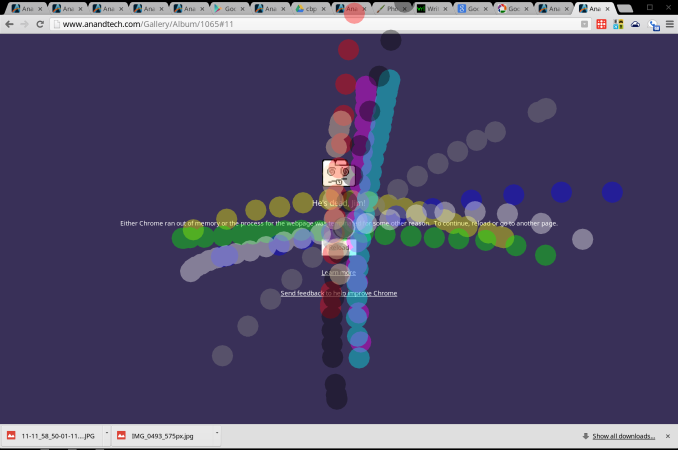
The Chrome OS BSOD (plus touch indicators)
Android enthusiasts will be familiar with compcache, a method of creating a compressed page file on system memory that can help alleviate memory shortages. Now called zram, this technique fits perfectly within Chrome's philosophy of speed over all other factors. Local storage options vary too much in speed for their speed targets with Chrome, so operating even the page file within memory is a logical step. In practice, zram is better, not great. When a page is purged completely, you get the Chrome BSOD equivalent and an option to reload. This alleviates system slow downs that arose from automatically refreshing each page as you tabbed through them. I haven't noticed any particular slow down that might indicate that a given page's data was being recalled from zram, which could be a good sign. But there's no changing the fact that slicing a piece away from that 4GB for use as a page file isn't nearly as effective as adding another 4GB.
�Display
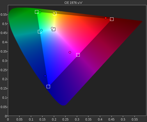
Matching the fit and finish of the body is the Pixel’s display. The popularity of larger “retina” displays has left us with something of a glut of HiDPI content to ogle. It’s something quite odd to sit quite so close to a notebook screen and be entirely unable to discern any individual pixels. Users of the rMBP may be used to this experience, but for me it was a treat to spend so much time with such a nice display after a few years with my 13” MBP. Pixel density isn’t everything, though; what we’re really looking at is an arrangement of colors and so color accuracy is our new obsession. Our displays guru, Chris Heinonen, has updated our workflow for evaluating displays and the results are nothing short of incredible. Here he’ll explain what’s changed and what you’re looking at; let us know what you think and please do click on the images to get a good look at them in full-size.
Starting with this review, we're introducing the Color Comparator tool from CalMAN, which they just introduced into version 5.1 of their software. Most often in reviews you will see the DeltaE value for colors that we are sampling, which provides a numerical idea of how far off from ideal a sample is. Anything below 1 you can't see when they are side-by-side, and anything below 3 you can't see while in motion. While this is a very useful tool to see how accurate a color is, it doesn't provide someone with a visual idea of the error.
The color comparator tool shows the ideal colors right next to the actual colors, so you can see where the errors are. Even with an uncalibrated display you can get a good idea of the amount of error that is present. Of course, the more accurate your display is, the more accurate the differences will appear to be, but it still provides a more real-world example. It also lets you possibly compare two displays where the dE values might be 0.7 and 1.0 and see if you can actually tell a difference, or if you are splitting hairs at that point. More information can be found on this tool here http://store.spectracal.com/colorcomparator but hopefully this proves useful to our readers.
Display Properties Comparison
|
|
Chromebook Pixel |
13-inch rMBP
(uncalibrated) |
|
CCT Avg |
6442 |
6632 |
|
Grayscale Avg |
7.132 |
1.7825 |
|
Gamut Avg |
6.8234 |
n/a |
|
Saturations Avg |
7.0927 |
2.1663 |
|
GMB Avg |
5.7664 |
2.4521 |
There's no denying that the 13-inch rMBP has a great panel and the dE values are in the realm of undetectable in motion, and nearly undetectable in static images. The intention here is to calibrate it for color accuracy, so that image professionals can get to work as soon as they open the box. The Pixel... doesn’t hit quite so solidly. From our chat with Caesar, we know that Google’s target was a warmer display than the rMBP, and so the CCT coming it at just under the ideal at 6500k makes sense. The dE figures, though show that while the average is closer to ideal, the individual colors miss in a more noticeable way. In this case, most of the colors are rather undersaturated, a contrast to Apple’s slight oversaturation. The result isn’t exactly unappealing, it’s just not accurate. In use some vibrant colors appear more vivid against the desaturated representations of other colors. This inaccuracy does cost the Pixel when looked at by the discerning eye of a professional; most users, though, aren't likely to spare a second thought on it.
Input
A high pixel density isn’t the only thing special about the display. A capacitive 10-point touch layer is built-in, and though the OS isn’t exactly touch-centric, it is nice to have the option. The reality fo the market, though, is that touchscreens are inevitable. As the price of the technology drops and users become more accustomed to them the barriers to inclusion become nil. It feels gimmicky at times, and the keyboard/mouse schema has never seemed to me like one waiting to be disturbed. But including touch doesn’t detract from the experience, and I found myself putting it to use way more than I expected. Does a site render text too small to read? Resize in a flash. Scrolling through Google Maps looking for something? It’s probably quicker to do it with one finger on the screen than two on the trackpad. Even on-screen buttons are quicker to hit with your finger than by dragging the cursor to them and then tapping, provided the action area is large enough. It wasn’t long after I started using it that it just became the natural reaction. All sorts of buttons are just waiting to be pressed, and it becomes so instinctive that you will spend days after reaching up to lesser equipped screens.

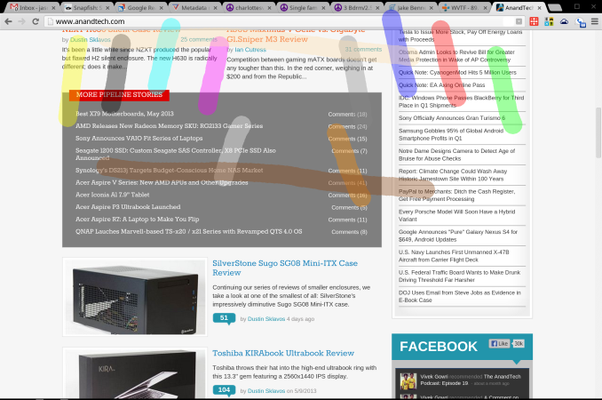
Scrolling and other touchscreen gestures were at one point quite choppy. In the course of this review, though, updates to the software have drastically improved performance to the point I almost prefer it to the touchpad. That said, you’re often not sure what you’ll get when you open up a given app. Sites where a pinch to zoom gesture can have a useful impact, say Google Maps, can implement the appropriate APIs and often are. In sites with responsive designs, zooming can alter layouts for readability, though often that ends up feeling like two processes competing with each other. Pinch to zoom does simply that in less responsive designs, or sites that lock onto a particular layout, such as GMail. These features are hidden behind chrome://flags because they remain a work-in-progress, but I urge any users to turn them on and try them out. You’ll likely forget about that touchpad before long.

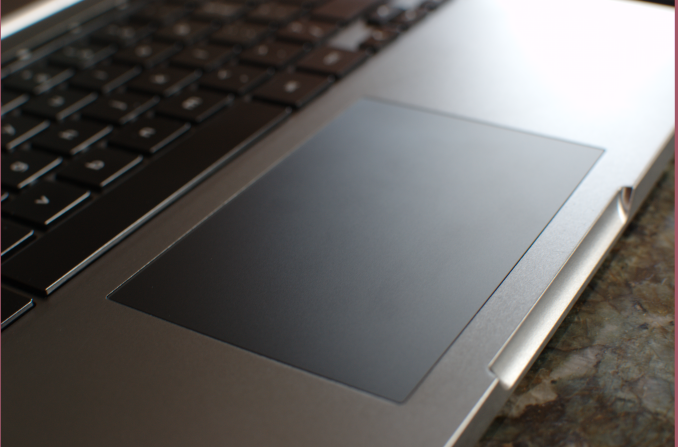
Speaking of that touchpad, it remains frustrating that so few players in the notebook space have nailed touchpads. It should be particularly embarrassing to other notebook manufacturers that this is Google’s first attempt, and they’ve done an excellent job. The large glass trackpad offers a novel tactile experience after so much time with Apple’s units, but is no less well performing. Taps and clicks are registered without fail and the scrolling experience with the touchpad is smooth and easy. Once again, the settings to activate more complex gestures on the touchpad are buried deep within chrome://flags/ so they’re not quite ready for primetime. But they offer something that Chrome has dearly needed, real multitasking.
Before I leapt into the world of OS X, or Linux for that matter, I was knee deep in Windows 7. Dozens of tabs spread across four or five browser windows and a few other applications, all in one space. OS X showed me that windows management was distinct from workflow management. The early days of Chrome OS were an experience that, then, felt all too familiar. When the hardware was incapable of handling more than a few tabs, it was easy to be diligent about culling the fat and closing unused pages. Better hardware made clear that something in software needed to be done to better manage the myriad of web apps and pages I could now keep open.
The technique that Google chose is familiar to OS X users, and revolves around that capacious touchpad. Buried in chrome://flags are options for three-finger touchpad gestures. Three finger swipes left and right let you scroll through a given window’s tabs, and three finger swipes up and down let you scroll through the available windows. The window switching is particularly useful and unique; unlike OS X, swipes don’t shift one position at a time, rather allow you to scroll through the open windows like a stack of cards. The gesture is not yet refined and requires some amount of practice to get right. The difference, though, makes this a multi-tasker’s tool.

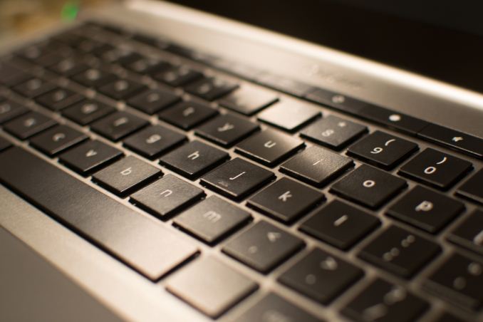
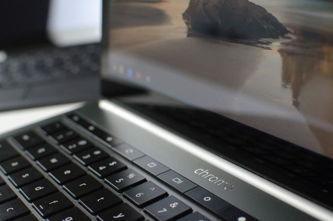
We’ll end our input discussion with my favorite of all, the keyboard. If the design of the Pixel advances the experience of an all aluminum notebook, the keyboard similarly moves the goal posts. This isn’t a revolutionary component; the keys are a little squarer but the layout isn’t novel. The CapsLock key is once again usurped by the dedicated Search button, which I might actually use more often if it sat where the Start/Option key did. Instead the CTRL and ALT keys are broad on the left side, which does make them easy targets when switching tabs/windows. I was surprised by the mechanical action of the keys. One of the compromises of thin notebook designs is the depth of the keys, and their motions. Laying your fingers on the Pixel’s keys they feel slightly wobbly, and I was expecting a quite squishy typing experience. Instead, though shallow, the keys action is quite refined, with an easy to discern and trigger point that makes precise typing a breeze. The broad palm rests made for a very comfortable typing experience and overall I had no problems clicking away for hours at a time. This fountain of praise for the keyboard ends with the row of function keys. Controls for volume, brightness, window switching and dedicated back, forward and refresh make up this row, and you’ll make haste to find ways to avoid them. The keys are remarkably stiff and their action ill defined so lighter depressions don’t have any effect. Can’t have it all, I guess.
�Performance
A friend saw me using the Pixel and asked if he could give it a try. After admiring the design and hardware he opened it up and said, “But this is basically just an iPad with a keyboard, right?” I didn’t know how to answer the question. I’d never considered the comparison, indeed I didn’t even think to include the iPad 4 as a point of reference in this review. How is the Pixel like an iPad? It took me a while to process, but I think what my friend was getting at is that the Pixel is primarily for consumption, in the same way as the iPad. Different approaches to the future of computing, with the same pitfalls. I got the same feeling from reading Anand’s Surface Pro review. Microsoft is so convinced that this hybrid strategy is the way to go, but in their case the hardware falls short, providing an imperfect tablet and notebook experience. Meanwhile, the aforementioned iPad has excellent tablet hardware and software, but trying to get work done on one is mostly folly; chock it up to a form factor that doesn’t hold up for lots of typing and a UI that’s better suited to the unitasking of media consumption than the multitasking of even the full GMail/GTalk website.

Chrome OS, as Google’s foray into the future of computing, suffered from some pretty modest hardware. Yet in real terms, even the lowly Atom Chromebooks outpaced the silicon found in even the iPad 4. But faster silicon and a speedy browser never seemed quite good enough. And that’s where the Pixel comes in. With the Pixel we’re looking at what is honestly pretty humble silicon, nearly identical to the processor in the 13” MacBook Air. What you get, though, is performance that rivals the better endowed 13” Retina MacBook Pro.
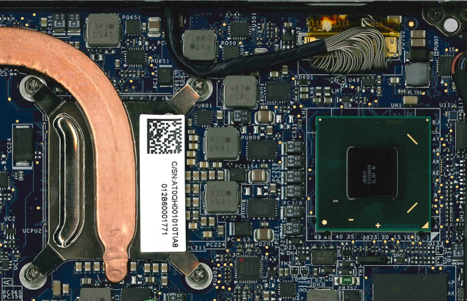
Pixel's Intel Core i5-3337U SoC (under cover)and HM75 Chipset
As always, the Chromebook test suite is something of a grab bag from several categories. Our tablet tests get good representation here, alongside some tests we’ve been incorporating for Surface reviews. As hard as it is to benchmark on Android, it’s much worse on Chrome OS.
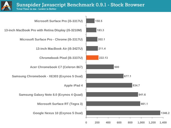
We start with our Javascript tests, including our age old friend, Sunspider. This test is so long in the tooth that we’re on the verge of seeing two digit test times. The test gives us a good idea of how far apart the lowest players in compute are versus the highest, and that’s without including any top of the line devices. Within a given performance category, though, the differences become small.
If you just wanted to establish that the Pixel belonged in a class apart from the history of Chromebooks, and tablets for that matter, this is it. The Pixel’s performance here is close enough to the the rMBP as to consider it a draw, though the Surface Pro in IE seems to beat both soundly. This is something of a cake walk for this caliber of hardware, so let’s look at something a bit more demanding.
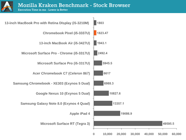
Mozilla Kraken is the next iteration in Javascript tests, with a much more strenuous workload, though it is already rapidly approaching sub-1,000 ms scores. Against the Surface Pro, the Pixel comes out way ahead here, even with the field leveled by running Chrome as the browser. There’s a clock difference of just 100 MHz between the Pro and the Pixel, not nearly enough to account for the difference in performance. This may be a situation where the Chrome OS conceit bears fruit; by eliminating the cruft of other operating systems, more resources can be devoted to the task at hand. Once again, the Pixel and the rMBP sit neck and neck with each other, despite a 15% maximum clock advantage in the rMBP’s favor. The rest of the pack? An order of magnitude behind.
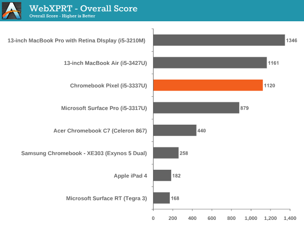
Kraken and Sunspider don’t make for terribly well-rounded tests; what we want is something that can tax CPU, memory, and even GPU and local storage. For something approaching that we’ve added WebXPRT from Principled Technologies. The test actually simulates real world web applications and should give us a better idea of how the different platforms stack up when viewed from a wide angle lens.
The rMBP has a definite edge over the Pixel here, showing a chink in the armor. We haven’t explored WebXPRT enough to say for certain what components are being exposed in each subtest. It’s possible that memory limitations played a role, or the clock advantage in the rMBP just needs a longer test to have its value exposed. Regardless, the test does still make clear that in this group, the Surface Pro, Pixel and rMBP are alone at the top, and the Surface Pro is just barely hanging on.
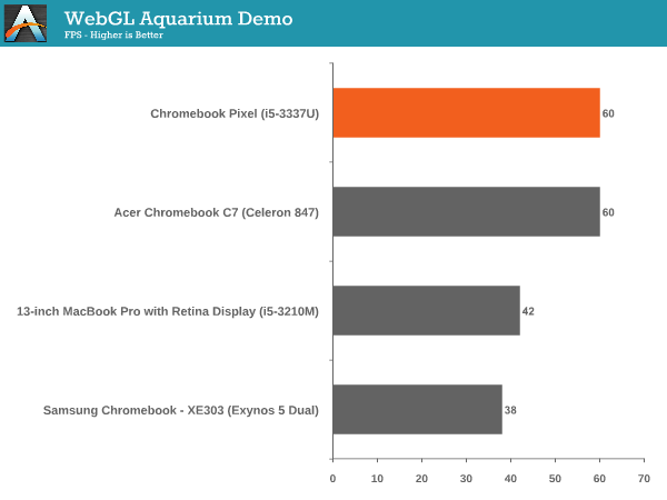
WebGL is a developer tool that’s quickly gaining popularity, though it remains mainly the stuff of tech demos. If gaming is to be a serious component of the web as a platform, then a robust API must exist and supported hardware must perform adequately. When the Acer C7 Chromebook crossed our path we were impressed with Intel’s HD 2000 graphic’s ability to outperform the Atom offerings and even Samsung’s Mali GPU. Now we have HD 4000, in a few iterations. Testing WebGL capabilities is not the easiest affair, despite the number of tech demos, but we chose a few and measured up our players.
These results go a long way to demonstrating how challenging it is to compare such disparate platforms. Though the rMBP and Pixel both use Intel’s HD 4000 graphics, they’re each configured slightly different. The rMBP has the base clock advantage (650Mhz to the Pixel’s 350MHz), but each has the same maximum frequency (1.1GHz). That max is theoretical, tough and the reality of notebook design is that device thermal characteristics will weigh heavily on whether that maximum is achieved, and for how long it might be sustained. There’s also the fact that these devices run drastically different operating systems, and so these tests become more about how their respective platforms handle WebGL given roughly similar hardware. The loose results shine very positively on Chrome OS, less so on Chrome on OS X.
The WebGL aquarium test was particularly anomalous, with the Pixel hitting v-sync even after raising the number of visible fish to 1,000. Again, these tests don’t establish a firm graphics performance advantage for the Pixel, but simply look at the ability to render WebGL graphics. There is a direct relationship with the Pixel and the Chromebooks that preceded it and here we can say with certainty that the advantage goes to the newcomer. Anand described in his review of the Samsung Chromebook (XE303) having to watch even simple games stutter and drop frames. The same remained true in the Acer C7. The Pixel removes that concern, and establishes a performance watershed for WebGL; WebGL developers that want to what platform puts their best foot forward need look no further.

After all that, though, there’s a certain subjective reality that we must discuss. Even owners of workstation class PC’s have experienced poor performance in their browser. Web sites are increasingly complex, able to generate multiple threads within themselves and consuming impressive amounts of resources. And even when there’s not much going, perhaps a few display ads on a long column of text with images interspersed, you can still encounter stutter and hesitation as you scroll through the page. Or there’s a long delay after triggering an action in a web app, before seeing the appropriate reaction. The culprit could be network in nature. It could be related to the app itself. Or it could be, that a background process needed those compute cycles for a bit, before relinquishing them to complete your task. Chrome OS removes that confound, while also working to mitigate network delays. And the result is palpable. Even in Gmail, derided for some time now for its laggy performance, feels fluid and responsive. Playing a simple 2D canvas game could be an exercise in frustration in the C7 or even my MBP, but in the Pixel you never perceive anything but v-sync. There’s something to this experience that can’t quite be measured with the tools we have, but it’s there, and it’s really nice.
�Battery Life
Like our performance tests, our battery test borrows more from our tablet reviews than it does our notebook reviews. The inability to run any native software here limits us to... well, to the browser. So, we start with our web browsing test. The idea is straightforward, we’re cycling through four websites, disabling any background services that might interrupt the process and setting the display to our customary 200 nits. This test is designed to challenge ARM cores, giving them just enough time to render a page and go back to sleep before asking for the next page. This isn’t as challenging for Ivy Bridge silicon, which is able to complete the render and rush to sleep much faster, which we know can yield better average power consumption and better battery life. The other factor that affects battery life in this scenario is that display. With over 4 million pixels to light up, the panel is going to chew through power a lot faster than something less dense. Only one way to found out how it goes, though.
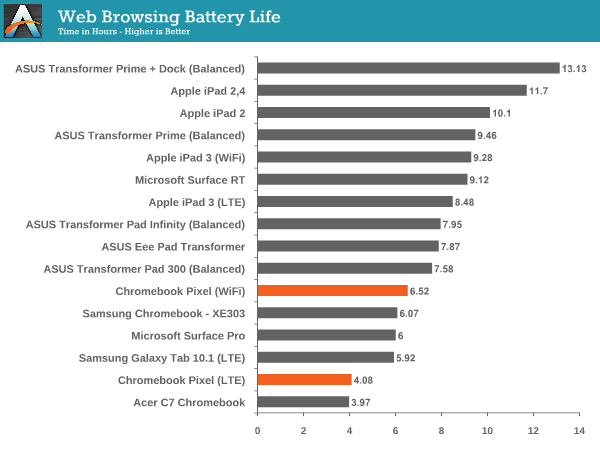
The Pixel ends up eking out 6.5 hours on WiFi, besting the Surface Pro by a bit, but it’s much more a wash, the larger battery’s added capacity is exhausted by the more power hungry screen. On LTE the Pixel puts up 4.08 hours of stamina; enough for a few hours at a cafe, but not an all day untethered session.
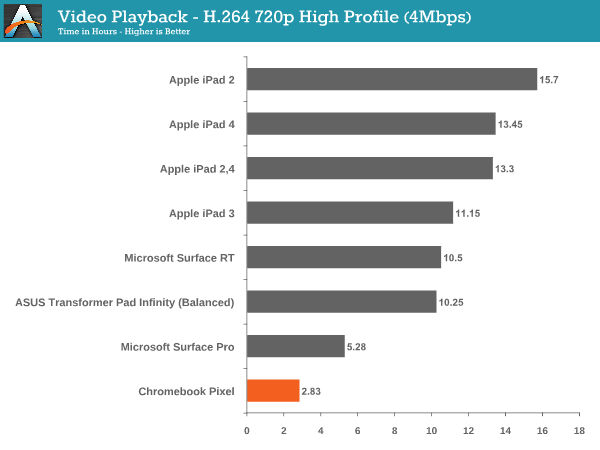
Our video test loops a 720p video encoded with H.264 with an average bit rate of 4 Mbps with the screen once again set at our traditional 200 nits. Running this test on a Chromebook is a little different than any other platform. The video player does exist somewhat outside the browser, but the software is written in HTML5. Hardware accelerated decode of H.264 content is a staple of Chrome and HTML5, though. Right?
This is really awful, and surprising performance. The best explanation we can muster is that an issue in the video player is preventing this file from utilizing hardware decode resources. In that case, decoding and then scaling the video to match the display might tax the system enough to cause this sort of poor performance. If that's the case then an update could drastically impove this score; until then, though, the Pixel does not make for a good media companion on the road.
Ultimately, what we’re really seeing in these charts, is that the rush to sleep advantage Ivy Bridge has over ARM is not enough to overcome ARM’s power envelope. The Pixel’s silicon is a 17W part. Even the most power hungry ARM SoCs in this table clock in below 5W. That’s a deficit that’s going to be hard to overcome... for now. There’s a very real reason to suggest caution in buying anything with Ivy Bridge right now, Anand made the same case in his Surface Pro review. A Haswell alternative in the future should exhibit better battery life, with equivalent performance. There’s also the Atom refresh (Silvermont) to consider; a quad-core Baytrail part could provide plenty of performance while drawing a lot less power than the Ivy Bridge part we’re using today.
Is the Pixel going to let you sit in the park all day, working on the great American novel? No, it won’t. Heck, it might not get you through a longish movie during a flight. If untethered stamina is a prime concern, look elsewhere than really any of the Chromebooks. If you’re near an outlet most of the time, this performance just isn’t great. When you design a thin, modern notebook, you have to make compromises, and in this case, battery life was one of them.
�
Conclusion
Something magical happened during the course of this review. I know many of you have been waiting for it, and we apologize for the delay. But truth be told, it was worth it. I’d already spent a few weeks with the Pixel when it entered the bowels of Anand’s lab to have its display characterized. I used that time to put together much of what you’re about to read. My conclusion was somewhat complex but came to this: If you want Chrome OS to succeed, can put it to good use now, and have Retina MBP class money to spend, you should get it. Philosophically the flaws of Chrome OS are its assets, and its assets are occasionally flawed. And once I’d retrieved the Pixel from Anand’s labyrinth (you thought I meant laboratory didn’t you?) I opened it up to give it one last look, and something magical had happened. It got better.

Operating systems change and improve, that’s nothing new. Bug fixes are and point updates are released that buff up the design, smooth out the dings and add functionality. This is generally something that trickles out over months, if not years. Yet in just a few weeks, Google’s team had brought to the Stable release more fixes and features than I was prepared for, and which sent much of my review back to square one. And, perhaps, that’s the perfect introduction to this review; a testament to the fact that if nothing else, when you buy a Chromebook, you’re buying something that’s getting better faster than any other operating system you’ve used before.

The user experience remains limited. Some have joked that Chrome OS should have a giant Beta tag on its side; indeed, these naysayers may have a point. If that is the case, the value of your $1300 lays not with the silicon, lithium-ion cells, metal chassis, nor that display; the true value of the Pixel comes in the potential that comes with a platform given nearly all the hardware features we could ask for. Chrome OS continues to improve, with frequent updates that affect every aspect of the software. Packaged apps, Native Client and asm.js are all new techniques for bringing more immersive, beyond-the-browser style apps; while APIs like WebRTC, WebGL and WebAudio enable more complex applications to be built entirely within the browser, and leveraging hardware resources for performance. Indeed, Chrome OS’s future seems ever more fortified by the preponderance of web apps being introduced by Google at I/O this year. Some of the most exciting things that surfaced during the keynote were services that span across all platforms. Multiplayer games that can be played on iOS, Android or any Chrome browser. Notifications that can be responded to or cleared in your browser, and register as acted upon on your phone. All enabled through services and incorporated with no user intervention.

This is a future that could play out wonderfully. It could also find itself floundering for years, unable to gain sufficient traction to attract the developers that will make Chrome OS feature competitive. Or, as plausible, the real dagger in the heart of Chrome OS, will be Chrome itself. As compute becomes cheaper, the need for a cruft free operating system to drive a fast and seamless web experience diminishes. I don’t know which way this might go, but I want to be a part of it. And I think that’s the primary criteria that buyers should consider. If you’re compelled by the notion of the web as a platform, this is a notebook for you. If you want the nicest looking laptop around, and aren’t beholden to legacy apps, this is a notebook for you.
Frontiers aren't for everyone, though. There'll never be many buyers for the Pixel, and Google was always going to be okay with that. Though they built this to serve a particular sliver of the market, it faces competition even there. The stiffest competition comes from an unsurprising place: the 13" MacBook Pro with Retina Display. Starting at $1499, it is just a hair above the LTE model we're testing today, and not so far from the base Pixel to leave them in distinct price categories. And for your extra cash, you get a capable operating system with an existing application ecosystem able to serve the most discerning of users. And that's the real clincher, any app you'd like (even Chrome), not just the promise of a bright future of web apps. Google's content to bring all of Chrome's features to every platform, so that the success of the web as a platform can be available to all. So, if you're not ready, consider the rMBP. If, on the other hand, you're ready to leave all other platforms behind, and set forth with only Chrome by your side, then you'll find no better option than the Chromebook Pixel.



![]()







_575px.jpg)
