Original Link: https://www.anandtech.com/show/5128/amazon-kindle-fire-review
Amazon Kindle Fire Review
by Anand Lal Shimpi & Vivek Gowri on November 29, 2011 3:31 AM EST- Posted in
- Mobile
- Amazon
- Kindle Fire
- Kindle
- Tablets
The iPad Comparison
I'll be honest here (I always am?): I don't understand the iPad comparison. The Kindle Fire and iPad 2 couldn't be more different. They are vastly different sizes, shapes and prices. They even serve slightly different functions. The search for an iPad killer reminds me of the search for a Voodoo killer back during the heyday of 3dfx in the late 1990s.
The Kindle Fire serves entirely different purposes than to take marketshare away from Apple.
Why would Amazon enter the IPS LCD equipped multitouch tablet business to begin with? For users who are content reading ebooks on an e-ink screen, the vanilla Kindles are as good as they get. The problem is for users looking to consolidate devices, they may find themselves carrying a Kindle and a tablet of some sort (likely an iPad) and will ultimately ditch the Kindle in favor of the iPad. Should these users replace their Kindles with iPads, there's the argument that Apple could tempt them away from Amazon's Kindle store altogether. If they want a more affordable tablet however they are likely going to be forced into a solution that's probably not very good. Neither possibility is something Amazon likes, so the obvious answer is to offer a Kindle that delivers enough of the tablet experience that will satisfy those users looking for more than an e-ink Kindle could provide.
The Fire is that Kindle.
No Tradeoffs: Compute & Display
When faced with the task of bringing a not-sucky $200 tablet to market, Amazon refused to skimp in two areas: compute and the display. It reaffirms something that we've known for quite a while: to deliver the best user experience you still need fast silicon and a great display. The third thing you need is efficient software, which is something Amazon attempted to deliver by customizing Android, but I'll get to that later.
The SoC doesn't sound fast anymore, not with Tegra 3 and Krait waiting around the corner, but the OMAP 4430 is still one of the fastest things you can buy today. It features two fully equipped Cortex A9 cores (complete with MPE), a 1MB shared L2 cache, two 32-bit LPDDR2 memory channels and a PowerVR SGX 540. CPU clocks aren't as high as they could be at 1GHz, but if Amazon does its job well enough on the software side they should be sufficient. To put things into perspective, this is more general purpose compute than the original iPad and something competitive with the iPad 2. It only falls short of the iPad 2 in the GPU department, but seeing as the Kindle Fire isn't designed to be a big gaming platform the loss isn't significant.
| Tablet Specification Comparison | ||||||
| Amazon Kindle Fire | Apple iPad 2 | BlackBerry PlayBook | Samsung Galaxy Tab 8.9 | |||
| Dimensions | 190 x 120 x 11.4mm | 241.2 x 185.7 x 8.8mm | 194 x 130 x 10mm | 230.9 x 157.8 x 8.6mm | ||
| Display | 7-inch 1024 x 600 IPS | 9.7-inch 1024 x 768 IPS | 7-inch 1024 x 600 | 8.9-inch 1280 x 800 PLS | ||
| Weight | 413g | 601g | 425g | 447g | ||
| Processor | 1GHz TI OMAP 4430 (2 x Cortex A9) | 1GHz Apple A5 (2 x Cortex A9) | 1GHz TI OMAP 4430 (2 x Cortex A9) | 1GHz NVIDIA Tegra 2 (2 x Cortex A9) | ||
| Memory | 512MB | 512MB | 1GB | 1GB | ||
| Storage | 8GB | 16GB | 16GB | 16GB | ||
| Pricing | $199 | $499 | $199 | $469 | ||
The Fire is equipped with only 512MB of RAM but, once again, if Amazon does its job on the software side this should be sufficient. Moving to 1GB would allow you to keep more applications active at once and pave the way for more textures in games, but as I just mentioned, the Fire isn't much of a gaming platform to begin with.
The display is small by iPad standards, but as I mentioned in our PlayBook review, it does make the device far more likely to be by your side wherever you may go. The iPad and other 10-inch tablets make for a far better web browsing experience, but they are too big to just carry around with you like you would a wallet or smartphone. The Kindle Fire is bigger than anything that should occupy space in your wallet, but it's small enough that you might actually take it wherever you go.
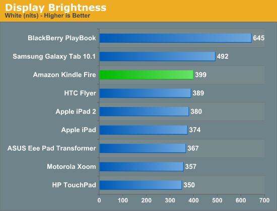
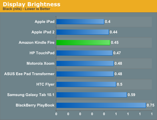
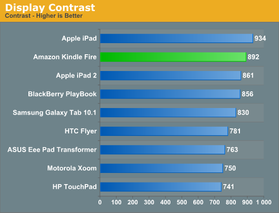
Display quality is pretty good. The 7-inch 1024 x 600 screen hits 400 nits at its brightest setting, and its black levels are reasonable at 0.45 nits. The resulting contrast ratio is good as well.
The white point is an almost Samsung-like 7200K across all brightness settings. Interestingly enough there's no difference in brightness once you get below 25% on the slider control.
The Form Factor
The first Kindle I ever bought was the second generation model. Upon receiving it I felt that it was the perfect handheld tablet form factor. The 2nd generation Kindle was both thin and light enough that it could truly be a book replacement. I'd carry it everywhere and it wasn't a burden to hold and read for hours.
The Kindle Fire strikes me with no similar feelings about its form factor. It's portable, more so than the iPad and it's reminds me of my old Kindle in surface area but that's it. The Fire is light enough to be held in one hand but when reading for extended periods of time I still find myself having to support the device with my chest if I'm lying on my back. There's simply no innovation in the form factor. While my old Kindle was the perfect form factor, the Fire is just acceptable.
This isn't all Amazon's fault however. The hardware in a plain old Kindle allows Amazon to build something ultra thin and ultra light. Moore's Law has yet to give us something that can perform as well as the Fire while operating within the confines (battery included) of a regular Kindle. I suspect that we'll eventually get to that point, however it may take a good three years for that to happen.
The standard Kindle's e-ink display is beautiful to read pages of books on, but it is hardly desirable for images or web content. The Kindle Fire is a bit better, but still not perfect in this regard. In text mode reading magazines or books is as pleasant as can be given that you're staring at an LED backlit LCD. If you're just going to be reading books, the experience on a vanilla Kindle is better. The advantage to the Fire of course is that you can do more than just read pages of text - it's good for magazines and web pages as well.
Unfortunately here the 7-inch 1024 x 600 display is limiting. It's virtually impossible to read a magazine (in magazine view) fully zoomed out like you would a book. I found myself preferring the text view of magazines I tried subscribing to on the Kindle Fire. Web browsing is more of a mixed bag. You get a really great browsing experience compared to a smartphone, or a really cramped browsing experience compared to an iPad. This is the same problem I pointed out in our PlayBook review:
Even when I'm not out and about, the PlayBook is quite usable as a content consumption device. In portrait mode fonts are a bit too small for me to read comfortably on the couch but in landscape it works well as a reddit browsing machine.It's in the couch-lounging usage model that the PlayBook does fall short of the iPad or Xoom. But in terms of portability the PlayBook is clearly a much better balance of functionality and mobility. If you read between the lines you'll come to the same conclusion I have: neither the PlayBook nor the iPad is the perfect form factor for a tablet. Further more, I'm not sure there is a single perfect tablet form factor.
Mario Twins
Rumor had it that in order to save time (and likely cost) in bringing the Fire to market, Amazon had opted to use the same design as the BlackBerry PlayBook courtesy of the ODM that made both: Quanta.
ODMs like Quanta will build anything you want or they'll do slight modifications to an existing design to suit your needs. The idea is you don't need to be an expert at everything. If your differentiation is primarily software and you just need a fast hardware platform, Quanta (or Pegasus or Foxconn, etc...) will give you that and let you roll your own software stack on top of it. It's not all that uncommon in the industry. This is actually how companies like Marvell work in the SSD space as well. They'll give you the hardware, but the most successful drive makers simply use the Marvell hardware as a base platform - they all write their own firmware.
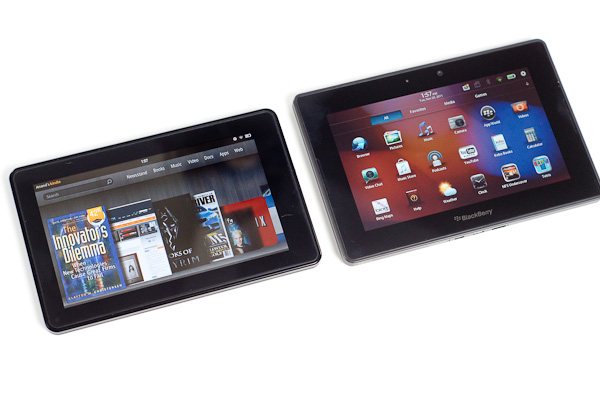
Aesthetically, the Kindle Fire looks a lot like the PlayBook. The dimensions, screen size/resolution and even build quality are eerily reminiscent of one another although the PlayBook is tangibly larger. Both tablets have a large screen bezel (the PB's is bigger) and soft touch plastic on the back. The power/lock button on the Kindle Fire is also quite similar to what's used on the PlayBook. It's in a different location and is much easier to actuate but it's clear that even the buttons came from a similar parts bin.
A look inside both devices shows a different arrangement of components and a different layout on each motherboard. Our own Brian Klug spotted a curious reference on each board however: the PlayBook's board is labeled Rev. G while the Fire's board is labeled Rev. F. Is it possible that the two boards are simply different revisions of one another?
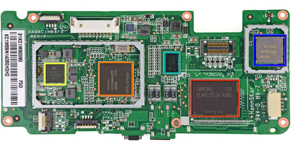
Image Courtesy iFixit - Kindle Fire Motherboard
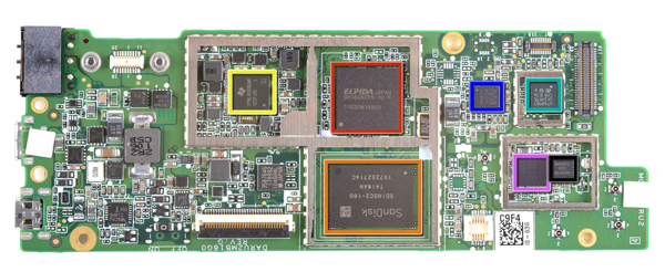
Image Courtesy iFixit - Kindle Fire Motherboard
Either way it's clear Amazon departed from its usual unique design approach with the Kindle Fire. While previous Kindles were fairly recognizable among a sea of devices, the Kindle Fire looks and feels like a PlayBook. In fact, when it's off and sitting on your desk, you'd be hard pressed to tell that it was something made by Amazon. The large 'kindle' lettering on the back was likely designed to address this brand identity issue, but it really was the only thing Amazon could have done given the generic looking platform.
Looks aren't a major concern of mine but I do wonder what we can conclude from this. Either the Kindle Fire was a rushed project to catch the 2011 holiday shopping season or it's a sign that value tablets can't look very special, or perhaps both?
Simplicity in Hardware
Despite the physical similarities to the PlayBook, Amazon whittled down the number of buttons on the Kindle Fire to just one: power/lock. Volume controls are entirely in software, and to be honest I don't miss the physical buttons. As this isn't a smartphone, I don't need to worry about quickly silencing a ring or increasing the volume of a call. The tradeoff here makes sense.
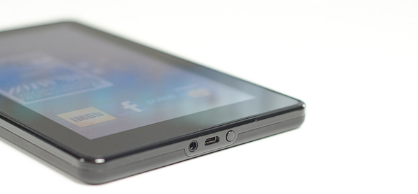
As I mentioned before, the round power/lock button is easy to actuate. The bigger problem is the button's location: at the bottom of the Kindle Fire. On the bright side it does keep the button out of your way when you're reading, it just happens to be in the exact opposite location of where years of using modern smartphones/tablets have taught us to expect it. Then again, an oddly placed power/lock button isn't too big of a deal when you've got a configurable software screen lock.
A 1/8-inch headphone jack and micro USB port keep the power/lock button company. Amazon doesn't ship the fire with a micro USB cable, instead you just get a power brick with a micro USB end for charging the Fire. To Amazon's credit, to use the Fire as a Kindle you never need to hook it up to your Mac or PC. A standard USB cable is only really needed for getting your own music, videos or apps onto the device.
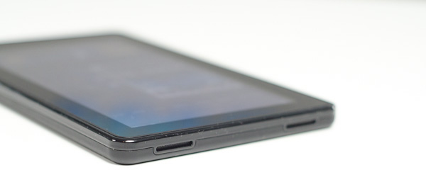
There are a pair of stereo speakers on the opposite end of the device. The volume control feels non-linear and the speakers get loud enough to make their position a bit awkward. Hearing loud noises from one side of the device and not the other isn't really desirable, particularly since you'll likely be watching movies on the Kindle Fire in landscape mode.
The Operating System
There are three reasons why the Kindle Fire is one of the most important tablet releases of the year: software, services, and shopping. The hardware, while nice, plays a definite secondary role here. The user experience, with tight-knit integration with Amazon's full suite of digital media services (Kindle, Appstore for Android, MP3 Cloud Player, and Prime Instant Video), is what makes the Kindle Fire the most formidable threat.
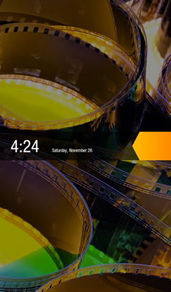
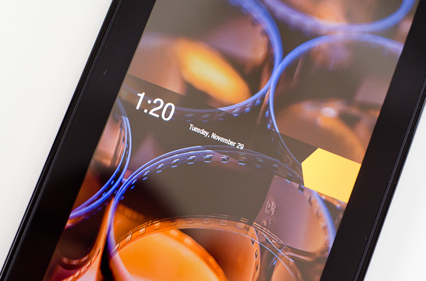
Amazon and Lab 126 have taken the same route as Barnes and Noble here and built the Kindle Fire operating system on top of Android 2.3. This is basically a skinned version of Gingerbread just as you'd find on an HTC Flyer or the old Galaxy Tab 7", but instead of augmenting the stock Android experience, the goal here is to hide it entirely. When you press the (stupidly located) lock button, you're treated to a simple lock screen, featuring a high resolution image of Amazon's choosing and an orange lock slider with the day, date, and time. Note that you cannot change the lockscreen image without rooting the device.
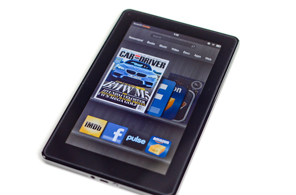
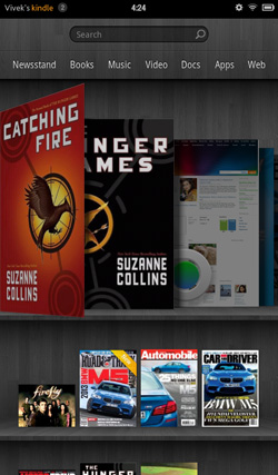
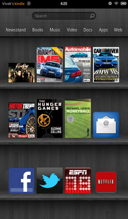
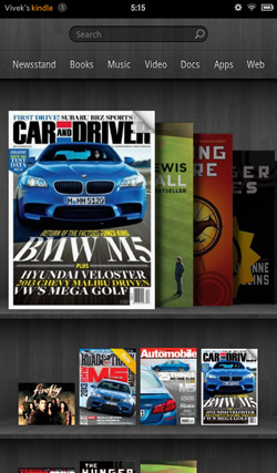
Slide the bar over to get to the homescreen, and you find yourself looking at a virtual bookshelf of apps. The top shelf is called the Carousel. It's a rotating, Cover Flow-style list of recently used files and applications that you can swipe through. It's nice, in that you can switch between your recent windows, but there's too many app windows that are stored. This leads to two problems: there can be some choppiness in the animation if you try to scroll through the entire list quickly, and overall it's a bit visually chaotic and disorganized. It's good, but it'd be better if they shortened the list to just the last 8-10 items. The shelves underneath are made up of items you deem "favorites". You can pin almost any content to the mainscreen - applications, magazines, newspapers, books, albums, playlists, videos, documents, websites; just hold down the icon/cover to add to favorites, then it'll show up on your homescreen. 4 icons per shelf, and the size of your bookshelf grows downwards as you add more content to it. However, as you add more content, scrolling through the bookshelf tends to get a bit choppy.
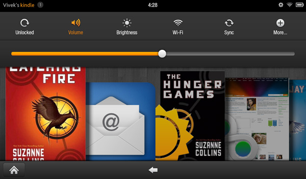
The notification bar from Android 2.x is still there, but the notification drawer is a push-button affair instead of a slide-down windowshade. The left side of the notification bar contains the battery and WiFi indicators as well as a small gear. Press it to bring down the quick setting options, and select "More..." to get to the full settings menu. The quick settings options are the rotation lock, volume and brightness controls, wireless settings, and a manual sync button. The main menu settings are relatively limited compared to normal Android, mostly account and security options, along with the standard device settings: sounds, display timeout, keyboard, network, date/time, and application permissions. The notification tone catalogue is basically lifted from Honeycomb, as are the keyboard touch sounds. The sounds are basically the only personalization options you've got. There's no real wallpaper to speak of other than the dark gray bookshelf, and as mentioned before, you can't touch the lockscreen images.
There are no hardware buttons, so the standard Android navigation buttons show up on a bottom navigation bar. The Home button and back button are always present, joined by the menu button and search when relevant. The menu bar disappears when you're viewing print or video content, necessitating a touch of the screen to bring up the navigation bar.
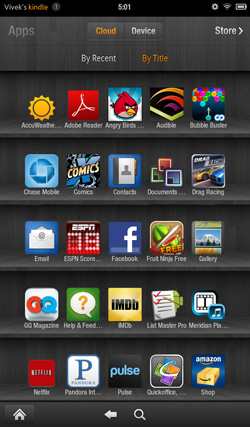
Above the Carousel is a list of the different content areas. You can access the web or one of the content libraries by hitting the corresponding name: Newsstand, Books, Music, Video, Docs, Apps, Web. Web takes you to the browser, Apps takes you to the main application launcher, and the rest of the content areas are mostly self-explanatory. It's the only way to access the browser, the launcher, and the music player, so you'll use those buttons often. Above the content libraries is a search box that searches through your books, magazines, documents, movies, music, and apps. We'll cover all of these systematically, starting with the browser, which Amazon says is "cloud-accelerated" using the computing back-end of Amazon Web Services. It's called Silk.
The Amazon Silk Browser
Although Amazon has done an excellent job in making the Fire's home screen nice and responsive (read: fully GPU accelerated via a backing store), the browser does not receive the same treatment.
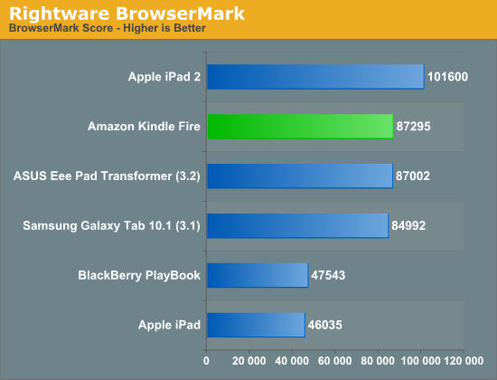
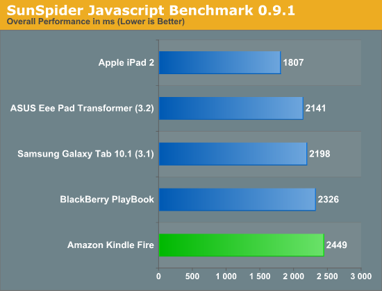
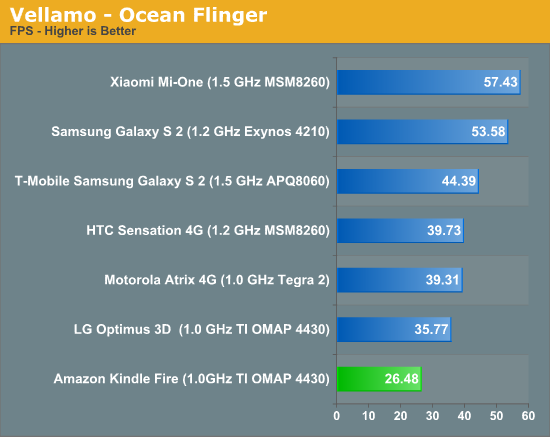
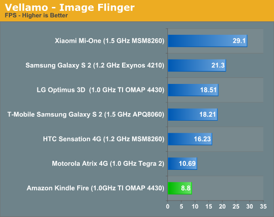
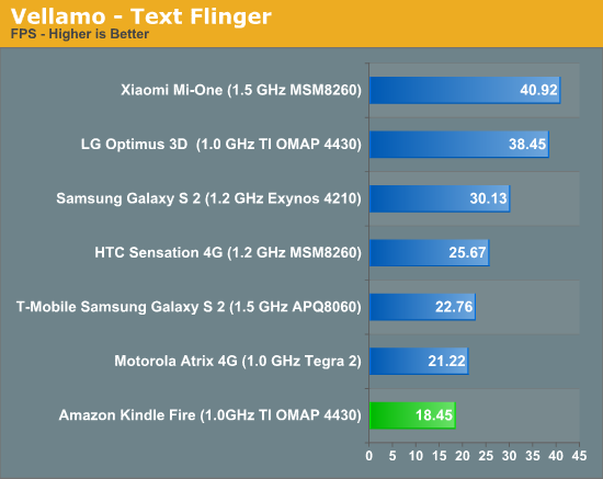
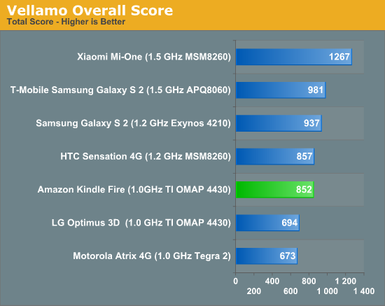
Rendering (including JavaScript) performance is reasonable on the Fire, but scrolling down web pages is clearly sub 30 fps. The choppiness is something that individual Android partners have addressed in their own custom browsers (e.g. Samsung in the Galaxy S 2), however it appears that Amazon has not done the same. As a result the browsing experience on the Kindle Fire feels distinctly 2010 rather than modern day Android, particularly compared to the strides Google has made in Honeycomb and (presumably) Ice Cream Sandwich. The Vellamo flinger tests support our comments about scrolling performance:
I don't doubt that Amazon will eventually enable a fully GPU accelerated browser at some point in the future, its failure to do so today is irksome. The missing feature is particularly upsetting in light of another, fairly large customization to the browsing experience that Amazon has chosen to introduce instead: cloud based caching.
If there's one thing I'm not particularly happy about with the Kindle Fire it's the web browser. I've already explained that Amazon didn't bother to deliver the smooth, GPU accelerated experience we've come to expect from Samsung's SGS2 browser, Honeycomb or iOS. Web page loading performance is reasonable but the actual browsing experience suffers. What may have been understandable a year ago is no longer the case today, particularly with Ice Cream Sandwich weeks if not days away from a US release.
My biggest issues have nothing to do with performance however, they stem from the cloud accelerated browsing features of Silk. I've already written about much of this publicly but I'll start with a quick recap.
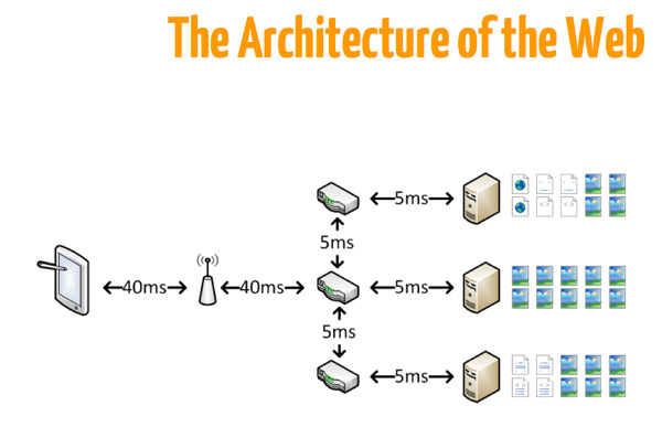
Amazon insists that the browser is an aging limitation on the overall mobile experience. A single page load can require negotiating connections with dozens of servers, followed by downloading megabytes of content, none of which are optimized for mobile devices. Why assume that all page elements are optimally compressed for delivery to a sub-1080p display?
Amazon feels the best way to address delivering the desktop web to mobile devices is via its own cloud services. With the Silk browser's "accelerated page loading" feature enabled, any website you load is proxied through Amazon's AWS servers. The Silk browser then only has to deal with a single host that all content is funneled through:
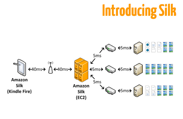
With all content filtered through Amazon's servers there are two things that can happen: 1) Amazon can learn a lot about how Silk users browse the web and 2) Amazon can optimize the content within its cloud before getting to you.
Let's talk about the second advantage. Images and data can be (re)compressed before they get to you and Amazon can prefetch additional pages based on what it thinks you'll request next. On a greater scale, Amazon can reduce the bandwidth load to site owners by serving already cached data from its AWS cloud rather than re-requesting the elements from the original servers. For one person accessing a site there are no savings, but with thousands of people pulling the same page the benefit is clear. There's a lot of good that can come from Silk's page loading optimizations, unfortunately almost none of it is realized today.
I thought it odd that Amazon would debut cloud-based caching on a device that was WiFi only. Saving bandwidth is really important on cellular connections that are either low performance or limited by data use caps (or both). Neither of these things applies to the Kindle Fire in its state today. It's no surprise that using Silk with accelerated page loading enabled offers no real benefits on the Kindle Fire.
I detailed all of my testing procedures in a separate piece last week, but here are the relevant excerpts:
I started out by doing some raw web page loading tests. I picked three web pages: AnandTech.com, Engadget.com and NYTimes.com. I loaded each one 10 times in a row and averaged all of the run times. I did the same with and without the Silk browser's accelerated page loading feature enabled (cloud caching).
The results are below:
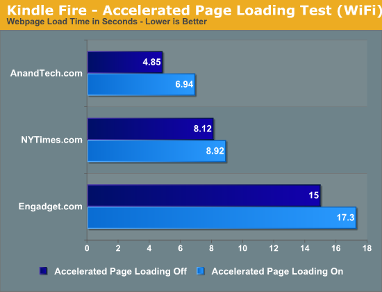
As expected, Amazon's accelerated page loading does nothing to accelerate page loads. In fact, it slows it down compared to going direct to the servers I'm trying to reach. The numbers are mirrored in my own use of the Kindle Fire. Web pages simply load slower if you have this feature enabled.
Amazon also argues that it's enable to improve performance by optimizing content for the device you're viewing it on. In other words, Amazon is able to perform server side compression of things like images to deliver a seemingly lossless reduction in file size and thus improve performance. This claim was a little more difficult to investigate as requesting a full uncompressed JPG didn't seem to go through Amazon's compression routine. Instead I sniffed the Kindle Fire's traffic on my network and looked at total bytes transferred for a handful of page requests. This time I looked at the same three websites from earlier (AT, Engadget, NYTimes) but also added CNN.com for something a bit more mainstream, and Reddit.com for something a bit more awesome (and text heavy).
To deal with the fact that these are live websites with ever changing content I ran all of the tests back to back, ensuring that the actual website content didn't change between runs. I also ran each test at least 5 times to deal with any differences in ads that loaded. I cleared the cache between each run to always request data from Amazon's servers. The results were remarkably consistent. Once again, the data is below:
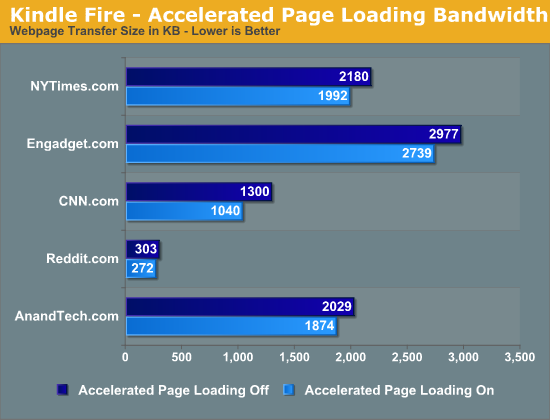
The average compression ratio for these test web pages through Amazon's servers was 0.891. Everything seemed to reduce fairly predictably, the exception being CNN.com which saw a compression ratio of 0.801. It's possible that CNN's content is unnecessarily large and could stand for some server side optimization of its own. It's interesting that even Reddit, a text heavy site, was able to see some benefits from Amazon's accelerated page loading feature.
It's worth noting the average KB saved by enabling accelerated page loading is only 174KB. That amounts to just under 10% of the 1758KB average page size in this test. If you're severely limited by bandwidth caps, these savings might come in handy but otherwise they're not large enough to be noticeable.
If the amount of data transferred is smaller, but the pages take longer to load this can only mean one thing: the transfer rates are slower from Amazon. Indeed they are:
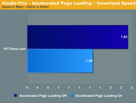
When loading NYTimes.com I averaged (again, over five runs, cache cleared between each one) 1.93Mbps with accelerated page loading disabled and 1.26Mbps with the feature enabled.
Curious to test my theory about cloud-side caching being a good target for a future 3G Kindle Fire, I tethered the tablet to my iPhone 4S and used AT&T's 3G network for all of the page loads.
I picked three sites this time around: AT, CNN and Engadget. I chose these three because CNN benefitted the most from Amazon's compression and AnandTech was penalized the most by going through Amazon's servers. Engadget was simply a good middle data point between the two.
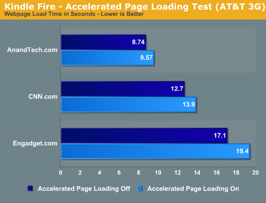
Unfortunately even on AT&T's 3G network, Amazon's accelerated page loading made things slower. The impact wasn't as noticeable as it was over WiFi, but it's there. If you're a Kindle Fire owner and you want the fastest browsing experience, you'll want to disable Silk's accelerated page loading.
We are at the very beginning of this journey however, Amazon's eventual plans for Silk are far more aggressive than the 10% bandwidth savings we get today:
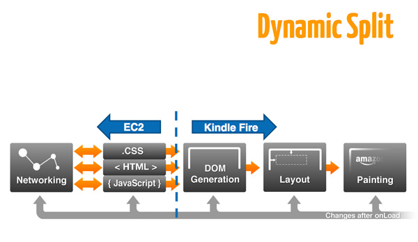
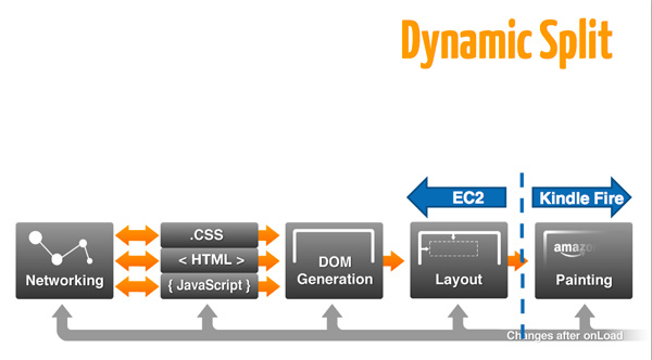
Depending on the content (and device) Silk could choose just how much of the workload to shift to the cloud. The selection can be dynamic and has some far reaching implications for dumber-than-a-tablet devices. Amazon made it very clear that to deliver an adequate experience on the Kindle Fire it could not sacrifice compute performance. With more server-side offloading technologies like Silk, Amazon could deliver competitive browsing experiences with less client-side compute. Opting for a slower SoC wouldn't just reduce cost but it'd also reduce power consumption, enabling thinner/lighter tablets. Earlier I mentioned how my original Kindle felt like it had the perfect form factor, but the Kindle Fire wasn't able to recreate that magic due to the hardware requirements of the platform - in the long term Silk may be Amazon's ticket to building more capable Kindle-like tablets without making form factor sacrifices.
I'm required to use the future tense here because today it's nothing more than speculation. The bigger problem is today Silk's accelerated page loading does more for Amazon than it does for you. It slows page load times and hands over a ton of behavior data to Amazon:
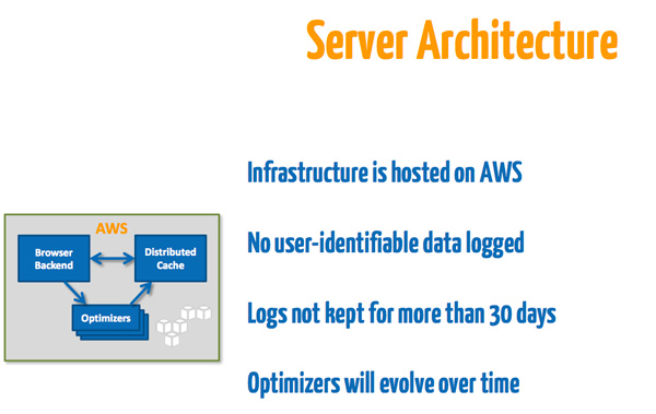
Amazon insists it doesn't log any user identifiable data and it purges logs at least every 30 days, both of which seem reasonable. Unfortunately neither does anything for the end user today. You're paying Amazon for a Kindle Fire, paying for the content to go on the device, and doing Amazon a huge favor by giving it insight into your browsing habits. This is similar to how the contract with Google works except in Google's case, you're trading behavioral data for a bunch of really good, free user experiences. Amazon needs to deliver something of value in order to make Silk's accelerated page loading an option that its users should use.
For now Amazon quietly leaves accelerated page loading an option enabled by default. I suspect if it hadn't made this decision, no one would use the feature as it actually slows down performance. If Amazon wants to do no evil in this case, it should either make accelerated page loading a compelling feature, or give Kindle users something in return for leaving it enabled (free Amazon Prime perhaps? :)).
Flash Performance & HTML5 Compatibility
As always I looked at Flash/HTML5 performance and HTML5 compatibility with Amazon's Silk browser. Neither is particularly impressive:
| Flash/HTML5 Performance - GUIMark 3 | ||||||||
| Bitmap (HTML5 Cache) | Bitmap (Flash) | Vector Test (HTML5) | Vector Test (Flash) | Compute (HTML5) | Compute (Flash) | |||
| Amazon Kindle Fire (1024 x 600) | 17.6 fps | 29.9 fps | 7.5 fps | 22.6 fps | 8.8 fps | 28.4 fps | ||
| Apple iPad 2 (1024 x 768) | 19.1 fps | N/A | 14.2 fps | N/A | 13.4 fps | N/A | ||
| BlackBerry PlayBook (1024 x 600) | 11.2 fps | 26.3 fps | 10.7 fps | 25.9 fps | 10.2 fps | 23.0 fps | ||
| HP TouchPad (1024 x 768) | 27.7 fps | 42.6 fps | 9.3 fps | 28.5 fps | 8.0 fps | 22.1 fps | ||
| HTC Flyer (1024 x 600) | 30.3 fps | 50.6 fps | 12.1 fps | 21.4 fps | 8.5 fps | 26.6 fps | ||
| Samsung Galaxy Tab 10.1 (1280 x 800) | 22.9 fps | 25.0 fps | 11.4 fps | 19.3 fps | 11.2 fps | 23.6 fps | ||
Flash/HTML5 performance are at least relatively competitive with other Android tablets, although definitely not the fastest solution here (especially given its lower resolution). I suspect this has more to do with the current implementation of Flash on the Kindle Fire rather than a hardware limitation.
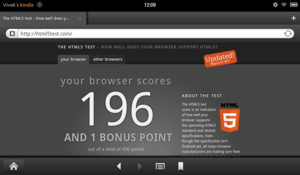
A quick run through HTML5 test shows just how far Amazon has to go with its Silk browser:
| The HTML5 Test | ||||||||
| Test | Amazon Kindle Fire | Apple iPad 2 (iOS 5.0.1) | HP TouchPad | RIM PlayBook | Samsung Galaxy Tab 10.1 | |||
| Total Score | 196 (and 1 bonus point) | 296 (and 9 bonus points) | 229 (and 5 bonus points) | 274 (and 9 bonus points) | 222 (and 3 bonus points) | |||
| Parsing rules | 1/11 | 11 (2 bonus points) | 6/11 | 11 (2 bonus points) | 11 (2 bonus points) | |||
| Canvas | 20 | 20 | 20 | 20 | 20 | |||
| Video | 21/31 | 21/31 (4 bonus points) | 21/31 (4 bonus points) | 21/31 (4 bonus points) | 21/31 | |||
| Audio | 20 (1 bonus point) | 20 (3 bonus points) | 20 (1 bonus point) | 20 (3 bonus points) | 20 (1 bonus point) | |||
| Elements | 13/28 | 22/28 | 16/28 | 20/28 | 20/28 | |||
| Forms | 32/98 | 75/98 | 41/98 | 47/98 | 52/98 | |||
| User Interaction | 34/36 | 17/36 | 34/36 |
34/36 |
7/36 | |||
| History and navigation | 5 | 5 | 0/5 | 5 | 0/5 | |||
| Microdata | 0/15 | 0/15 | 0/15 | 0/15 | 0/15 | |||
| Web applications | 19/20 | 15/20 | 15/20 | 15/20 | 15/20 | |||
| Security | 5/10 | 5/10 | 5/10 | 5/10 | 5/10 | |||
| Geolocation | 0 | 15 | 15 | 15 | 15 | |||
| WebGL | 0/25 | 9/25 | 0/25 | 0/25 | 0/25 | |||
| Communication | 5/25 | 25 | 15/25 | 25 | 5/25 | |||
| Files | 0/20 | 0/20 | 0/20 | 0/20 | 10/20 | |||
| Storage | 15/20 | 15/20 | 15/20 | 15/20 | 15/20 | |||
| Workers | 0/15 | 15 | 0/15 | 15 | 0/15 | |||
| Local multimedia | 0/20 | 0/20 | 0/20 | 0/20 | 0/20 | |||
| Notifications | 0/10 | 0/10 | 0/10 | 0/10 | 0/10 | |||
| Other | 6 | 6 | 6 | 6 | 6 | |||
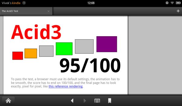
The Acid3 score is a lot better at 95/100:
Books
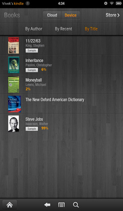
This being the Kindle Fire, the Kindle experience is the central focus here (other than making boatloads of money for Amazon). Hit the Books library, and you see an option at the top for Cloud and Device. All of your purchased books are located on the cloud, and you can download them to your Kindle Fire's local storage as necessary. The Fire has roughly 5.5GB of free space to use for content, so some content management will be required over time, particularly if you download a lot of videos to local storage. The books you own are displayed in list form, on a dark gray wood background. You can choose how you want your books organized, whether by title, author, or recently viewed.
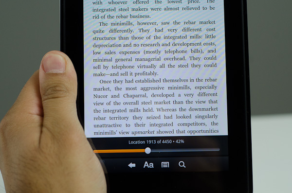
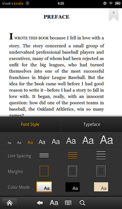
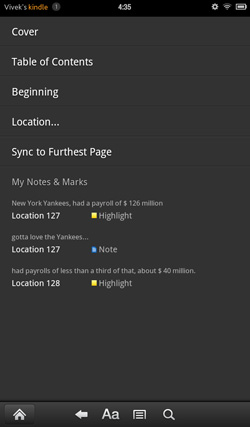
The reader itself is pretty standard, very clean. You can tap on the left and right of the screen to move back/forward through pages, just like you can on a regular Kindle. As soon as you get into the book, the notification and navigation bars hide themselves, allowing you to view the pages alone with no UI elements to distract from the content. Tap once to bring up the nav bar, and you see five options: the standard home, back, menu and search, this time joined by an "Aa" button to configure font and text display settings. There are three different options for margins and line spacing, eight different text sizes, and a choice of background colour (white, black, and a poor approximation of parchment that comes out about three shades too dark). The default typeface is Georgia, other options include Caecilia, Trebuchet, Verdana, Arial, TNR, Courier, and Lucida. I found the default settings very comfortable for reading, only changing to a black background and white text when reading in the dark but otherwise leaving the options untouched.
Search works well, showing all the instances of the word you searched for with a two-line snippet of text, along with the chapter and location number. Beyond that, you can select text, highlight, and add notes. If a single word is selected, the dictionary definition is provided in the option box. The text selection works exactly as it does in standard Gingerbread, so you can pick out groups of text for highlighting. In addition, you can choose to search the selected text in Google, Wikipedia, or other parts of the book. It's actually pretty fantastic for studying and textbooks.
The lone disappointment here is that the framerate of the page turning animation isn't really where you'd expect it to be given the quality of hardware on board here. It's not exactly choppy, but it's noticeably not as smooth as the experience on an iPad or other Android tablets.
Newsstand
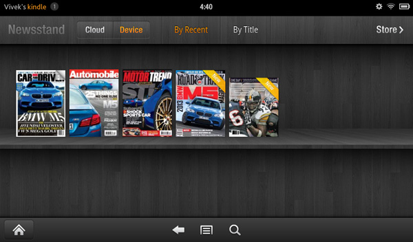
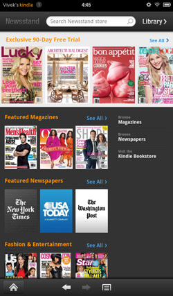
The Newsstand library works similarly to the Books library. You have every magazine issue arranged on a bookshelf similar to the one on the homescreen, again with options to view from the cloud or from local device storage and the choice to organize purchased magazines by title or recent viewing.
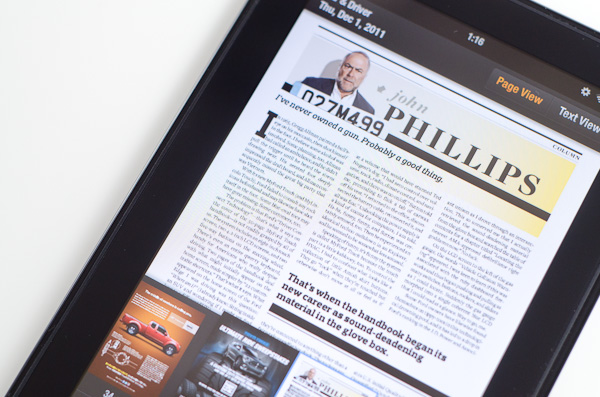
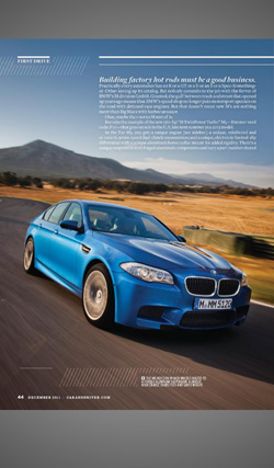
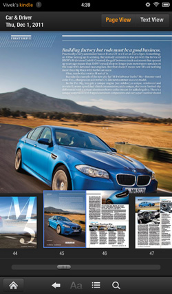
Once you pick a magazine, you're treated to a beautiful visual experience, with images rendering pretty crisply on the display. However, with the aspect ratio of magazines being different than the Kindle's screen, you end up with gray bars on the top and bottom. Also, the text tends to be impossibly small in page view. Zooming and panning a pain, and because the page is basically just an image object, the zoomed text isn't as crisp as one would like for comfortable reading.
Thankfully, Amazon has tossed in a "Text View" option that functions similarly to the "Reader" function in the iOS 5 iteration of Safari, basically taking the text from the page and putting it in an environment nearly identical to the eBook reader environment. You can easily move between articles in the magazine with the menu button, so you don't need to leave text view to read the entire magazine. Tablets are supposed to give you the full magazine experience without limits. On the Kindle Fire, I found myself preferring to read magazine content in text view instead.
We see the same mild framerate slowdown from Books in the Text View mode, but it's in the actual magazine page view that you run into major issues (Get it, get it? No one? Sorry, bad joke.) It's way, way choppy - it's not even a lack of smoothness here, it's that page turns happen at something approaching 5 frames per second. Granted, given the image-rich nature of magazines, it makes sense, but that doesn't make it acceptable.
Kindle Store
To this point, I've basically been ignoring the elephant in the room - content purchasing. The Kindle Fire is naturally tied to Amazon's Kindle Store for eBooks, newspapers, magazines, and singles (essays, articles, and short stories).
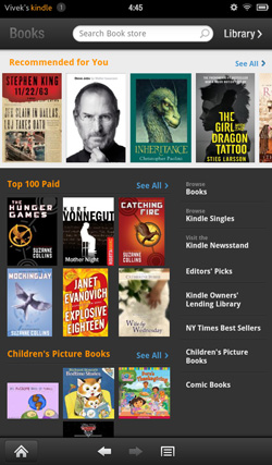
Displayed prominently on the Newsstand and Books libraries is an innocent looking link to the Kindle store. The Newsstand store is pretty similar to Apple's Newsstand store, while the Book store basically looks like iTunes for eBooks.
The standard array of newspapers and magazines are available, with a couple of notable exceptions (like the Wall Street Journal). Most magazines go for between $1 and 3 a month and around $3-5 if you're buying a single issue. Newspapers tend to be in the $10-12 range per month and $0.75-0.99 per day, though The New York Times asks for $20 for a monthly subscription.
Some magazines (TIME Magazine and Conde-Nast publications among them) have tablet-specific apps from which you can purchase and download issues. Because they're designed specifically for the tablet form factor, the reading experience is first-rate, with clearer text and fewer slowdowns than the standard magazines, in addition to videos and other interactive content. One major annoyance though: if you leave the application while an issue is being downloaded, the download will be cancelled. Considering that the interactive, rich-format apps are 250-300MB in size, it gets a bit tiring to wait through the downloads.
The Kindle eBook store is basically the biggest name in digital book purchasing and delivery, so it's about as comprehensive as you can get. Recent books and big name titles go in the $10-15 range (top sellers in order are $15, 15, 14, 10, and 13), whereas classics can be had for as little as $0.99. Singles and short stories also go in the $1-3 range. I think most digital books are overpriced considering that you don't actually get a physical book with them, but people are still buying them in droves, so what do I know?
The experience is pretty seamless - select the title you want and you're given two options - "Buy" and "Try a Sample". Pick one and it'll download. Samples are actually pretty nice, they send the first few chapters, just enough to get you interested, and then you see a nice message that says "End of this sample Kindle book. Enjoyed it? Buy now."
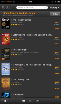
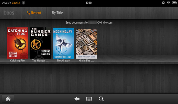
There's actually a third option, if you're a Prime member. You can go to the Kindle Owners' Lending Library. You can basically pick a book from their list, and every calendar month, you can borrow one to read for free. No due dates, no strings, just one free book a month that you can borrow. And it's some pretty major titles too, former New York Times bestsellers and the like. Currently, the most popular books on the Lending Library are the Hunger Games trilogy. The Lending Library is the first of two Prime services on display here, the other being Instant Video.
Prime Instant Video & Movies
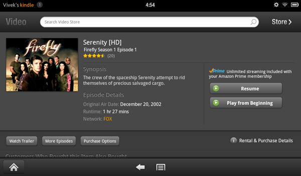
Prime is the second major money maker here after the Kindle store. Amazon even throws in a one month free trial to Prime with the purchase of a Kindle Fire, just to make sure you know what you're missing if you decide to not get it. The biggest content pushed by Prime is Instant Video, basically Amazon's equivalent to Netflix. You can stream any of 10,000+ movies or TV shows instantly through Prime, or rent/purchase them for a cost. The streaming option is definitely nice, because you don't have to deal with downloading and storing the movies and running into issues with the limited amount of onboard NAND.
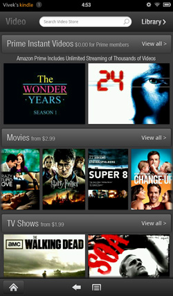
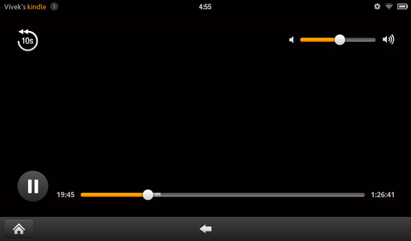
As such, the video library takes you directly to the storefront. At the top are the featured Prime Instant Videos; underneath that are the featured movies and TV shows available for purchase. The Prime Instant selection is good enough that you can get away without paying to download movies. You can save videos from Prime or the Video Store to the favorites list. The video playback controls are very simple, just play/pause, a time bar, a rewind by 10s button, and volume control.
Music and video content can be preloaded onto the device, so long as the videos have a filesize of less than 2GB. High Profile H.264 content plays without an issue. The Kindle Fire had no problems with HP streams at up to 30Mbps. In fact, you're more limited by the 2GB file size limitation than you are bitrate on the Kindle Fire. We have TI's excellent video decoder to thank for this.
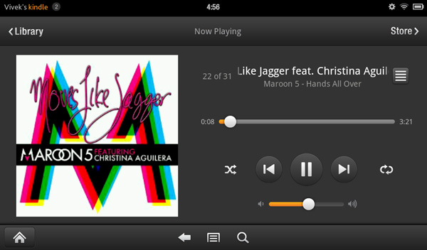
In addition, music can be purchased from the Amazon MP3 store and streamed from Amazon's Cloud Drive web storage app. The music player itself is pretty standard and relatively similar to the original Gingerbread one. When music is playing, the song shows up in the drop down notifications menu for easy access to the player. I'd like to have seen some form of control in the notifications menu or on the lockscreen, but no such luck.
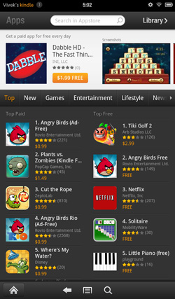
Appstore for Android
Android Market is not available on the Kindle Fire, replaced by Amazon's own Appstore for Android. Lest you forget, this is an Amazon device, not a Google device. Nowhere do you see Google's name explicitly, other than the default search engine in the browser.
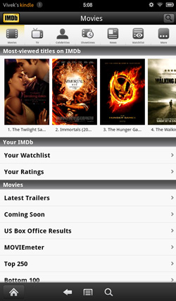
There's 10,000 apps instead of something close to 400,000 in Android Market, but Amazon's store has a pretty healthy catalogue to choose from - every major app is available, though some of the smaller and more random apps are not available. Netflix, Hulu, OfficeSuite Pro, Documents To Go, ESPN Scorecenter, Angry Birds, Words With Friends, Evernote, eBay, IMDB, Chase Bank, Fruit Ninja, Atari Games, even WiFi Analyzer are available. I haven't found anything important lacking yet, but if you're addicted to getting every single random app, you're probably going to find the Appstore selection a bit on the smaller side. I do like that every day, there is a featured paid app of the day that is offered for free. I, like most people, enjoy free things, so I'm not going to complain.
The apps themselves are standard Gingerbread ones - the experience feels pretty similar to the 7" Galaxy Tab. They're blown up smartphone apps, really, just like they were on the Nook Color and Galaxy Tab. There are questions as to what will happen if the Kindle Fire gets updated to Honeycomb or Ice Cream Sandwich, but that's something that will have to be monitored in the future.
Documents & Email
Documents is pretty similar to Books, though it's with content that doesn't come from the Kindle storefront. Personal documents can be sent to the Kindle Fire via something called a Send-to-Kindle email address. Only approved contacts can send documents to the Kindle Fire. Documents can be in a number of formats - .doc/docx, PDF, HTML, TXT, RTF, JPEG, GIF, PNG, BMP, PRC, and MOBI files. What this means is that if you play it right, you will never need to connect the Kindle Fire directly to USB.
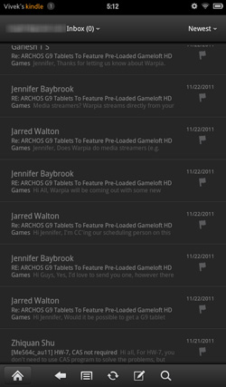
The email application isn't the same as Gmail, but if you set it up properly, it works similarly to the native Android Gmail app. It sets Gmail up as an IMAP account, so you do get push notifications. Obviously, no labels, archiving, or threaded conversations. After getting used to the features of native Gmail, this feels a bit like going back to the stone ages (or iOS). I wish there was an option to get the native Gmail app on the Kindle Fire, but I understand why they had to ship an email client with support for all email services.
For non-Gmail users, the email application is sufficient as well. I used it with our AnandTech IMAP servers without a problem. Deleting accounts is a little awkward (you have to back out to the accounts page, tap and hold and then remove account) but otherwise the experience is pretty straightforward. I've also found that the email app doesn't always respect you telling it not to automatically check for emails, which can be a bit disturbing if you're trying to do something else and new email notifications keep appearing.
The email experience is ok overall, it's no where near as good as the iPad - partially due to the smaller screen, but it is easier to read and reply to things on here vs a smartphone with an even smaller display. The Kindle Fire's form factor does allow you to have somewhat of a smartphone experience by allowing you to hold the device in both hands and thumb away at the keyboard.
Keyboard & User Experience
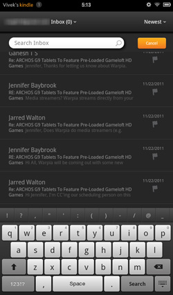
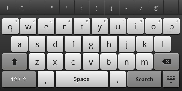
The keyboard looks and acts like a mildly reskinned version of the default keyboard included in Gingerbread. The two biggest differences are that the keys are square, and the keypress sound comes from Honeycomb. As such, it works pretty well - you're not going to type out essays on it, but the ergonomics are good and the visual style is cleaner and more consistent than the Gingerbread keyboard.
I come away from the Kindle Fire feeling pretty pleased with how Amazon has gone about crafting the user experience. It's genuinely sleek, with a simpler and more elegant interface than Android. It's less capable, less customizable, and less intricate than any build of Android I've used before, but also more polished and more user friendly. It's pretty limiting, so some of the power users I've spoken to are relatively disappointed, but for a device targeted at mainstream-level consumers, this is one of the best implementations of an Android-based OS I've seen. It's more distanced from Android than the Nook Tablet OS; you have to dig pretty hard to find the really direct ties, but every single piece of the UX is different in some way.
It just feels more complete than the stock version of Android, a more cohesive and consistent user interface throughout the entirety of the operating system. It's significantly more polished from a visual standpoint, but you do get the feeling that it's not fully baked yet. There's a general sluggishness though the UI, as well as some odd pauses and stutters during complex animations. Examples being page turns in books and magazines, and the overall choppiness of the carousel. There's also an issue where screen taps will not always register or delay in registering, resulting in a double tap that will either act as one or two taps.
The OS isn't as fluid or as smooth as it should be, but given the kind of hardware on board, it's likely something that can be resolved in future software builds. As we've seen time and time again however, although UI smoothness is something that can be resolved, it's not always something that ends up being actually resolved.
GPU Performance
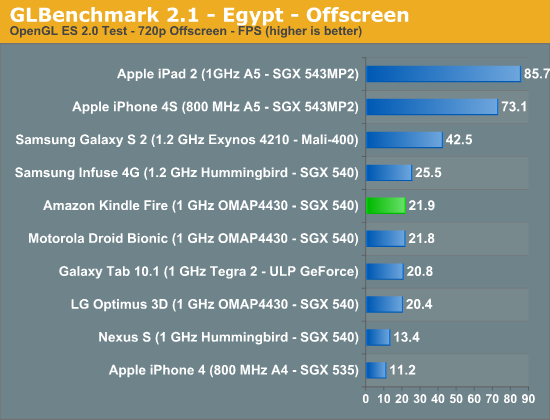
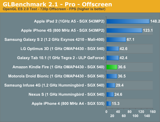
I threw GLBenchmark on the Kindle Fire (Android apps can be sideloaded via USB and a file manager to run the .apk) to see if Amazon skimped on its GPU driver optimizations. Luckily it didn't, the Kindle Fire's PowerVR SGX 540 performs just as well as you'd expect it to:
WiFi Performance
Amazon didn't sacrifice compute in building the Kindle Fire, but WiFi performance is pretty bad. As I alluded to in our earlier piece on Silk performance, the Fire is limited to around 15Mbps over 2.4GHz 72Mbps 802.11n (5GHz isn't supported):
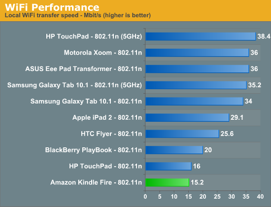
It's unclear if this limitation is due to the TI WL1271 chip on-board or if Amazon just didn't tune the WiFi driver stack for performance vs. power consumption. I'd assume the latter given the focus of the Kindle Fire.
I also measured transfer rates over USB 2.0 to confirm this wasn't some NAND performance limitation. The Kindle Fire uses a single 8GB eMMC package from Samsung. Sequential read speeds were nice and high at 24MB/s, but sequential writes to the device were noticeably lower. I measured between 4 - 6MB/s, which isn't unheard of for low-end NAND. The lowest sequential write speed I measured is still 2x the speed of the fastest transfer I recorded over WiFi, so this is definitely the result of the wireless stack.
Battery Life: 6 Hours
I swear the Kindle Fire has a hard stop at six hours of continuous use. Regardless of the nature of my benchmarks, the Fire always dropped out after six hours of use. I ran our video playback test, our tablet browsing test and our smartphone browsing test - in every case the Kindle died in around 6 hours:
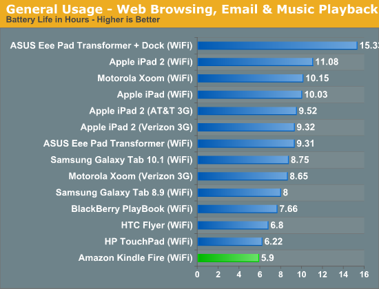
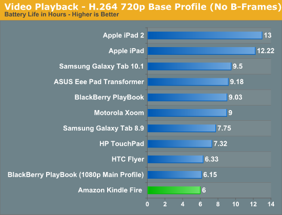
Obviously these only matter if you're going to be using the Fire as a tablet. As a Kindle, you can expect longer battery life as there's simply less work going on and the majority of the SoC is just power gated during that time.
Either way you're still limited by the fact that the small chassis of the Fire can only accommodate a 16Whr battery. That's around three times the capacity of a high end smartphone battery, but it has to cope with a much larger (and more power hungry) display.
Final Words
The Kindle Fire is probably the best tablet you can buy at $199. Amazon has effectively defined the new price point and specs for entry level tablets, anything comparable shouldn't even bother with a price tag greater than $199. I'm sure this won't come as welcome news to players in the Android space looking to enjoy Apple-like profit margins, but sometimes the truth is hard to hear.
At $199, Amazon is giving you some of the fastest mobile hardware money can buy today. The reason the Kindle Fire isn't a must buy for everyone is because the software experience layered on top of the hardware isn't yet perfect. The OS is clean and easy to navigate but the UI isn't always smooth, interactions aren't always responsive and the browser isn't as pleasant as what you can get from iOS or newer versions of Android.
The counterpoint is that for $499 you can get this software experience, while at $199 you obviously have to give something up. I'd argue that you shouldn't have to give anything up. Much of the software experience I'm asking for is already baked into current or close-to-shipping versions of Android today. Amazon picked an earlier point in the curve to fork from Android, but what I'm asking for is technically possible today. Amazon did the right thing by including the best hardware possible in the Kindle Fire, it simply needs to follow through on the software side to truly unlock it.
Amazon does deserve points for a job well done in a number of areas. First and foremost, the Kindle Fire's version of Android is really well executed. While there are some navigational hiccups, the experience overall is quite good. I would strongly encourage major players in the Android space to look at what Amazon has done when they are considering their own customizations to Google's OS. Yes, sometimes less is actually more.
As much as I'm not a fan of the Silk browser today, I can see where things could go. I do believe that Amazon really wants to deliver the full tablet experience in a device the size of a regular Kindle. Moore's Law will eventually give us that reality, but Amazon may be able to speed things up by moving much of the heavy lifting into the cloud. I do hope this is the future Amazon is working towards and Silk's cloud-side caching isn't solely a power grab for behavioral data.
The integration of Amazon Prime video streaming and the Amazon stores is extremely well done. If you're an Amazon addict, the Kindle Fire will likely do horrible things to your bank account.
I feel like Amazon believes in the Kindle Fire and thus we will see the software get better over time. As with most tablet recommendations lately, if you can wait, doing so would be wise. Don't assume that things will get better, wait for Amazon to make them better and then reward the company with your hard earned dollars.
That being said, more concrete recommendations are always nice so here we go:
1) If all you do is read eBooks, grab a regular Kindle. The reading experience is far better on those devices. Sure response time is noticeably longer than on the Kindle Fire, but you do get better battery life, a display that's easier on your eyes, etc...
2) If you already have an iPad/Honeycomb tablet, look elsewhere. I appreciate you reading this review but don't buy a Kindle Fire. If you really want something more portable to read books on, see point 1.
3) If you need an entry level tablet, the Kindle Fire is as good as they get for $199. You get the same general purpose compute and memory as an iPad 2, at a far lower price. GPU performance isn't a knockout but as long as you're not a hardcore 3D gamer (do those exist on Android yet?) or high end game developer this isn't an issue.
I'm curious to see how this plays out. The e-ink Kindle has a unique (perfect?) form factor and delivers a pretty good experience. The Kindle Fire has a more generic form factor (perhaps too small for certain uses?) and delivers a varied experience depending on what you're doing. I appreciate what Amazon is trying to do here: good tablet experiences shouldn't cost as much as much higher performing computing devices, and cheap tablets shouldn't sacrifice everything to get there. The Kindle Fire is Amazon's first attempt at bridging the gap between those two extremes. It's the best out today given its price point, but it's not the best Amazon could have done. I'm waiting for round two.

