Original Link: https://www.anandtech.com/show/4059/nexus-s-and-android-23-review-gingerbread-for-the-holidays
Nexus S and Android 2.3 Review: Gingerbread for the Holidays
by Brian Klug on December 14, 2010 4:08 PM EST- Posted in
- Samsung
- Nexus S
- Gingerbread
- Android 2.3
- Smartphones
- Mobile
It’s hard to know where to start with the Nexus S, as there’s so much going on so fast in the smartphone space, and especially on the Android side of the smartphone market. To put it in perspective, the Nexus One is just shy of one year old, and yet the hardware already feels like it’s in dire need of an update. That’s not to say that the one-year cadence is too short - it isn’t - but just to put things in perspective.
Back when it launched, one of the primary goals of the Nexus One was to make phone shopping carrier-agnostic. Shop around for the cheapest service (or the best coverage and speed, depending on your priorities), then bring your own unlocked phone and enjoy. Since there’s no early termination fee, you could turn around and sell the phone a few months down the road, and use that money to upgrade before you’d normally be eligible. It’s not a foreign concept to the rest of the world, but for whatever reason isn’t viable in the US.
Turns out those reasons were simple - people want carriers to provide first-party support for devices, and people want to play with devices in stores before making the jump. Enthusiasts didn’t care and bought the phone anyways. Mainstream sought out whatever carriers had in their retail stores - branded devices with skins, mass-media marketing, and devices with lots more advertising. Months later Google CEO Eric Schmidt announced there wouldn’t be a Nexus Two, and Google shuttered the Nexus One online store a little while after, though you could still buy one if you were a developer. And somewhere between all that, the Nexus One’s purpose really changed.
The purpose was obvious - stock Android running the absolute bleeding edge version possible, carrying with it the latest iteration of Google’s vision of handheld mobile computing. Since then, if you’ve wanted to keep abreast of the bleeding edge of Android, you basically needed to have a Nexus One.
There has been a steady stream of flagship Android devices since the Nexus One, and it’s finally time to update that hardware. This time around the marketing message mirrors what the Nexus One morphed into - buy this handset, and you’re getting the stock Google Android experience with no carrier branding, fast software updates without vendor overhead, and a few new things such as near field communication hardware support. With that out of the way, let’s dive into the hardware and then Android 2.3.
Meet Nexus S
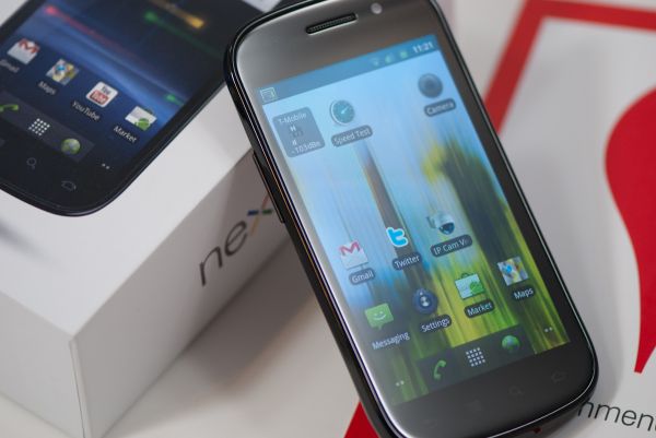
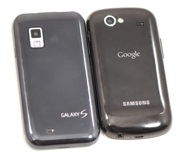
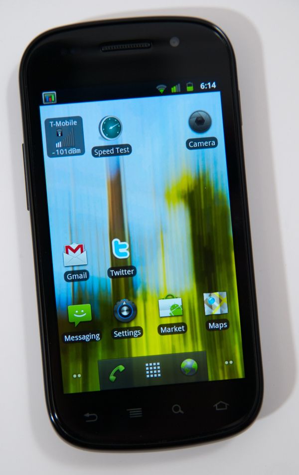
Right off the bat it’s extremely obvious that the Nexus S draws a lot of design language from the Samsung Galaxy S line of devices - Samsung is quite literally the S in Nexus S.
The two share the same 4” AMOLED display, and (love it or hate it) the same glossy plastic case. In the hand, the Nexus S feels almost identical to the Vibrant or Fascinate - they’re both very light (though the Nexus S is about 12 grams heavier), and fit in your palm almost the same way.
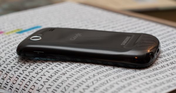
I bring up the back material because again it still strikes me as an odd choice. It shows fingerprints, can feel slippery, and honestly is just hard to rationalize compared to soft-touch devices like the Nexus One. The Nexus S backside has a raised ridge at the bottom, which in the hand sits naturally below your pinky. It’s an ergonomic touch that has the advantage of not letting the back get scratched up when placed back-down on a table, but adds thickness.
Also on the back are the camera and LED flash, the same shape speakerphone port as the Galaxy S, and prominent Google and Samsung branding.
Button placement on the Nexus S also reminds me of the Galaxy S devices. The left side has the volume rocker, the right has the power button. On the Nexus S these buttons are slightly raised and are a bit easier to locate with your fingertips. The volume button has a bit of play but not enough to unnerve. I maintain that placement is perfect - held in my left hand, the power button rests just under the index finger, and volume rocker rests under the thumb. If you carry in the right hand, the power button is under the thumb (though a bit harder to locate) and the volume rocker is under the index finger.
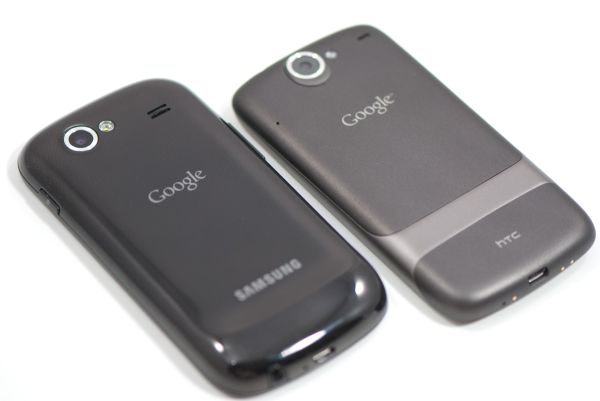
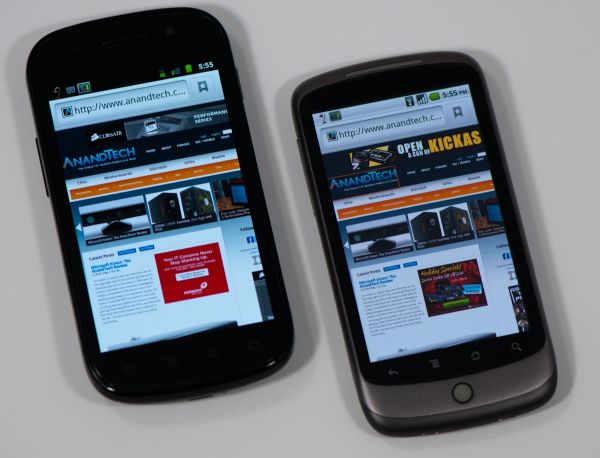
The most interesting comparison for the Nexus S is the original Nexus One. Side by side, you can see how the Nexus S emulates the rounded-corners shape and form factor, it’s just scaled up appropriately to fit a 4” display. The chromed edge around the camera remains the same, and the LED flash is also similar in appearance. It’s really obvious that Samsung and Google put a lot of effort into making sure that while the Nexus S was something different, it didn’t totally sacrifice the Nexus One’s original design language.
Along those lines, the Nexus S puts the microUSB port in the center at the bottom, though the headphone jack is also relocated to the bottom. In fact, probably my only gripe about the Nexus S design is this awkward placement for the headset jack. I guess that’s a silly thing to take issue with, since you can just stick the device in your pocket upside down, but then again nearly every other smartphone puts that jack up on top.
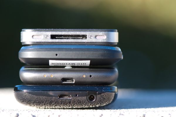
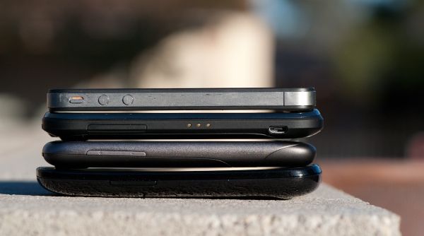
Top to bottom: iPhone 4, myTouch 4G, Nexus One, Nexus S
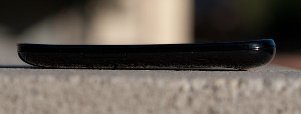
Where the Nexus S differs the most from other phones is its curved front face and glass screen which Google calls the “Contour Display.” The curvature is a very subtle concave one - in reality the total sag is only about 2 mm - which gives a radius of curvature of about 4 meters. Again - subtle, but noticeable. It’s only curved in the vertical direction however, not horizontal (or convex) like the Dell Venue Pro.
What’s interesting is that most of the active region of the display is relatively flat, it’s only when you get out to the edges that the phone is curved. You can really tell when looking at your reflection in the glass. In that sense, the contour display is probably more of a hyperbolic shape than spherical one, but I won’t bore you with some discussion about conic sections. The end result is that when you’re swiping your finger around on the curved display there isn’t any noticeable resistance or change in depth like I’ve noticed with other shaped-display devices. Holding the Nexus S to your face while in a call, that curvature is somewhat helpful but nothing life-changing. Overall it’s just impressive to see such a large unbroken curved glass display.
The front-facing camera sits in line with the earphone grille off to the right, on the left side are proximity and ambient light sensors in the same order as I saw on the Fascinate. It’s awesome to see no branding on the front of the device from either Samsung or Google. At the very bottom are the four Android buttons, all of which are unfortunately in yet another different order. On the Nexus S, the order is back, menu, search, home, whereas on the Nexus One it’s back, menu, home, search. On the Fascinate, it’s menu, home, back, search. It’s unfortunate the Nexus One and S couldn’t share the same order, especially since search being at the far right has pretty much been the only constant among devices.
Under the curved glass surface the Nexus S packs the same 4” Super AMOLED panel as the other Galaxy S devices. The glass surface is given the same oleophobic treatment the iPhone 3GS received.
It’s also interesting to note what’s missing from the Nexus S that the Nexus One had - notably, that much maligned trackball is gone, and with it all notification LEDs. I’m a bit disappointed that directional controls like an optical trackpad or mechanical trackball are absent from the Nexus S. It’s one of those things you don’t miss until you don’t have one. Things like scrollback and sending cursor commands in connectbot (arguably Android’s best SSH application) simply require having some directional controls - there’s no virtual keyboard with arrow keys (edit: except Swype, thanks everyone). Other things like Android’s Quake 3 port, kwaak, are difficult to navigate and impossible to play without that control. Missing the notification LED isn’t a big deal for me personally - I find them to be a nag - but they are functional quick-glance aides. Android doesn’t turn on the display when a new SMS arrives, thus that notification LED is usually the only way to know something new has come in.
We’ve put together our usual comparison table, and in here it’s really apparent how much similarity there is between Galaxy S and Nexus S, unsurprisingly. The subtle changes are in size, shape, and extra features like NFC, front facing camera, LED flash, and of course Gingerbread.
| Physical Comparison | |||||||||
| Apple iPhone 4 | Motorola Droid 2 | Samsung Galaxy S Fascinate | Samsung Focus | Google Nexus S | |||||
| Height | 115.2 mm (4.5") | 116.3 mm (4.6") | 106.17 mm (4.18") | 122.9 mm (4.84") | 123.9 mm (4.88") | ||||
| Width | 58.6 mm (2.31") | 60.5 mm (2.4") | 63.5 mm (2.5") | 65 mm (2.56") | 63.0 mm (2.48") | ||||
| Depth | 9.3 mm ( 0.37") | 13.7 mm (0.54") | 9.91 mm (0.39") | 9.9 mm (0.39") | 10.88 mm (0.43") | ||||
| Weight | 137 g (4.8 oz) | 169 g (5.9 oz) | 127 grams (4.5 oz) | 119 grams (4.2 oz) | 129 grams (4.6 oz) | ||||
| CPU | Apple A4 @ ~800MHz | Texas Instruments OMAP 3630 @ 1 GHz | 1 GHz Samsung Hummingbird | 1 GHz Qualcomm QSD8250 | 1 GHz Samsung Hummingbird | ||||
| GPU | PowerVR SGX 535 | PowerVR SGX 530 | PowerVR SGX 540 | Adreno 200 | PowerVR SGX 540 | ||||
| RAM | 512MB LPDDR1 (?) | 512 MB LPDDR1 | 512 MB LPDDR1 | 512 MB LPDDR1 (?) | 512 MB LPDDR1 | ||||
| NAND | 16GB or 32GB integrated | 8 GB integrated, preinstalled 8 GB microSD | 2 GB, 16 GB microSD (Class 2) | 16 GB integrated | 16 GB Integrated | ||||
| Camera | 5MP with LED Flash + Front Facing Camera | 5 MP with dual LED flash and autofocus | 5 MP with auto focus and LED flash | 5 MP with autofocus, LED flash, 720P video recording | 5 MP with Autofocus, LED Flash, VGA front facing | ||||
| Screen | 3.5" 640 x 960 LED backlit LCD | 3.7" 854 x 480 | 4" Super AMOLED 800 x 480 | 4" Super AMOLED 800 x 480 | 4" Super AMOLED 800 x 480 | ||||
Although we’re told that the Nexus S packaging our Nexus S review unit came in won’t be the same as the packaging it ships with later this week, it’s still worth a look.
It’s very similar in color and design to the old Nexus One packaging (no surprise). White all around with minimal extraneous text, and device up top when opened. Underneath is warranty and health info, and below that is a set of earbuds and charger.
Near Field Communication
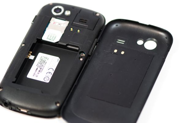
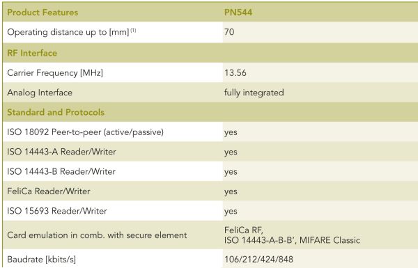
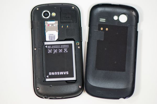
Note that in the previous section I didn’t pop the back off the Nexus S and show you what’s underneath. That’s because what lies beneath is relevant to something new which the Nexus S has that no other Android smartphone has quite yet - Near Field Communication (NFC). NFC in practice is similar to RFID in that it’s a contactless, short range communications protocol - the two also work using magnetic induction and a loop antenna in the 13.56 MHz ISM band. If we finally remove the back of the Nexus S, you’ll see that loop antenna almost immediately.
There are two gold pins on the back of the Nexus S, and a corresponding set of pins on a flex circuit attached to the battery cover inside. If you look closely at an angle, there’s a very clear circular raised area which is that loop antenna, just like we’re used to seeing.
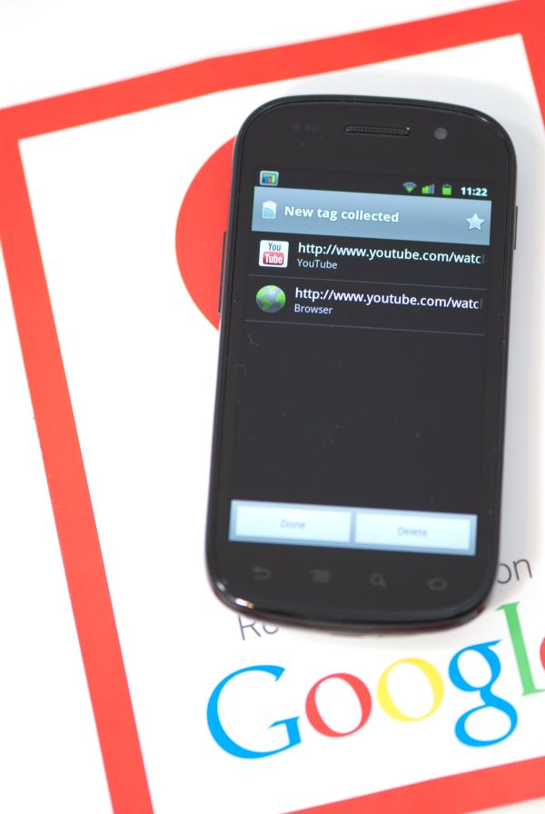
The principle is simple - bring the Nexus S near a smart tag, the smartphone induces some current, and the tag sends back some data. If the phone is on and you swipe it over a smart tag, the device will read it - you don’t need to launch an application or download something like barcode scanner. In its current state, the Nexus S can read these smart tags and act on them, offering functionality similar to a QR code. Currently scanning a tag launches the Google tag reader which shows you what information was in the tag, but other applications will be able to process tags with different intents just like you can open photos and documents with certain extensions using any Android application.


NFC right now works a lot like how QR codes do, but with a few differences. I experimented a long time ago with putting a QR code on my business card, with data in a simple vcard format. If you’ve ever tried this, you’ll quickly discover that the data you can fit on a QR code is rather limited - just under 3 kilobytes. You also have to launch an application, have some ambient illumination, and have a decent camera. QR codes are awesome, don’t get me wrong, but what NFC offers is the ability to do all of that faster, with more data (storage space is a function of the smart tag’s physical size), without launching anything. The tags themselves run around 5 to 25 cents.
But what about communicating with other devices and writing tags? That’s where NFC has the potential to be very interesting. There are three different operating modes for NFC - read/write which allows the device to read a passive smart tag, P2P mode which allows for bidirectional communication between two devices at up to 848 kilobits/s, and finally smart tag emulation, where the device acts like a passive contactless tag. The Nexus S NFC controller is NXP’s latest, the PN544, which has hardware support for all three modes. At present, Android 2.3 only supports read mode, but support for all three are coming.
Google has open sourced NXP’s controller software, and will slowly be updating the SDK with support for P2P mode and card emulation mode. At that point you can imagine applications like Bump leveraging NFC to transmit contact data between phones, using your smartphone as a mass-transit pass (buy your ticket on the phone, then use emulation mode to emulate the pass), or even a payment token.
Google sent along a sample Google Places smart tag with the Nexus S. This is the kind of tag they’ve shipped out in business kits to a number of locations in their pilot city of Portland, Oregon to help launch Google hotpot. This specific tag is big and constructed out of vinyl, but that’s purely because it’s intended to be placed in a storefront window. Other smart tags can be much smaller, like a stickers. Playing around with the tag, I couldn’t find a stiff region or trademark inflexible portion like I’m used to seeing with RFID tags.
Wave the phone over the sticker less than about five centimeters away, and it’ll read the tag. I tried through average thickness plate glass, and it worked fine. It’s insensitive to rotation, but works best when the phone is perpendicular and you couple those two loop antennas together - unsurprisingly. Reading the sample tag is nearly instant, and happens whenever the phone is on - a dialog pops up with info from the tag you’ve read. Inside tag reader is a long list of scanned tags.
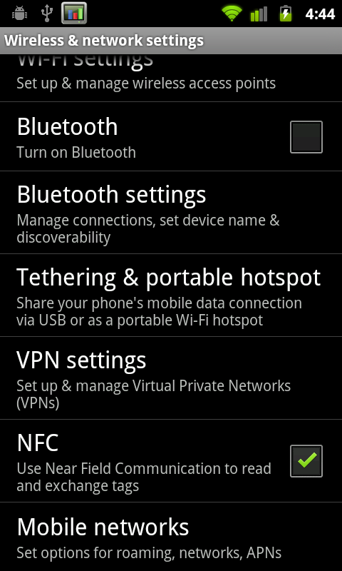
There’s a new settings option inside wireless & network settings for turning NFC on and off. Because NFC is always scanning in the background, it does use some current, but NXP’s documentation puts it at 50 microamps in power down mode with the RF detector active (ready to detect a tag), and 35 milliamps when briefly interacting with a tag. In practice, NFC shouldn’t adversely affect battery life. I haven’t had time yet, but will run our battery life tests with NFC turned on and off, but don’t expect a measurable difference. I’ve included a video of NFC reading the supplied tag in the Android 2.3 overview video on the following pages.
Though there aren’t very many NFC tags out in the wild waiting to be read yet, the same could be said for QR codes just one or two years ago. Hopefully NFC tags start cropping up, along with NFC enabled applications which use the P2P communications mode to transfer data. Of course, other device makers will have to build NFC readers into their devices as well
Android 2.3 - Gingerbread
With NFC out of the way, the next major thing which makes the Nexus S special is, of course, Gingerbread. As an aside, what an apt codename for Android 2.3 given its launch just weeks before the holidays. The new version of Android brings a ton of new stuff to the table and smooths over a few rough spots, so let’s dive in.
User Interface - Lots of Contrast
First up is the most obvious change from 2.2 (Froyo) to 2.3 (Gingerbread) - UI changes, a significant change in iconography, and a number of speed improvements. Probably the most striking UI change is how much black there is everywhere, starting with the notifications bar. The background of the notifications bar is completely black, and the cellular connectivity and WiFi connectivity icons change colors.
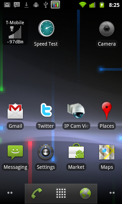
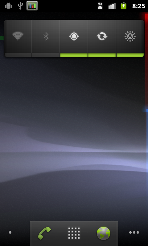
Green indicates an active connection to Google services for syncing your google account, and grey indicates no connection. When you connect to data or change your data connection, there’s a brief transition period when the icons are grey (as expected) due to the loss of connectivity. It’s just a bit confusing at first since the icons never did use to change color. The AM/PM suffix is gone from the current time, and the icons are simplified to be just grey on black. Overall, it’s a vastly more attractive, high contrast look which potentially improves battery life on AMOLED devices.
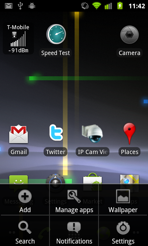
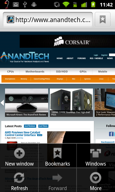
Pulling up the menu on the home screen also reveals some changes. The menu window is transparent like it was with Android 2.2 but given the black treatment the transparency seems more pronounced. There’s also now a shortcut to manage apps in this menu. Virtually all the menus throughout Android have this same white on black style now.
The dialer, launcher, and browser soft buttons at the bottom of the launcher also get some green. Green, orange, and black seem to be Google’s favorite colors for Gingerbread at this point.
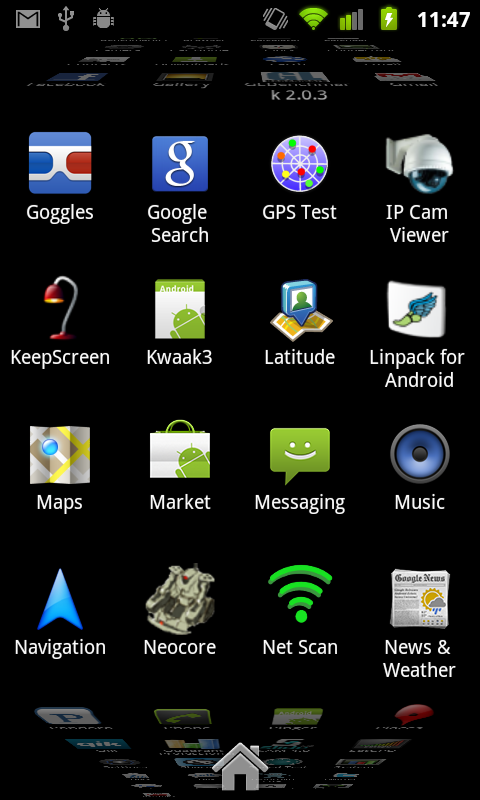
The other major UI change is what happens when you reach the end of a list and tried to overscroll. Previously, when you scrolled to the end, scrolling just stopped. Now, when you hit the top or bottom of some list and overscroll, you get a glow animation at the top or bottom appropriately. I’m reminded of how plastic fogs as you bend it - keep trying to scroll down and it’ll glow more and more orange.
Gingerbread brings some GPU acceleration to task as well. Although not everything is hardware accelerated, almost all animations are, and there’s a definite difference in feel as a result. Things like the application launcher cube and the corresponding fade-in, fade-out which always felt like they chugged along on the Nexus One are way sped up. Not everything is perfect, however. Scrolling in most lists still sends the CPU to 100%, and the browser still doesn’t feel as smooth as it should, but the UI in Gingerbread does feel faster.
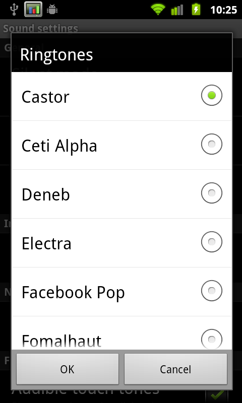
It isn’t really a UI thing, but Gingerbread also includes totally new default notification sounds that are much, much better. The new notification sound is awesome, as are the new ringtones. Previously there was something strangely harsh about all the sounds, the new ones are much more appealing.
Last but not least is the awesome power-off animation. It looks like an old CRT turning off, the contrast of the AMOLED display makes it look believable. Check out our video overview to see it in action.
Applications Manager
The revamped applications manager now shows a bit more information in each pane. For example in the ‘downloaded’ tab, there’s now a bar at the bottom showing how much internal storage is being used and how much remains free. USB storage (which curiously still has a microSD logo) shows how much applications use if they’re on external storage.
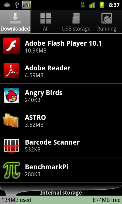
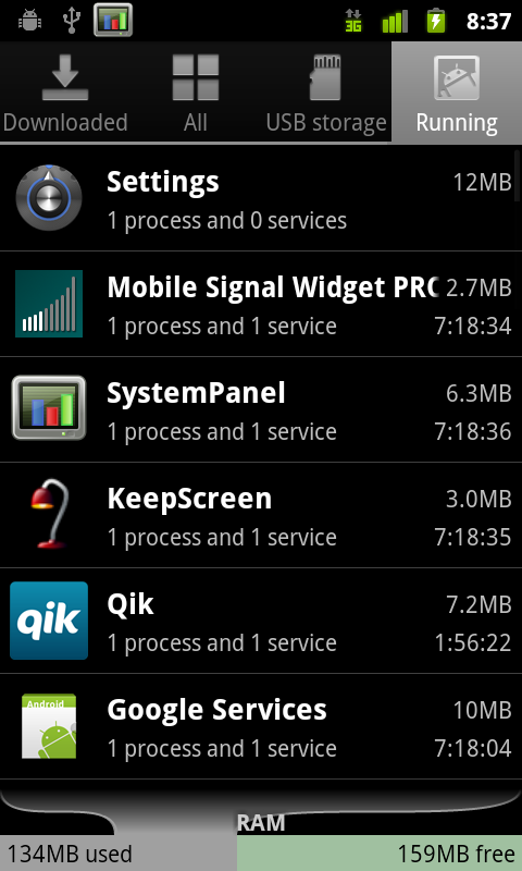
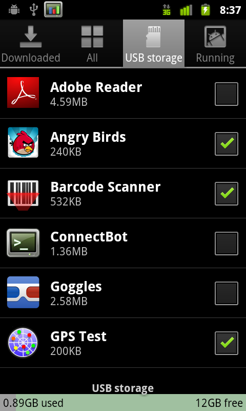
Every application that can be moved shows up here, and the checkbox corresponds to whether they’ve been moved over to external space.
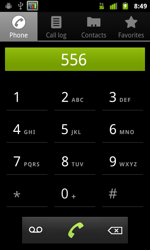
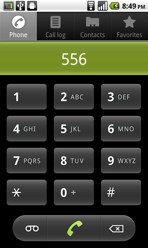
Nexus S (2.3) dialer, versus Nexus One (2.2.1) dialer
The dialer also receives a facelift, getting the high-contrast black treatment the same as most of the 2.3 UI. The buttons are more subtle and glow green when touched instead of orange. Notice how everything that used to be rounded is now square - that’s the other subtle UI change throughout Gingerbread.
Keyboard
I’ve been harping on about Android’s stock keyboard since about day one. It’s had a venerable run as the platform’s prime keyboard, but lacked multitouch and never really felt optimal. As a result, virtually every device vendor ships with a multitouch keyboard of their own (like Motorola), or bundles Swype (which is awesome). I think Gingerbread’s keybord is finally awesome enough that we might not need the former of those two. Side by side really says what’s changed best:
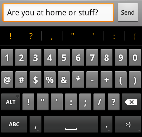
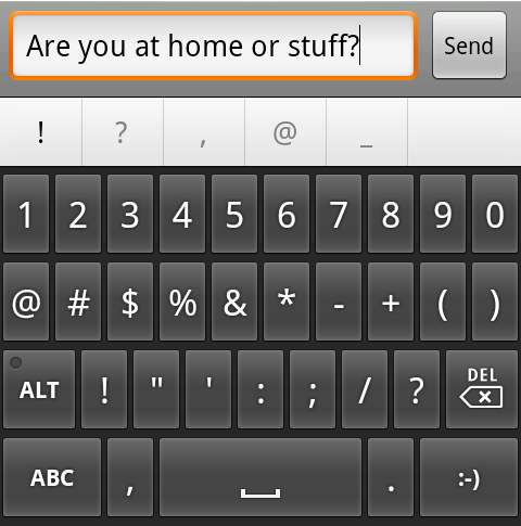
Nexus S (2.3) stock keyboard, versus Nexus One (2.2.1) stock keyboard
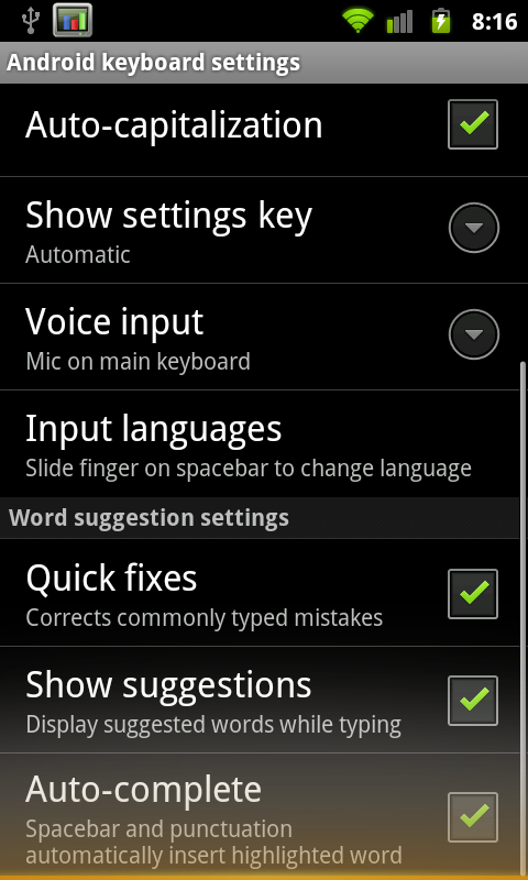
The keyboard takes up less vertical space, there’s more of a margin between keys in the horizontal and vertical direction, and the font is now more readable. Oh, and it’s multitouch. The result is that you can finally do things like shift+<character> or hold down a key for accented characters and simply slide your finger over.
The spacebar now glows orange when Android predicts that one word best fits from the characters you’ve typed. Pressing space inserts that word, and a space, whereas before it was never really clear what you could do.
Overall usability with the new stock Android keyboard is much improved. I can finally type at full speed and use multitouch combos, but the real improvement comes from the subtle change in shape. Though vendors will still probably stick swype on retail devices, the multitouch keyboard in Gingerbread honestly eliminates the need to do much more.
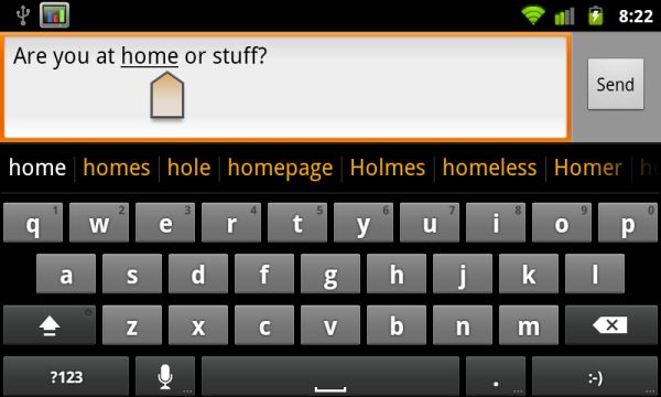
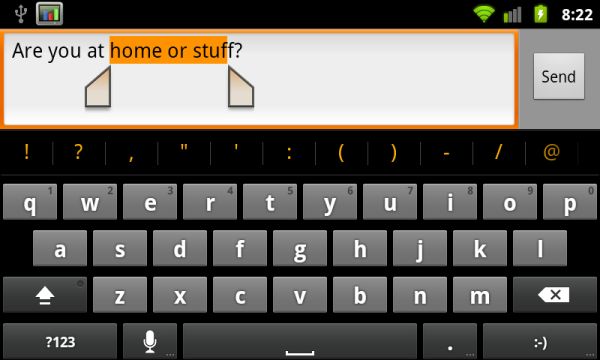
There are also new selection aides for both going back to a word suggestion or replacement, and selecting text to copy and paste with. Tap on a word, and you get the selection icon.
You can drag that around to select words which are then underlined appropriately. If you long press and tap select word, you’ll get two selection handles which can be dragged around to highlight text.
Tap again and you’ll get a dialog to cut, copy, or paste. It’s definitely an improvement. This selection workflow doesn’t require a trackball anymore, which is undoubtedly a contributing reason for why the Nexus S lacks one.
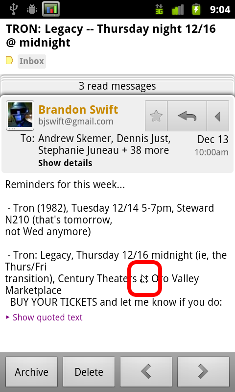
There’s a bit of a rough spot when selecting text from an email, which is a bit of a puzzle. The workflow curiously still involves having to hit menu, more, select text, and then drawing a line across text you want highlighted. What’s odd is that between selecting text and drawing that line, Android literally draws a mouse cursor in the window. I’m not sure what that’s doing there, but it puzzles.
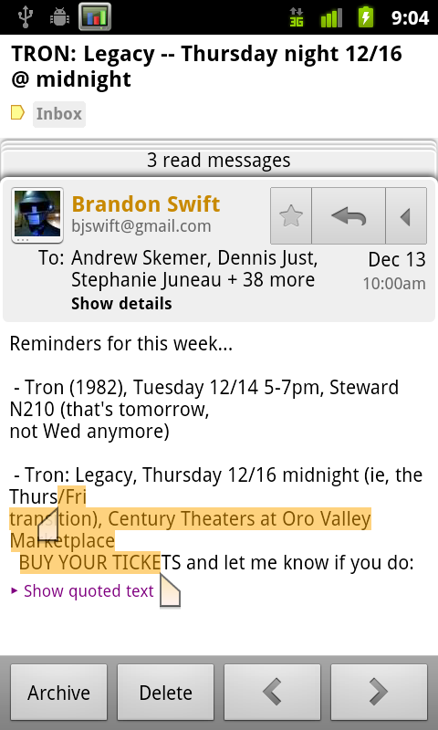
You do get the same selection handles though, which works perfectly. Tapping on the text in a non-editable field simply copies it to the clipboard instantly.
SIP calling Support
Chances are that most people don’t know what Session Initiation Protocol (SIP) is. I used SIP briefly a long time ago and had to refresh myself even, but SIP essentially is a protocol for setting up voice and media streams between devices. For most intents and purposes, that boils down to VoIP, which is what’s done with Gingerbread. The idea is to get a SIP account from a provider which will route calls to PSTN callers, and serve as a gateway for other SIP account holders to call you. With a SIP account, you basically get an internet phone number, and the ability to call normal PSTN numbers for a small fee.
I set myself up with a simple account from voip.ms and configured the Android client to use it. SIP account settings are inside call settings, at the bottom under ‘internet call settings.’ You can choose whether to send all calls over your SIP number, ask each time, or only do it when calling other SIP accounts.
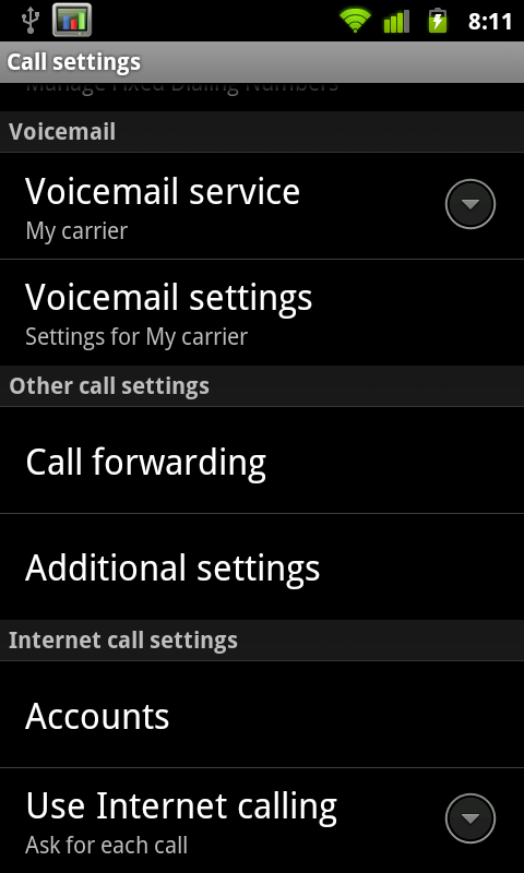
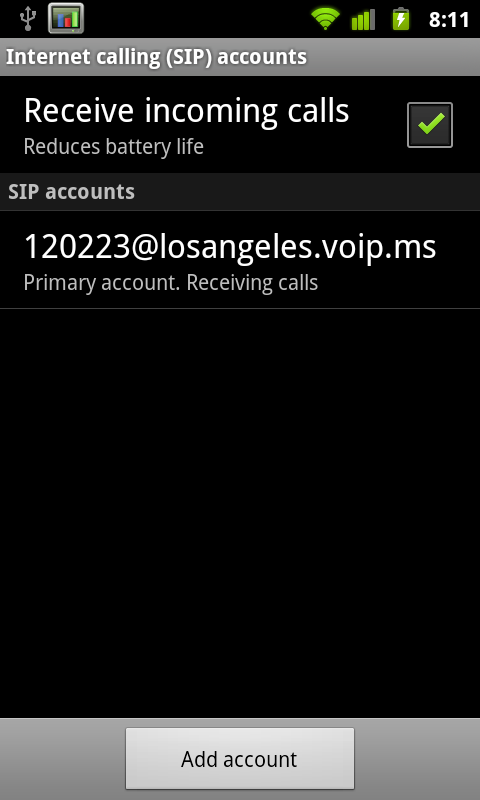
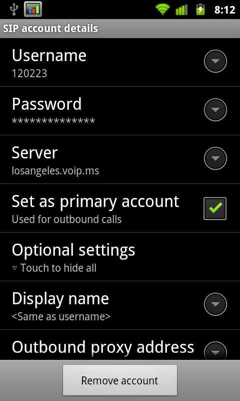
Inside settings you can configure whether or not you want to have an active registration for receiving incoming calls. Of course, keeping that open uses some battery life. Inside the SIP account settings are fields for your credentials, server, and basic configuration. There isn’t any choice about what codec you’re going to use.
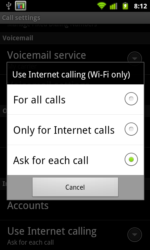
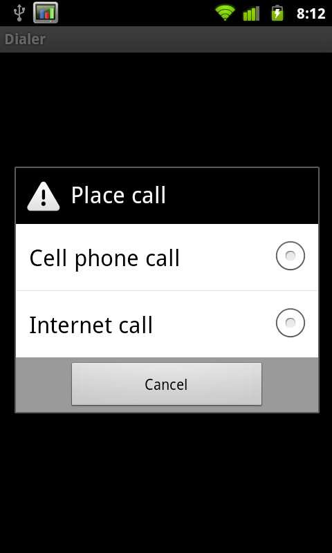
With this enabled, when you go to make a call (if you so chose) you’ll be prompted whether you want to connect over cellular telephony or through VoIP. The disappointing part is that VoIP calling only works over WiFi. Yeah, that’s a completely arbitrary limitation.
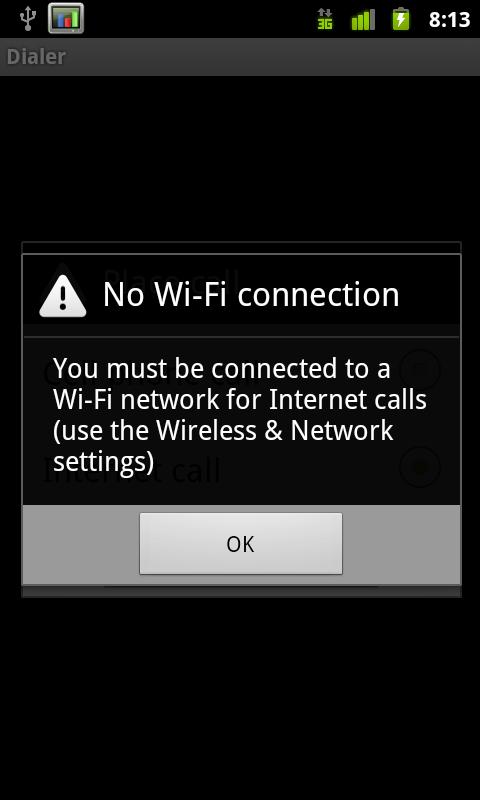

It’s a disappointment that we’re back to playing this game appeasing carriers by putting arbitrary limitations on features. Nokia doesn’t do it on their devices, and yet European carriers haven’t bled themselves to death. I’m sure this limitation will be gone within 10 minutes of someone rooting Android 2.3 on the Nexus S, so why bother?
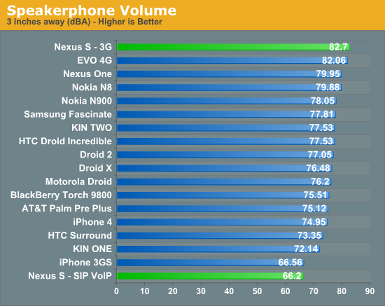
Overlooking the limitations, SIP calling works, and works just fine. It’s integrated into the Android platform natively, just like it should be. Calls come in and go out just like they would if you were calling through cellular voice. I thought voice quality was fine, and people I called said I sounded fine as well. Of course, a lot of that depends on your SIP provider and what routes they have for PSTN, so your mileage may vary. One thing I did notice is that SIP on speakerphone is way, way too quiet, more on that later.
Battery Manager
Probably my favorite change is how much improved the battery use window is. I thought Android previously had a very useful breakdown of battery use based on total consumed CPU time and metrics like how long you’ve had the screen on, but the new graph is even better. From battery use, there’s a graph at the top. Tapping on it brings up a much larger graphical view of consumption.
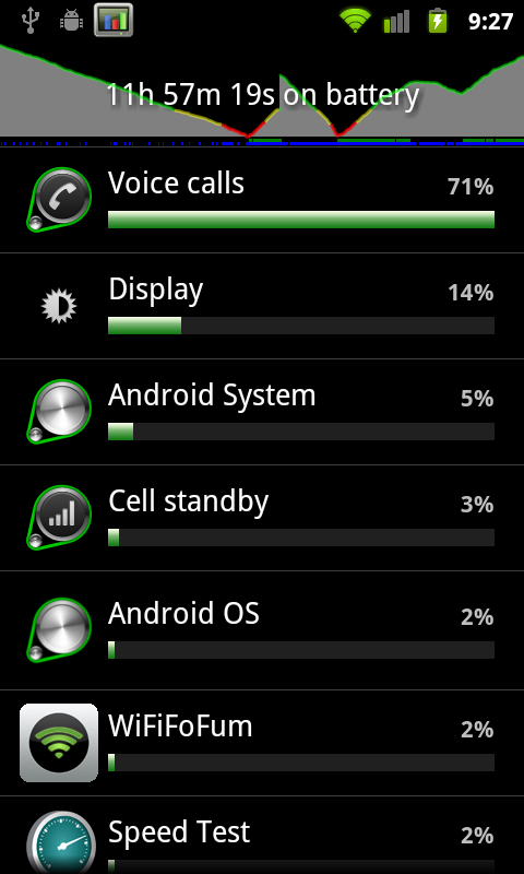
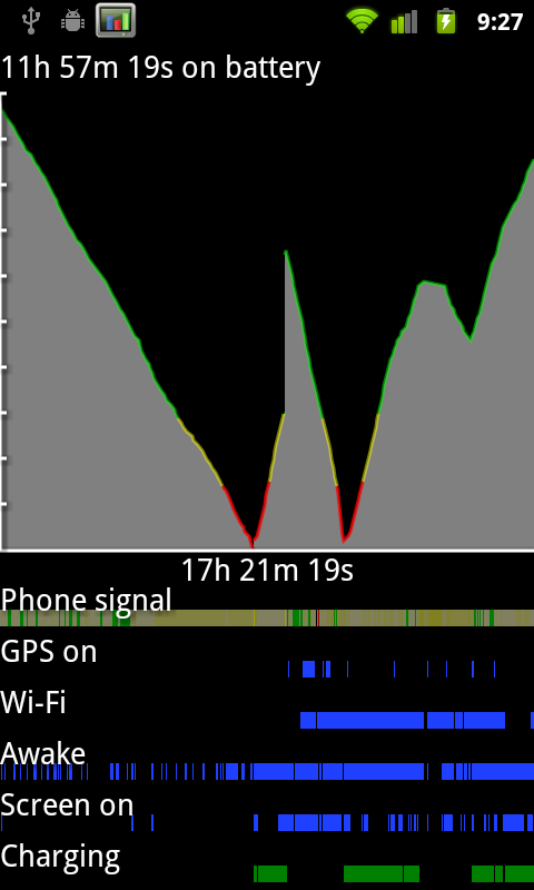
The line corresponds to battery charge. Below it are timelines for signal, GPS, WiFi, screen and device activity. At the very bottom is charging. The result is that you can see how different activities affect the battery, and what uses more charge based on the slope of the line. This is something I’ve done previously with System Panel which shows similar information, but lacks phone signal, GPS, and WiFi tracking.
There’s the total running time for the plot on the x axis, and the total time the phone has been on battery along the top. Every platform needs something like this.
Other Changes
There’s a subtle tweak to the downloads manager, but nothing major, and the stock camera now has a few more features. I’ll discuss the camera changes in the camera section. The rest of the changes are under the hood so to speak. There are updated OpenGL ES drivers which provide more efficiency and faster 3D performance, a concurrent garbage collector for the Dalvik VM which now only takes 3 ms, a kernel update, Khronos OpenSL ES and Khronos EGL support, and a host of new sensor support. The Nexus S notably includes a gyro, and the Android 2.3 stack now includes support for a ton more sensors, including barometer. There’s also native support for front-facing camera, which I’ll show in the camera section.
Android 2.3 also supposedly adds WebM and VP8 support, though I’ve had no success playing back any test videos and am working on encoding some smaller ones to try on the Nexus S. One video played back using the android video player had audio but had no video, other videos played back in the browser showed controls but never started playback.
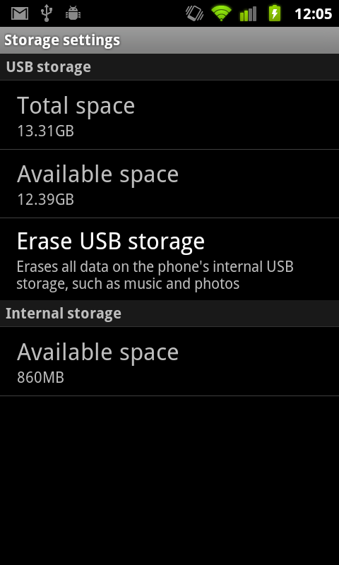
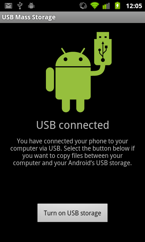
The other new thing is support for devices with no external storage. Instead, internal storage can be partitioned to work like a virtual SD card. In the Nexus S, there’s 16 GB of iNAND, which is SanDisk’s combination of MLC NAND, a NAND controller, and DRAM on a single die, all of which expose themselves over eMMC or eSD. SanDisk’s documentation notes 12 MB/s and 30 MB/s sequential writes and reads, respectively, though there’s no information about how small size reads and writes fare. In essence, iNAND is an embedded storage solution. On the Nexus S, 1 GB is partitoned to act like traditional “internal storage,” and 15 GB are partitioned as “USB Storage” which in principle acts just like external storage used to.
Overall Gingerbread brings a lot of notable improvements, the majority of which are pretty much immediately obvious. New keyboard, a tweaked graphical style, better copy and paste, better power and applications management tools, SIP VoIP calling natively, NFC compatibility, support for devices with extra large screens such as tablets, and interestingly EVDO Rev B support in the telephony manager. If you’re interested in all the changes, check out the official Android SDK 2.3 platform notes (http://developer.android.com/sdk/android-2.3.html). That said, there are still a few things I wish Gingerbread included.
There are a few places in the UI where the old silver-colored UI shines through that could’ve benefited from some of the new black/contrasty goodness. The address bar in the browser and the messaging application both have lots of chrome instead of black. It’s also a bit puzzling why there isn’t any new first-party support for video chat given the front facing camera. Google could have leveraged its already-popular chat infrastructure (Google Talk) to provide a seamless video chat experience across mobile and desktop. Instead, there’s really nothing to do with the front facing camera other than take pictures of yourself or use a marketplace solution to video chat, all of which I’ve enjoyed marginal at best success with.
Small Fixes
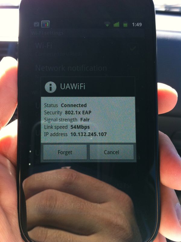
There are a few other changes that I consider fixes which Android 2.3 has that aren’t directly noted. Chief among them are working 802.11x EAP support, which I can confirm works perfectly. I tested on an enterprise-level 802.11x network which uses PEAP with certs and had no problems authenticating, staying online, and even handing off.
The other notable thing I tested was to find out whether the messaging (SMS/MMS) database is any better. In Android 2.1 and 2.2, I found over and over again that the whole thing would slow down after getting a day or more worth of texts inside. For me, that translates to a couple hundred. To test, I sent myself 200 messages and had friends bombard me best they could with everything they could muster. All total just over 500 in under an hour. The messaging application remained speedy and hasn’t become unbearably slow like I’m used to saying. As best I can tell, this seems way improved if not entirely fixed.
Finally here's a video I put together with all the changes and a comparison with the Nexus One loading the AnandTech homepage:
Contour Display
I’ve already touched on a lot of what there is to be said about the Nexus S display. It’s an unbroken piece of gently curved glass, and underneath is the same 4” Super AMOLED display we saw on the Galaxy S line of phones. Pentile is still here, love it or hate it - best I can tell it literally is the same thing as in Galaxy S devices. Brightness is a little better on the Nexus S, but you still get perfect blacks that look awesome on the new black-heavy Gingerbread UI.
The Nexus S display is indeed excellent. We’ve got full viewing angles galleries and uniformity shots. Notably, there were no color or luminance uniformity issues we could pick out on our Nexus S - it appears flawless. Again the banding in our RGB gradient image is due to the gallery application color depth, which remains unchanged sadly.
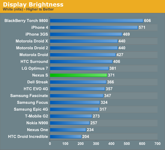
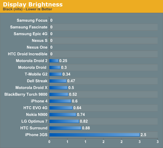
The Nexus S also gets an oleophobic coating, something the iPhone 3GS got a lot of press with. I found that after a few months and wipings, the 3GS lost its amazing ability to repel oils. So far the Nexus S has withstood copious amounts of finger and face grease, coming clean with a quick brush on the shirt or lens cloth.
The curved surface is more of an aesthetic extra than an ergonomic feature, but it still is impressive that this is possible. The nice thing about having the front face in compression (from the concave shape) is that scratches probably don’t affect the glass’ structural integrity nearly as much as they would in tension. Glass is just stronger in compression rather than tension - the reason is primarily because cracks don’t propagate as well on surfaces in compression as they do in tension. Viewing angles on the Nexus S are very good, again the curvature is small enough that it doesn’t adversely impact vertical viewing angles.
Capacitive touch was always a major problem for me on the Nexus One. Anand noted it in his Nexus One review, and I experienced it firsthand with mine. I exchanged it and got one some months later with much better response and far fewer false touches, but compared to other flagship devices something always just felt wrong. Luckily the Nexus S has no such issues - touch is flawless, multitouch is excellent as well.
Camera Analysis
If there’s anything to be learned in a straight comparison between the Nexus One and Nexus S, it’s again that megapixels don’t matter. I never was a huge fan of the Nexus One camera - there’s a strange undersaturation in some images, and that extra glare from having another layer of plastic between the lens and your object where grime could collect.
The Nexus S is overall much improved, but still not perfect. Again, the obvious analogue here is to the Galaxy S, but side by side quality on the Fascinate looks markedly superior in our lights-on test. With the lights off and the flash set to auto, the Nexus S is much improved. The reason is that the stock camera now correctly illuminates the object while running the autofocus routine - the result is that in the dark shots are now focused properly. Further, you get an idea for whether the flash reaches far enough to actually do any good. Kudos to Google for fixing this.
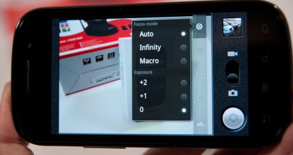
Even more Kudos, however, for adding some manual focus settings. Tap on the settings button, and you can select from Auto, Infinity, and Macro. Objects beyond hyperfocal distance are essentially in focus when the camera is focused to infinity, so if you’re shooting photos beyond a certain distance and don’t want to bother with wasting time focusing, infinity is super useful. Likewise, macro gets you the closest possible focus.
The back facing camera isn’t the best we’ve seen, but it’s an improvement from the Nexus One. In our lightbox test, there’s still a lot of missing dynamic range and detail in the texture on the Exacta camera, but there’s so much more contrast compared to the Nexus One.
I took photos in our bench location, in the light box with lights on and off, and then just casually while I carried it around.
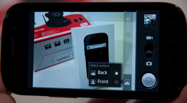
There’s also a button along the row of other camera settings buttons for changing to the front facing camera. When you’re in the front facing camera, a few options go away. You can’t change resolution, and focus controls are also obviously gone since the camera is fixed focus. Resolution is VGA. Quality on the front facing camera isn’t spectacular, but then again the aperture diameter on that camera is barely 1 mm. The front facing camera also flips-images horizontally after capture.
What’s odd about the Nexus S is that video encoding is only 720x480, not the HD 720P we’re used to seeing with the Galaxy S. Video is encoded in H.264 with AAC audio, at an average bitrate of 3,664 kilobits/s on the back camera. The front camera records at 640x480 with the same codecs at just over 1 megabit/s.
I noticed that audio doesn’t quite sync up in the front facing camera video, which is a bit unnerving to say the least. The back camera is fine, and seems relatively smooth. Not having 720P is a disappointment, hopefully someone unlocks HD recording on the Nexus S same as was done on the Nexus One. It certainly isn’t a matter of the SoC not being powerful enough if Galaxy S can do it.
I took a video with the front and back facing camera at our usual location:
Rear Camera:
Front Camera:
And one more video in a different location per some commenters asking for an indoor to outdoor progression for gauging quality.
Baseband and Cellular
On the far left side of the Nexus S is another region with the indicative flex/tape appearance that belies an antenna. From experimentation, this region is for WiFi and Bluetooth. The active region for the cellular region is at the very bottom of the Nexus S, as it is with the overwhelming majority of other phones.
We ran our normal suite of attenuation tests on the Nexus S and compared to the rest. The Nexus One had a mini antennagate of its own back when it came out, no doubt Google and Samsung both wanted to avoid a similar situation with the Nexus S. The table says it all - attenuation from holding the device is in line with the 15 dBm or so we’re used to seeing. There aren’t any attenuation issues with the Nexus S.
| Signal Attenuation Comparison in dB—Lower is Better | |||||||
| Cupping Tightly | Holding Naturally | On an Open Palm | |||||
| Nexus S | 13.3 | 6.1 | 4.3 | ||||
| Samsung Fascinate | 10.0 | 5.0 | 0.0 | ||||
| Droid 2 | 11.5 | 5.1 | 4.5 | ||||
| BlackBerry Torch | 15.9 | 7.1 | 3.7 | ||||
| Dell Streak | 14.0 | 8.7 | 4.0 | ||||
| Droid X | 15.0 | 5.1 | 4.5 | ||||
| iPhone 4 | 24.6 | 19.8 | 9.2 | ||||
| iPhone 3GS | 14.3 | 1.9 | 0.2 | ||||
| Nexus One | 17.7 | 10.7 | 6.7 | ||||
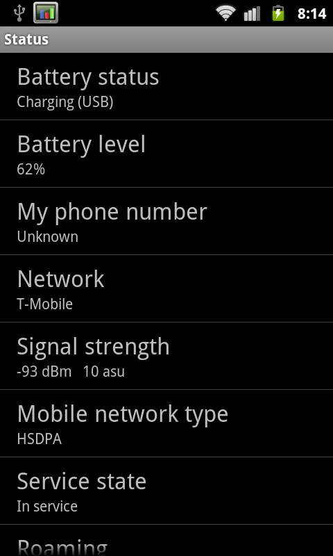
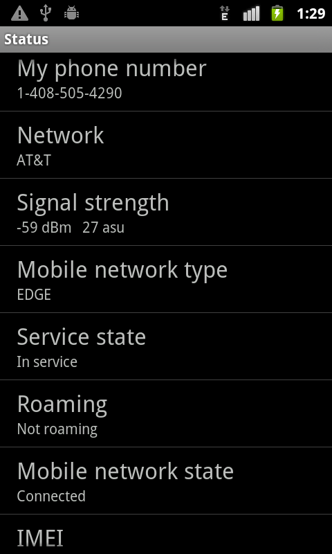
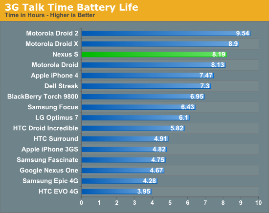
I did notice however that the Nexus S likes falling back to EDGE from UMTS and HSPA a whole lot. I’ve only had a limited time to play with T-Mobile’s 3G turned 4G network, so I’m not crying foul, but I did notice that voice calls often migrate over to EDGE if you’re in marginal (but not awful) UMTS coverage, and data does the same from time to time. During my battery life call tests, I had to re-initiate the call three times due to the Nexus S falling from UMTS (3G) voice to GSM and not wanting to pollute data. Signal in my office is admittedly on the lower end at -91 dBm, but still within an acceptable range. The phone will automatically hand back on to UMTS, then to HSPA after a while, but the fallback to EDGE seems much more aggressive than I’ve ever remembered any device being.
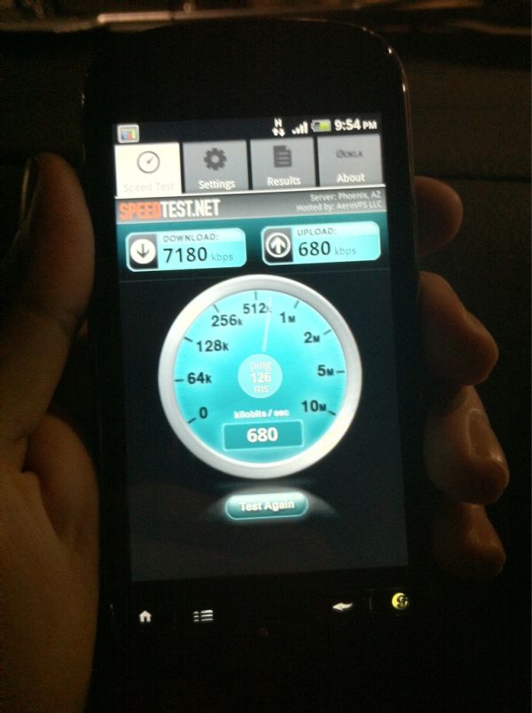
I’ve run over 100 speedtests in the short three or so days I’ve had the Nexus S in my HSPA+ enabled T-Mobile market. I saw maximum throughput of 5.1 megabits/s down, 0.64 megabits/s up and average speeds of 2.55 megabits/s down, 0.51 megabits/s up over that time using the Speedtest.net application to a sever in the same city.
The Nexus S is a tri-band HSPA device and quad-band GSM device as shown in the table above. Just like the launch-day Nexus One, the Nexus S won’t work on any 3G in the USA except T-Mobile. You’ll get EDGE if you stick an AT&T SIM inside.
| Nexus S - Network Support | |||||
| Tri-Band HSPA | 900 / 1700 / 2100 MHz | ||||
| Quad-Band GSM/EDGE | 850 / 900 / 1800 / 1900 MHz | ||||
| HSDPA/HSUPA | 7.2Mbps / 5.76Mbps | ||||
When the Nexus One came out - before I signed on with AnandTech in this capacity - I wrote that the problem with the Nexus One concept was that the hardware didn’t have a pentaband UMTS radio. The promise was completely carrier-agnostic phone shopping, yet the only choice you could get with 3G UMTS/HSPA support was T-Mobile. Of course, an AT&T version came later, but the problem remained - hardware wasn’t carrier agnostic, so how could the promise ever be a reality? I’m disappointed that the same thing applies to the Nexus S, although this time around there’s no guarantee we’ll get an AT&T version at all. There are obvious engineering challenges to building pentaband UMTS/HSPA hardware, but if Nokia can do it with the N8 and a select few other phones can pull it off, it can’t be that hard.
The other thing on everyone’s mind is how much HSPA+ 21.1 differs from HSDPA 7.2 or 14.4 in practice. Well, I’ve been sitting on a myTouch 4G for a while waiting for some T-Mobile service to test with, and in comes a Nexus S with a T-Mobile SIM card. Naturally, I carried the two with me and ran tests at almost the same places. The results are pretty interesting. On the myTouch 4G, I saw maximum throughput of 7.18 megabits/s down, and 0.66 megabits/s up, with an average of 2.75 megabits/s down, and 0.56 megabits/s up.
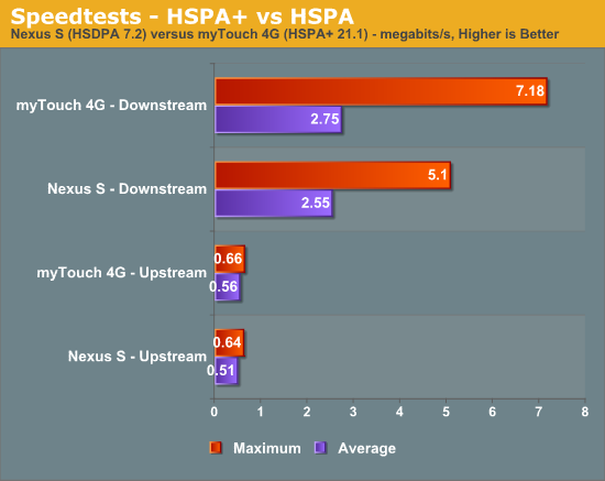
The subtle difference in most cases actually makes sense. The difference between HSDPA 14.4 and HSPA+ 21.1 is just a change in modulation from 16-QAM to 64-QAM. The symbol rates for those two are the same, they just differ in the modulation scheme by a factor of 4 more decision points. Since 64-QAM requires better SNR over 16-QAM, we really only see that modulation scheme when we’re close to the tower. When that’s the case and SNR is really good, HSPA+ of the 21.1 sort does pay off, and you get impressive speeds such as that 7.18 megabit/s speedtest. However, when you’re even just half way out of the cell radius, SNR is most likely no longer good enough for 64-QAM to maintain an acceptable frame error rate, and you’ll fall back to 16-QAM just the same. In reality, HSPA+ only becomes super interesting when MIMO is added into the picture, and even moreso when dual-carrier links are added. MIMO lets us multiplex the signal spatially, and multi-carrier effectively aggregates carriers together for a faster link.
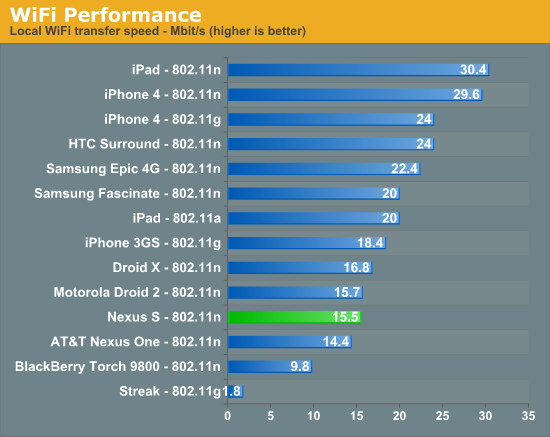
WiFi range on the Nexus S is what I’m used to seeing for smartphones. I make it to the same place right at the curb with the Nexus S as I do other devices. The Nexus S has 802.11 n/b/g support, and I saw it connect at 72 megabits/s on my 802.11n network. In testing, the Nexus S downloaded our local 100 MB PDF over at 15 megabits/s over WiFi.
Rounding out this section is a note that the Nexus S suffers from none of the GPS issues that plague the Galaxy S. I tested thoroughly - fixes are fast and accurate over GPS and work like they should using Google location services with WiFi trilateration.
Speakerphone, Voice, Battery
So I mentioned earlier that the Nexus S speakerphone is a bit quiet when calling with SIP VoIP. I think that’s an understatement - it’s extremely quiet when making a SIP call. Again these tests are the same way we’ve run all our other speakerphone tests - 6” above the device with our USB datalogger.
The Nexus S is louder than the Nexus One for normal calls, however. Speakerphone at maximum volume has a bit of distortion, but one volume notch down it goes away entirely. I thought speakerphone voice quality was very good. Earphone volume is acceptable if a tad on the quiet side, but then again I think the same thing for nearly every other handset. Voice quality on the earphone is exactly what I’m used to for UMTS voice. There’s software noise cancellation for video, but I can’t locate a second microphone on the Nexus S for noise cancellation in calls. Having that second microphone was a big deal for the Nexus One, so I’m surprised it’s absent in the Nexus S - if it’s there, I at least couldn’t find it.
Battery life on the Nexus S is actually shockingly close to the Nexus One. So much so that it’s honestly scary in the case of 3G and WiFi browsing time. 3G Talk time on the Nexus S is far better than the Nexus One. We of course ran our normal suite of tests for 3G and WiFi browsing time, loading through a couple dozen pages with the screen at 50% brightness, extraneous processes killed using a task killer, and the display on. For the talk time test, we play music at both ends, allow displays to sleep, and take the total talk time. I noted that the Nexus S fell back to GSM voice three times, each time I reinitialized the call after the Nexus S reacquired UMTS. I’m going to run this test again and update if necessary - just know that’s what happened if these numbers change.
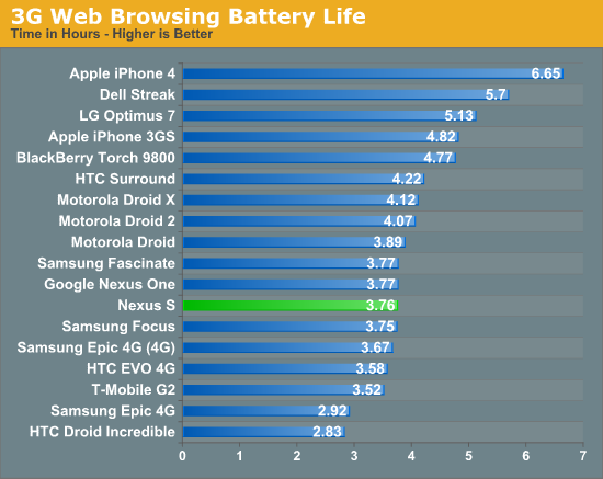
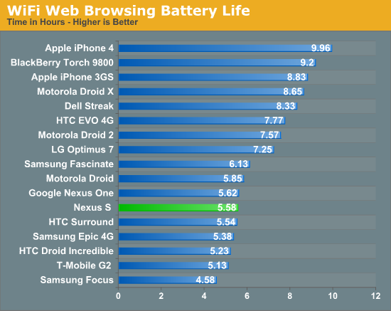
The Nexus S includes a slightly bigger battery than the Nexus One (5.55 Whr versus 5.2 Whr). I’m a bit surprised battery life didn’t improve just a bit more between the two.
Performance
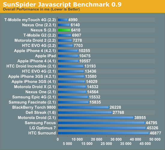
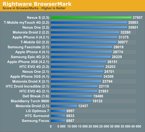
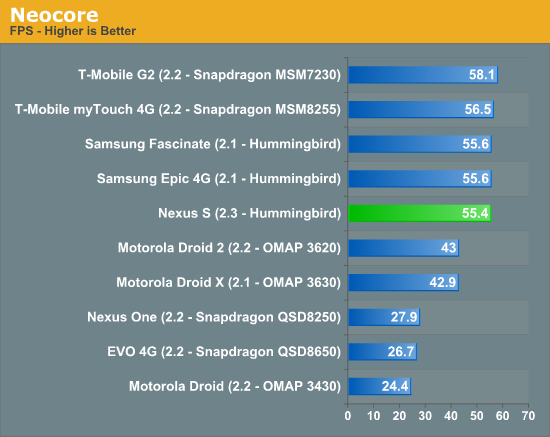
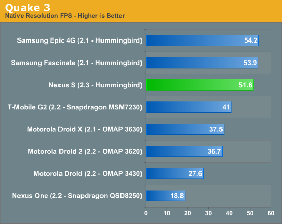
We’ve already seen that Hummingbird is a competent performer in the Galaxy S line of devices, but haven’t gotten to see how that performance changes with the updated Dalvik VM that 2.2 (and thus 2.3) brings. Android 2.3 doesn’t bring as big of a performance boost, and it’s hard to tell in the first place given the lack of any other Hummingbird devices running Android 2.2.
Regardless, performance overall is around where it should be. I’ve included numbers from the myTouch 4G which I’ve begun testing, and Vivek’s G2 as these show performance of the new 45 nm Snapdragons which is also competent. Adreno 205 comes close to but falls short of PowerVR SGX 540 in every case. Note that Neocore is now clamped by vsync across both the new Snapdragons and Hummingbird - those numbers literally are the cap.
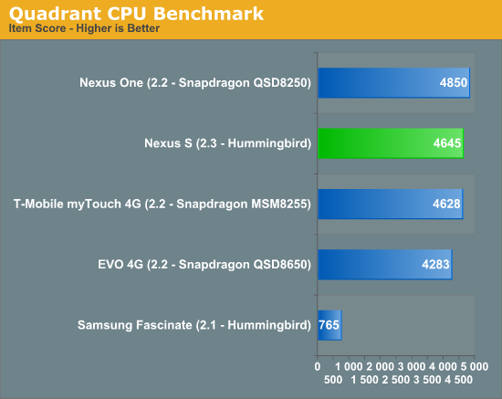
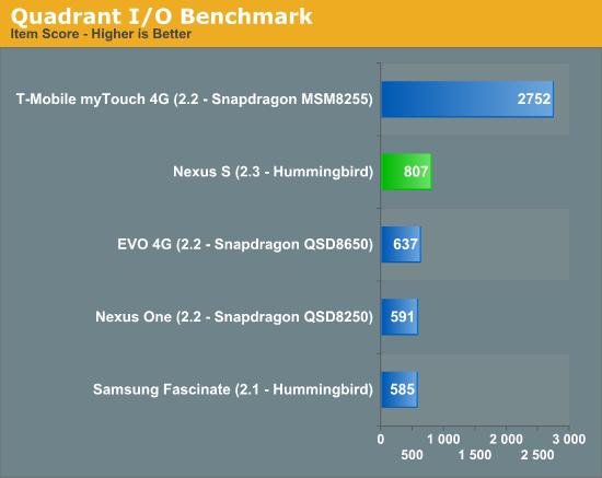
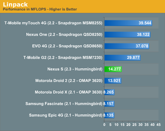
We also continue to see the strong lead in Linpack from Qualcomm Snapdragon’s much faster FPU which neither of the A8s can catch. That said, Hummingbird does see a jump over the numbers it posts running Android 2.1.
Conclusions and Final Thoughts
Right now, there's no doubt about it that the Nexus S is the best Android phone on the market, but that's almost purely a function of its status as the only Android device with Gingerbread at the moment. That isn't to say the hardware choices Google made with Samsung are bad, they're just a bit puzzling. Lacking external storage is hard to swallow for enthusiasts, even if the "USB Storage" partition works just like an SD card when connected over USB. Not having an HSPA+ baseband - even if it doesn't do much in terms of actual realizable speed at the moment, T-Mobile is already fast - is a checkbox feature that will give many pause as well. That said, the Nexus S does have notable extras that other phones lack such as the contour display and an NFC controller, but those aren't of immediate utility. NFC looks like something a number of other smartphone makers are going to get serious about supporting, and Google plans to quickly add support for P2P and card emulation modes. Using a smartphone as a hotel key, bus pass, or movie ticket sounds like something even I would've stuck firmly in the science-fiction category a decade ago, but that's what those modes will enable.
If the previous Nexus One was any indication, the real value from owning an actual google-branded phone is that you get updates first. Carriers and other vendors should take note - people want software updates, and fast. Promise quick platform updates, deliver them on the date you set, and you'll build some brand loyalty.
The Nexus name should always mean that the device is something of a rubric for other Android devices on the same software platform. It's the hardware the Android team will be carrying around when thinking about what changes to make to the platform, it's the device developers will likely use as a baseline reference design for performance and testing. Plus, it's stock Android - there's no T-Mobile branding, no HTC Sense, no carrier skins. Going forward, there's also going to be no moratorium on carrier-skinning with Gingerbread, so getting a device with pure unadulterated Android like the Nexus S really is a value-added proposition.
Going forward, I hope Google continues to make a Nexus device which represents their own pure vision of the smartphone space. The G1 served that purpose, then the Nexus One, now the Nexus S takes that role. I'm still waiting for that completely carrier-agnostic device with pentaband UMTS support and maybe some CDMA/EVDO goodness tossed in there, but that's likely a long ways off.
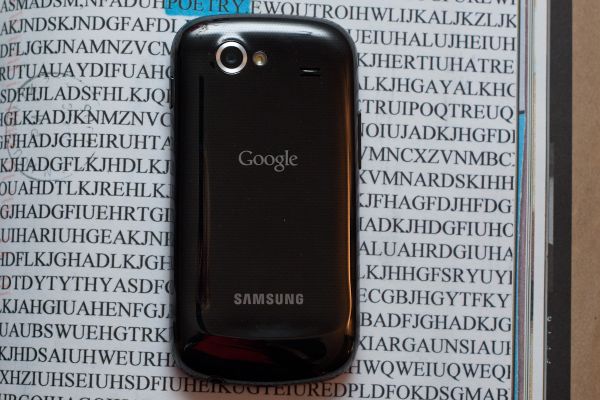 Photo courtesy Sarah Trainor
I really feel like putting all my weight behing a total recommendation of the Nexus S would be easier were it not on T-Mobile alongside two equally competent, HSPA+ enabled, 45nm Snapdragon packing devices, namely the G2 (which also has stock Android) and the myTouch 4G. The 45nm Snapdragons with Adreno 205 GPUs have proven completely competent performers (and I'm not even finished testing the myTouch 4G yet), with Adreno 205 performing just shy of SGX 540, but worlds better than Adreno 200. If HSPA+ support really matters to you, even if it isn't the MIMO/Dual-Carrier variety that's going to make a huge difference quite yet, you're honestly better off getting one of those two phones and waiting the months (or however long it will be) before they see a Gingerbread build. If you want Gingerbread (and also awesome hardware) right now, get the Nexus S.
The other big question mark on the horizon is what dual-core SoCs from TI, Qualcomm, and NVIDIA will do to the smartphone landscape. It's possible that we'll see battery life improvements alongside another dramatic change in performance, but success all depends on how polished software, drivers, and the devices themselves are. It's a gamble for certain to wait and see what hardware will crop up at CES, but one month isn't very far away. For now however, the Nexus S is king of Android.

