Original Link: https://www.anandtech.com/show/10559/the-samsung-galaxy-note7-s820-review
The Samsung Galaxy Note7 (S820) Review
by Joshua Ho on August 16, 2016 9:00 AM EST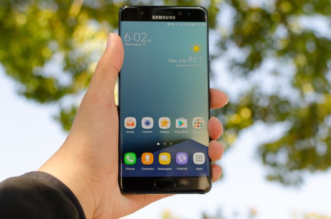
This year has been difficult for smartphones, which is a bit of a paradox when you consider just how much better things have gotten compared to last year. With Snapdragon 820, 650, 652, and 625 we’ve finally moved past the shadow of the Snapdragon 810, 808, and 617/615. While there were Android devices that shipped with the Exynos 7420, they were often paired with a modem that was not necessarily the most power efficient. Despite all of this, there seems to be a general disappointment with smartphones. People are increasingly finding it hard to justify phones like the HTC 10 or Galaxy S7 with competition from OnePlus, Xiaomi, and even Apple with their iPhone SE.
In this context the Galaxy Note7 brings much of the flavor of the Galaxy S7 edge, but blends it with the S-Pen of the Note line and a few new features like the iris scanner. If you were paying attention to the industry with the launch of the Galaxy S6 and Galaxy Note5, it’s very much more of the same rather than the major redesigns that we saw moving from the Galaxy S5 to the Galaxy Note 4. To better illustrate what I mean we can take a look at the spec sheet.
| Samsung Galaxy Note5 | Samsung Galaxy Note7 | |
| SoC | Exynos 7420 4x Cortex-A57 @ 2.1Ghz 4x Cortex-A53 @ 1.5GHz Mali T770MP8 (Samsung 14LPE) |
Snapdragon 820 (US) 2x Kryo @ 2.15GHz 2x Kryo @ 1.6GHz Adreno 530 Exynos 8890 (ROW) 4x Exynos M1 @ 2.3GHz 4x Cortex A53 @ 1.6GHz Mali T880MP12 (Samsung 14LPP) |
| RAM | 4GB LPDDR4 | 4GB LPDDR4 |
| NAND | 32/64/128GB NAND (UFS 2.0) | 64GB NAND (UFS 2.0) + microSD KLUCG4J1CB-B0B1 UFS 2.0 1 lane MLC |
| Display | 5.7” 1440p SAMOLED |
5.7” 1440p SAMOLED Dual Edge |
| Network | 2G / 3G / 4G LTE (Category 6/9 LTE) Region Dependent |
2G / 3G / 4G LTE (Category 12/10/9 LTE) Region Dependent |
| Dimensions | 153.2 x 76.1 x 7.6mm, 171g | 153.5 x 73.9 x 7.9mm, 169g |
| Camera | 16MP Rear Facing w/ OIS f/1.9, 1.12µm, 1/2.6" (Sony IMX240, Samsung S5K2P2) |
12MP Rear Facing w/ OIS, f/1.7, 1.4µm, 1/2.6" (Sony IMX260, Samsung S5K2L1) |
| 5MP Front Facing, f/1.9, 1.34µm (Samsung S5K4E6) |
5MP Front Facing, f/1.7, 1.34µm (Samsung S5K4E6) |
|
| Battery | 3000 mAh (11.55 Whr) | 3500 mAh (13.48 Whr) |
| OS | Android 5 w/ TouchWiz (At Launch) |
Android 6 w/ TouchWiz (At Launch) |
| Connectivity | 2x2 802.11a/b/g/n/ac, BT 4.2 microUSB, USB2, GPS/GLONASS/Beidou NFC, MST |
2x2 802.11a/b/g/n/ac, BT 4.2 USB-C, USB3.1, GPS/GLONASS/Beidou NFC, MST |
| Fingerprint Sensor | Capacitive by Synaptics | Capacitive by Synaptics |
| SIM | NanoSIM | NanoSIM |
When we look at the spec sheet, the Galaxy Note7 is almost identical to the Galaxy S7 edge, but sees a minor bump in size and the addition of an S-Pen. Of course, the Galaxy Note7 is a big step up from the Note5, but for perspective it's generally more interesting to look at recent smartphone launches to contextualize the device under test. For the first time we’re really starting to see the impact on internal volume that the S-Pen has, as the Galaxy S7 edge is slightly smaller than the Galaxy Note7 but actually has a larger battery, which wasn’t the case when comparing the Galaxy S6 edge+ and Galaxy Note5. Of course, the S-Pen does also provide functional value if regularly used, so it’s a trade-off that has to be considered by the end user. While we’re still on the subject of the S-Pen, it no longer breaks the phone if inserted backwards. It also has a thinner 0.7mm tip and an extra bit of precision for pressure sensing, but we'll have to take a closer look a bit later here.
Other than the addition of the S-Pen and a slightly larger display, the Galaxy Note7 also gains a USB-C port relative to the Galaxy S7 edge, which makes the connector reversible. It also supports USB 3.1 Gen 1 but the cable in the box is USB 2 only, which seems to be a popular trend with a number of recent flagships. There’s also the addition of the iris scanner, which supports iris scanning from one pair of eyes. Other than these changes, the Galaxy Note7 at a high level is rather difficult to tell apart from the Galaxy S7 edge.
Design
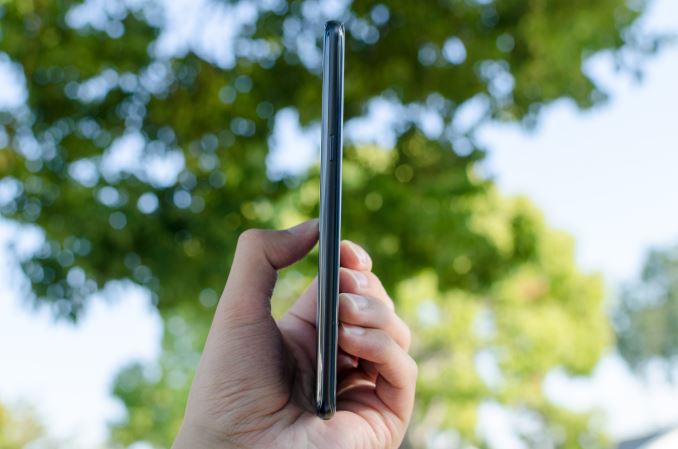
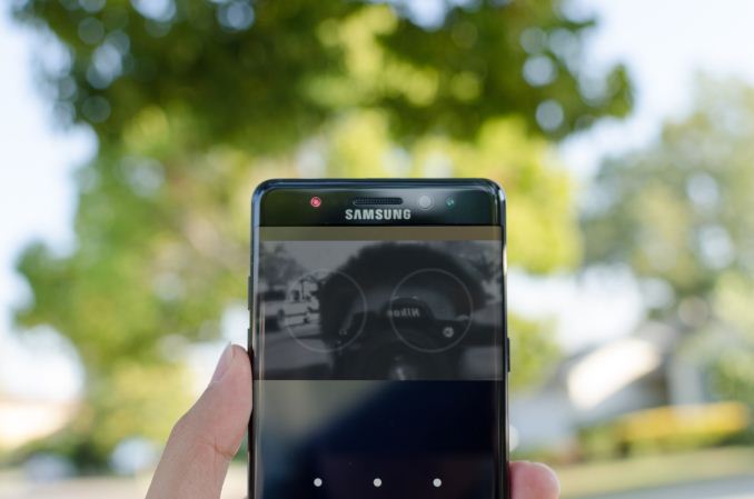
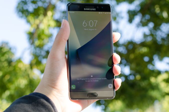
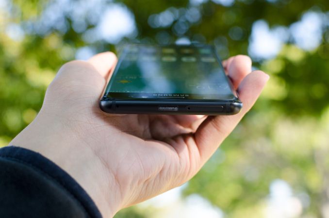
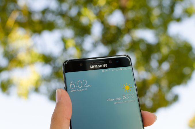
The similarities between the Galaxy Note7 and Galaxy S7 edge don’t really end at the spec sheet either. Both devices have the same curved pebble-like design on the front with a physical home button and pretty much the only noticeable difference here is that the curve of the edge display is changed. There are also some extra sensors to enable the iris scanning functionality at the top near the earpiece such as the IR LED and IR camera, but Samsung is sticking to what works for them here.
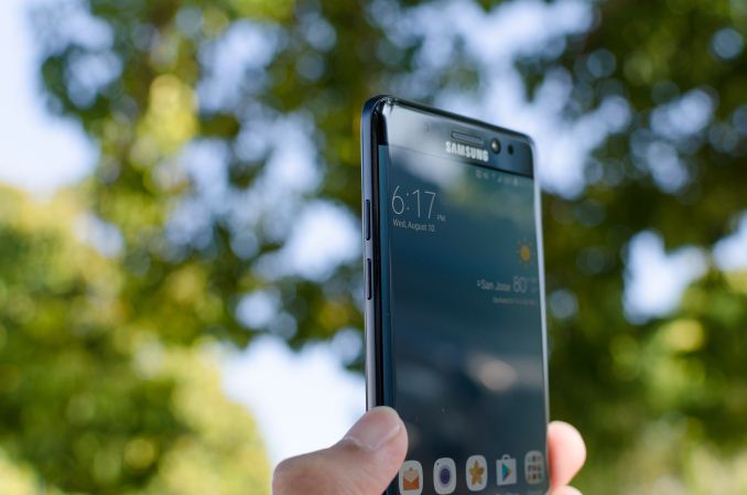
Along the sides of the phone we start to see some of the differences as the device has the same radius of curvature on the front and back of the phone so the front and rear glass feel identical when your finger approaches the edge of the device rather than a more severe edge on the display lens and a gentler one on the back as seen in the Galaxy S7 edge. This also causes some noticeable changes in viewing angles which we’ll address in later sections. What is worth talking about right now is how edge swipes seem inconsistent in the sense that the edge panel requires a swipe that basically starts right at the edge of the display, while apps seem to do best when an edge swipe starts at the junction where the display begins to curve. This kind of thing is fairly annoying for the first few days you use the phone but eventually you get used to it, but in some ways this is a missing step of usability.
The front and rear glass of the Note7 meet with an aluminum frame that functions as the backbone of the phone. As the glass back is epoxied to this aluminum frame, there is no removable battery, but this simplifies internal design and volumetric efficiency. The LG G5 continues to be the last notable flagship with a removable battery and has notable issues with volumetric efficiency as a result, so I’m not sure it necessarily makes sense with the kinds of designs that Samsung has been pursuing for the last year and a half, but it would be nice to see some method of removing the back cover without using a hair dryer if only as a concession to the likelihood of shattering a glass back in a drop.
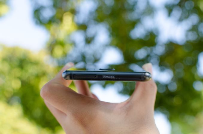
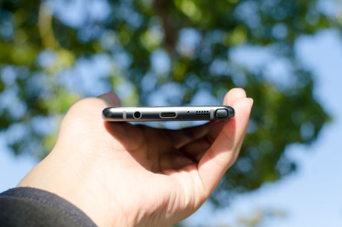
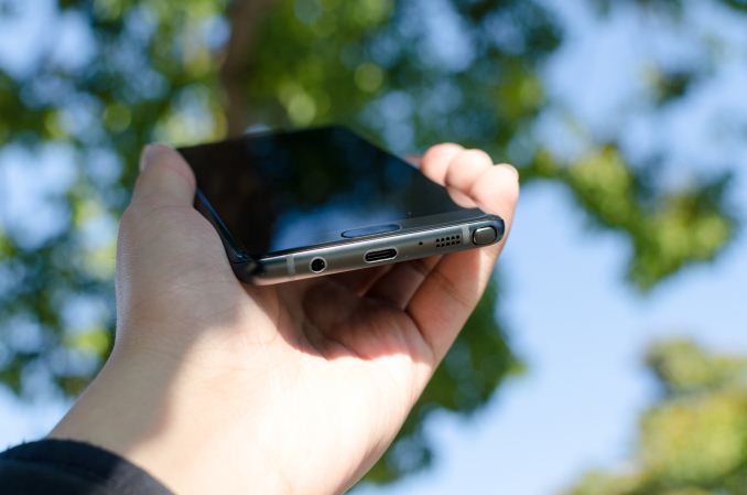
Discussions of repairability aside, the aluminum frame of this phone also holds things like the SIM/microSD tray, microphone holes, and other cutouts. It’s worth mentioning here that the phone has better alignment of all the various buttons and holes compared to the Galaxy S7 edge by a significant margin. Things like the power and volume buttons are centered and in the right place ergonomically and remain fairly clicky, although if you’re used to something like the HTC 10 they have a much softer break and feel. There have been various people that have complained about these things, and presumably in an effort to address these kinds of complaints Samsung saw fit to resolve this issue but things like the microphone holes are not necessarily aligned, so if Samsung really intends to sell this design story of symmetry I suspect future generations will need to resolve these kinds of small niggles. It’s worth mentioning that even the antenna insulation on the frame is symmetrical. The entire phone is basically edge-less and feels like holding a pebble. The one notable area of this phone that actually has a perceivable edge here is the S-Pen, which has a slight edge that helps with pulling it out if you have slightly longer fingernails. If you don’t have fingernails, the head can be depressed to make it protrude for easy access. The device also has a 3.5mm jack, which is nice to see when at least one recent device has shipped without one, but I’m still undecided on whether this really matters one way or another.
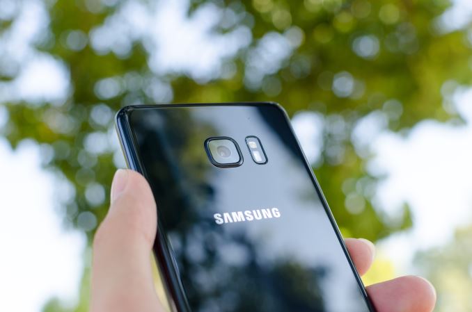
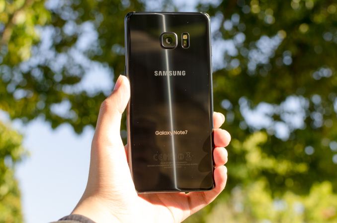
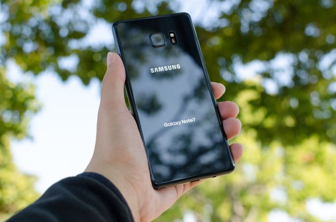
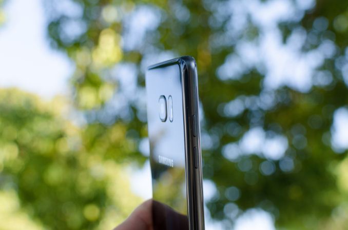
The back of the phone is pretty much identical to the Galaxy S7 and S7 edge. The curved glass helps with ergonomics, with a slightly rounded square camera lens which now contains a subtle pattern of concentric circles between the cover lens and the camera module. I don’t think this actually serves a functional purpose and actually calls attention to the rather strange mismatch of a squared-off cover lens with a circular camera. It’s worth mentioning here that the coating underneath the glass is no longer as elaborate as the one seen in the Galaxy S6 or Note5, which had an extremely fine texture to it and multiple layers to produce a neat effect in the sun, but there are still some interesting optical effects to this back cover as reflections diffuse vertically instead of a simple mirror reflection.
Overall, the design of the phone is acceptable, but honestly at this point it’s nothing really special. If you’re stepping up from a phone like the Galaxy Note 3 it’s going to feel nicer in the hand but really the design is just keeping up with competition like Xiaomi. I would argue that OnePlus and Google/Huawei have surpassed Samsung here as far as ID goes from a lower price point, and that both Apple and HTC have done better than Samsung for about the same price. We can argue about how Apple uses a plastic liner or whatever minute detail in the design is “better”, but something as simple as the camera lens is square even though a circular design would look less out of place due to the use of concentric circles. The IR LED, front facing camera, and iris scanner are visually unbalanced, and microphone holes are just not aligned in any sensible way. For all of the marketing bravado about symmetry and a focus on design, these kinds of things make it feel like Samsung is really just doing this to address press criticism rather than doing it out of some kind of internal push for improved design.
The Galaxy S6 was a massive leap forward for Samsung, and as we approach the end of year two for this design I think it’s time for Samsung to move forward once again. There are only so many ways to make a slightly rounded rectangle, but something other than the same curved glass and aluminum frame with physical home button would go a very long way towards refreshing the design. It’s easy to argue that Samsung’s strategy of mostly making the exact same design with a slight twist has worked for them for a very long time, but just looking at the past Samsung and other OEMs in the business usually only get about two generations out of a given ID before they need to refresh their designs. The edge display is pretty, but functionally it’s honestly at least mildly annoying because edge swipes don’t really work the way you’d expect them to due to the abbreviated edge on the Note7 relative to previous devices. This is obviously my opinion, but the Galaxy Note7 feels designed in a disjointed manner. The right pieces are generally in the right place, but if you look too closely the seams of not-quite symmetrical parts are still there. I found it hard to fault phones like the Galaxy S5 and Note 4 that were unabashedly functional, but this is a phone that tries to have some sense of style so it’s harder to be kind here. The Note7 isn’t going to make you sad when you take it out of the box and functionally there’s absolutely nothing wrong with this phone other than the strange ergonomics of the edge display, but if you look too closely you’ll notice the incongruities.
Display
Moving past the design the next point of interest is going to be the display which is one of the major elements of any smartphone, and pretty much the first thing you’re going to notice when you power on the phone. It’s easy to look at a display and provide some fluff about how the colors pop and how the high contrast leads to dark, inky blacks, but to rely solely on subjective observation really fails to capture the full extent of what a display is really like. If you put two displays side by side, you can tell that one is more visible outdoors, but there’s no way of distinguishing whether this is the case because of differences in display reflectance or display luminance. Other factors like gamut and gamma can also affect perceived visibility which is the basis for technologies like Apical’s Assertive Display system.
In order to try and separate out these various effects and reduce the need for relative testing we can use testing equipment that allows for absolute values which allow us to draw various conclusions about the ability of a display to perform to a certain specification. While in some cases more is generally speaking better, there are some cases where this isn’t necessarily true. An example of this is gamut and gamma. Although from an engineering perspective the ability to display extremely wide color gamuts is a good thing, we’re faced with the issue of standards compliance. For the most part we aren’t creating content that is solely for our own consumption, so a display needs to accurately reproduce content as the content creator intended. On the content creation side, it’s hard to know how to edit a photo to be shared if you don’t know how it will actually look on other people’s hardware. This can lead to monetary costs as well if you print photos from your phone that look nothing like the on-device preview.
To test all relevant aspects of a mobile display, our current workflow uses X-Rite’s i1Display Pro for cases where contrast and luminance accuracy is important, and the i1Pro2 spectrophotometer for cases where color accuracy is the main metric of interest. In order to put this hardware to use we use SpectraCal/Portrait Display’s CalMAN 5 Ultimate for its highly customizable UI and powerful workflow.
Before we get into the results though I want to discuss a few choice aspects of the Galaxy Note7’s display. At a high level this is a 5.7 inch 1440p Super AMOLED display that is made by Samsung with a PenTile subpixel matrix that uses two subpixels per logical pixel in a diamond arrangement. The display driver supports panel self-refresh as a MIPI DSI command panel rather than a video panel. In the Snapdragon 820 variant of this device it looks like there isn’t a dynamic FPS system and a two lane system is used so the display is rendered in halves. The panel identifies itself as S6E3HA5_AMB567MK01 which I’ve never actually seen anywhere else, but if we take the leap of guessing that the first half is the DDIC this uses a slightly newer revision of DDIC than the S6E3HA3 used in the Galaxy S7. I’m guessing this allows for the HDR mode that Samsung is advertising, but the panel is likely to be fairly comparable to the Galaxy Note5 given that the Galaxy S7 panel is fairly comparable to what we saw in the Galaxy S6.
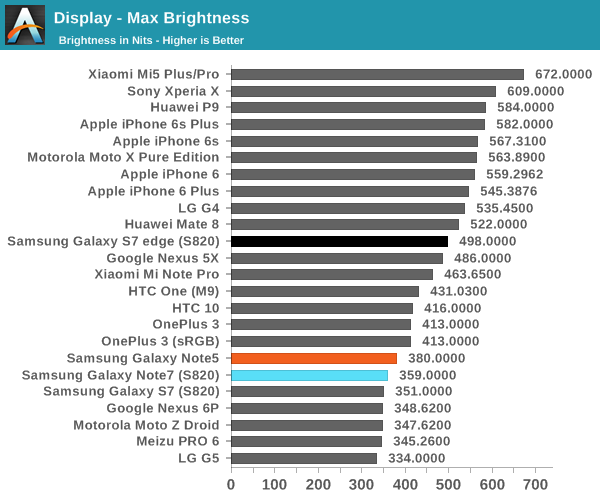
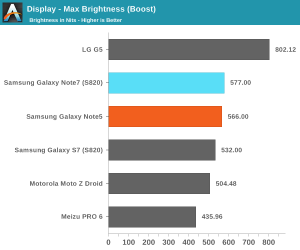
Looking at the brightness of the display, it’s pretty evident that the Galaxy Note7 is a bright panel, especially when compared to things like the HTC 10 and LG G5. The G5 does reach “800 nits” with its auto brightness boost, but the true steady state is nowhere near that point while the Galaxy Note7’s display can actually stay at its boost brightness for a reasonable amount of time and I’ve never really noticed a case where the boost brightness couldn’t be sustained if the environment dictated it.
Before we get into the calibration of the display it’s probably also worth discussing the viewing angles. As you might have guessed, the nature of PenTile and AMOLED have noticeable effects on viewing angles, but in different ways. As AMOLED places light emitters closer to the surface of the glass and doesn’t have a liquid crystal array to affect light emission, contrast and luminance are maintained significantly better than a traditional LCD. However, due to the use of PenTile it is still very obvious that there is a lot of color shifting as viewing angles vary. There are still some interference effects when you vary viewing angles as well. In this regard, LCDs seen in phones like the iPhone 6s are still better here. You could argue that one is more important than the other so I’d call this a wash, but AMOLED could stand to improve here.
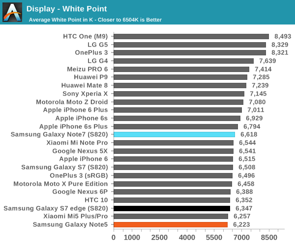
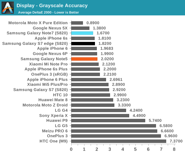
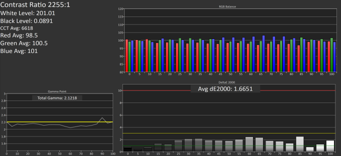
Moving on to grayscale and other parts of the display calibration testing it’s worth mentioning that all of these tests are done in Basic mode which is something I would suggest using in these AMOLED devices in order to improve both calibration accuracy and battery life as brightness is generally controlled by PWM while hue is controlled by voltage, so constraining the gamut actually reduces power draw of the display. Putting this comment aside, the grayscale calibration is really absurdly good here. Samsung could afford to slightly increase the target gamma from 2.1 to 2.2 but the difference is basically indistinguishable even if you had a perfectly calibrated monitor to compare to the Note7 we were sampled. Color temperature here is also neutral with none of the green push that often plagues Samsung AMOLEDs. There’s basically no room to discuss for improvement here because the calibration is going to be almost impossible to distinguish from perfect.
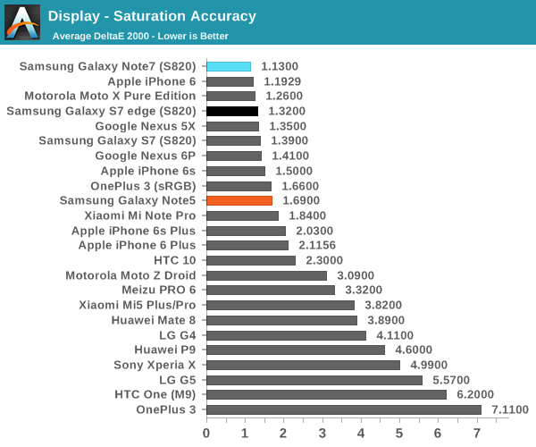
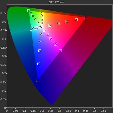
In the saturations test again Samsung has basically nailed the sRGB gamut here to the extent that it’s going to be basically impossible to distinguish it from a reference monitor. I really have nothing else to say here because Samsung has no room to improve here. Of course, saturation sweeps are just one part of the whole story, so we can look at the GMB ColorChecker to see how well the Note7’s display can reproduce common hues.
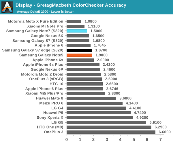
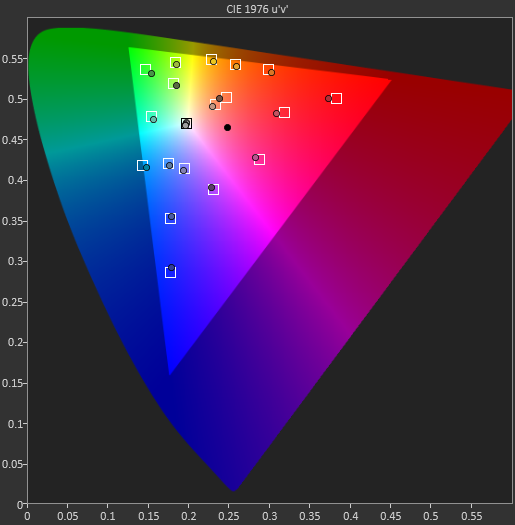
In the Gretag MacBeth ColorChecker test a number of common tones including skin, sky, and foliage are represented as well as other common colors. Again, Samsung is basically perfect here. They might need to push up the saturation of reds slightly higher but it’s basically impossible to tell this apart from a reference monitor. If you want to use your phone for photo editing, online shopping, watching videos, sharing photos, or pretty much anything where images are reproduced on more than one device, the Galaxy Note7 is going to be a great display. It may not be much of a step up from the Galaxy Note5, but at this point the only avenues that Samsung really needs to improve on is the maximum brightness at realistic APLs above 50% and power efficiency. It would also be good to see wider color gamuts in general, but I suspect the value of such things is going to continue to be limited until Google and Microsoft actually make a serious effort at building color management into the OS. It might also make sense to try and improve color stability with changes in viewing angle, but I suspect that AMOLED faces greater constraints here relative to LCD due to the need to improve the aging characteristics of the display. Regardless, it’s truly amazing just how well Samsung can execute when they make something a priority.
Battery Life
Obviously, battery life is one of the most important aspects of any smartphone, tablet, or other mobile device shipping today. The main point of interest for a lot of people seems to be battery life as even though we’re approaching what might be considered a full day of use a lot of people seem to need quite a bit more as battery life demands can vary dramatically from day to day. If you sit in an office for much of your day with the phone next to a charger then battery life demands are going to be relatively light but if you have to deal with a 12 hour flight with a 2 hour wait for a transfer before another 4 hour flight then you’re probably going to find that most devices are not going to have the ability to get you through a full “day” if your day of use involves 9 hours of usage between movies, games, web browsing, and other data synchronization tasks. This is obviously an extreme case but if you’ve ever done a trans-pacific flight this isn’t that far-fetched if you can’t fall asleep for at least 10 hours of the ~16 hour flight.
In order to try and test this properly then we turn to our 2016 suite of benchmarks which allow for proper characterization of battery life in fairly realistic workloads. In order to make for useful relative comparisons we disable all background tasks and set the display for all devices to 200 nits on a blank white screen for all tests. In the case of the Galaxy Note7 due to its similarity to the Galaxy S7 edge we’ve elected to run a compressed version of our suite although if time permits we’ll be adding additional results and commentary.
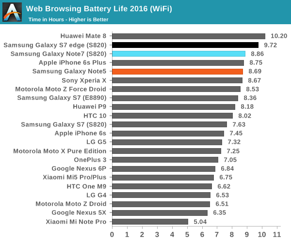
With that said we can start with the WiFi test which shows about an 8% drop for the Note7 relative to the Galaxy S7 edge. This might be surprising to some but given that the display area of the Note7 is 7% larger and the battery is about 3% smaller it’s not all that surprising as I wouldn’t be surprised if literally everything but display has identical power consumption on the Galaxy Note7.
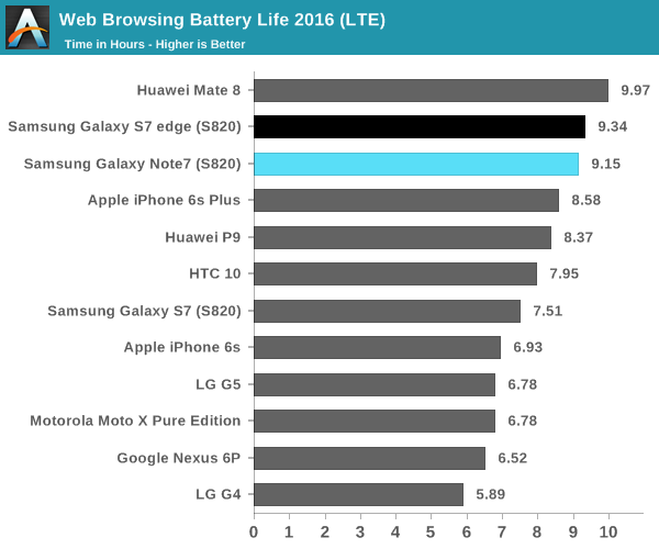
While the WiFi test result is pretty much in line with expectation the LTE test result is visibly different and somewhat surprising to see. It’s tempting to explain the relative difference change away as a function of Verizon and T-Mobile LTE differences but reception was fairly comparable across both test units and both were tested on LTE. Given that the Note7 has 4x4 MIMO for cellular connectivity I suspect that there are some RF front-end changes that distinguish the Note7 from the S7 edge but the RF front-end is only visible to the modem rather than the overall system so unless the modem itself can be accessed I suspect the most viable method of figuring out the changes here will be a device teardown which isn’t in the scope of this review.
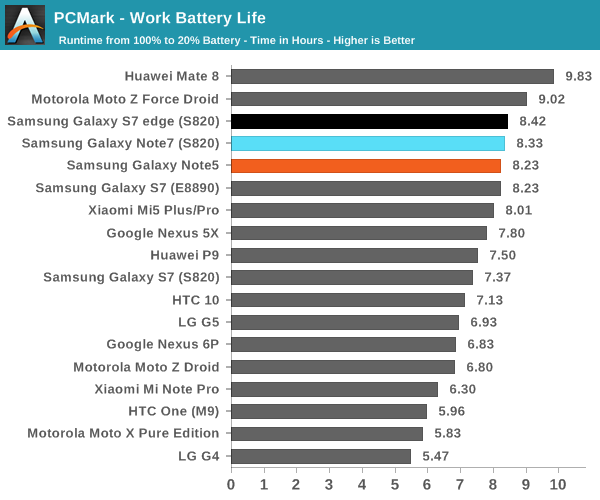
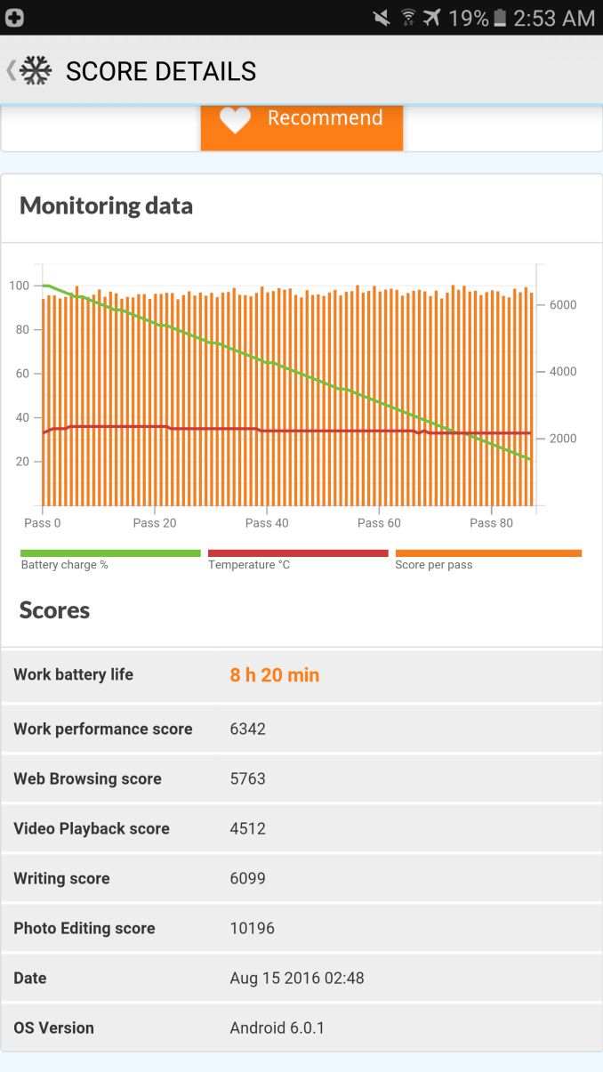
The next point of interest is going to be PCMark which shows how close the Galaxy S7 edge and Note7 are in WiFi and CPU bound tasks as they last basically an identical amount of time and have fairly comparable performance if you get both on the same version of software. Due to time constraints I would refer back to the Galaxy S7 Part 2 Review if you are interested in seeing what heavy workload battery life is like, but overall the Galaxy Note7 keeps fairly good battery life even if it isn't as great as the Galaxy S7 edge.
Charge Time
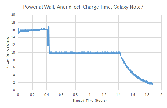
Of course, while battery life is critical we need to also talk about the other side of the equation which is how quickly it can charge. After all, if you’re stuck in an airport waiting for your connection and burn off most of your battery in the process, it’s going to be fairly painful conserving battery until you get to your destination because your phone can’t charge quickly enough to compensate for additional usage. In order to test something like this, we rely on measurements from the wall and waiting until the power draw from the wall reaches a specified level that indicates full charge has been reached. In the case of the Galaxy Note7, the charger uses QC 2.0 or Samsung’s adaptive fast charge technology depending upon the AC adapter you’re using, and internally the battery charger IC is a TI BQ25898S which contains a buck converter that can take a 9V or 12V input and step it down to the appropriate voltage for the battery with supports for current up to four amps at roughly 90% efficiency.
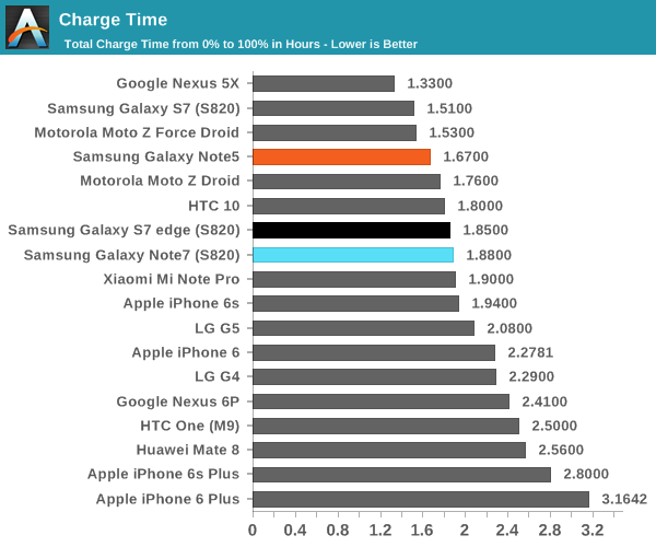
Looking at the overall charge time the Galaxy Note7 performs respectably as it reaches full charge in under two hours and takes basically as much time as the Galaxy S7 edge, which is probably not a surprise given their similar battery capacities. For the most part I think we’ve hit an upper bound here as far as charge time goes. The real challenge now is to focus on reducing the heat output and impact to battery longevity that these fast charging solutions have similar to OnePlus’ Dash Charge and Qnovo’s Adaptive Charging technologies.
System Performance
As previously mentioned this year a major goal of ours was to focus on benchmarks with metrics that better indicate user experience rather than being subject to additional layers of indirection in addition to updating our previously used benchmarks. Probably one of the hardest problems to tackle from a testing perspective is capturing what it means to have a smooth and fast phone, and with the right benchmarks you can actually start to test for these things in a meaningful way instead of just relying on a reviewer’s word. In addition to new benchmarks, we’ve attempted to update existing types of benchmarks with tests that are more realistic and more useful rather than simple microbenchmarks that can be easily optimized against without any meaningful user experience improvements. With that said, let's get into the results.
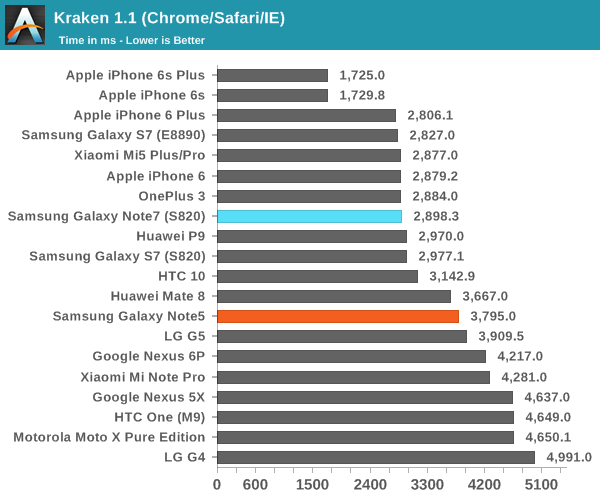
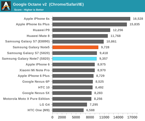
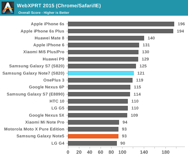
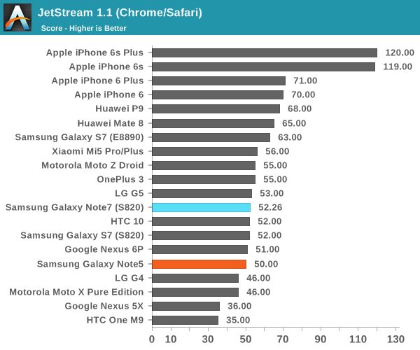
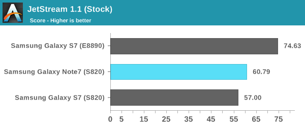
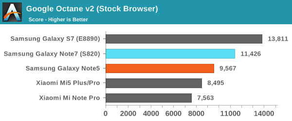
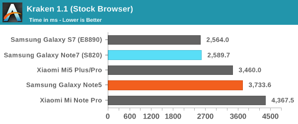
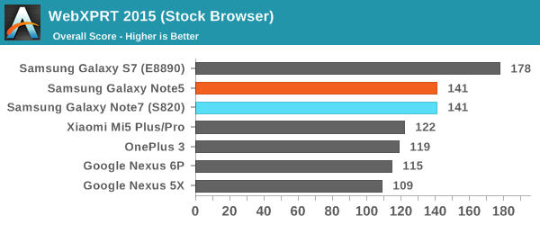
Browser performance here is pretty much in line with expectations as pretty much every OEM using Snapdragon 820 is going to be using the same basic BSP and most of the optimizations here are going to be done by Qualcomm rather than the OEMs.
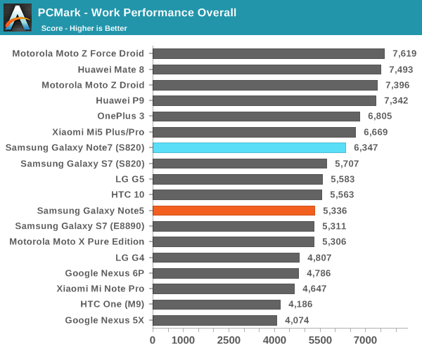
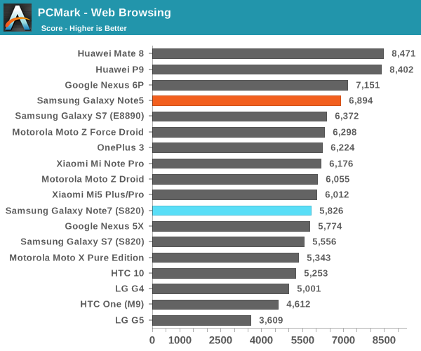
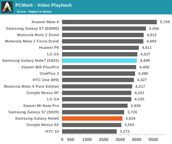
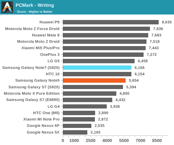
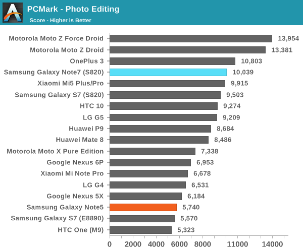
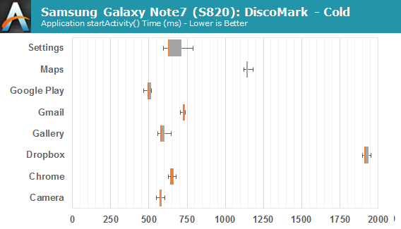
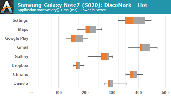
Again, performance is in line with expectation in PCMark, although there are some improvements here and there that are primarily centered about web browsing performance which is almost constantly being improved as developers figure out new optimizations for browsers. With that said we can move on to Discomark, which is a true high level benchmark designed to show exactly how quickly a suite of common Google and OEM applications load from NAND or from RAM.
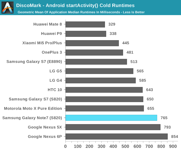
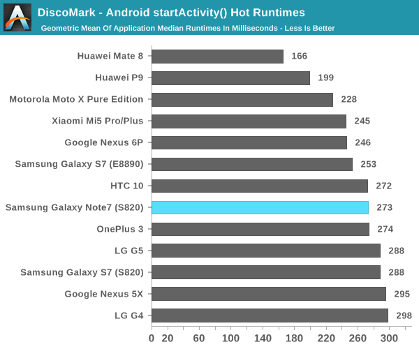
Here the Galaxy Note7 shows some improvement on hot runtimes relative to the Galaxy S7, but the cold runtimes have dropped for some reason. It looks like much of the delta here is due to Dropbox which is now running significantly slower on the Galaxy Note7. I suspect that this is related to possible changes in Dropbox or its interaction with TouchWiz rather than any significant underlying difference in system performance relative to the Galaxy S7. Overall, the Galaxy Note7 performs about where you'd expect from a Snapdragon 820 device from Samsung given the performance of the Galaxy S7.
System Performance Cont'd
Now that we've covered more general purpose benchmarks that tend to emphasize CPU performance and GPU compute performance, we can look at benchmarks that tend to more strongly emphasize things that games will see benefits from such as improved GPU graphics performance and improved CPU physics processing performance.
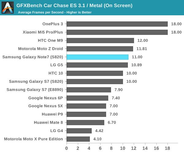
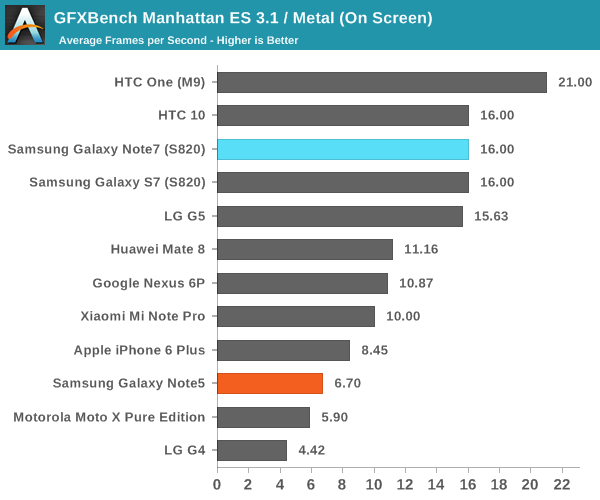
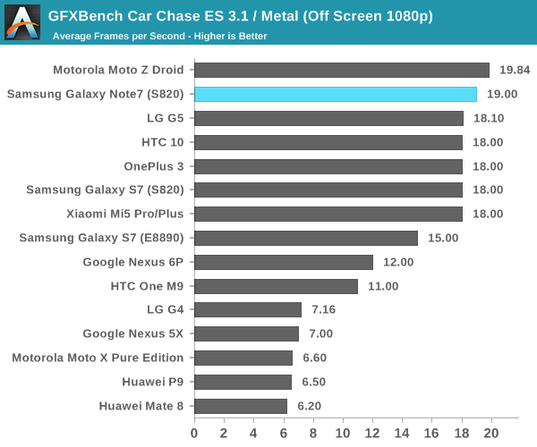
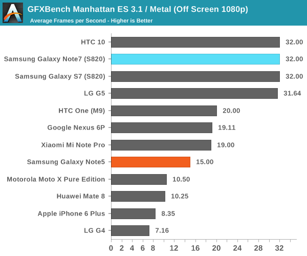
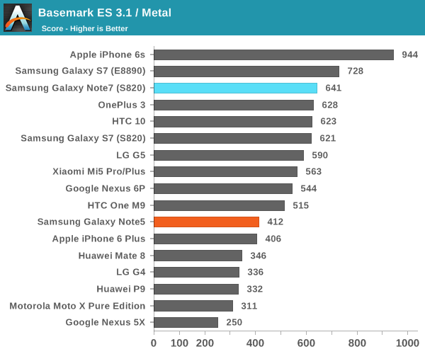
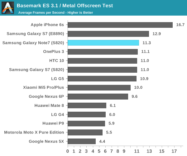
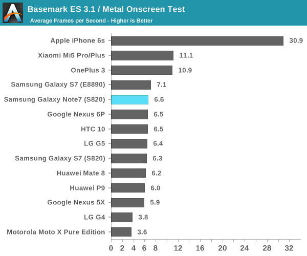
It's probably no surprise, but the Galaxy Note7 performs as expected with the latest drivers and in ideal thermal conditions. The Adreno 530 should be more than sufficient for the forseeable future but for maximum performance it's best to enable 1080p rendering or lower to maximize frame rates in games like Real Racing 3 that tend to really use the GPU to its fullest extent.
NAND Performance
Of course, while Discomark provides a sort of holistic view of performance for a specific task, it’s also important to at least try and break down the various aspects that impact system performance so rather than simple black box testing we can further understand what factors influence performance and therefore provide additional information to make better buying decisions. One of the major contributors to general purpose performance is going to be storage performance, which is often something often ignored by marketing as the nitty gritty details of NAND storage realistically require some background in solid state physics and devices to understand, as well as some understanding of computer science and engineering.
While I’m not really happy with the state of our mobile storage benchmarks, for now I don’t really see another option here as the publicly available storage benchmarks for Android and iOS are fairly basic. Putting aside the state of the benchmarking industry, our current benchmark remains AndroBench 4 which provides at least some basic storage benchmarking capabilities. We use custom settings with this benchmark which attempts to make the test more realistic as the default settings are just wildly unrealistic. This includes adjusting the buffer size, increasing the file size to 100 MB, and only using one thread instead of 8. 256KB file size is targeted as this is the most common block size if you profile this kind of thing for sequential writes and reads, while 4KB block sizes are the most common for other tasks as the vast majority of computer architectures use 4KB pages for virtual memory. Single-threaded I/O is common in most cases because multi-threaded programming is still difficult for most people to reason about in an effective manner because conscious thought is inherently serial in nature with some multiplexing. In addition to this, many eMMC solutions on the market don’t really perform well with multiple threads simultaneously as the controller can’t do anything with extra requests other than reply with a busy signal which already happens with a single thread.
Putting aside discussions of testing we can take a look at the storage solution used in the Galaxy Note7 before getting into the actual results. The Note7 continues to use basically the same storage solution as the Galaxy S7 and S6, which is to say an MLC-based solution that has a UFS Gear 3 single lane interface for bandwidth up to 600 MB/s and basically has the exact same model number if you check the SCSI devices attached to the system save for some changes that indicate the higher 64GB storage relative to the 32GB chips that are most common in the Galaxy S7.
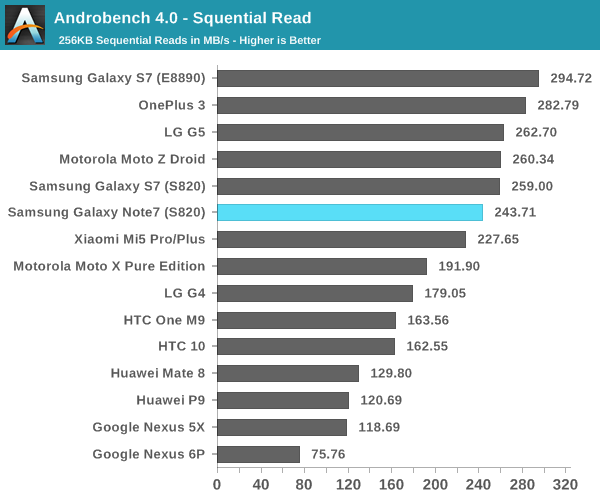
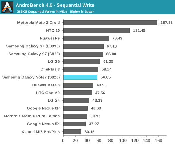
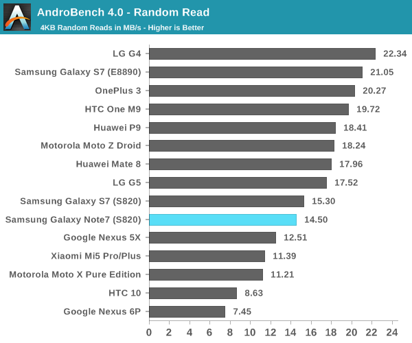
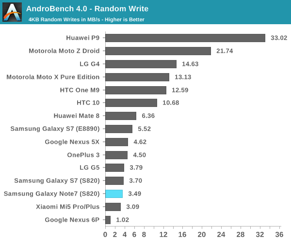
Looking at the test results it performs exactly as quickly as you’d expect from this MLC solution as we’ve tested it in the Galaxy S6, S6 edge, S6 edge+, Note5, S7, S7 edge, and now the Note7 as well as the LG G5. The performance here is acceptable but obviously if you look at burst performance the iPhone 6s has a faster solution due to the hybrid SLC/TLC storage solution. The main benefit of pure MLC NAND is that performance is more consistent as there’s no precipitous drop when the SLC buffer fills. There’s always room to improve but I don’t really see how it’s going to happen unless Samsung moves to V-NAND for the next generation.
Camera Architecture
In general, camera has become probably the single biggest point of differentiation between smartphones at this point. As smartphones are often the only camera that most people carry on a day to day basis, the rear camera on a smartphone really cannot be a disappointment relative to the competition. While we can talk about how much a front-facing camera matters in terms of quality, it’s pretty safe to say that for photos and videos that are worth saving will be taken with the rear-facing camera.
While post-processing and a number of other factors are going to have a huge impact on the overall camera experience, the foundation that makes it possible to deliver a great camera is always going to start at the hardware.
| Samsung Galaxy Note Cameras | ||||
| Galaxy S6 Galaxy Note5 |
Galaxy S7 Galaxy Note7 |
|||
| Front Camera | 5.0MP | 5.0MP | ||
| Front Camera - Sensor | Samsung S5K4E6 (1.34 µm, 1/4") |
Samsung S5K4E6 (1.34 µm, 1/4") |
||
| Front Camera - Focal Length | 2.2mm (22mm eff) | 2.1mm (21mm eff) | ||
| Front Camera - Max Aperture | F/1.9 | F/1.7 | ||
| Rear Camera | 16MP | 12MP | ||
| Rear Camera - Sensor | Sony IMX240 Samsung S5K2P2 (1.12 µm, 1/2.6") |
Sony IMX260 Samsung S5K2L1 (1.4 µm, 1/2.6") |
||
| Rear Camera - Focal Length | 4.3mm (28mm eff) | 4.2mm (26mm eff) | ||
| Rear Camera - Max Aperture | F/1.9 | F/1.7 | ||
It’s probably not any surprise that the Galaxy Note7 has the same exact camera setup as the Galaxy S7, but in case it was ever in doubt it shouldn’t be now. Given the similar camera setup I don’t think that there’s a ton of difference to be expected between the two phones but things like software algorithms can and do change with time so it’s important to not just immediately write off the Galaxy Note7 or assume it’s immediately going to be award-winning. It’s worth reiterating here that the dual pixel system likely incurs a sensitivity penalty as in order to implement the dual pixel system each pixel must have a physical light barrier as you need a microlens and a barrier to make light from the same object converge on two separate photodiodes so the amount of light collected is inherently going to be less than no barrier and a single photodiode per pixel. I’m also curious to know whether any quantum effects appreciably change sensitivity here as if a single pixel is a 1.4 micron square then each photodiode has area similar to a 1-micron pixel. With that said we can move on to the one major change highlighted by Samsung, namely the user experience.
Camera UX
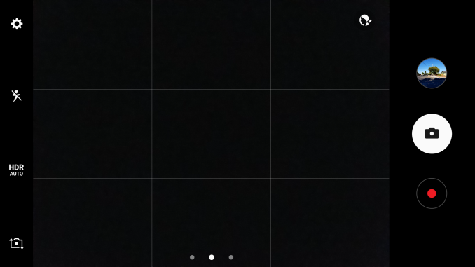
One of the major points highlighted in the launch event was that the camera application was completely redesigned. In addition to a fairly subdued icon that better fits the color palette for Android in general, the UI itself is a bit cleaner out of the box.
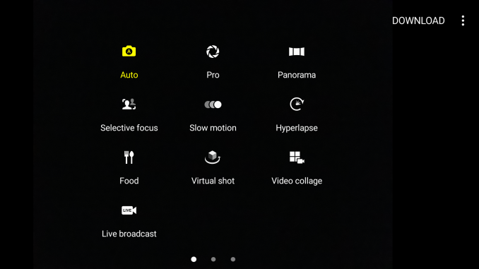
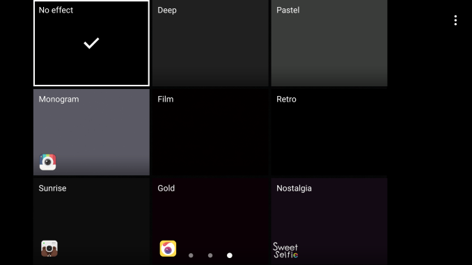
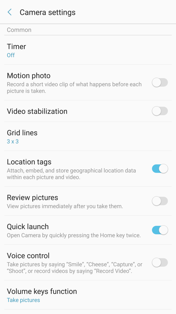
Right away when you open the camera app the most apparent thing is that the number of icons has been reduced. Instead of a dedicated mode button it’s now a swipe, and the same is true of the effects button. There’s also no more timer or resolution button on the screen by default, and the button to hide the various settings buttons has been eliminated entirely. It’s also worth mentioning that the button to change between cameras has been moved and a gesture to do the same thing has been added so you can simply swipe up or down to switch between cameras. Samsung also continues to shut off the camera after a few minutes automatically which is good if you’re a normal user but annoying if you’re trying to set up a shot of an ISO chart with a tripod.
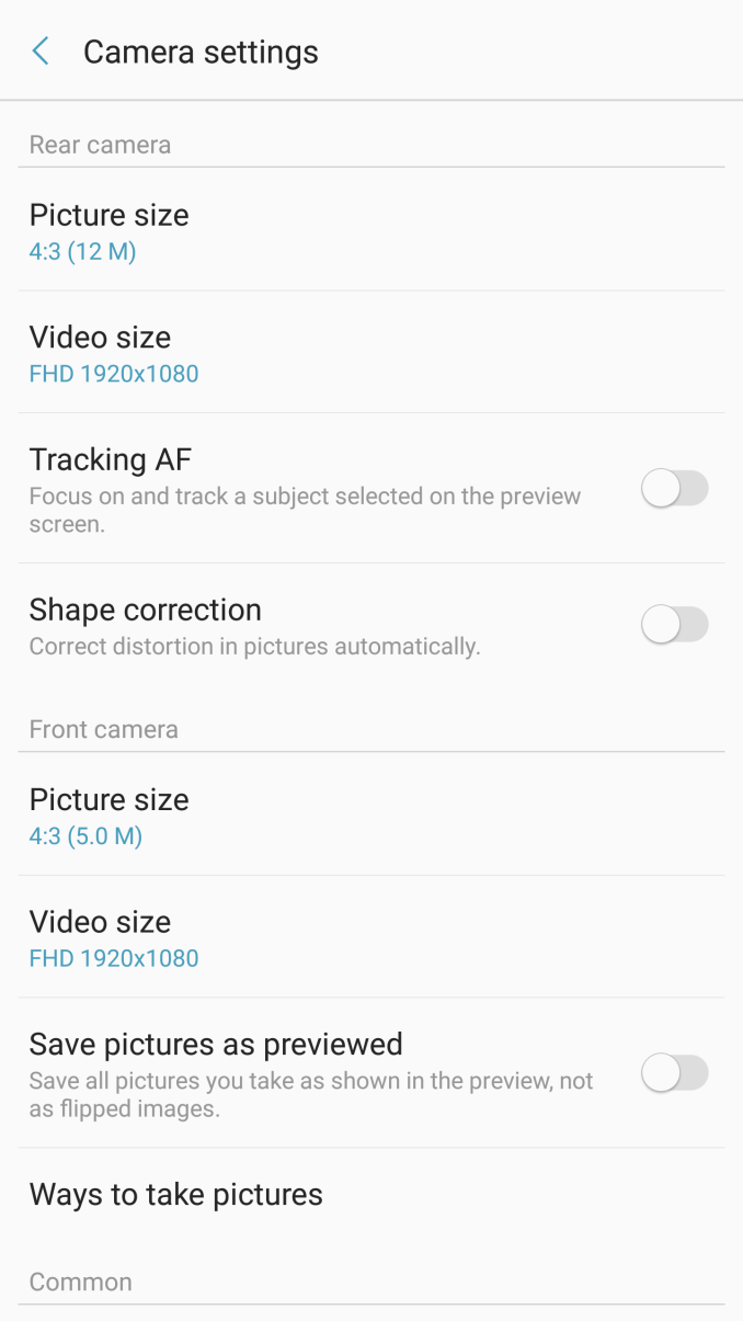
Other than these changes almost nothing else really changes. There are some extra toggles like shape correction in the settings overflow and RAW output is now hidden under Picture Size for the rear camera but nothing else is really notable. I don’t really have anything else to say here that’s new, and I would refer to the Galaxy S7 Part 2 review if you are otherwise unfamiliar with Samsung’s camera application. As both perform identically as far as focus and capture speed goes subjectively we’ll temporarily forgo these results in favor of timeliness for this review.
Still Image Performance
Now that we’ve gone over what the Galaxy Note7’s camera looks like from an architectural standpoint and a user experience standpoint we can talk about how it performs. In the interest of timeliness and due to the sheer level of commonality with the Galaxy S7 in camera we have dispensed with a broad-base comparison across multiple generations and OEMs and price points in favor of a more test scenes with the Note 7’s direct competitors to have more relevant data points that do something other than reiterate parts of the Galaxy S7 review.
| Daytime Photography |
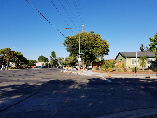
Looking at a simple daytime scene the Galaxy Note7 looks almost exactly like the Galaxy S7 but with some very minor contrast changes and some slight reduction in sharpening. In blind A/B testing I suspect It would be impossible to actually consistently tell which photo came from which device in a consistent manner. The LG G5 has had a major OTA recently which seems to have affected camera processing as while it was noticeably sharper than the Galaxy S7 and Note7 before it now looks fairly comparable with less visible luminance noise but also less detail.
The Note7 outputs higher detail here compared to the iPhone 6s Plus which is likely due to the larger sensor used in the Note7, but pretty much every high-end Android flagship is shipping larger sensors at this point so it’s not too surprising that the iPhone 6s Plus is starting to show its age as far as camera quality goes.
When compared to the HTC 10 it’s fairly obvious that HTC has missed exposure for this scene as rather than exposing for the center with some radius and weighting they seem to expose for the whole scene with a higher weighting applied to the center of the lens. As a result things like the sky look somewhat washed out compared to reality. The iPhone 6s Plus’ color rendition is pretty much exactly how I saw the scene, so the sky isn’t reproduced quite right there. On the other hand, shadow detail is clearly superior to the Galaxy Note7 on the concrete, and texture detail is also comparable. There are some clear issues with the HTC 10’s edge detail as high-contrast edges are rather soft and more comparable to the iPhone 6s Plus, so I would say the two are fairly comparable but the Galaxy Note7 edges past due to its better edge contrast.
| Low Light Photography 1 |
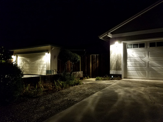
Moving on to the low light scenes the first scene was just a photo of some houses at night which has both brightly lit and dark areas which are mostly identical save for the appearance of a random cat at the fence for the iPhone 6s Plus. Starting with the comparison for the Galaxy Note7 and S7, it’s obvious that the Galaxy S7 elects to use a much warmer white balance than the Galaxy Note7. I’m reluctant to pass judgment on the white balance here because pretty much every OEM is using some kind of fuzzy logic and white balance is almost always just an educated guess, so misses like this aren’t that unusual. Again, pretty much everything looks identical as far as detail goes with maybe some minor differences in edge sharpening but not much here.
Compared to the iPhone 6s Plus other than the extra cat in the photo it reproduces the fairly cold fluorescent lighting used by the first house more accurately, but other than this difference detail looks almost identical between the two.
Compared to the LG G5, we can actually see some noticeable differences in detail on the plaster walls and clearly better detail reproduction on the shrubs in the center of the frame. I would argue that the LG G5 does the best out of any of the devices tested here as LG seems to have the cleanest noise reduction algorithms.
Relative to the HTC 10 it’s obvious that the Galaxy Note7 isn’t capturing as much detail as the HTC 10 when you look at areas like the plaster under the light as various patterns that can be seen in the HTC 10 just aren’t there on the Galaxy Note7’s version of the same image. These details are also captured by the LG G5 so it’s unlikely that we’re just looking at some image artifacts either. The HTC 10 does suffer from some noticeable purple noise at the bottom right edge of the photo though and color noise is more noticeable as you get to the very edges of the image.
| Low Light Photography 2 |
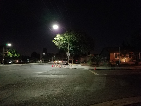
In the next scene I deliberately chose a fairly low light scene where dynamic contrast is not really needed but white balance would be difficult to get right. Here we’re starting to see some difference in post-processing when comparing the S7 and Note7 as it’s obvious that Samsung has significantly toned down the sharpening effects here compared to the Galaxy S7. However, if you use the reference photo I took with the HTC 10 with manual white balance in an attempt to get the correct color rendition it’s obvious that the Note7 is a bit too yellow while the Galaxy S7 properly captures the basically orange lights given off by these sodium lights. Again, white balance can vary dramatically just based on the slightest angle change so I suspect that the differences in white balance aren’t going to be consistent from scene to scene.
Relative to the HTC 10 in Auto mode, both are equally wrong in white balance here, but it’s obvious that the HTC 10 still has more detail especially if you look at the RAW + Manual version of the photo which has even more detail preserved by Lightroom compared to the JPEG processing. The HTC 10 just has a better camera here.
If you look at the iPhone 6s Plus it actually ends up missing white balance even more as I think it’s assuming that these are conventional sodium lamps while the street lamps here are just extremely orange for whatever reason, and much more so than what I’ve seen in most cases. Detail between the two is actually comparable as well, and the Note7’s sharpening is much less aggressive than the Galaxy S7 so I would give the Note7 a narrow edge here.
Finally, the LG G5 I would say probably comes the closest to actually getting color rendition right in this scene. Detail is also one of the best here and I would argue it’s clearly superior to pretty much every other camera I tested here short of a dSLR.
| Low Light Photography 3 |
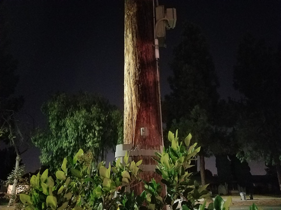
As a sanity check I went ahead and went to the same scene that I used for the Galaxy S7 review to see how cameras performed here. Once again, comparing the Galaxy Note7 and S7 it’s evident that there are slight changes in white balance but nothing huge and probably more a function of slightly different positions rather than actual changes. The main change here is the reduced amount of sharpening halos which reduces edge contrast slightly but looks a lot more natural. Detail for the most part is really unchanged here. For whatever reason the Galaxy S7 I received has issues with light streaking on the lens no matter how I clean it, but the Note7 doesn’t have these issues which might also be an advantage.
Relative to the iPhone 6s Plus it’s difficult to distinguish any difference in detail relative to the Note7 and color balance is basically identical as well. It’s also worth mentioning that the noise reduction is slightly cleaner on the iPhone 6s Plus but the difference is small. I would call it a wash here as both devices have fairly similar output and minor differences in both directions.
Against the HTC 10 the Note7 is clearly inferior. Just looking at the asphalt there’s better detail on the HTC 10, and if you look at the street sign you can clearly make out the words Glenmont Dr while the Note7 really only has Glenmont legible. The tree also has finer detail. The one thing that the Note7 does handle better is distortion, as the lights are just clearly blown out and a lot of optical aberrations are visible compared to the optics on the Note7. I suspect HTC is just going too aggressive with focal length here as the problem is especially worse on the edges despite wiping down the lens of each phone with a cotton cloth before taking the shot.
The same sort of story plays out with the LG G5 but detail is somehow slightly worse than what we saw on the HTC 10 which leads me to believe that the recent OTA has really affected image processing. The G5 just has a much cleaner photo than what the Note7 is putting out, as is the HTC 10.
| Low Light Photography 4 |
In this scene which attempts to introduce an object fairly close to the camera such that focusing at infinity is no longer sufficient, we can test to see how well a device hits focus. Here, again the only perceivable difference between the Galaxy S7 and Note7 is color balance. Detail is basically identical.
Relative to the HTC 10 the Note7 has clearly superior dynamic range. This is often a sticking point for HTC even with auto-HDR. The photo is just very dark. Doing the same photo in manual mode with a 2 second exposure solves the problem so I suspect that HTC is clamping gamma at high ISO in an attempt to reduce color noise. The sharpening halos on the Note7 are also fairly visible in the background when compared to the manual mode reference photo while the HTC 10 on auto doesn’t do this sort of thing. Detail on the wood is also much finer on the HTC 10, which seems to be a product of the larger sensor and generally less heavy-handed noise reduction.
Relative to the iPhone 6s Plus the Note7 has a noticeably brighter exposure and better dynamic range. Detail is also comparable, but again it’s obvious that Samsung is doing some artificial sharpening that really makes for some strange effects as out of focus background objects now have random sharp halos on them. Samsung ultimately wins out here, but the sharpening artifacts really do count against them and if not for the superior dynamic range I would hand the win to the iPhone 6s on this alone.
Looking at the LG G5 detail is better than the Note7 but color balance is strangely warm and the dark background is lacking detail compared to the Note7. However, the G5 also gets points for having more natural noise reduction and sharpening, so I would probably call this one a wash as depending upon what matters to you in a camera one type of output is going to be preferable to the other.
| Low Light Photography 5 |
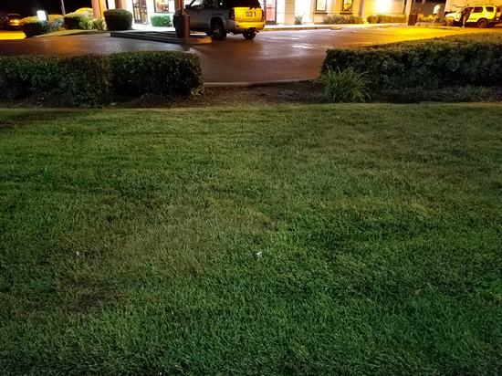
As a final scene I decided to do a fairly simple test of absolute detail in low light by just pointing the camera at a patch of evenly lit grass, but in fairly low light conditions. This is not designed to be difficult test, but makes things like poor noise reduction fairly obvious. The Galaxy Note7 once again shows visibly less artificial sharpening. The Note7 clearly still has some noise reduction but not a ton. Color balance is once again different as the Note7 renders the grass somewhat excessively green while the Galaxy S7 is a bit more accurate. Both are pretty much the same, but these are minor differences worth noting.
However, relative to the HTC 10 it’s obvious that fine detail is not being rendered very well by the Galaxy Note7. A lot of fine textures and colors are just being replaced by almost no fine texture and a single green hue which has a lot of implications for things like portraits, although depending upon what you want from a camera you may not want to capture all of the pores of someone’s face. Sharpening on the HTC 10 is just very subtle if it’s there at all.
If you look at the iPhone 6s Plus it’s obvious that detail is again comparable, but the iPhone 6s Plus is more conservative with its post-processing and lacks the extra sharpening that the Note7 uses. In this particular case it’s acceptable to do this because it’s hard to notice the difference, but I would say the 6s Plus has better post-processing.
Looking at the LG G5 it looks like we’ve actually hit an edge case or something similar with its post-processing because unlike other scenes where it clearly leads the Note7 here it’s fairly comparable with aggressive noise reduction but fairly light sharpening. I would say this is pretty much a tie.
Just as a final sanity check here I decided to take a RAW photo with the Note7 and processed it with Lightroom and it’s fairly obvious that there’s more detail to be had here but the gains are small. I suspect what we’re really seeing here is just decreased sensitivity that comes with the dual pixel system. It’s obvious that there are huge user experience benefits but I get the feeling that if Samsung decided not to pursue minimizing module thickness as a design goal that the camera would’ve been much better than what we got. I also suspect that the lack of RWB is a major contributor to what seems to be a stagnation in detail and sensitivity.
Overall, the camera of the Note7 is kind of a mixed bag for me. On one hand like the Galaxy S7 it is just ridiculously absurdly fast at everything it does, but on the other hand the output is really kind of disappointing at times. It’s not amazing but it’s not awful either. The HTC 10 is almost always producing better results here and with a major iPhone launch on the horizon I think the camera will be acceptable, but not necessarily the best. I would say that the HTC 10’s camera is fast enough to not really annoy people and produces better output which makes it the better camera for still images, but if you really care about speed above all else then the Note7 is the fastest camera you can get today.
Video Performance
For this portion of the review we can take a look at video performance, which provides an extra test of encode block performance in addition to ISP, sensor, and optic performance. In the interest of not wasting time on retreading topics that are basically unchanged relative to the Galaxy S7, I would redirect readers interested in an in-depth exploration of this subject and comparisons to other devices to the Galaxy S7 Part 2 review as this part of the review will be almost entirely focused on just comparing the Note7 to the Galaxy S7 to see what’s changed.
| Samsung Galaxy Note7 Video Encode Settings | ||||
| Video | Audio | |||
| 1080p30 | 17 Mbps H.264 High Profile | 256 Kbps, 48 KHz AAC | ||
| 1080p60 | 28 Mbps H.264 High Profile | 256 Kbps, 48 KHz AAC | ||
| 4K30 | 48 Mbps H.264 High Profile | 256 Kbps, 48 KHz AAC | ||
| 720p240 | 76 Mbps H.264 Baseline | 256 Kbps, 48 KHz AAC | ||
Starting with encode settings, we can see that the Note7 retains the same exact encode settings as the Galaxy S7 and S7 edge, which probably isn’t a surprise given that we’re probably seeing the limits of what the Snapdragon 820’s encode blocks can handle in cases like slow motion video, although 1080p30 is likely not encode-limited at this point.
Galaxy Note7
Galaxy S7
In 1080p30 video the Galaxy Note7 and Galaxy S7 look basically identical save for some slight differences in color rendition. The Note7 seems to be slightly more accurate here as the sky is closer to the color of blue that it should be but detail and most other colors look fairly comparable and both still have some jerky OIS reset behavior.
Galaxy Note7
Galaxy S7
In slow motion video the Galaxy Note7 again seems to have slightly improved color rendition but detail and pretty much everything else is identical. I don’t think this is a reason to go out and buy the Note7, but hopefully these improvements to color rendition come to future OTAs for the Galaxy S7.
Overall I don’t think video results appreciably change the Galaxy Note7’s results here. The camera is great from a speed perspective and it’s good for video but in a lot of cases HTC really does have them beat with the camera on the HTC 10. I think the major win for the Note7 continues to be speed and consistency as the one major weakness of the HTC 10’s camera relative to the Note7 is somewhat unreliable contrast AF in low light, although in better conditions PDAF has no issues achieving perfect focus.
Software UX: TouchWiz Redesigned
If you read the Galaxy S7 review it was probably fairly evident that I found the design of TouchWiz as well as the performance of the software in general to be fairly lacking. It seems that people within Samsung found this to be the case as well as with the launch of the Note7 it’s clear that they’ve significantly changed the design of TouchWiz.
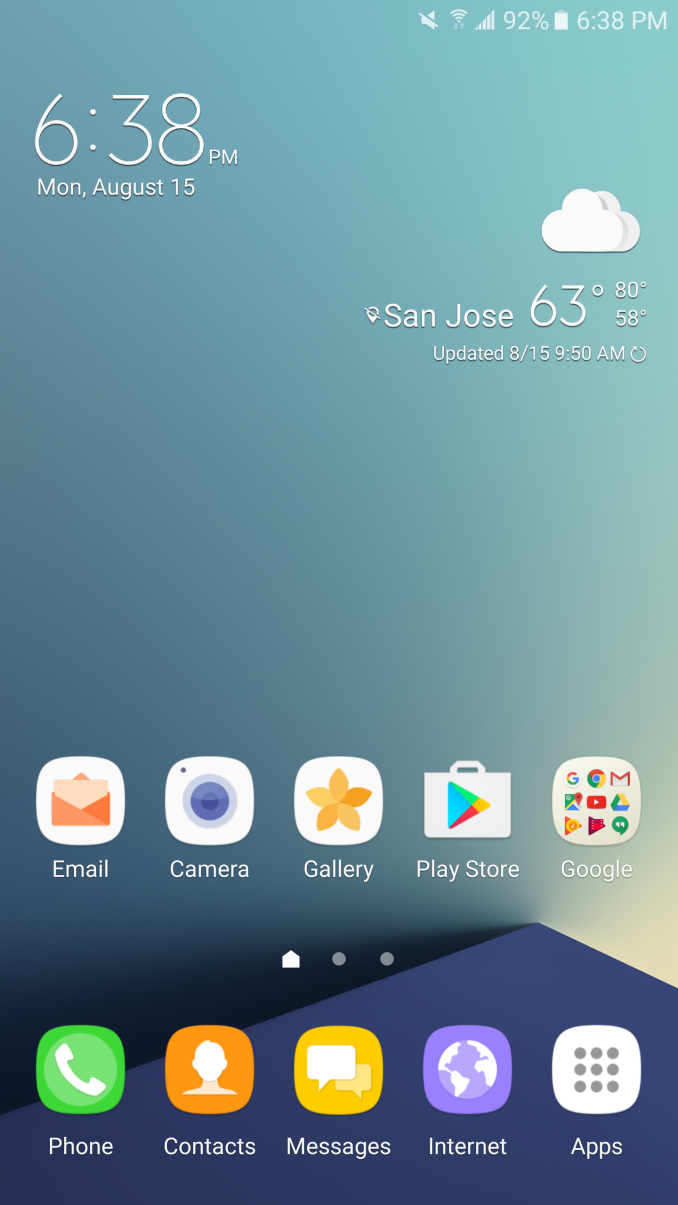
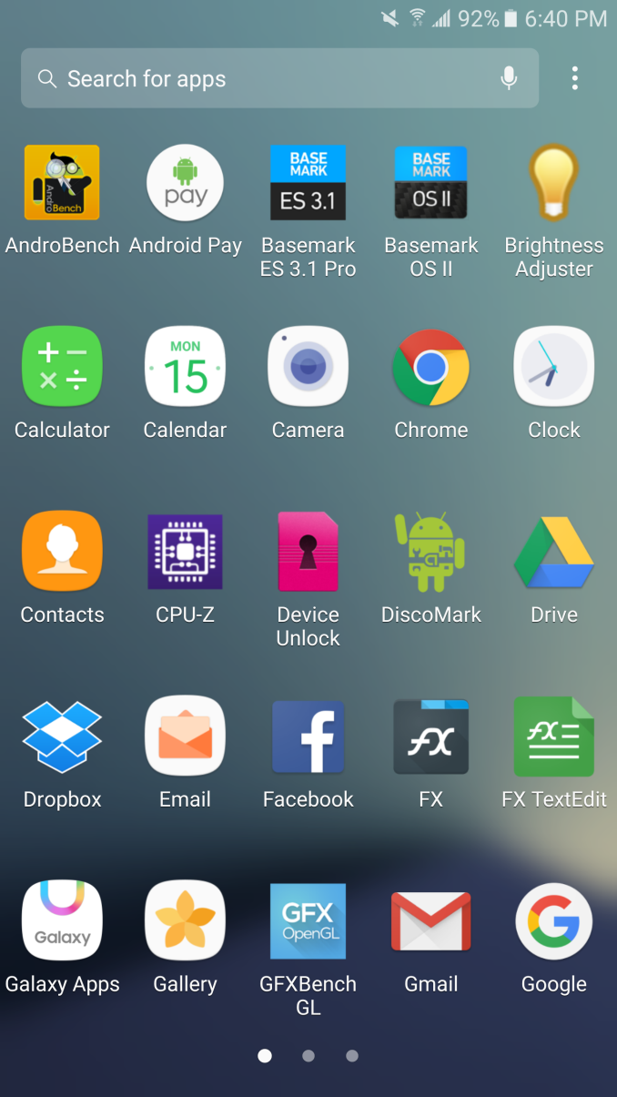
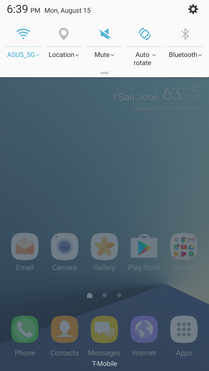
To start our examination of Samsung’s UI we can start with the homescreen. Right away it’s fairly obvious that the iconography is a lot better than it was before. Things like the camera application and email application no longer use strong, saturated colors. Instead we see more neutral pastel colors that fit in with Android icons in general and look a lot less out of place. The icons in general are just a lot less cluttered and have a cleaner look as well with the use of a simple envelope and letter instead of a letter sealed with an @ which complicated the design. The phone icon similarly no longer has random hatched squares that clutter the design which is great to see.
Moving past icons the applications themselves have been cleaned up somewhat and navigate in a more sensible way. For example, the messages application used to have search and “more” as physical buttons despite just being text. In the new version of the SMS application the “More” button has been replaced with Android’s standard overflow button and the search function has been placed into a bar that is clearly delineated similar to Google’s search bar. This sort of design flows a lot better which is great to see. However, I think that Samsung still has a ways to go here because if you look at something like the tabs Samsung still breaks with standard Android navigation convention because you have to tap on the tabs themselves rather than just swiping between conversations and contacts. Samsung users are probably used to this kind of thing but to every other Android user it’s a missing step of usability. Another weird usability issue is that going to the contacts portion of the Messages application has two distinct compose buttons which really does nothing but clutter up the UI.
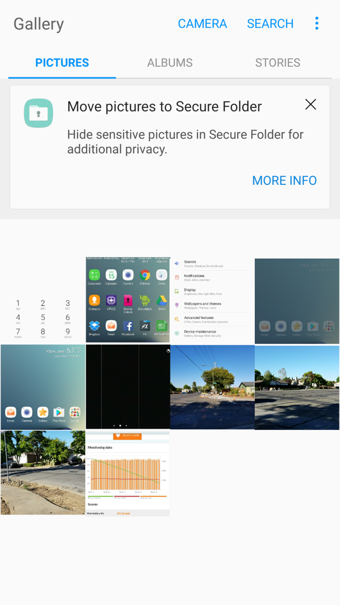
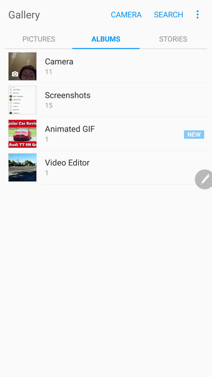
Looking at other applications like the Gallery, it’s actually possible to swipe from tab to tab which further adds to the strangeness of some of Samsung’s UI design decisions. It feels rather schizophrenic and while there’s progress here, Samsung hasn’t completely gotten over its past. The gallery application in general is great though, as it provides easy access to a general chronological picture stream as well as separating photos by albums for simpler navigation.
Other apps like the calculator and browser are also well-executed, with extra features like ad blocking although it isn’t necessarily 100% effective at doing this. Ads are generally a huge impact on battery life and data consumption so I would honestly recommend using Samsung Browser over Chrome at this point as there are also optimization benefits from using Samsung Browser due to the extra optimizations that Samsung uses here.
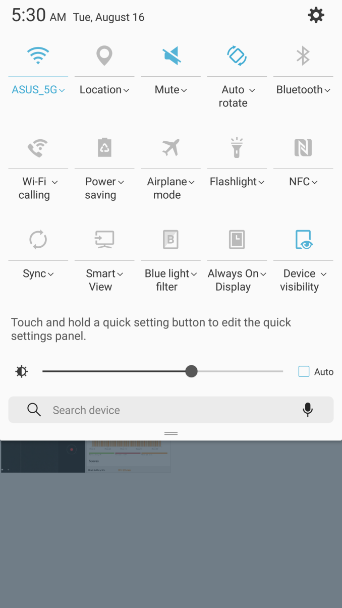
In addition to these changes things like the notification drawer are noticeably cleaner with only one row of quick settings unless you swipe again to get to the full quick settings drawer. The ability to access the flashlight in quick settings is nice as well. Tapping the settings icon leads to the settings application which has been cleaned up significantly and no longer has a bunch of tabs and frankly confusing navigation. Iconography here is also cleaner than what we saw from the Galaxy S7 but honestly I didn’t see a lot wrong with the Galaxy S7 here specifically. You can set up the secure folder here but honestly I didn’t use it seriously but it seems to work if you care about this feature.
Another notable addition that you can set up in the settings drawer is the Iris scanner. While I normally write off features from Samsung like this as a gimmick this iris scanner actually works, but with a few caveats. Right away it’s very obvious that the iris scanner doesn’t have the highest frame rate, although it is good enough to work. It also only registers one set of eyes. But other than these caveats, it actually works fairly well and the lock screen allows unlocking with either fingerprint scanner or the iris scanner. Scanning seems to work in both low light and outdoors although depending upon glare conditions it may not work outdoors. The lock screen also requires a swipe in order to enable the iris scanner so in most conditions the iris scanner is slower than the fingerprint scanner although if you’re wearing gloves the iris scanner is likely to be much faster.
The other feature worth discussing that falls under the aegis of software is the S-Pen. This works, but for the most part there’s really nothing ground-breaking here. The two major features added are animated gifs and the ability to translate things on the fly. These things both work and they might be useful but honestly I did nothing but check to see that they worked because I just don’t really find myself needing single word translation or GIF creation tools. Usability for both is fairly good as animated gifs are just a matter of using Smart Select and enabling the GIF option and translate is just matter of selecting Translate in the S-Pen overlay. The only other change here as far as usability goes is merging a bunch of disparate note-taking applications like Action Memo and S-Note and merging it all into Samsung Note which is good to see. The S-Pen continues to work well although I very rarely have any use for it other than signing PDFs with my signature, which is a great feature but I’m not sure if I’d buy a phone just to do that.
Galaxy Note7 left/top, HTC 10 right/bottom
The final thing I want to discuss as far as the software experience goes is performance. While TouchWiz is generally performant I still find lag here similar to the Galaxy S7. To prove I’m not crazy I did a very simple scrolling test between the HTC 10 and Galaxy Note7 on the same application on the same pages doing a very slow scroll on content that had already been preloaded and without any notable transitions. The Galaxy Note7 consistently drops frames right as the scrolling stops while the HTC 10 stays fairly close to 60 FPS throughout this very simple test, which just highlights the kind of frustrations that I have with Samsung software. I’m fairly confident that Samsung has the engineering staff capable of resolving these issues so it’s frustrating to see how this kind of thing just never seems to get fixed. These kinds of issues make it easy to think that Samsung really only cares about things that can be easily marketed rather than things that make for a good user experience, and judging by how Samsung can quickly turn around and fix things like iconography they need to take smoothness seriously if they want to continue justifying their pricing structure.
Overall, I think TouchWiz is a pretty acceptable experience, but it’s still lacking the level of polish I’m expecting from a major high-end smartphone these days. Design is a lot better and things like collapsing multiple note applications into a single application are great, but Samsung clearly still has the impulse to add random features that don’t really have a discernable purpose other than marketing. The iris scanner is not a marketing gimmick at all, but things like the Translate function really don’t make any sense and shouldn’t involve the S-Pen at all. It might be nice to have a full page translation with the ability to select the words to be translated similar to Google Translate, but hovering over each word and waiting for translation is not a very good user experience. Similarly, things like not being able to swipe across tabs in some apps while being able to do the same thing in others is just inconsistent and not very helpful. The Note7 is not horribly choppy by any definition, but it still clearly drops frames in places that other high end smartphones don’t. I get that marketing gimmicks help to move a phone, but I would rather see developer time spent eliminating frame drops and improving touch latency rather than adding a half-hearted translation feature and animated GIFs.
IC Design Wins
While we normally allude to the various things that we find in a phone in the interest of providing some extra depth for posterity I went ahead and dug through the software to find all the various peripherals that are present in the Galaxy Note7. For example, the Wacom digitizer identifies itself as the W9010 over i2c, which is interesting considering that this digitizer is the same one found in the Galaxy Note 3. In various briefings it was explicitly said that the digitizer supports double the number of pressure levels, so I’m not sure how this is achieved or if it really has any changes at all besides the smaller tip.
Moving past the Wacom digitizer we can see that there are a number of supporting ICs for power management and things like the battery charger. I’m not going to spend a ton of time talking about this but a huge number of these are Maxim Integrated ICs such as the MAX77838 switching regulator/PMIC, although I’m not clear on exactly what this PMIC supplies. There’s also the MAX77854 which functions as a PMIC, as well as a MAX98506 class D audio amplifier for the codec, which is likely used to drive things like the earpiece, speaker, and 3.5mm jack. This is shared with the Galaxy S7 and S7 edge and it looks like it uses the same WCD9335 audio codec so I wouldn’t get my hopes up about improved audio quality for the Snapdragon variants. If you want better audio you’re going to have to look towards the Exynos variant or the HTC 10.
Moving to slightly more boring but critical parts of the Note7 there are ICs like Cypress CapSense PSoC which enables the capacitive buttons and a TI BQ25898S battery charger IC which supports 9V and 12V charging voltages for adaptive fast charge. There’s also an NXP PN547 NFC controller and an NXP P61 secure microcontroller that seems to be for payments and similar applications. It should also probably surprise no one that there’s a Validity/Synaptics VFS7xxx fingerprint scanner here, although I found some mention of an Egis Technologies ET320 fingerprint scanner which makes me wonder whether Samsung is dual sourcing here.
The more esoteric ICs here include a Richwave RTC6213N FM radio tuner and a CEVA DBMD4 DSP which seems to be for always-on voice commands which are visible on i2c and SPI respectively. The only IC that I can’t identify at all is something called the SX9320 over i2c, which officially has zero mentions on the internet unless you count a Shacman trailer that is manufactured by Shaanxi Automobile Group in China or NGK spark plugs. At any rate, looking at these kinds of details it’s much more apparent just how critical economies of scale are as these are parts that seem to be shared across the Galaxy S7 and S7 edge, which surely helps to drive down cost due to the sheer volume of these devices. There are also things like FM tuners which aren’t necessarily going to be a point of advertising for a phone but are neat to have anyways.
Final Words
This has been a fairly long review despite the Galaxy Note7’s similarity to the Galaxy S7 edge so it’s well worth recapping everything that has been said thus far before we get into whether the Galaxy Note7 is worth buying or not. The first and most obvious place to start is the design of this phablet. For better or worse, this looks a lot like the Galaxy S7 edge, but it’s been cleaned up in noticeable ways. The Note7 has USB-C and USB 3.1 gen 1 which improves the design with a reversible USB connector, and the design in general is much more symmetrical with things like the volume buttons, power buttons, SIM tray, USB port, 3.5mm jack, and speakers all aligned to some extent. However, things like the top microphone port and the sensors flanking the earpiece are not really symmetrical. ID detailing does matter to some extent, but given how hard Samsung was pushing this narrative of symmetrical design I really fail to see how they can miss on these small details. The design is still acceptable now, but I think by next year Samsung really needs to have a new design ready that isn’t just two slabs of 3D glass with an aluminum frame in the middle. It doesn’t need to be something completely new but it does need to be different enough that you don’t have to closely examine the phone to figure out what model it is.
Moving past design the display of the Note7 is just clearly great. It’s one of the brightest on the market and has great contrast as well as excellent color accuracy. The reduced curvature relative to the Galaxy S7 edge also significantly improves the viewing angles of the edge although the subpixel arrangement still negatively impacts viewing angles. While the display is great it’s basically the same exact display that shipped with the Note5 for better or worse with the addition of an HDR mode that I was unable to use at all. A minor bump in power efficiency or improved viewing angles would go a long way to making the Note7 more attractive, but as-is there’s nothing really wrong with it. I’m not a huge fan of the edge display as far as usability goes but if you don’t use screen protectors there’s absolutely nothing wrong with the design of the display.
Of course, if we’re talking about power efficiency it also means that we need to talk about battery life. While the Note7 delivers solid battery life, it’s definitely a step down from the great battery life of the Galaxy S7 edge due to the addition of the S-Pen. If you care a lot about battery life you’ll have to make the choice between whether the S-Pen is worth the minor drop in battery life relative to the S7 edge. The lack of updated SoCs or really anything significant here means power efficiency is identical to the Galaxy S7 lineup. Charge time remains fast, but the lack of QC 3.0 or anything more advanced makes the device get fairly warm and reduces battery lifespan.
As far as system performance goes the Note7 is pretty much a dead ringer for the Galaxy S7. It actually gets even slower in Discomark on cold runs although thankfully it improves over the Galaxy S7 for hot runs. The Galaxy Note7 performs well in benchmarks but the closer we get to real-world testing the more apparent it is that Samsung is not really doing well in real-world benchmarks which is concerning. Obviously if Samsung continues to see rising profits they’re going to completely overlook everything written here, but I wouldn’t be surprised to see people notice relative differences in performance more and more as people get used to devices like the HTC 10 and iPhone 6s which are smooth and fast in real-world usage. Performance in game-based benchmarks continues to be excellent given the Adreno 530 GPU and NAND performance is also good, although burst performance is not as high as competing SLC/TLC hybrid solutions on the market.
As far as camera goes, the Galaxy Note7 continues to ship with the fastest camera on the market. Focus latency and capture latency are really unlike anything else on the market and the Note7 rolls back some of the excessive sharpening but I’m not really a fan of the lack of fine detail on most of the camera shots produced by the Note7, nor is the lack of proper stabilization in video all that impressive. These are things that should be fixed by default and I think the drive for the thinnest module possible has significantly impacted camera quality relative to the Galaxy Note5. If you only value speed, dynamic range, and extreme low light capability then the Note7 is probably still the best camera on the market, but if image quality outside of extremely dark situations matters I would argue that HTC has done a better job with the HTC 10’s camera even with its issues with optics and lack of 1080p60 or 720p240 video modes.
The final piece worth discussing before we discuss overall value and evaluation is software. TouchWiz has been redesigned which is good and it looks a lot better than before and things like the iris scanner are actually useful and work well which is amazing considering how this is the first Android smartphone with an iris scanner. However, TouchWiz still has some strange navigation behaviors that need to be cleaned up before it’s completely free of usability issues, and things like the S-Pen Translate function are just really pointless from the time I’ve used it and don’t need the S-Pen at all to function well. Animated GIFs work well, but are not really a must-have feature. My major complaint here continues to be a general lack of performance as things like scrolling don’t feel like they have the momentum or response that they should and I still see frame drops that don’t happen in comparable devices.
With all of this said I think the Note7 is fairly checkered. I’m sure there are people that want to buy one because it’s the only phablet on the market that really does a stylus well and if you’re someone that wants the Note7 for the stylus then you should stop reading now and go buy one because everything else on the market won’t meet your needs. If the stylus is just something that’s nice for you to have then the calculus gets much more difficult and the recommendation is no longer unconditional. The Galaxy S7 edge is currently about 750 USD and you can easily find people reselling new ones for any operator or international variants on Amazon for 600 USD or so. The Note7 does appreciably improve on the Galaxy S7 Edge, but it’s basically the S7 edge in a new package and with an S-Pen. You also get an extra 32 GB of storage which does justify the extra 100 USD that bumps the Note7 up to 850 USD.
With all of that said, I get the distinct sense that it will be much harder to justify the price well before the end of this year. The camera quality is kind of a disappointment given all of the hype at the launch of the Galaxy S7 given the dual pixel sensor and larger 1.4 micron pixels when the camera quality itself is not really an improvement over the Galaxy Note5 and is beaten out by the HTC 10. The software experience still shows dropped frames. There are still software features that feel like obvious gimmicks. The design is still lacking ID detailing. I’m sure other people will praise this device anyways but when a phone is this expensive and with smartphones in general getting polished to a mirror sheen each scratch becomes more obvious no matter how minor.
A lot of things are going to seem like nitpicks but the whole point of paying 400 USD more is so that the ID and engineering in both hardware and software bridges the last mile. Again, this is still a good phone and it really is as good as it gets for now, but with so many fall launches coming up I find it very hard to whole-heartedly recommend this phone. The only audience I can really recommend this to are people that are absolutely set on a Samsung phablet, and even then if you won’t miss the S-Pen I think the S7 edge is pretty much the same experience for 100-200 USD less when the extra money gets you so little other than an extra 32GB of internal storage.
The Galaxy Note7 goes on sale August 19 on all four major carriers and at least a few preorders will be arriving within the coming days for an average price of 850 USD for the 64GB SKU in Blue Onyx, Silver Titanium, and Black Onyx.

